-

Stanhope is a best in breed commercial property developer.
-

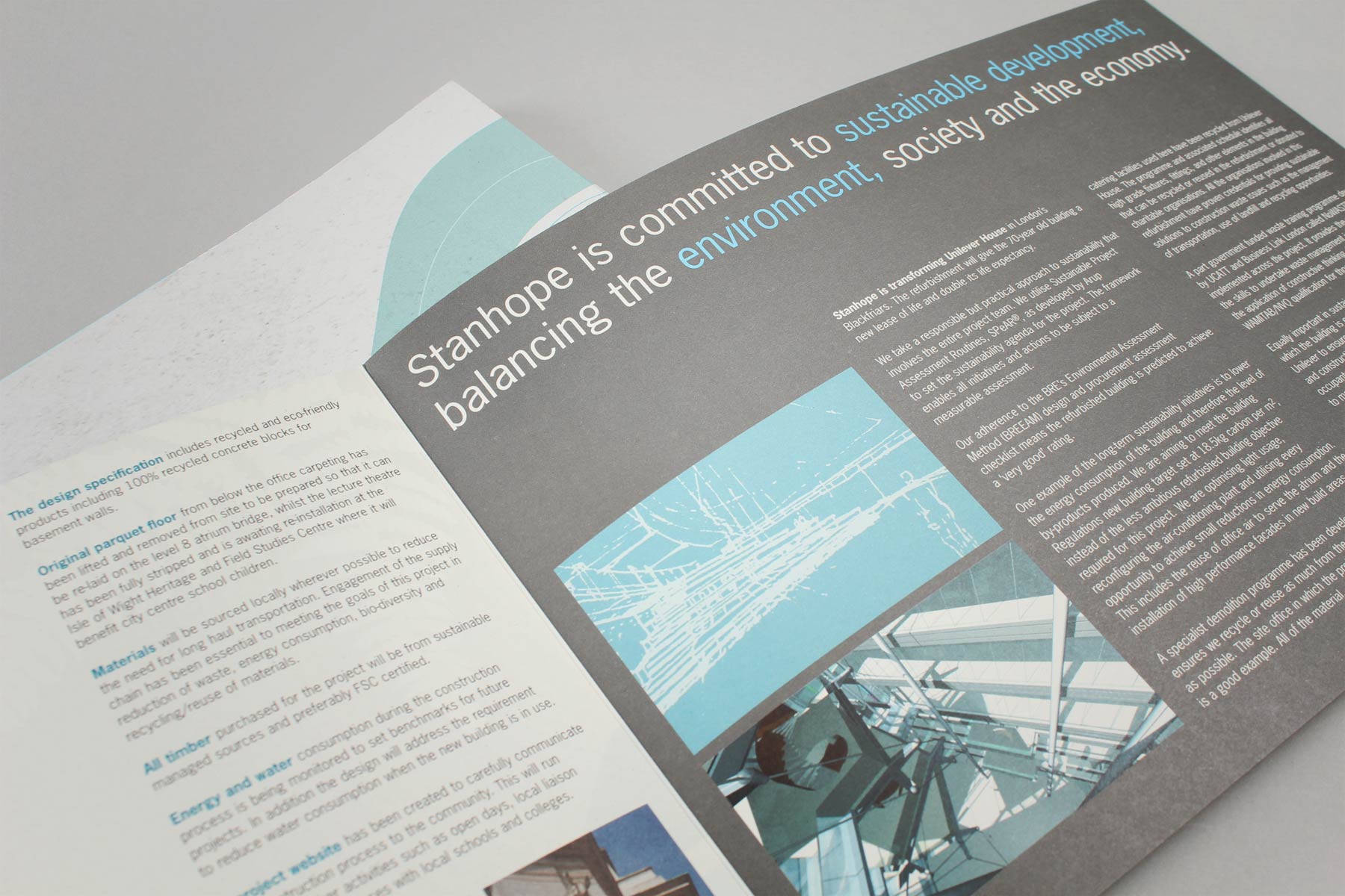
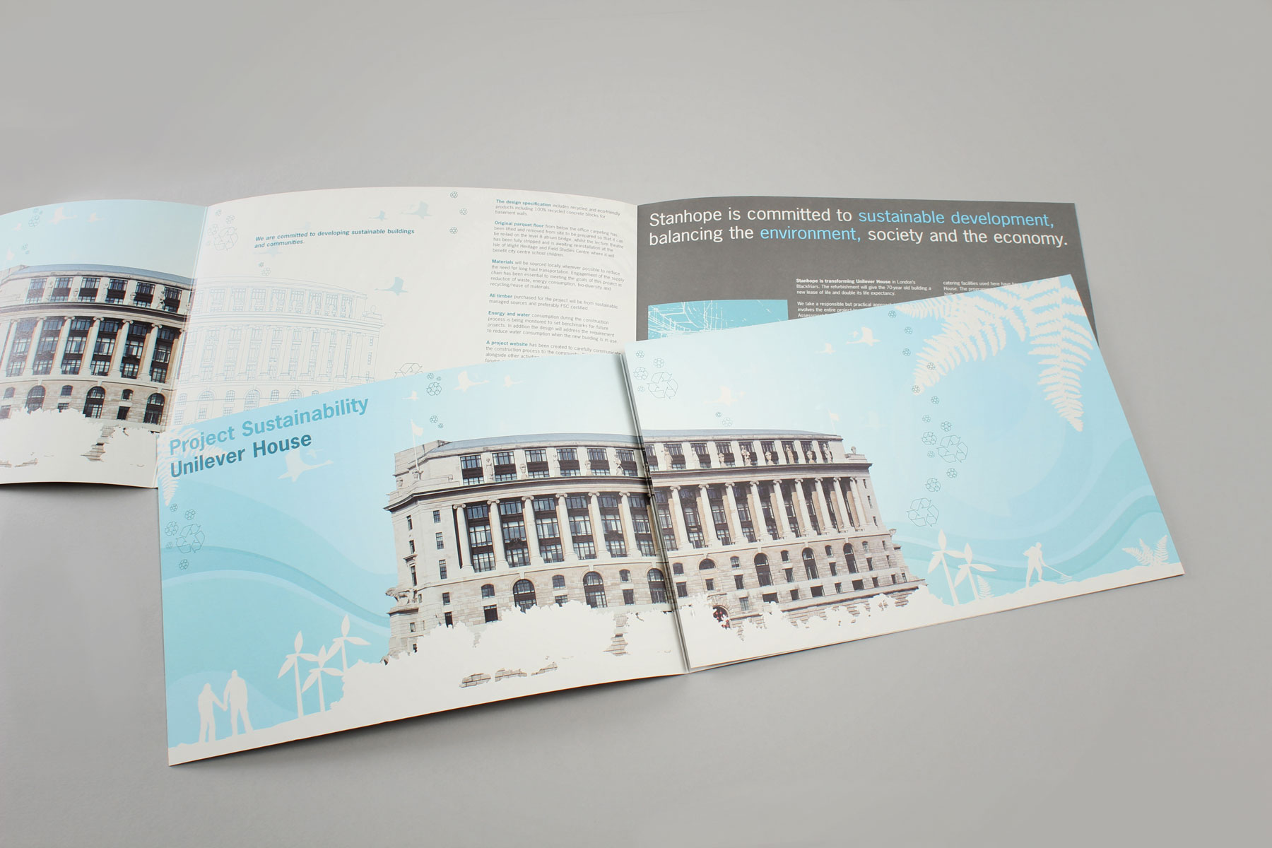
The communication featured information and diagrams conveying the Stanhope vision of building a future-fit, sustainable HQ for Unilever.
-

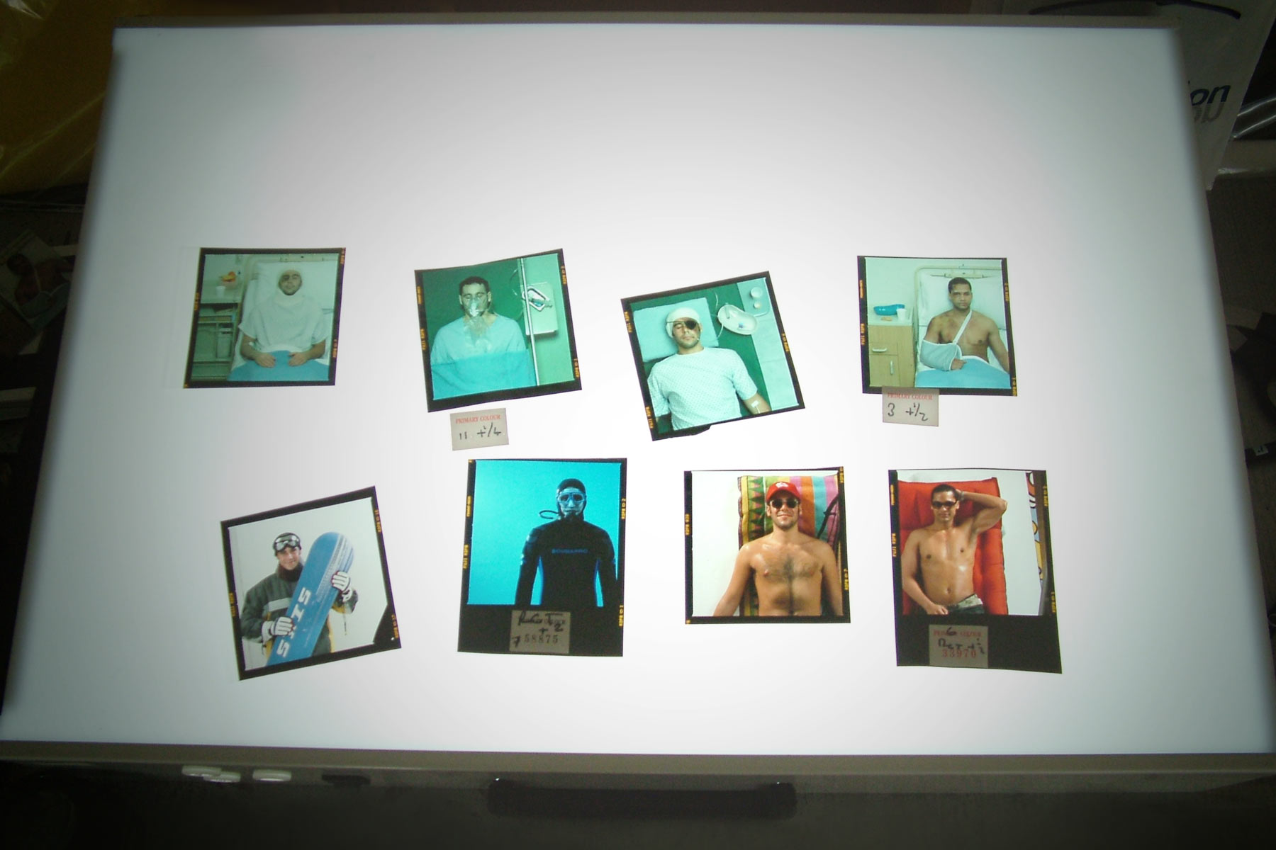
Although digital imagery was an option, we much preferred the warmth created through old fashioned transparency.
-

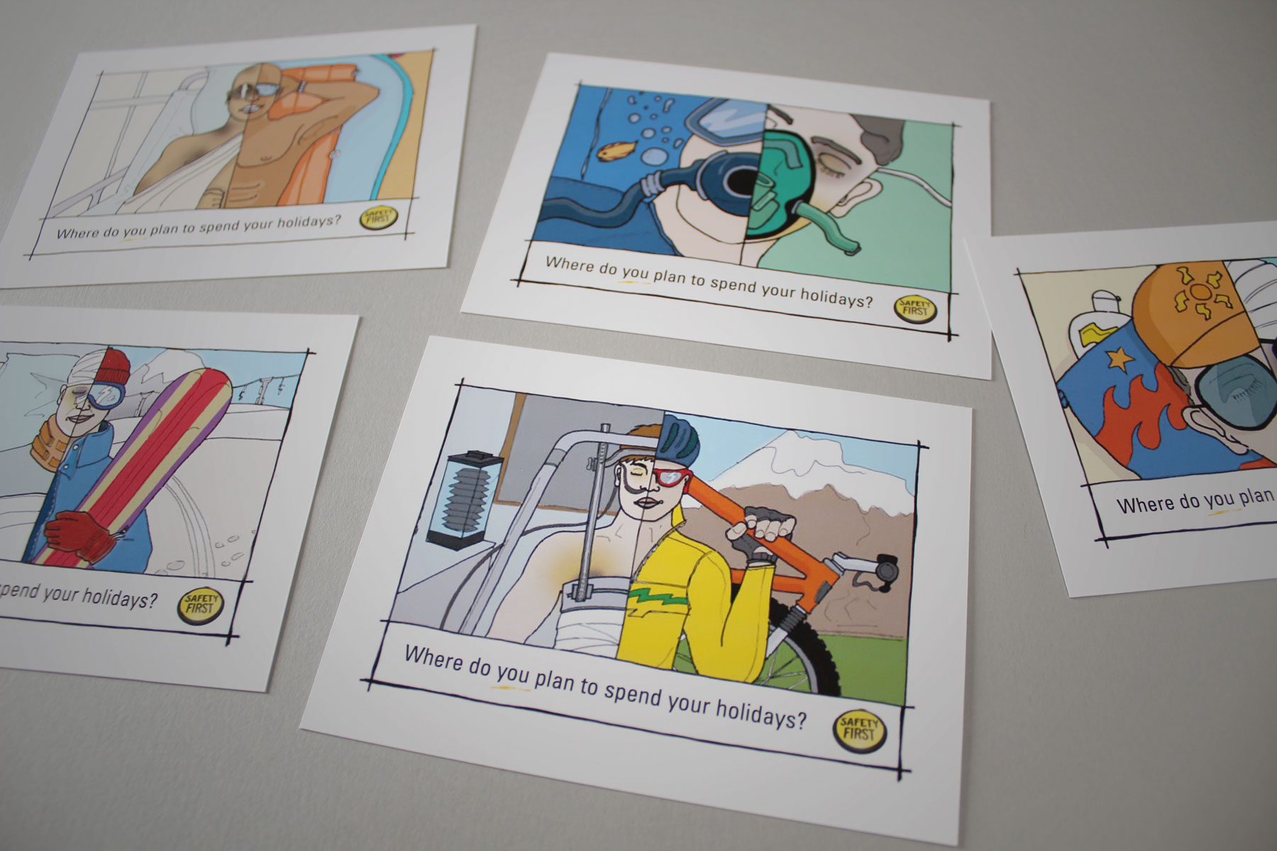
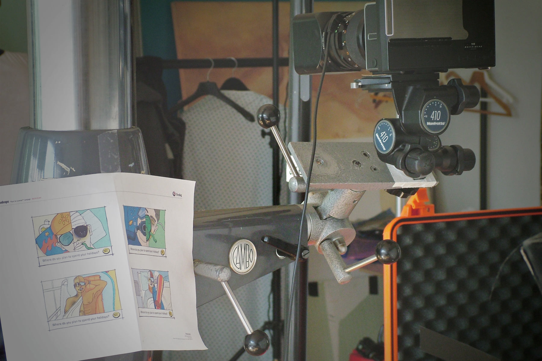
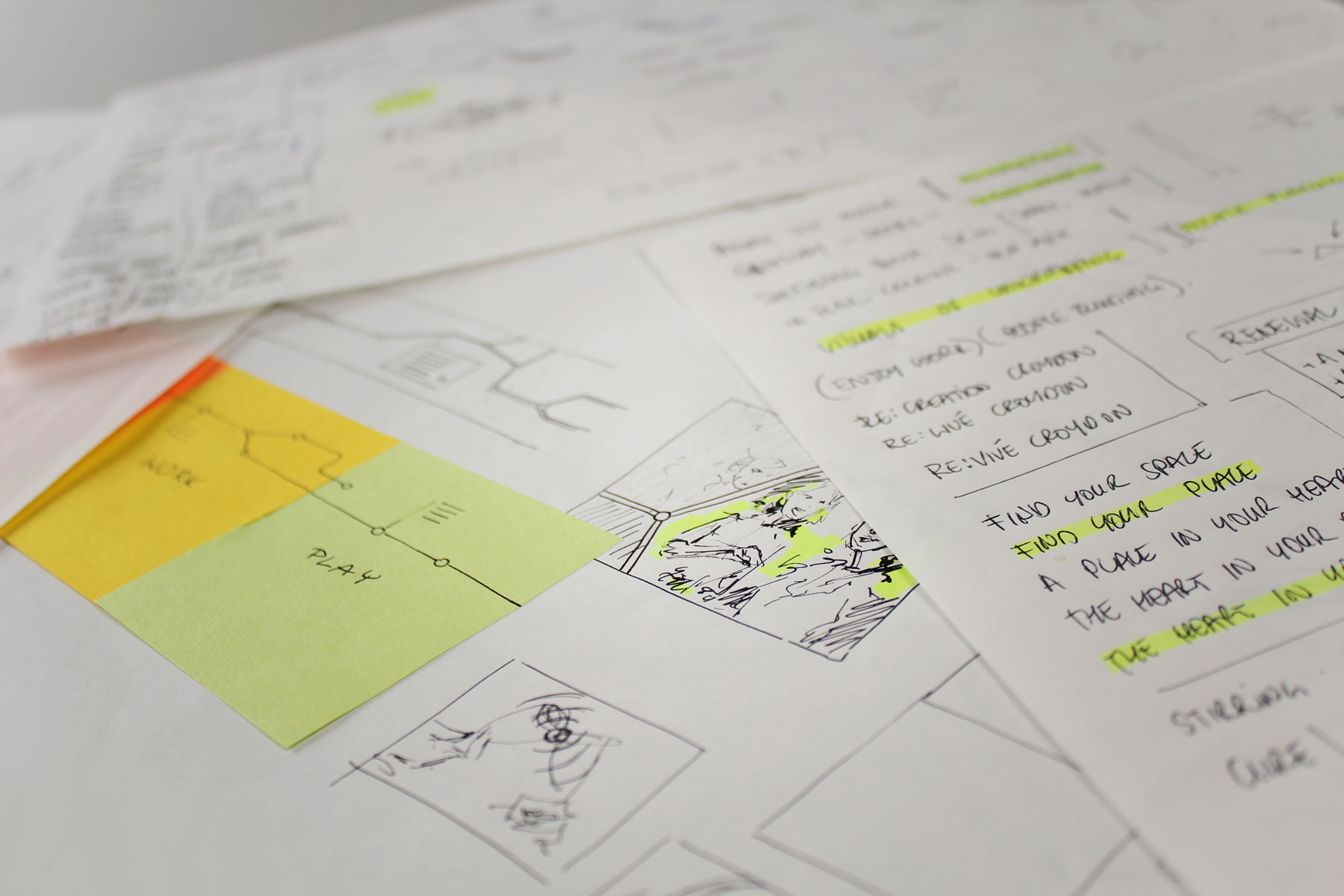
Following the research phase we created a number of concepts designed to grab attention. After a concept had been agreed, it we created shoot sketches so that we could plan the required photoshoots and post production.
-

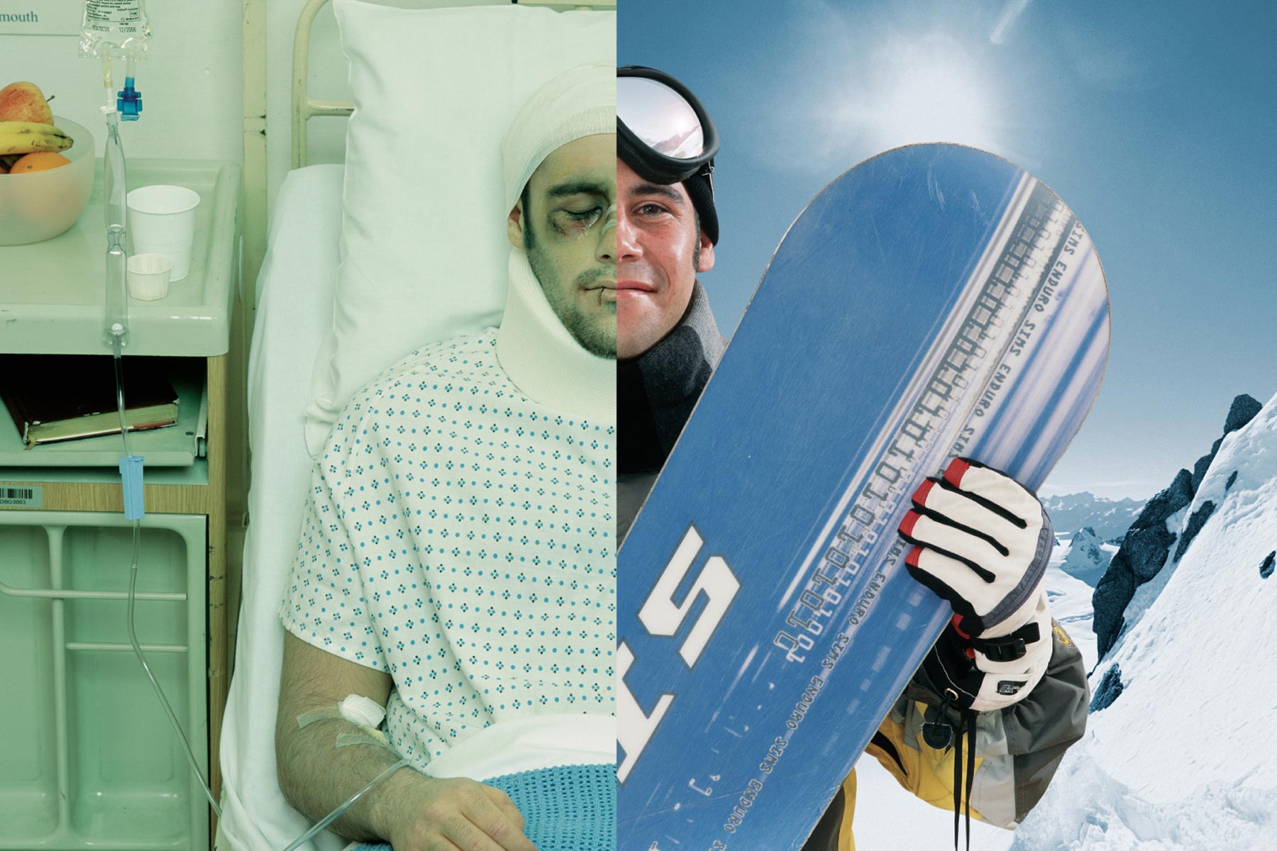
We wanted to control the vast majority of alignment in shot so post production was mostly around the area of colour grading and dropping in background media.
-

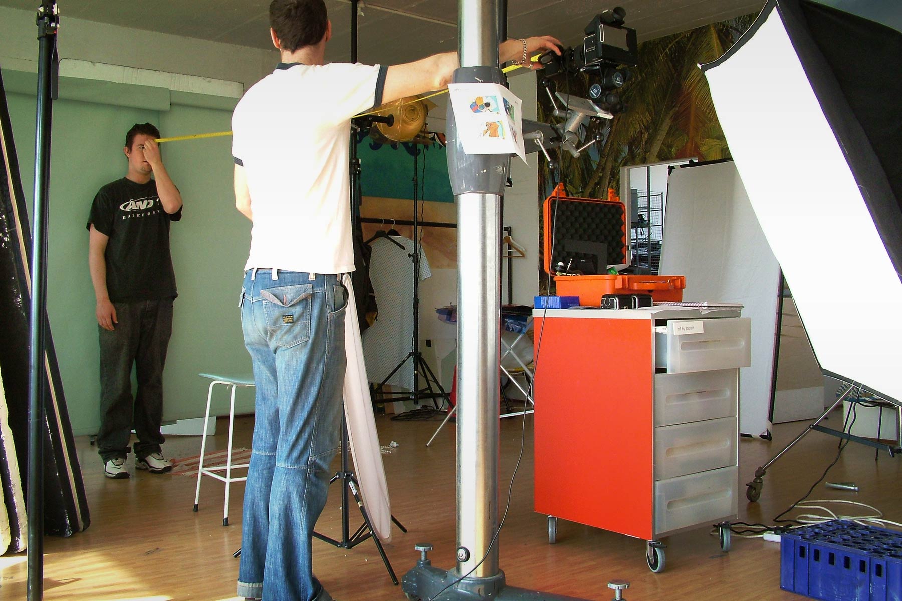
The shoot sketches sat with us on location, carefully governing the creative outcome.
-

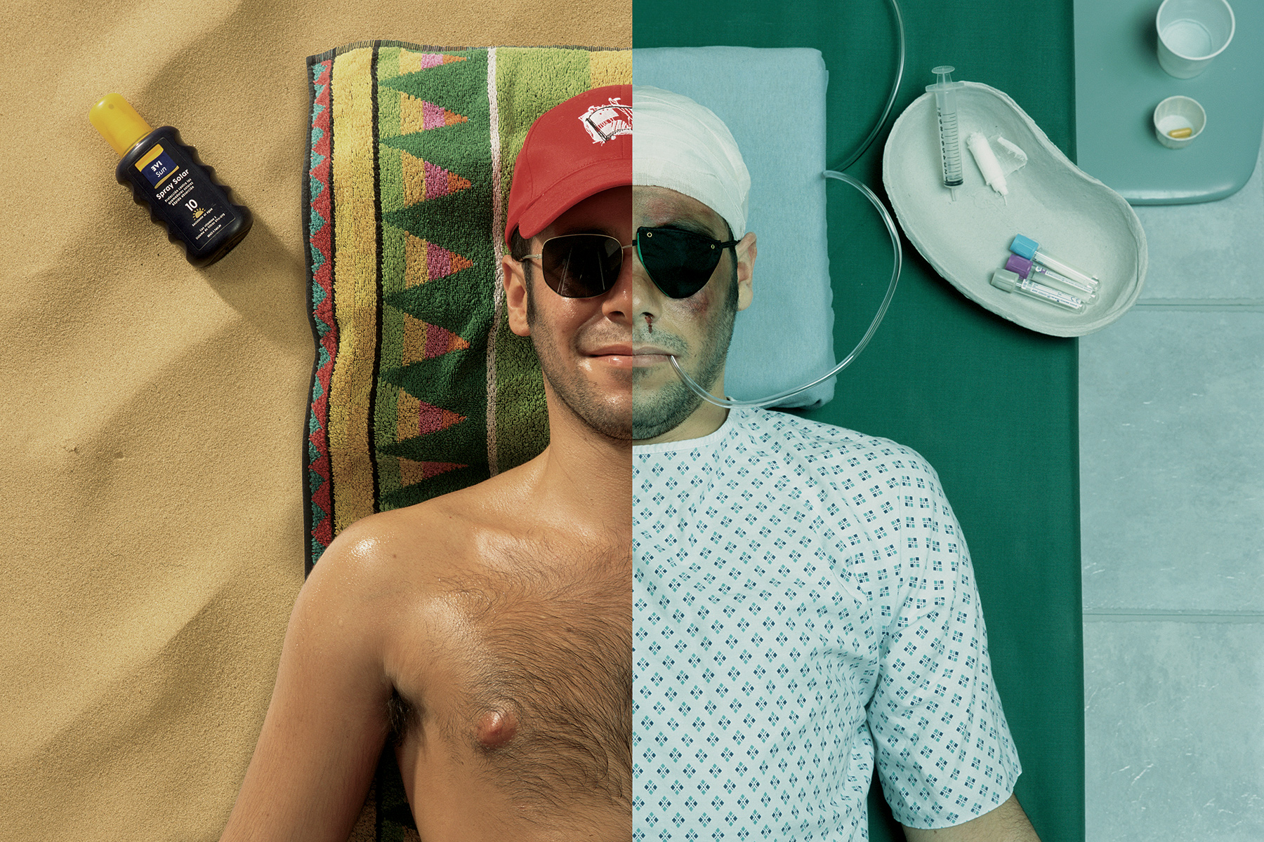
Due to the fact that we were creating composited imagery, we had to be fastidious about controlling the photographic process.
-

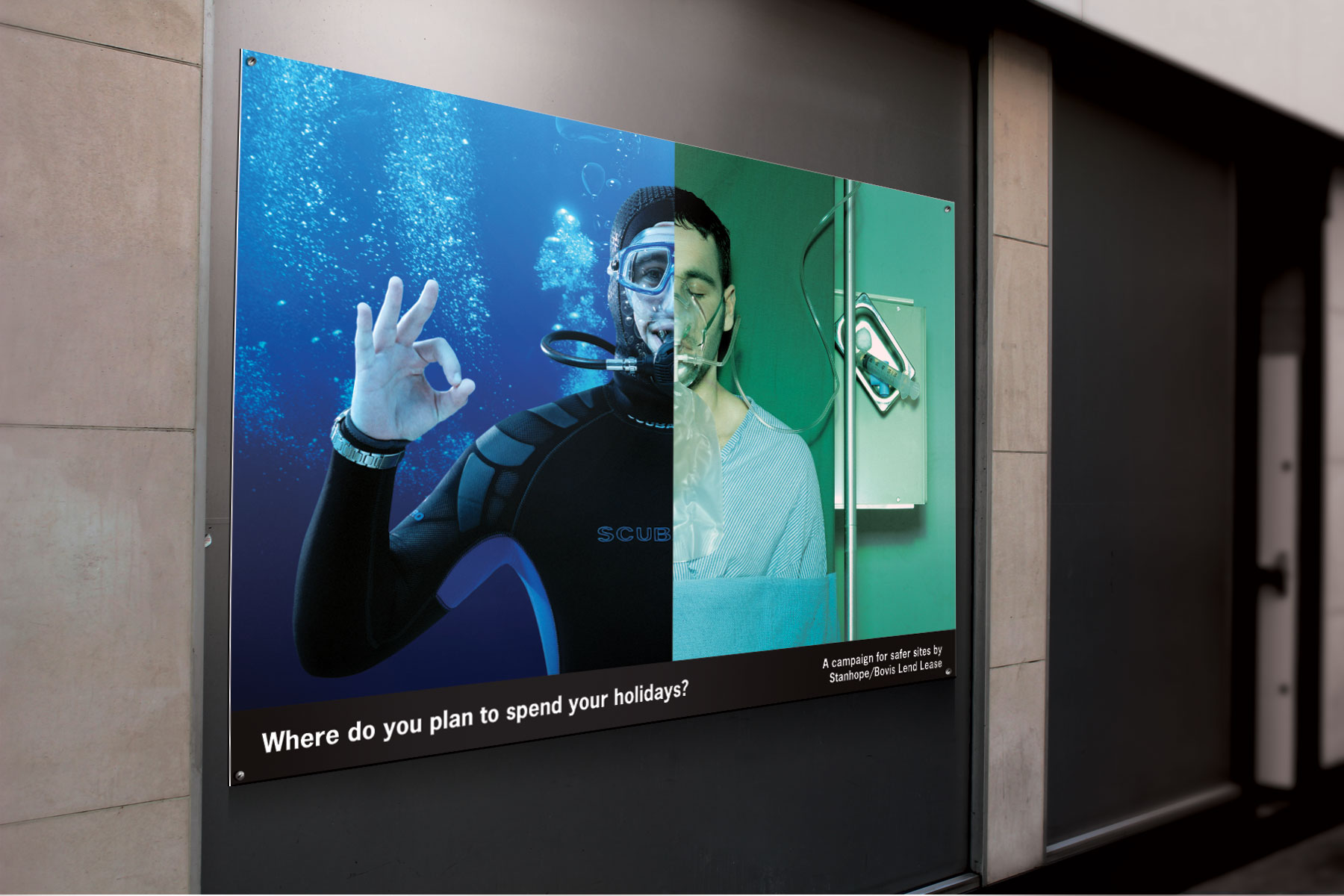
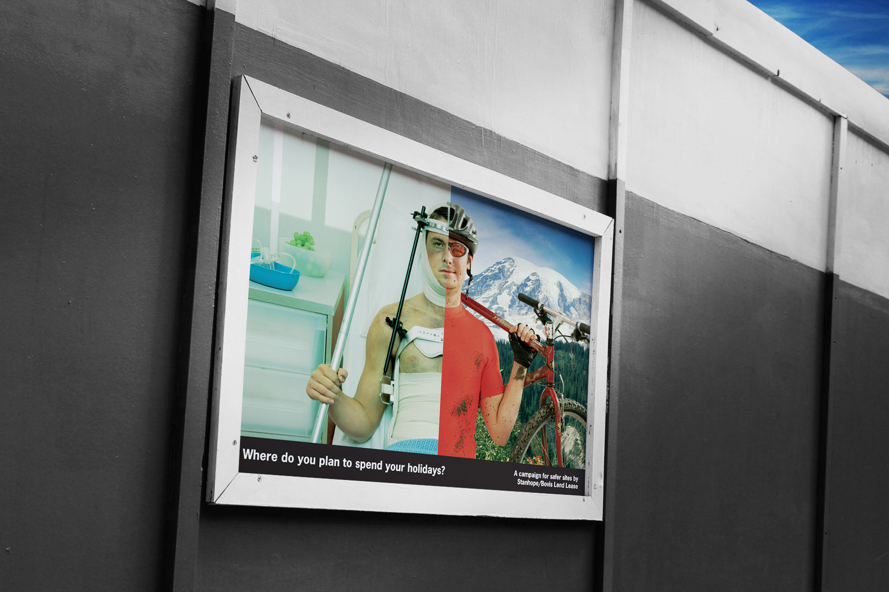
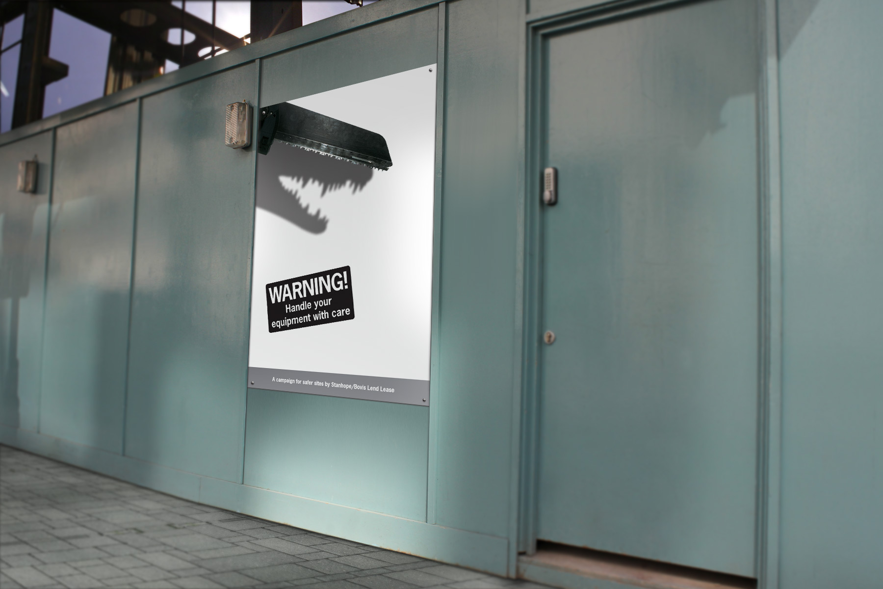
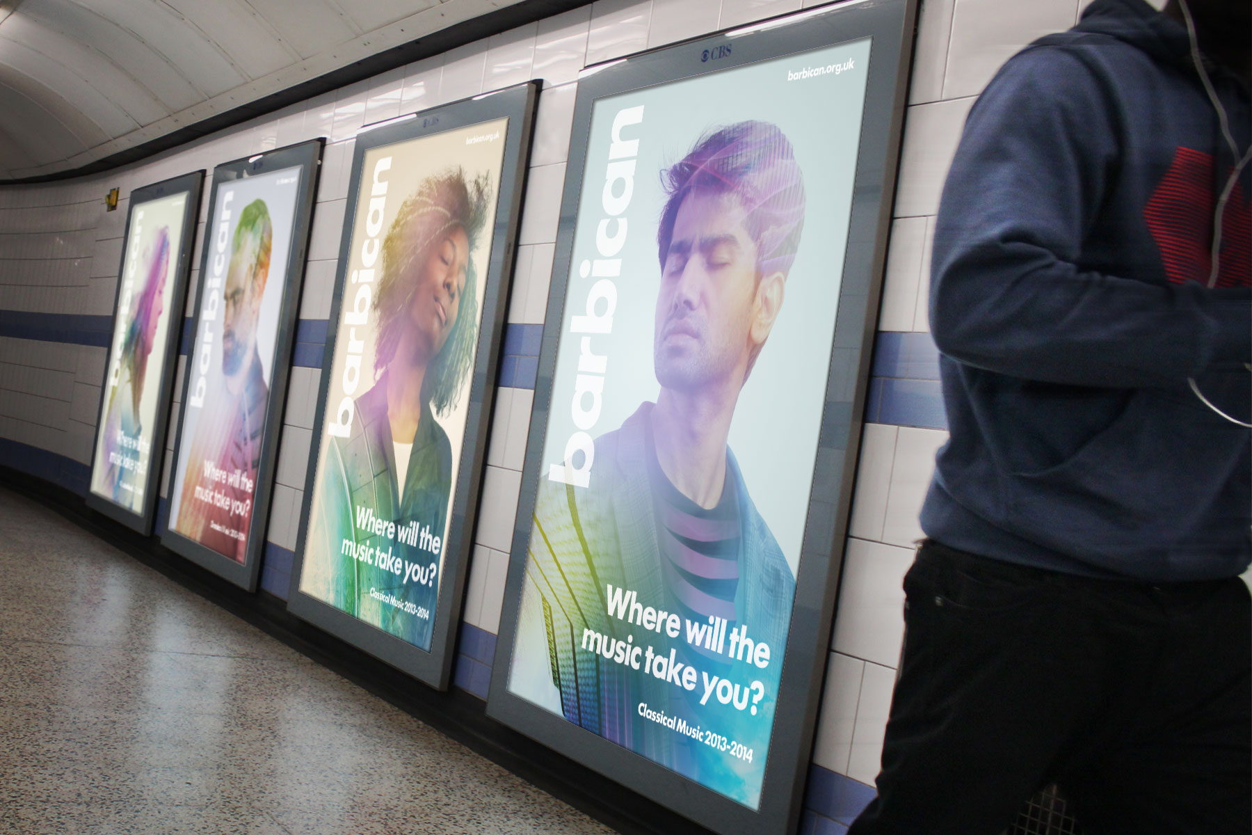
The advertising media was applied to a myriad of applications, from small A2 format block mounted posters in canteens to much larger billboard format.
-

The imagery is designed to be displeasing, exaggerating the colour hues so that the holidays are bright - And the medical imagery macabre.
-

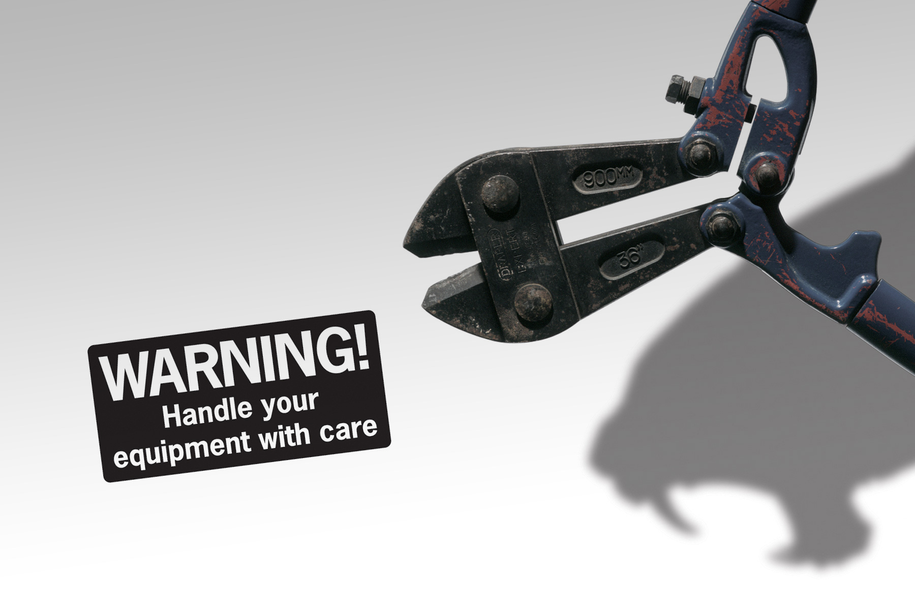
Research also informed us that regulatory text saturates the working environment. We therefore geared our campaigns to utilise the bare minimum of strong image and direct message.
-

Our second concept focussed on getting the site workers to view their tools as hazardous when not respected. Researched showed that the vast majority of incidents involved tools rather than falls.
-

The campaigns, which had on average five executions of each, were rotated around the sites at a weekly interval.
-

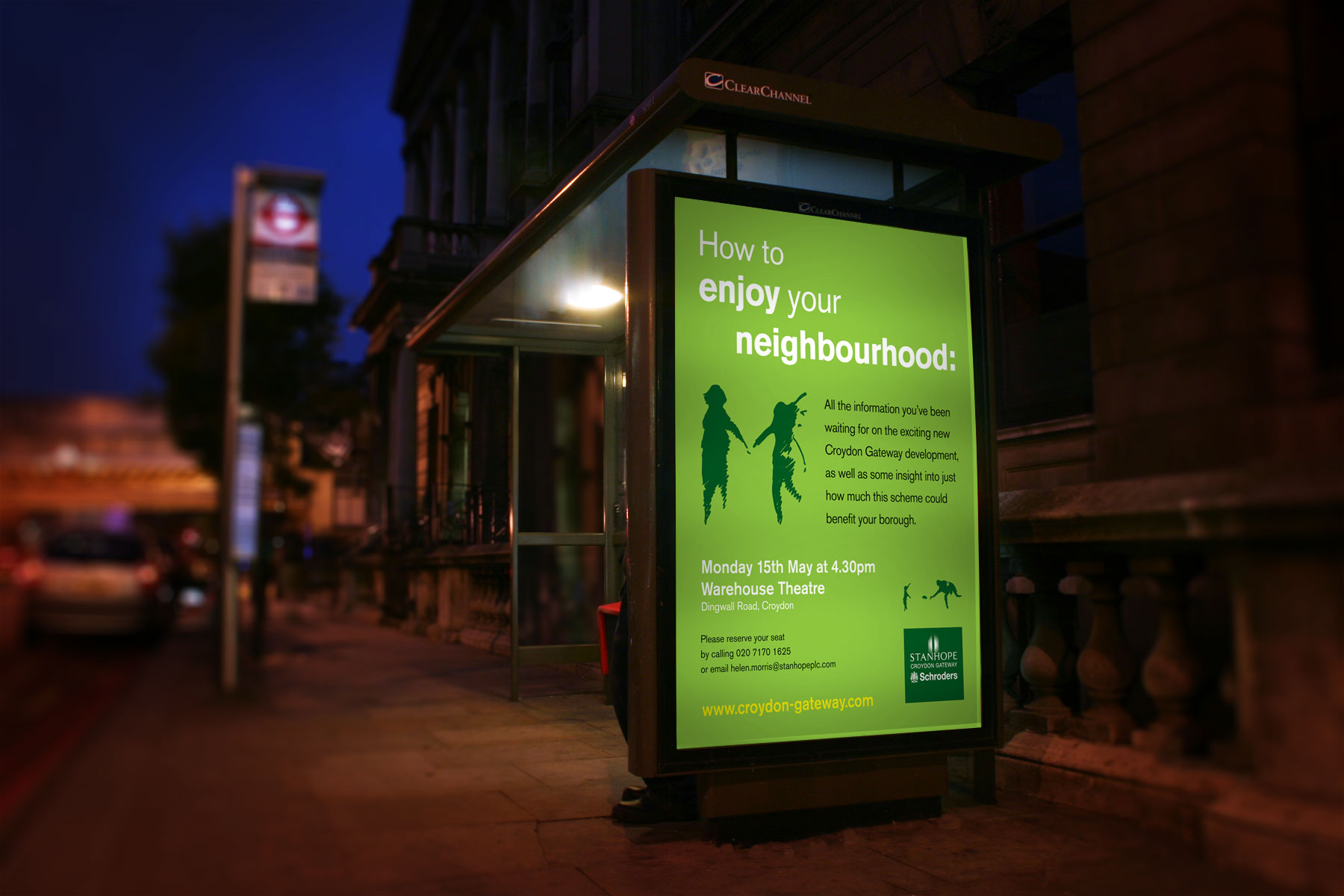
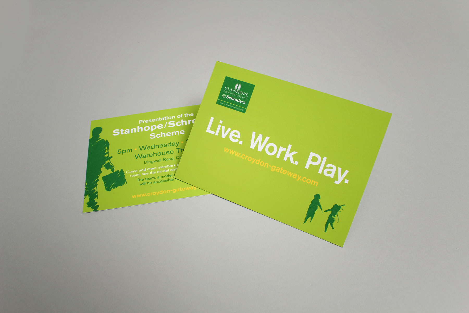
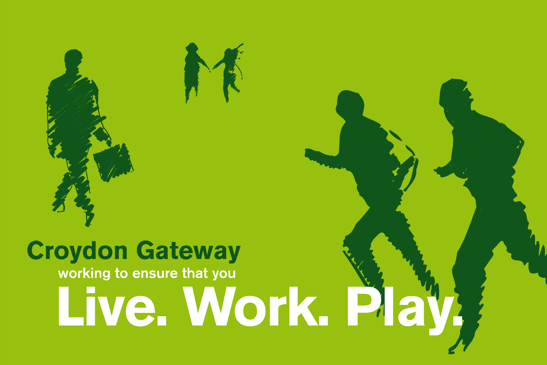
The project was all themed around creating an oasis in the heart of Croydon. We drew up conceptual avenues geared to deliver this message to the community.
-

The appeal of the bright and fresh identity was felt within the community almost immediately.
-

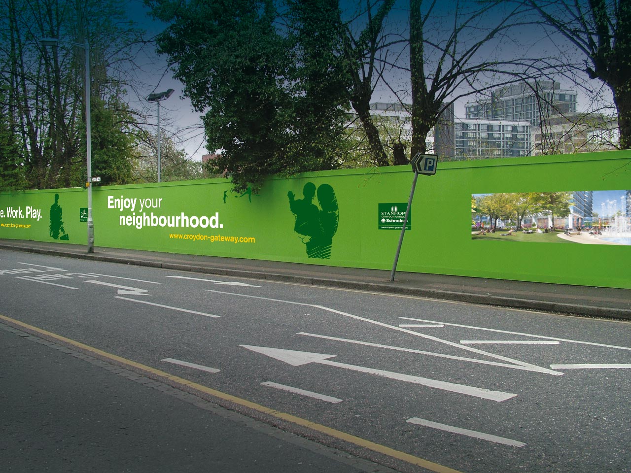
A key deliverable in the project was around the active communication of the development progress to the local community.
-

The campaign identity revolved around the Live - Work - Play proposition, inspired by the mixed use strategy of the development masterplan.
-

We utilised the vast perimeter of the site as a platform for messaging, visual identity and recent topical news about the development.
-

The use of organic and flowing illustrated assets around the imagery creates a positive and uplifting publication.
-

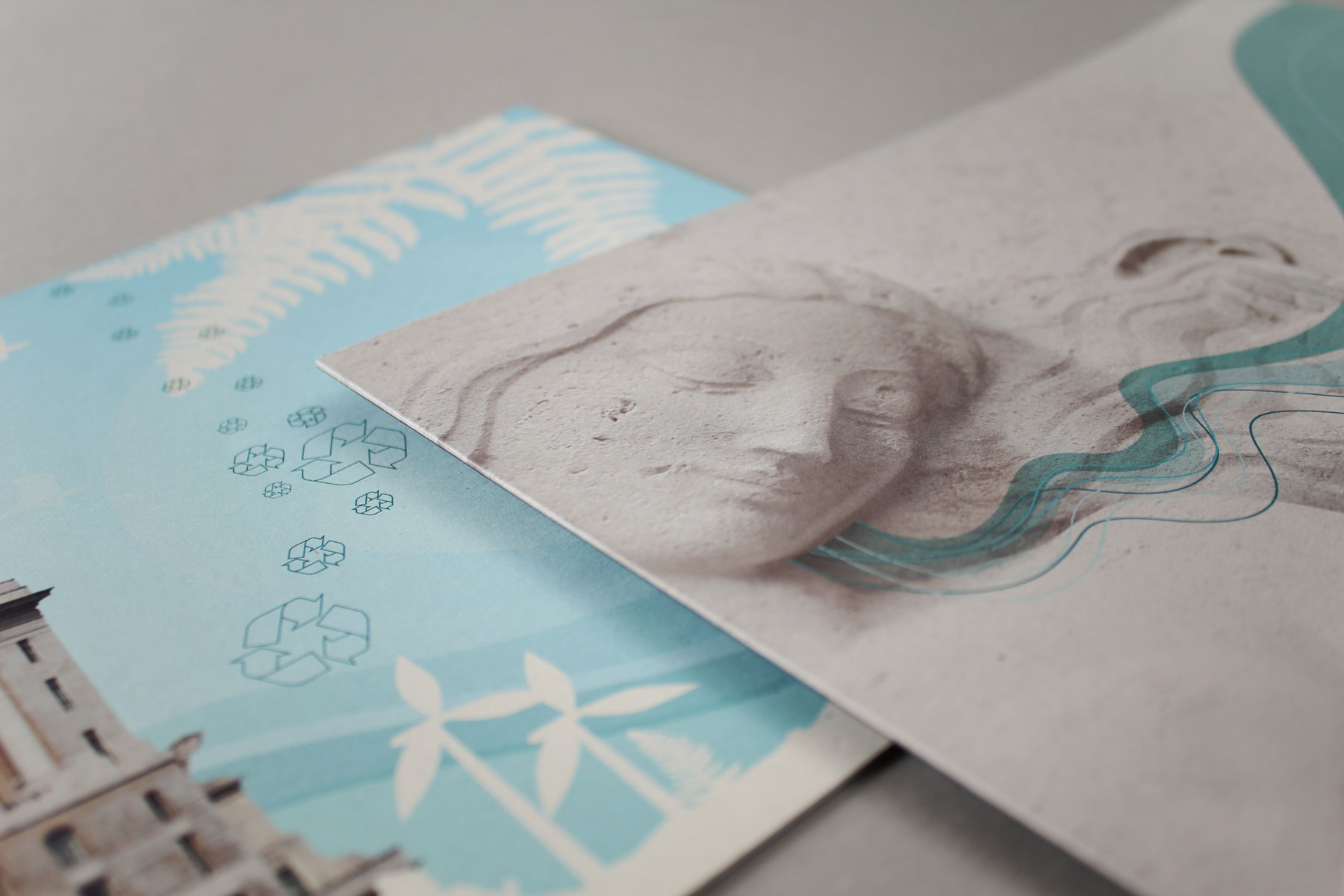
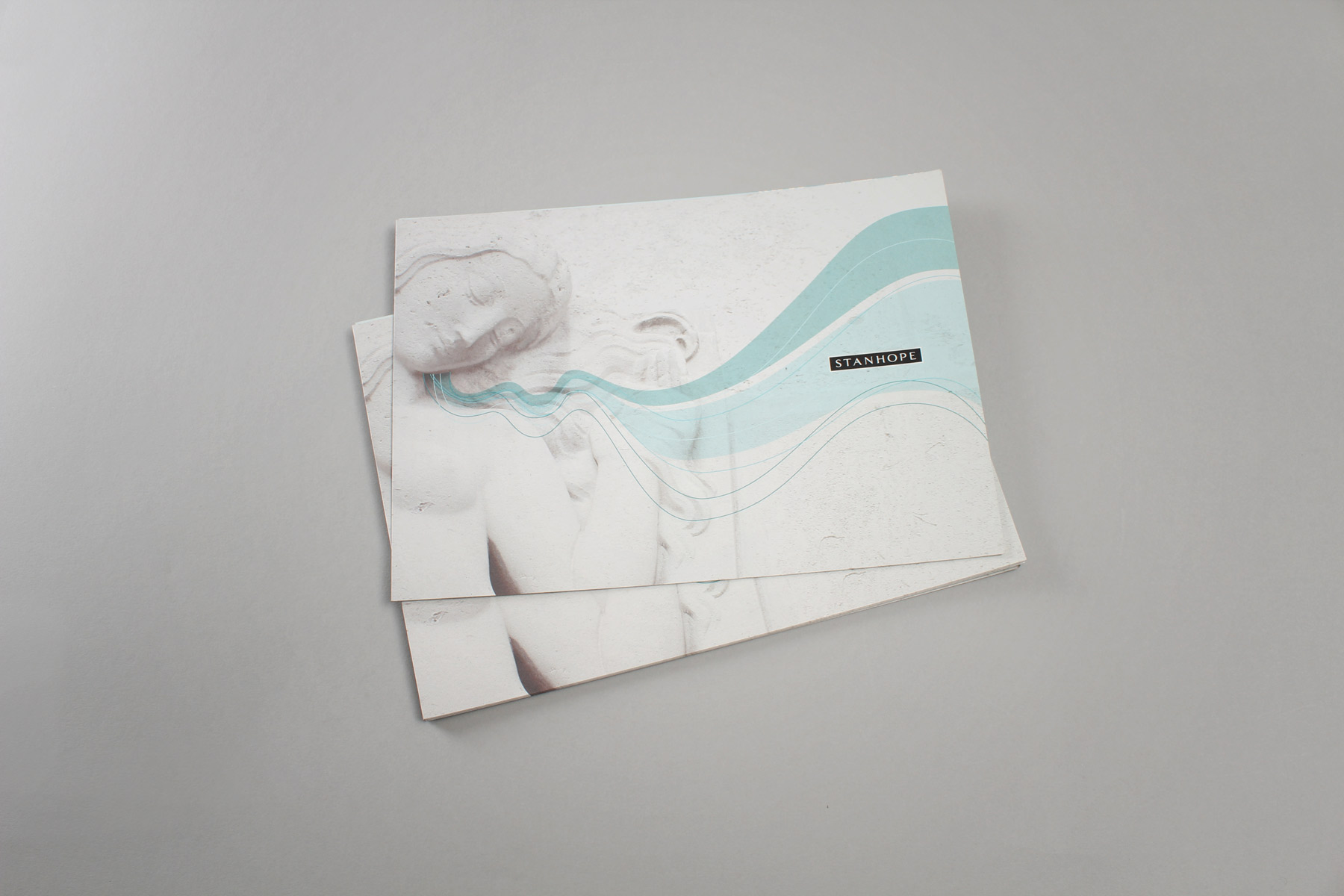
The print utilised more expensive yet recycled uncoated stock which suited the textures within the photography.
-

The design behind the brochure combined real architecture features taken from the development, combined with illustrated assets.
