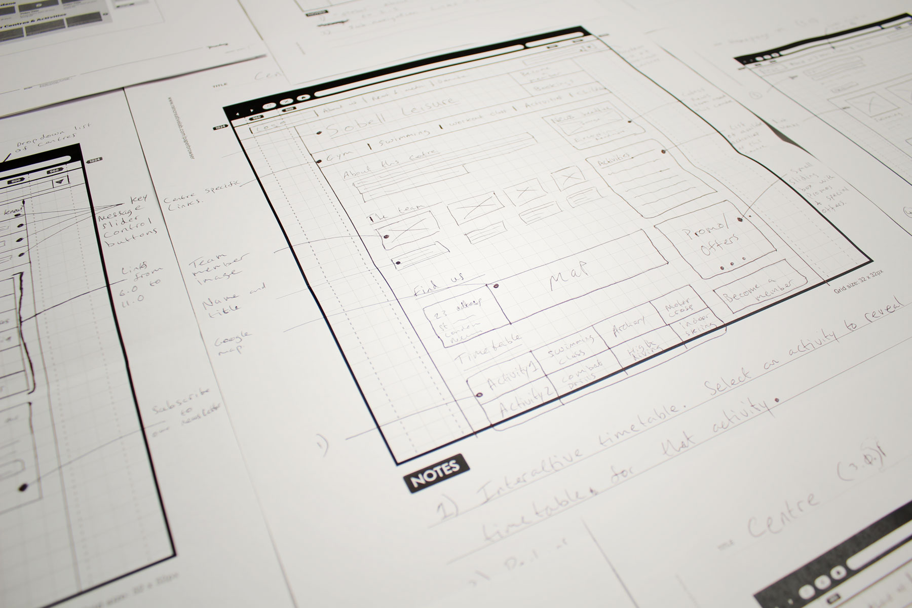
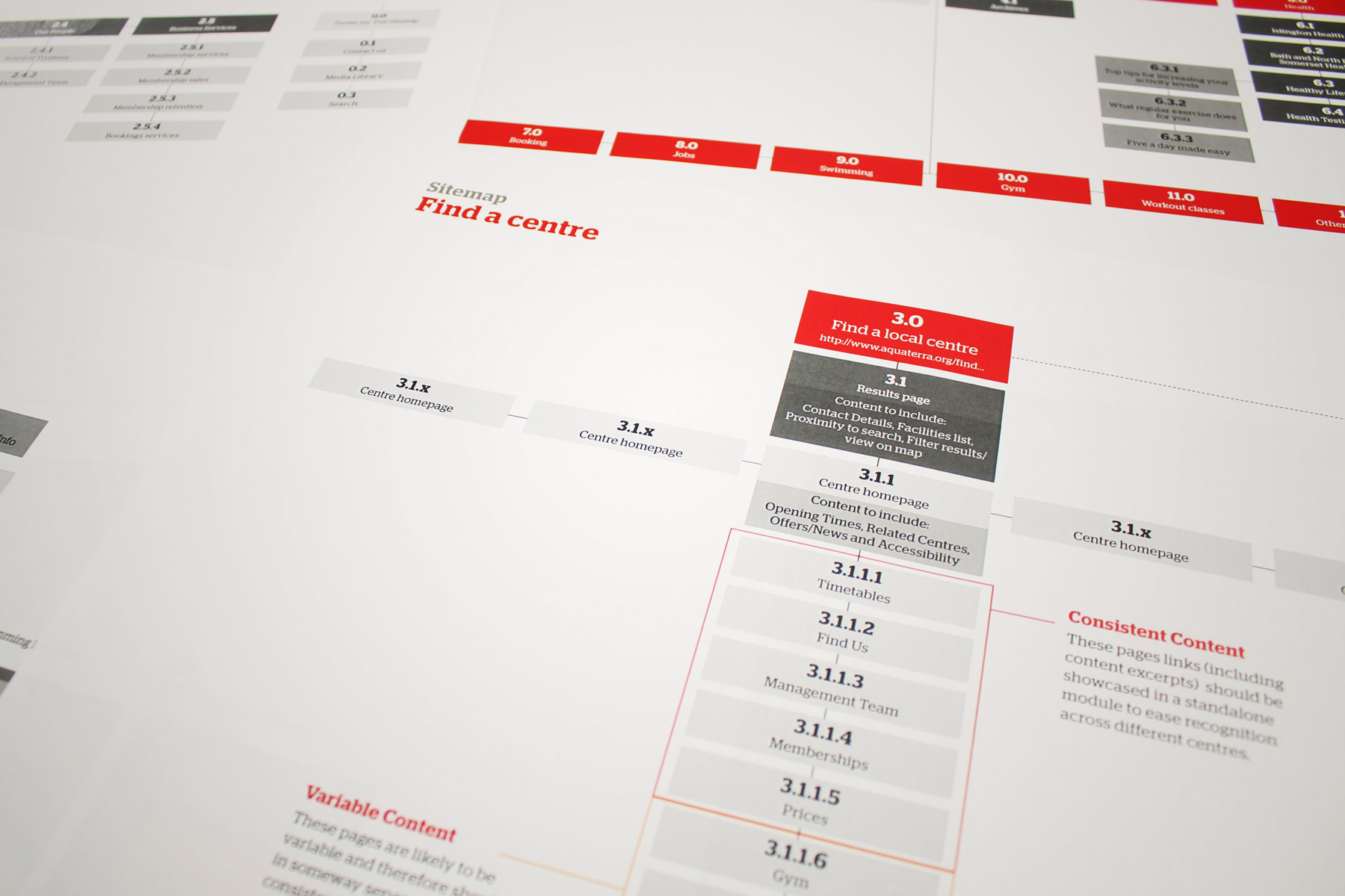
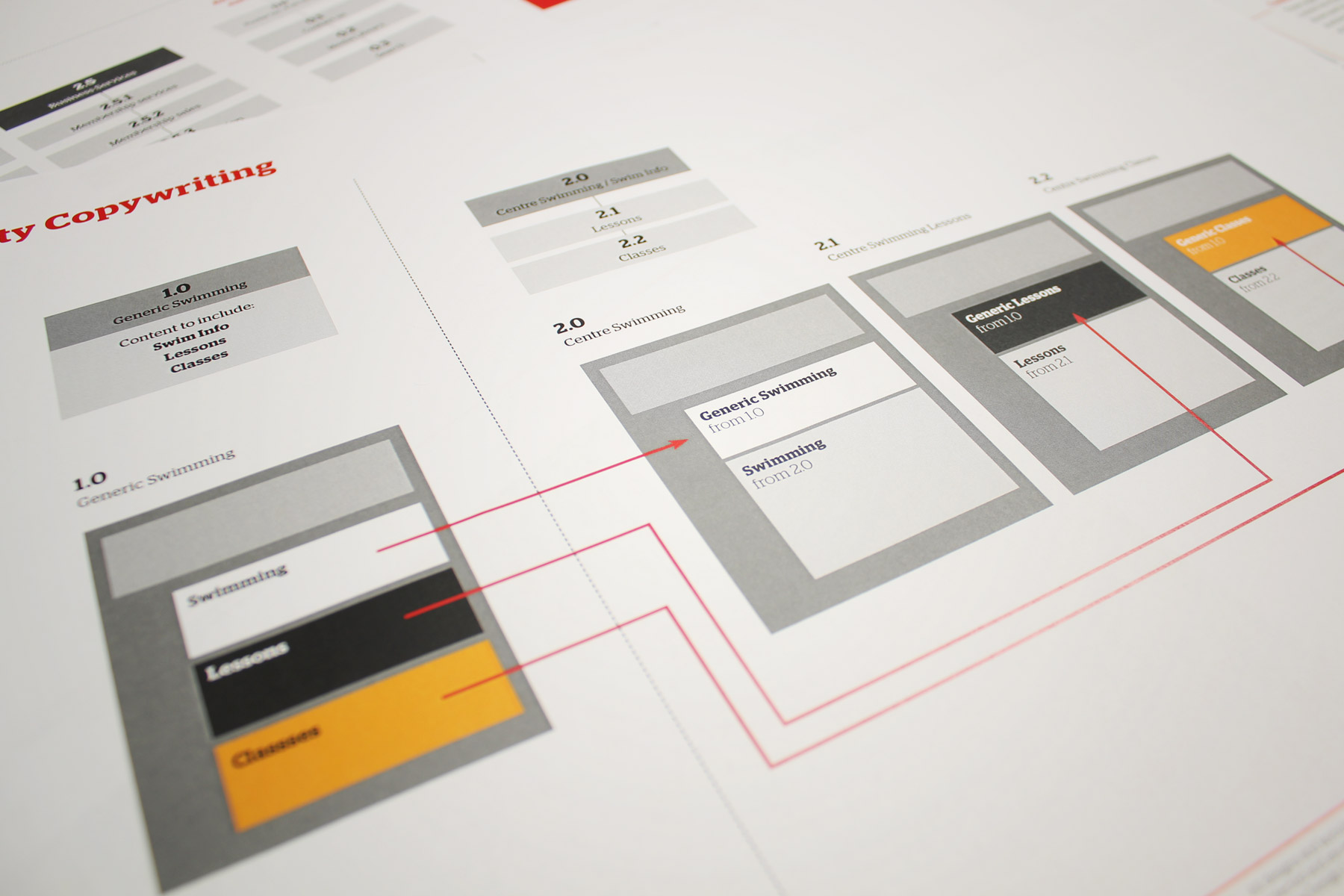
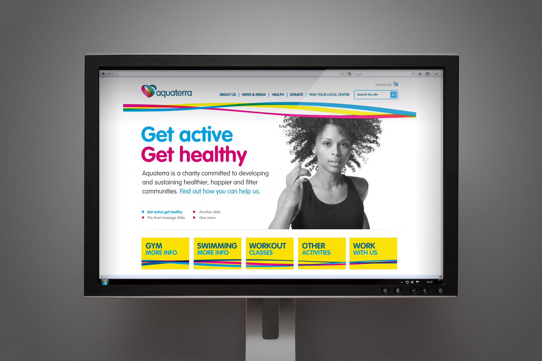
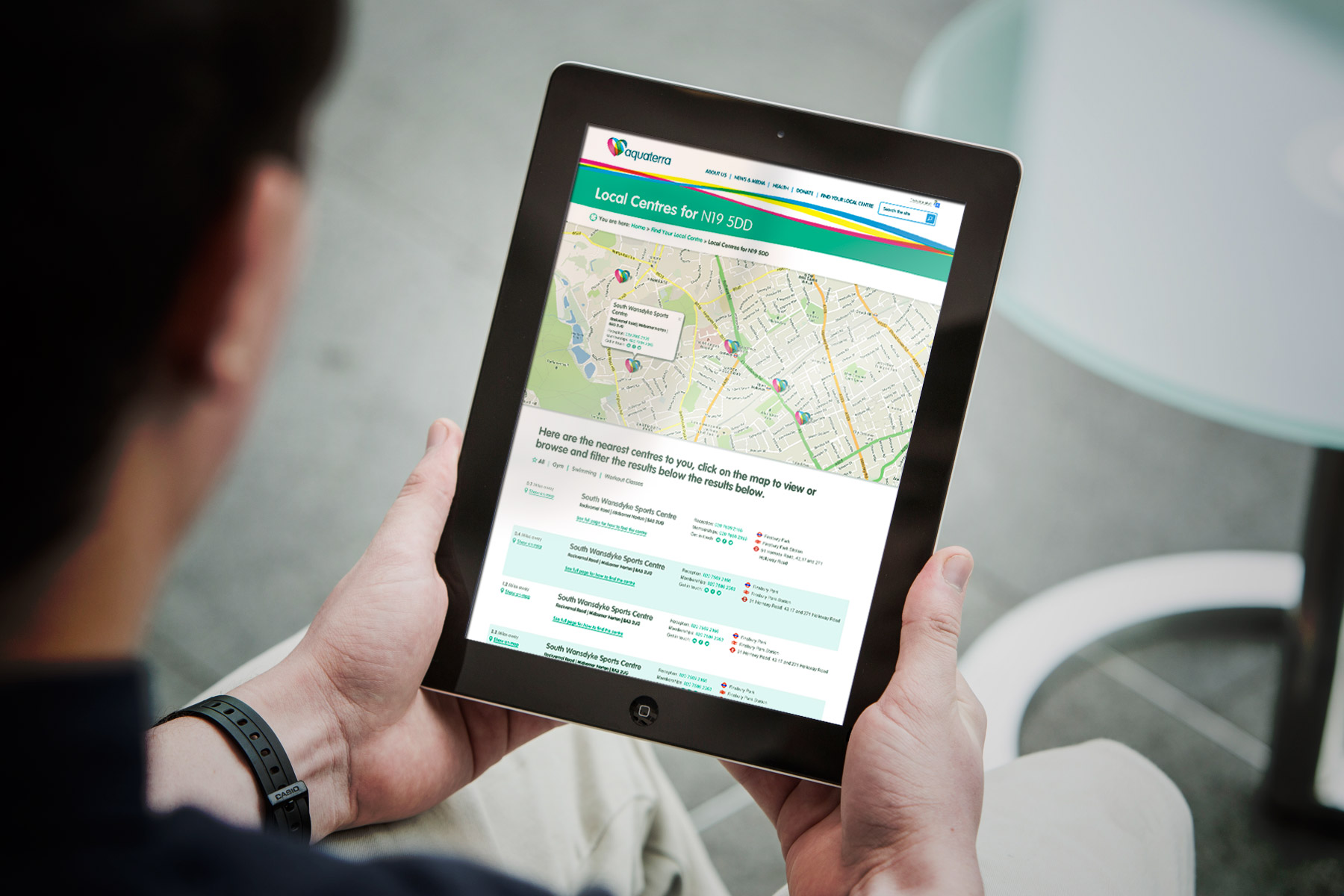
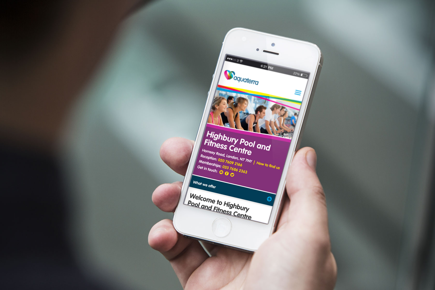
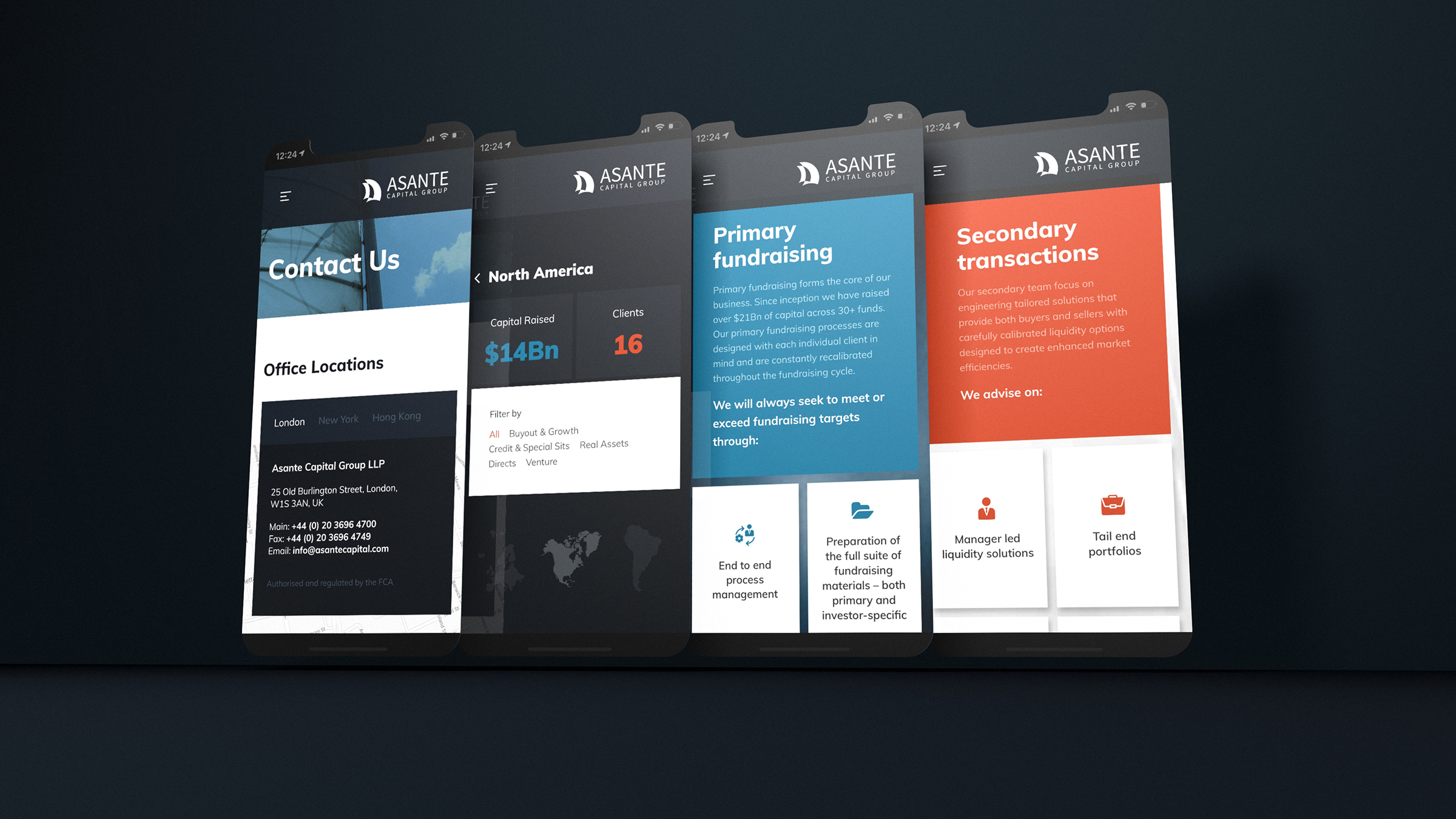
Our task was to increase site functionality by presenting it in a user-friendly way, making Aquaterra accessible for all.
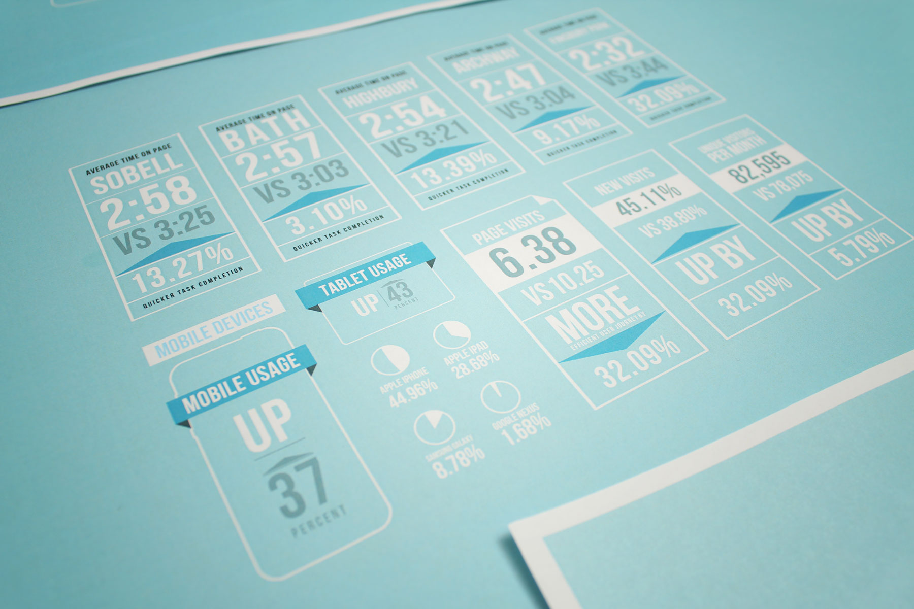
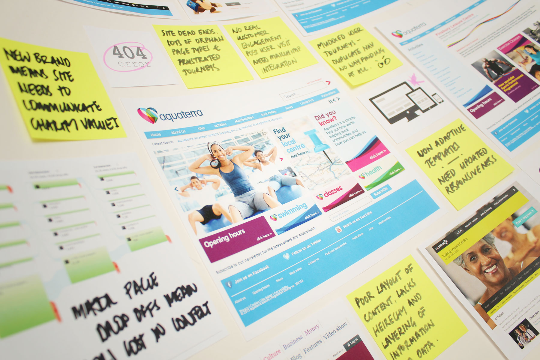
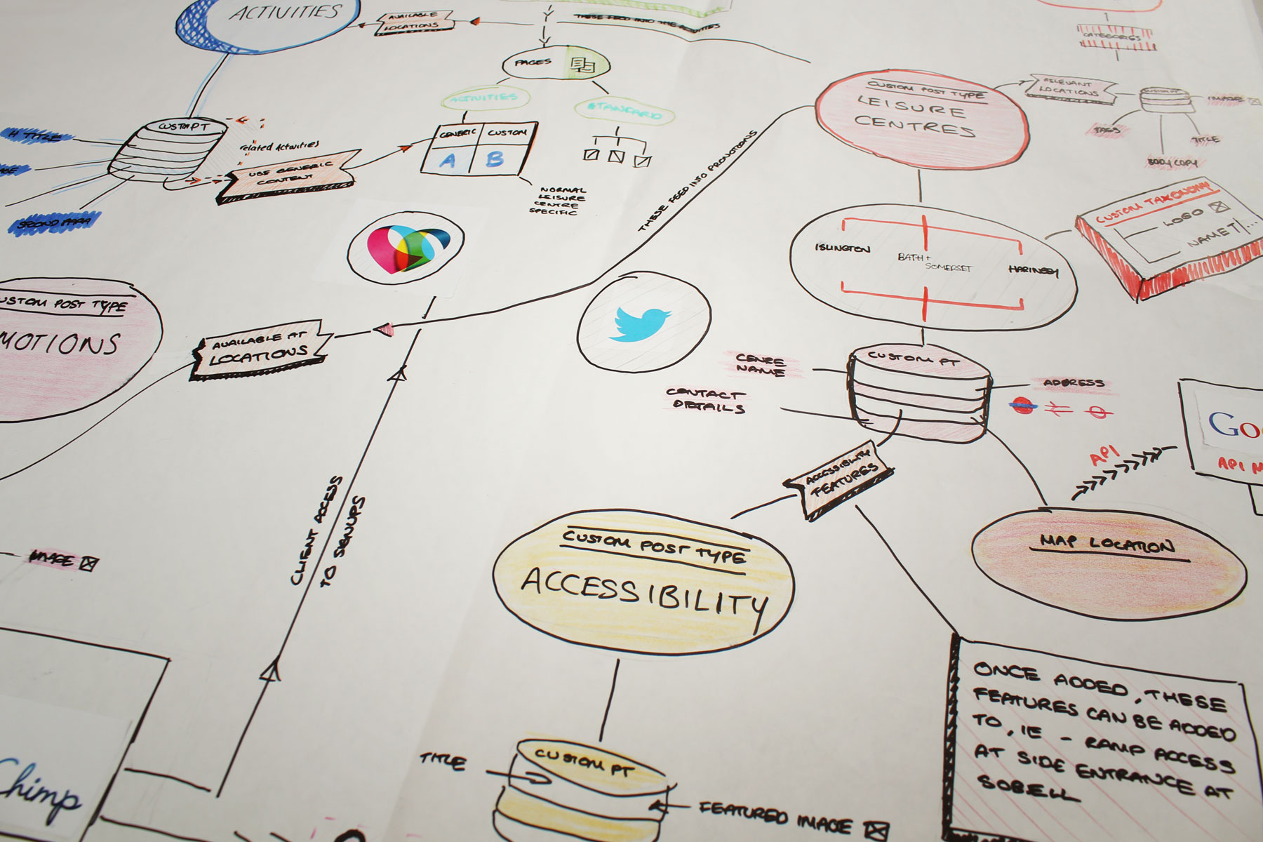
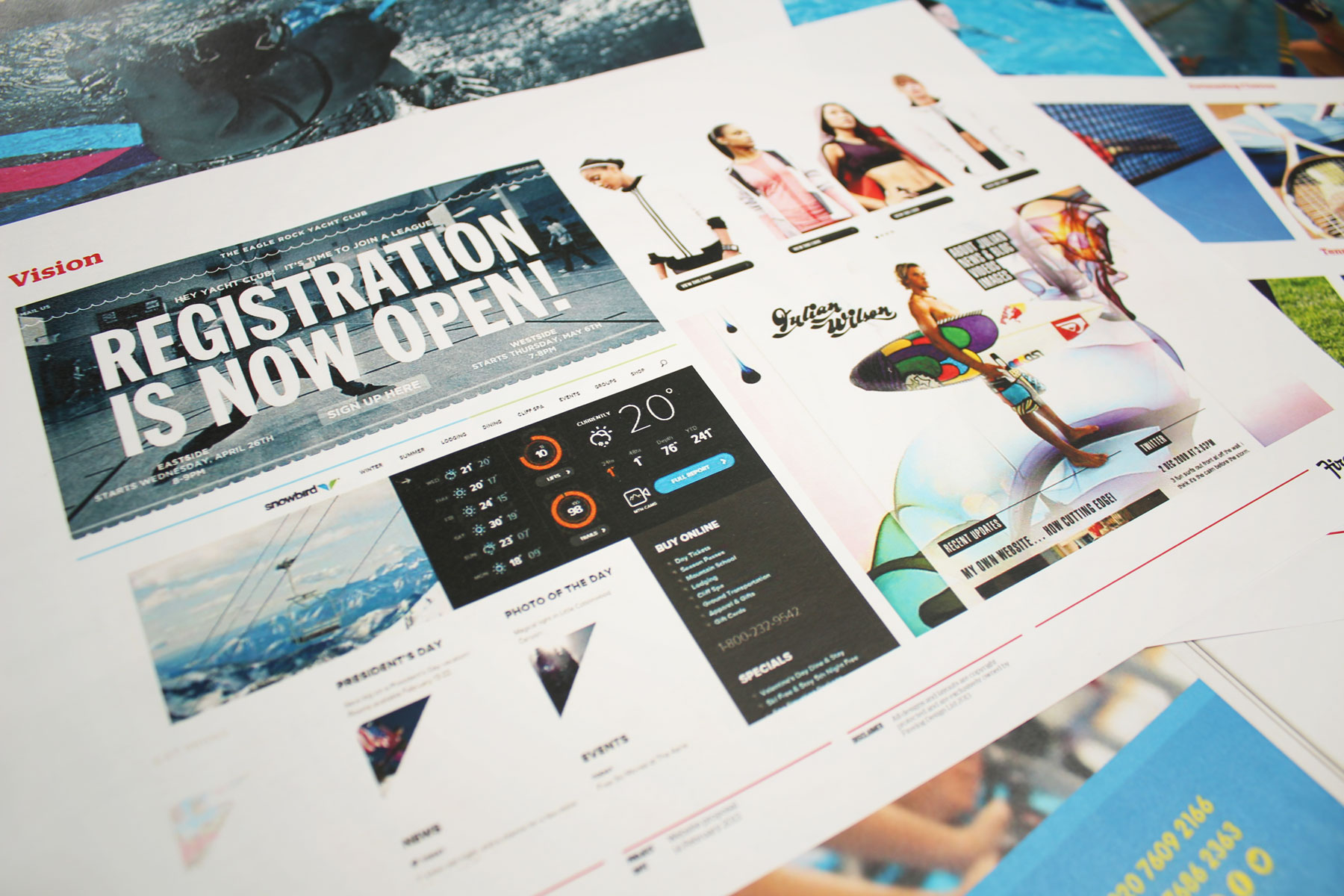
Aquaterra’s existing website was extremely hard to navigate, with duplicate pages and redundant data. Our task was to increase site functionality by presenting it in a user-friendly way, making Aquaterra accessible for all. We were tasked in the creation of a mobile first community HTML 5 website. Content was curated depending on user’s location and interests for an audience ranging from young children to senior citizens. A diverse audience uses Aquaterra’s site: it was therefore paramount that the UX was very strong for all users. We primarily achieved this through simplifying the entire look and feel of the site, employing large typography and outlining key information to increase task completion.


