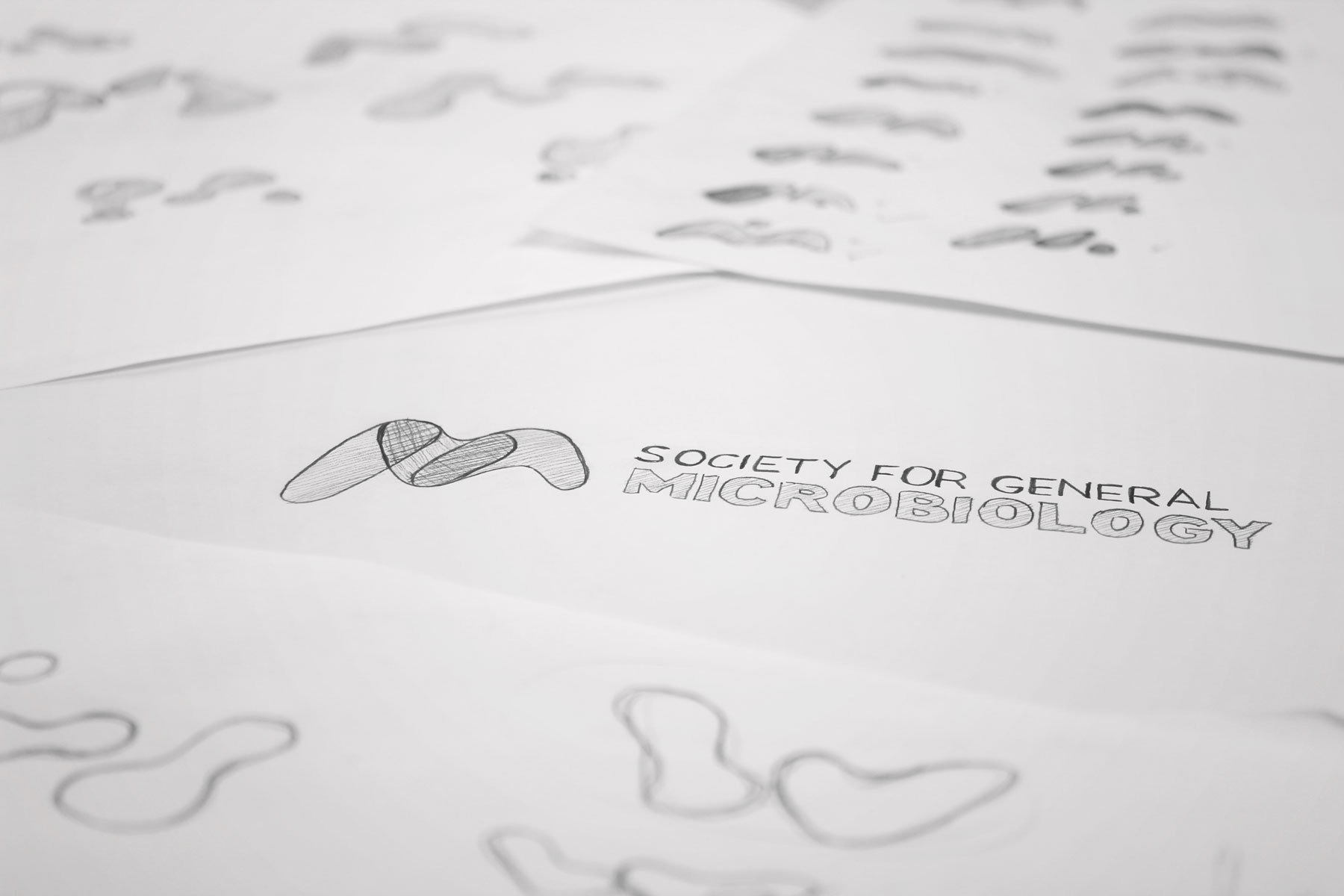
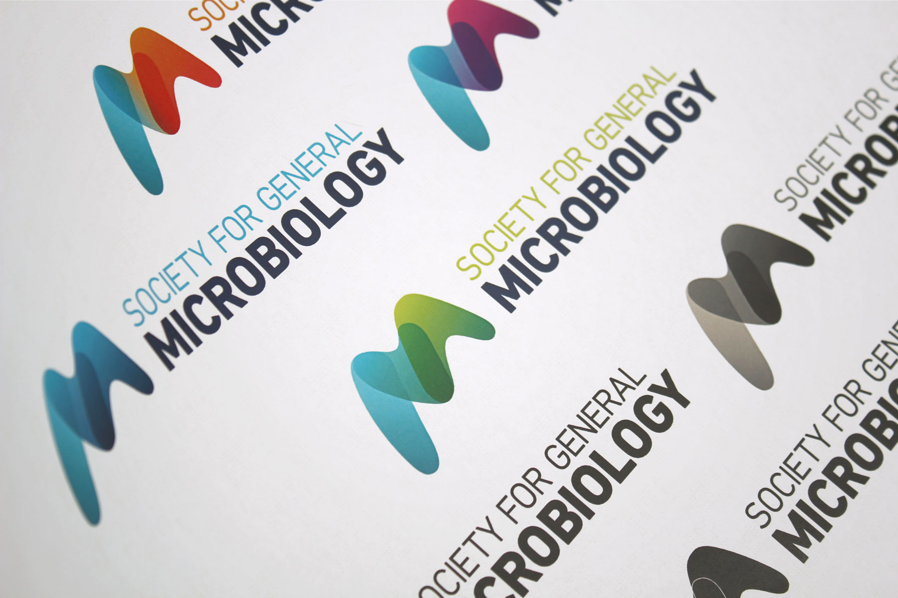
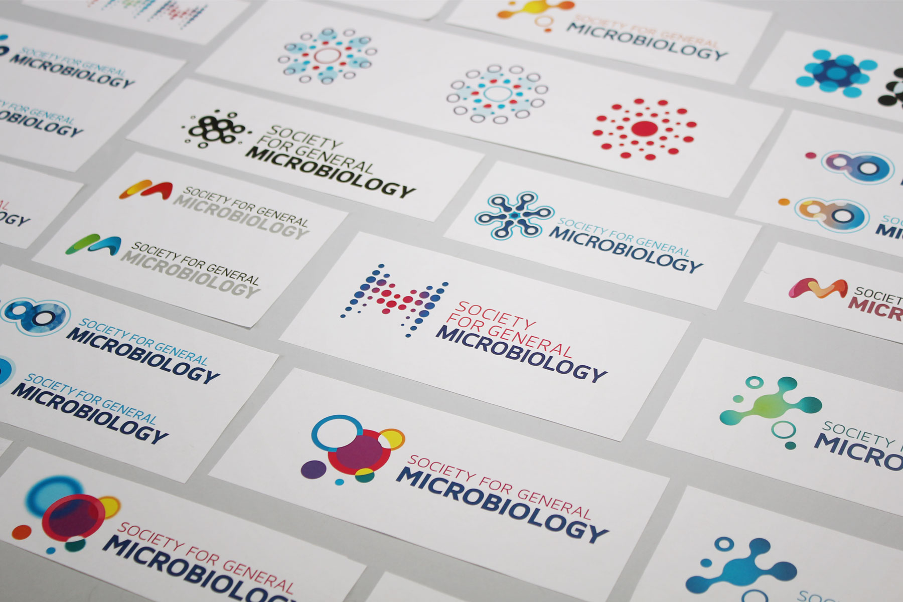
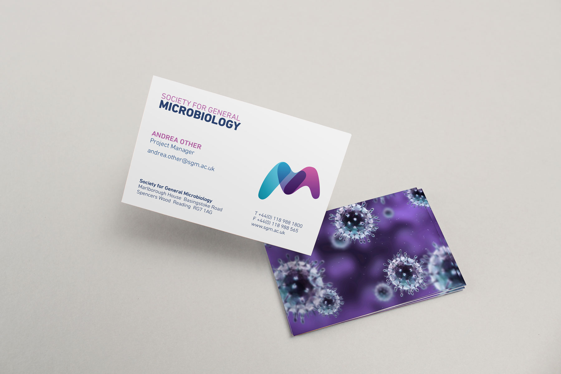
The M device subtly hints towards microbiology without being overly explicit.
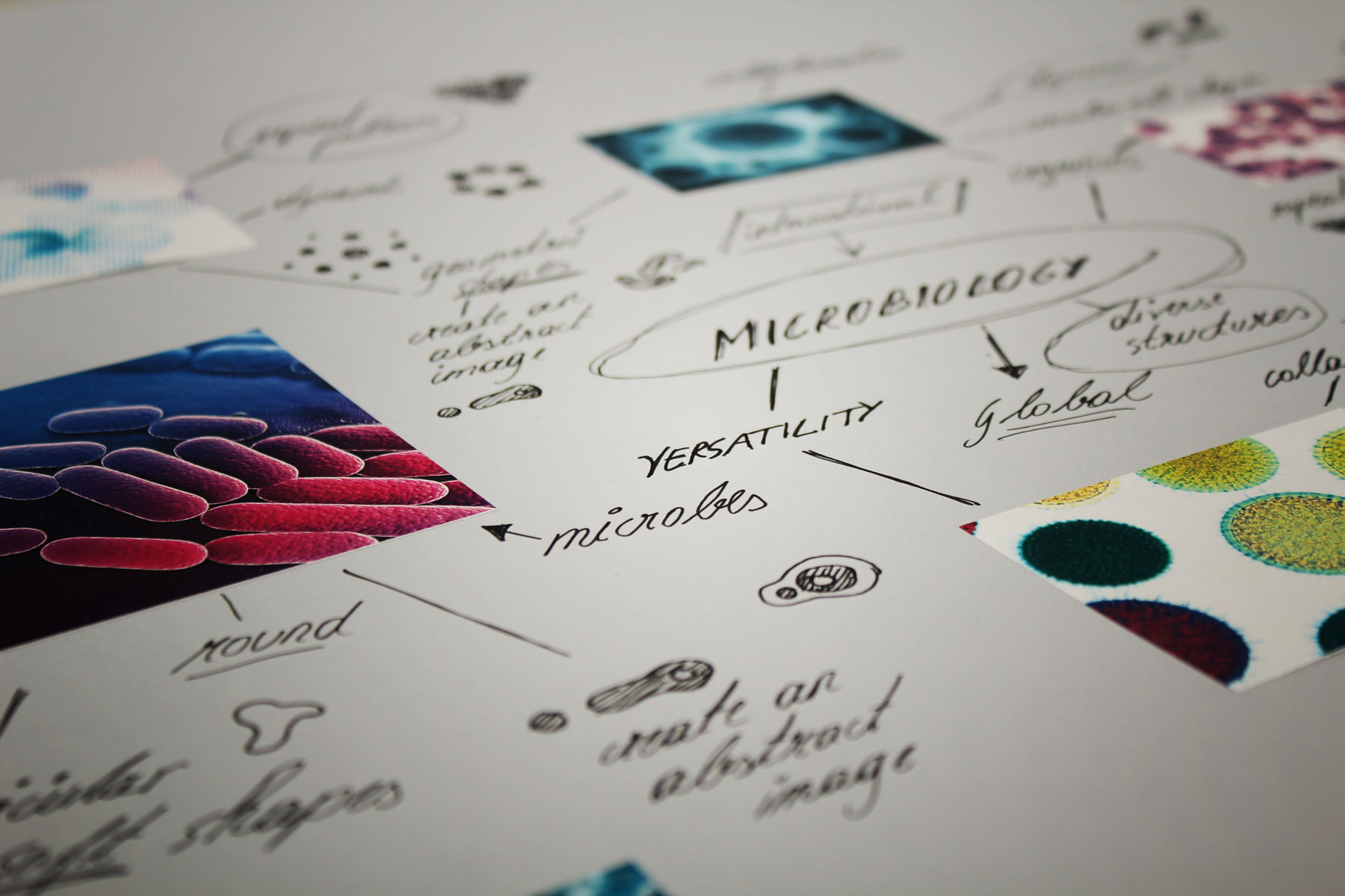
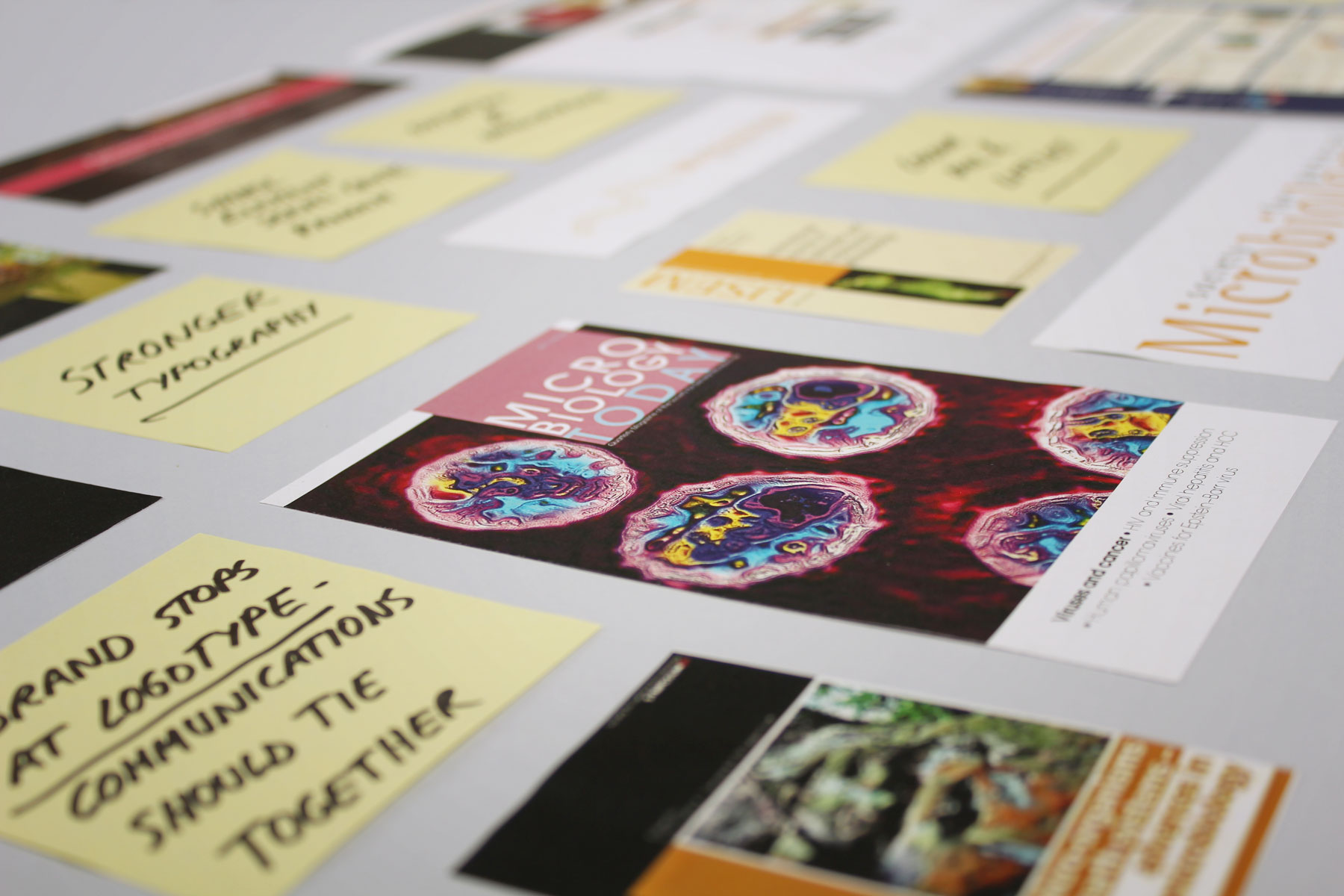
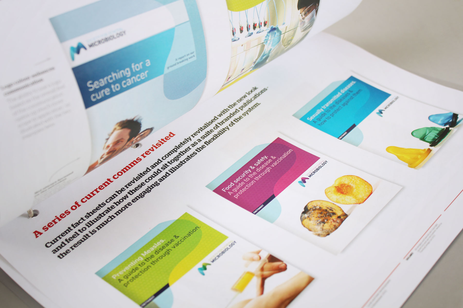
The Society for General Microbiology deemed its existing branding to be outdated and uninspiring. Its aim was to build a strong, lasting and consistent brand that reflected the organisation’s forward-thinking approach to microbiology. We made the brand scalable with a distinct icon to increase legibility. We made the brand mark abstract in design so it wouldn’t disenfranchise any particular audience yet bold and striking so that it would be highly legible for the digital domain. Initial development focused on the circular, soft shape of microbes. This evolved into an M device that subtly hints towards microbiology without being overly explicit.


