-
-
The onset of the Savannah branding project began with a mood setting exercise led by a positioning of "next generation search"
-
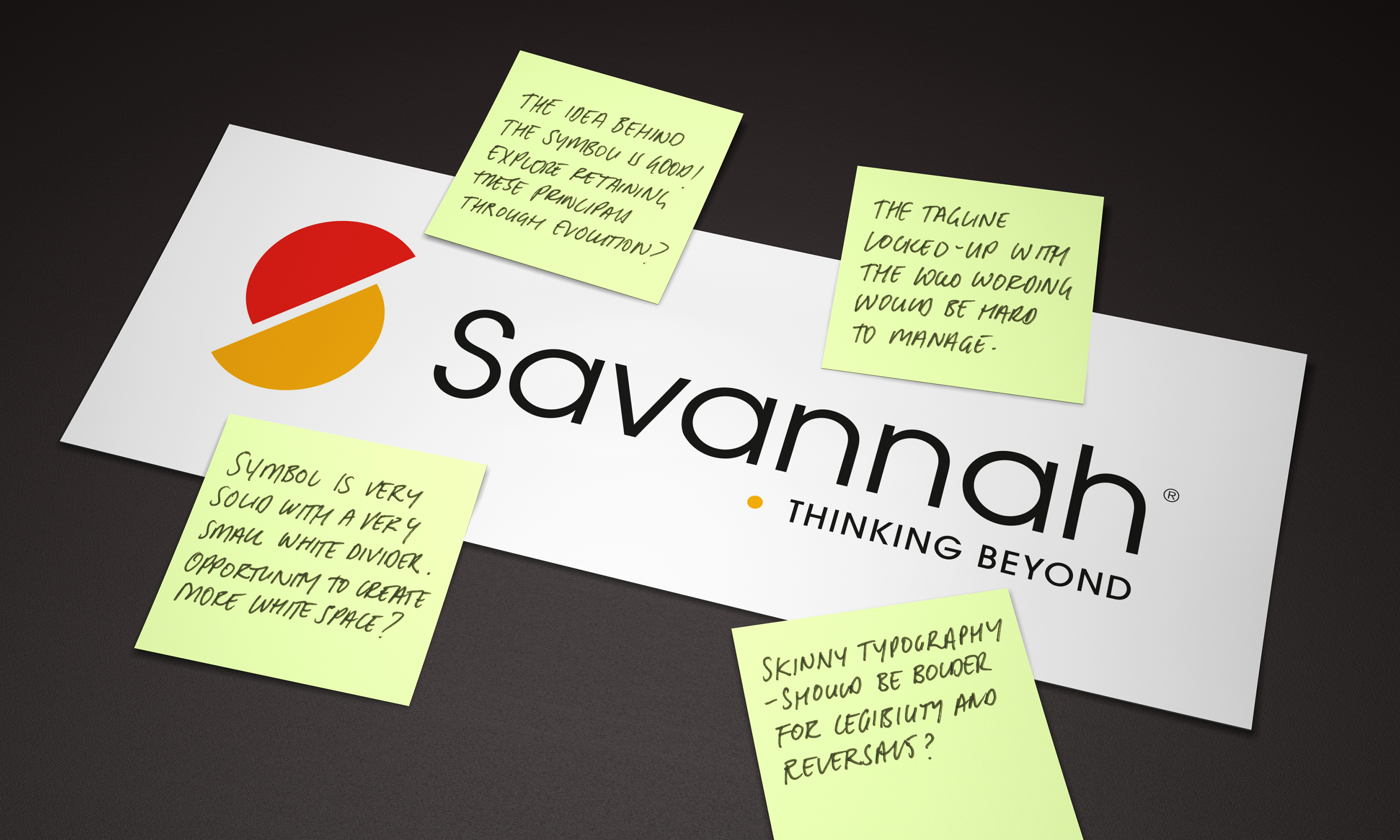
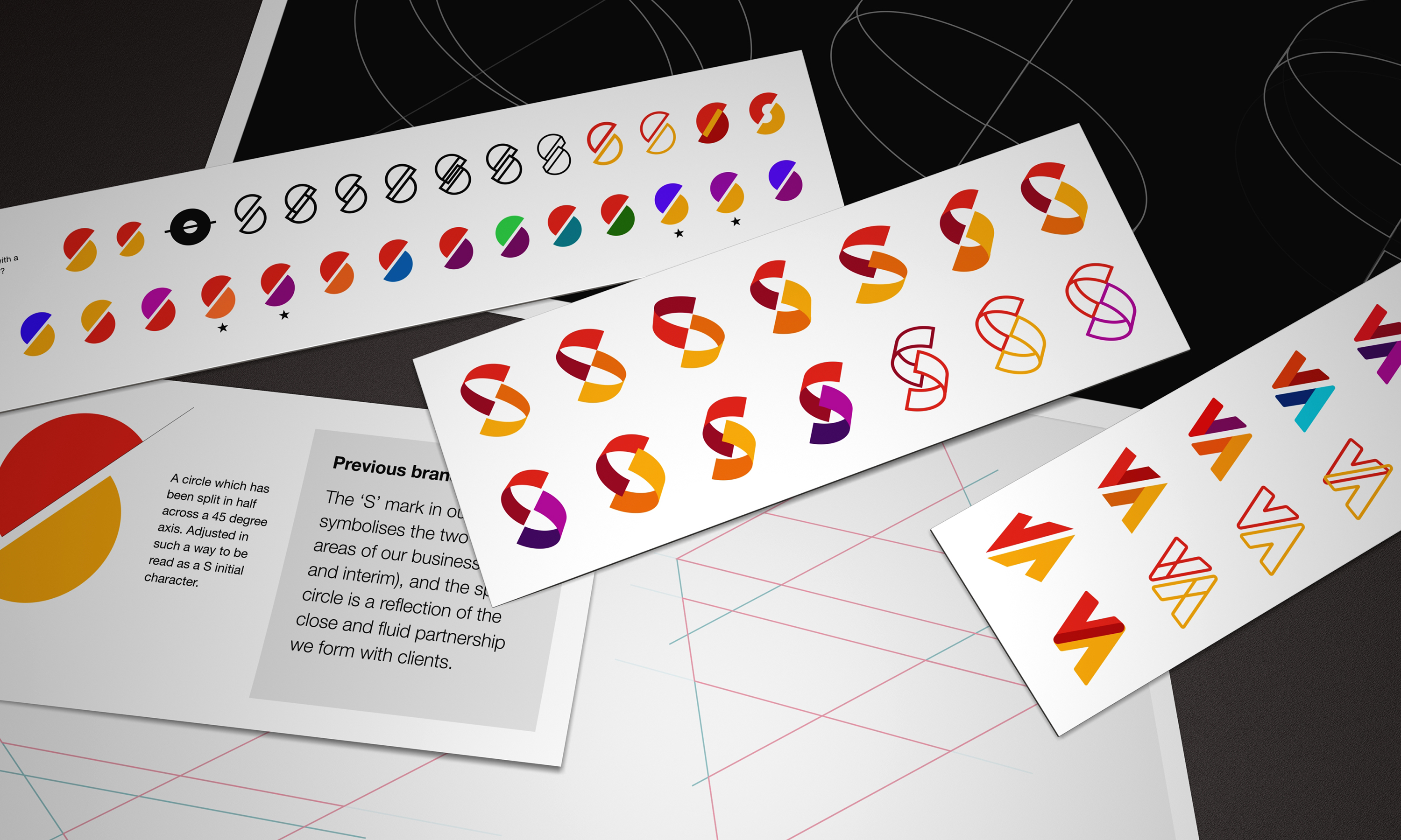
While the previous brand mark was weaker at small digital spaces due to fine typography, we did appreciate the logic of the two cut circle elements and their associated meaning.
-
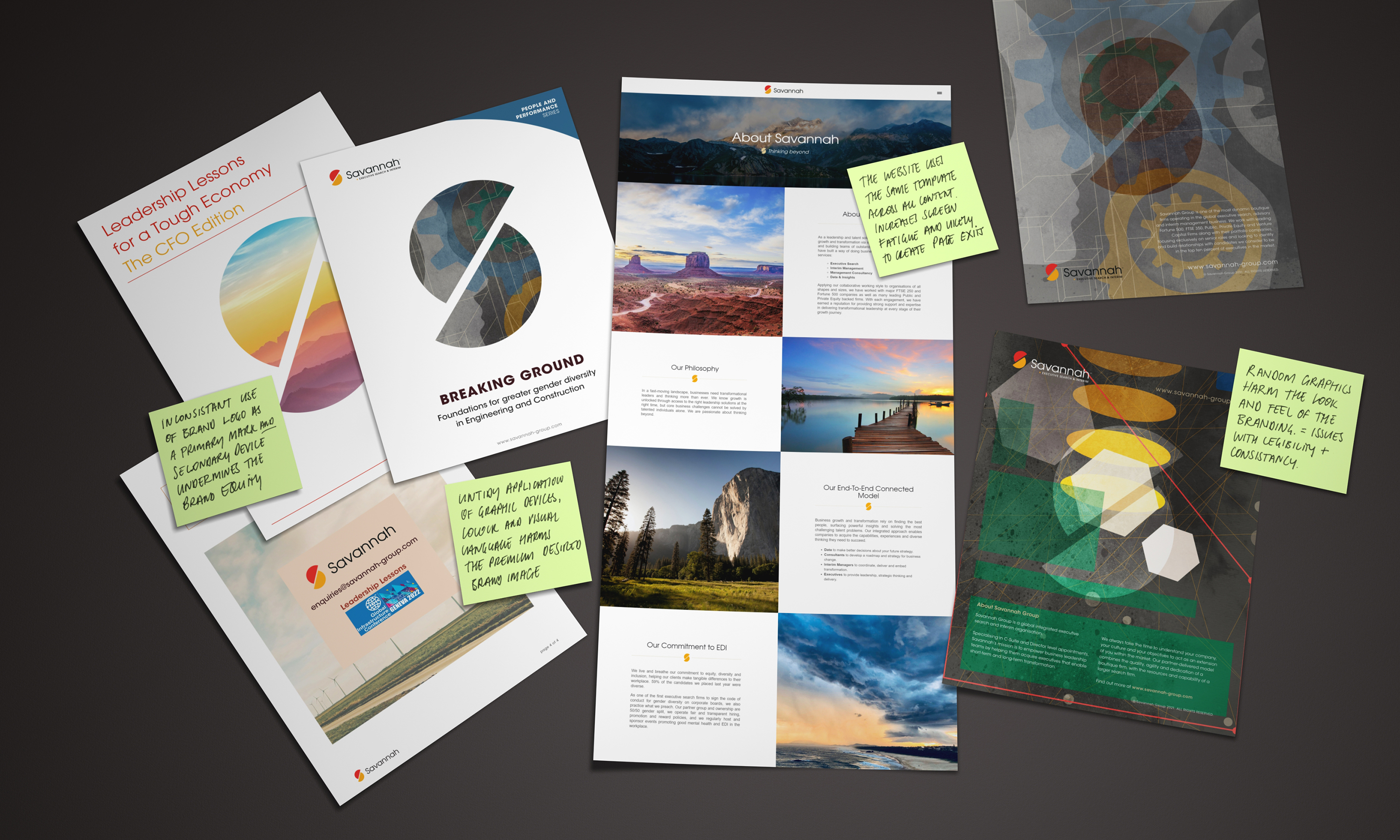
A series of landscape images supported the previous brand and visual identity. It lacked a connection to what the business offered. Thus, we set about looking to develop an identity with a deeper rationale.
-
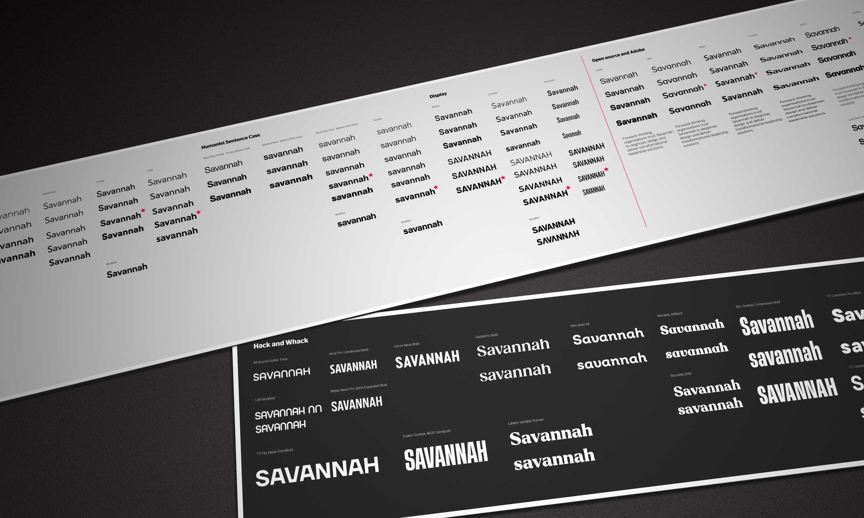
Opening up all the options for type and discerning the correct kind of feel for the identity we wanted to portray.
-
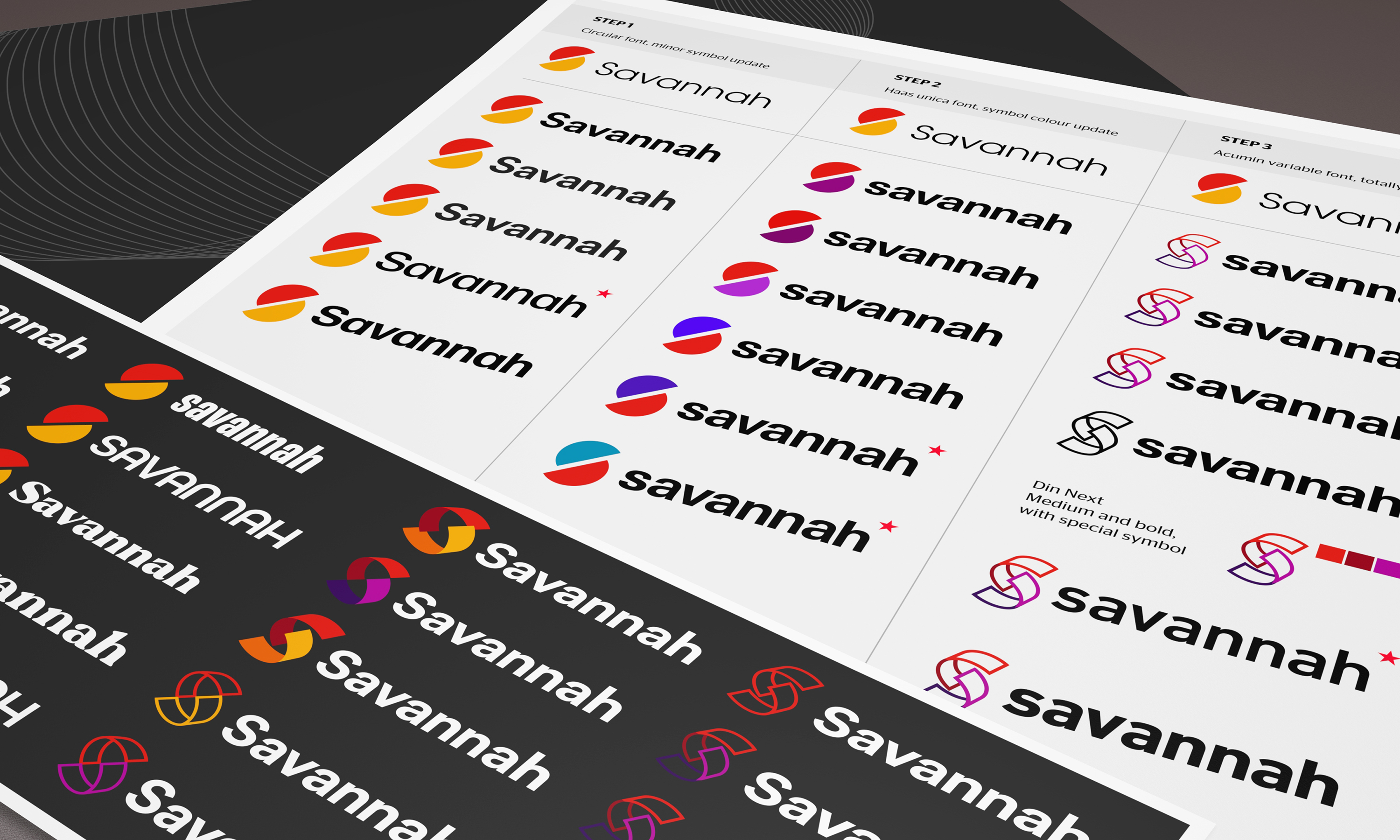
We looked at two primary colour directions and then paired the different levels of symbol evolution with suitable typographic partners
-
Taking an existing flat brand symbol and using doodles to scheme up a way of making the primitive forms based in three dimensions so that we could add some colour depth and form.
-
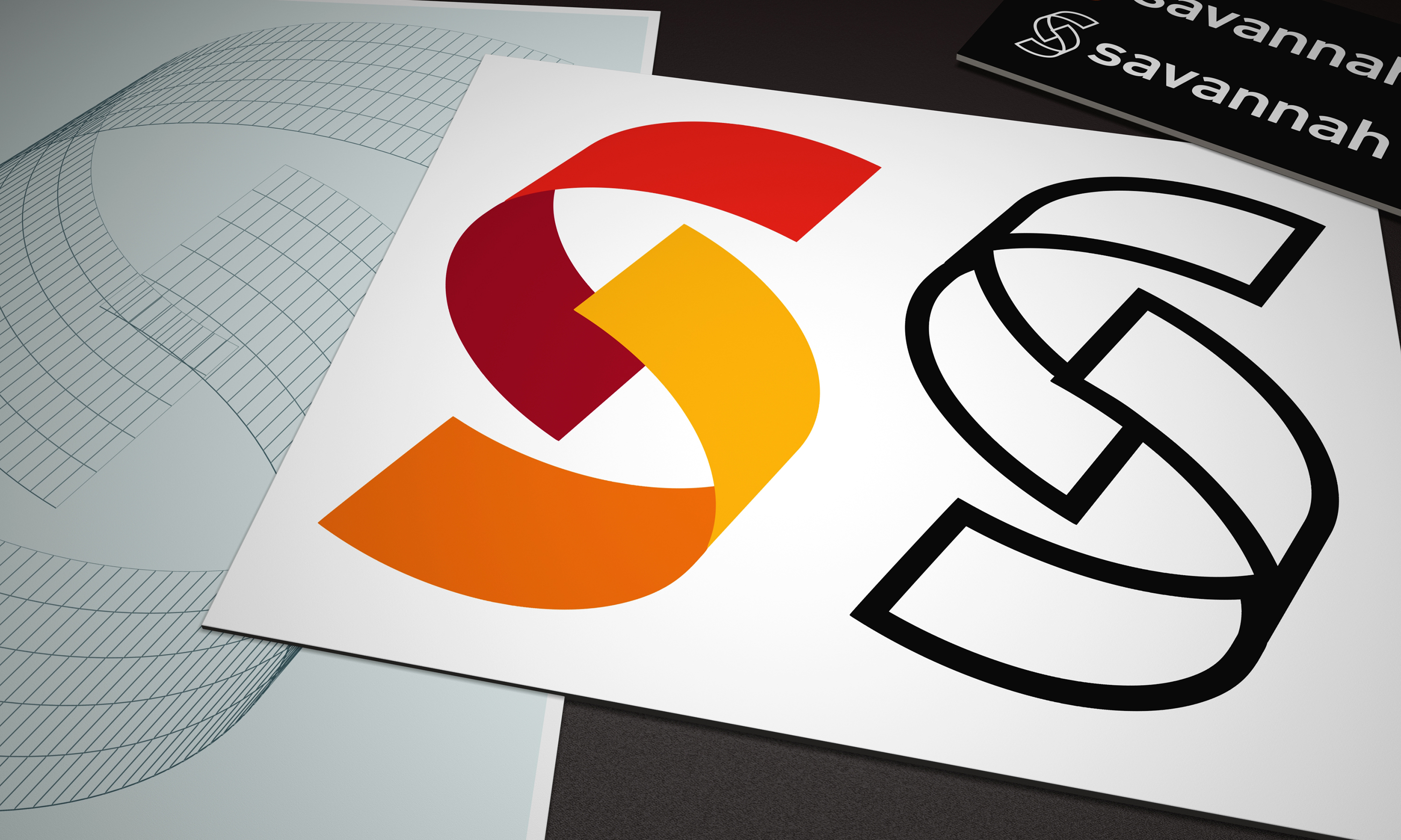
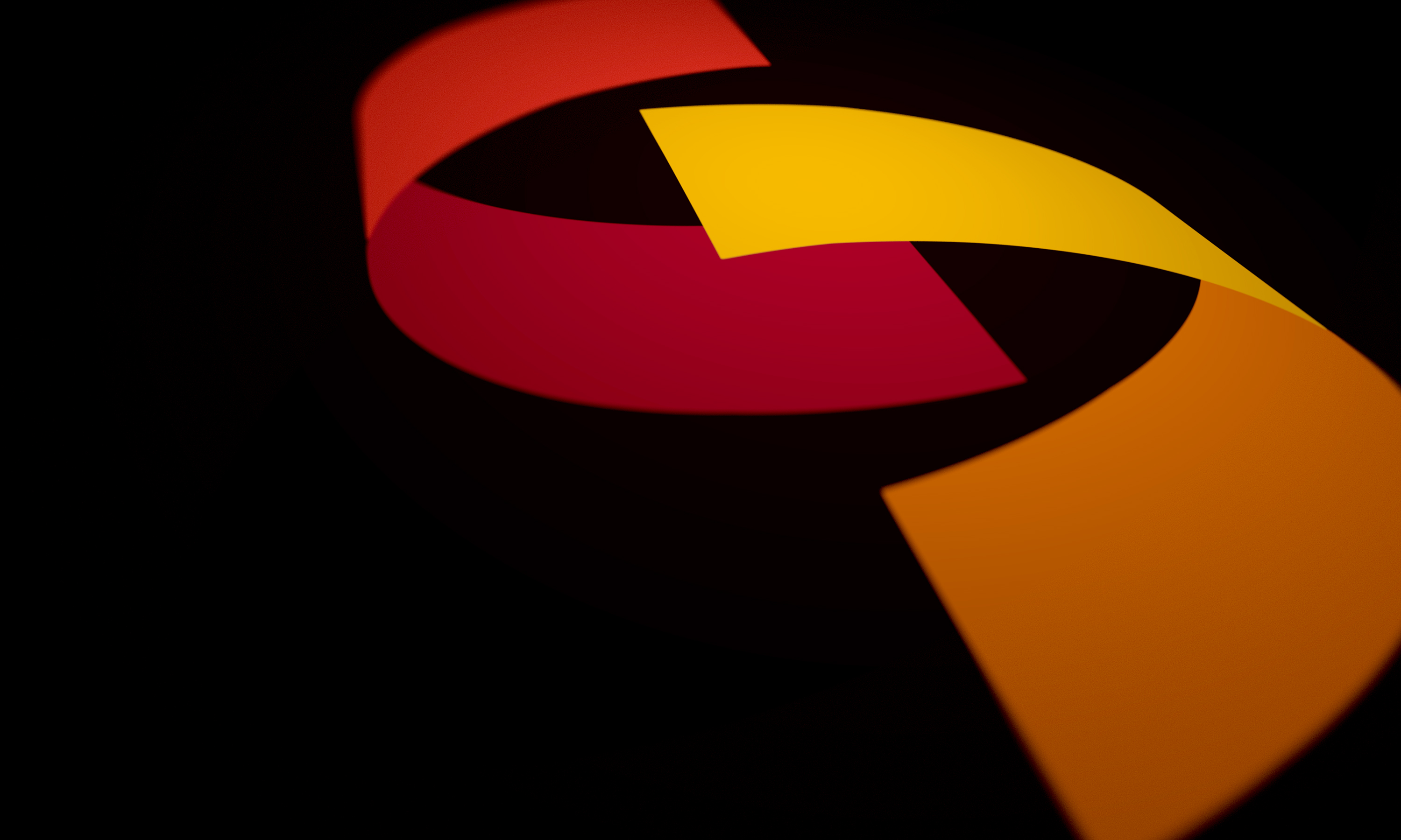
By turning the two harmonious discs into more of an extruded ribbon shape we were able to create a more interesting interplay between the forms.
-
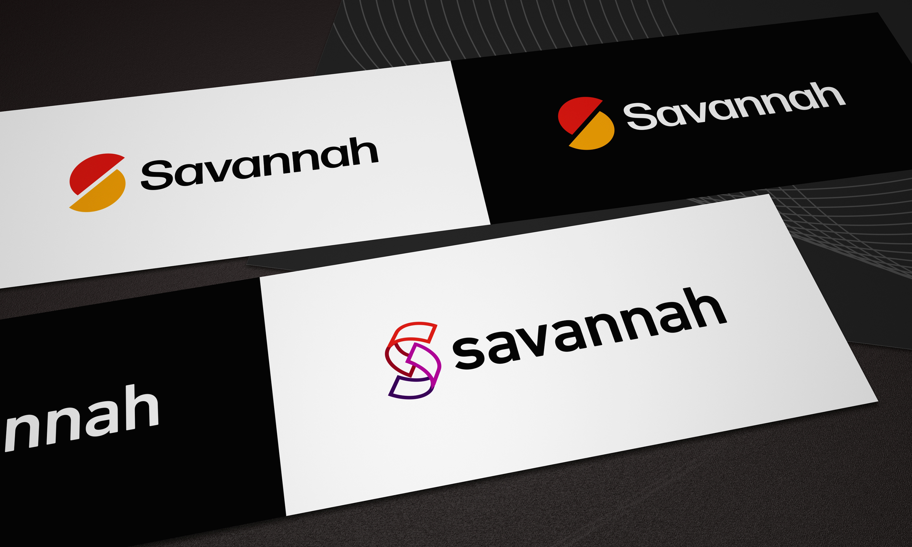
We took the client on a journey starting with a more conservative approach moving into more progressive reimagined brand concepts.
-

The successful brand evolution pays homage to the brand equity while pushing the logo into a more contemporary and individualistic feel.
-
When viewing the two brand marks alongside, the strategy behind the evolution becomes clear. Make it bolder, make it more progressive.
-

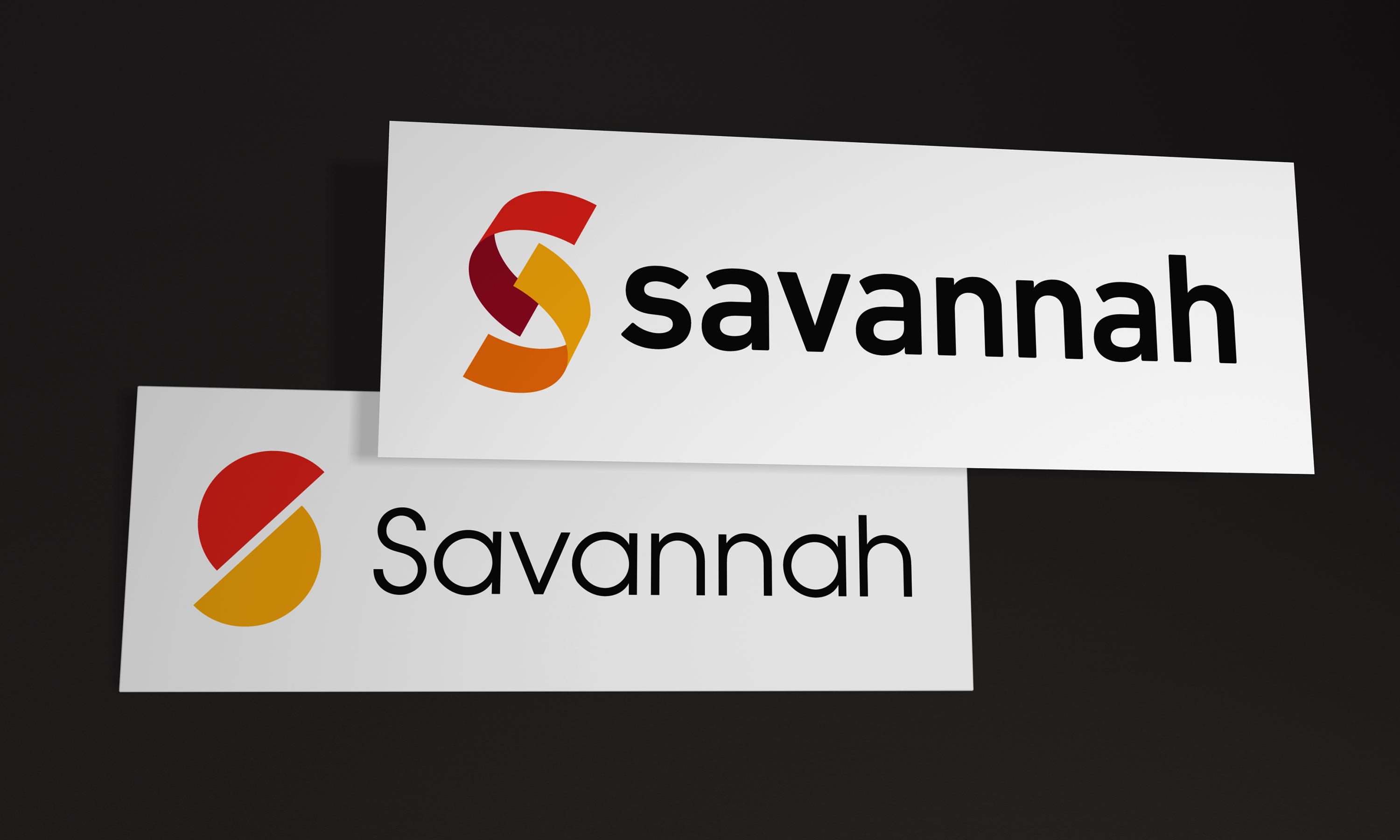
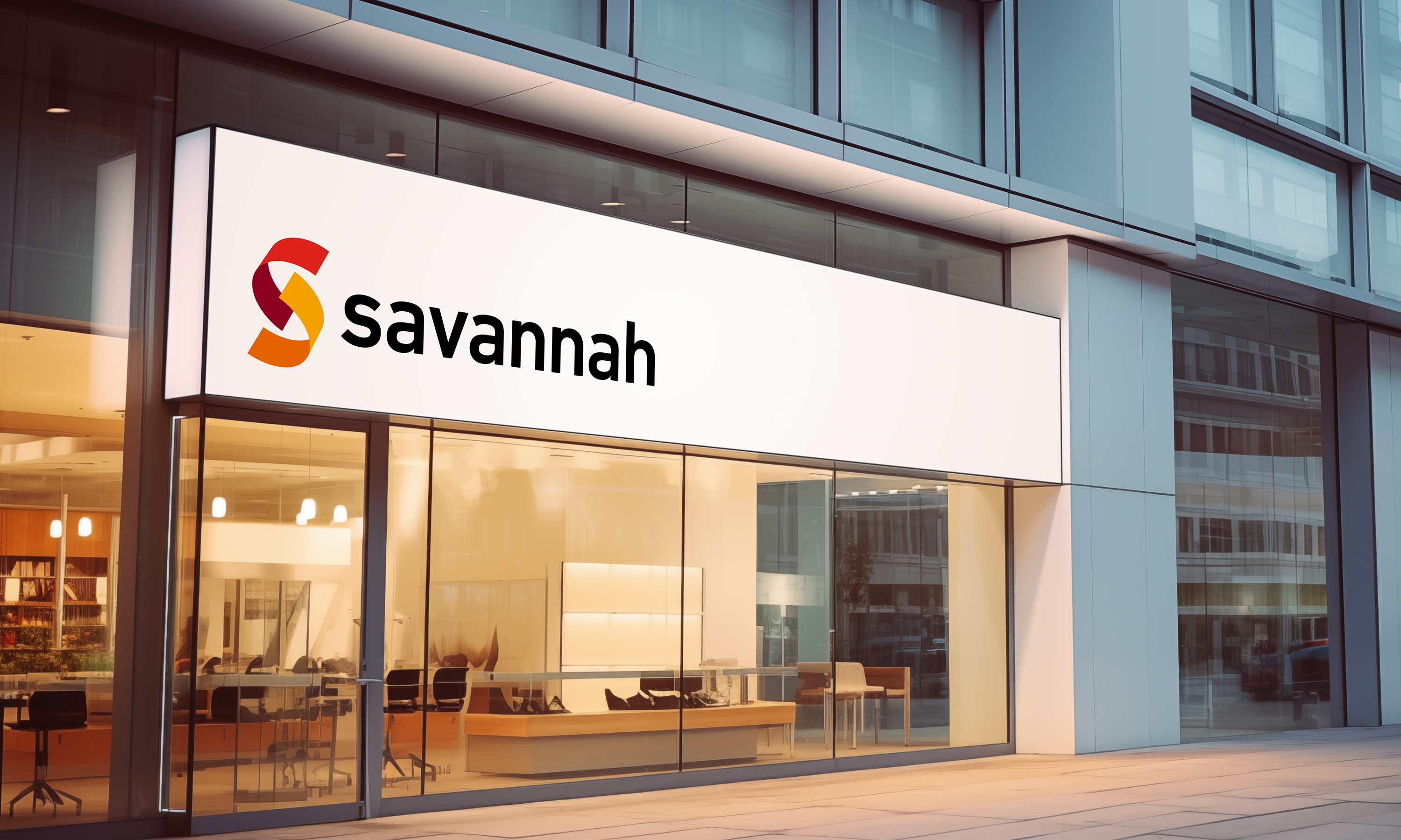
Ensuring the brand is always as clear and bold as it can be - Either on white or black, colour or line-art.
-
The combination of bright symbol and confident use of colour leads to a bold and demanding design.
-
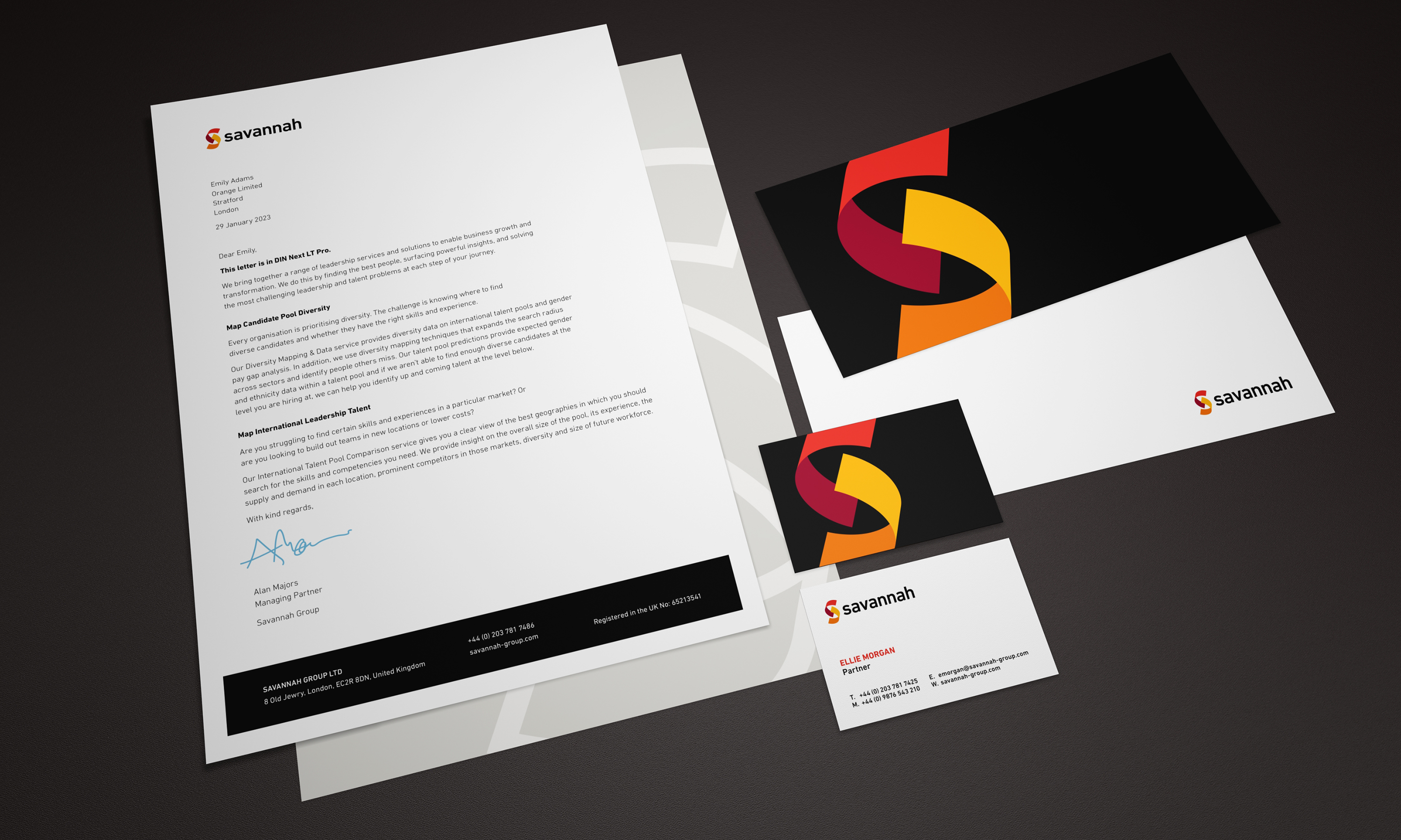
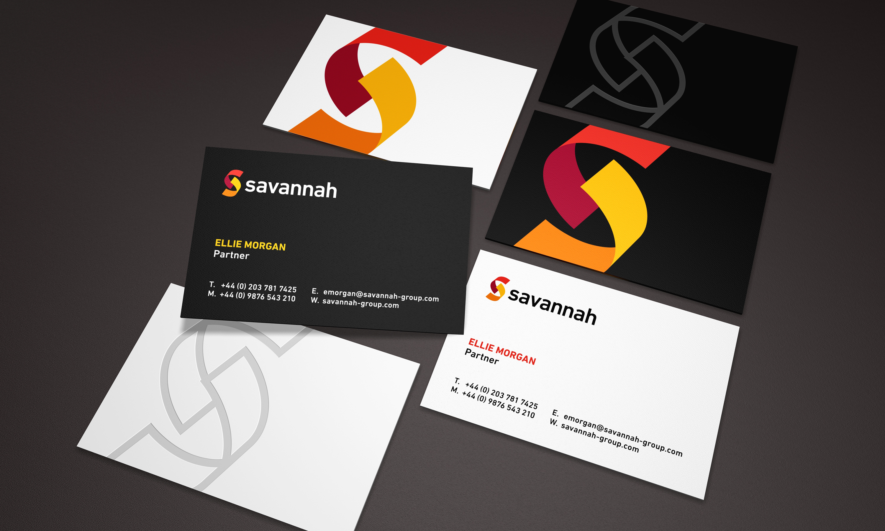
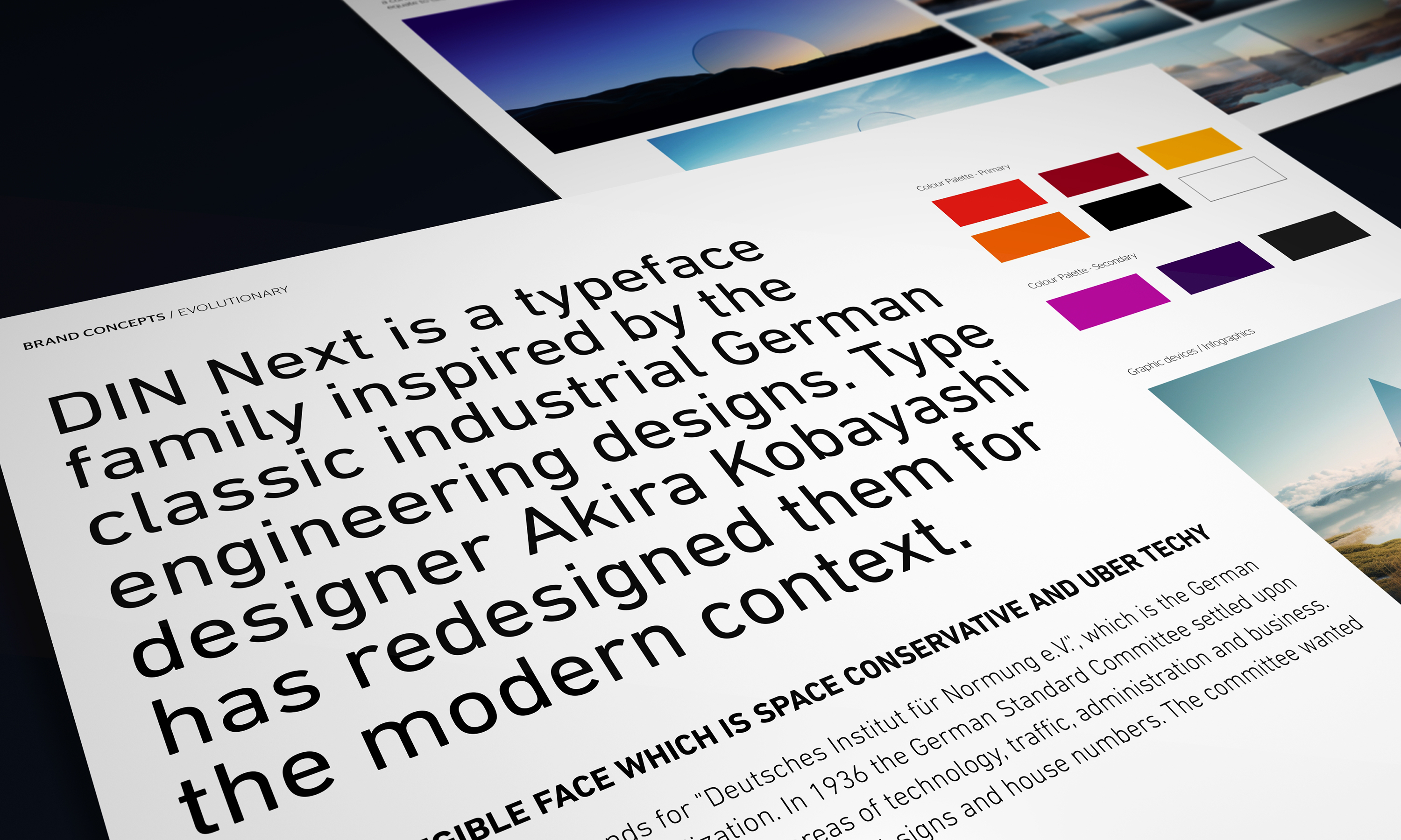
The stationery is comprised of primary elements and a strong DIN type feel
-
The customised DIN logo type in black sits neatly alongside the dimension led symbol.
-
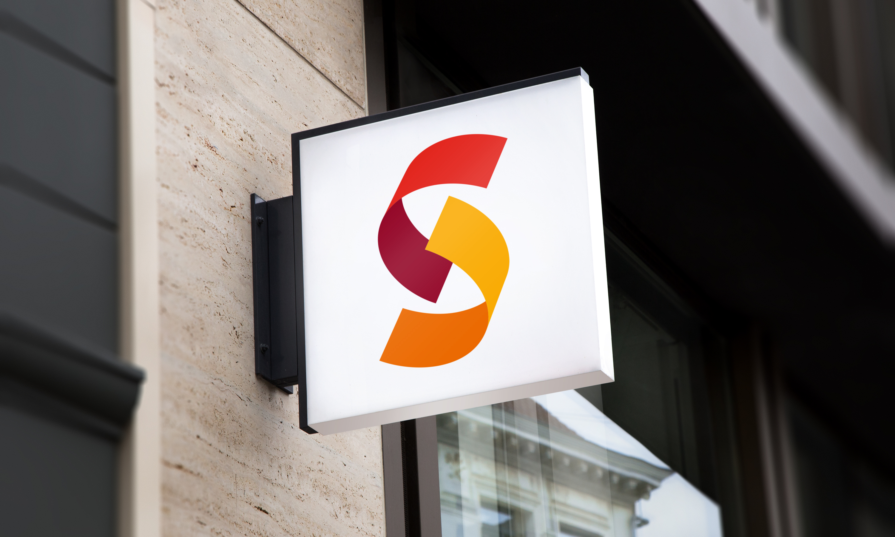
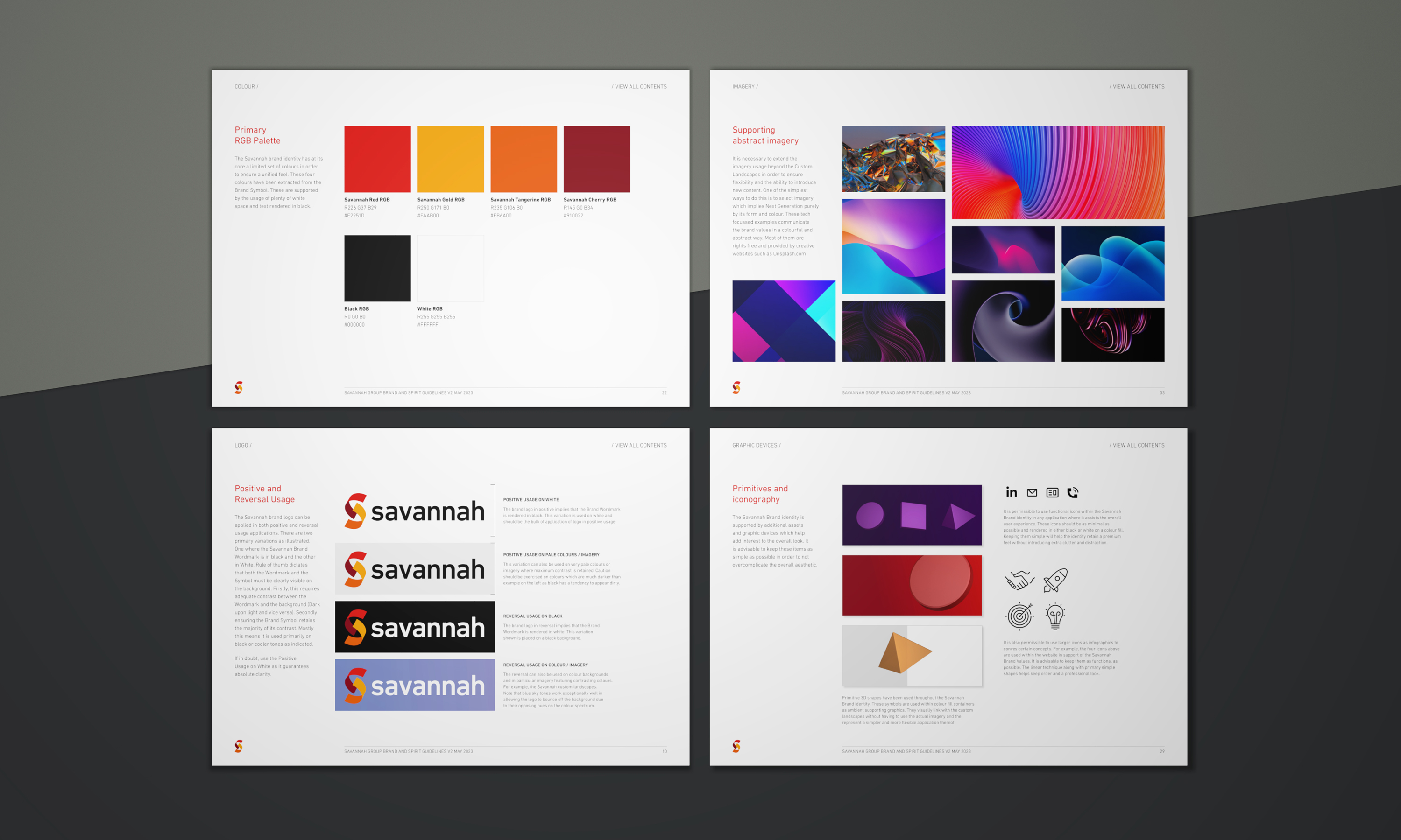
The brand symbol comprises two hues and their corresponding low light colours. This creates the basis of the onward colour palette.
-
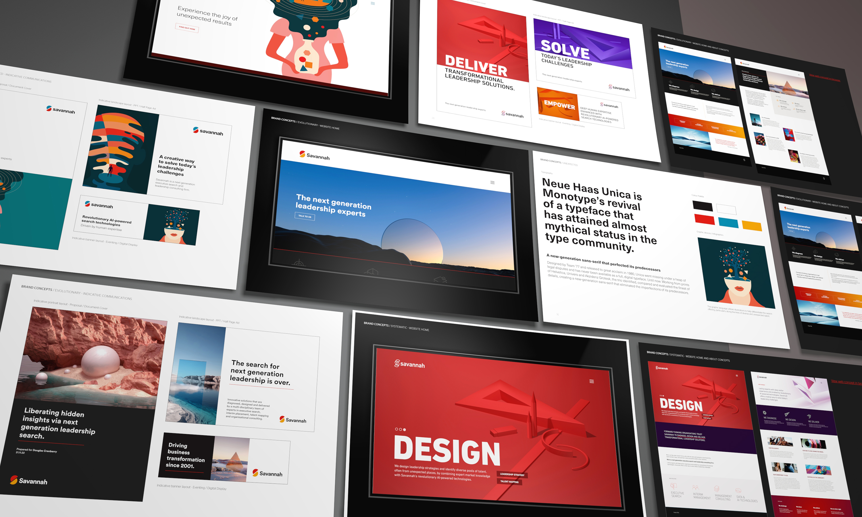
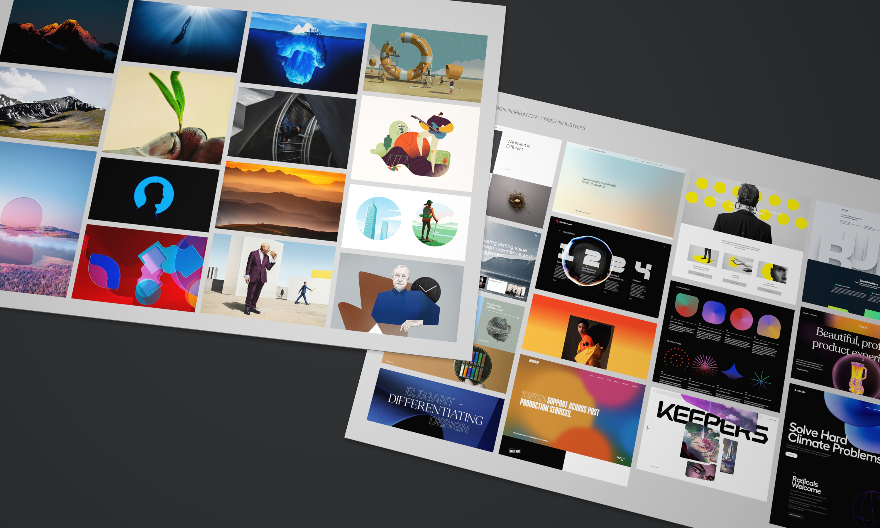
We presented a number of conceptual ideas from illustrations to photography stock.
-
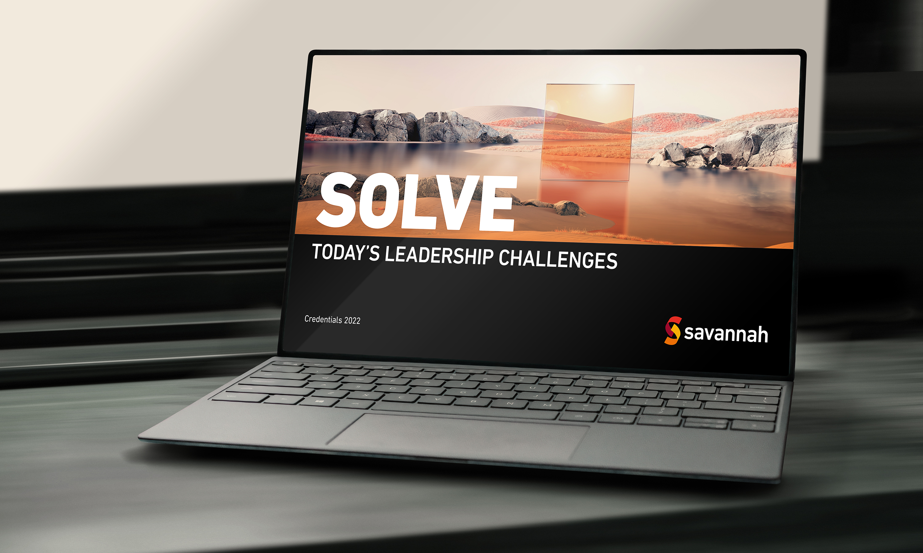
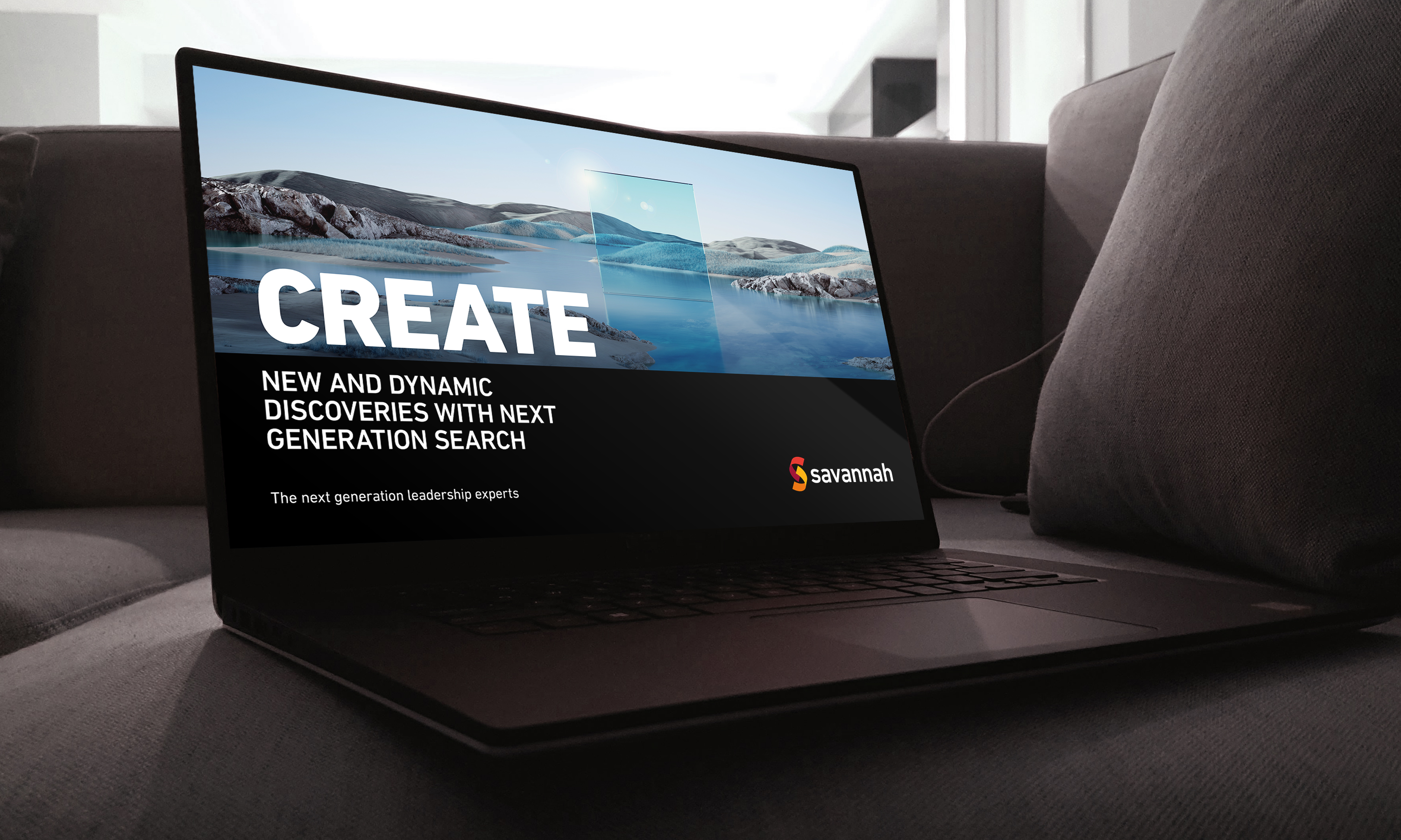
The experimental imagery is grounded with minimalist type and a tight colour palette which is based on a warmer segment of the total colour spectrum.
-
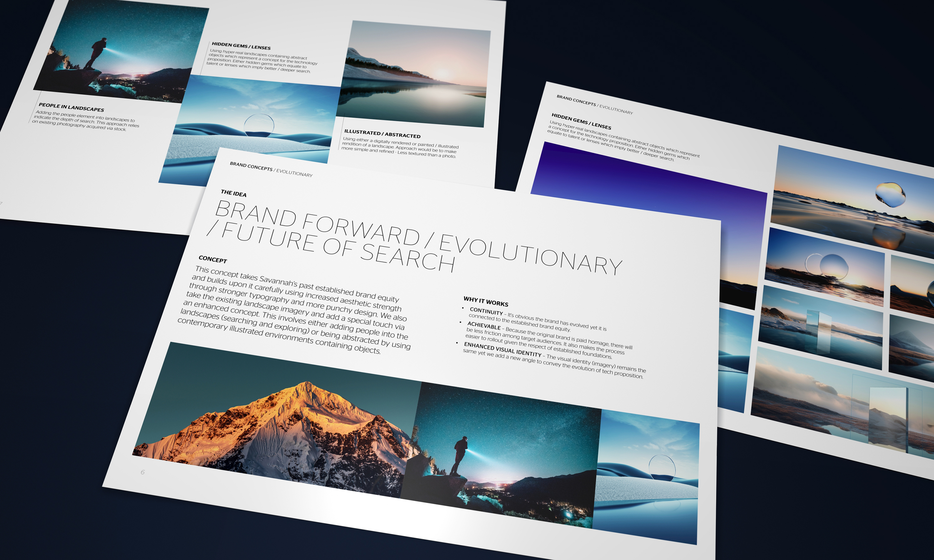
With an existing brand, we always start with the previous identity and look for opportunities to connect yet refresh with a new idea.
-

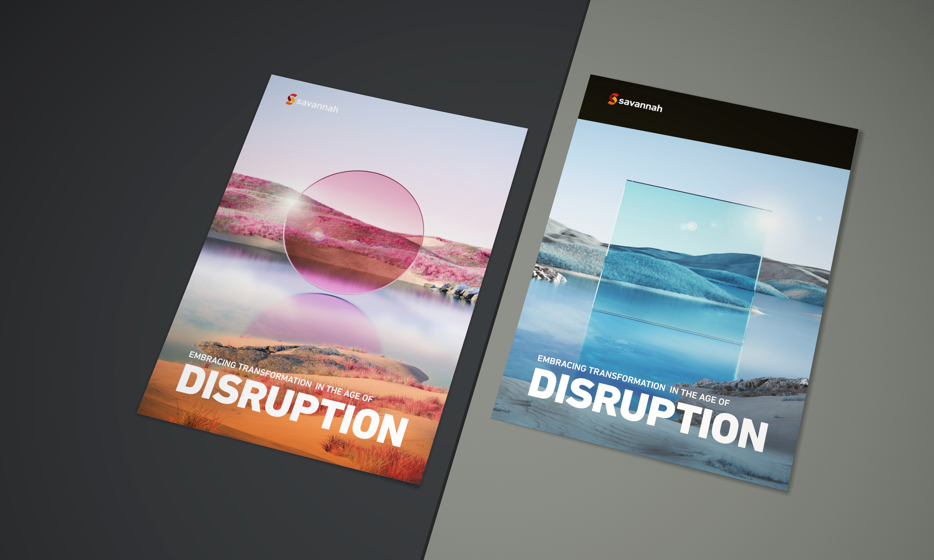
To create a cohesive image - we decided to use analogous colour for each of the renders and then use three different palettes which gelled well with the brand.
-
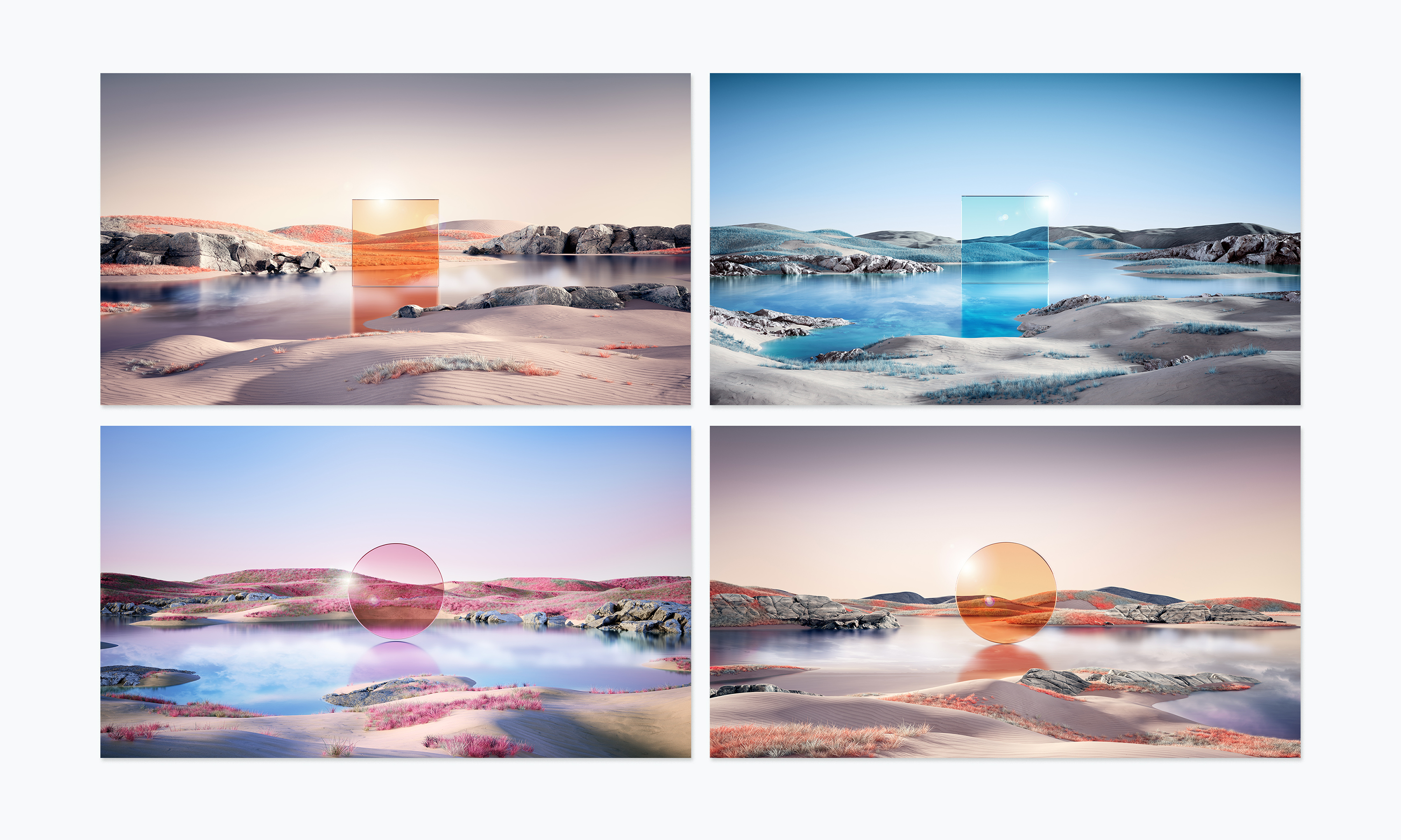
The custom imagery featured glass lens like objects in triangles, cubes and spheres.
-
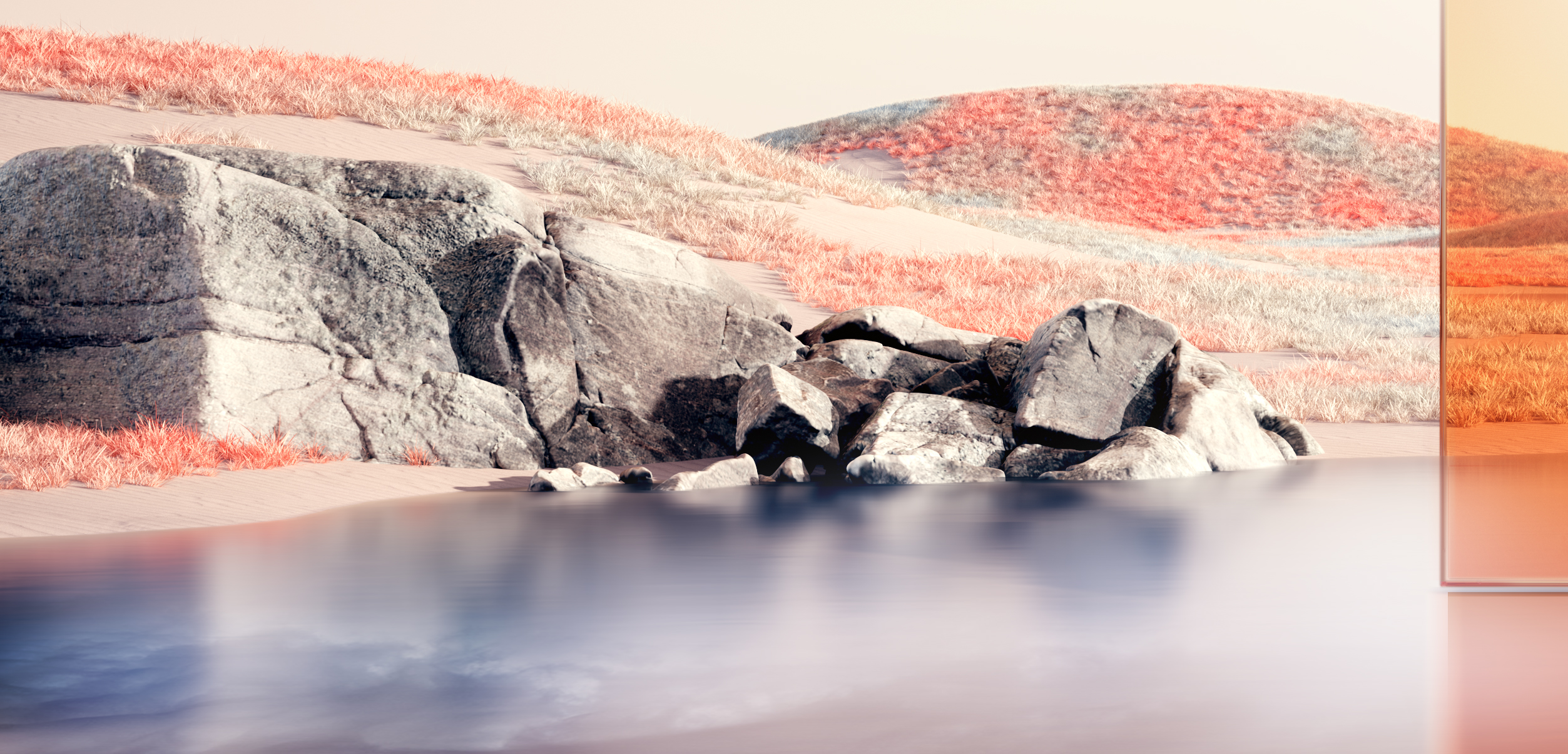
The otherworldly environments comprised of real material geometry alongside various generative particle systems.
-
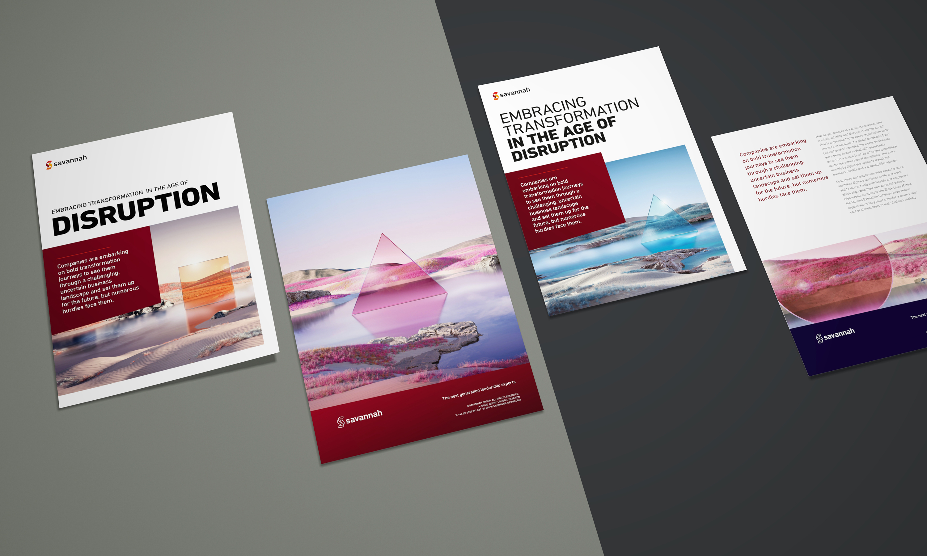
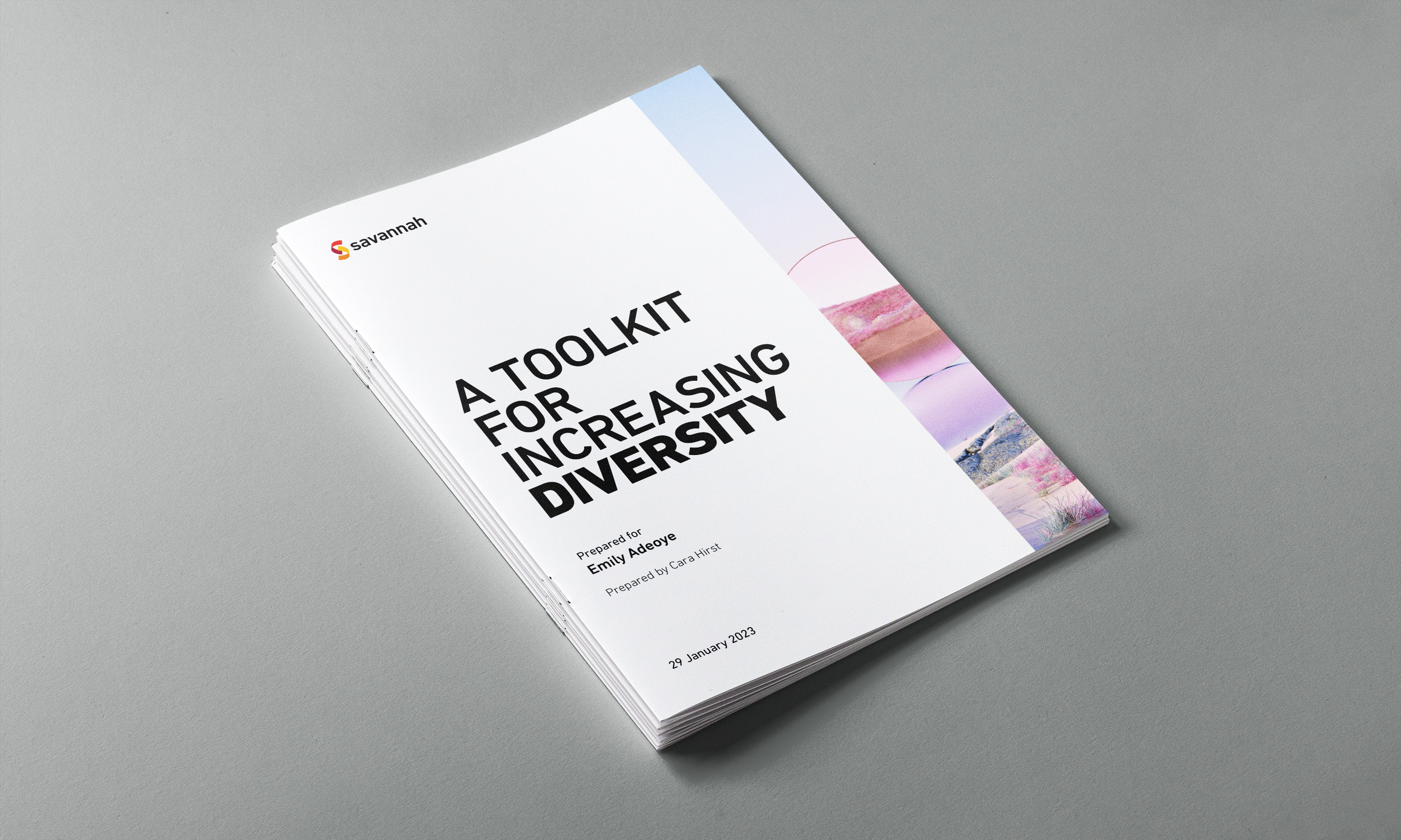
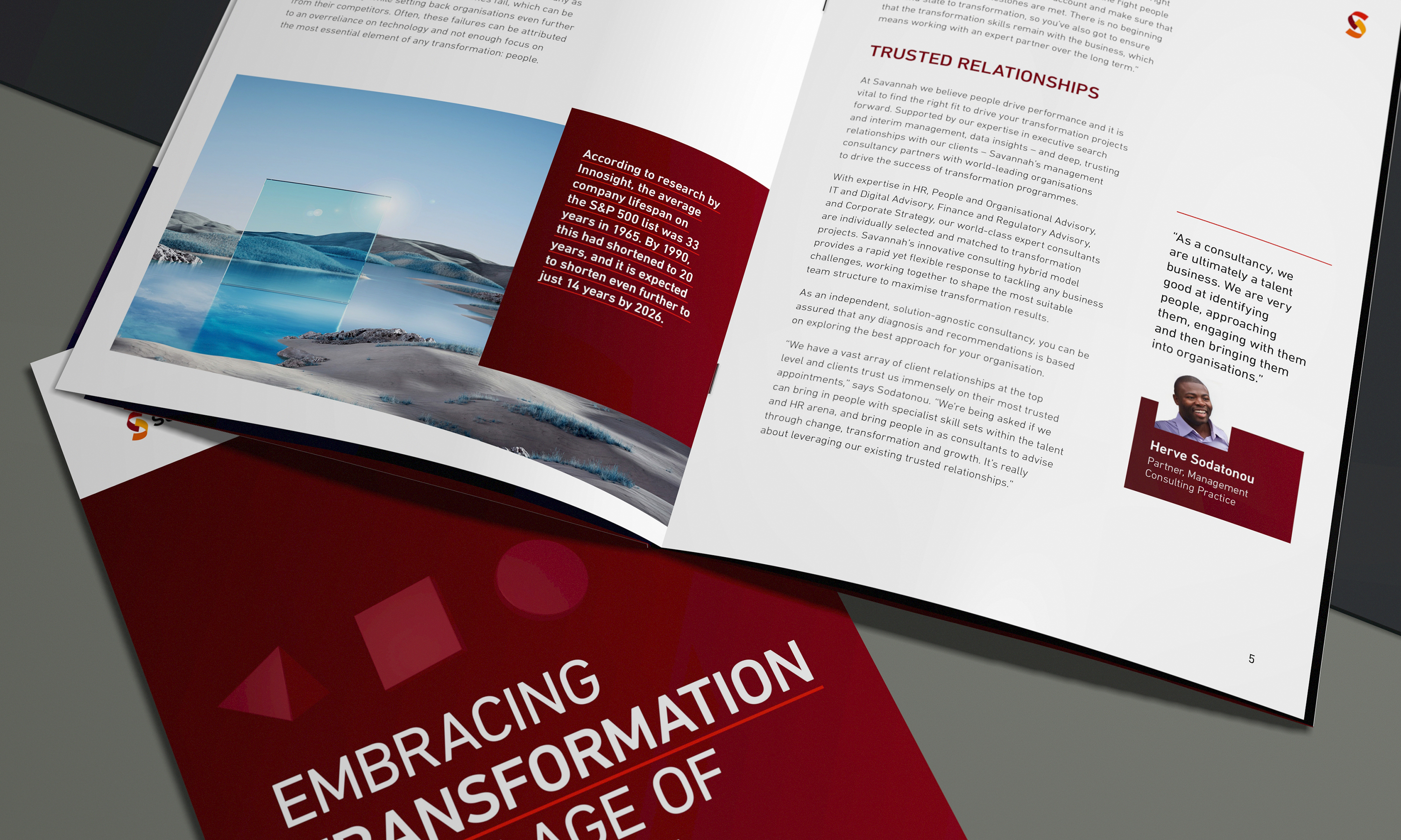
We created a wide remit of communications templates so that the business could readily create new White Papers and recruitment publications
-
The messaging readily connects with the suggestive brand imagery.
-
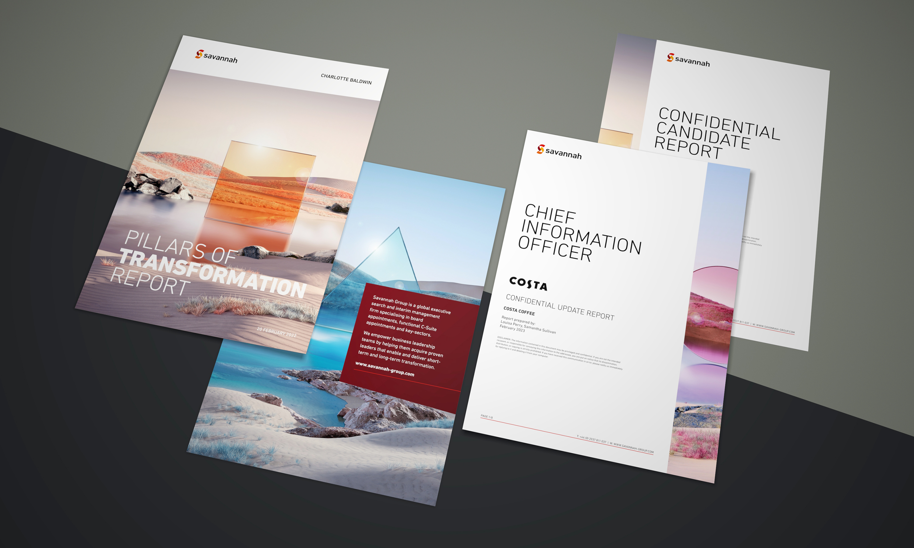
We worked on automation templates used for reporting.
-
DIN is a wonderfully adaptable typeface and is blessed with various weights and styles.
-
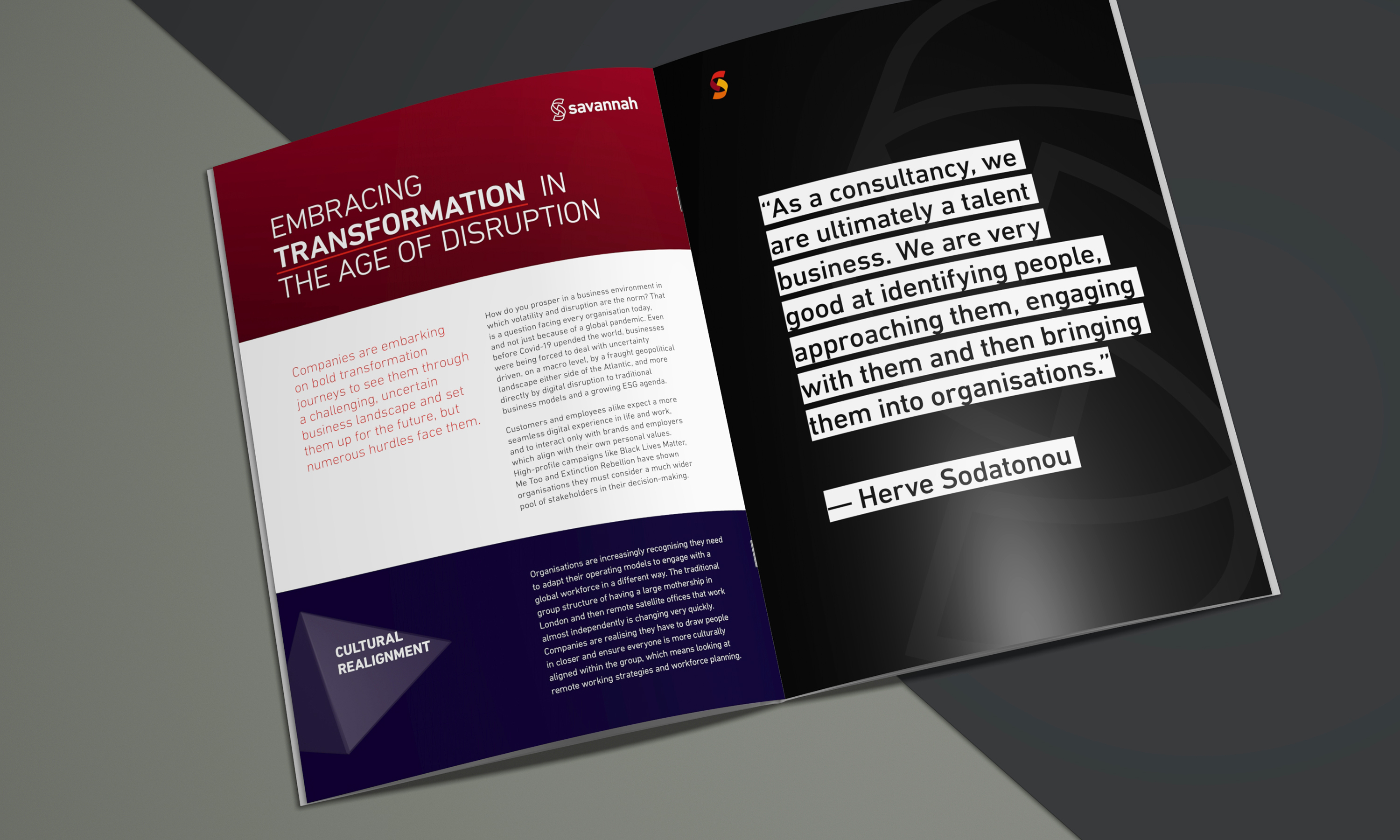
Quote styles in featured text and column pull quotes.
-
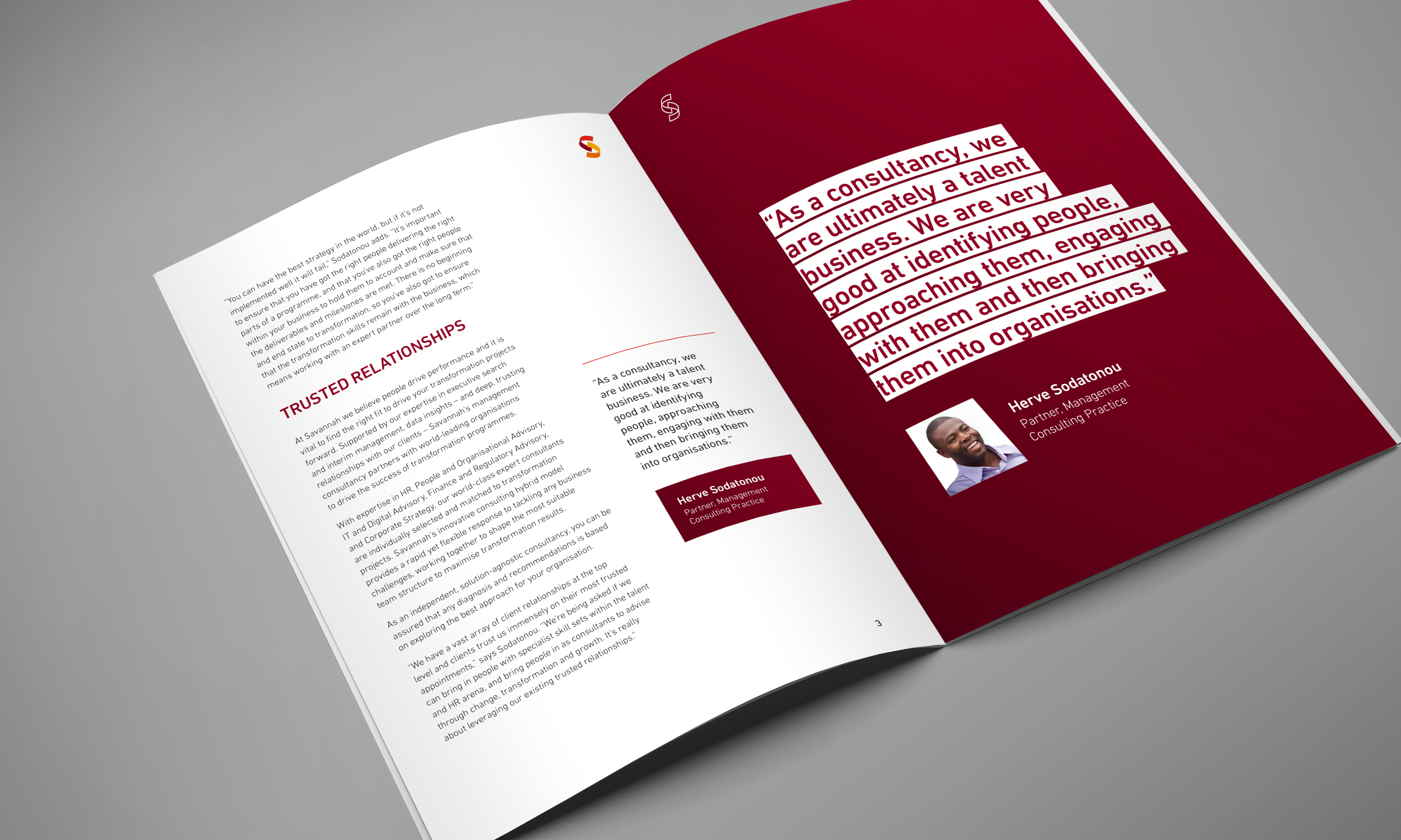
The brand messaging consists of active words paired with power statements.
-
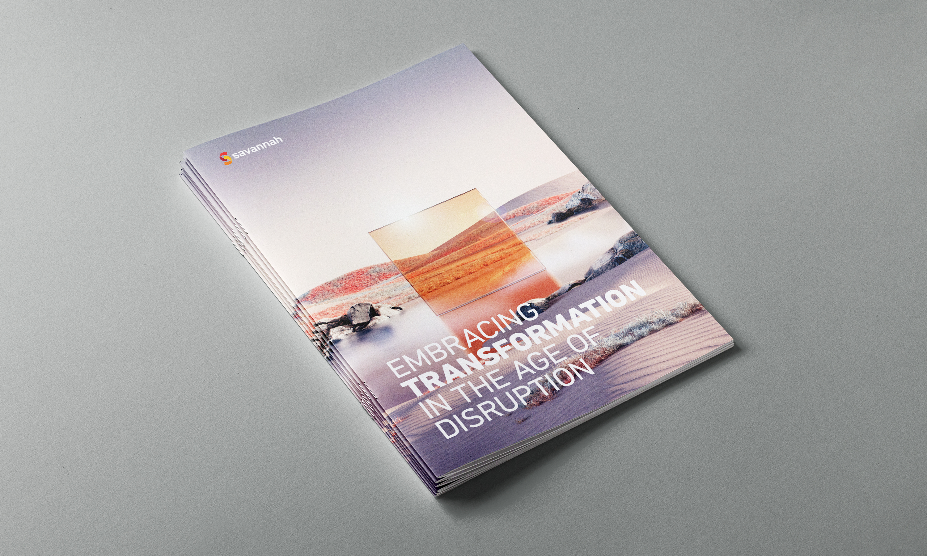
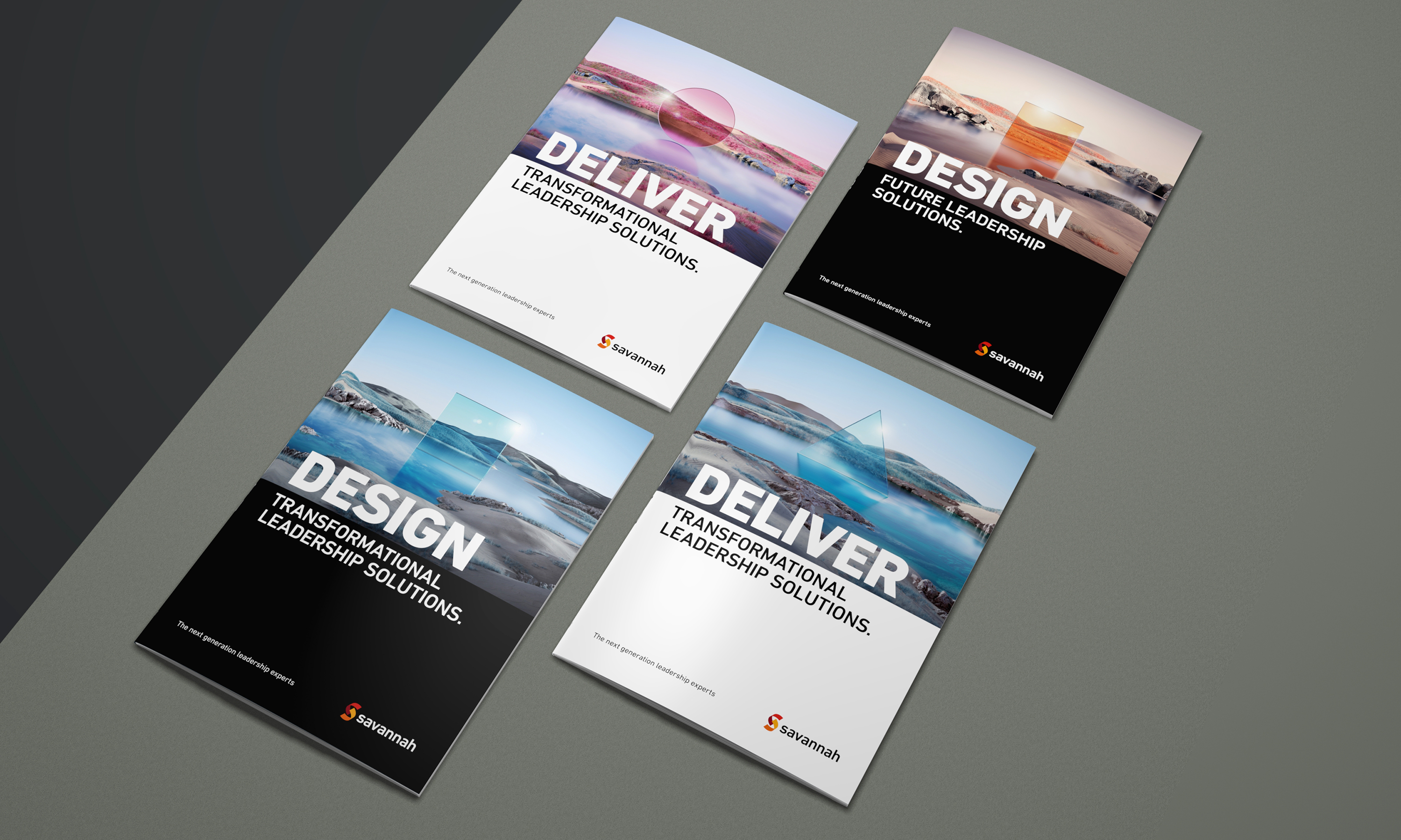
Image led cover with full bleed design.
-
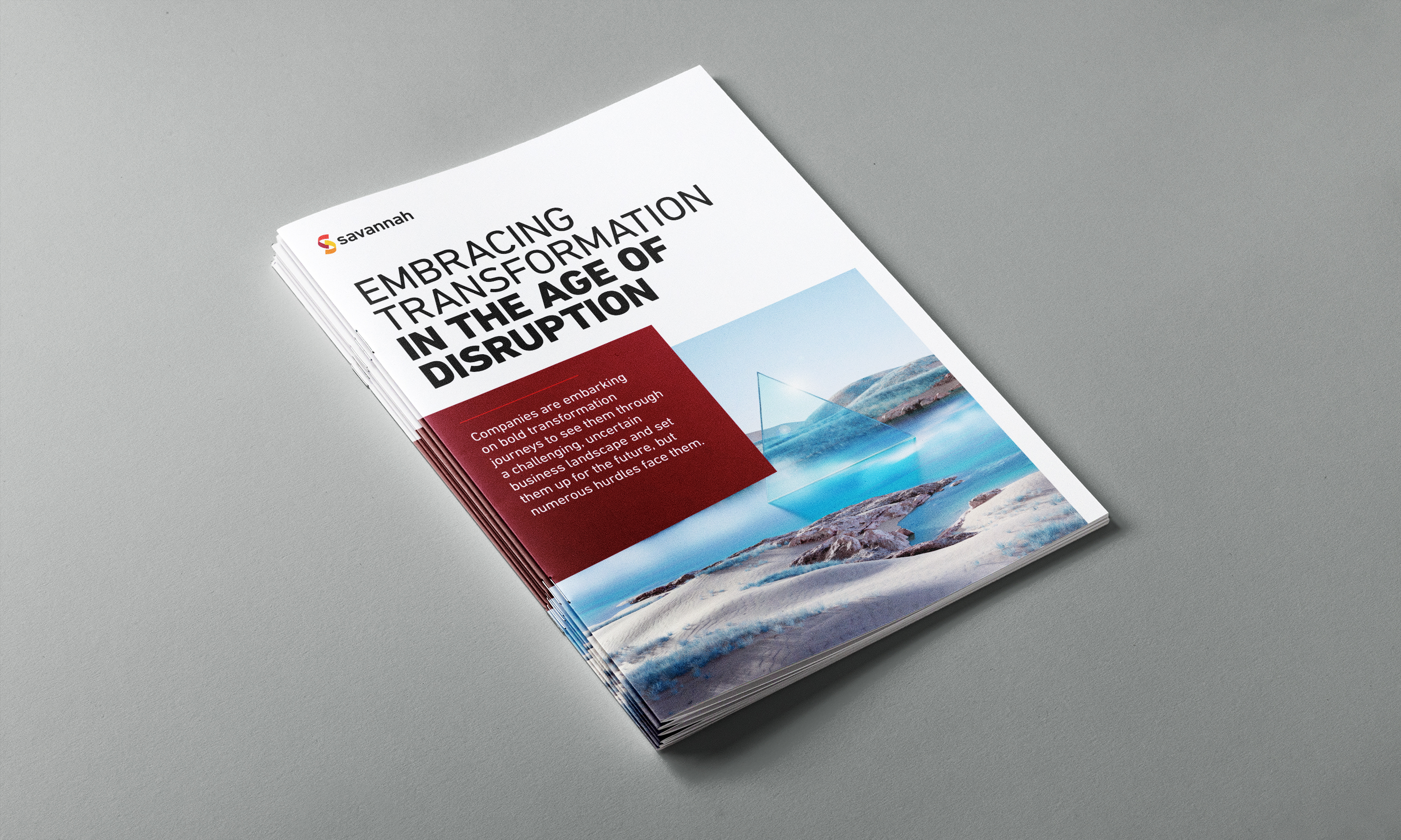
Detailed cover design using type and imagery.
-
A more report and typography led cover design.
-
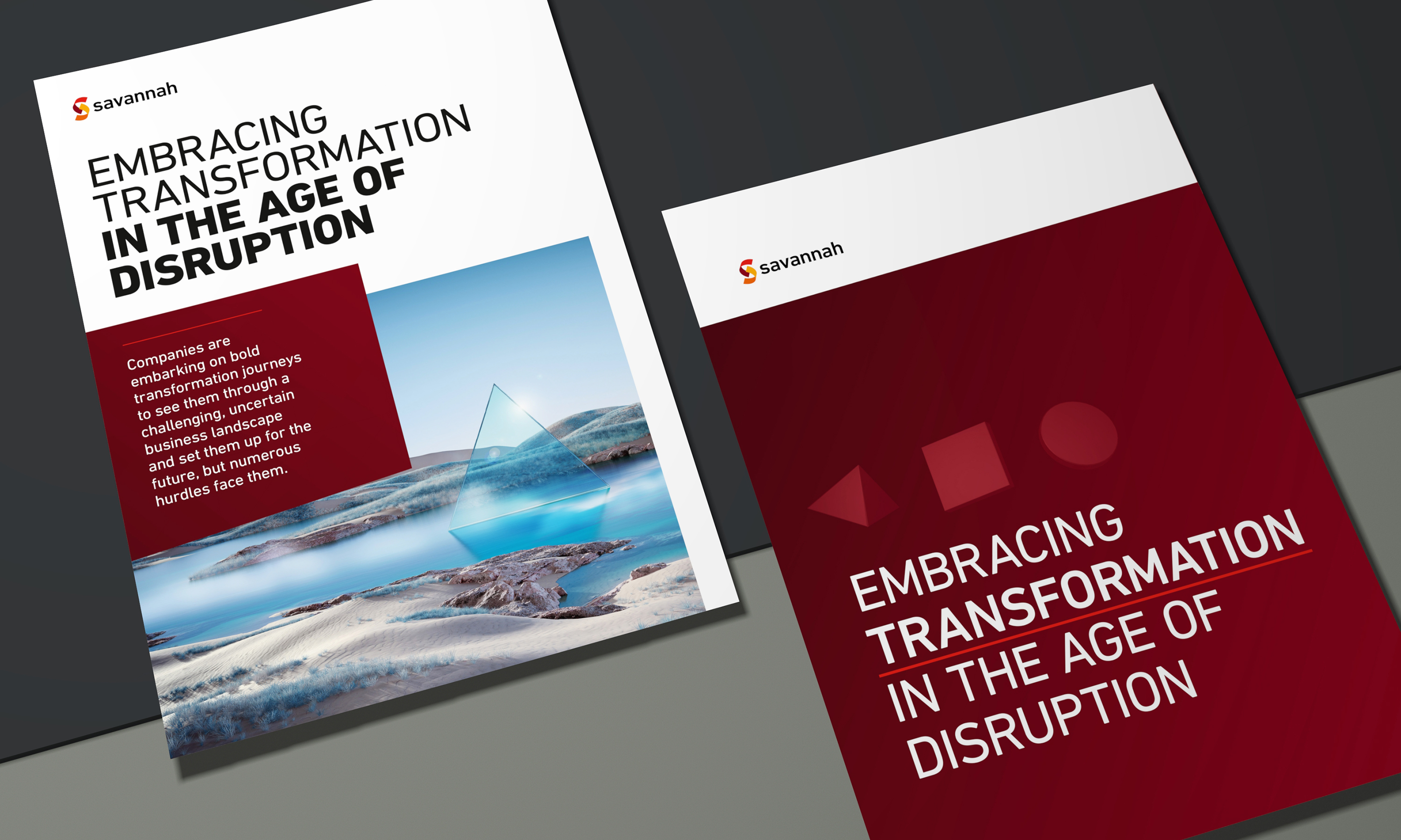
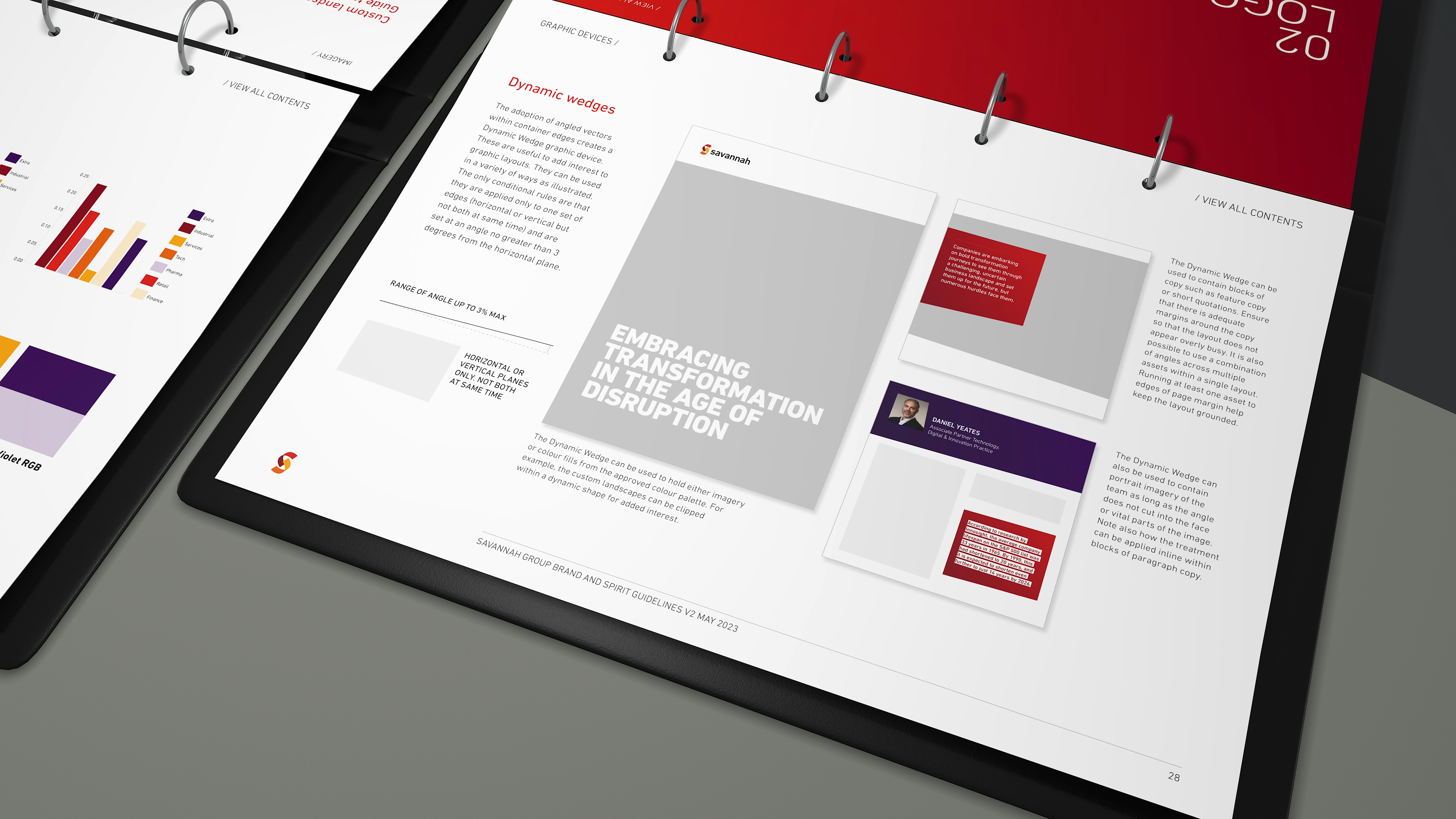
The combination of framed imagery, angular white space and amplified typography leads to a striking design.
-
The brand language is extended into a host of typographic devices and styles.
-
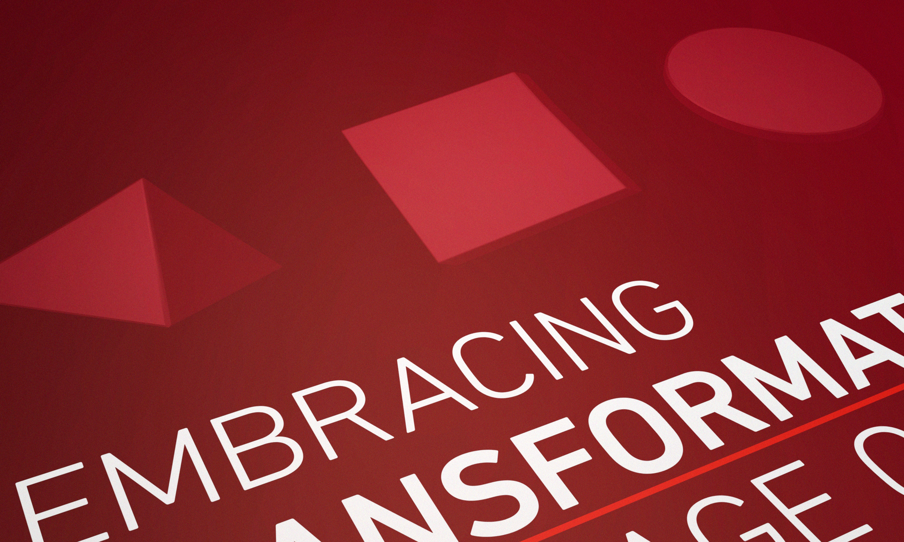
We created a number of simpler three-dimensional symbol forms which could be used in a one colour style.
-
The differing colour palettes used within the imagery keep the identity interesting.
-
Consistent application of layout with type style helps create a strong identity.
-
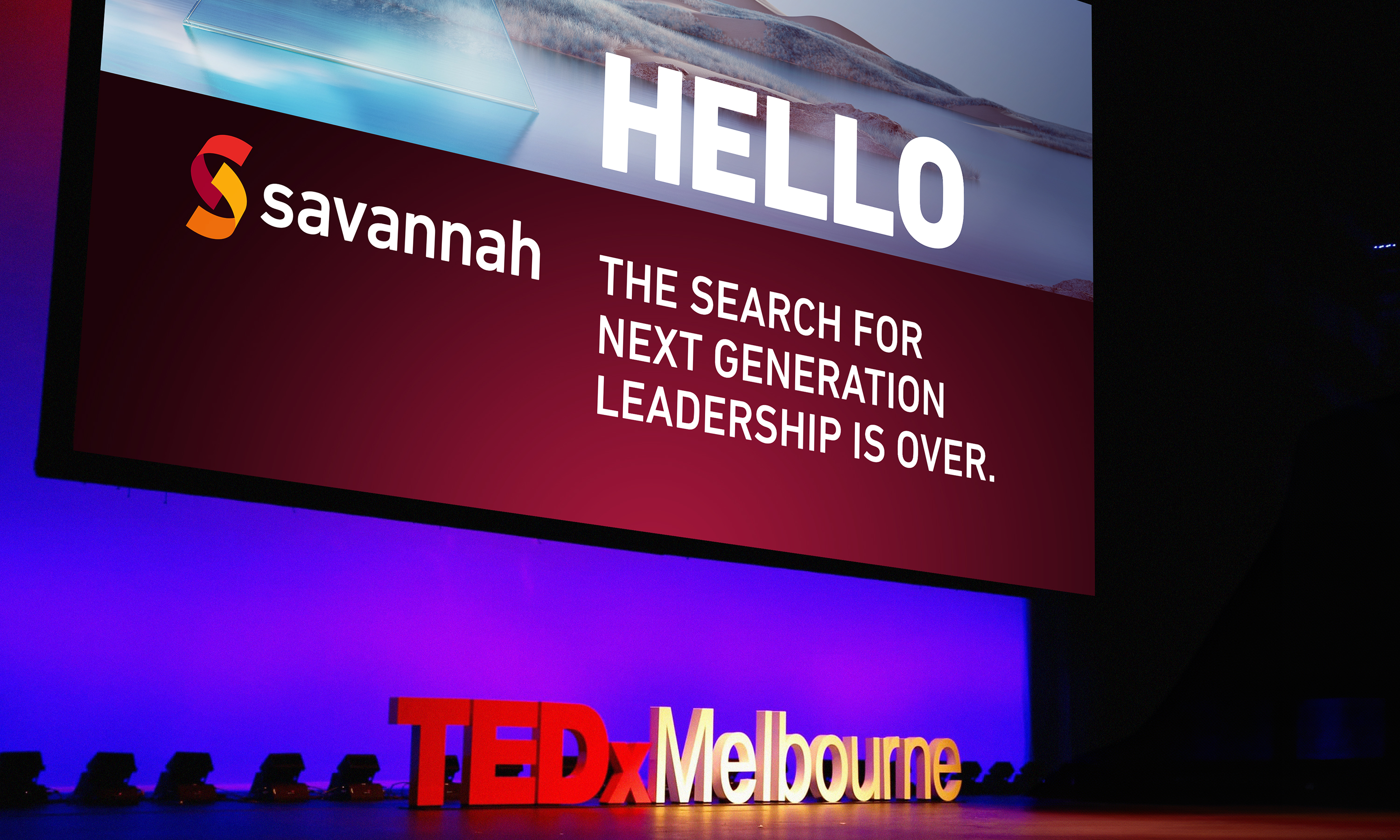
The combination of challenging messaging alongside esoteric imagery makes for a confident voice.
-
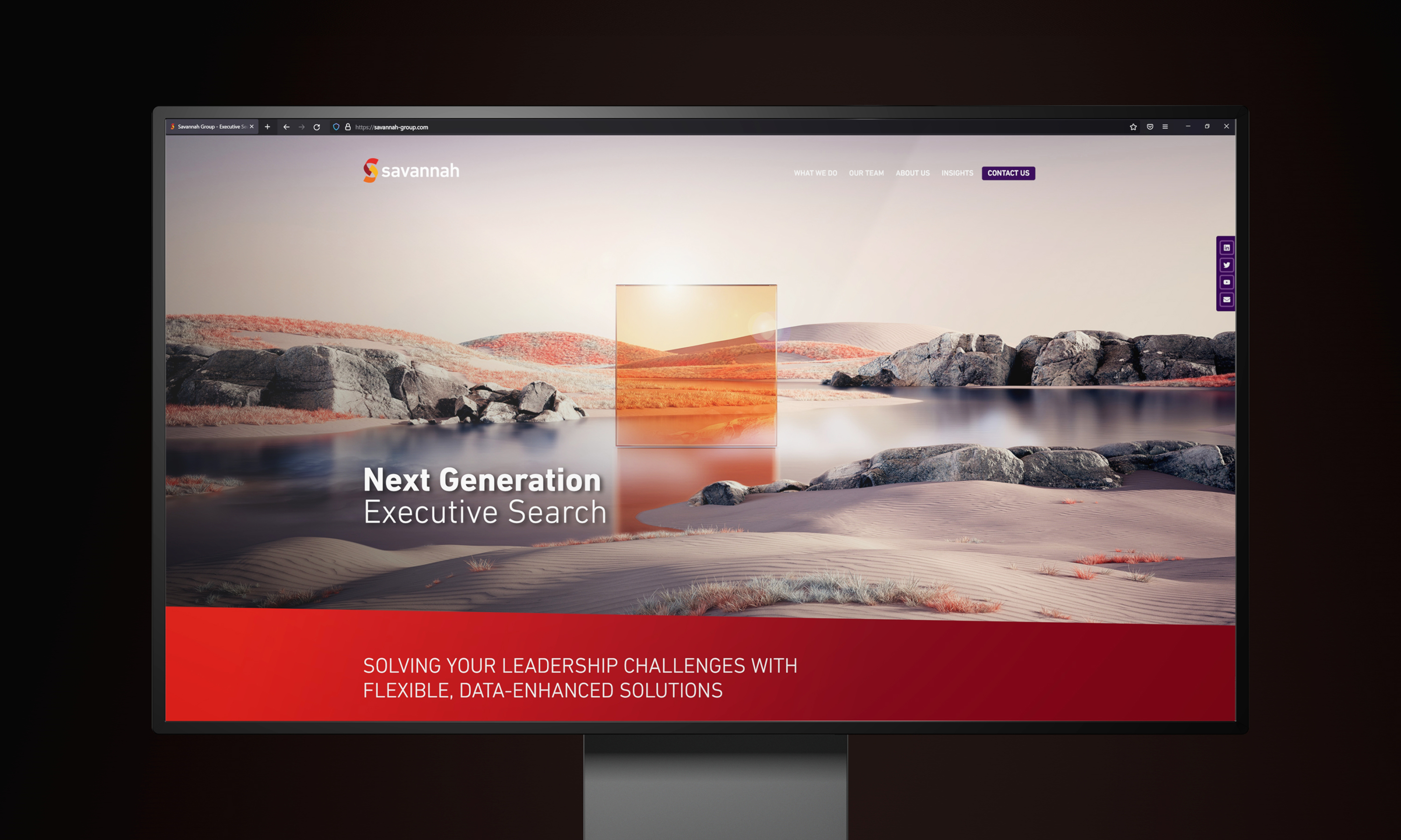
A bold and immersive image for that first impression.
-
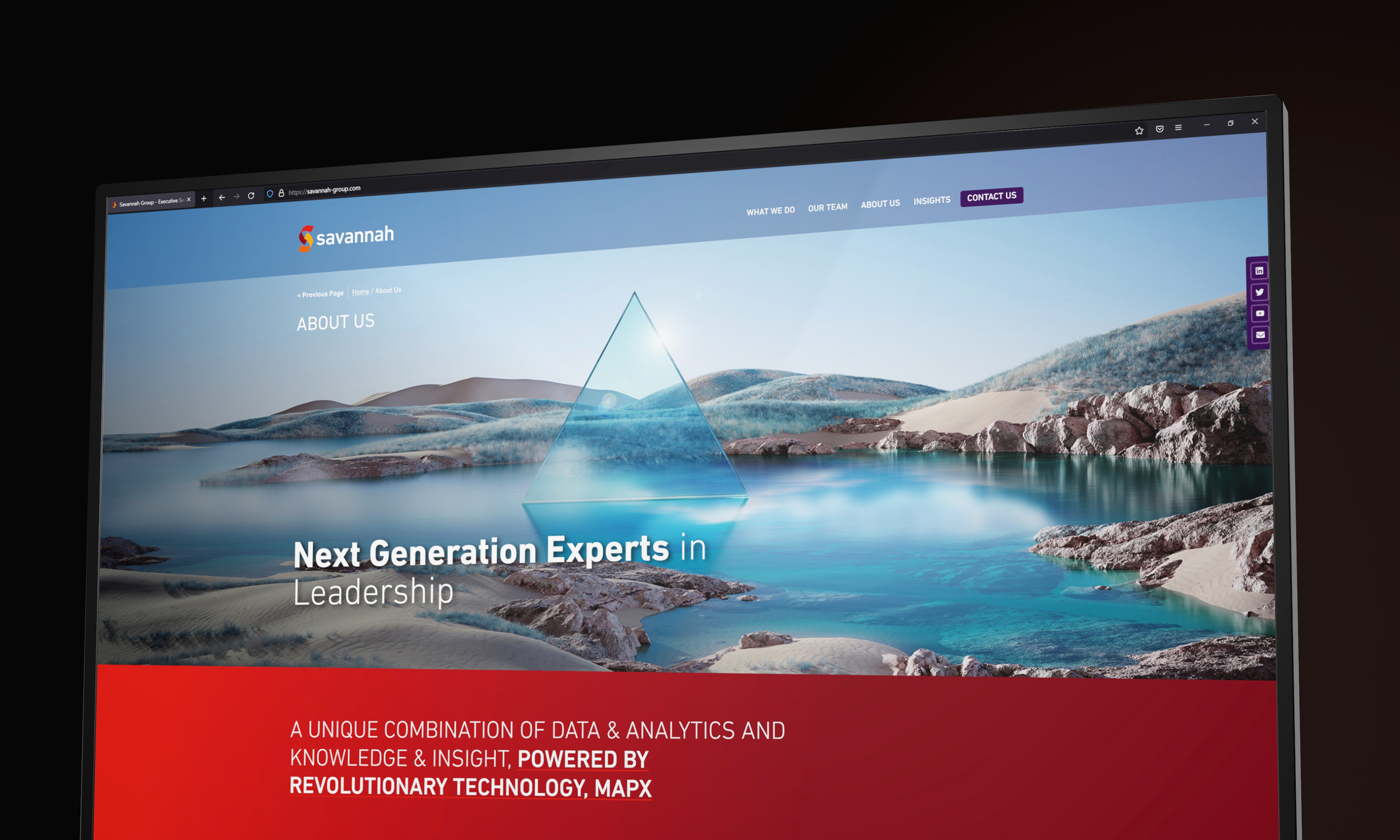
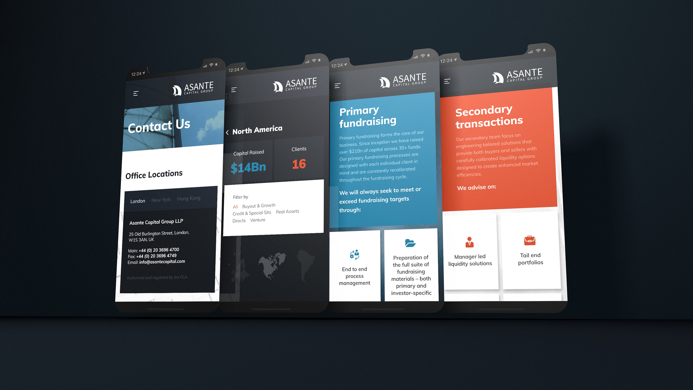
The recruitment website design extends the visual identity into the digital medium. Frames within the site design are angled to connect with the existing identity.
-
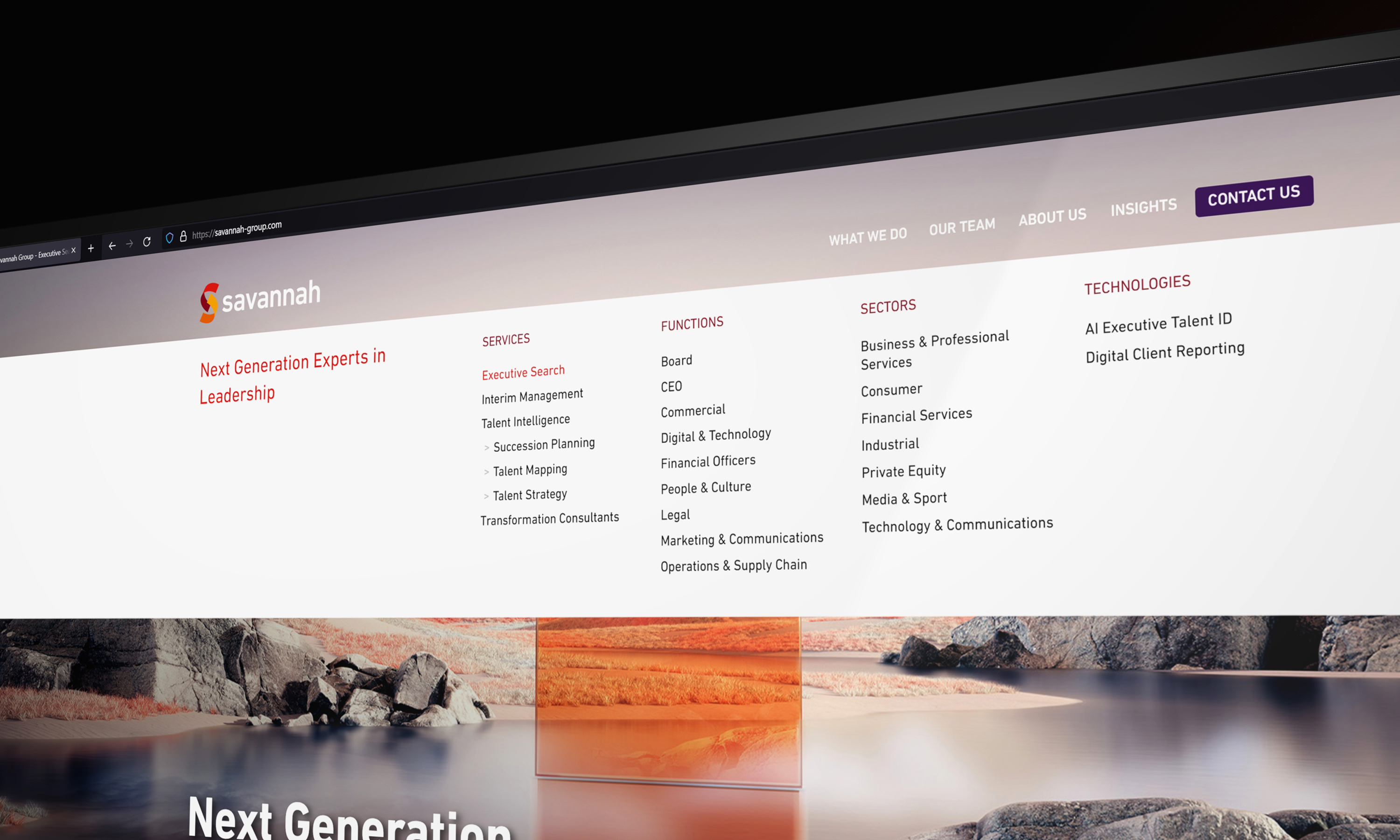
Careful structured data led by bespoke taxonomy design.
-
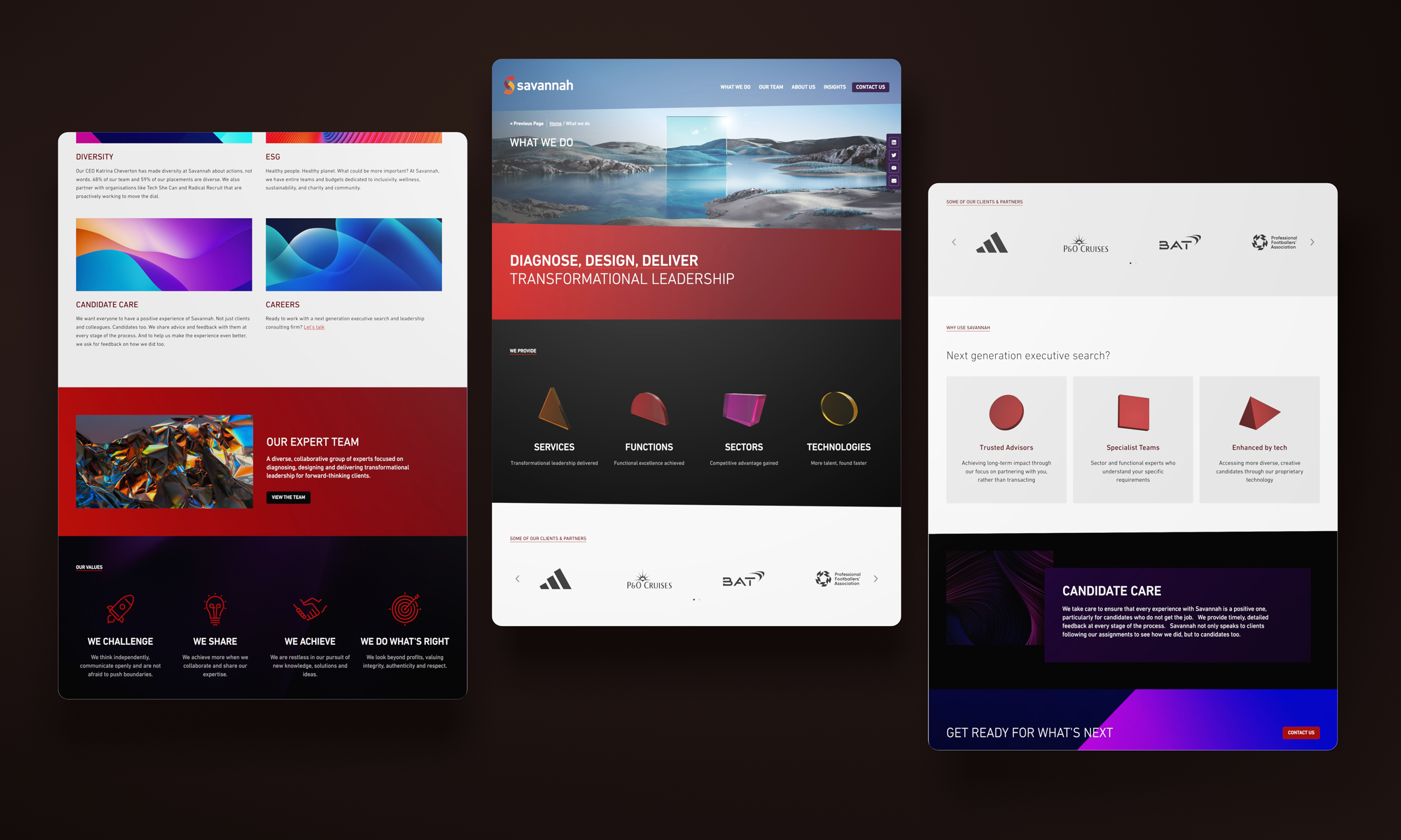
From renders to stylised stock imagery, to both three-dimensional and two-dimensional icon design - The design is filled with interest.
-
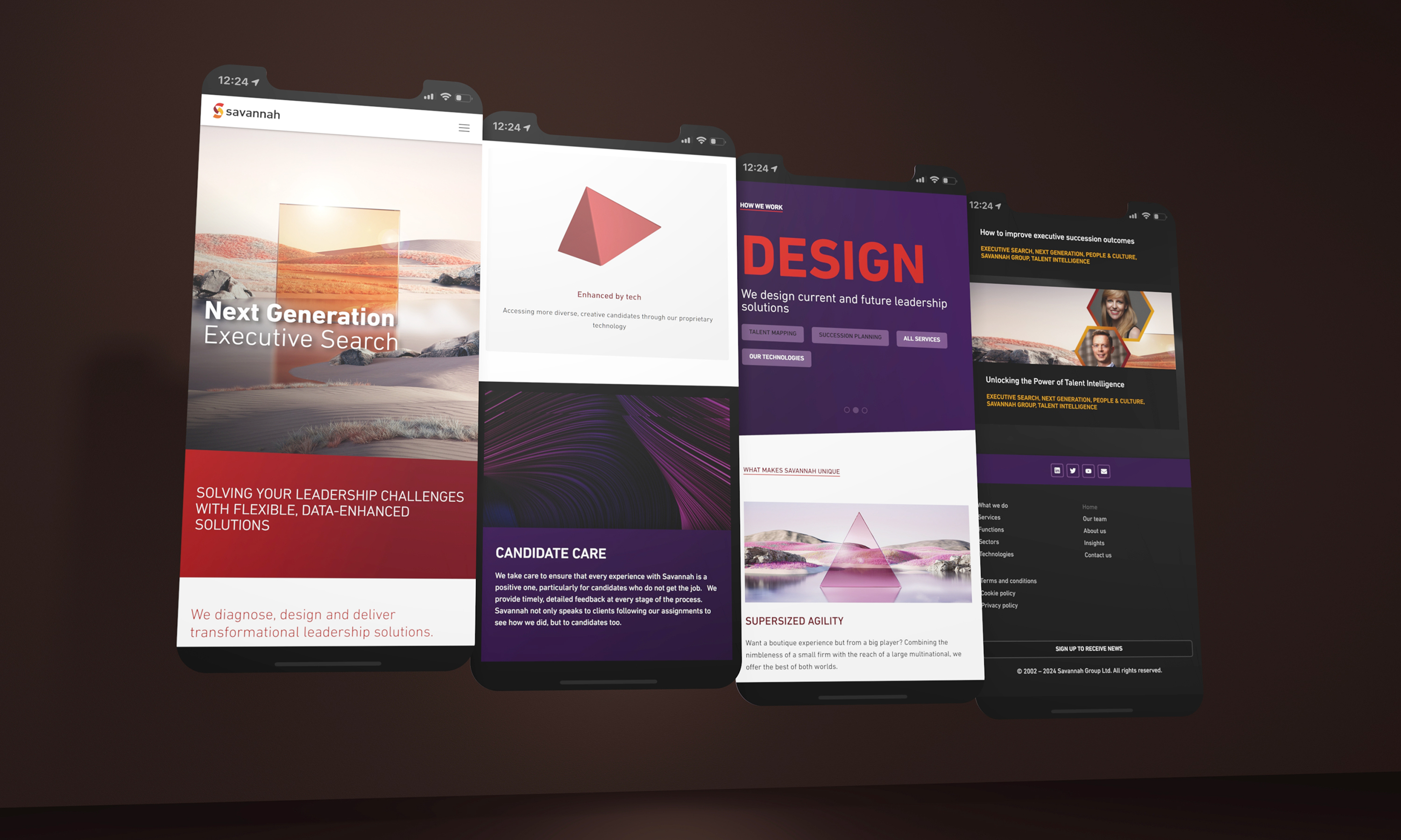
An extensive prototype design sprint to cover all devices and formats.
-
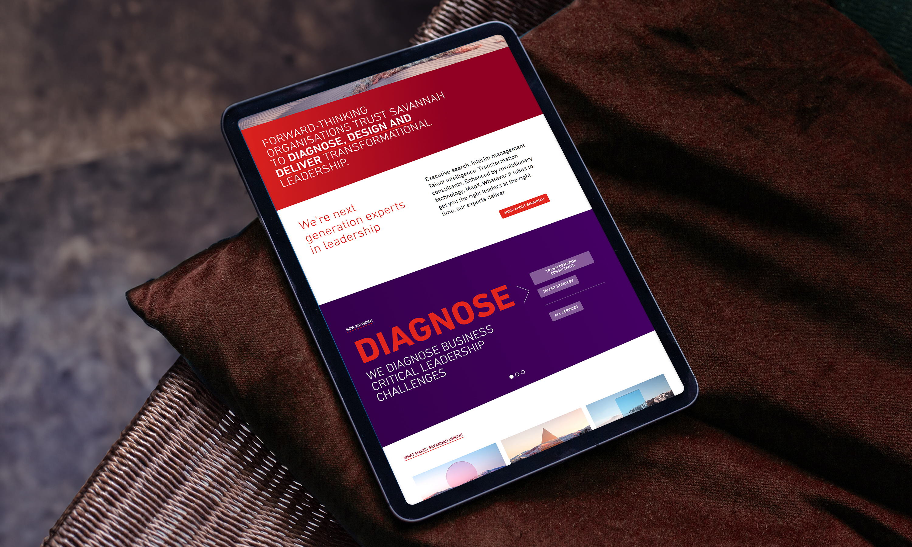
Confident use of colours and backgrounds help break up content reducing screen fatigue.
-
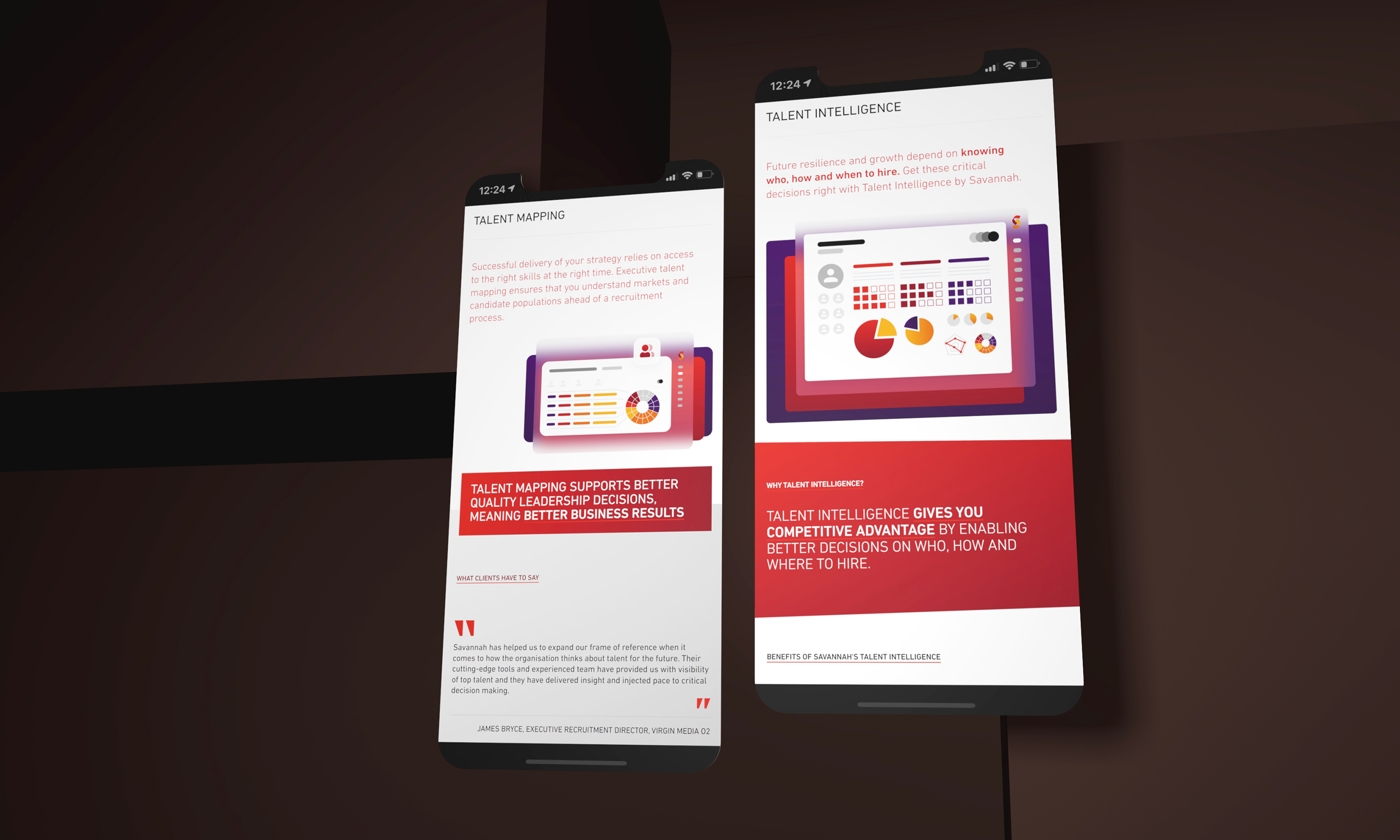
We have assisted the client in extending out the site around specific campaign and product activities. This example shows Savannah's Talent Intelligence offering.
-
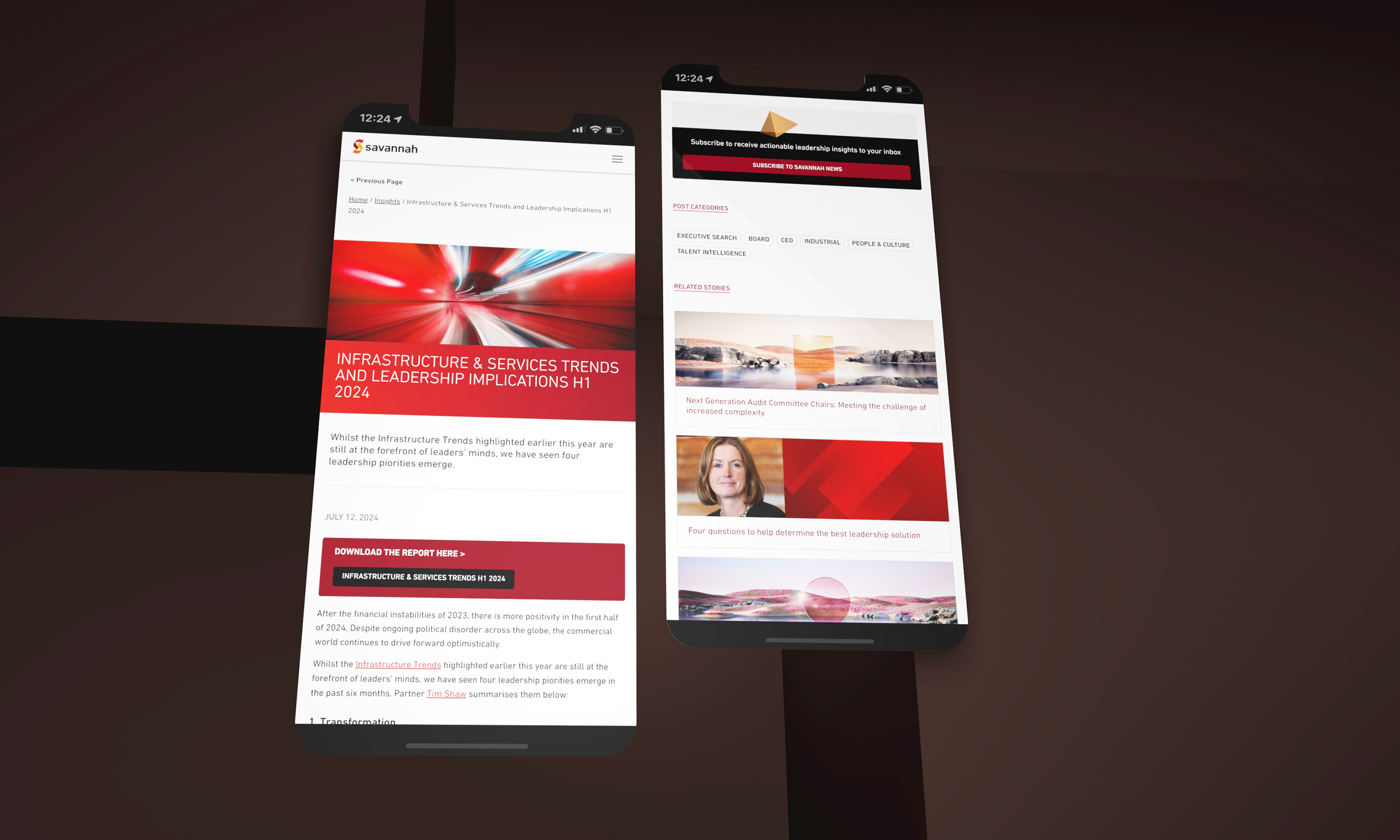
The insights section of the site is extensive and constantly refreshed. We paid careful consideration for users reading information in our process of designing WP Post formats.
-
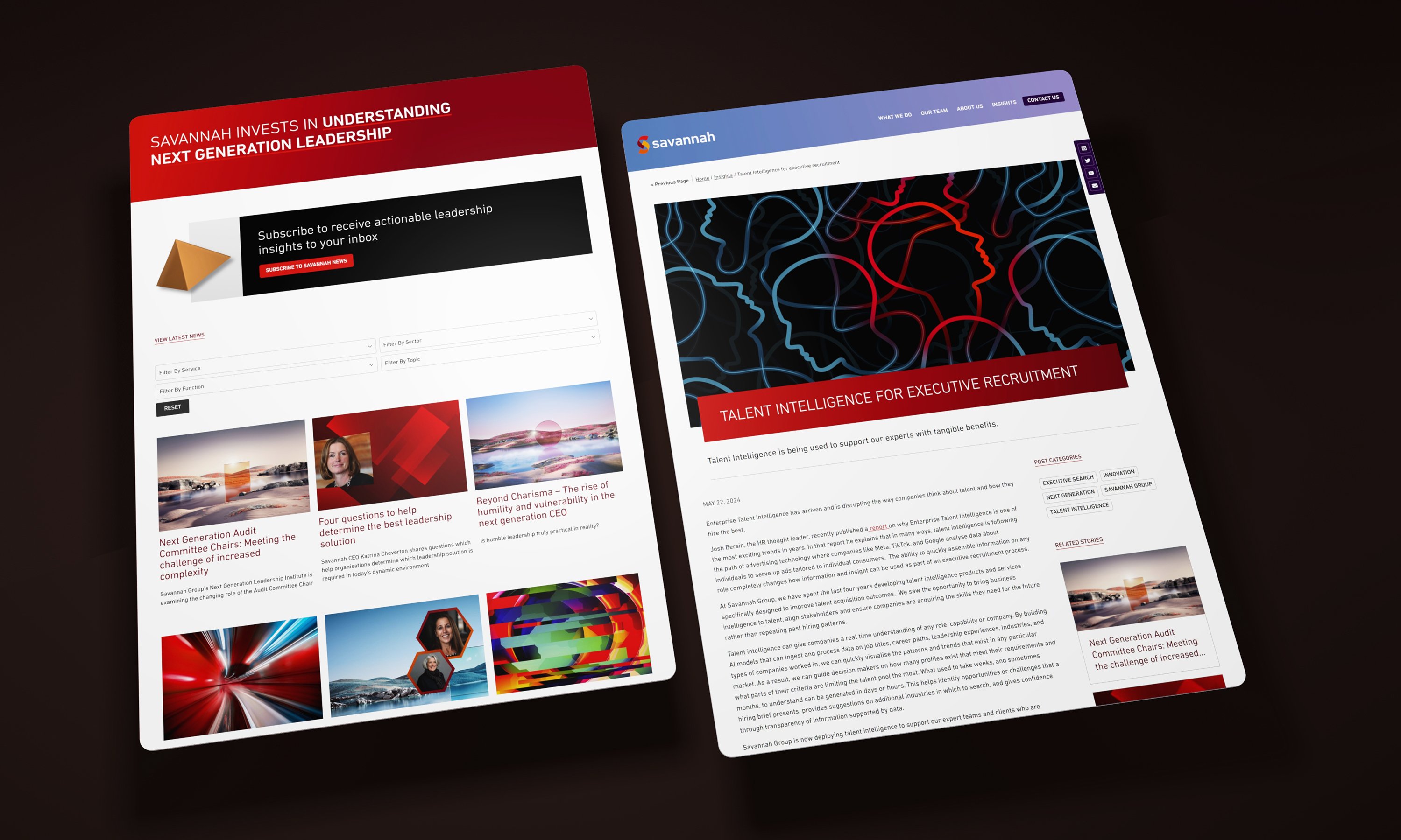
The insights section of the site is used to raise perceptions of capability as well as provide opportunities for natural search optimisation.
-
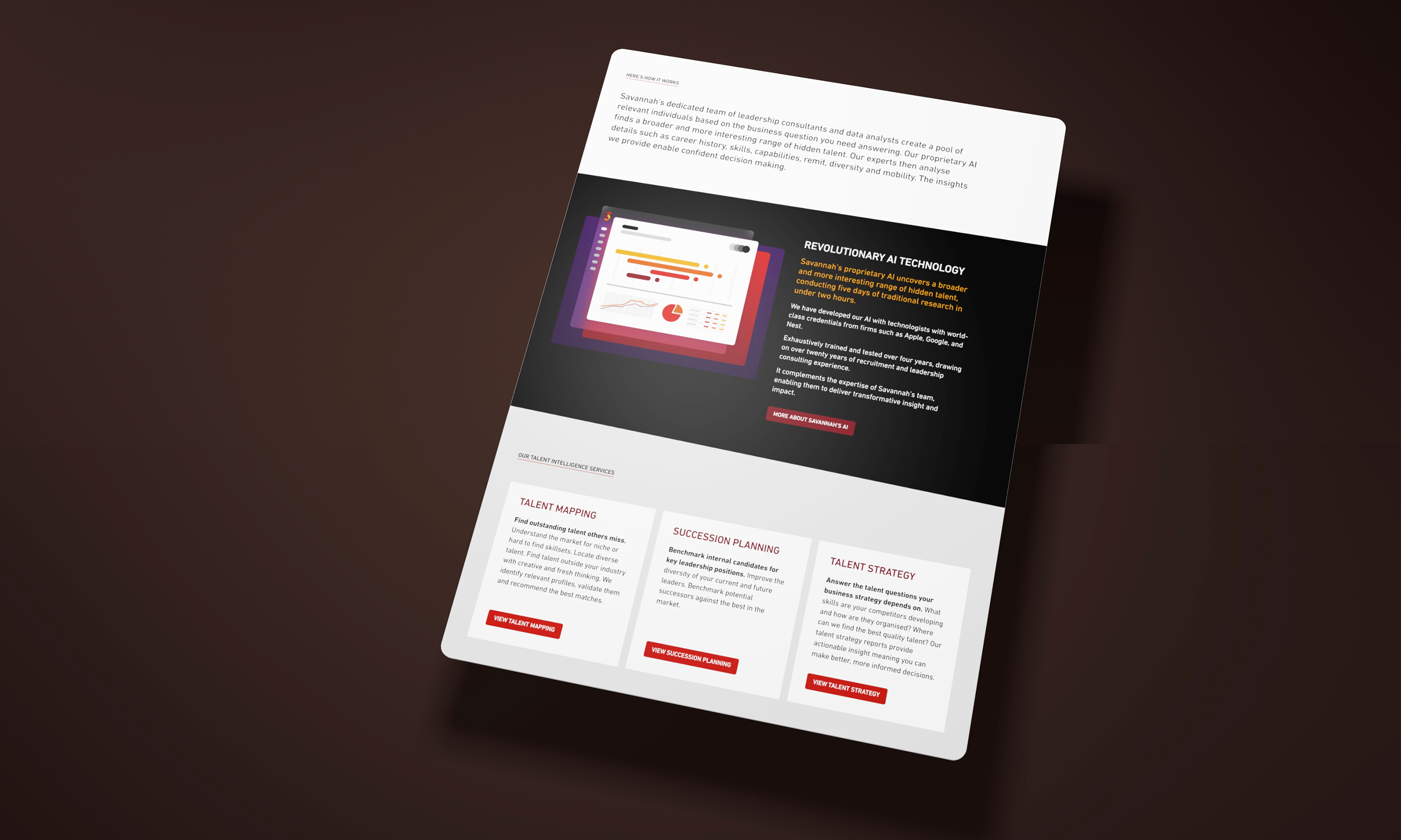
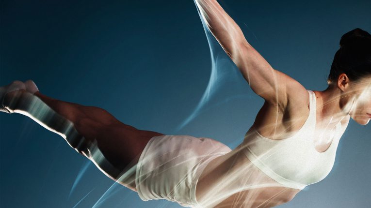
Technology propositions are conveyed with abstracted visuals which do a more marketing led job of communicating value than the software screens themselves.
-
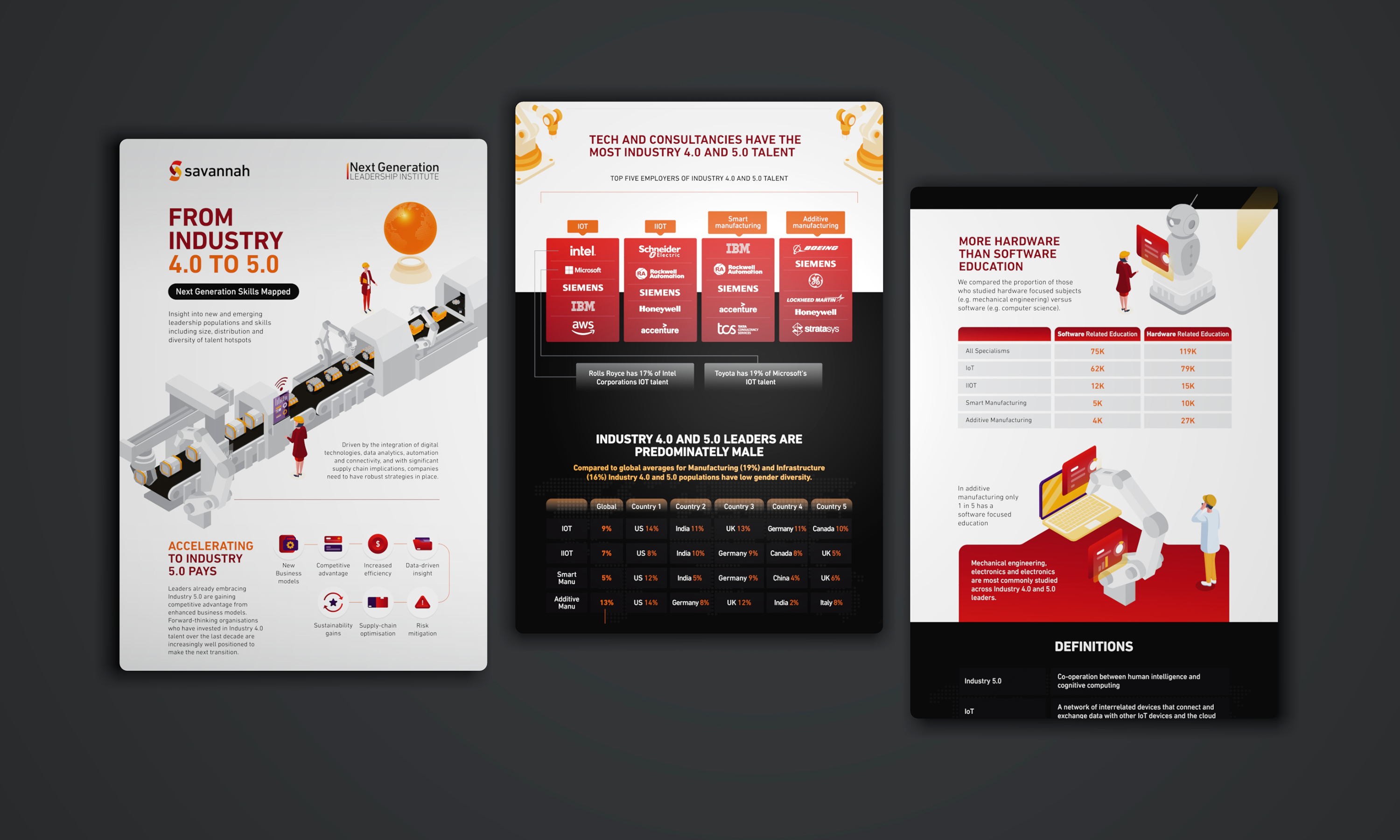
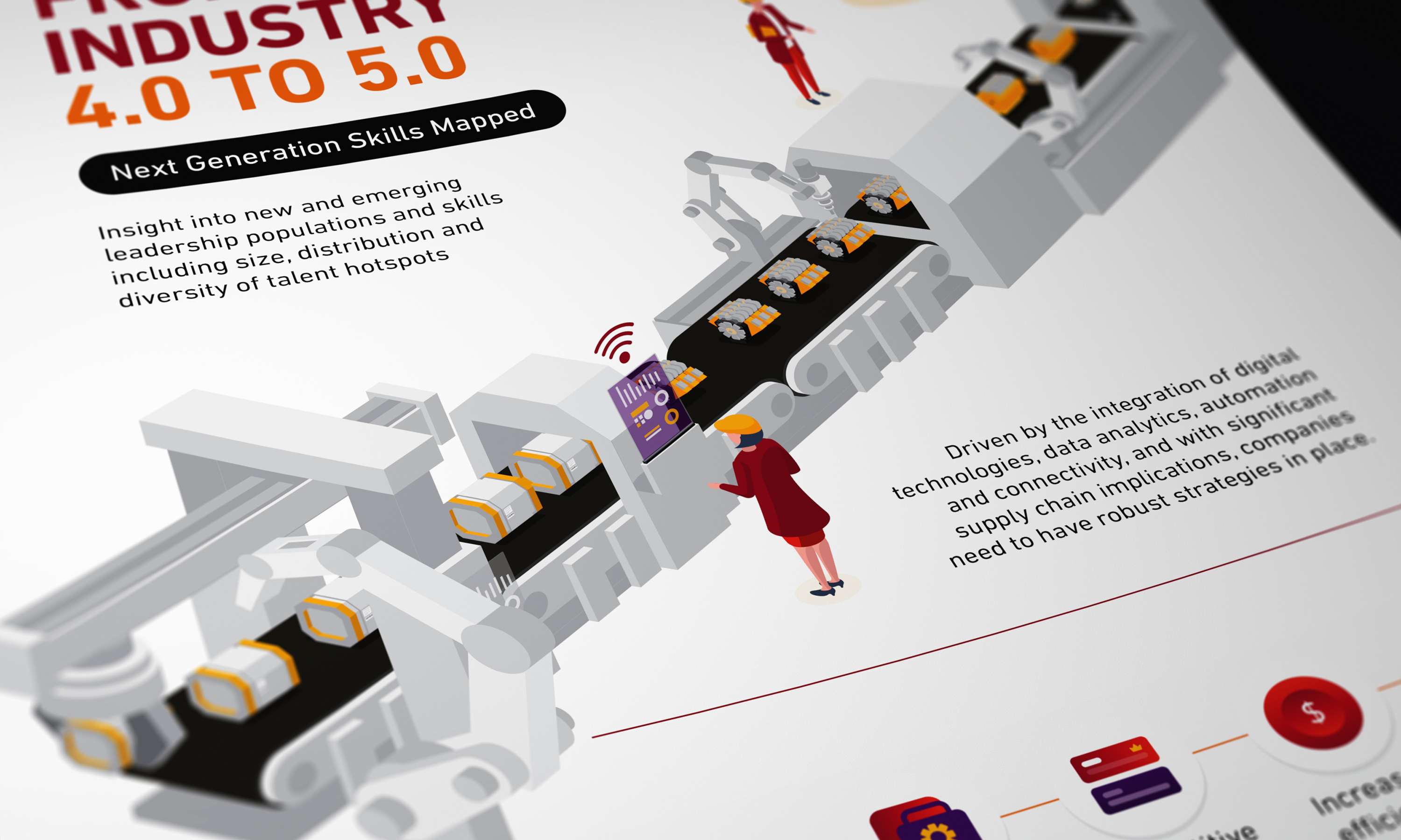
The site is supported by dedicated campaign microsites and landing pages. In this example, the Next Generation proposition is supported by a campaign on emerging roles.
-
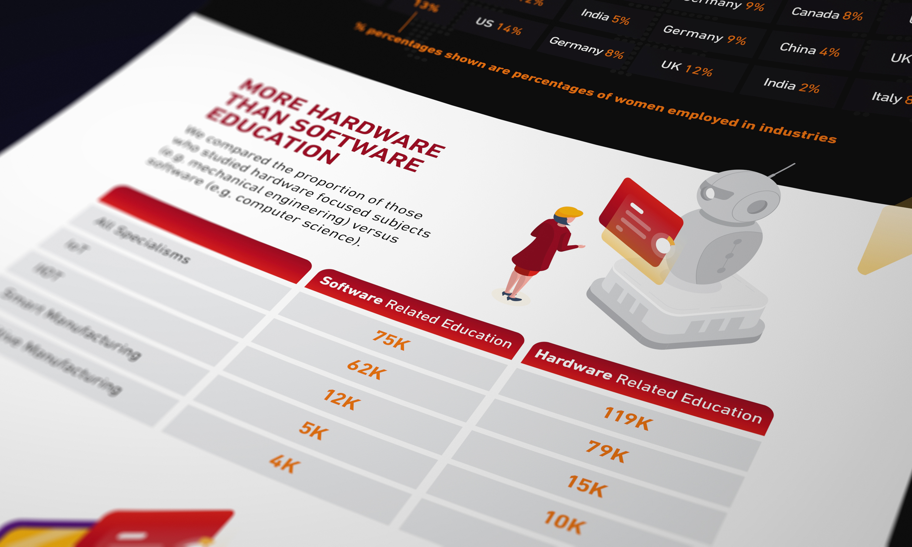
Using infographics and data sets to create interesting factual led reading.
-
Using rich graphics to engage with readers, potential clients and candidates.
-
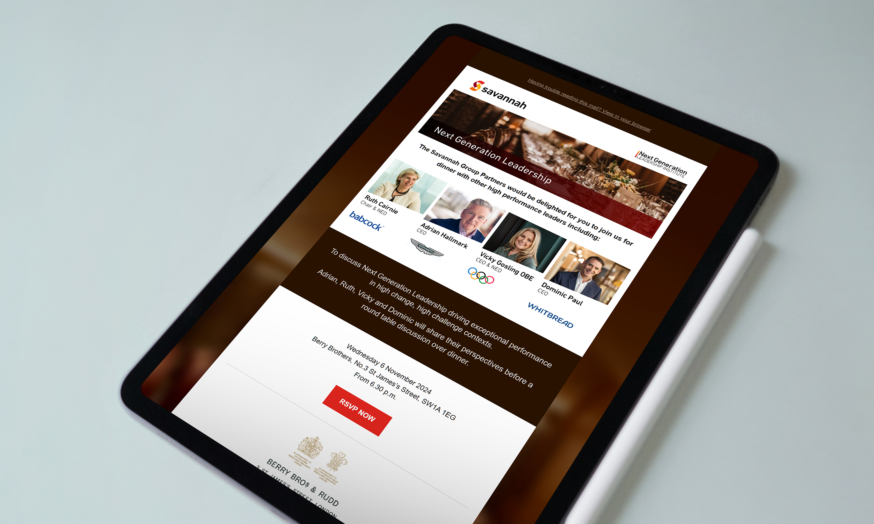
The creation of Mailchimp assets within Canva helped Savannah Marketing staff create content for the new Mailchimp email builder platform.
-
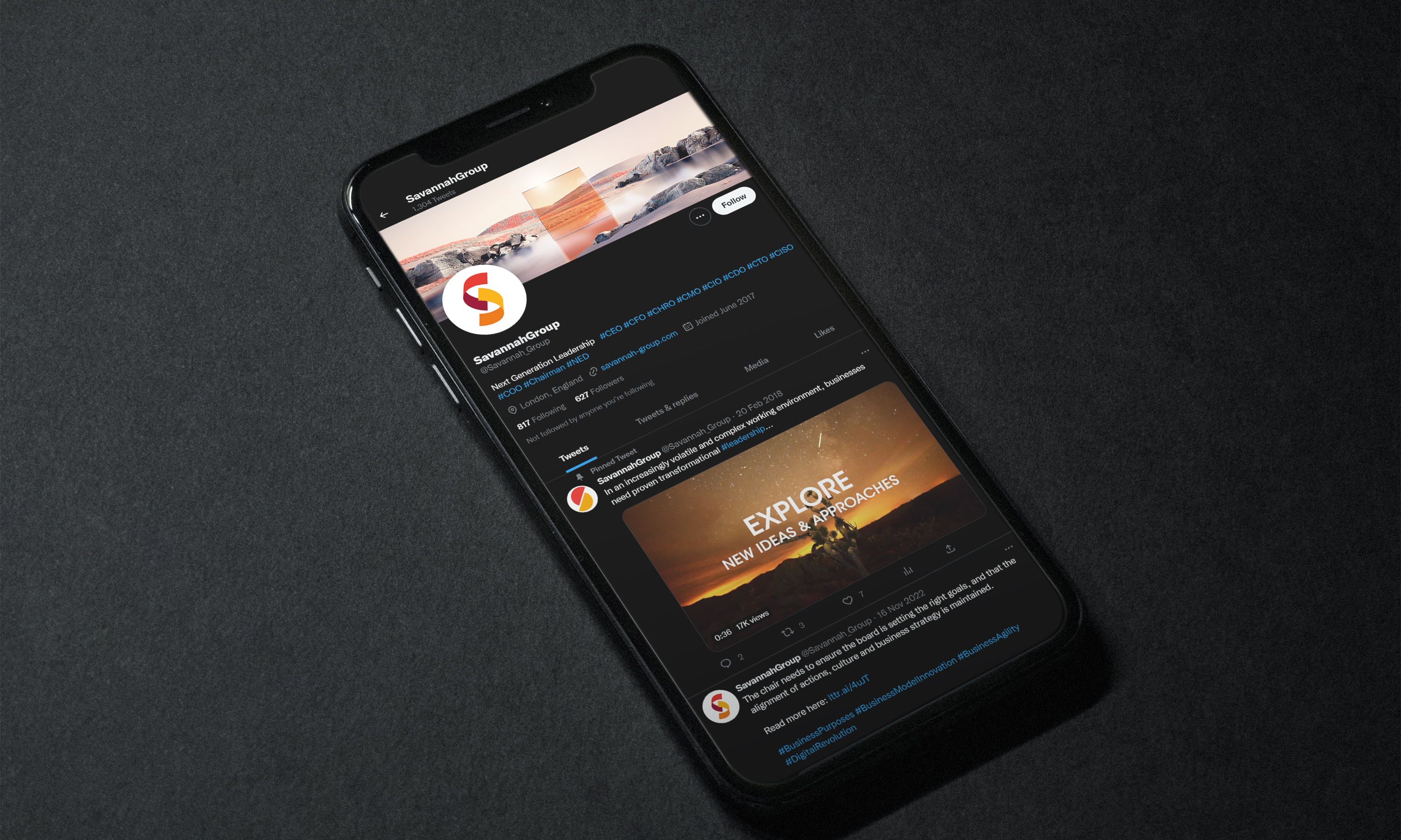
The combination of strong symbol and engaging imagery helps create a powerful online persona.
-
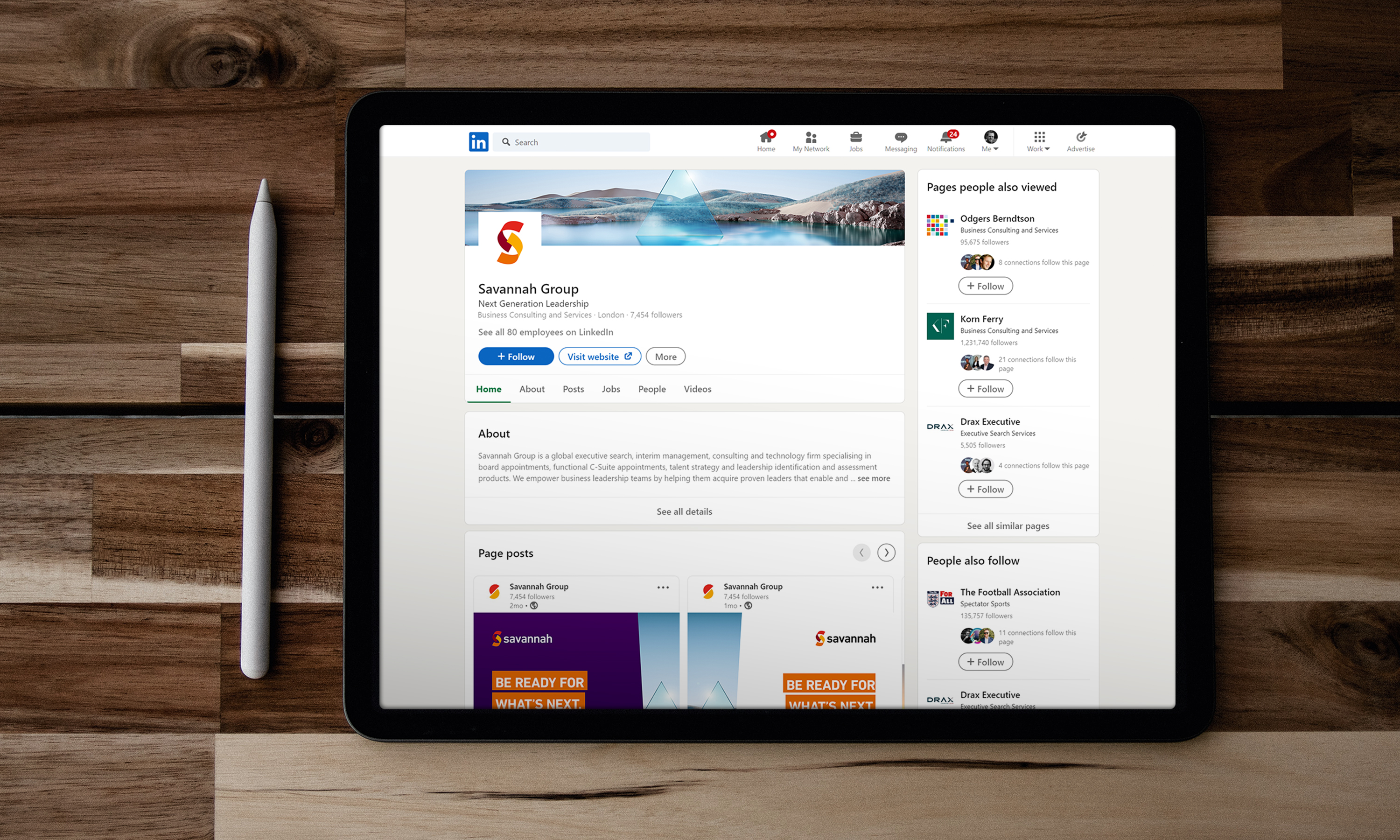
We created skins and post templates for all of Savannah's channels.
-
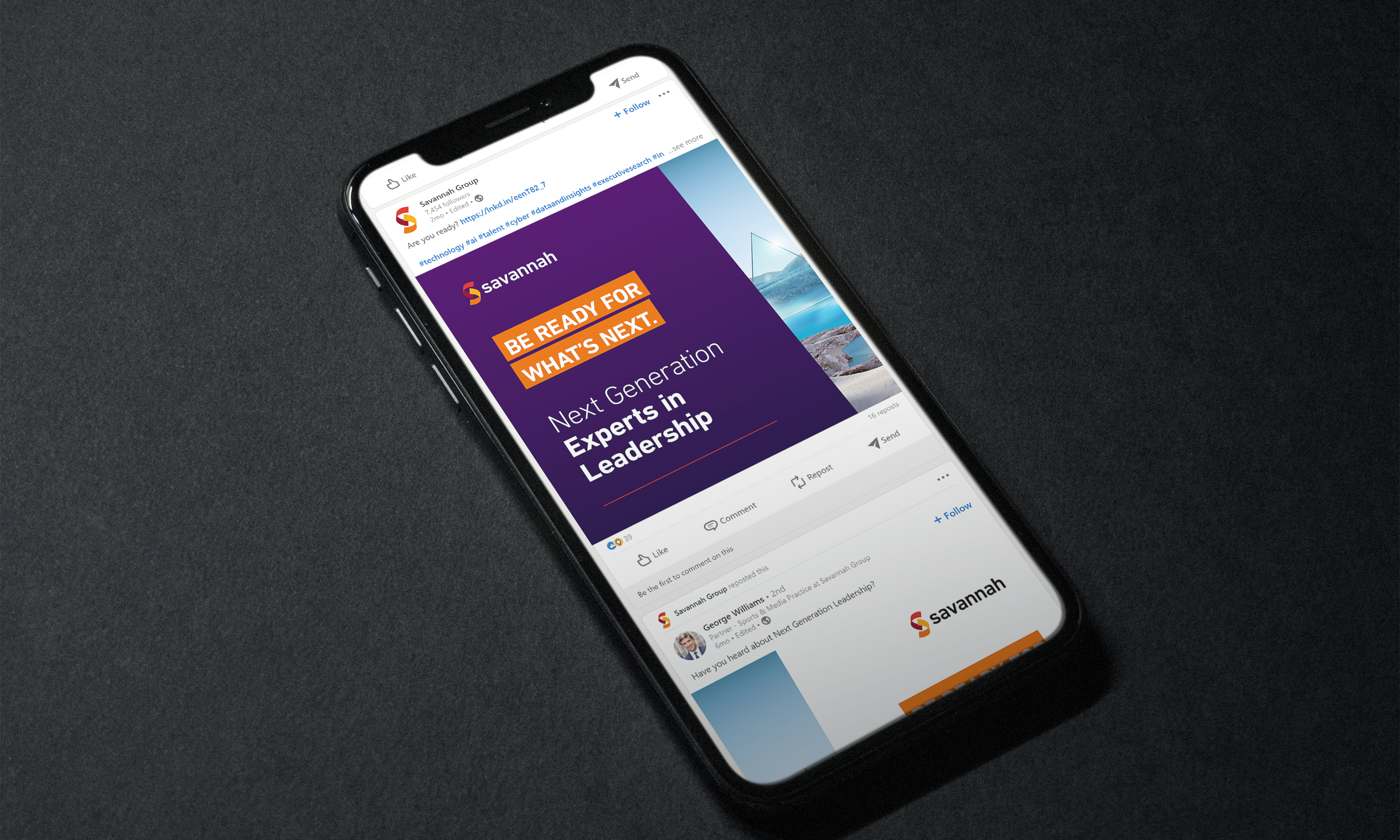
Post graphic templates created in Canva enable the client to create striking posts with relative ease.
-
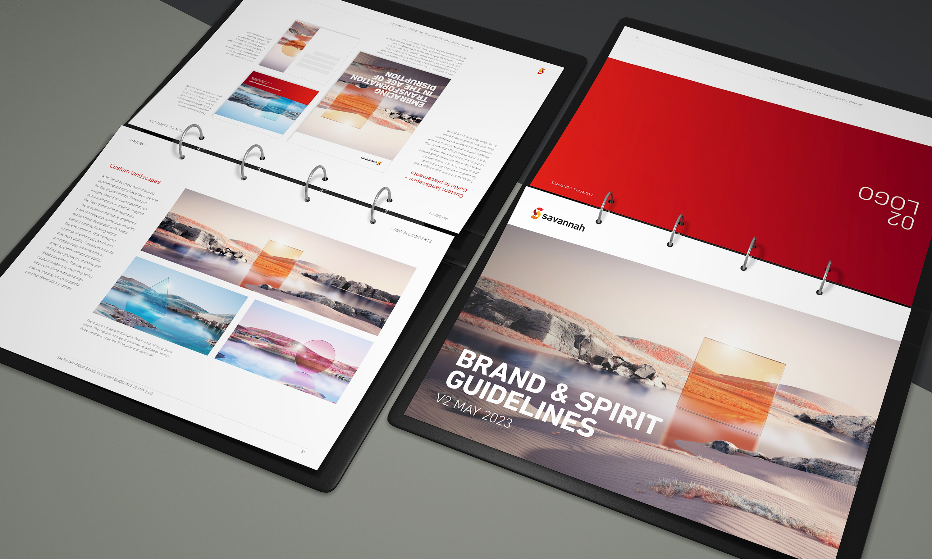
The total visual identity is well documented through an extensive brand guideline kit.
-
Strong identities are created using a combination of harmonious design assets. By documenting these actions accurately, it becomes far easier to brief and instruct designers working on the brand identity.
-
We break down the visual identity design process into a series of steps so that its consistency is ensured.