-
-
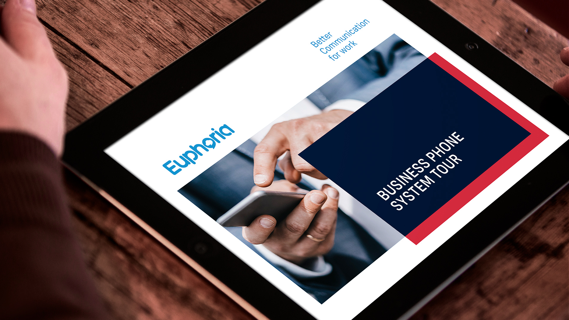
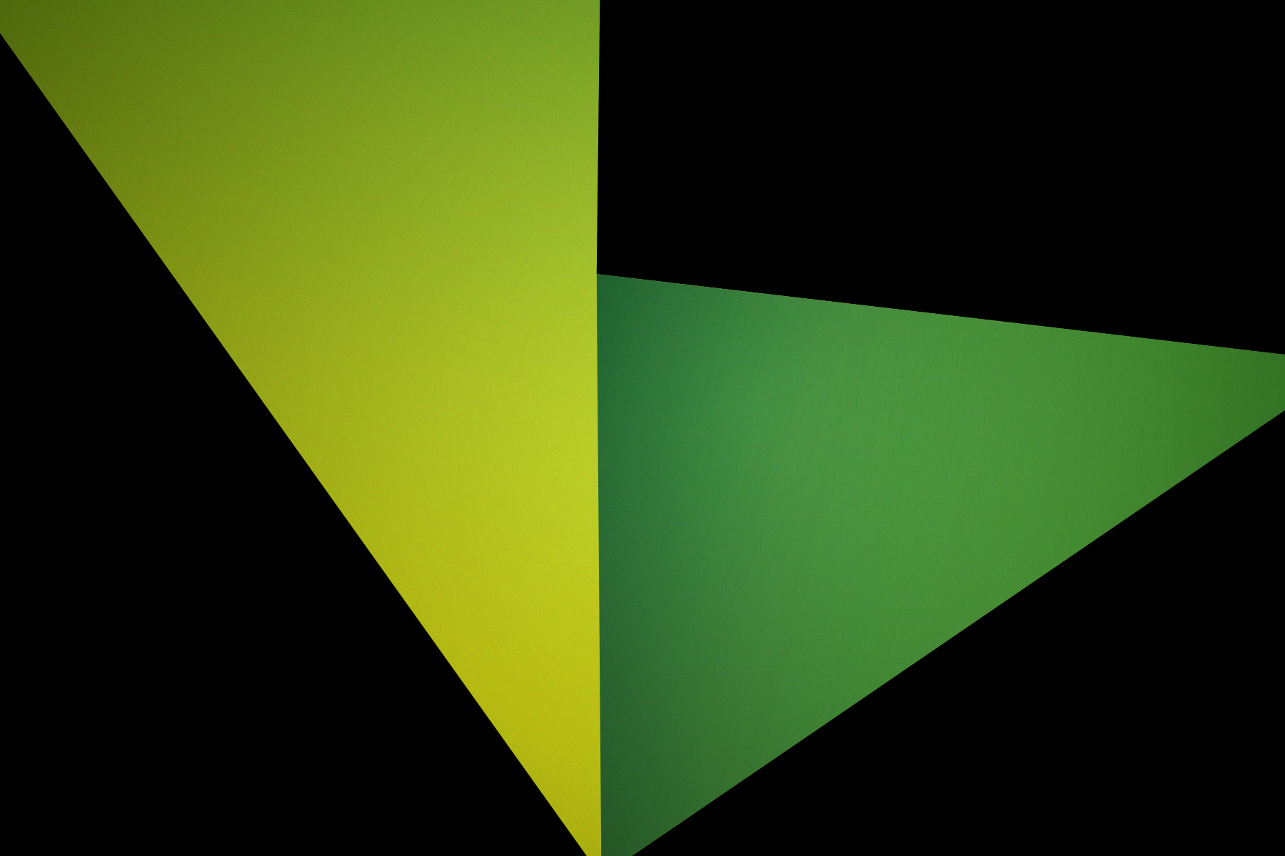
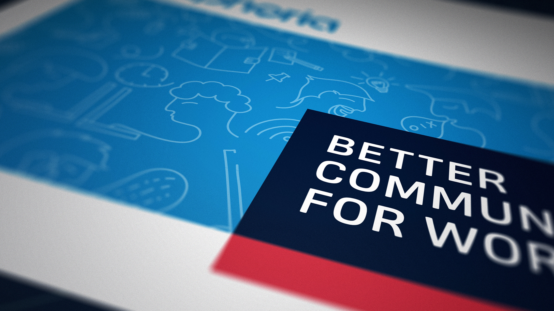
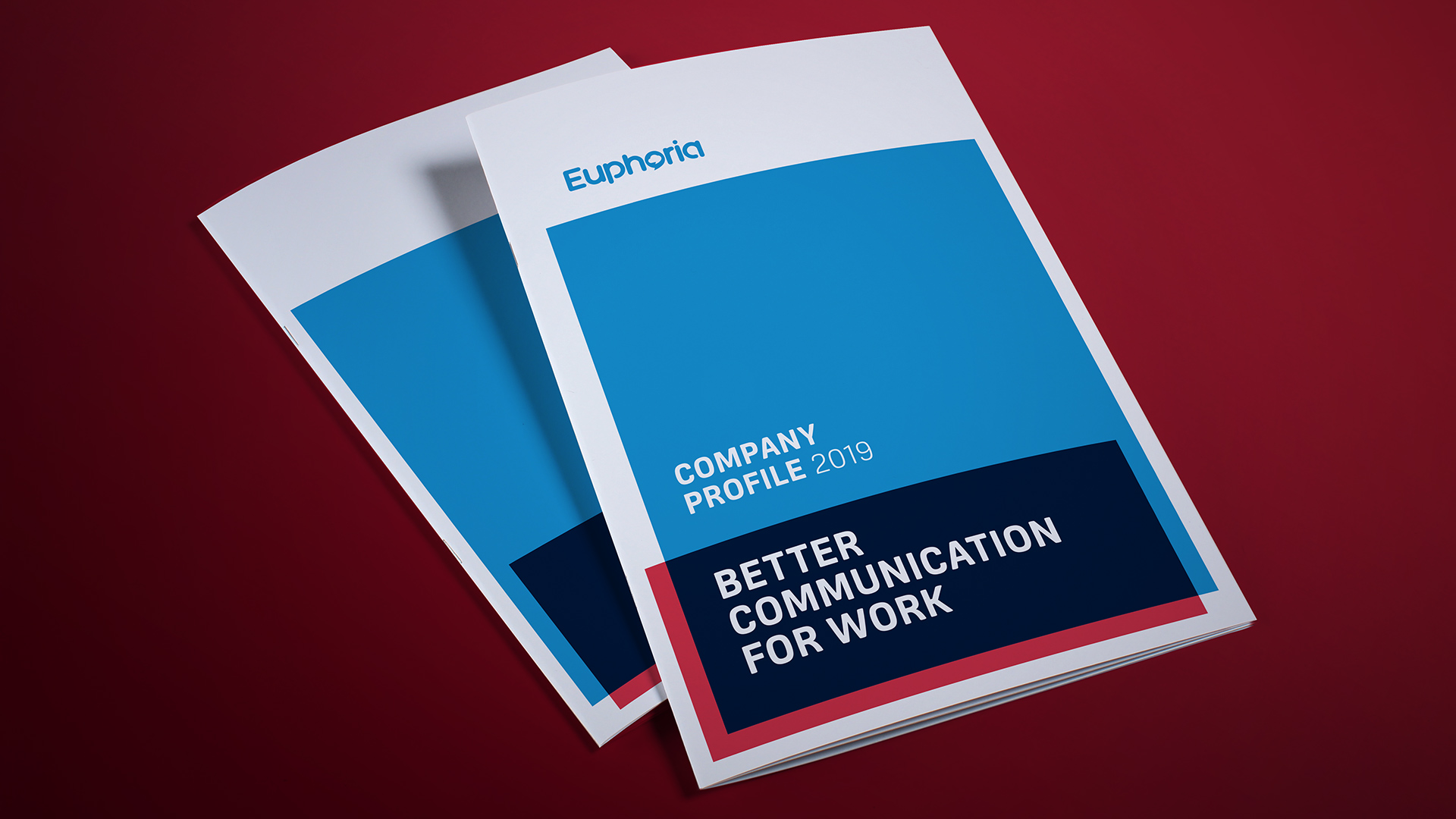
The visual identity system uses a simple overlapping rectangular device in the primary brand colours.
-
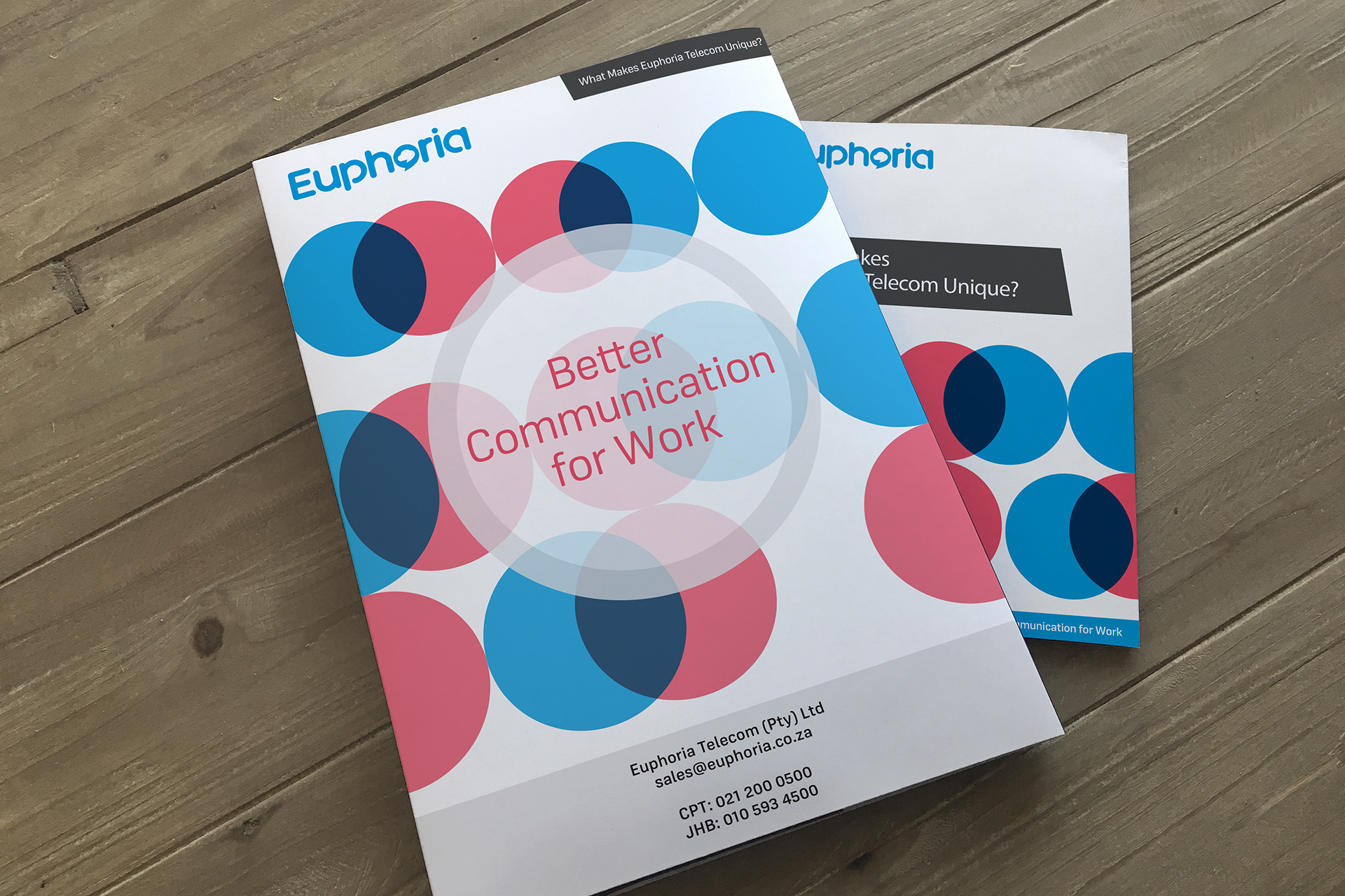
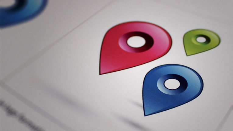
The previous brand identity for Euphoria consisted of a weak system made up of generic circular devices.
-
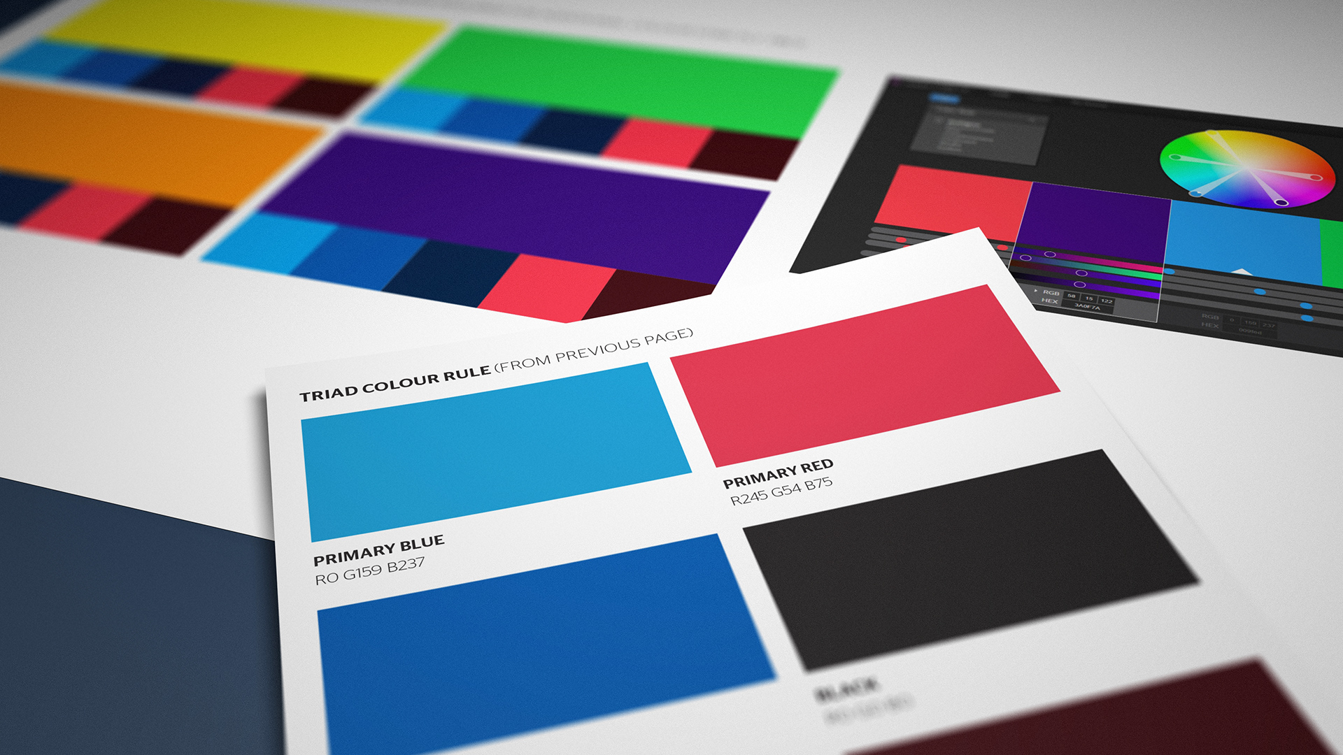
The first step became ramping up the colour contrast to improve both impact and harmony.
-
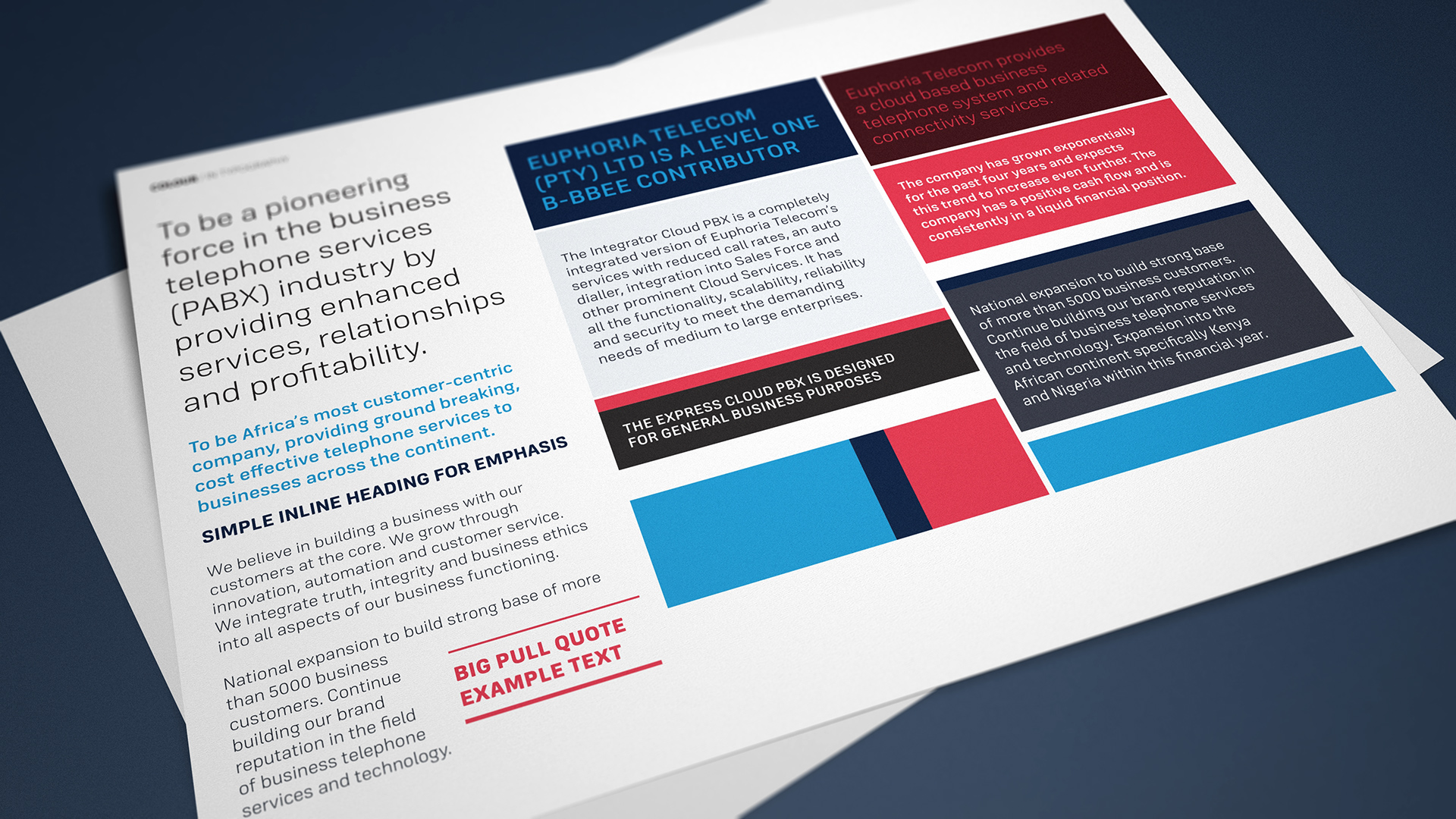
We created simple rules with colour balance and typographic styling.
-
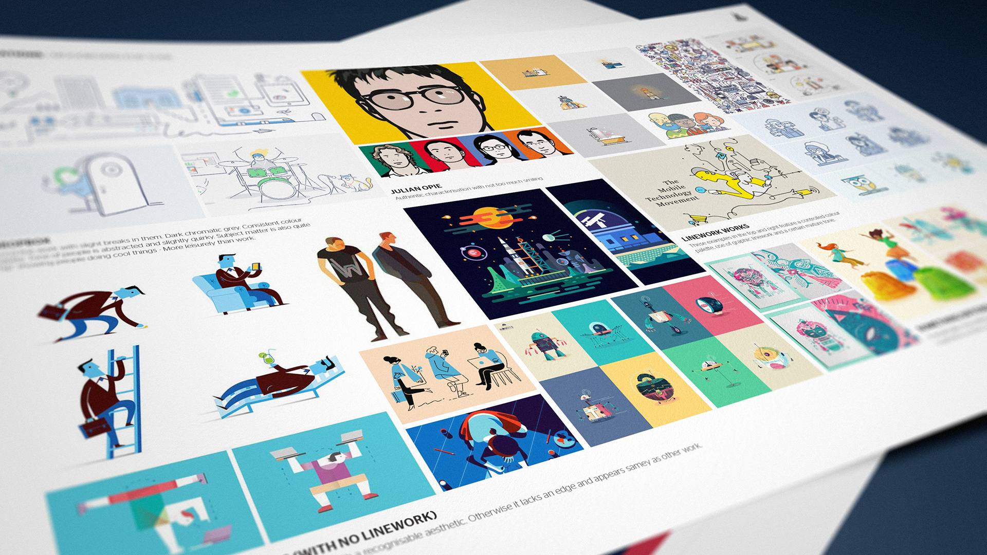
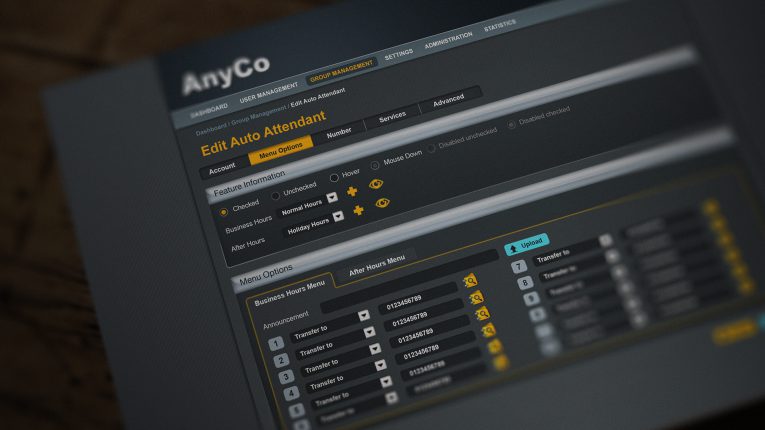
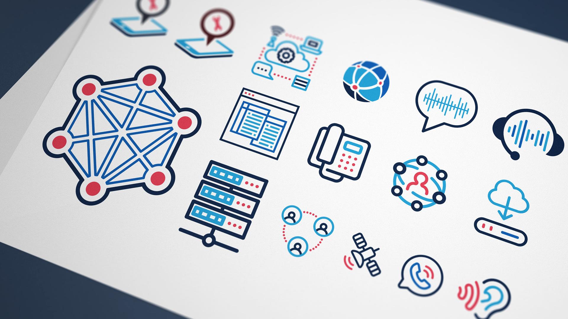
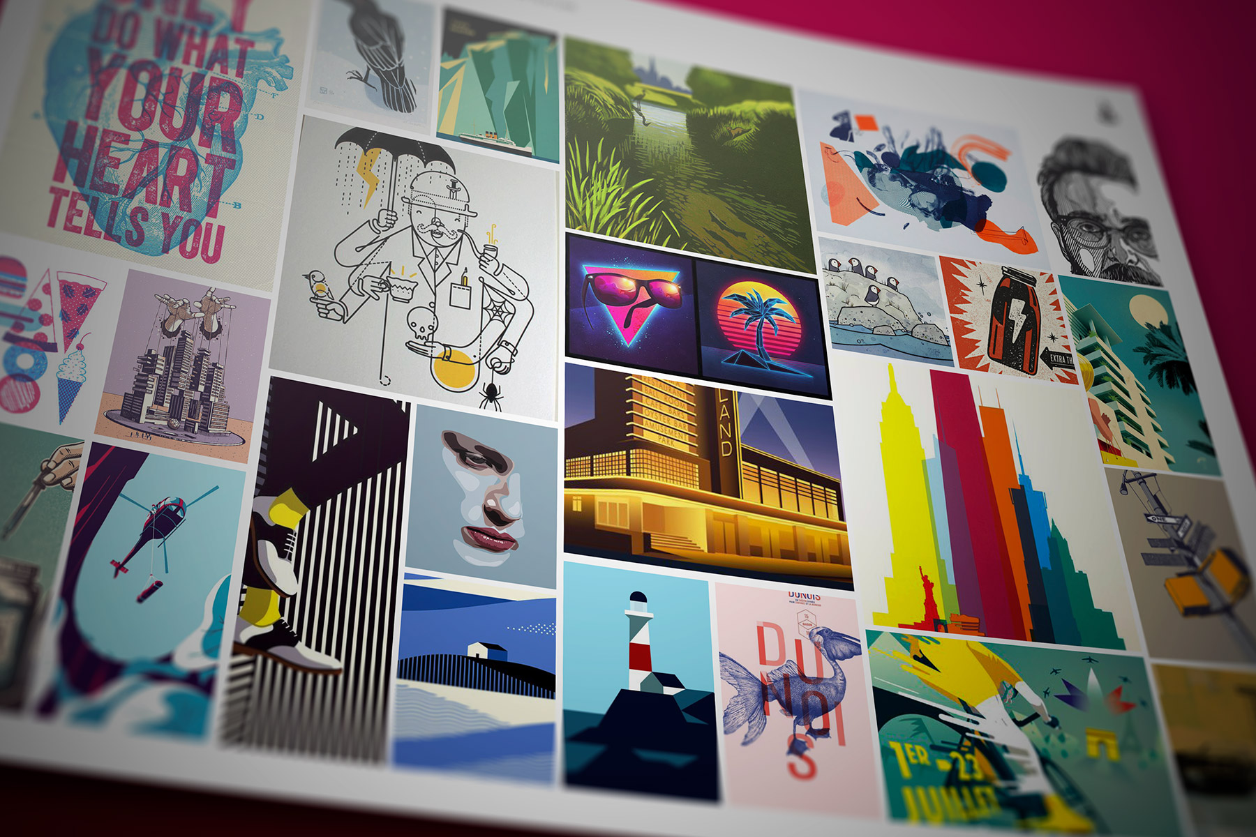
We provided guidance to the internal design team on how to undertake software storytelling using simple illustrations with a balanced colour palette.
-
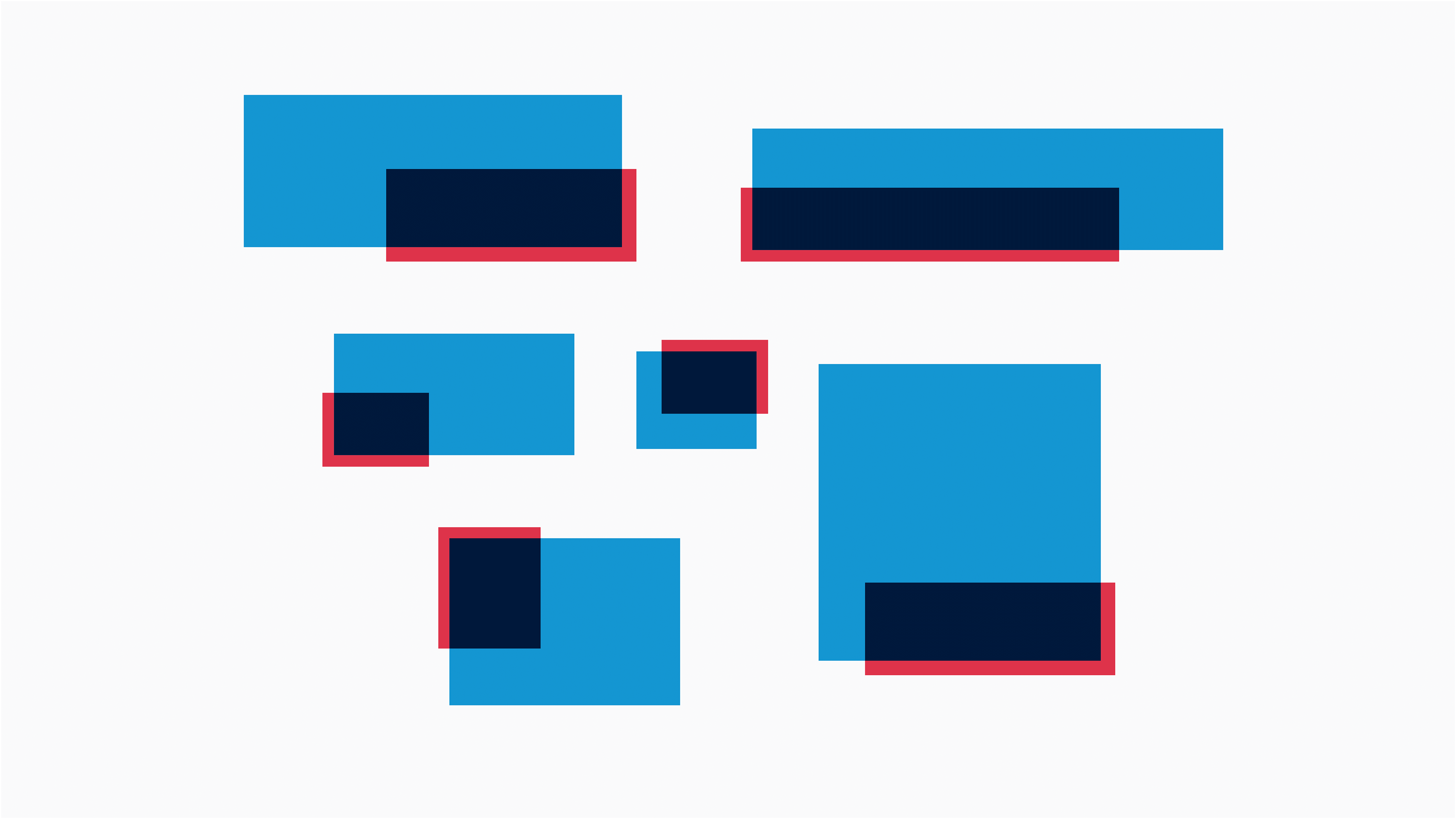
The colour palette is based on a palette which pays homage to blending modes (multiply in particular) and old 3D Analglyhs.
-
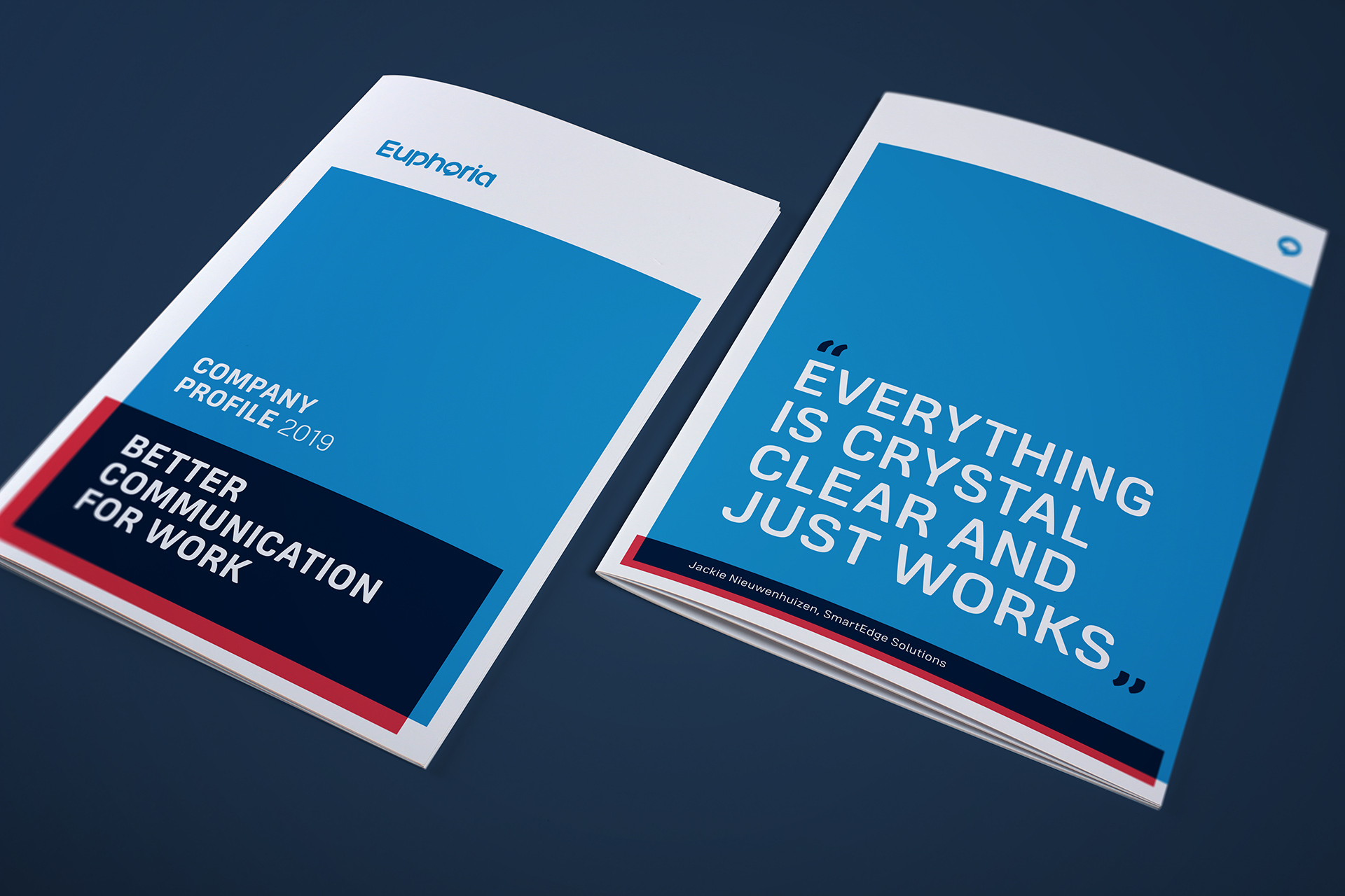
The combination of consistent type styling, colour usage and graphic system creates an instantly recognisable brand.
-
The brand uses red as contrast of extension. This allows for pop and an arresting offset to the blue palette.
-

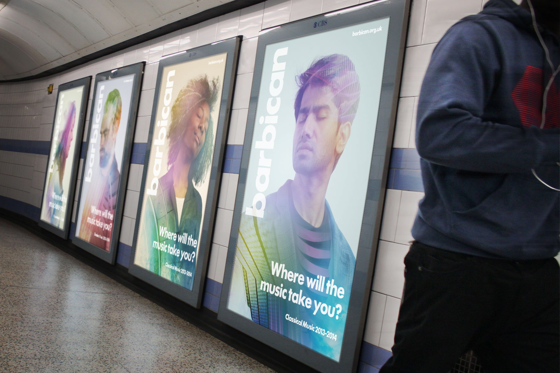
The ident applies especially well in the digital environment when often there are space constraints as well as infinitely variable formats.
-
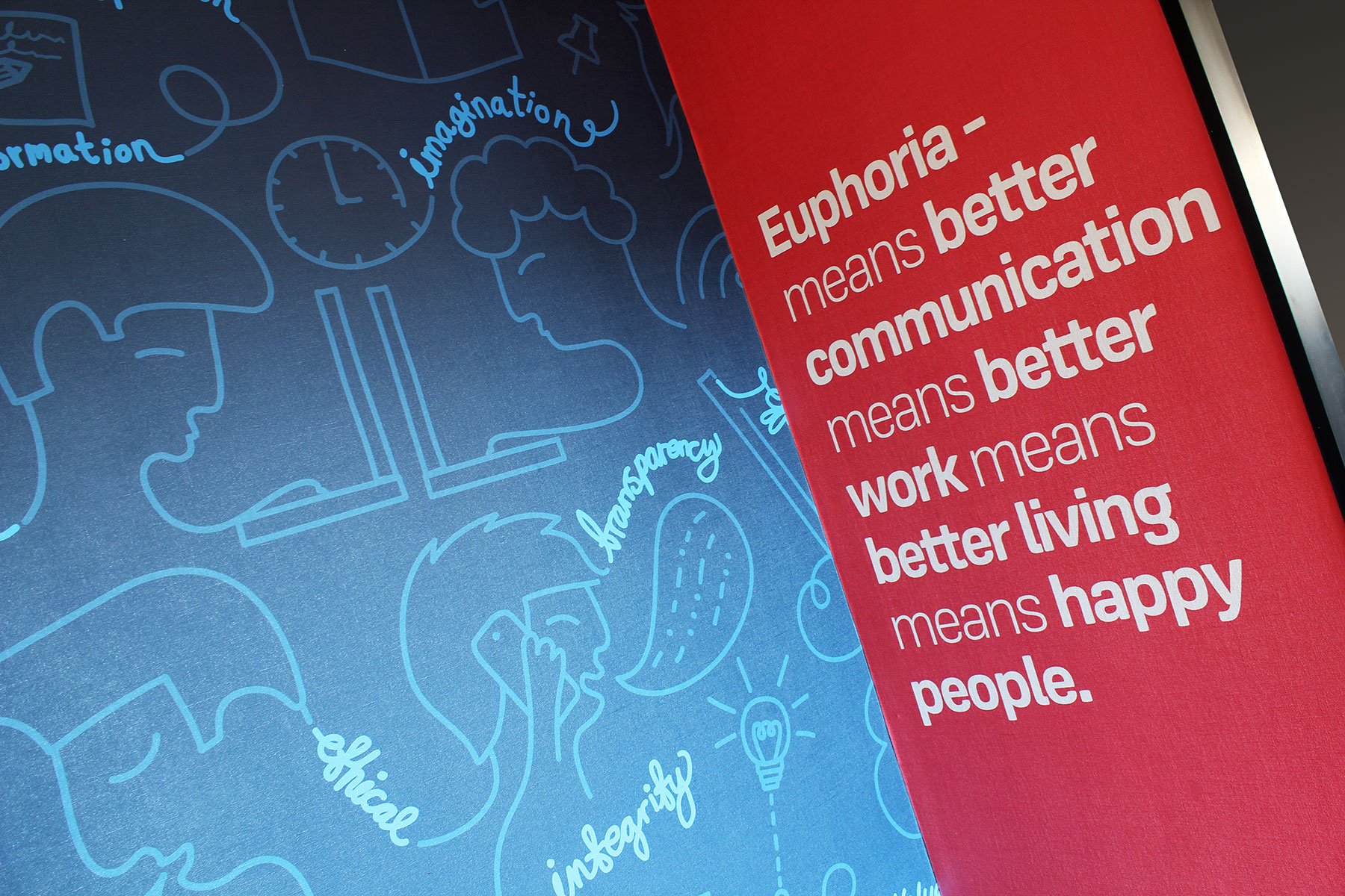
We created moodboard imagery and illustrated how the colour palette could be used. This was applied in handover to internal design teams.
-
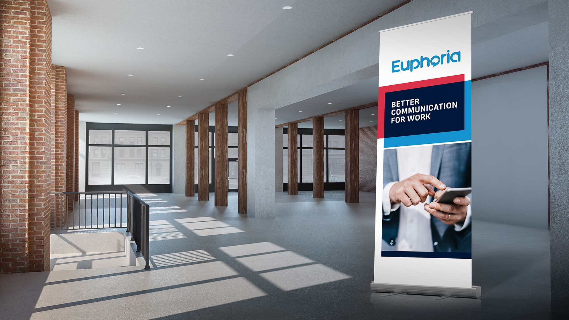
The flexibility of visual identity system allows for skinny formats.
-
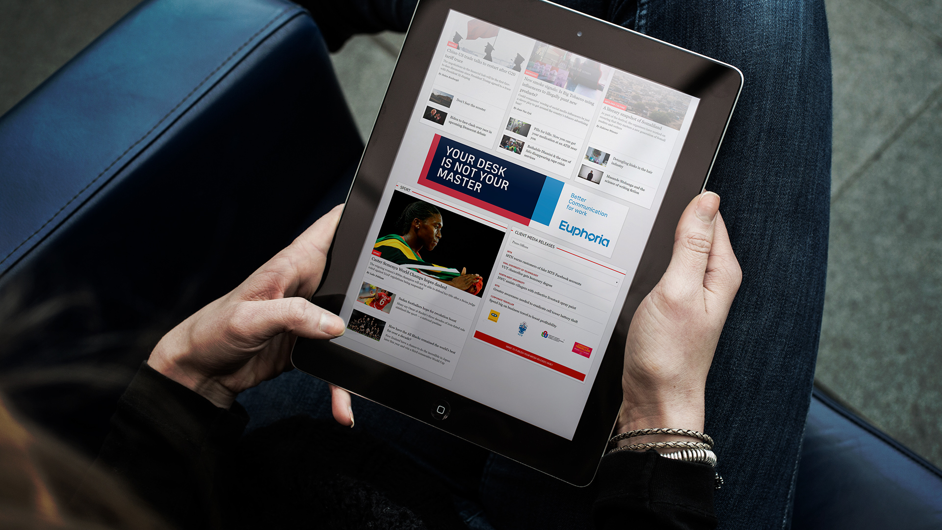
Strong colour and bold text dominates the digital display ads - the graphic device only occupying a small area.
-
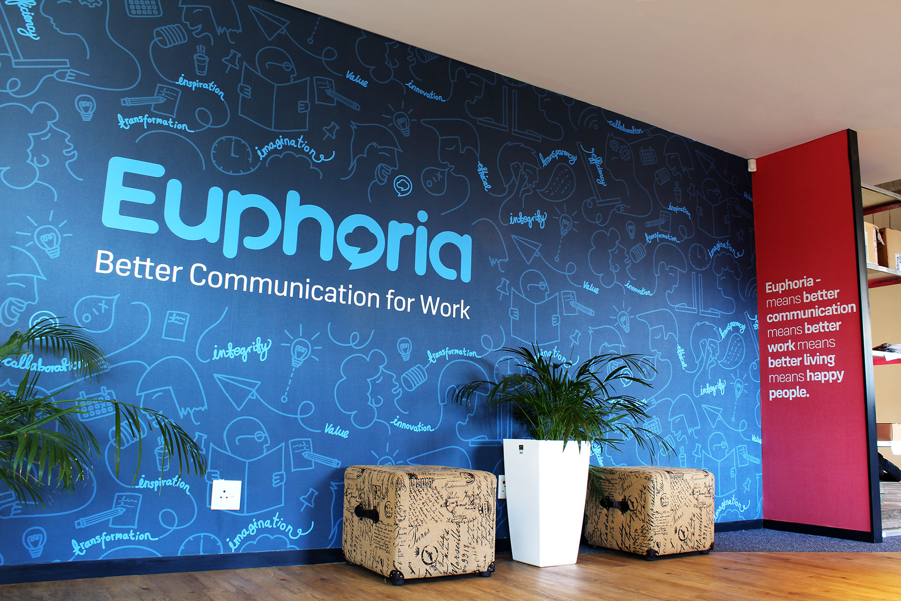
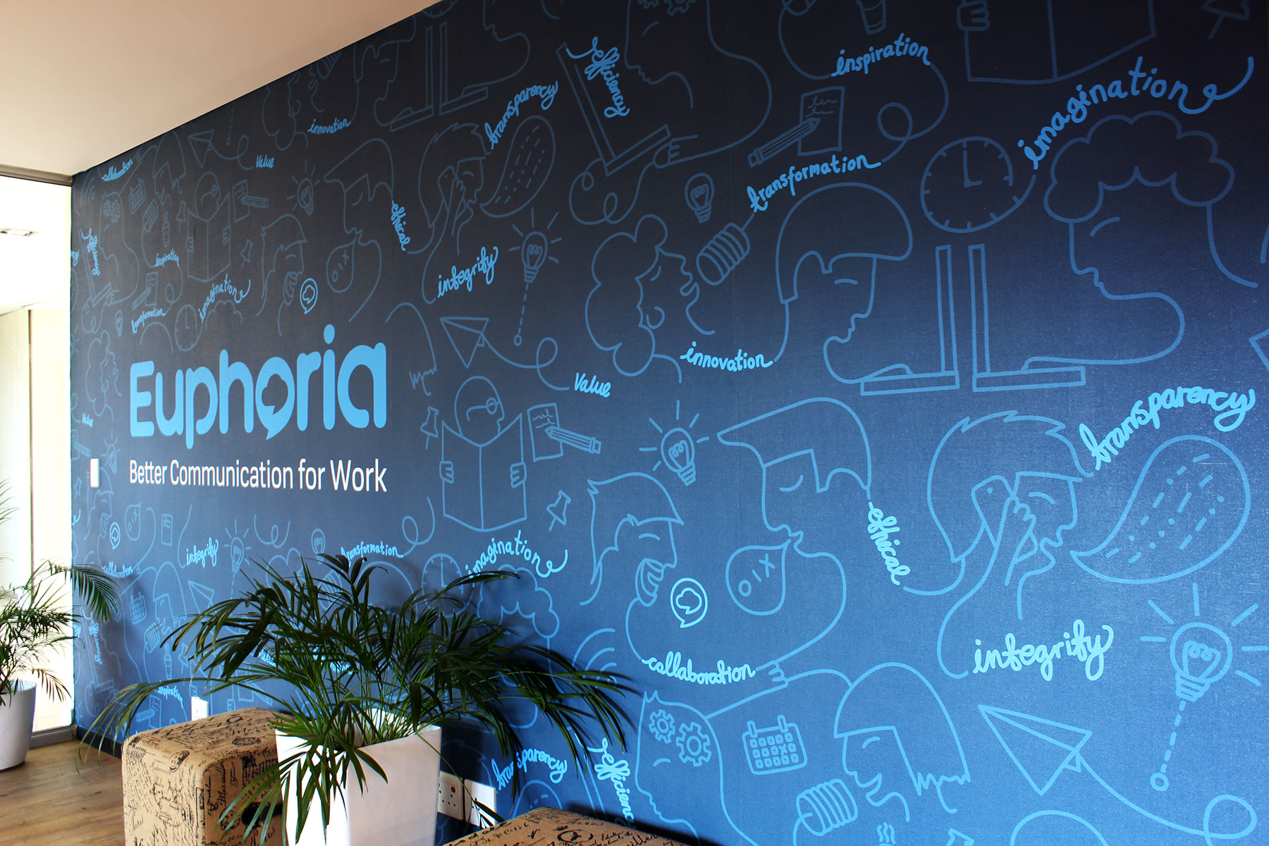
The wall lies immediately within the reception of the HQ in Cape Town.
-
The tone is approachable yet bold and confident.
-
-
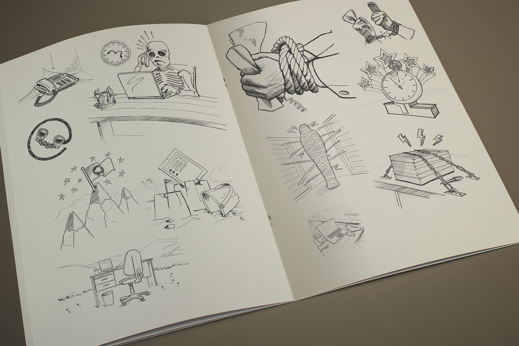
Firedog presented a number of hand drawn conceptual sketches before focusing on the three strongest concepts. We find this creative process incredibly efficient, whilst providing the client the benefit of choice.
-
The colour was deliberately chosen to maximise stand out within social media.
-
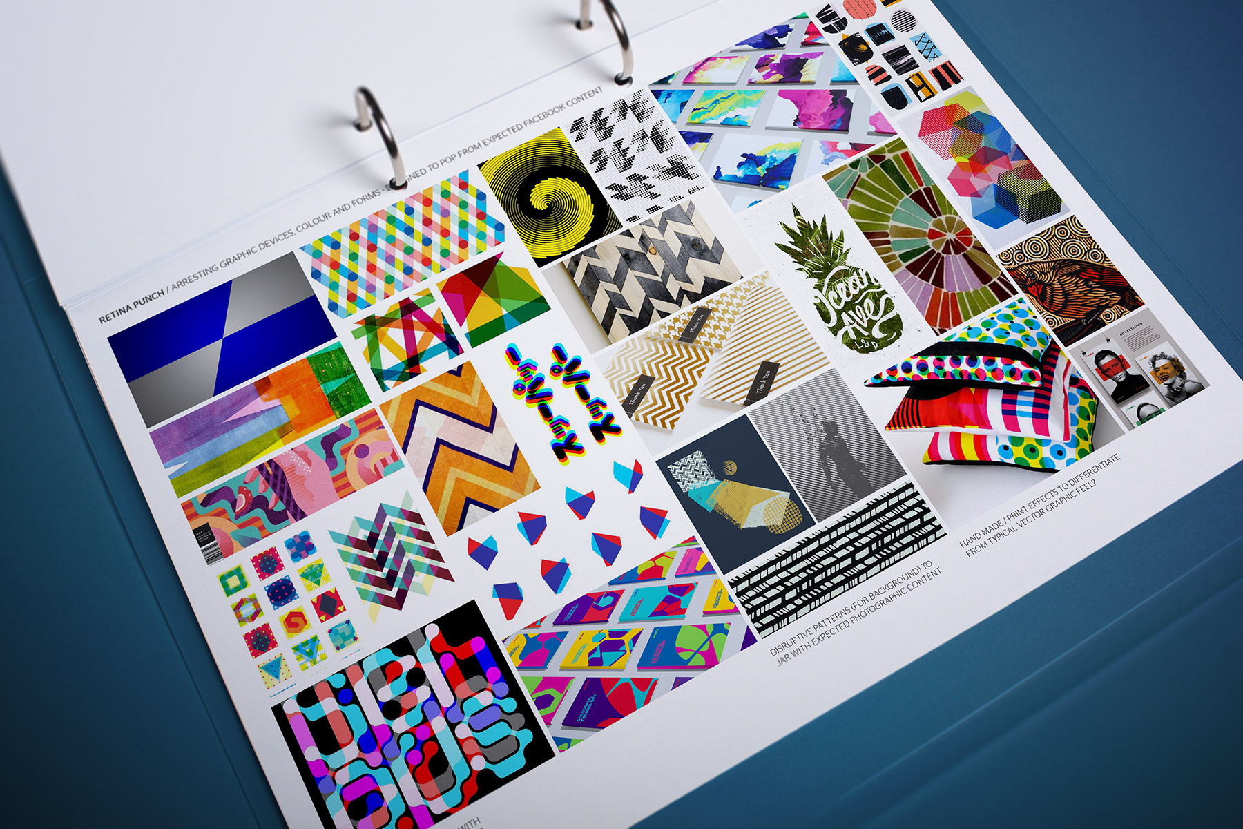
We studied various graphical mnemonics such as disruptive patterning, distortion, print effects and colour modelling. All with the deliberate purpose of stimulating the audience's subconscious mind.
-
Before commencing the conceptual process, Firedog presented a number of theme based moodboards which outlined our approach to creating differentiation within existing media channels.
-
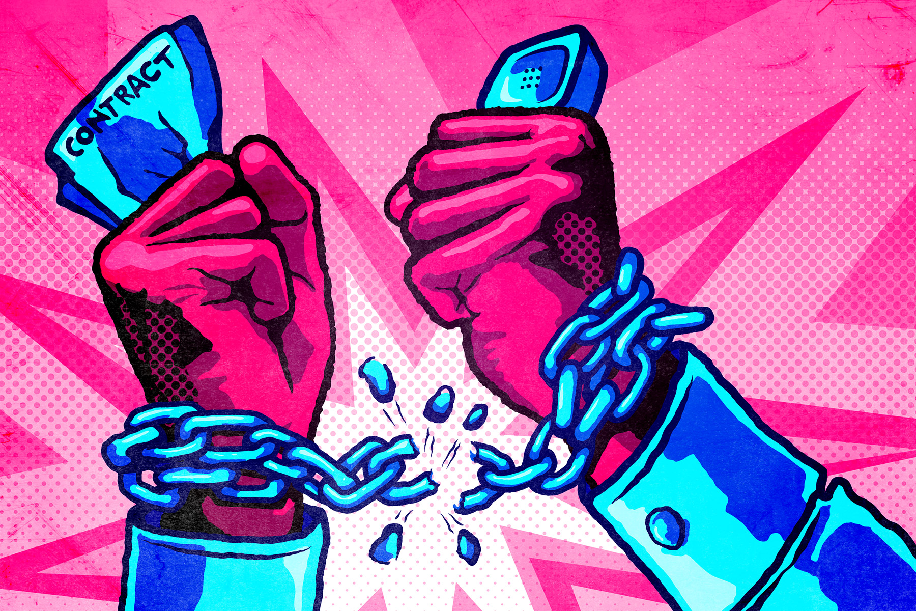
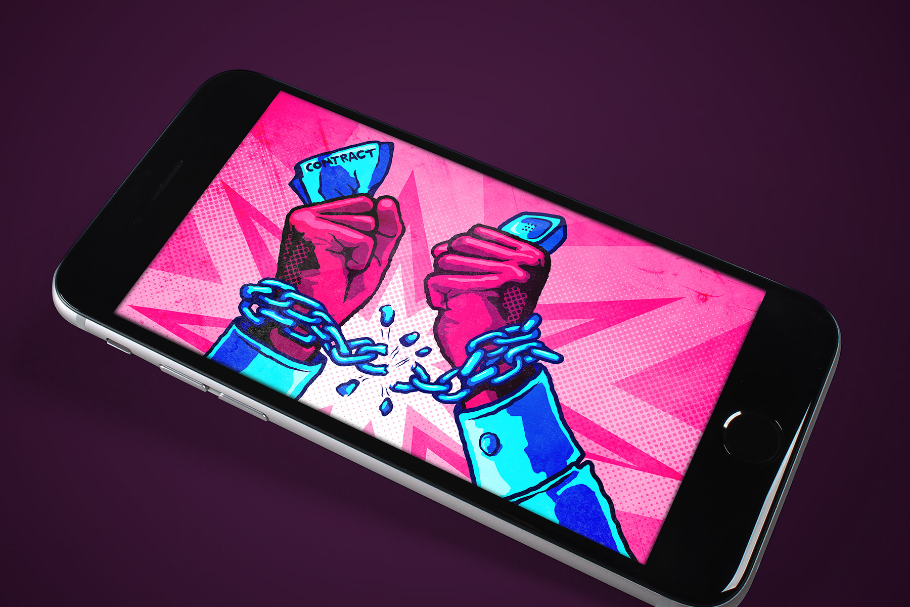
Headline - Free yourself from lengthy and restrictive contracts
-

Headline - Sick of waiting for poor customer support?
-
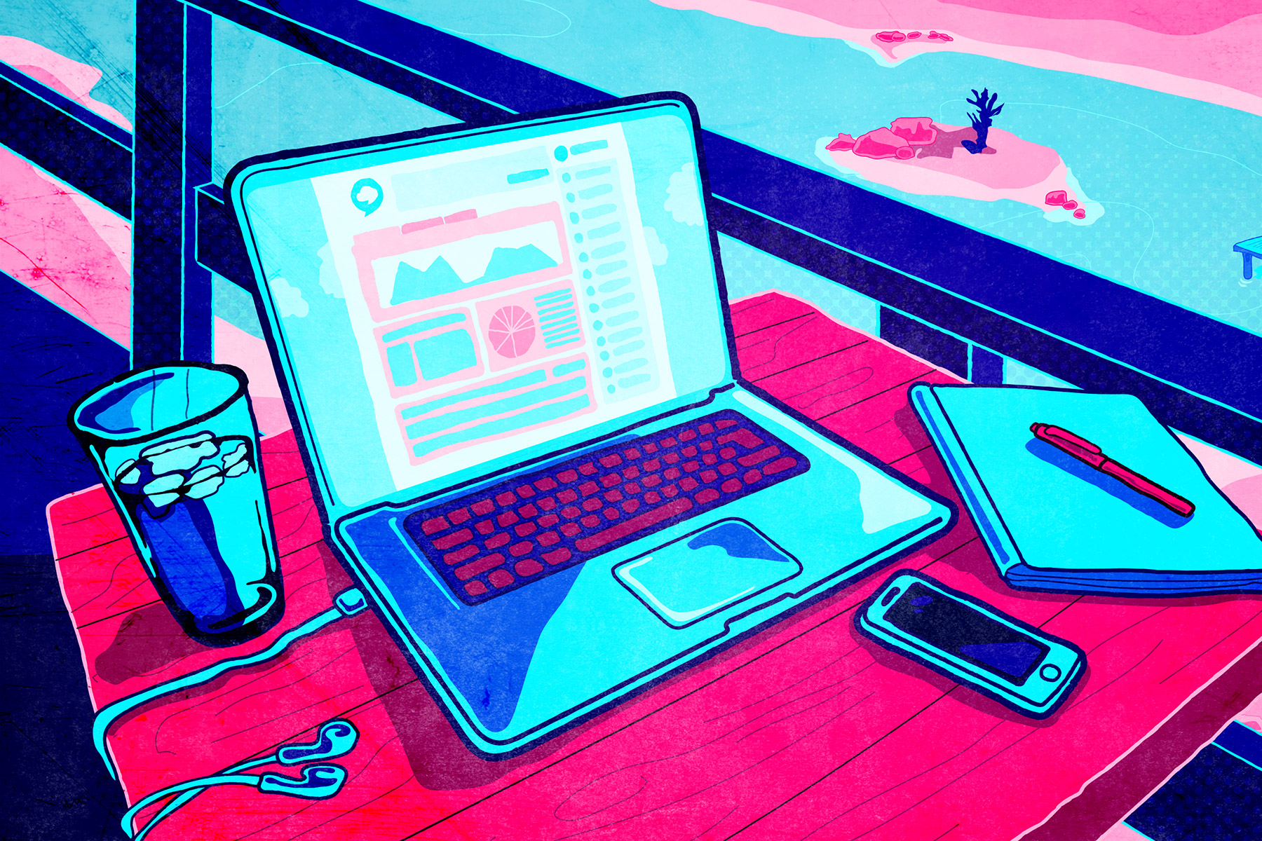
Headline - Work from anywhere