The work
Brand strategy • Brand identity suite
The brief
We were approached by the Greythorn Group to develop a family of brands that had very strong links with each other. The design solution needed to use a single symbol across the family with a simple colour change to create variety in the group.
The solution
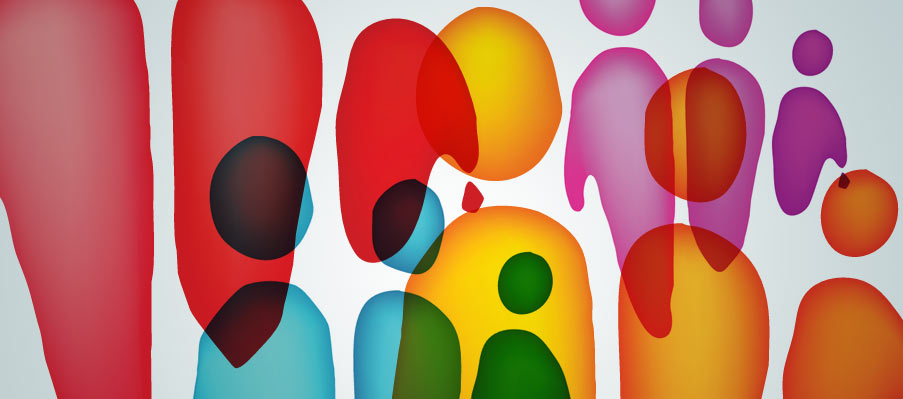
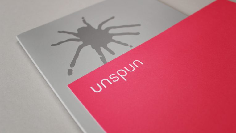
The abstract shaped symbol device was created as a link between the group companies and is representative of their core business, the movement of people. The logo structure was supported by a dynamic suite of fresh colours and a classic typographic naming execution.
The results
It was important that the solution was flexible enough for the group to grow and develop within time. The brand has been well received by the market and recent acquisitions for the Five Ten Group have already been incorporated into the brand family.


