Brand Identity and website

Foviance

A dynamic brand created for a dynamic merger.

Foviance is the UK’s pre-eminent customer experience consultancy, offering the full range of user experience consulting services, including usability and accessibility services, analytics consultancy and user research services. Our responsibilities included brand identity creation, design for print and corporate communications.

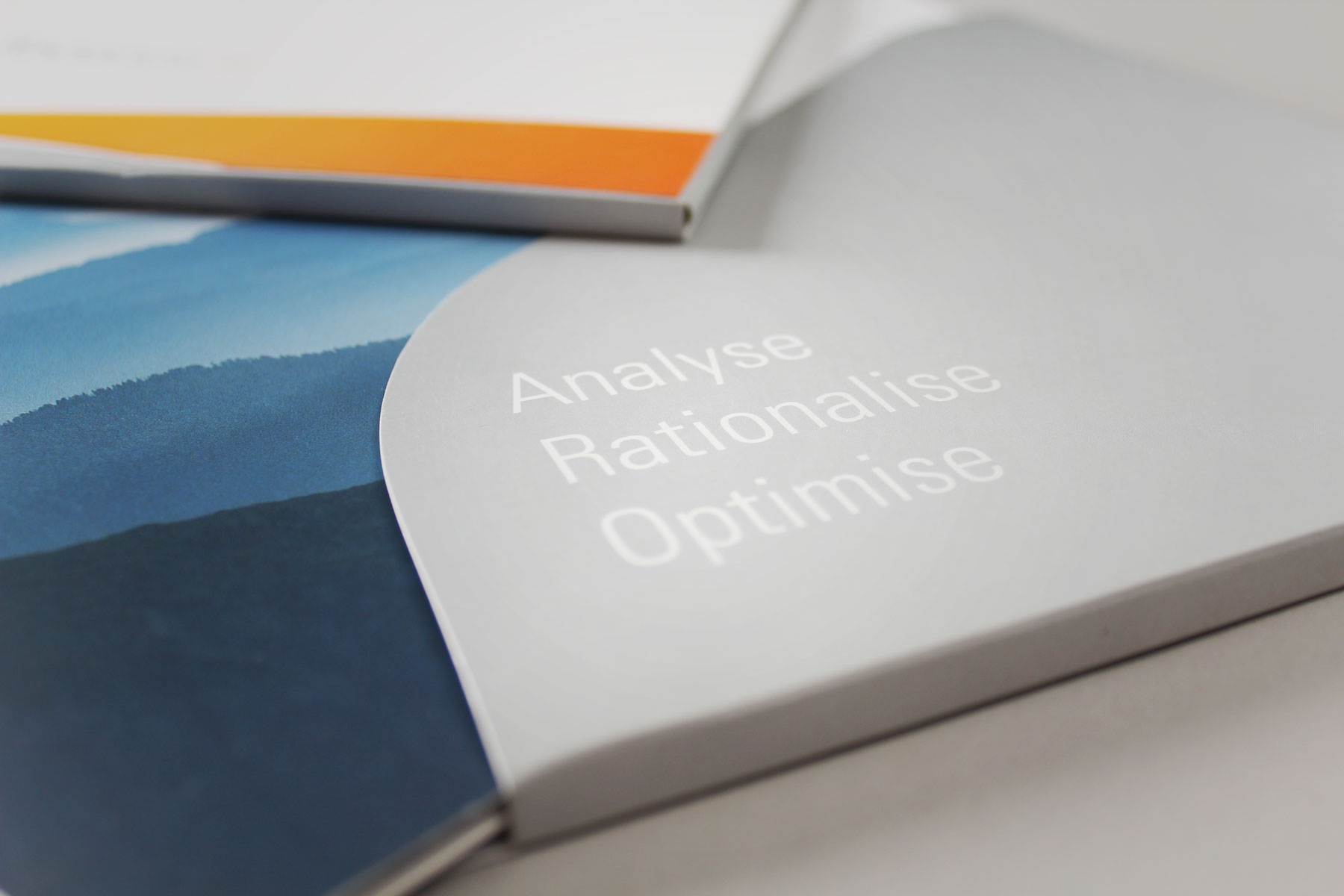
We helped develop the three part positioning statement. Analyse, Rationalise, Optimise - These indicate the three areas of business that make up the Foviance offer.

The full branding remit for the launch of the new company created by the merger between two European leaders in the web analytics and usability industries.

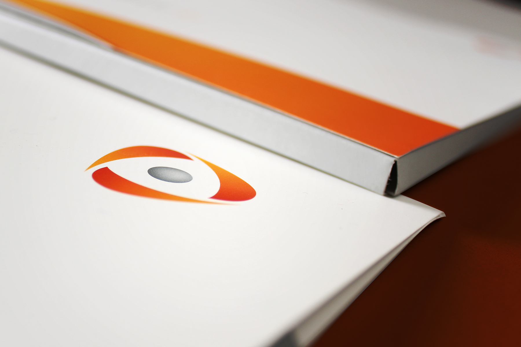
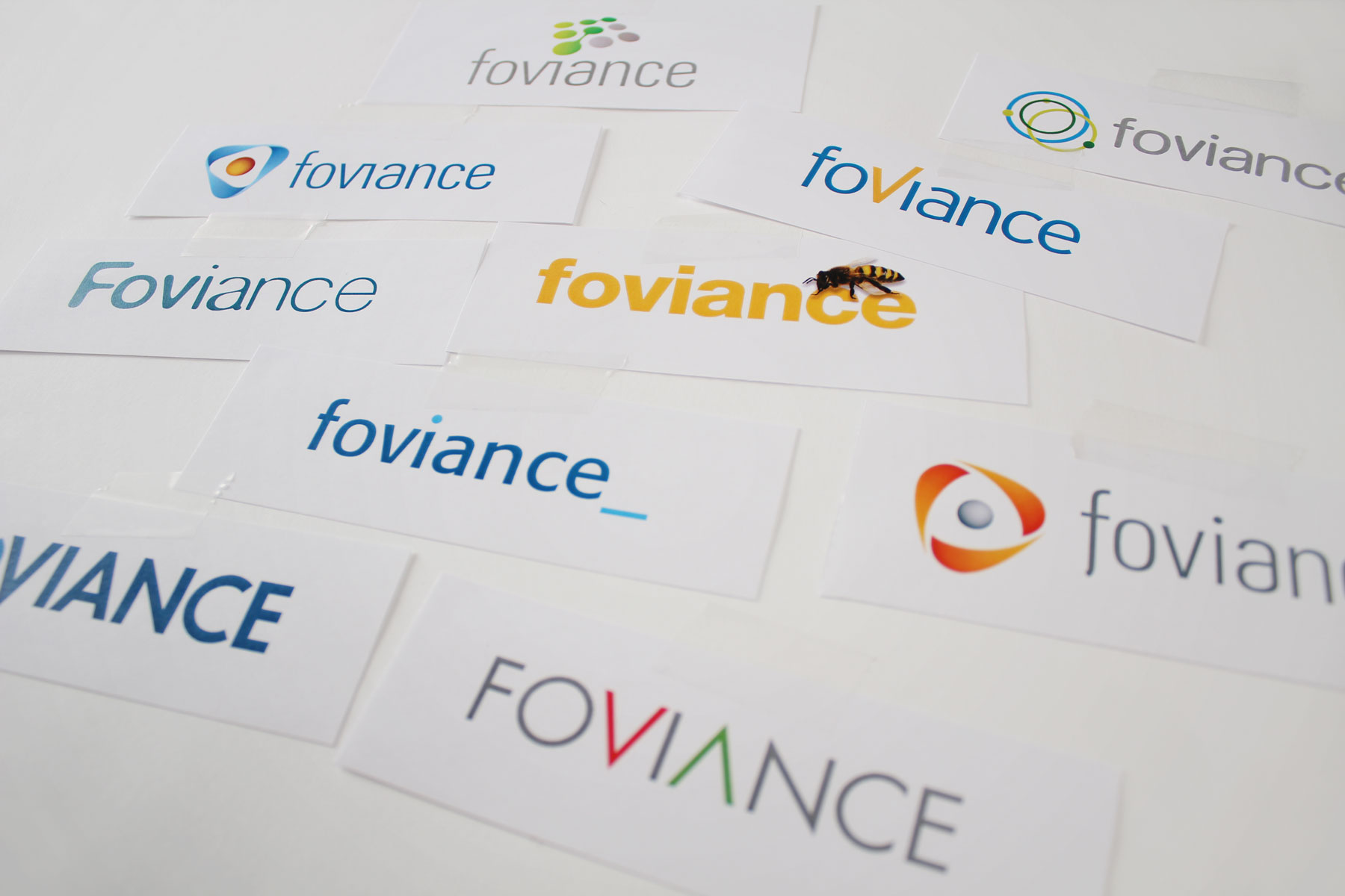
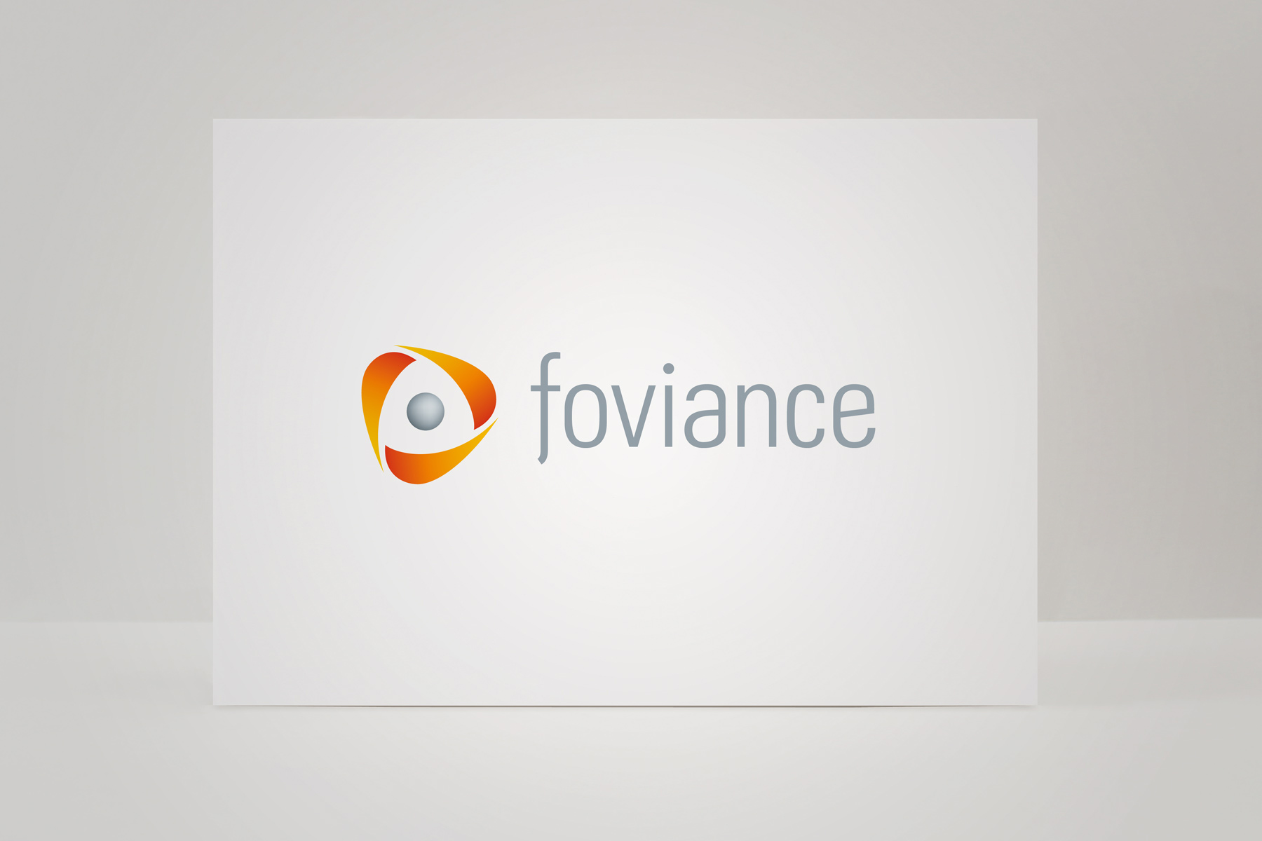
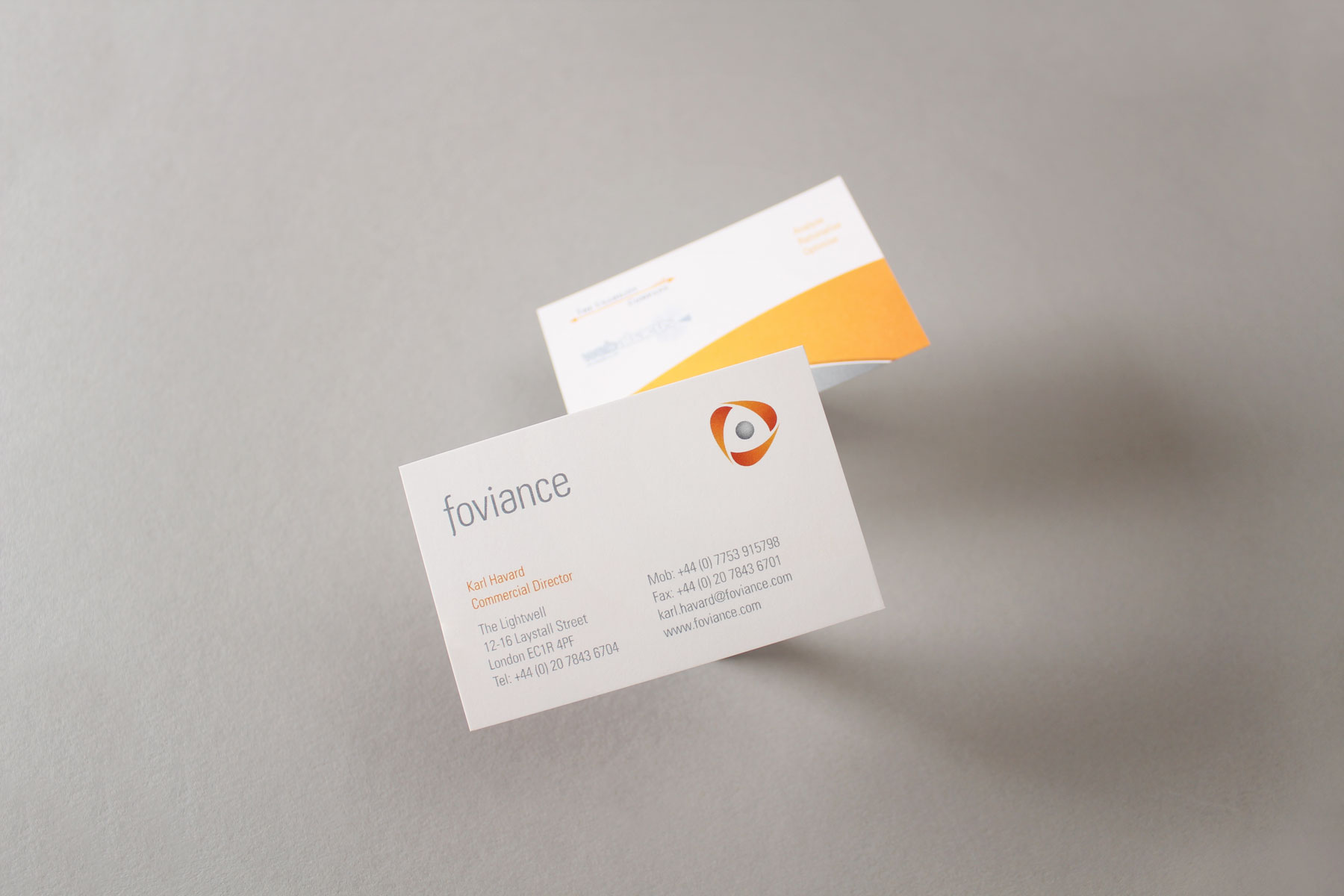
We created a brand identity that’s contemporary and hints at the technology capability offered by the company – usability and user experience design. The colour palettes selected have been used to create stand-out in what’s rapidly becoming a crowded marketplace. The three ‘swoosh’ ribbons have been designed to centre around a central focal point (The company name, Foviance, is derived from the word Fovea, which is the area of the eye that captures light in the retina). The three ribbons are indicative of Foviance’s approach to their client’s business. We further distilled their approach into a strap-line that offers 3 succinct words… Analyse. Rationalise. Optimise.

The graphic language contains a sweeping brand mnemonic.

Once we had signed off on the brand identity, we applied the identity to primary branding applications such as; folders, business cards, letterheads & signage. Although we expected that the design of the website would be specifically challenging due to the nature of the client… (They’re world leaders in website usability and web behaviour!), we found the Firedog designs well received within the industry.

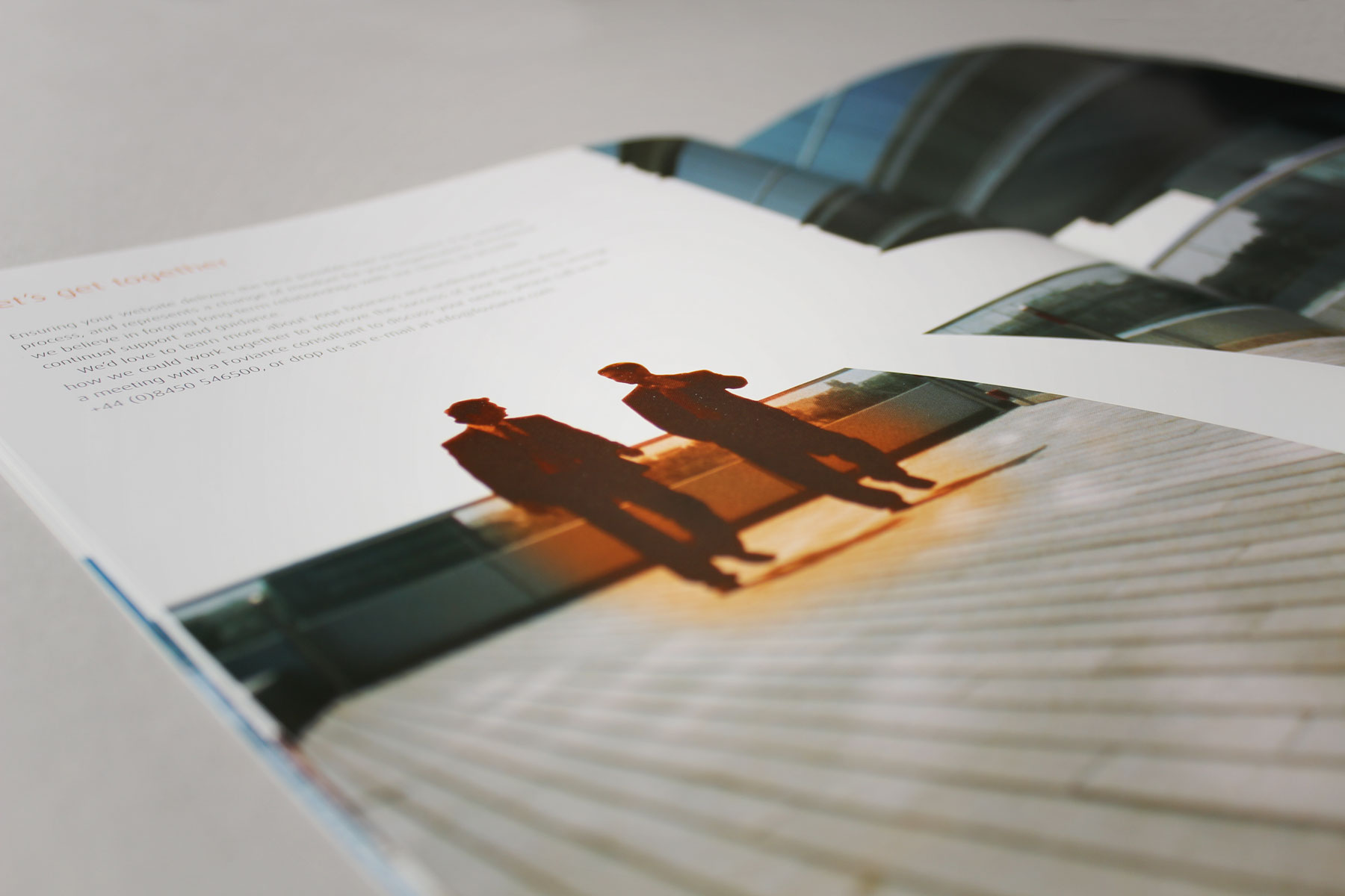
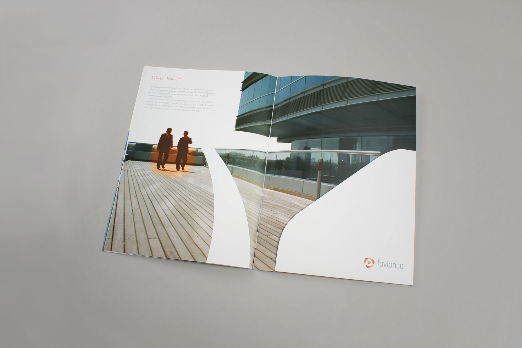
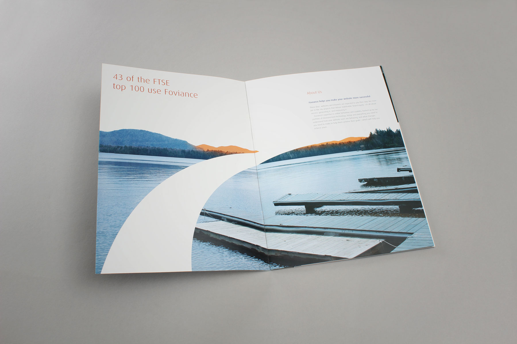
The imagery used warm spot focused areas to draw attention to certain conceptual metaphors - In this example, partnership.
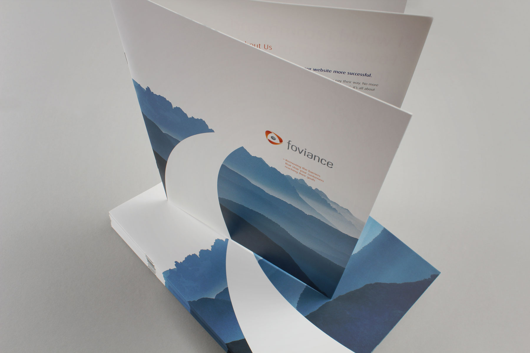
We created a suite of imagery which was calming and thought provoking - Always rendered in cool blues to offset the warm identity.

The images show the process of moving from an unfocused position to one of clarity.

Following the brand identity undertaken for the merger, Firedog was tasked with a website design and build kit for Foviance’s online presence. The site has been built and designed according to the latest in W3C standards. Accessibility and usability was the name of the game, more important than ever as these important web characteristics represent Foviance’s core business. In order to avoid the “blandness” pitfalls of a fully functional site, Firedog developed an intellectual look and feel applied to the site’s imagery. The images show the process of moving from an unfocused position to one of clarity. The site has had very favourable feedback within the web community and underpins Foviance’s very successful branding within the market.