Website and HTML5 learning apps

Imperial College

Digital strategy, communications, design and education technology for the world's finest science university.

The Business School at Imperial College - World class teaching and research at the heart of Imperial College London, one of the UK’s and world’s leading universities. Firedog has partnered with the Business School at Imperial College for over eight years. Our role has encompassed the full remit including digital strategy, user experience development and interface design.

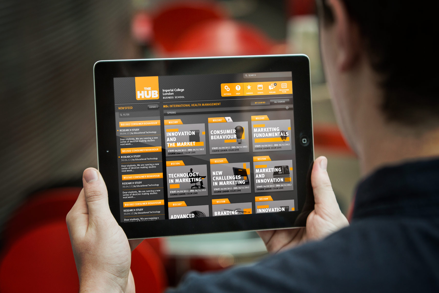
The HUB application needed to adapt to the diverse behaviours and environments adopted by the students. We developed HTML5 UIs for iPad / Tablet, Iphone, desktop and mobile.

Our core skills involve meshing the world of brand and product strategy with tech platform delivery.

We have delivered a number of projects working closely with the college’s Education Technology (Ed-Tech) and marketing teams. We assist by providing strategic recommendations for platform design incorporating user segmentation and product positioning. Our core skills involve meshing the world of brand and product strategy with tech platform delivery.

Our strategic remit has always been to position Imperial College as possessing one of the most high quality Business Schools across the world.

The Hub provides a centralised space on which faculty staff and students are able to share and collaborate.

The strategy and design of “The Hub” HTML5 learning application

The Imperial College Business School uses a ‘hub’ to communicate to their students about course materials, to share discussions and host online lectures. Instead of walking home with a pile of printed course materials, the students receive iPads at the start of their course – Along with an app shortcut for the Hub. The Hub needed to be designed for a multiplatform environment covering Ipads, smartphones and desktops. Our remit extended to UX strategy and design, user interface design, responsive HTML5 design and providing code, animation and style guidelines for the development engineers.

The Hub completely adjusts its content hierarchy according to the students environment. Desktop equates to extensive reading. Mobile equates to providing timeous information.
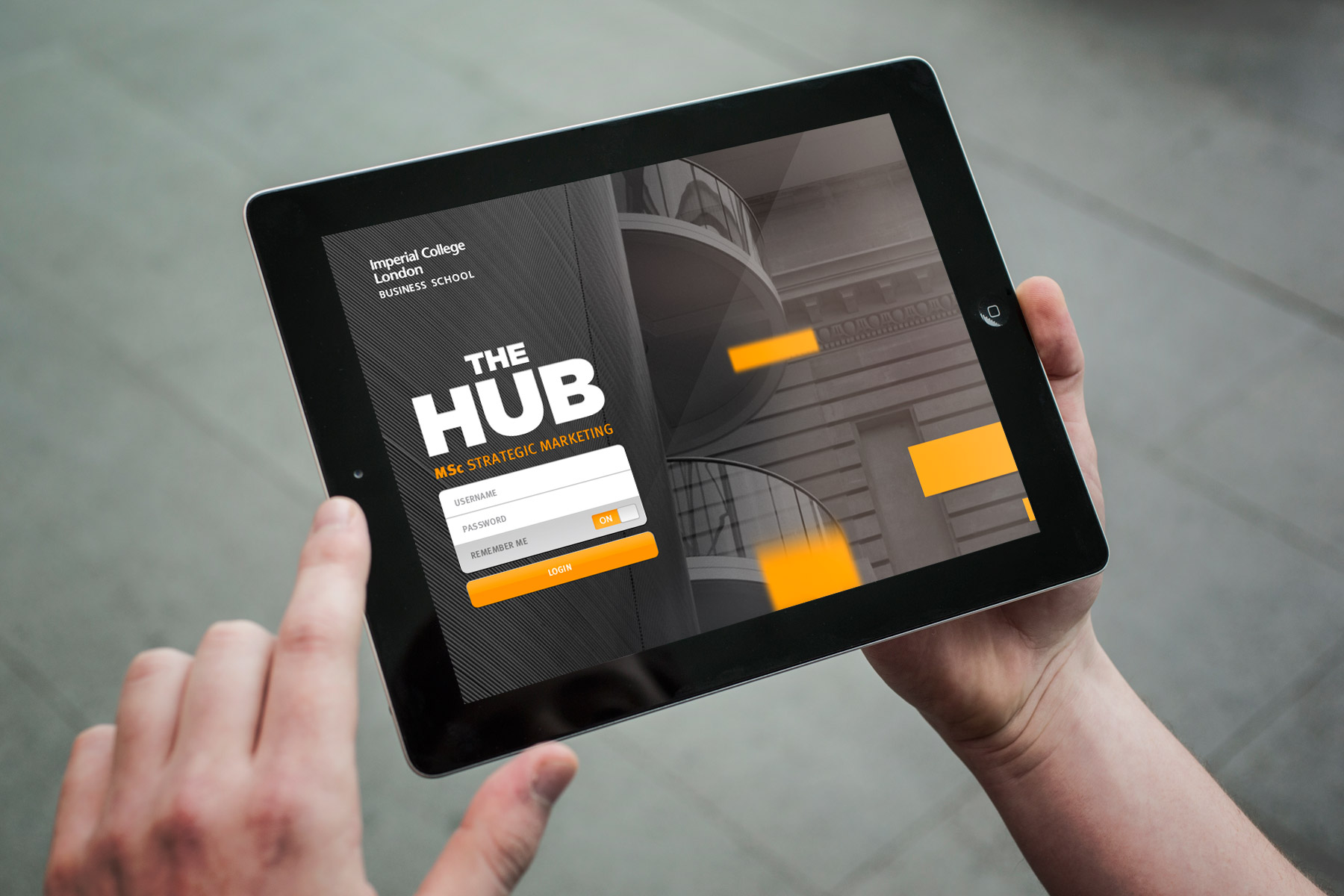
We worked with the client to establish a responsive HTML5 framework which was easy to use and adjusted as much as possible to the viewer’s choice of format. The Hub app is not only used by the students attending courses, but also from key staff and programme directors. As interactivity is a key part of any user experience we began with the iPad version and gracefully restricted the functionality to suit a smaller smartphone format. We chose a high contrast colour palette, which ensured great legibility. The entire interface was underpinned by black to create a slick and sharp feel. We used tonally restricted imagery and large app like padded icons to ensure a really usable and playful feel.

The application responds to the users environment. When in the desktop or laptop mode, content areas take preference with the view that the user is likely to be generating more written content.

In the first month after launch, The Hub received 90,000 hits from the approximate 700 users involved, a truly staggering uptake.

Along with the mobile platforms we developed the design for a full set of desktop PC interface style sheets, whereby the focus points are reduced making the design less app like, and more akin to the typical user experience of viewing a large amount of content in one window. The interface materials and subsequent guidelines were then handed over to the client to be created in the WordPress CMS system. The Hub app has exceeded all expectations with stunning results. The students and staff can be seen using the application in all formats across the college. In the first month after launch, The Hub received 90,000 hits from the approximate 700 users involved, a truly staggering uptake.

For the tablet version, it was important that the interface tapped into gesture best practice. We created a friendly and clear primary interface with high contrast and large clickable navigation assets.

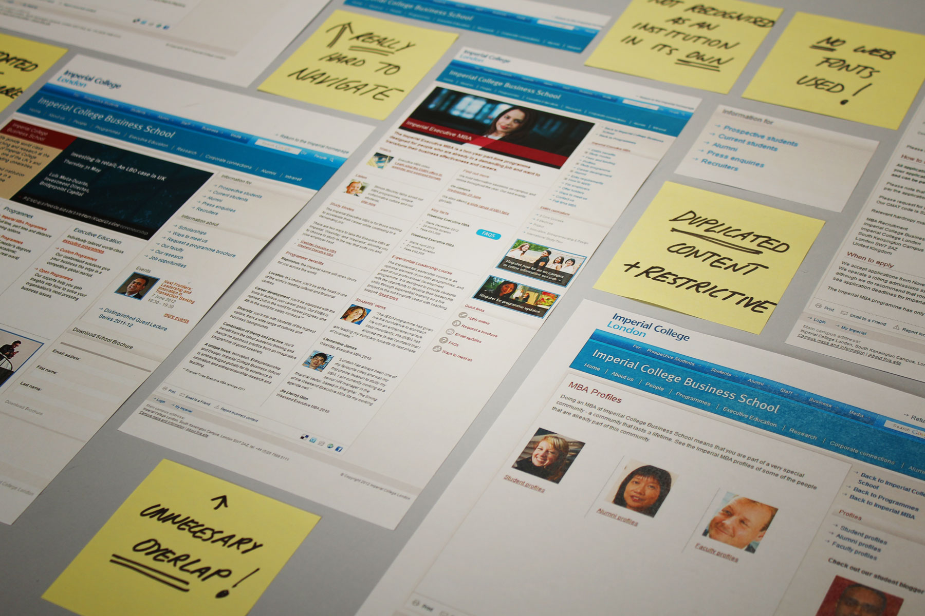
The Business School’s existing site was outdated, hard to navigate and members found generating content difficult.

The design and build of the Imperial College Business School website

The Business School’s existing site was outdated, hard to navigate and members found generating content difficult. Furthermore, the Business School wanted to be recognized as a global brand. The site’s existing format gave no indication that it was distinct from Imperial College. The dual navigation system for Imperial College and the Business School featured the same terms, meaning that there was often an overlap in content. This made the site confusing. Our solution was to introduce a link that takes you back to the original Imperial site, essentially separating it from the master brand.

To increase accessibility, we also introduced breadcrumbs and made the accessibility policy meet the W3C standard for visually impaired users.

To increase accessibility, we also introduced breadcrumbs and made the accessibility policy meet the W3C standard for visually impaired users. We also changed system fonts to web fonts, which are in line with Imperial College’s corporate guidelines. As the Business School struggled to maintain and generate content, we switched from Oracle CMS to WordPress. Easy to maintain, WordPress allows the Business School to author content more effectively.

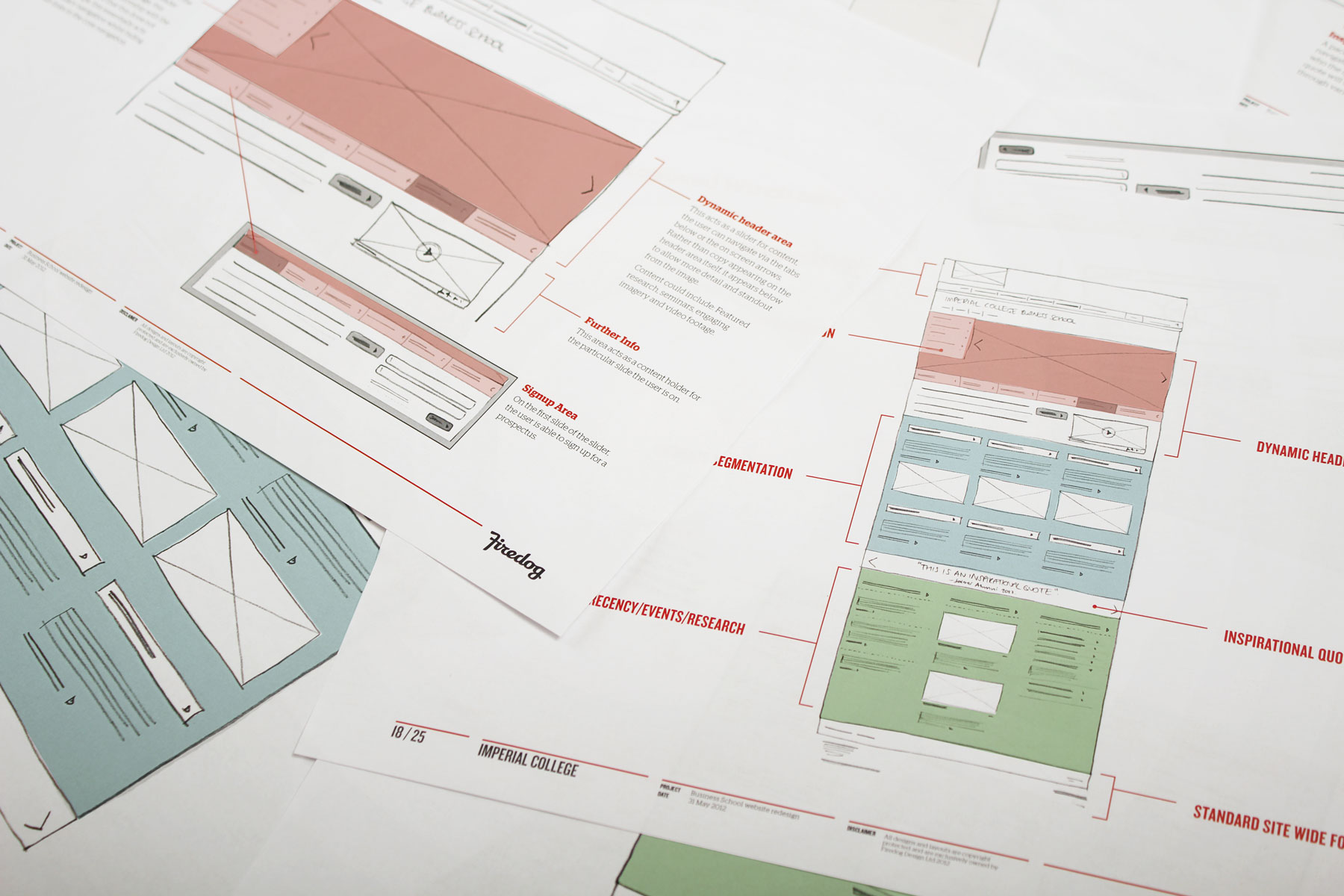
Before we begin the design process, rough sketched wireframes are put together to ensure key fucntional elements deliver strategic content effectively

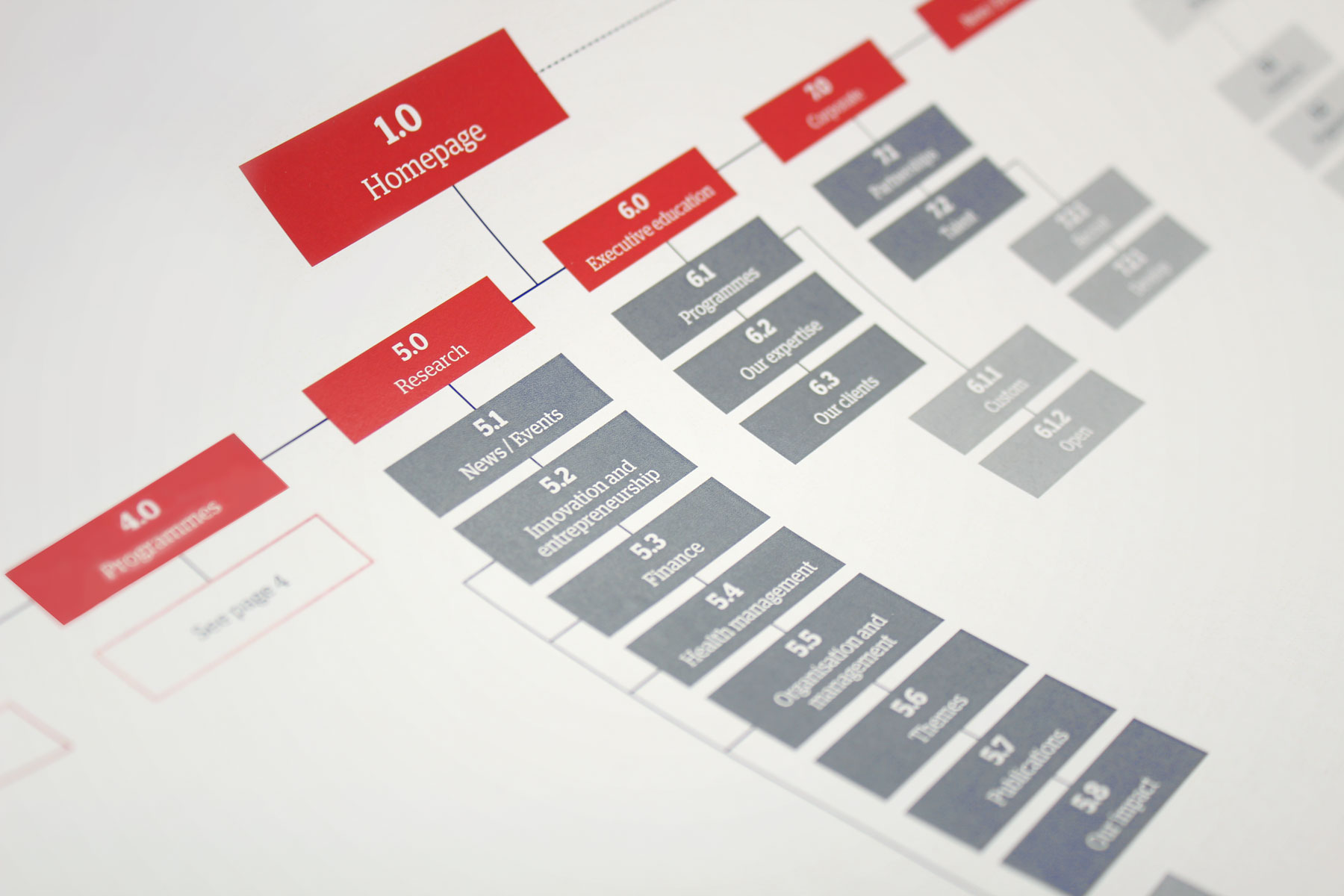
Streamlining data into one efficient administrative process and reducing 1500 pages to 800 has enabled highly effective navigation.

The site is now a highly responsive and includes a suite of interactive elements, featuring accordion tabs, sliders, pull-out quotes and galleries. The key pages are exciting and interactive, regardless of where they sit in the site’s navigation. We launched the site to work alongside a series of comms for the Business School. This clean and bright look and feel reflects the institution’s dynamic and open ethos. Streamlining data into one efficient administrative process and reducing 1500 pages to 800 has enabled highly effective navigation.

A number of concepts were produced to ensure that the Business School as an entity could be distinguished from Imperial College itself.

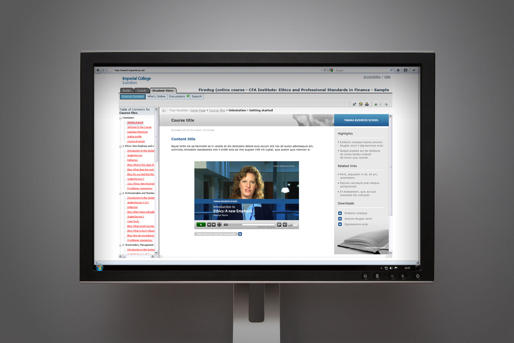
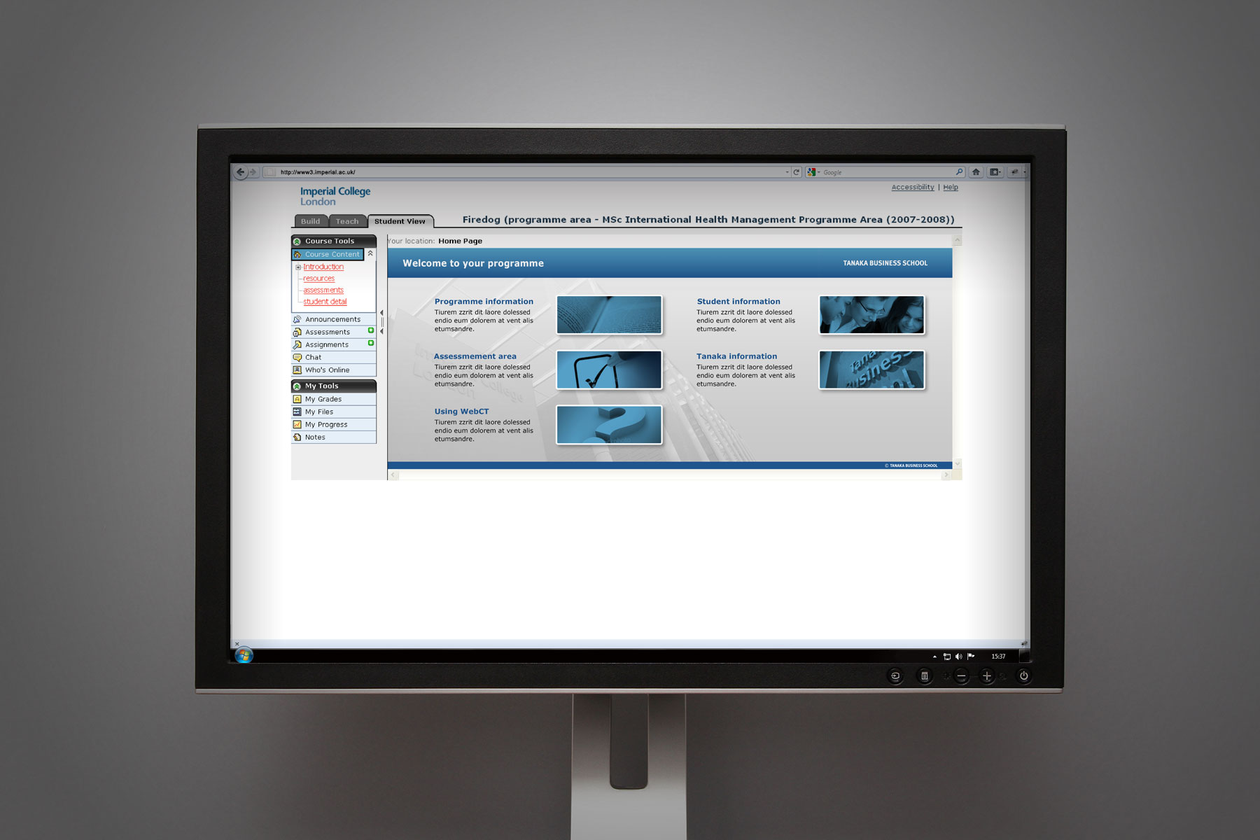
Blackboard learning platform – User interface design within a heavily restricted system

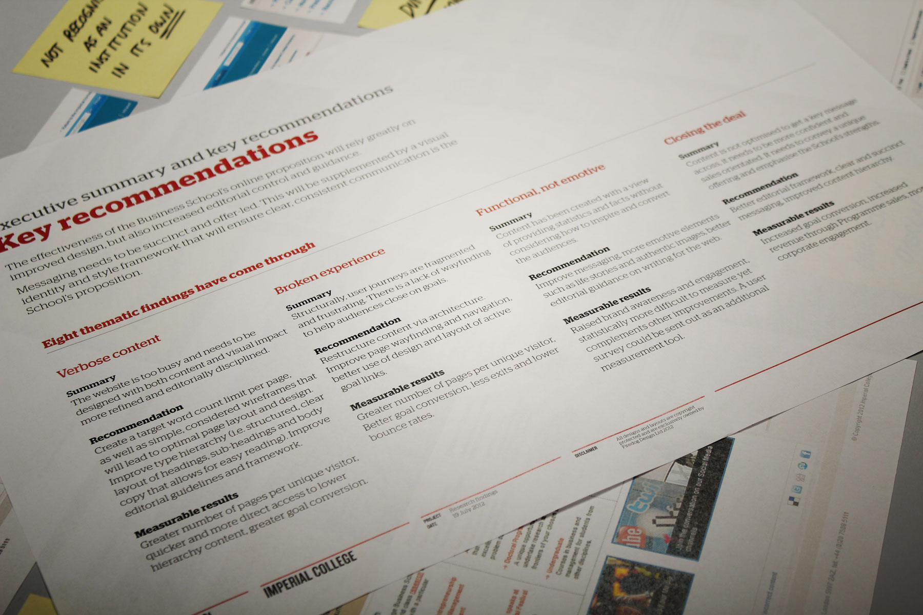
Our task was to redesign the Imperial College Business School area within the Imperial College London’s Blackboard e-learning system to bring the area in line with the new Imperial College Business School brand. The Blackboard system, is an online proprietary virtual learning environment which is used by all the divisions of Imperial College London for e-learning. Instructors can easily add such tools as discussion boards, mail systems and live chat, along with content, including documents and web pages. New features also include wikis, blogs, RSS and 3D virtual learning spaces. The first stage was to present recommendations for usability of the existing e-learning system. These recommendations covered raising the general standard of usability for the student, and ensuring the efficient management of the site by the Business School team. Firedog then applied the recommendations by redesigning the e-learning area, updating colours and design assets to increase both the aesthetic value and usability. We removed unnecessary icons and information and simplified the layout to increase usability and navigation. We built the front-end of the system area using HTML/CSS and provided the source files as a build kit to the Imperial College’s in-house development team. In addition, a style guide was provided which included icons, tables and graphic assets so the team can easily roll out additional pages when new courses are added. These establish design styles to ensure consistency, plus general best practice guidelines to ensure the management of the area as it develops.