-

The students were encouraged to jump about on a trampoline, creating vibrant and energetic poses. We supported these with colourful graphics which pay homage to the original Lewisham College identity.
-

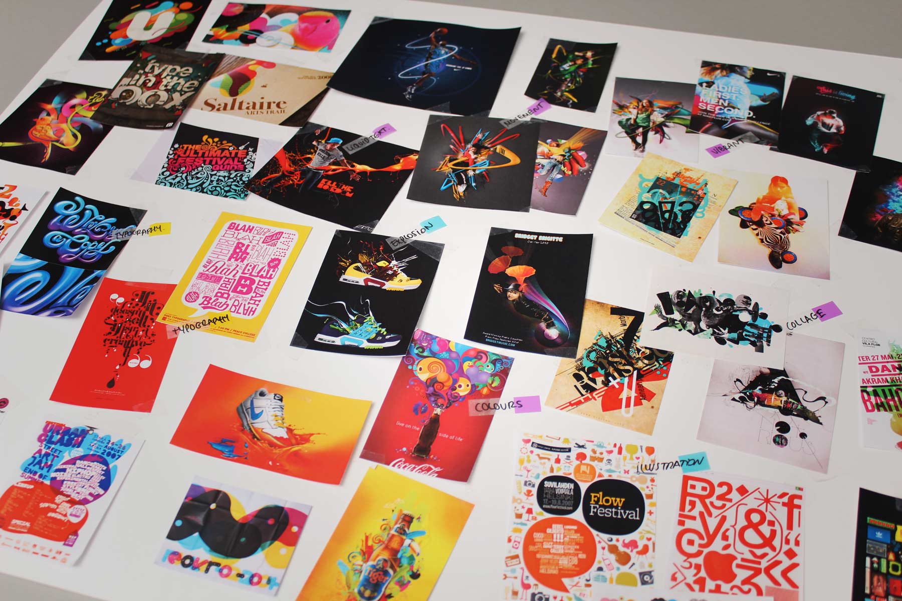
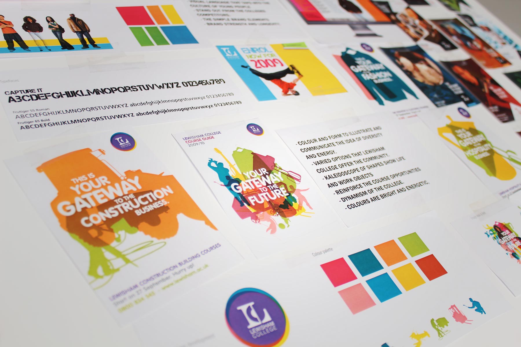
The visual identity rebrand project kicked off with a study across inspirational marketing. We looked at sports and arts influences.
-

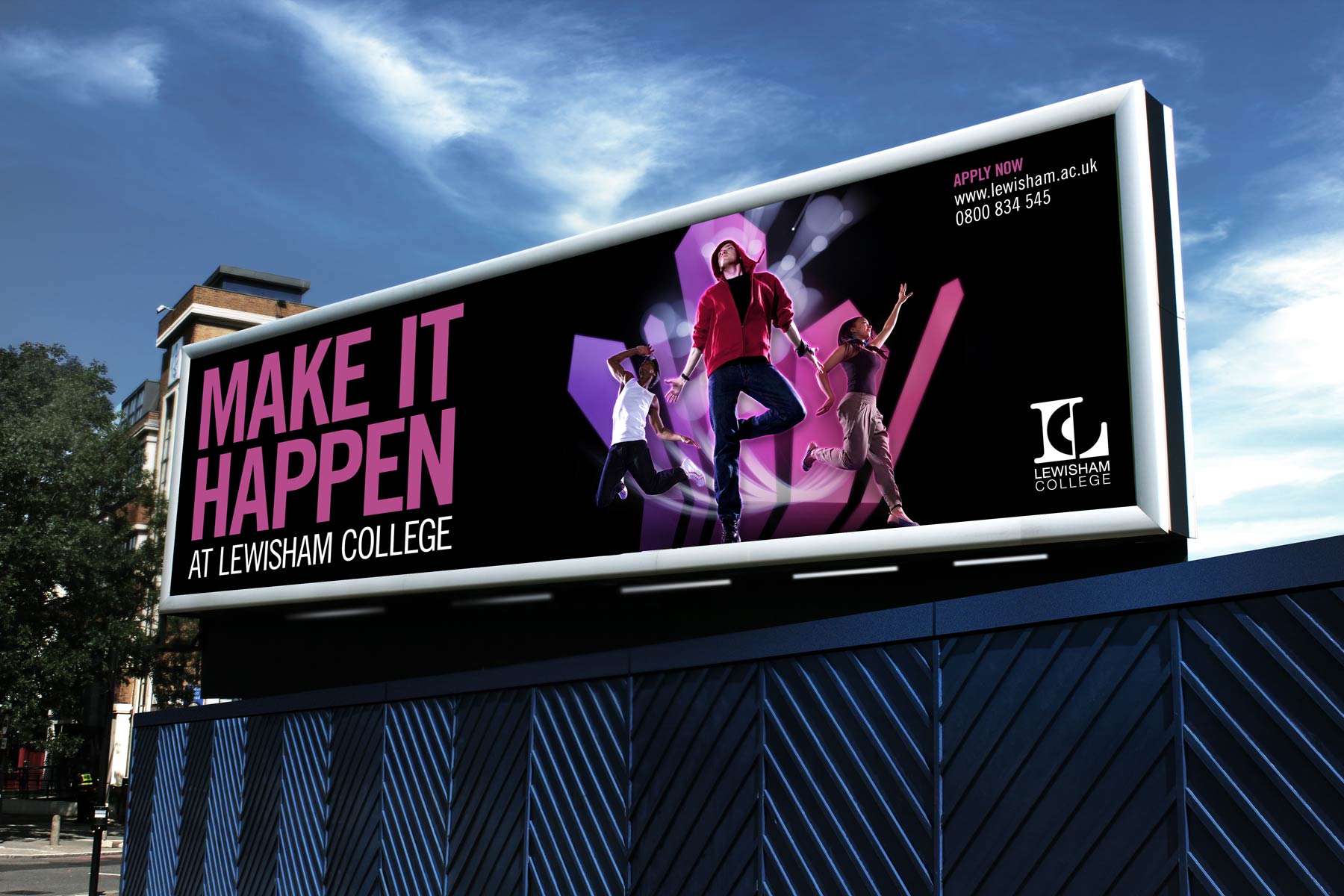
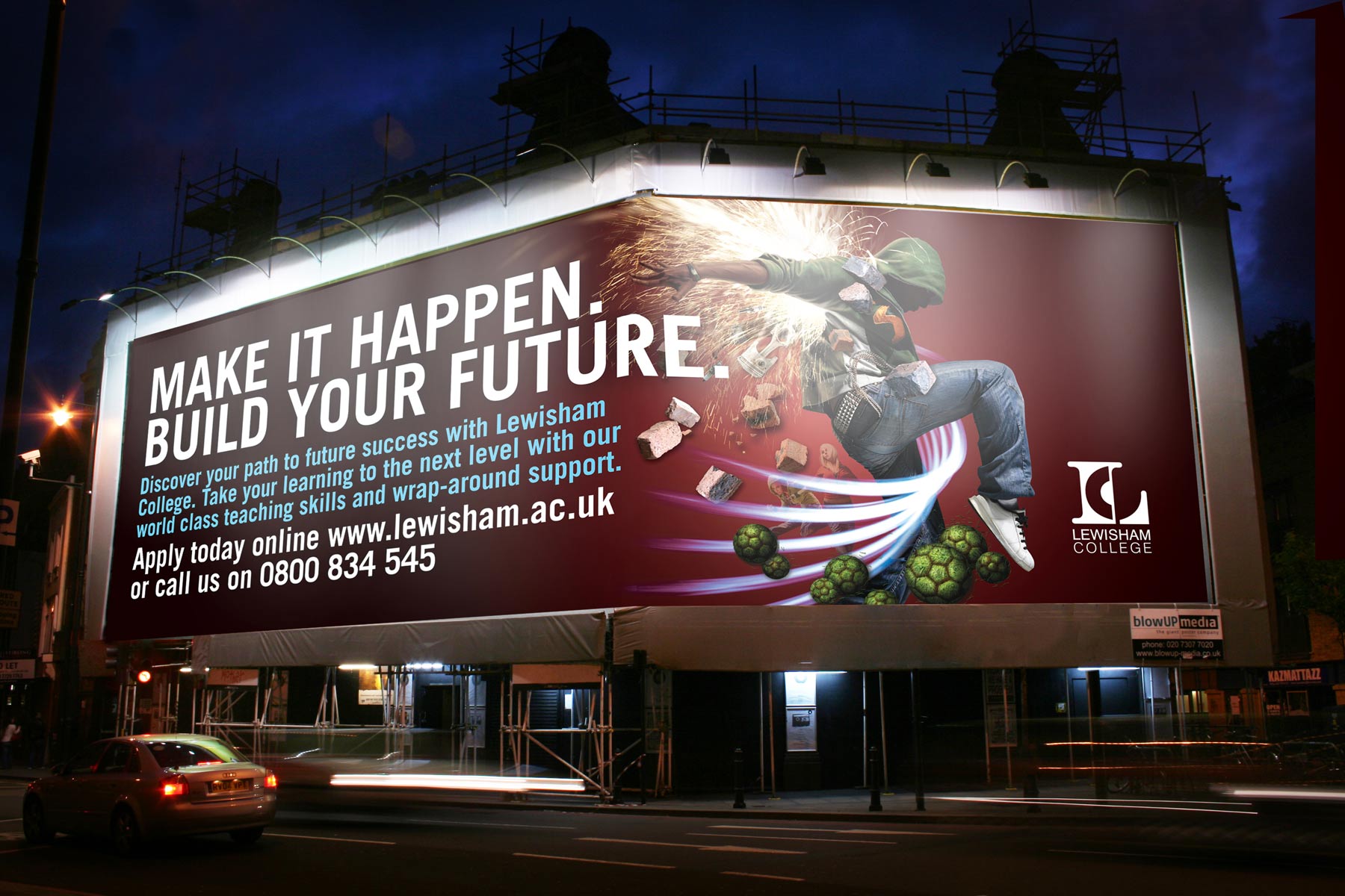
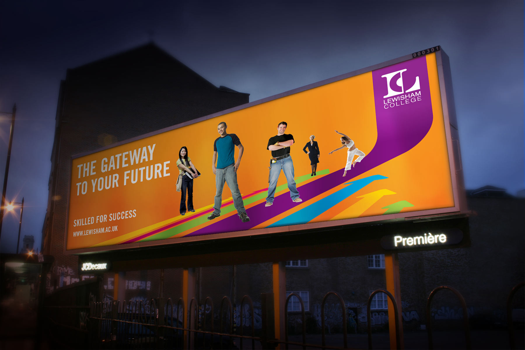
The campaign has been applied to both 48 and 96 sheet billboards around London.
-

The layout elements which rest on black are scalable and variable, which makes the campaign easy to roll out across all media.
-

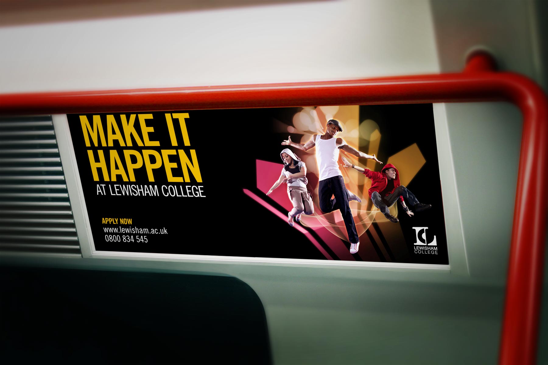
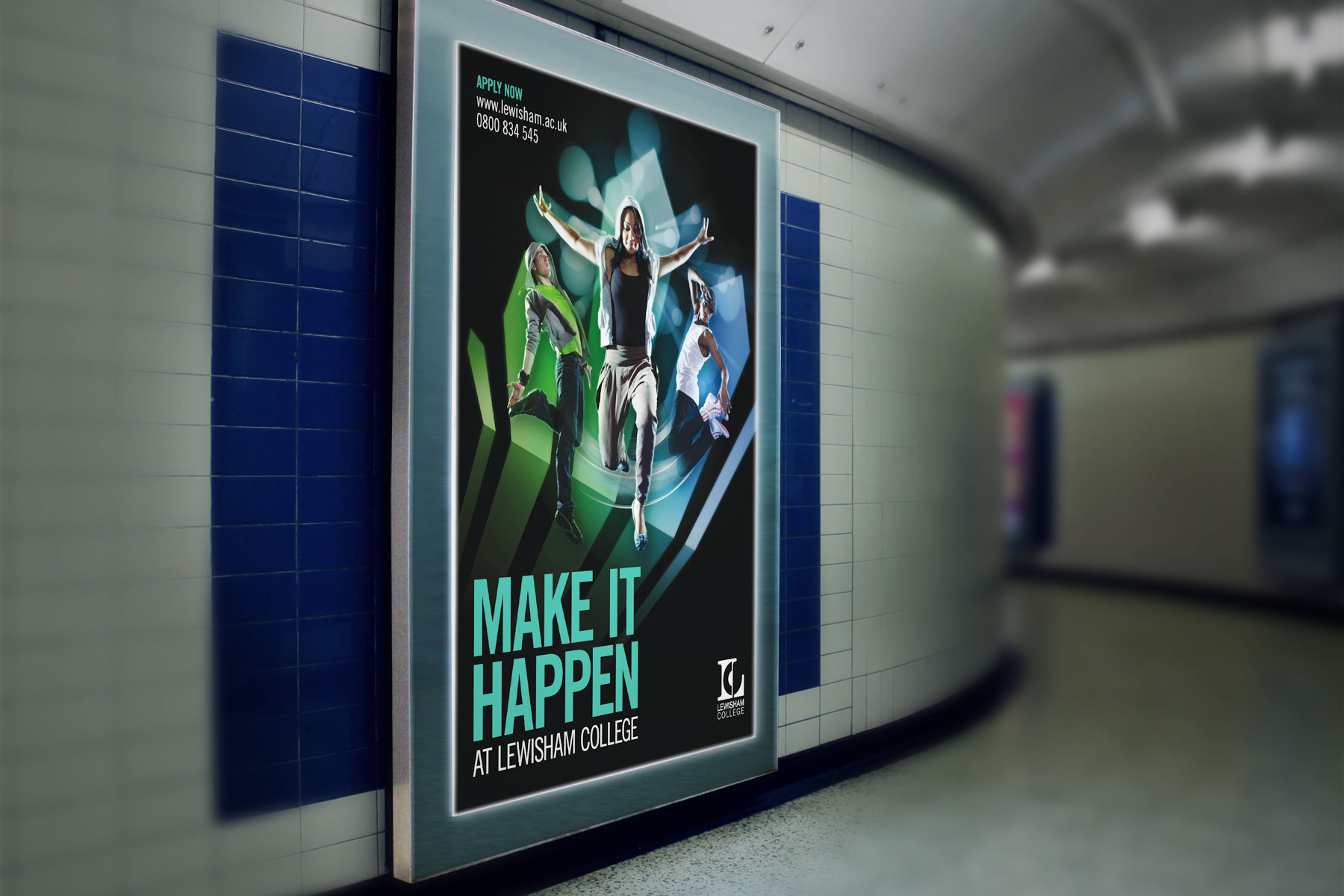
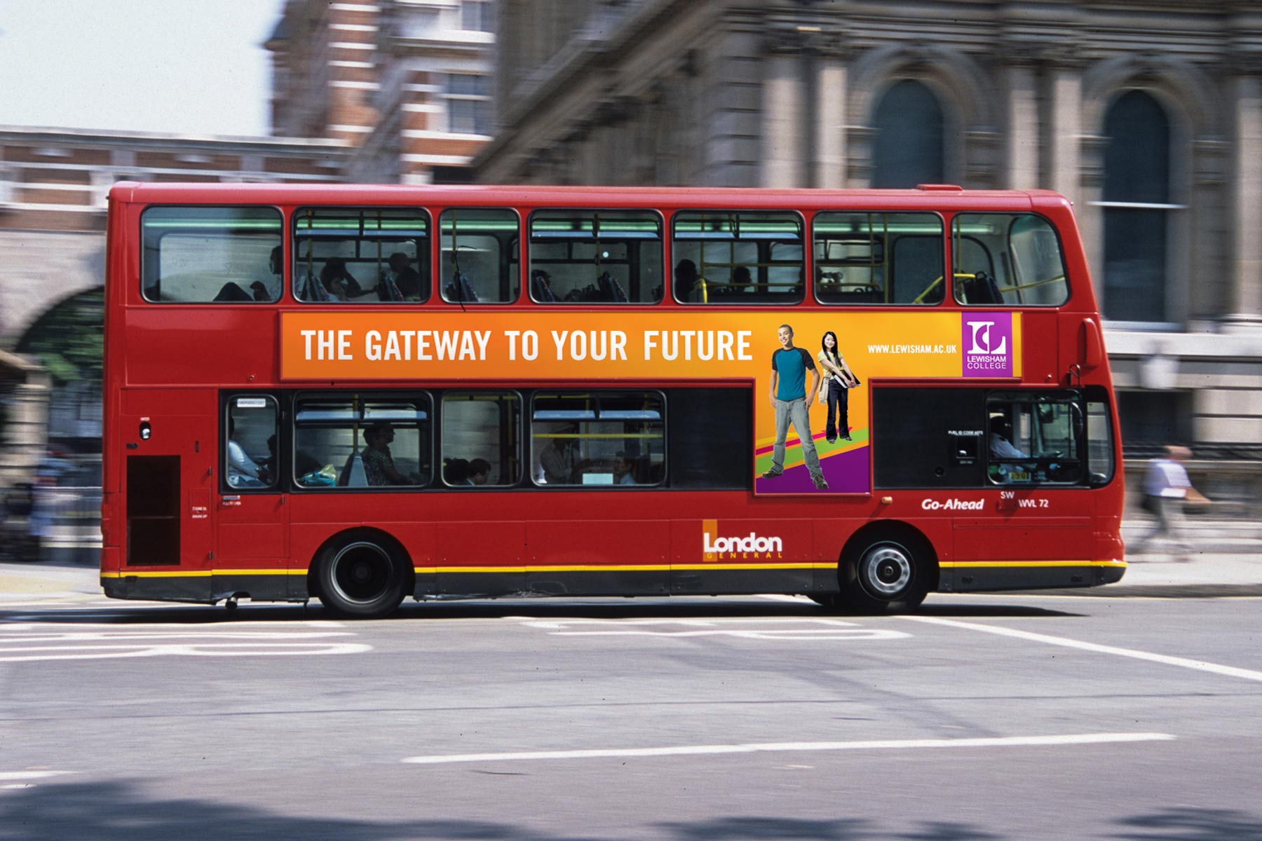
The campaign has also been applied to Adshels and other vertical media.
-

The combination of real student imagery and creative post production creates an engaging and moody virtual environment.
-

From even the first year campaign, featured here, it has always been important for the target audience to project themselves within the campaign.
-

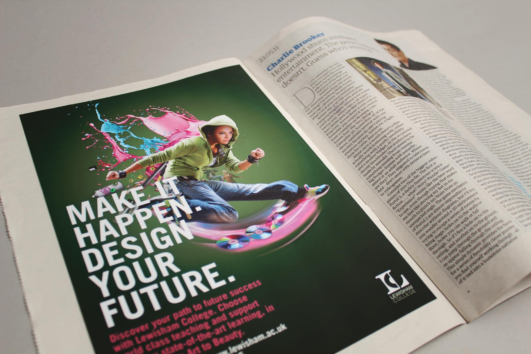
The campaign extended to local press. This image shows the arts, creativity and beauty application.
-

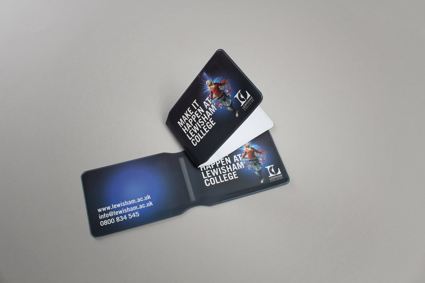
The campaign also extended to merchandising - Such as a handy travelcard wallet. Very useful in London!
-

The campaign utilised the powerful imagery to its greatest effect supported with hard hitting copy and a strong call to action.
-

In the first year we communicated to the different audiences by showing the primary figure supported by relative devices. Here is the IT and business application.
-

After winning a five way creative pitch we developed our ideas supported by a subsequent quantitave research program.
-

The brand had to adapt to both offline and online media as well as above the line and promotions usages.
-

The primary brief was about building awareness and confidence behind the identity. We produced a range of graphic applications which carried this visual thrust.
-

The brand visual identity comprised of hero imagery and strong bright graphic devices - All linked back to the college brand.
-

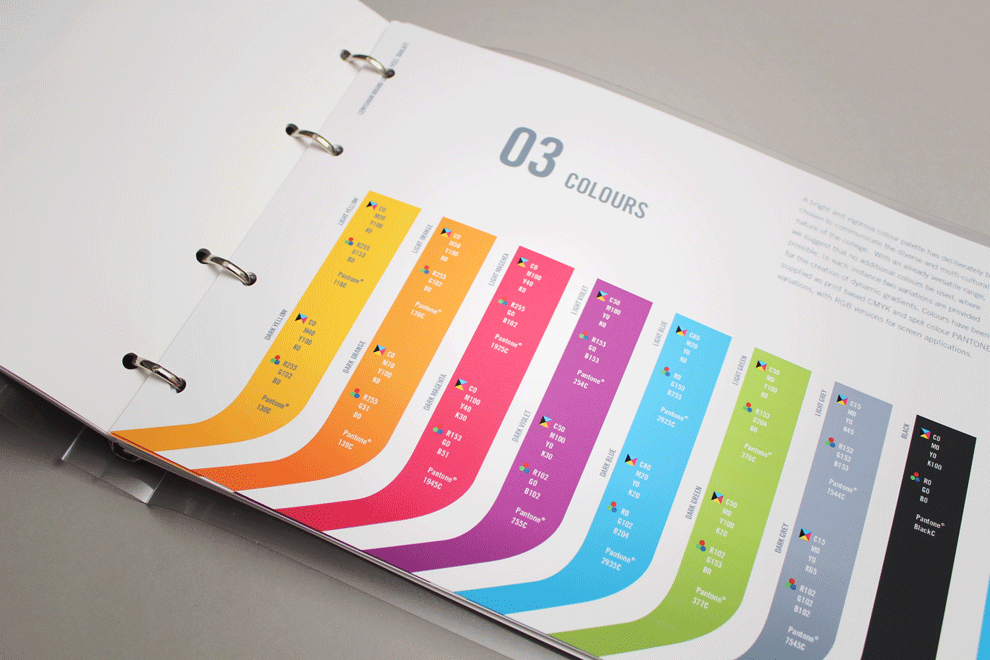
We created an extensive guideline kit so that the college could easily source and utilise local suppliers.
-

With South East London being a bit grey and urban, the identity looked to create instant standout and awareness.
-

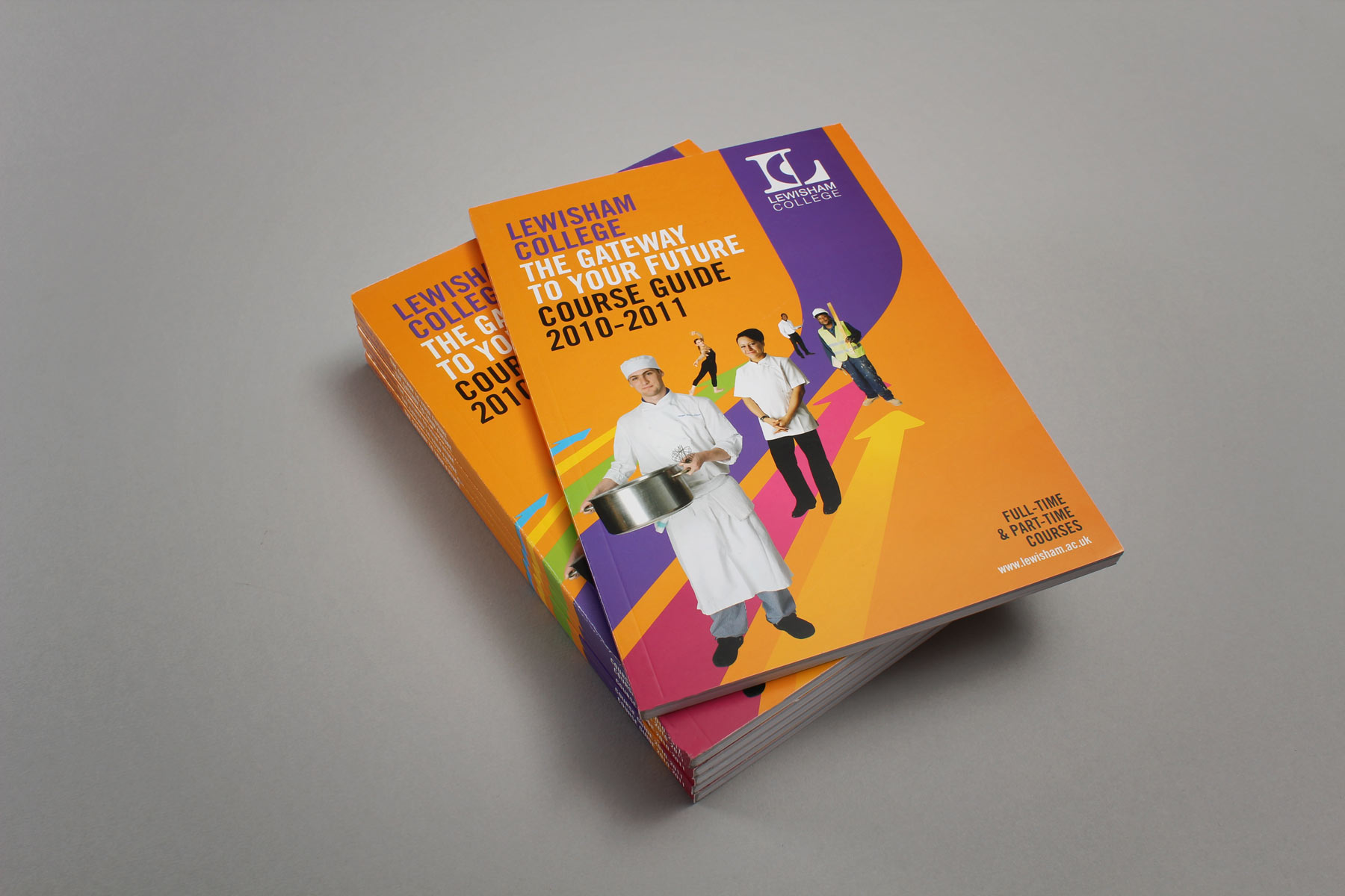
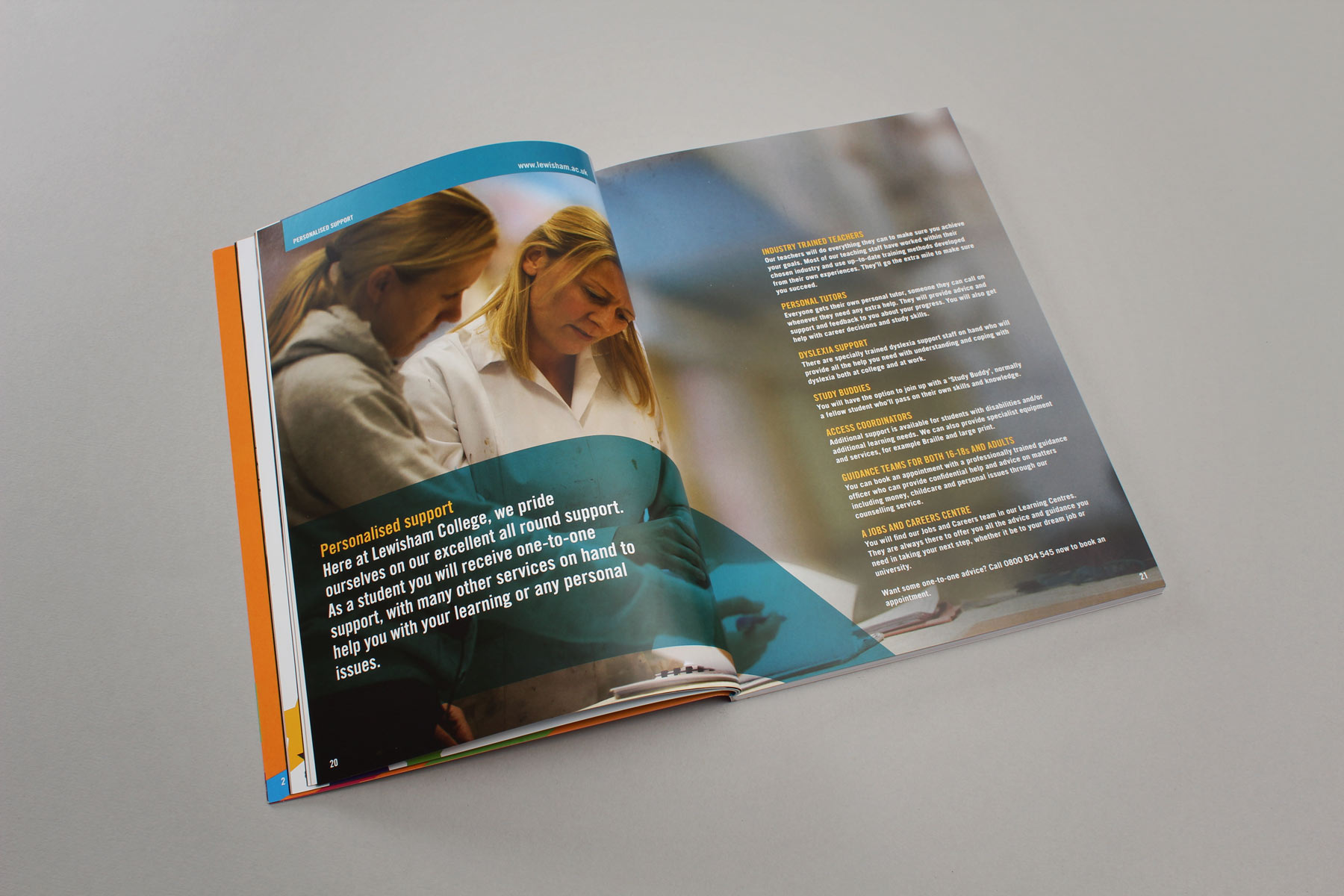
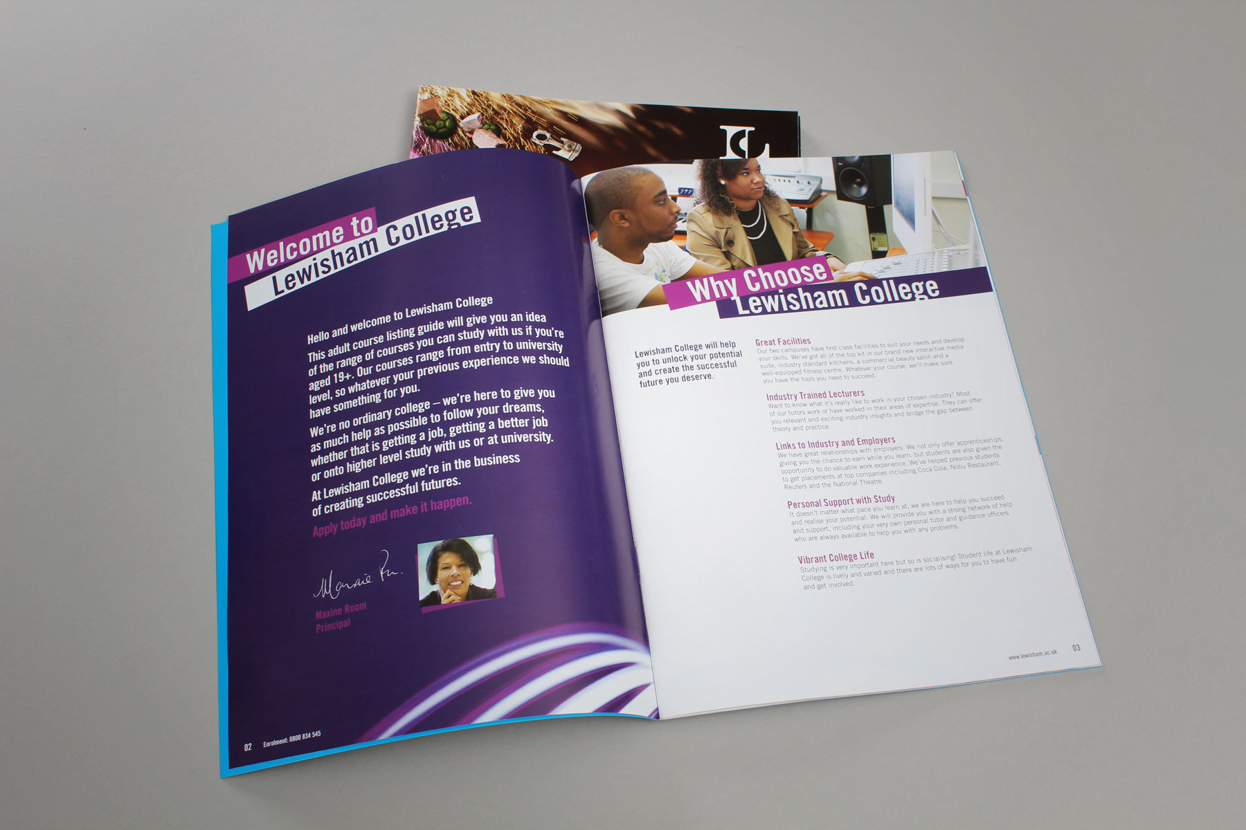
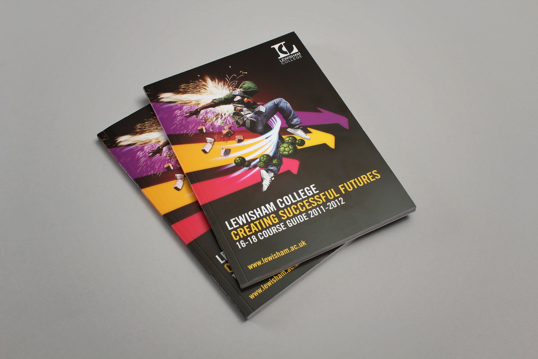
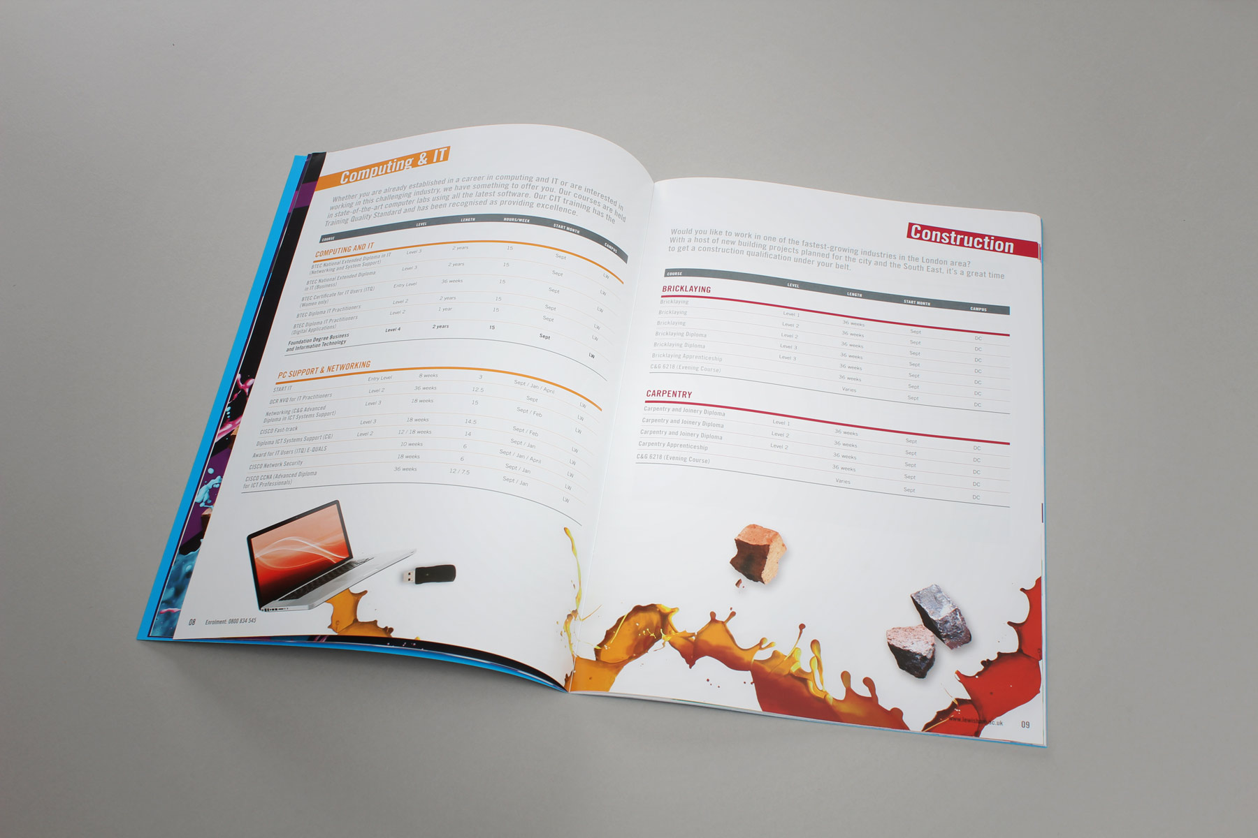
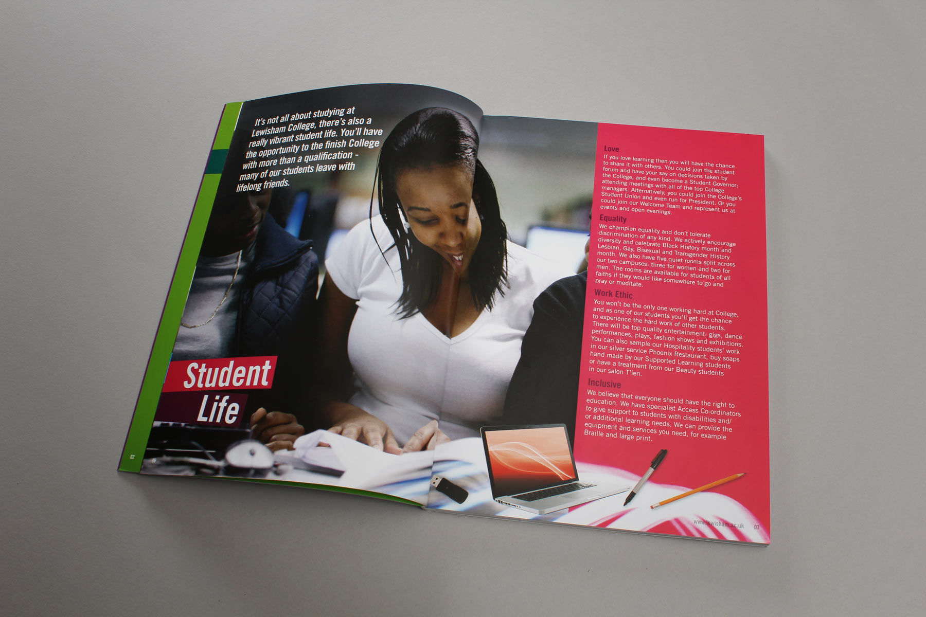
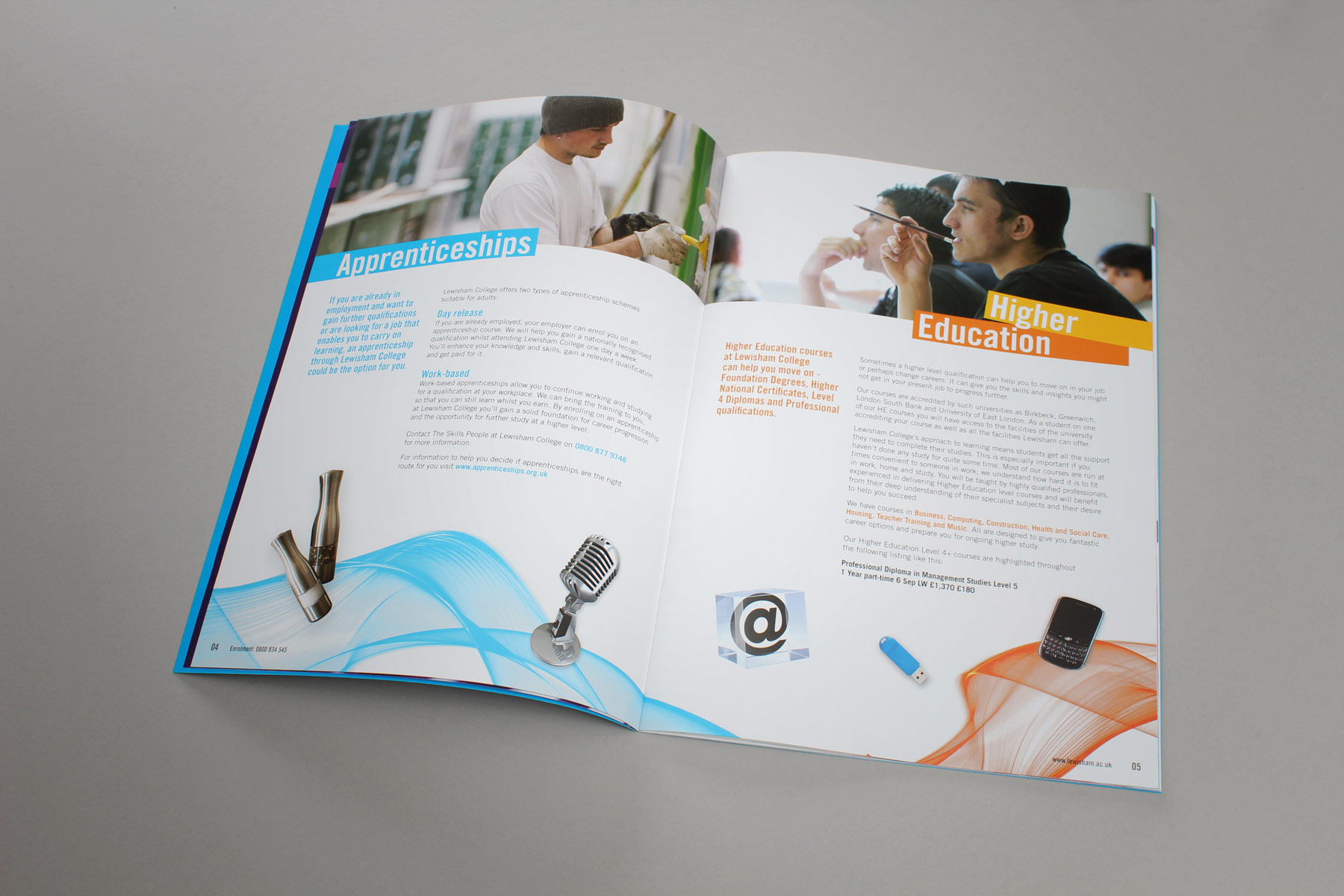
The course guide forms a natural extension to the Lewisham brand identity, also completed by Firedog.
-

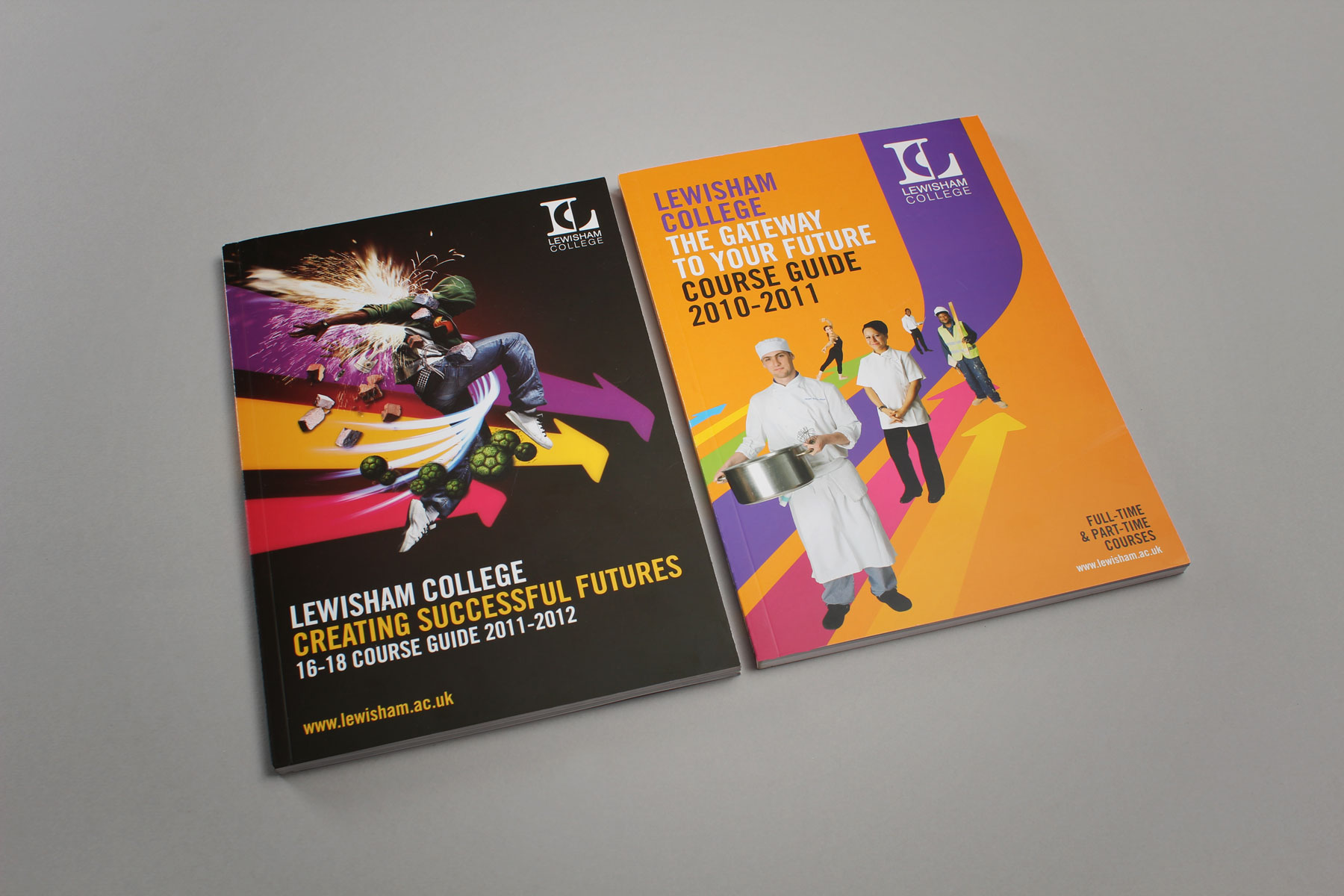
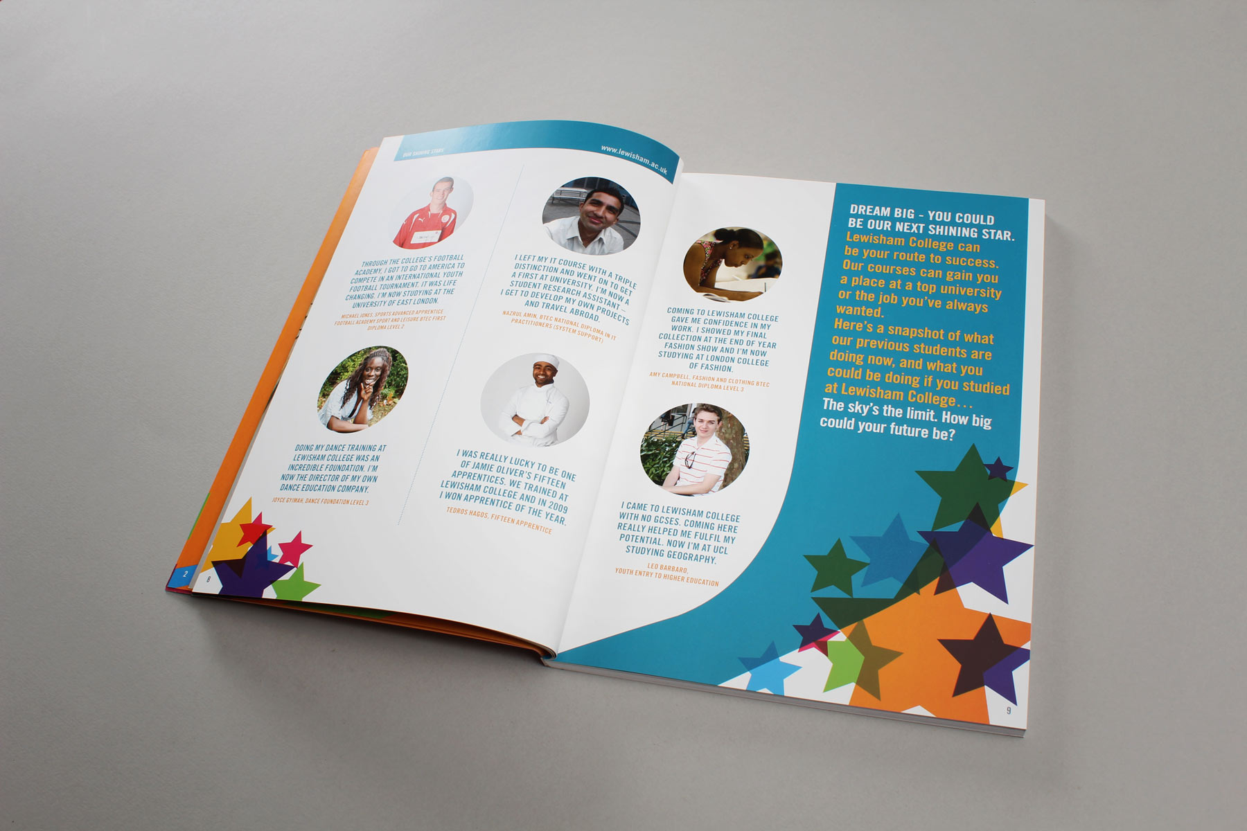
The guides consistantly use engaging imagery coupled with bright colours.
-

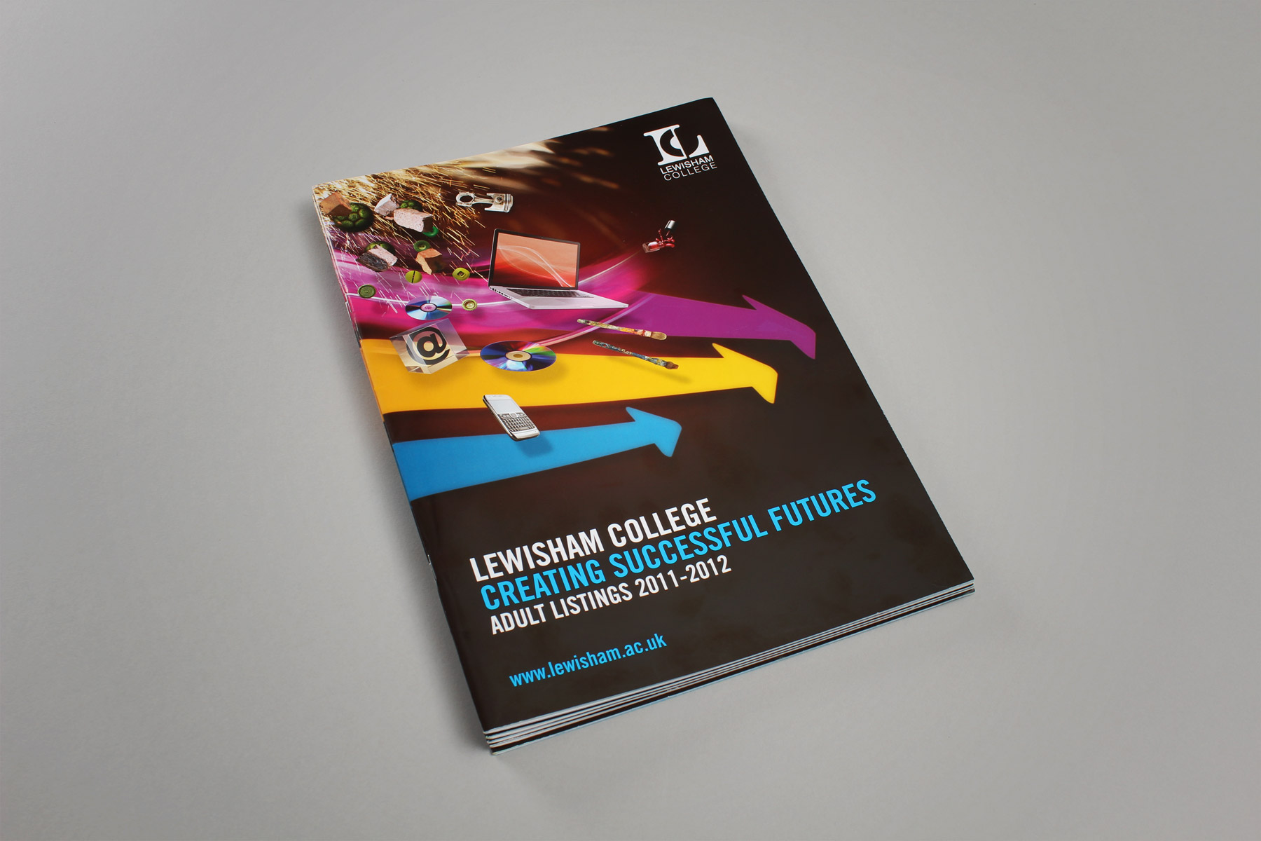
The vibrancy and use of both graphic shapes and imagery creates a striking publications visual identity.
-

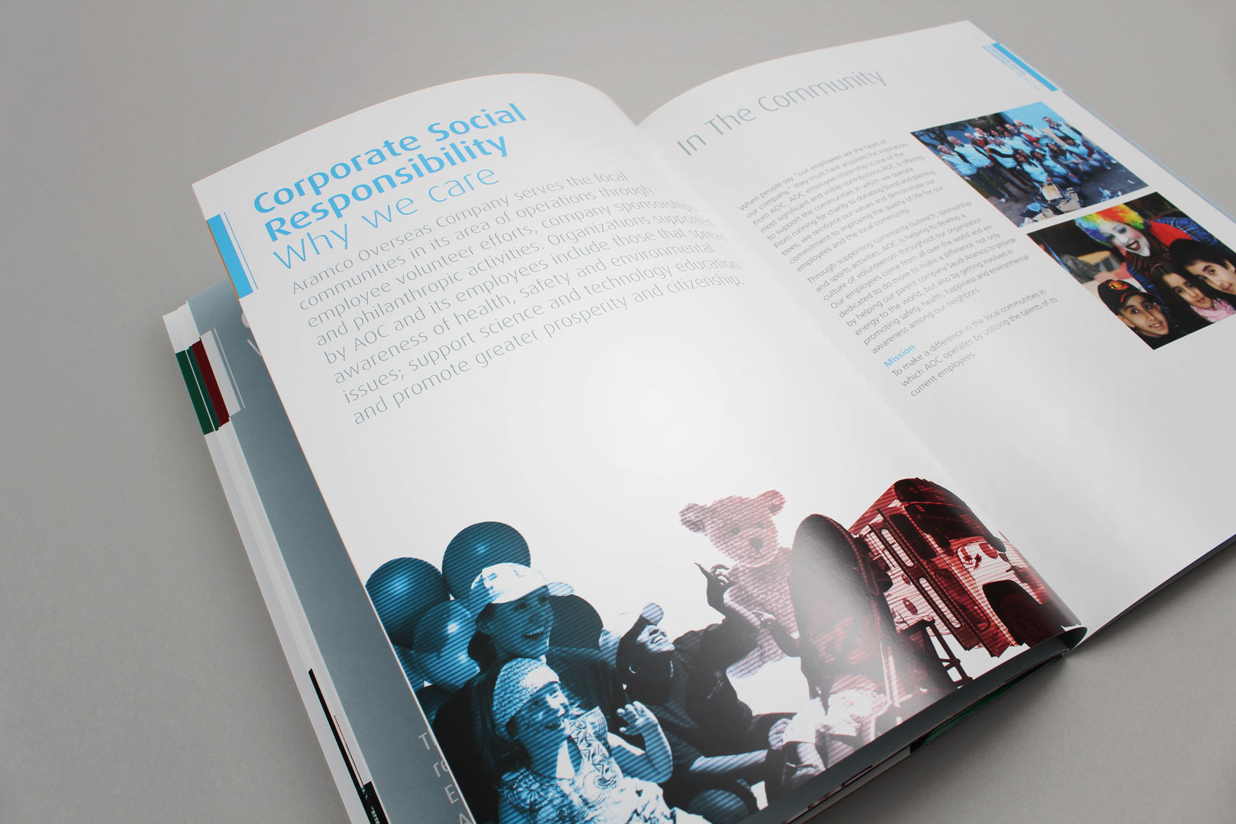
Two course guides showing how the brand language has been extended.
-

Coupled with the delivery of the course guide, a specialised publication - The Adult Listings, focussed at the adult learner.
-

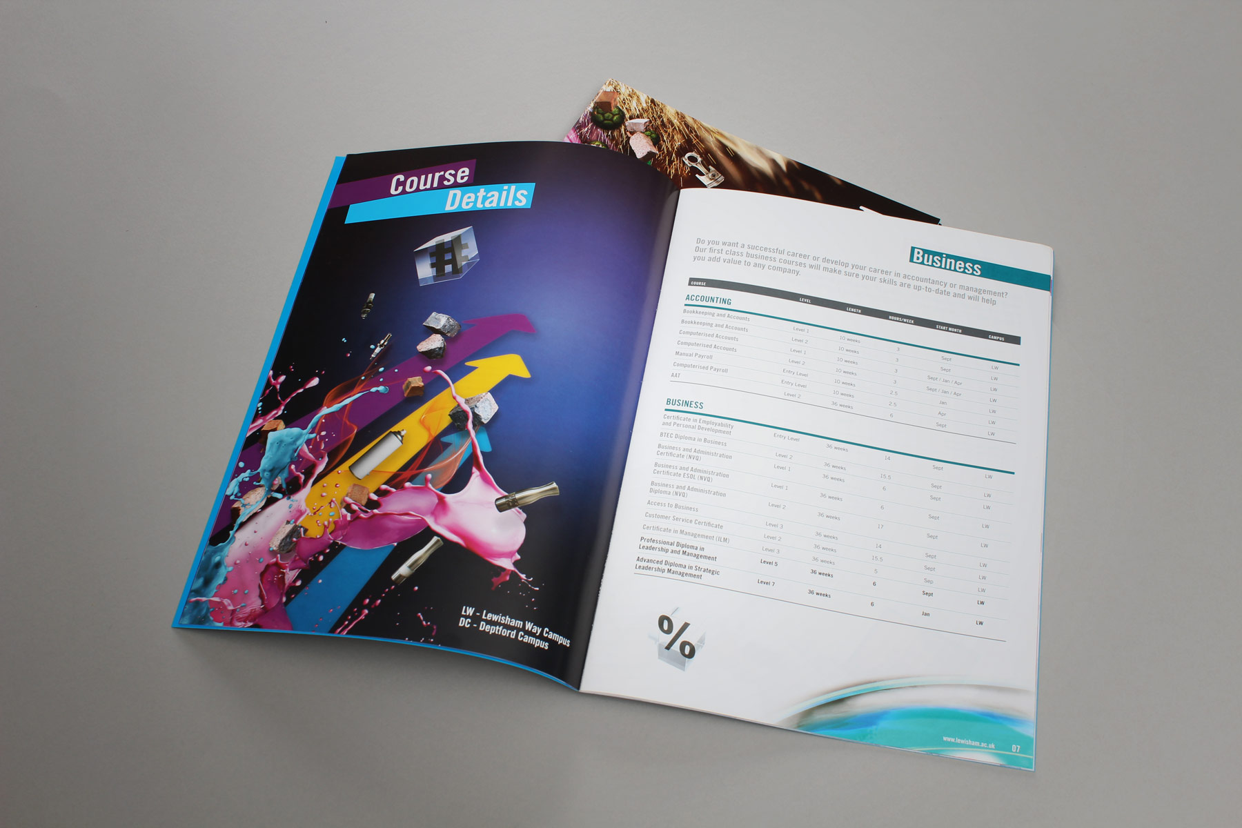
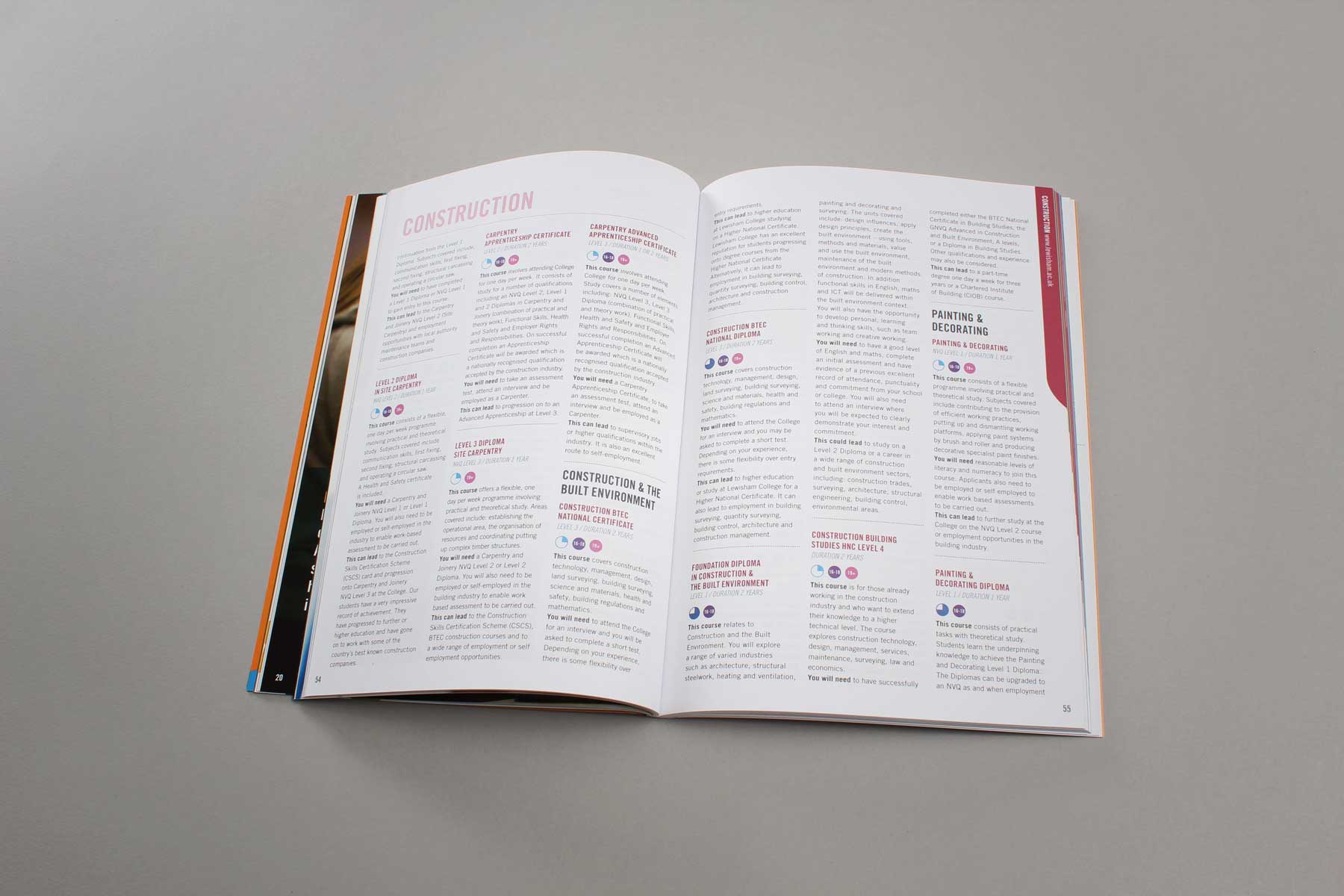
As most of the course publications are over 100 pages, we ensure a dynamic read by providing a number of varied page layouts.
-

The listings have been carefully crafted for ease of reading and reference.
-

The publication reaches the widest possible audience via the use of sophisticated yet friendly design aesthetics.
-

The course guides, whilst containing a different look year on year, all carry the same Lewisham brand values.
-

The resulting combination of formal layouts and dynamic imagery makes for both a confident yet accessible publication.
-

We worked with the client team to carefully select and utilise confident and appealing imagery, always focussed on the student.
-

We also have integrated the visual language with the above the line campaign materials which preceded the guide. This helps the audience make a connection between the materials.
