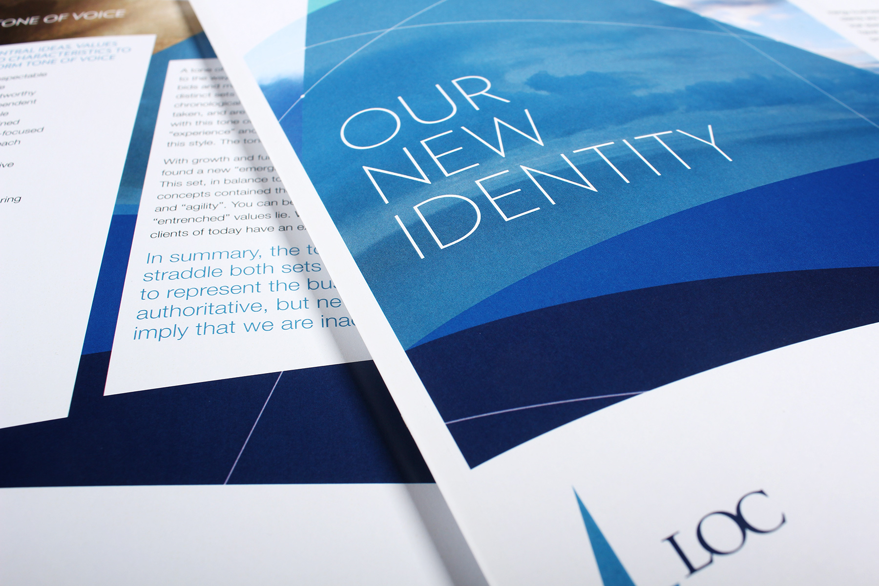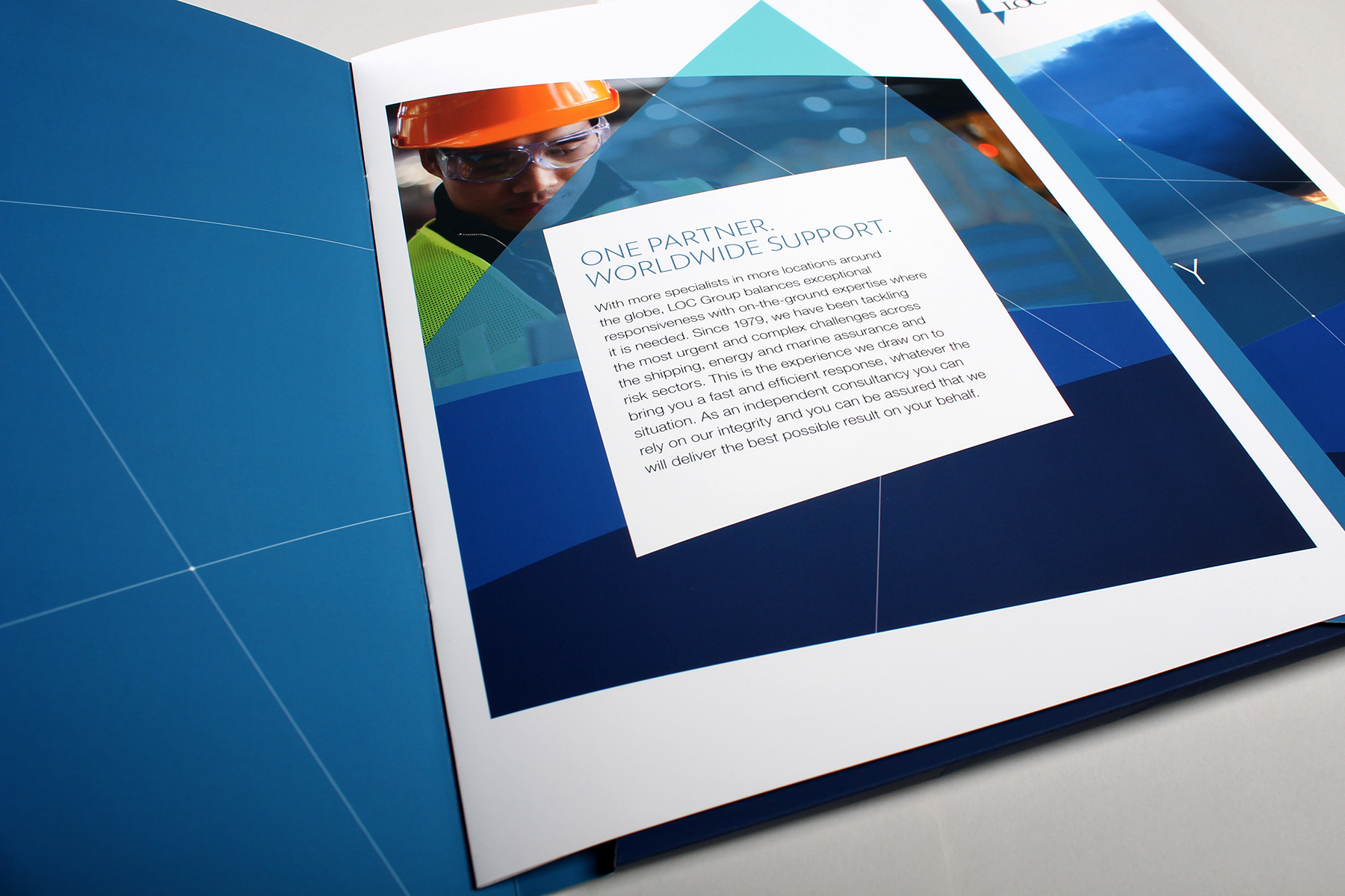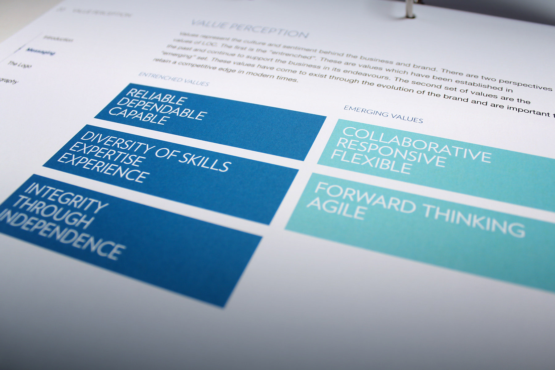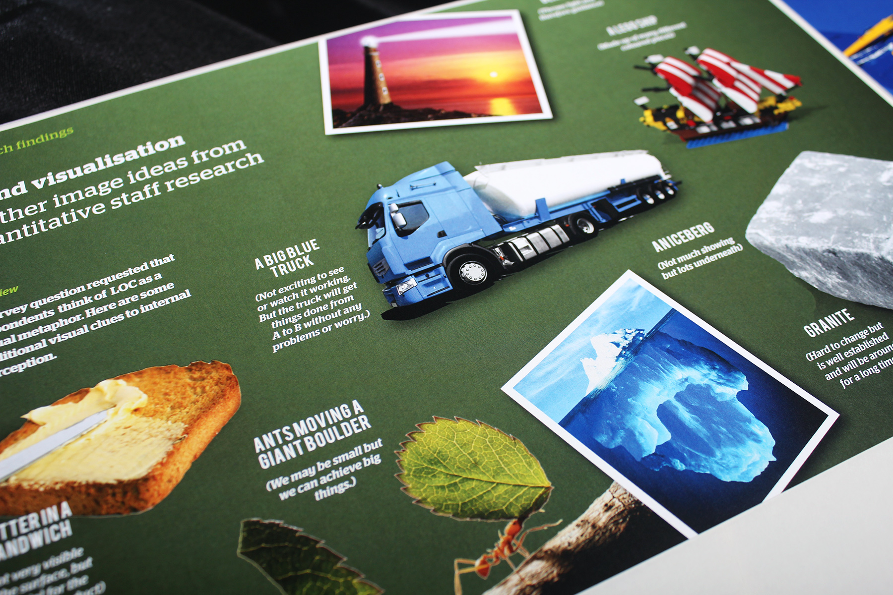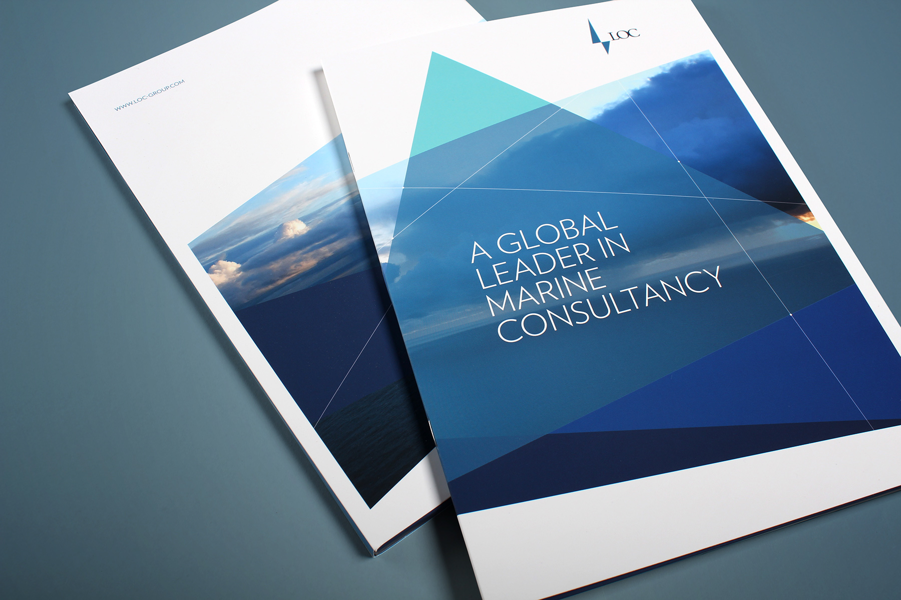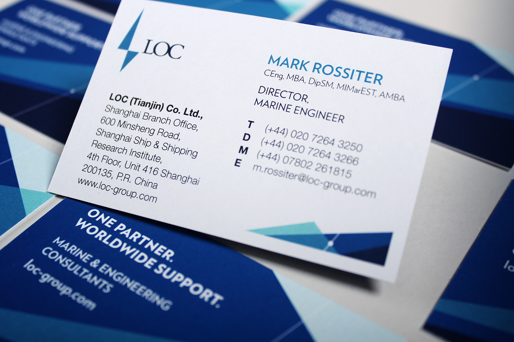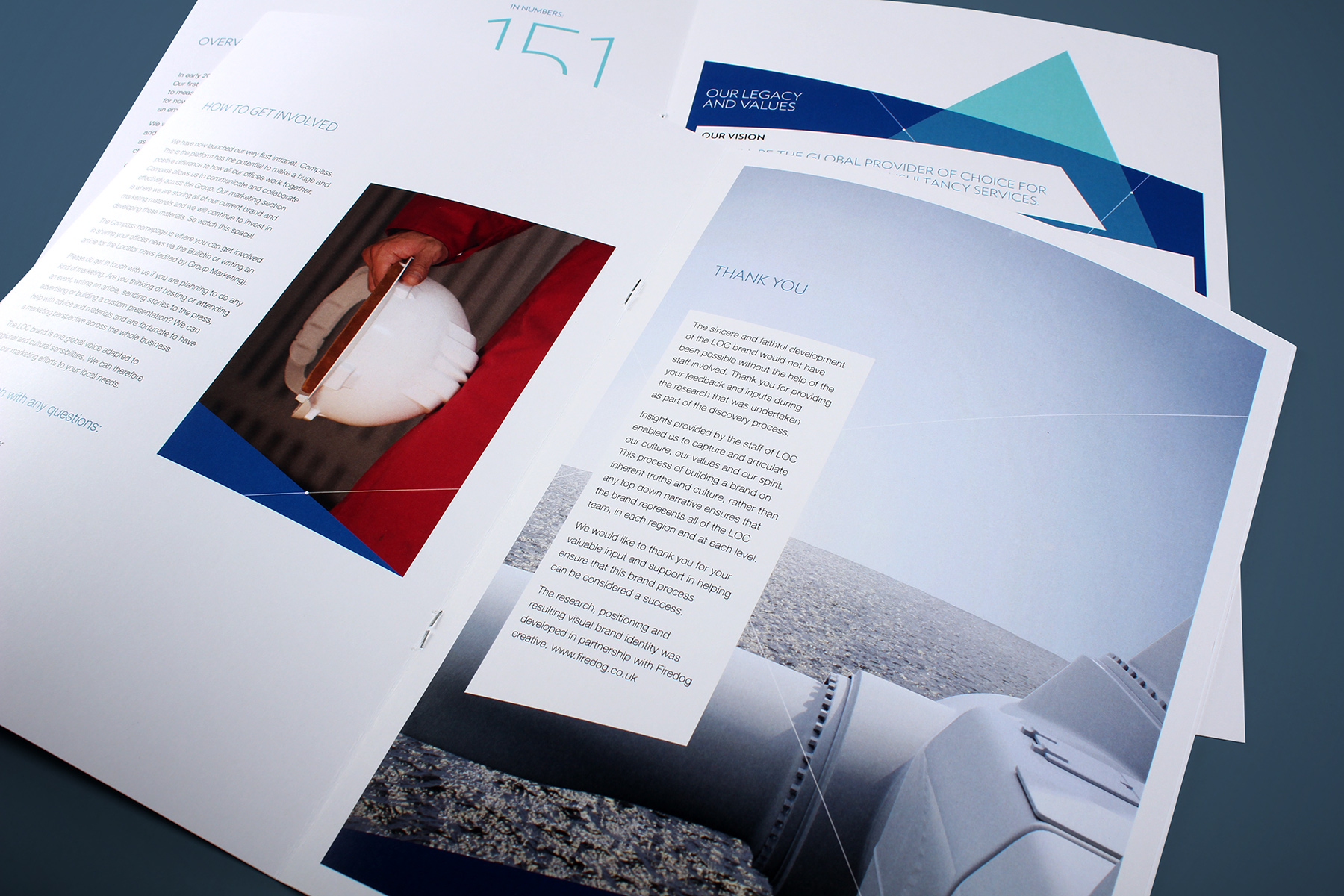
The visual identity creates a very striking aesthetic and delivers against the brief perfectly.
A visual identity oceans apart from its competition.
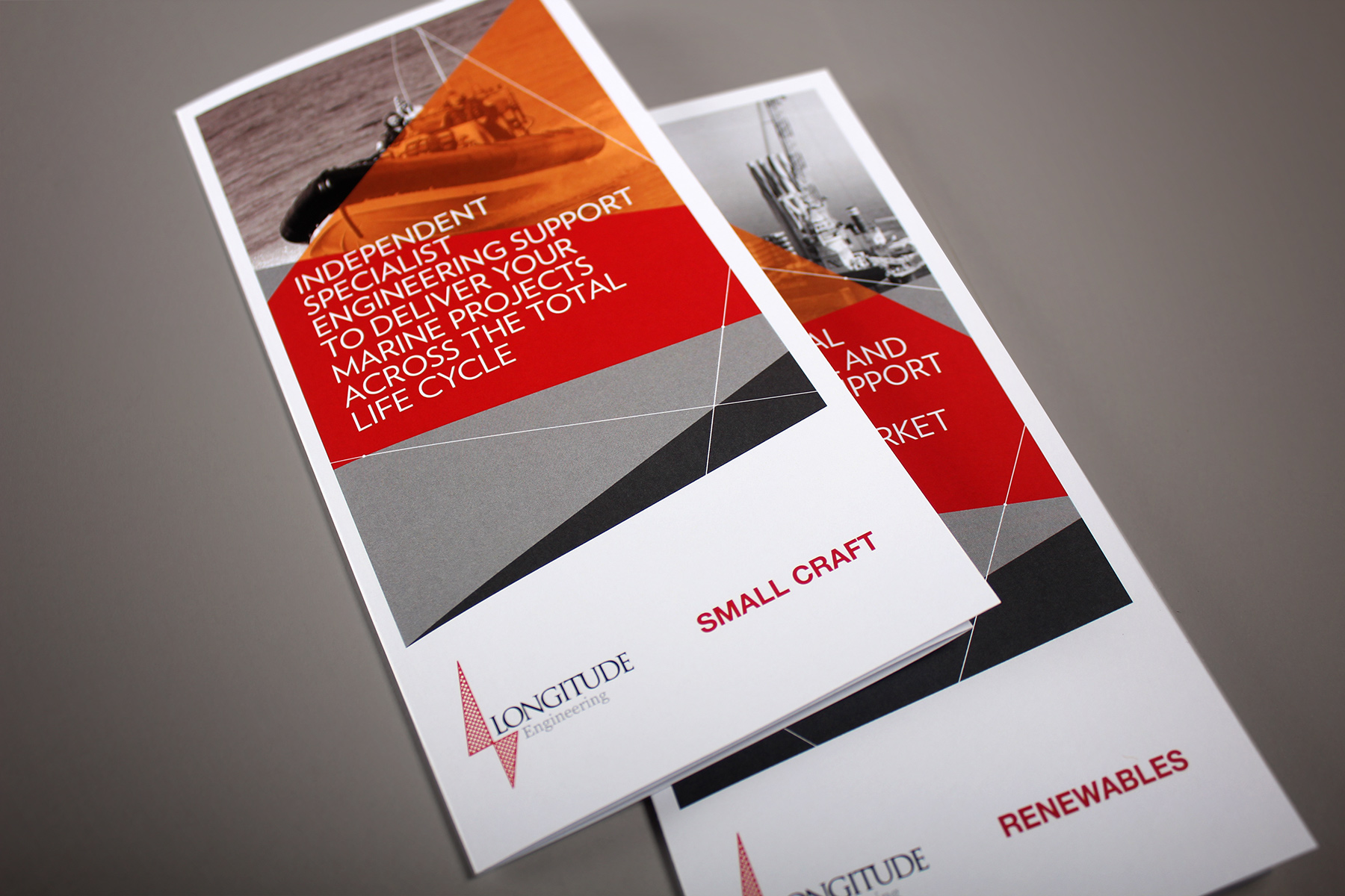
The incumbent brand identity lacked any visual thread and thus it felt incoherent and diluted. Our remit was to create a flexible engineering brand identity which could unify the various operating units and regions under one cohesive identity. Following the rebrand, we were to create a set of communications, as well as a new website for the group business. The brand needed to also adapt to the sister business, Longitude Engineering.

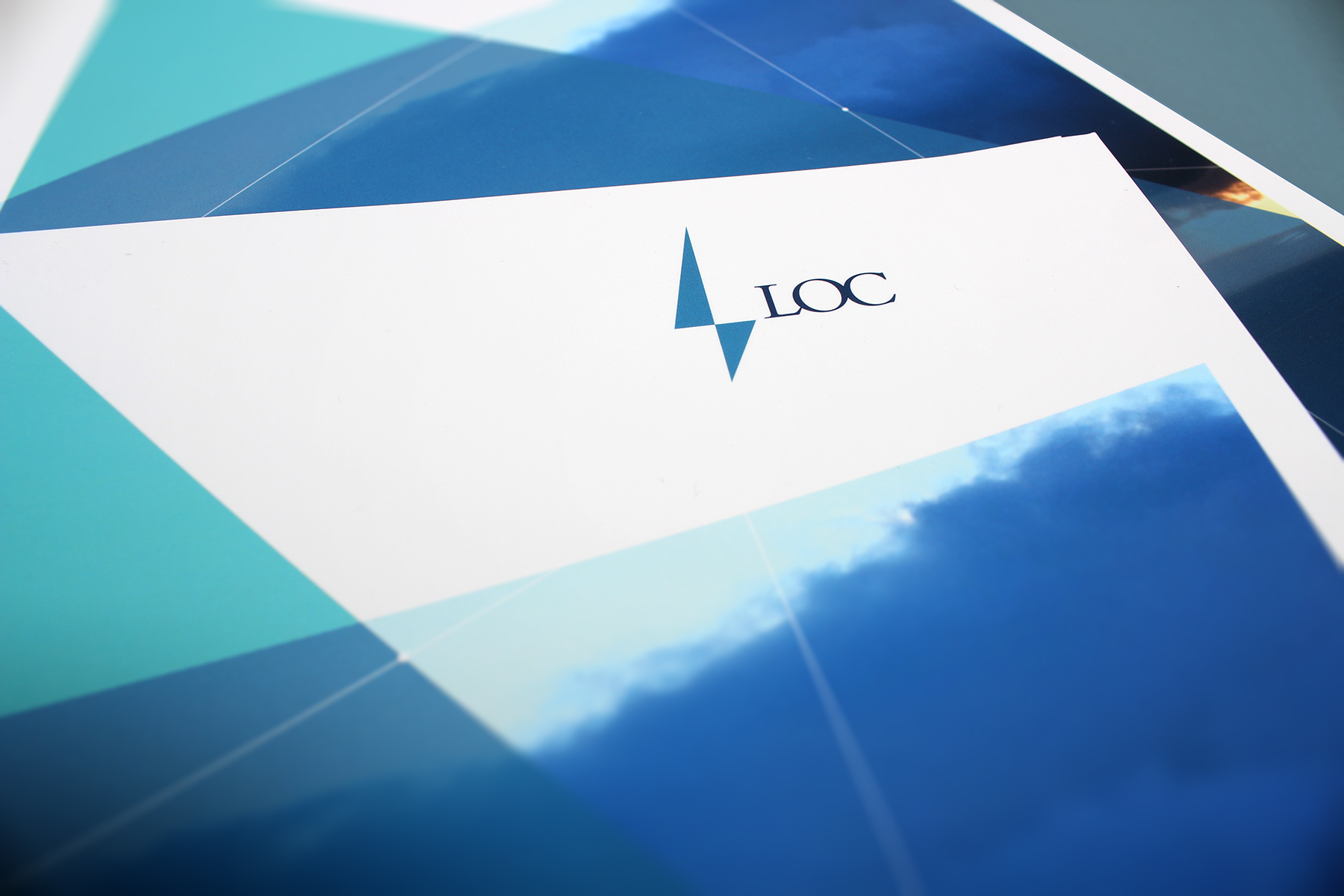
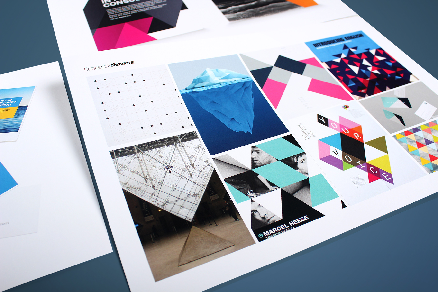
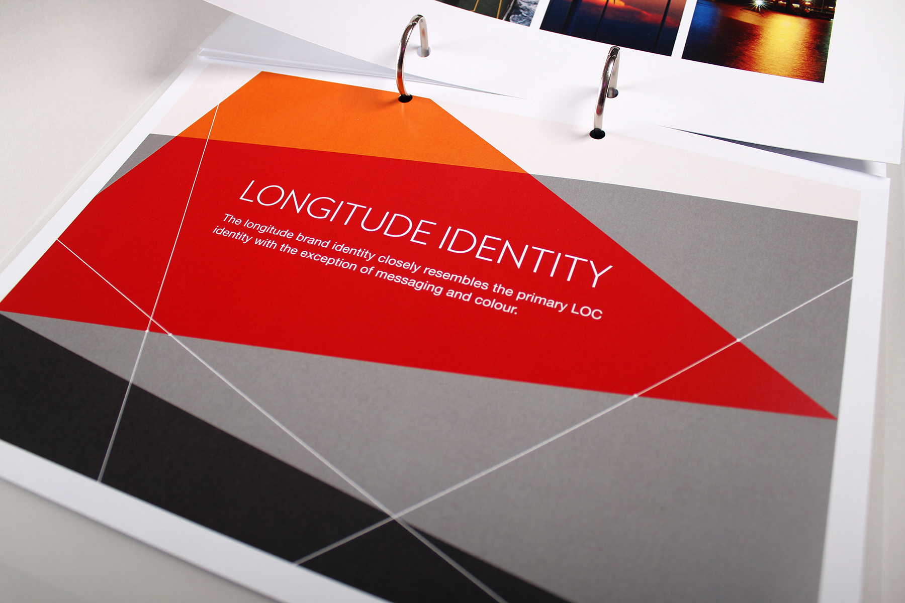
Our visual identity look and feel concept became inspired by the idea of global connectivity mashed up with a contemporary nautical twist.

Imagery and graphic devices interact in a system which is both random, yet controlled at the same time.
We continue to work with LOC on a day to day basis, and have delivered a new engineering brand identity and website for sister business Longitude. We have also created a sub brand and visual identity extension for their LOC Renewables proposition. We also support LOC on a tactical basis, creating a raft of additional advertisements, campaign and communications materials.


