-

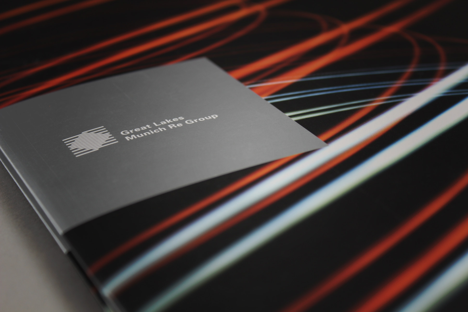
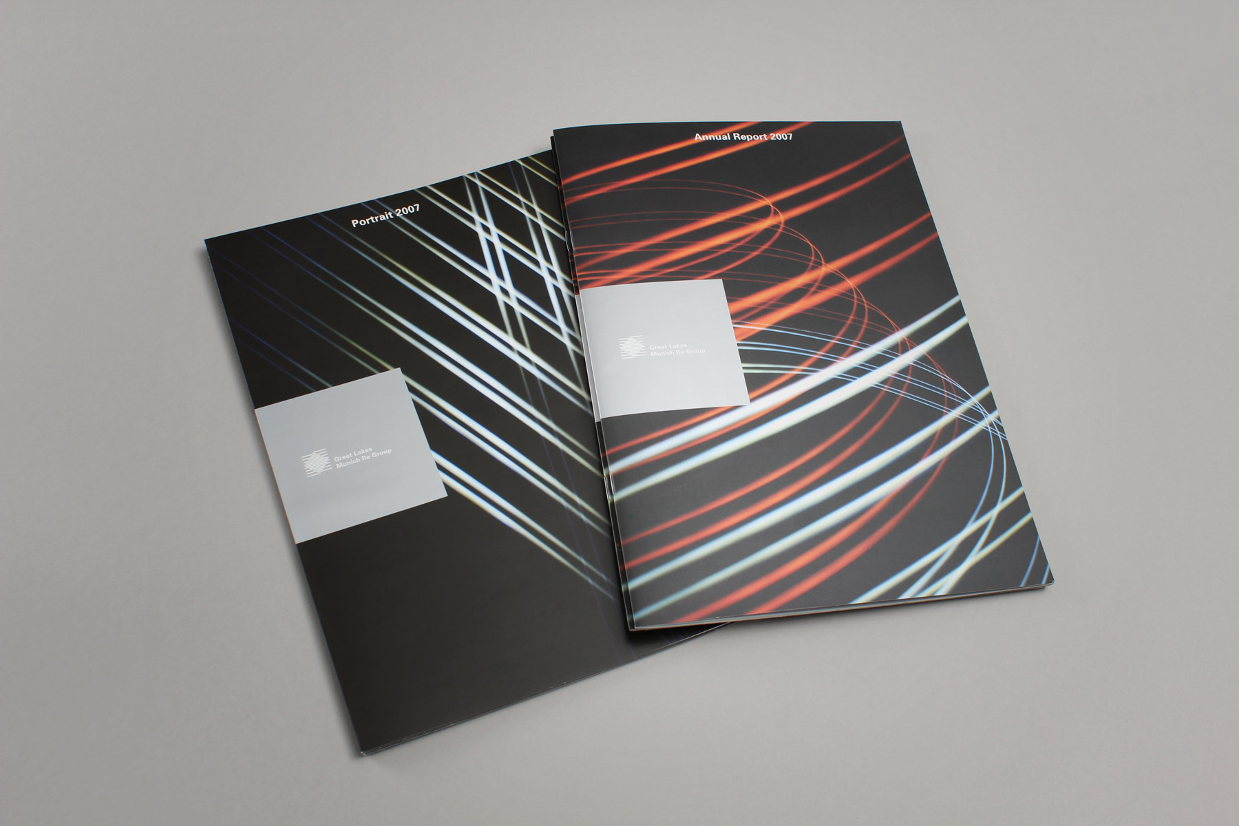
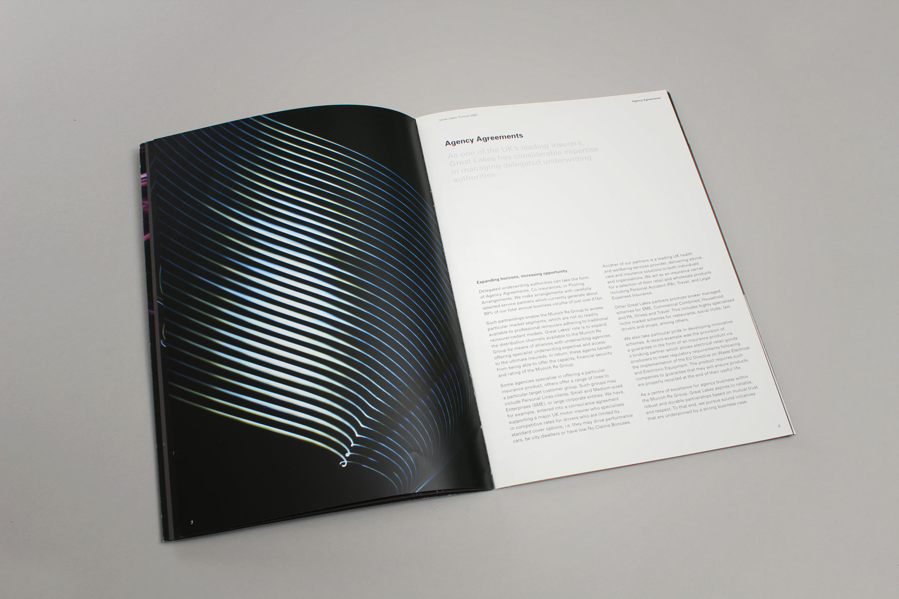
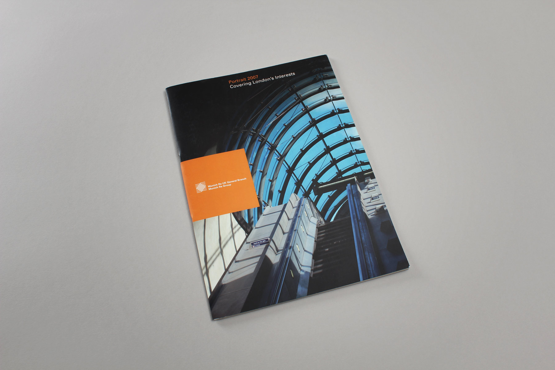
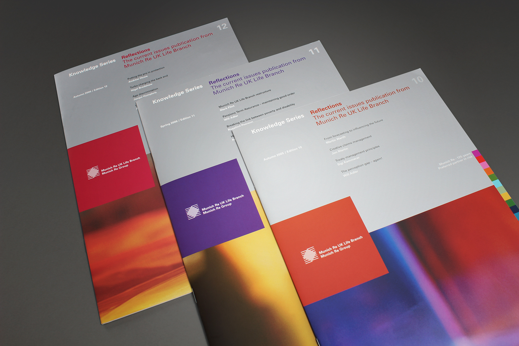
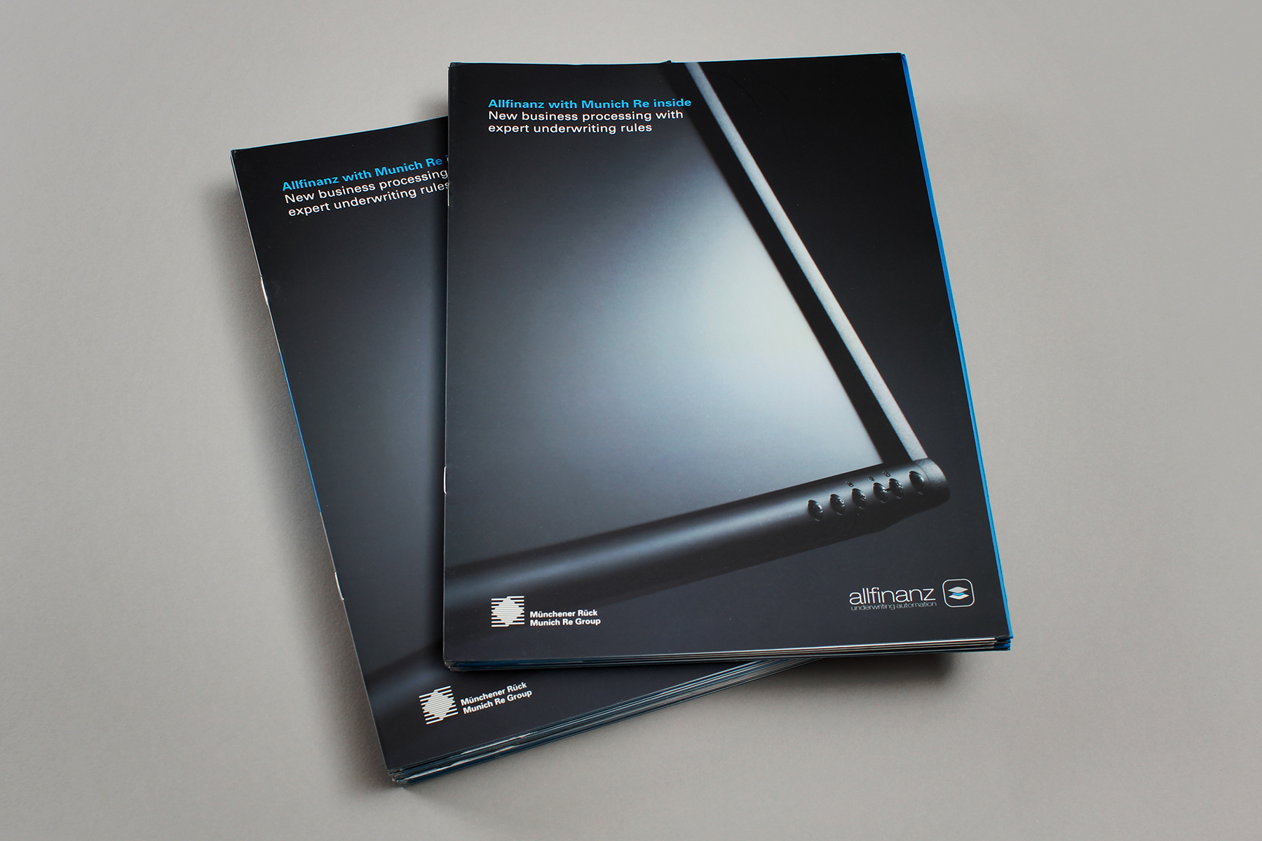
The publication was required to sit alongside other Munich Re communications. However, we created a strong point of difference by creating an abstract image led look and feel.
-

The brochure contained a sibling insert which contained more variable information, such as staff biographies.
-

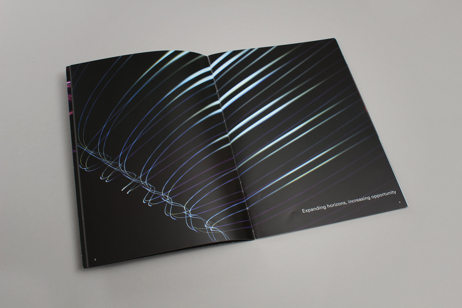
The images carry messages which convey the business values and propositions.
-

Due to the creativity behind the shoot, we were able to retain interest throughout the 24 page publication.
-

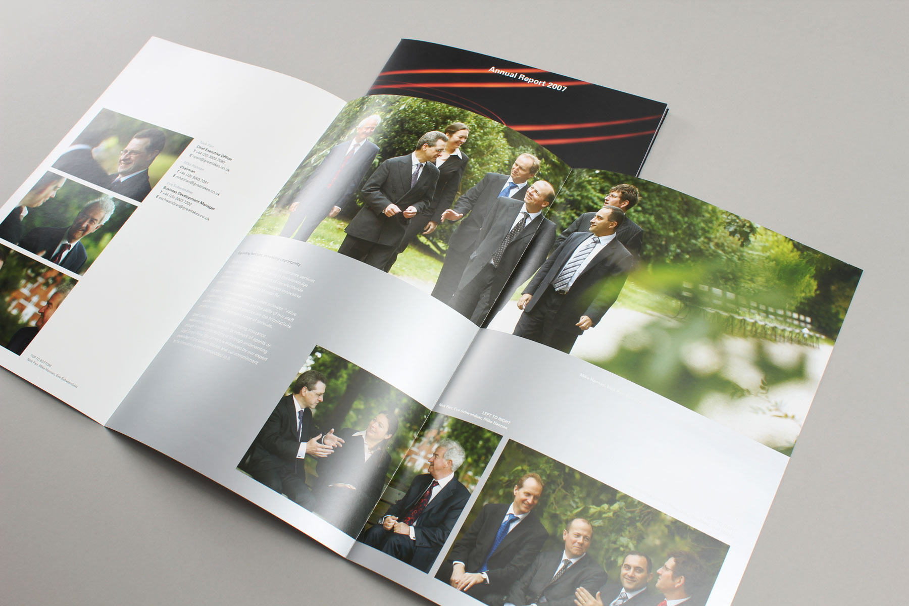
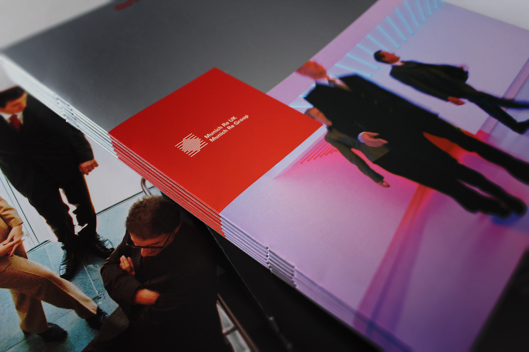
We wanted to create a lighter and more approachable image feel for the staff so we shot the subjects in Battersea Park.
-

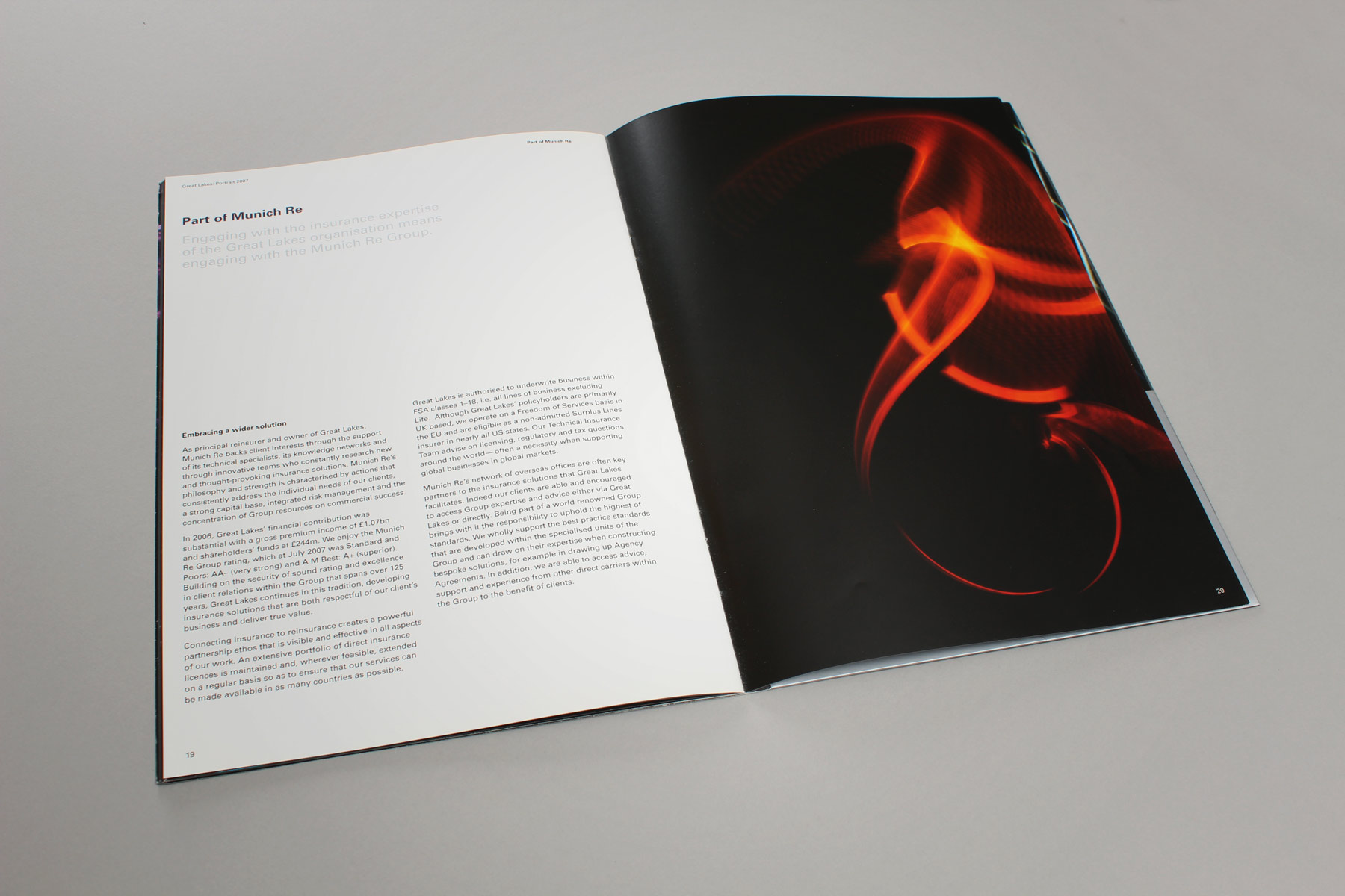
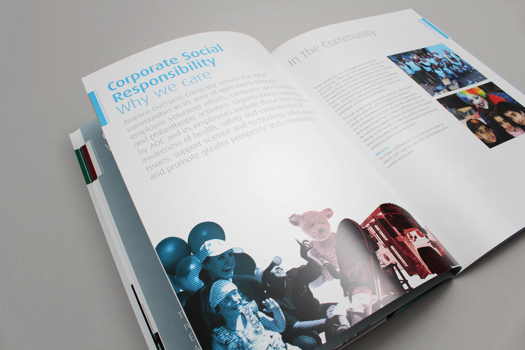
The brochure used imagery combined with a more formal and minimal text approach creating an business led publication.
-

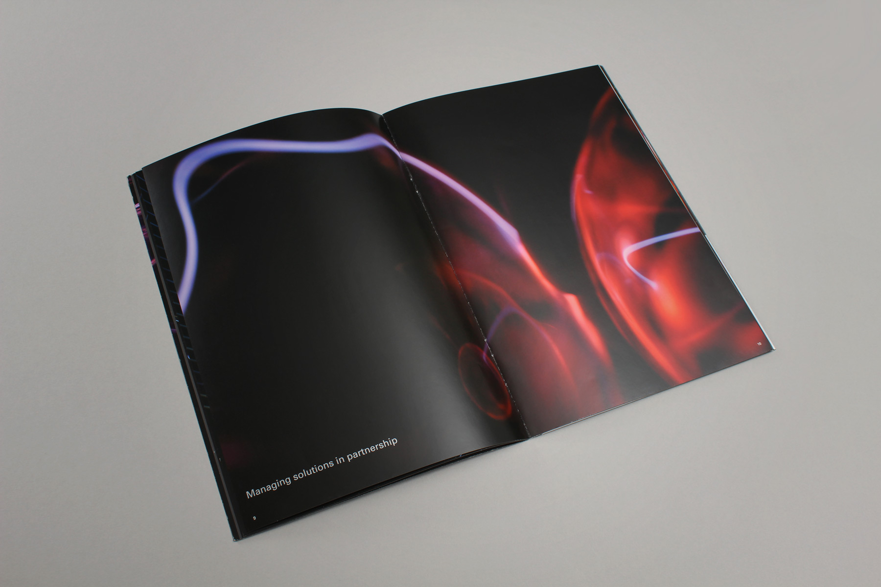
We created imagery around the concept of connectivity. Here a close up of a plasma globe.
-

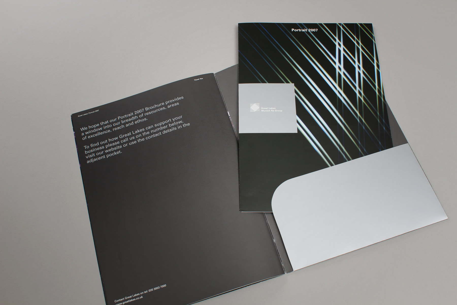
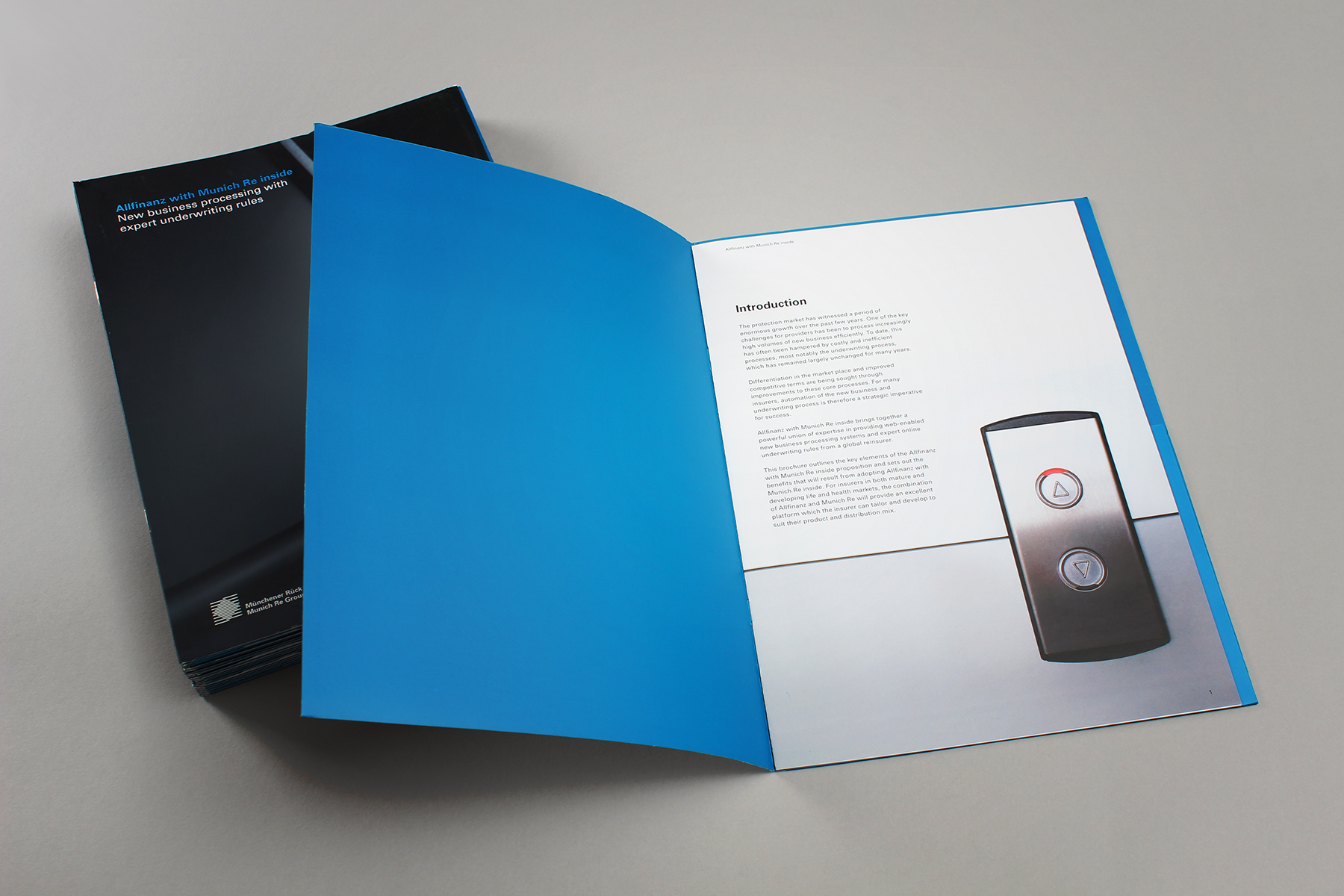
The brochure carried a pocket in the reverse so that it could be extensively used across the business.
-

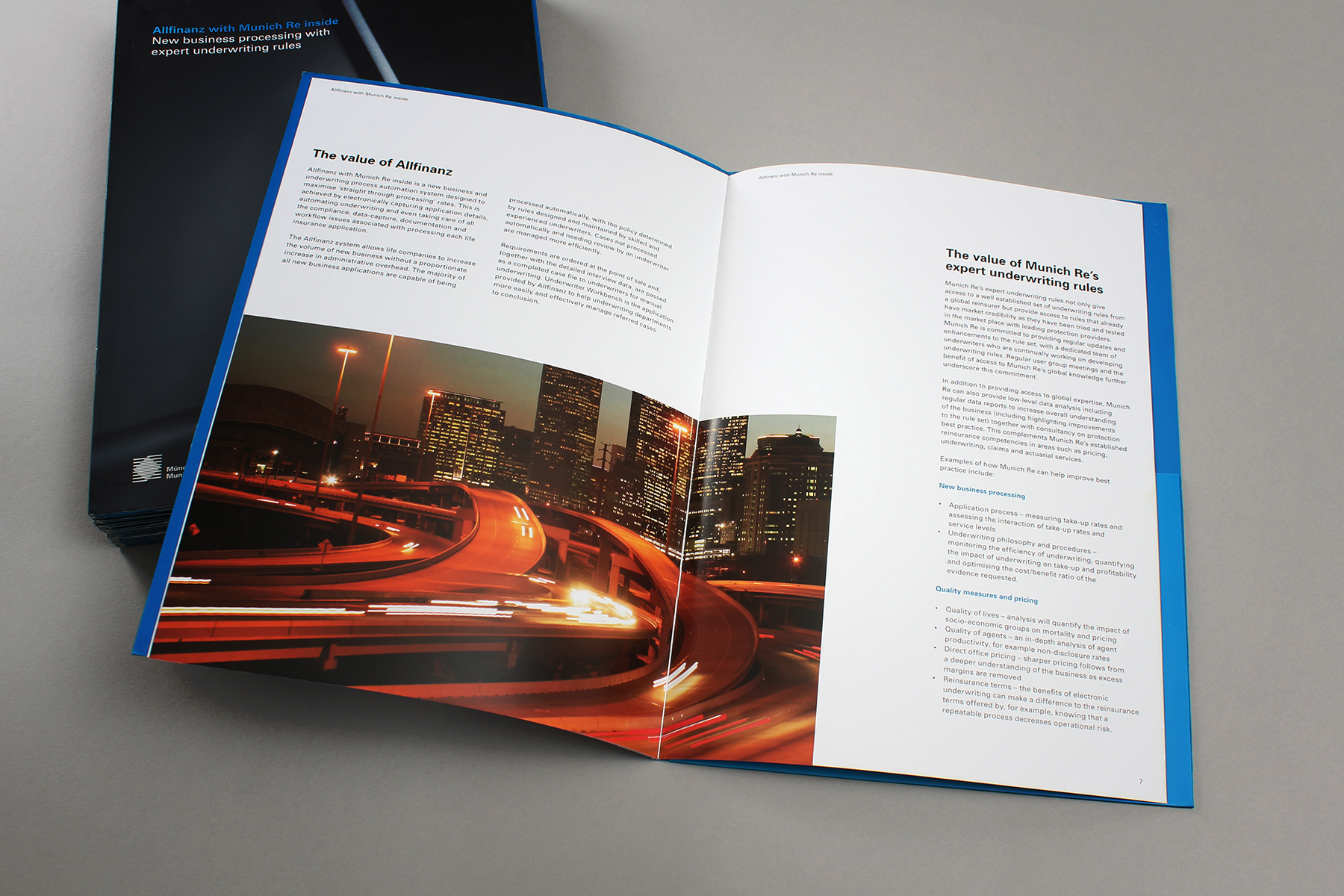
Due to the nature of the reinsurance business, a lot of the assets shown within the brochure would ultimately be covered by Munich Re.
-

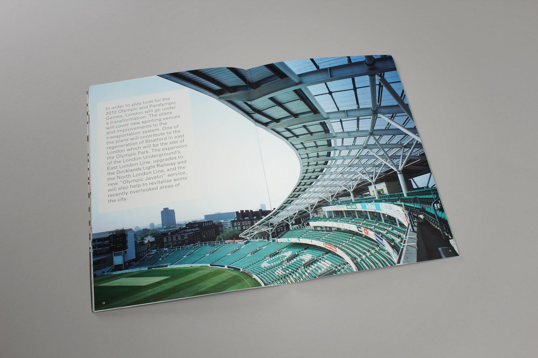
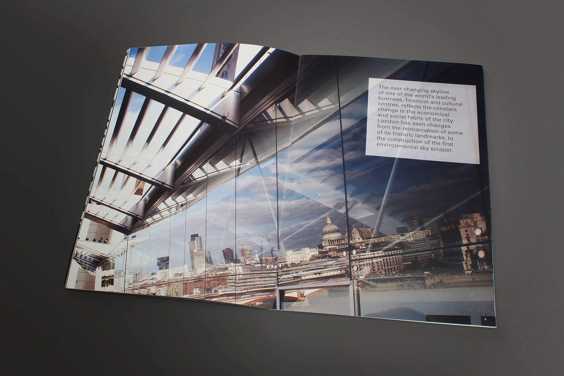
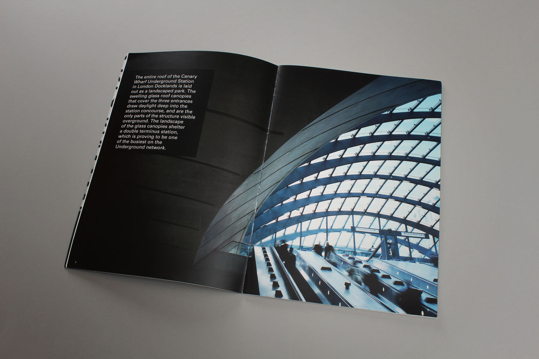
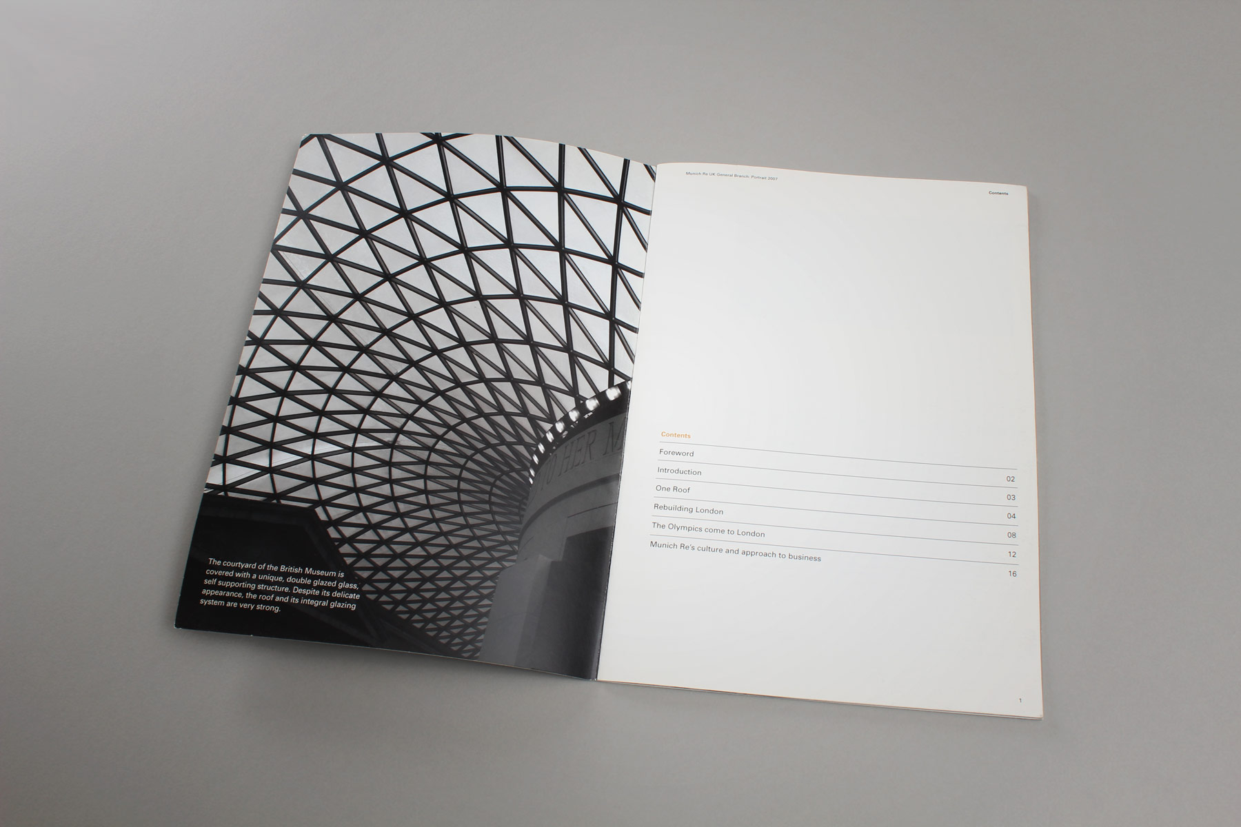
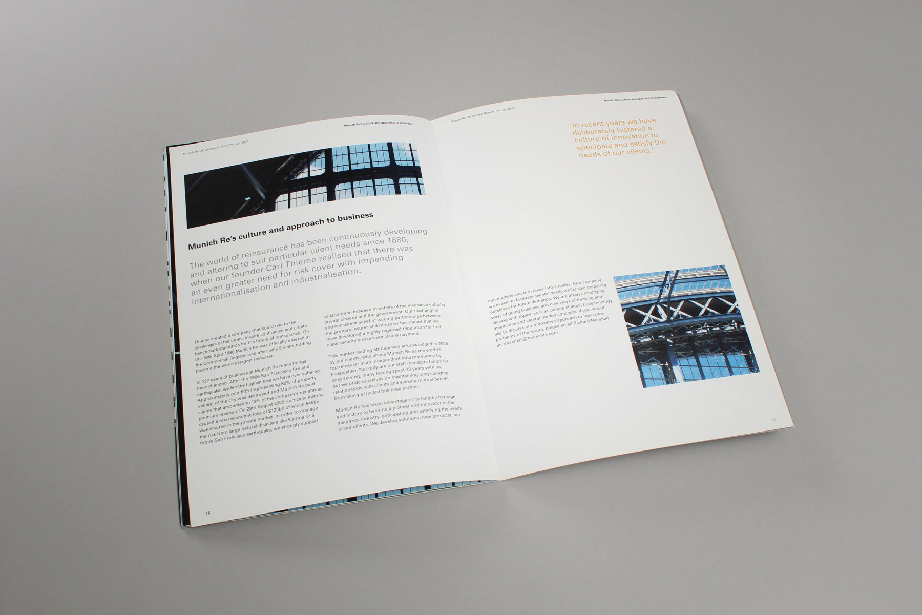
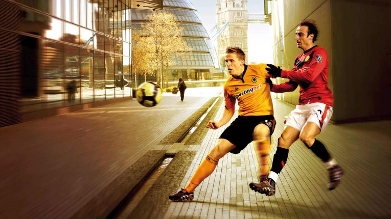
We used dynamic and famous roofing structures across London as a metaphor for the Munich Re business offer.
-

We seeded more functional copy within this narrative, making sure to convey the core values of the business.
-

The use of bold imagery and key statements enables the publication to raise interest amongst its readers.
-

Along with the image, we provided little insights to the origins of the structures.
-

The design concept also neatly dovetailed into the formal publication guidelines that we were directed to work within.
-

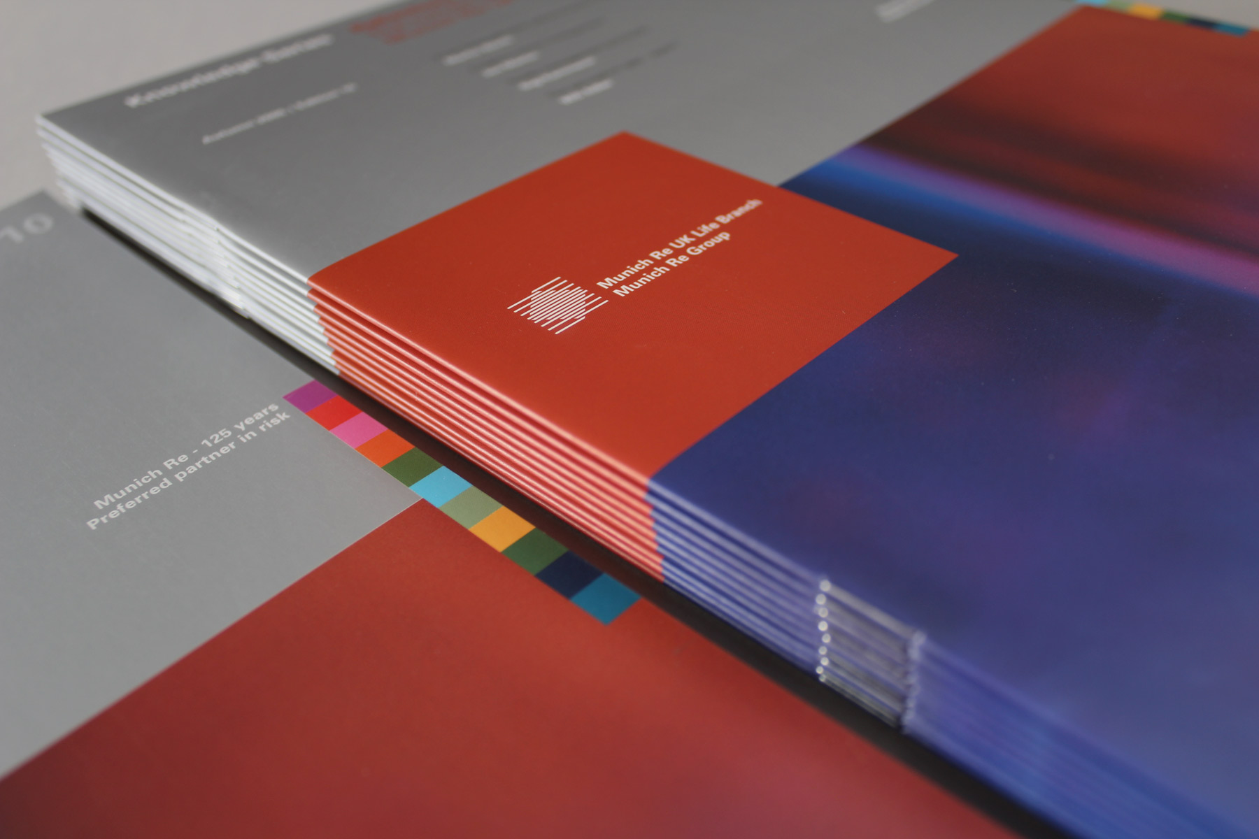
We used matt silver and bright imagery to convey a publication both contemporary and controlled.
-

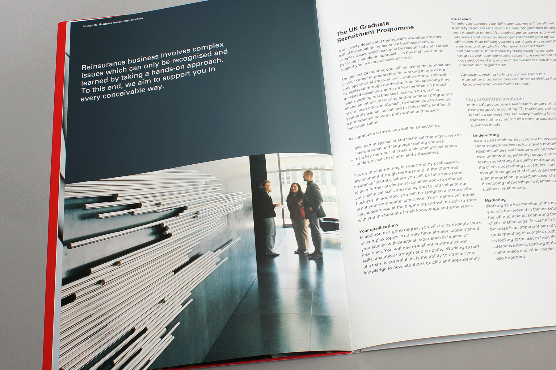
The Munich Re Graduate brochure featured dynamic imagery from the Munich HQ
-

We released around a dozen editions of the primary publication, making sure we kept a keen eye on consistency and editorial style.
-

We used large image areas in order to create interest.
-

The imagery featured dynamic metaphors for tech evolution.
-

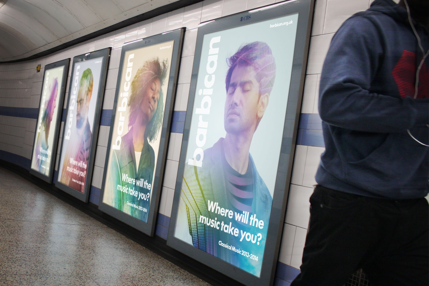
We used images with light backgrounds in order to retain impact yet allow for space for copy,
-

The result is a brand partnership which fits with the greater visual identity.
