-
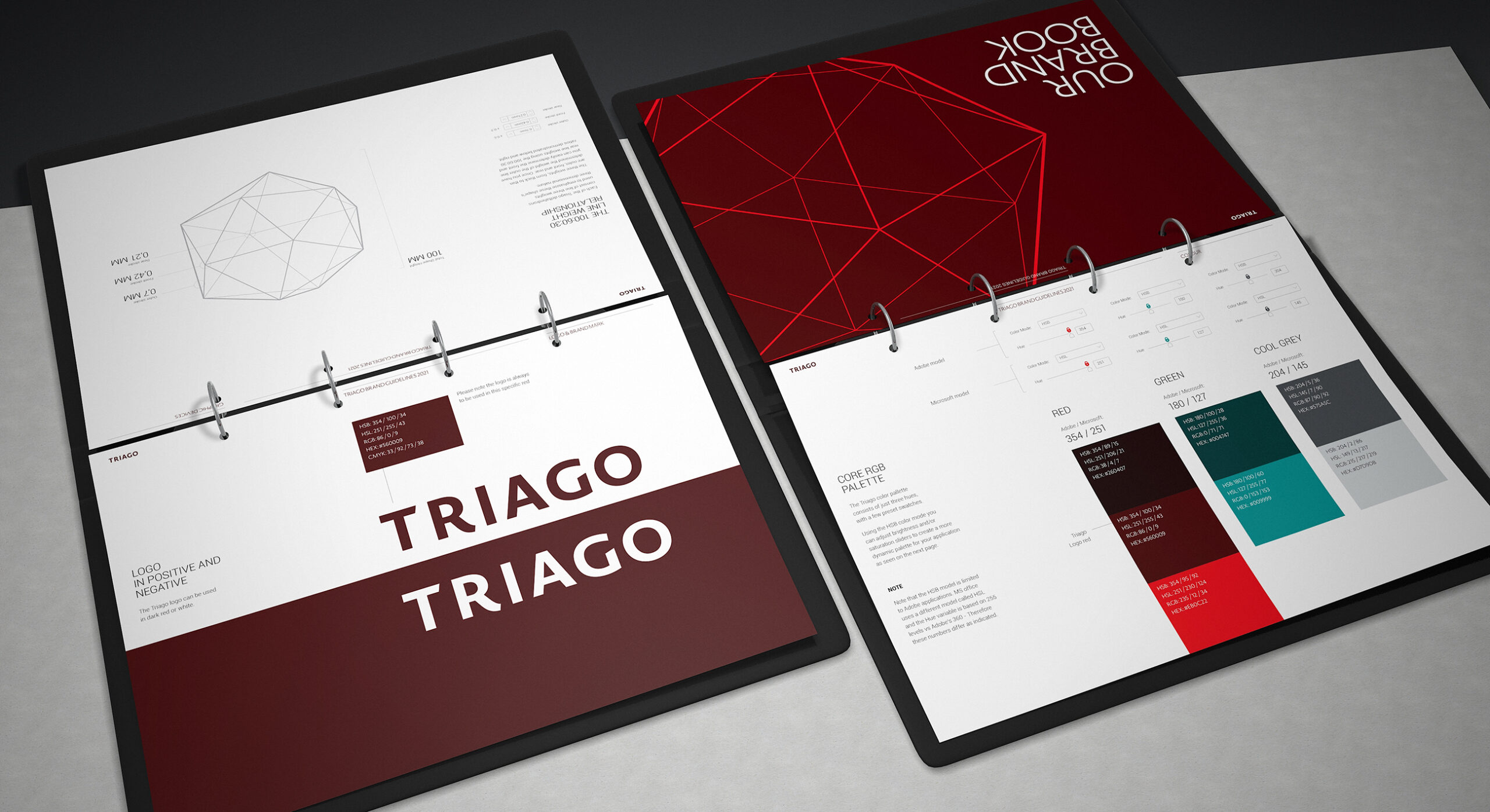
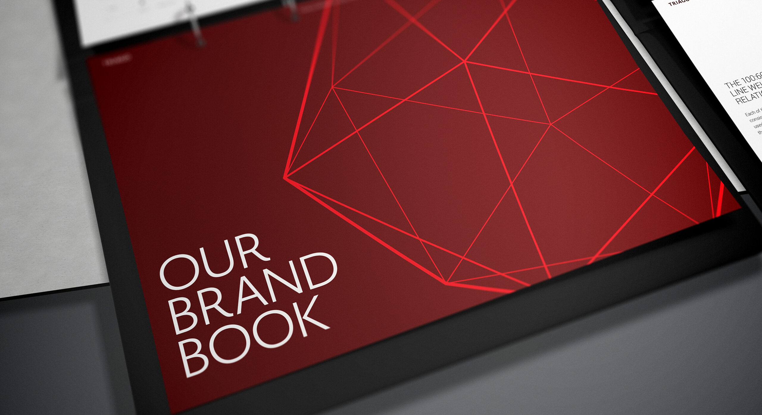
The Triago brand features warm red colours combined with a striking brand graphic device.
-
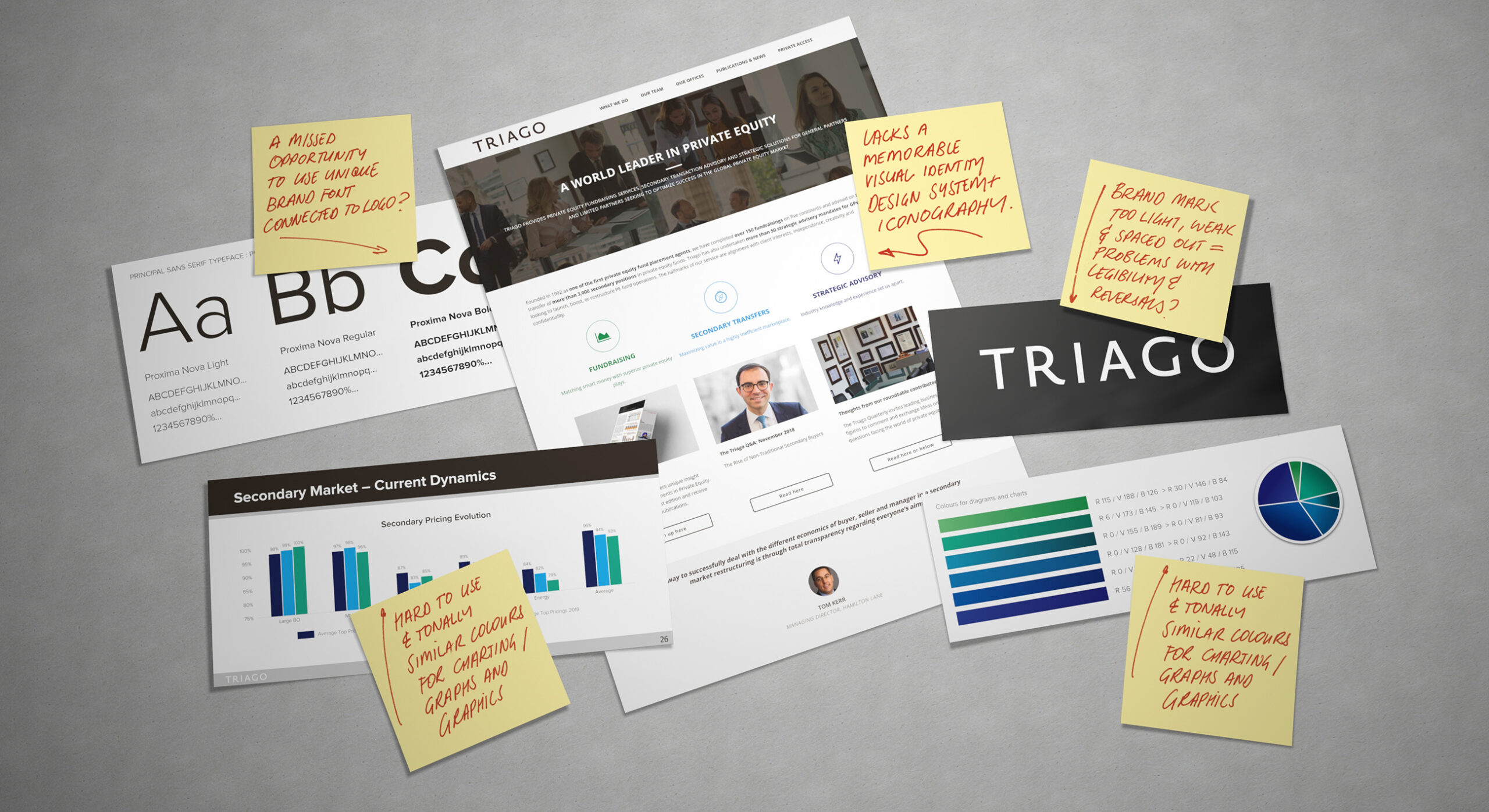
The previous brand lacked power, cohesion and an overall sense of vitality.
-
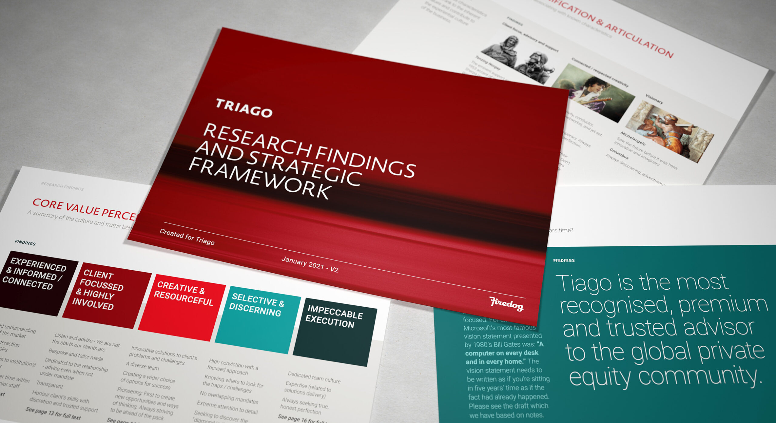
We created an extensive strategic framework document which provided important guidance on positioning, mission and values.
-
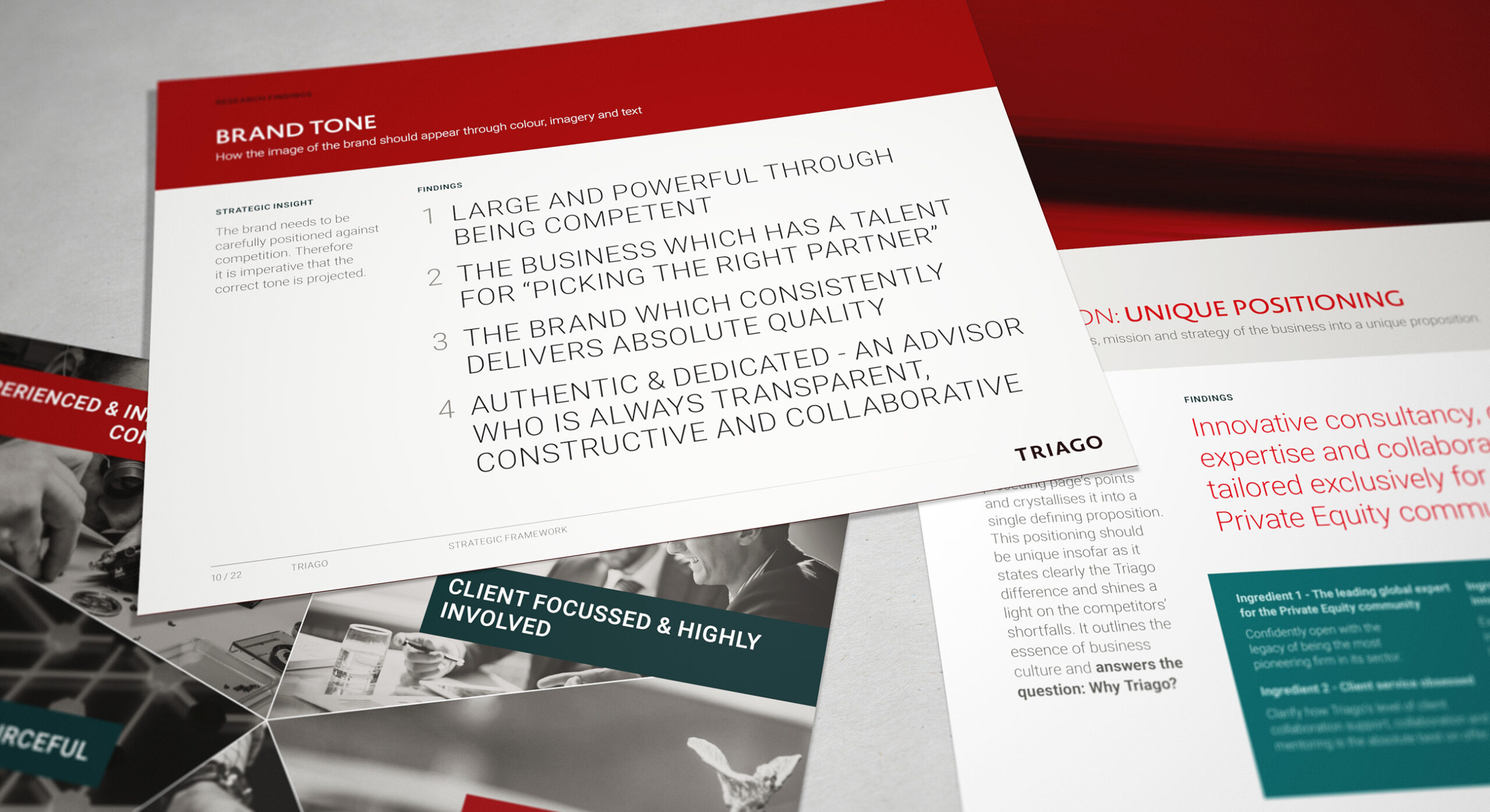
Using an accurate brand positioning narrows focus and ensures a targeted brand positioning and visual identity system.
-

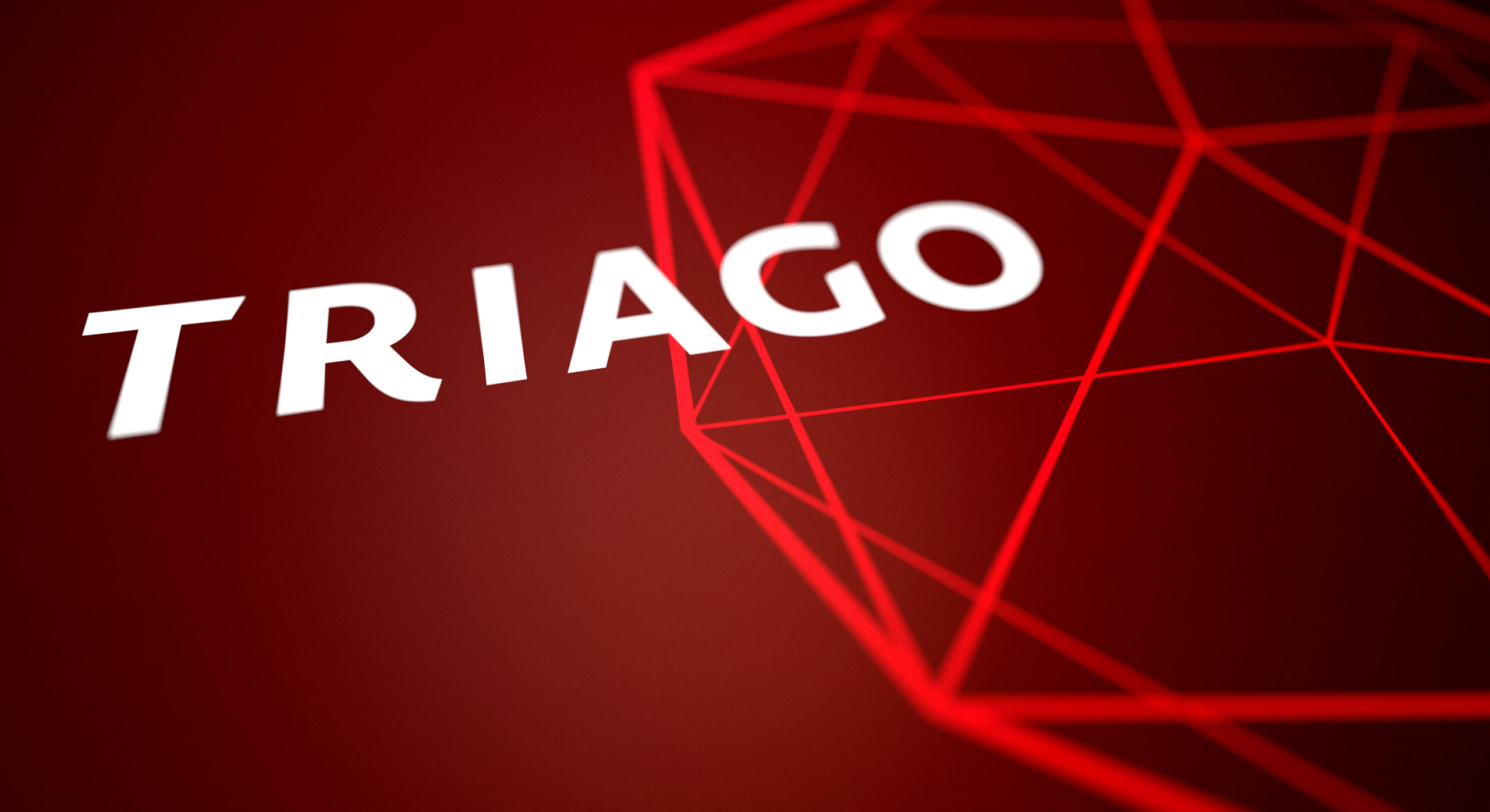
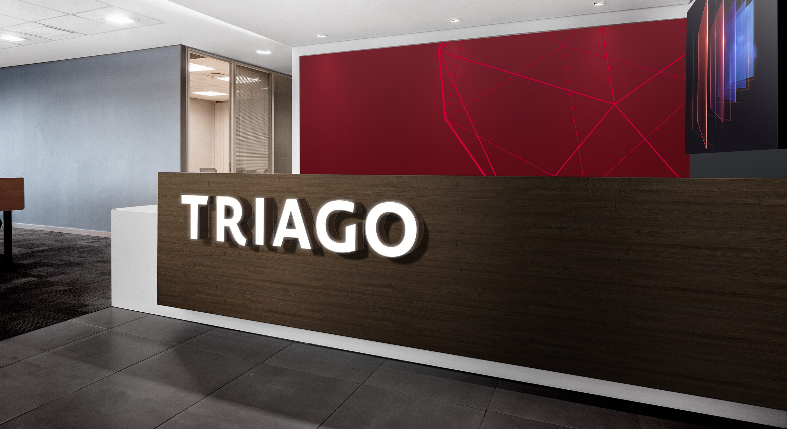
The most obvious and important creative guidance was to update the Triago wordmark, making it far more impactful and thus ensuring it worked hard at smaller sizes across new media.
-
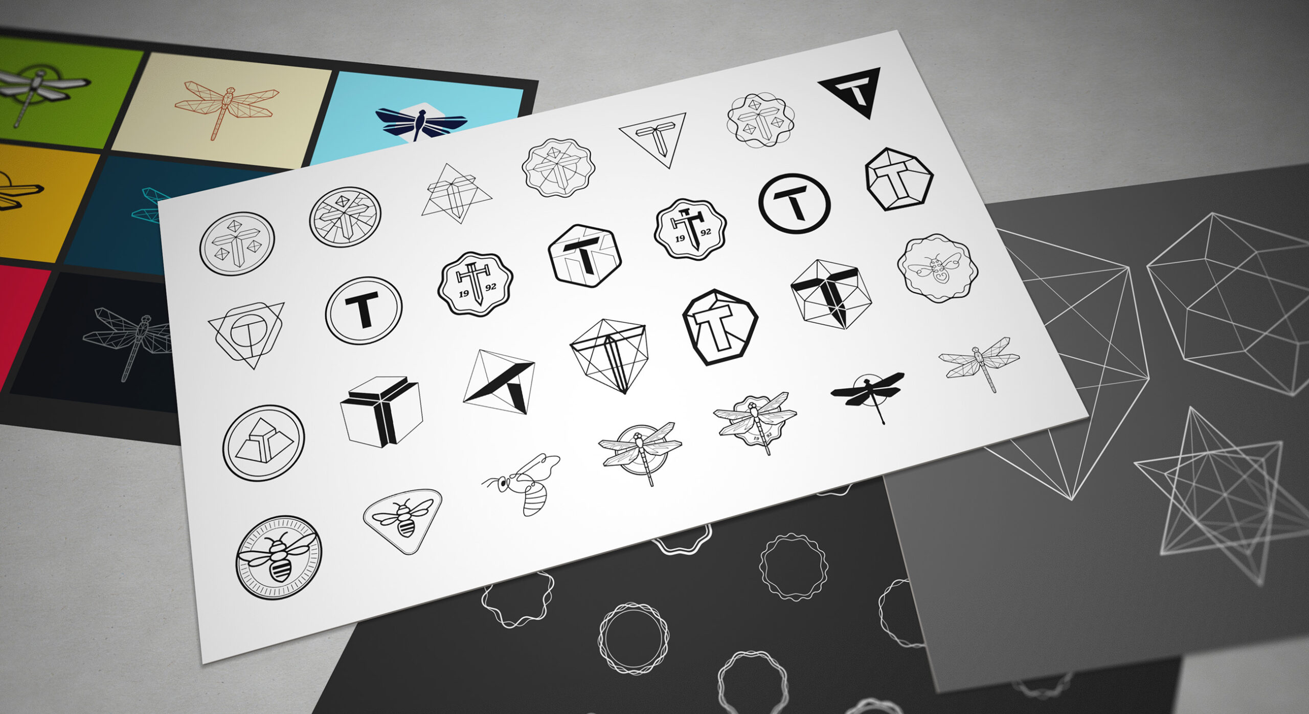
Our early creative exploration sought to convey heritage, a talent for discovery and hunting prowess.
-
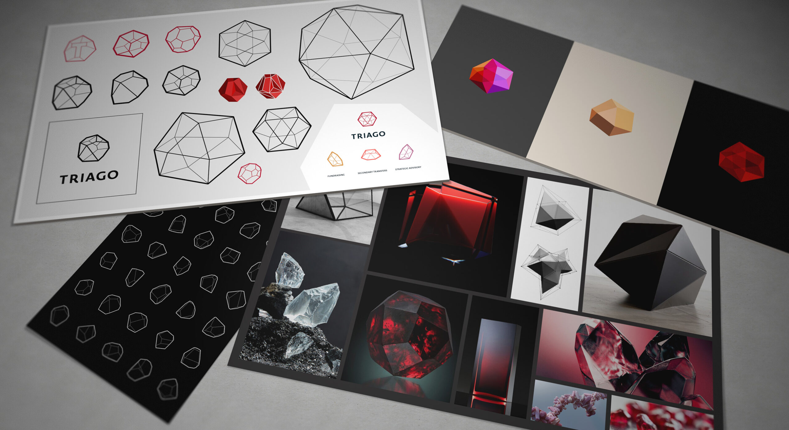
The brand symbol evolved to encompass Triago's knack for finding unique and compelling opportunities for their clients. We seized upon a soundbite from research : "finding the diamond in the rough"
-
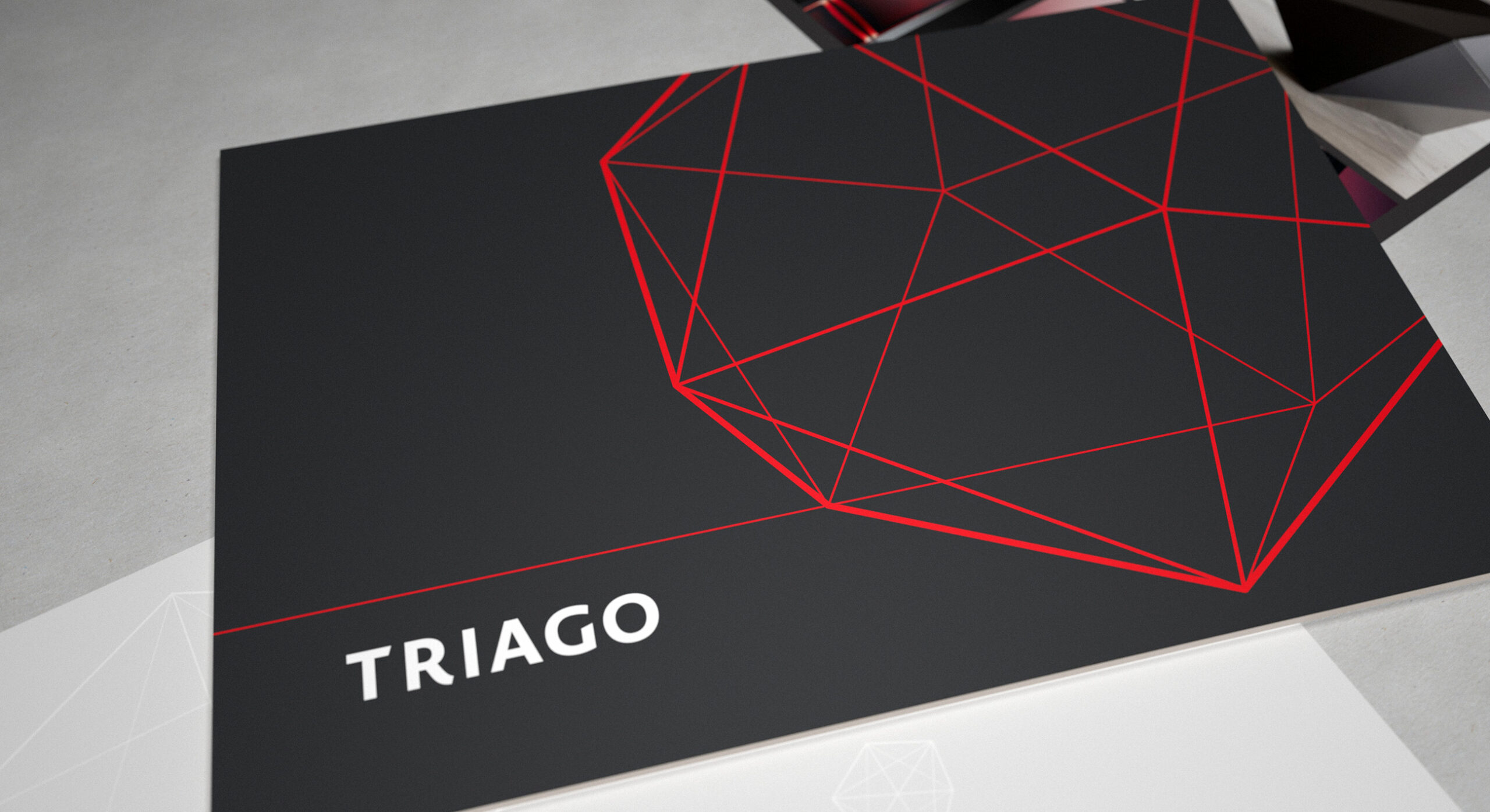
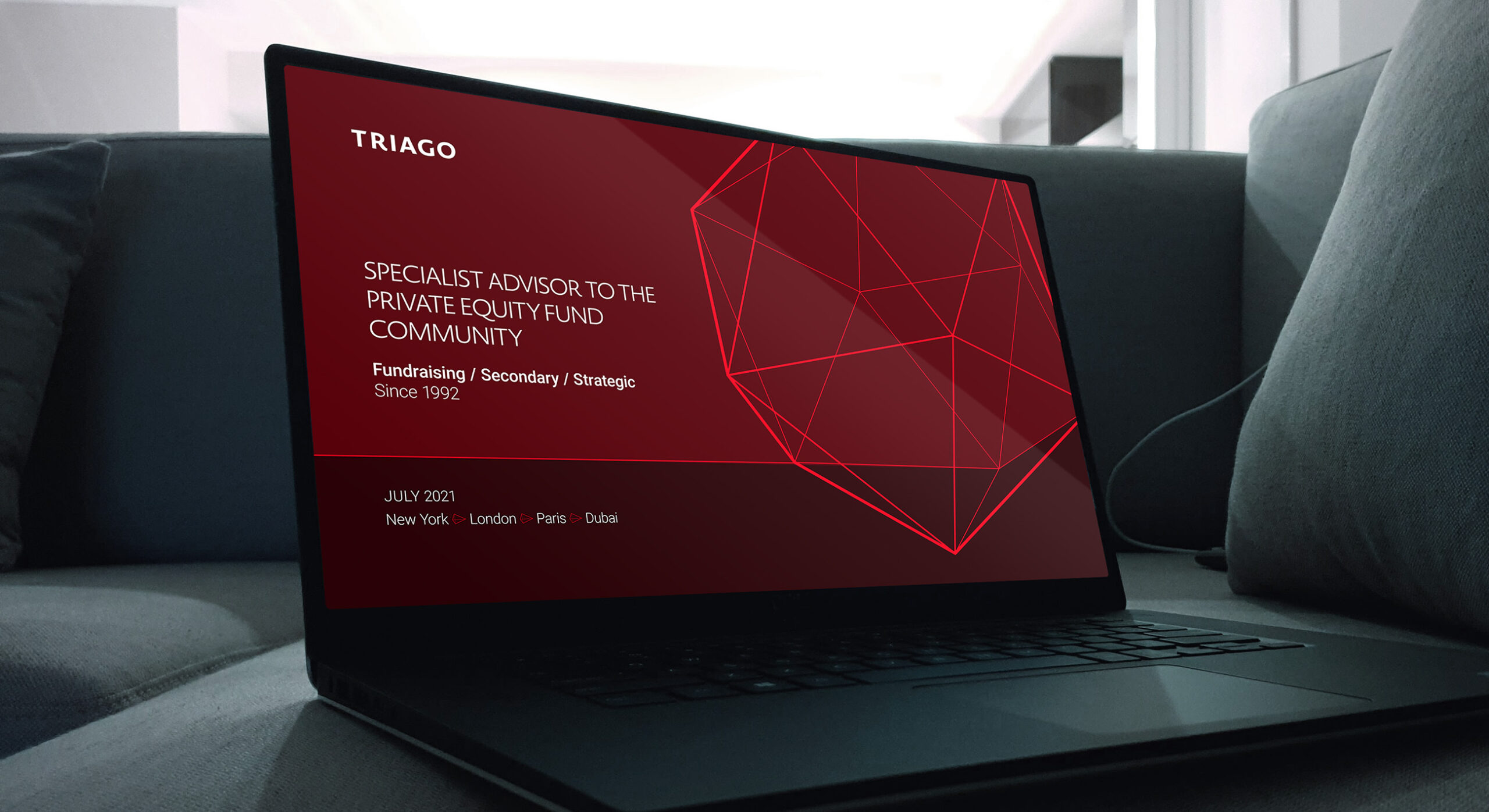
The Triago financial services brand identity uses a bold logotype, striking colour and a dodecahedra based supporting graphic device.
-
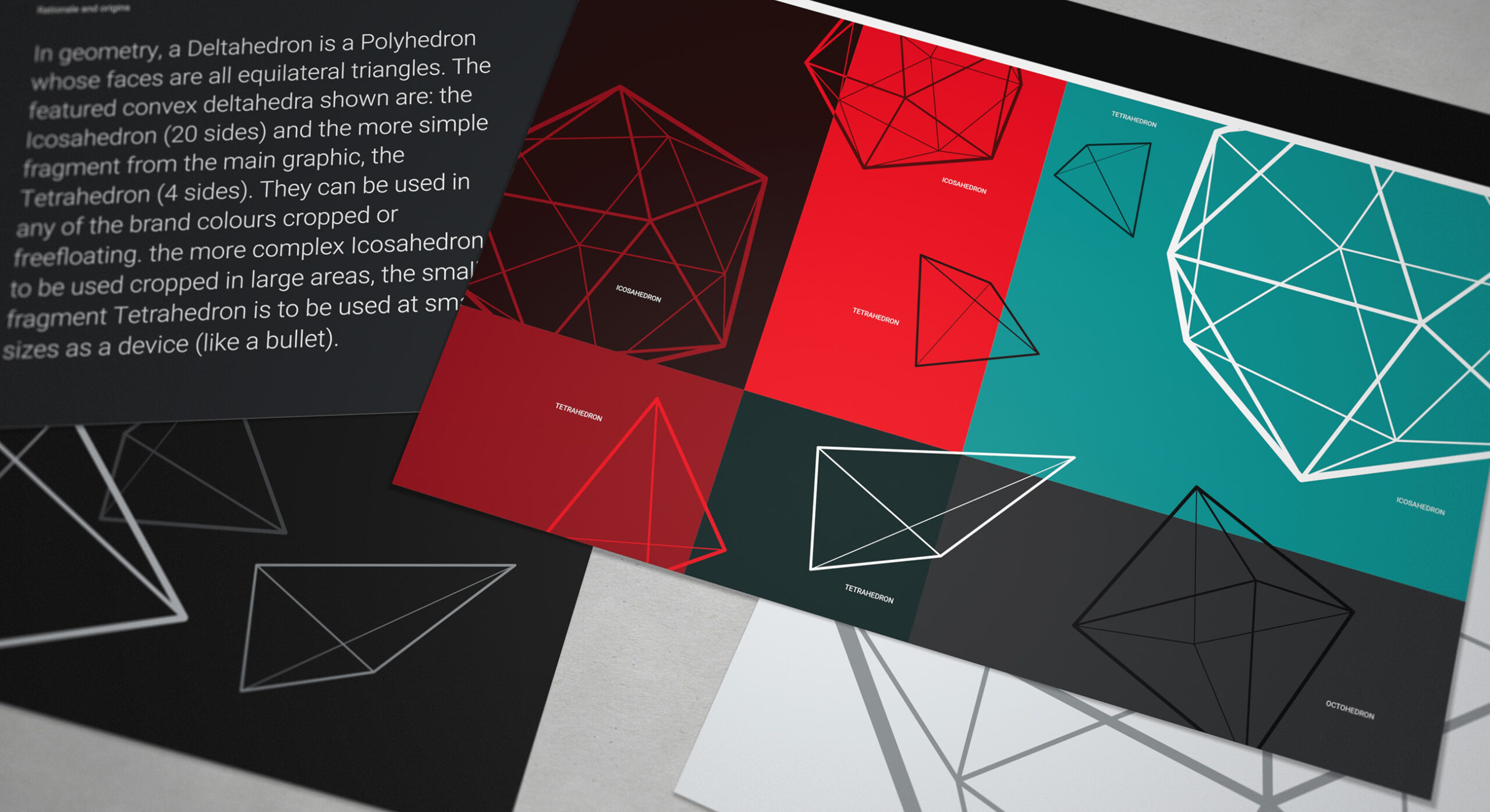
The deltahedron is a polyhedron comprised of faces which are all equilateral triangles. This element became the core graphic device which then is supported by Tetrahedrons and Octahedrons - also formed of triangular faces.
-
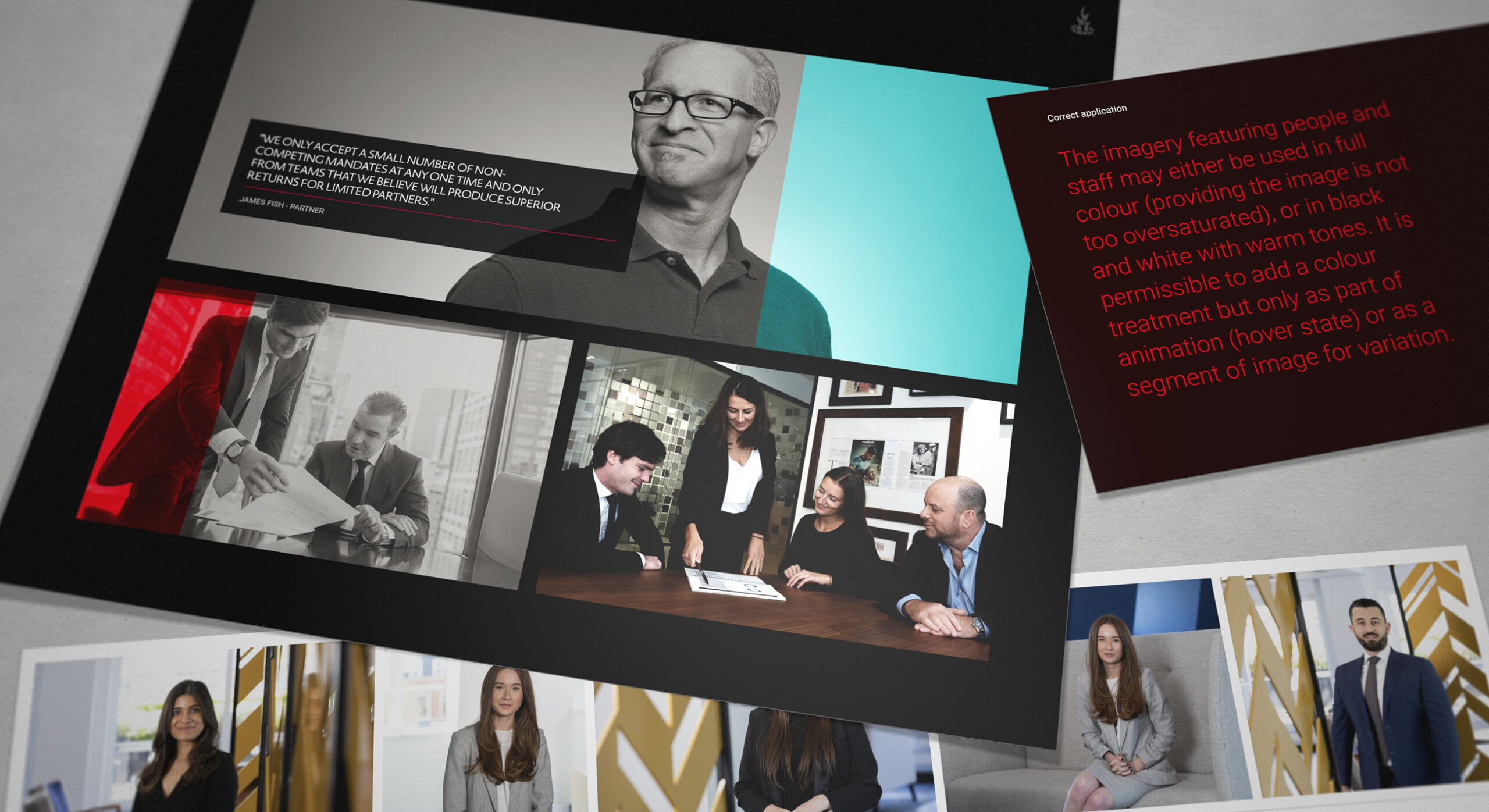
We developed a set of image guidelines and then commissioned a range of bespoke shoots in order to capture all the Triago staff.
-
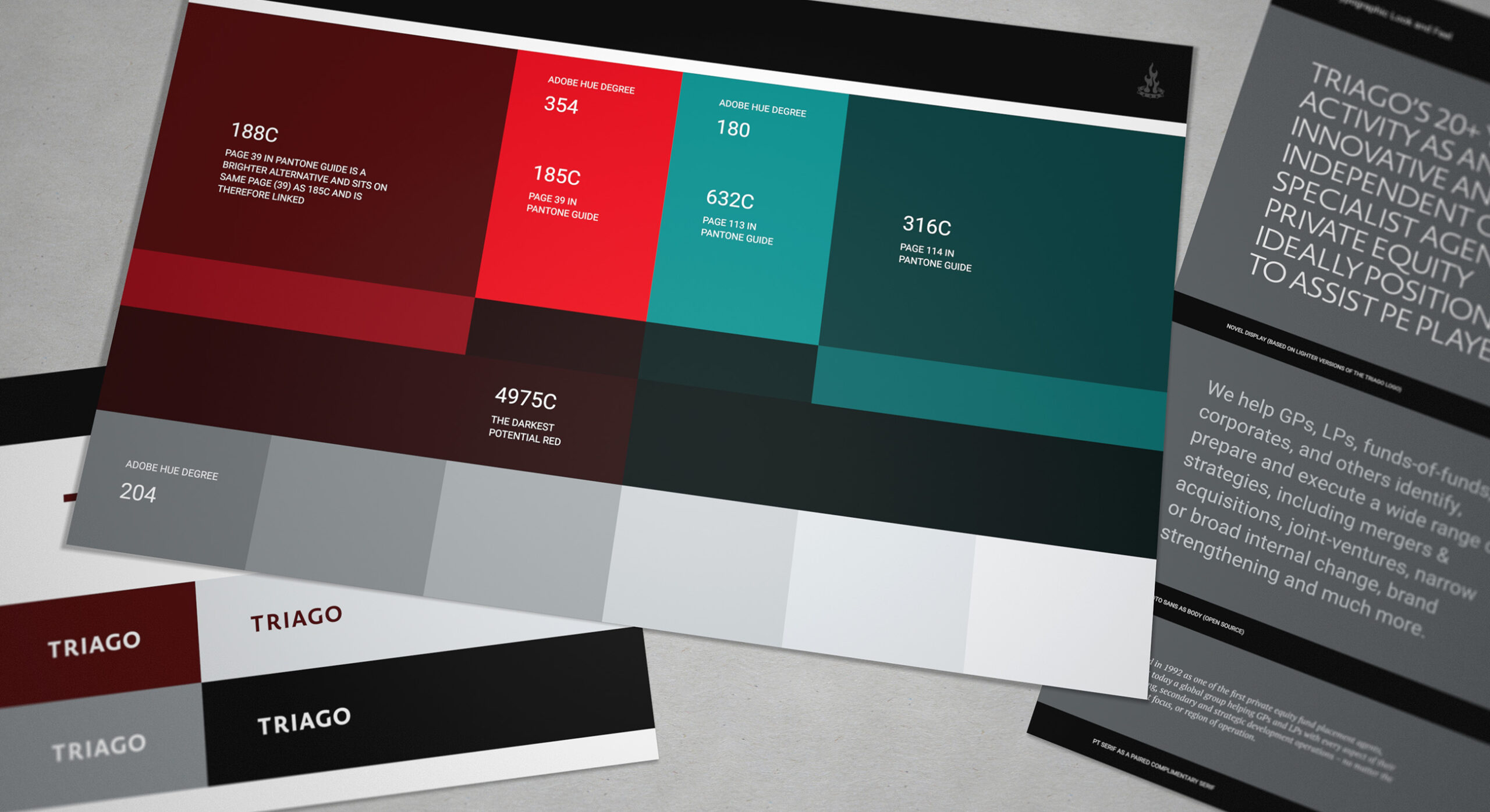
We combined a cool red with a complimentary teal in the identity. We then provided a locked in hue scale that advised on various tones which structured colour across various graphic elements.
-
It is useful in a branding system to utilise a separate wordmark and graphic device - insofar as they can be used on different planes within a composition.
-
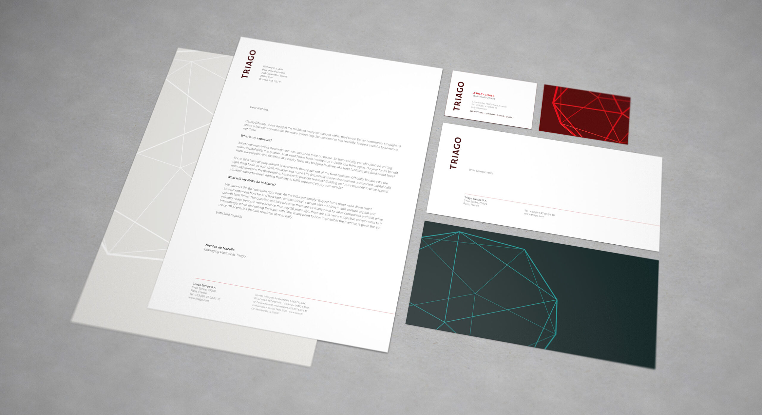
The printed communications use the graphic device across the brand palette in order to create interest.
-
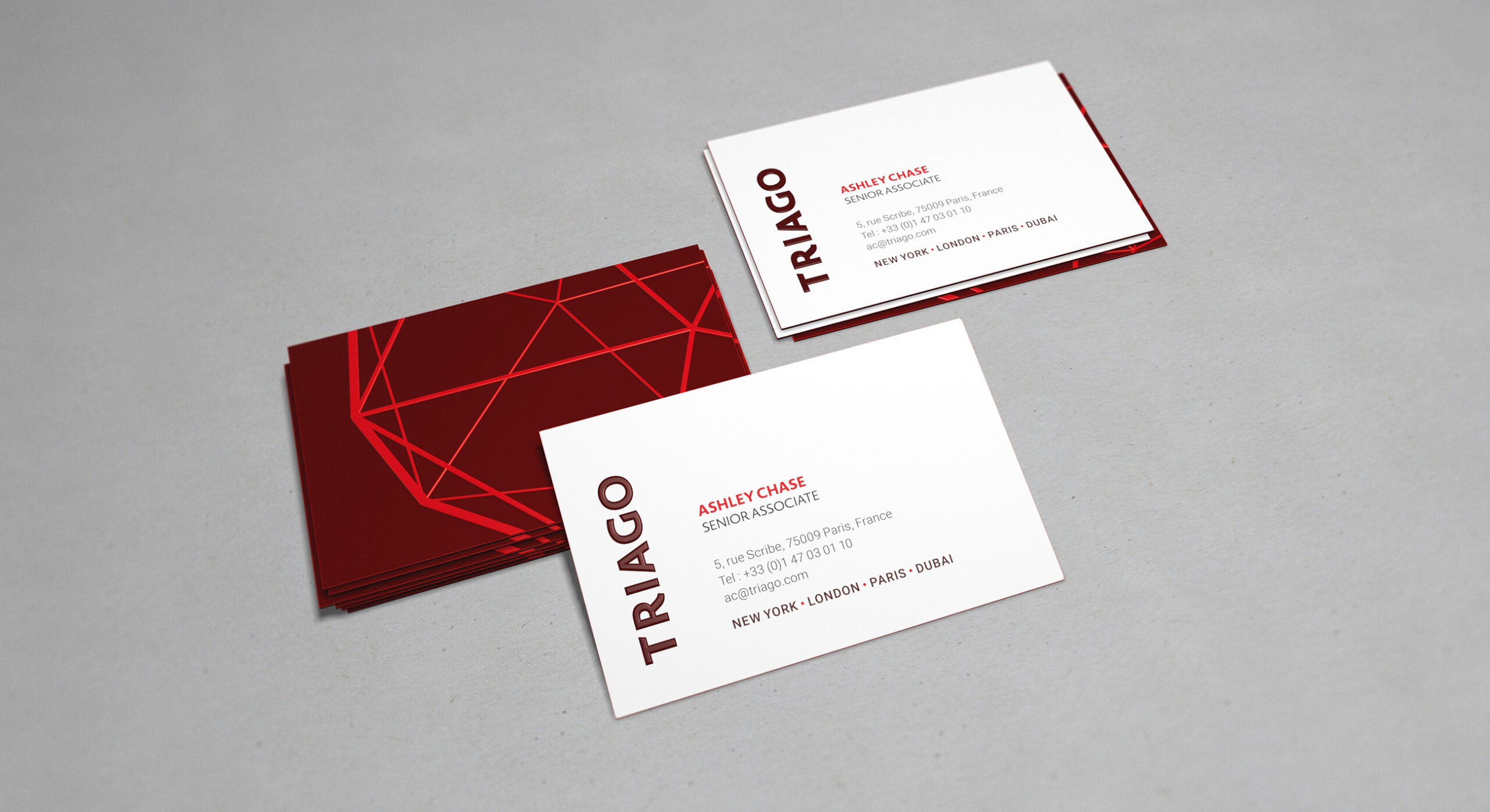
The stationery suite relies on special print finishes in order to create a tactile and premium feel.
-
In simple applications, the brand identity relies on the strength of the wordmark and consistant colour application.
-
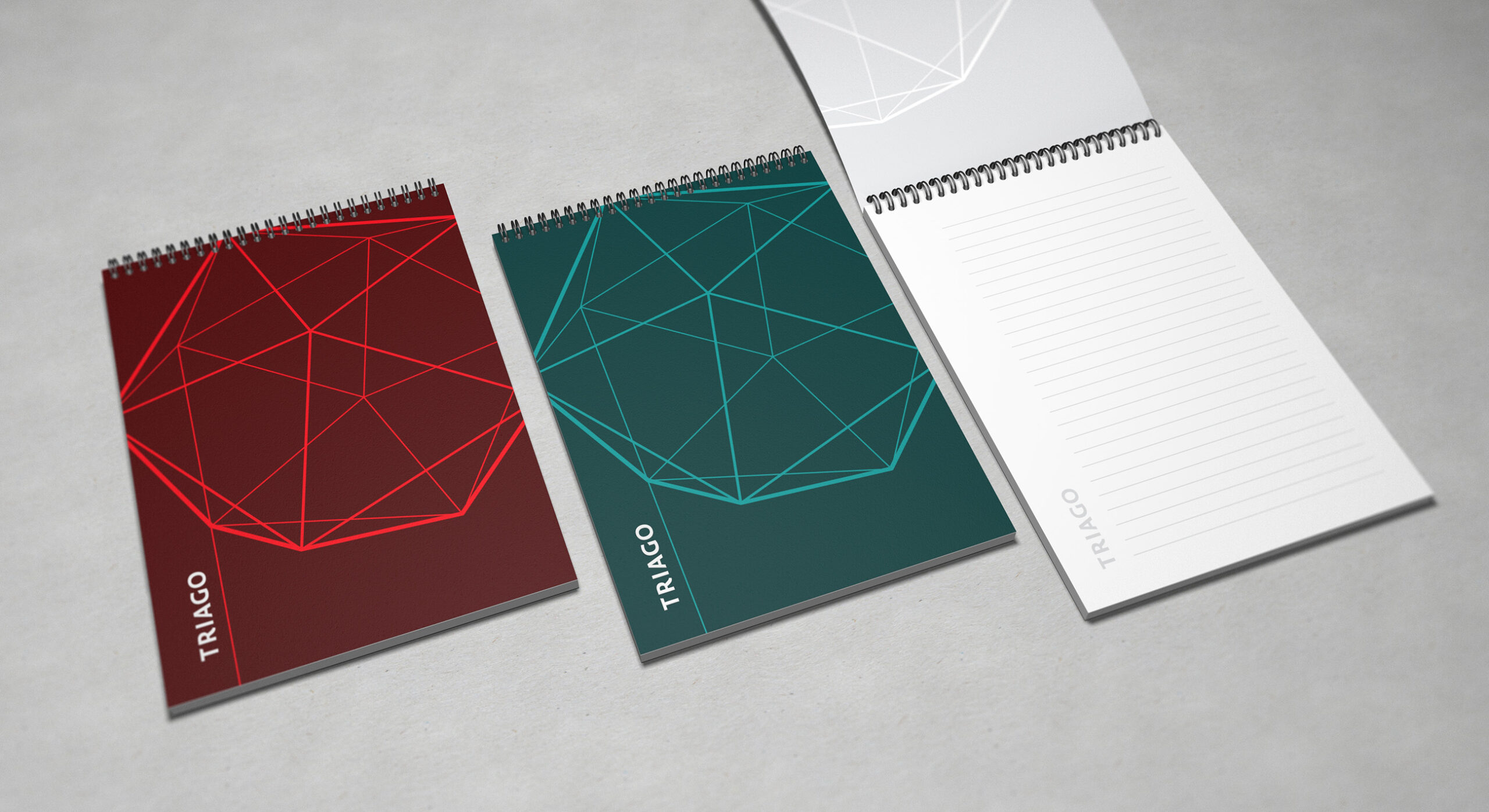
The graphic device works equally well on both sides of the colour spectrum. It is also used in cool grey on the flipside of document and printed covers.
-
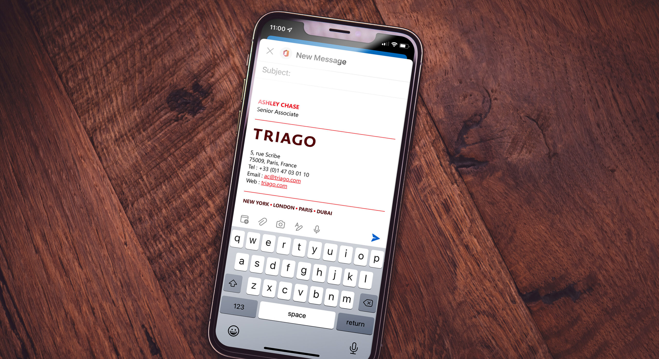
The brand identity extends comprehensively into digital communications. All PPT theme files and Microsoft document templates are provided as part of the branding process.
-
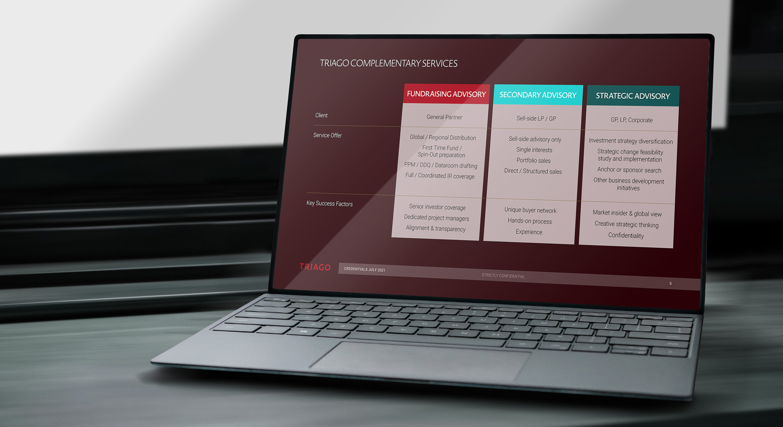
As part of the branding remit, Firedog assisted Triago on a 40+ page PPT pitchbook.
-
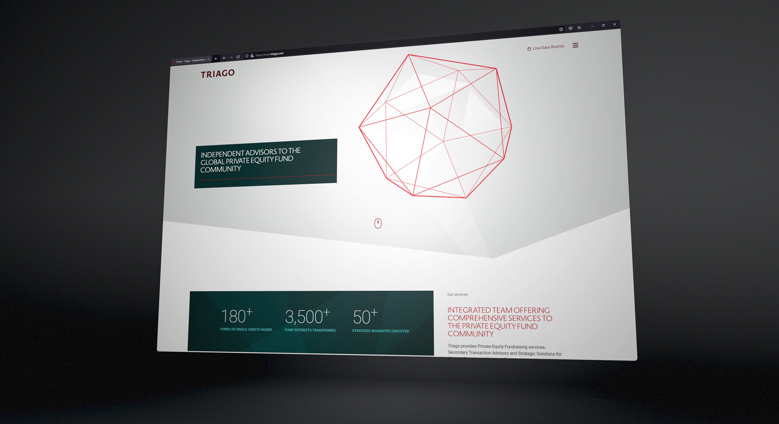
Firedog provided both the multipage design prototype and technical build of a new corporate website.
-
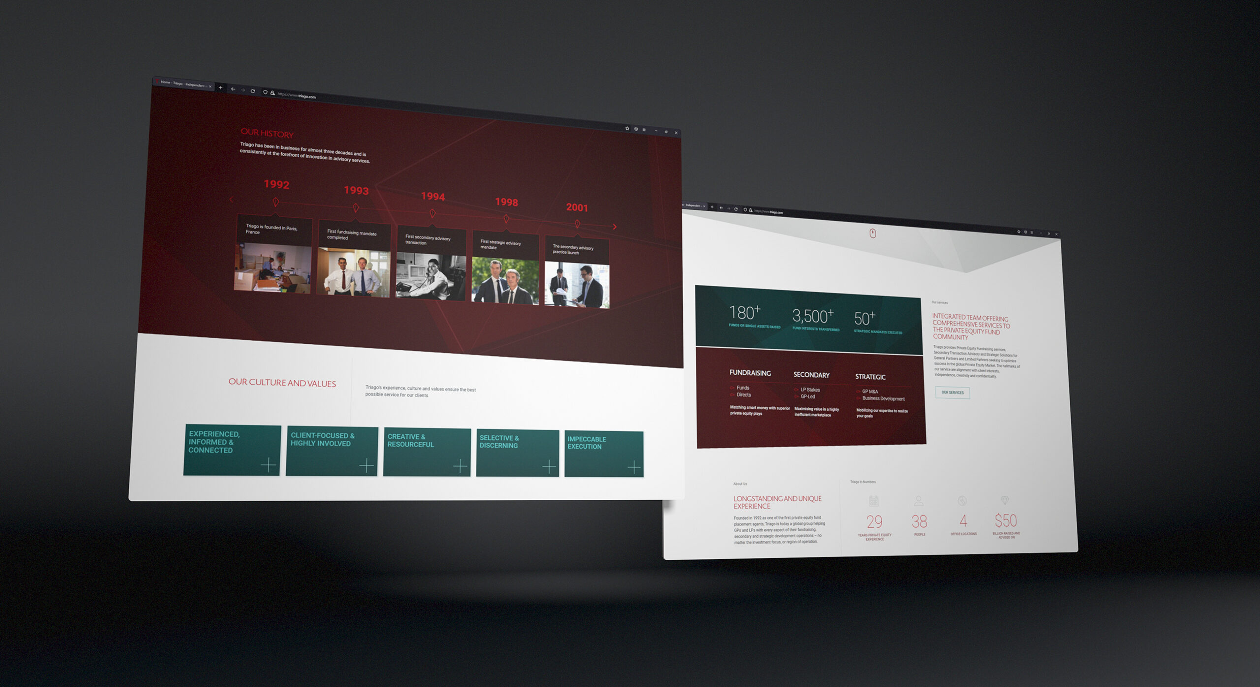
The website uses various applications of the colour palette in both positive and reversal in order to present a dynamic range of content parts.
-
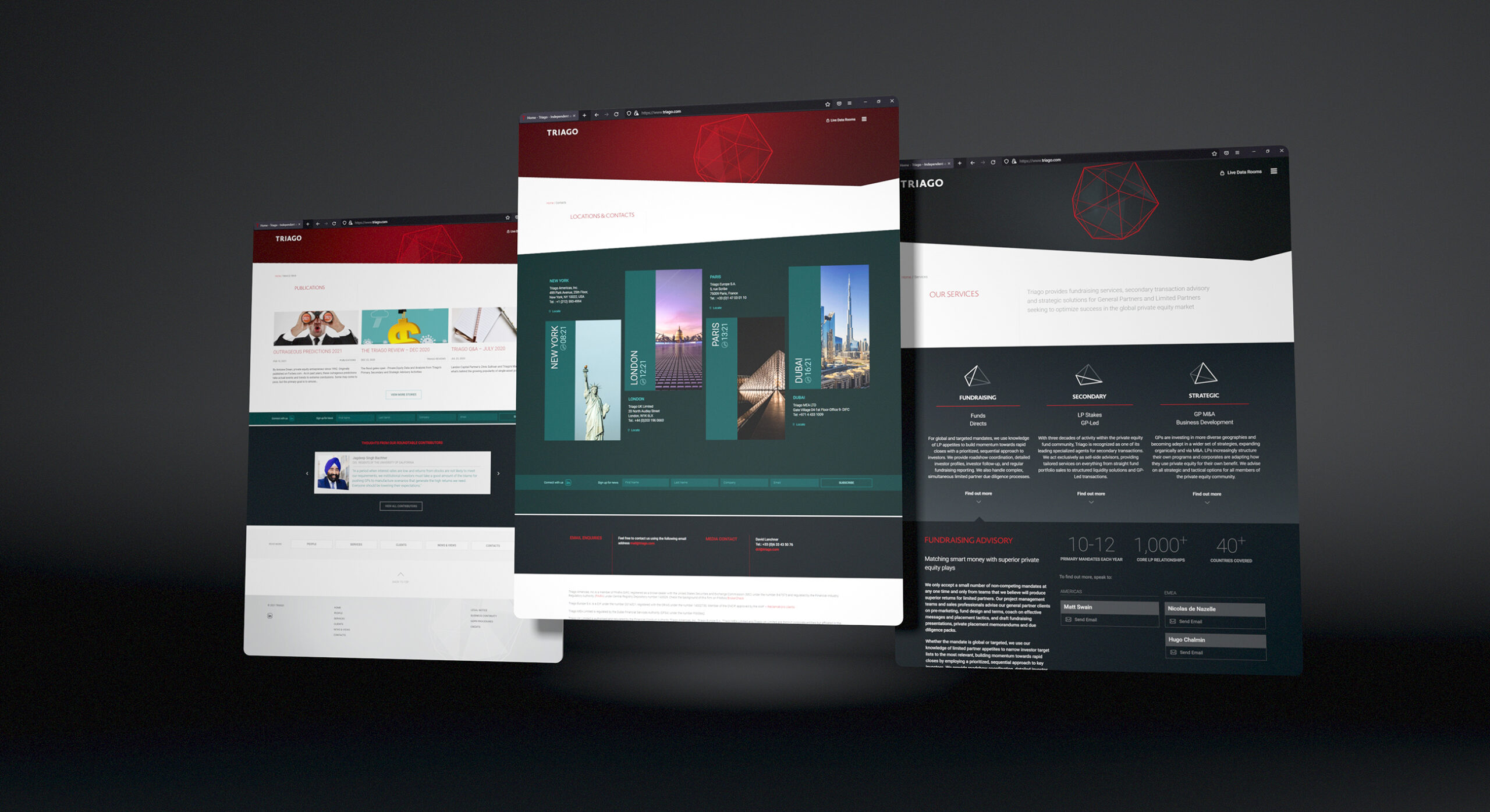
Adoption of an Adobe XD design methodology provides integrated design across all device breakpoints ensuring consistency no matter the user device.
-
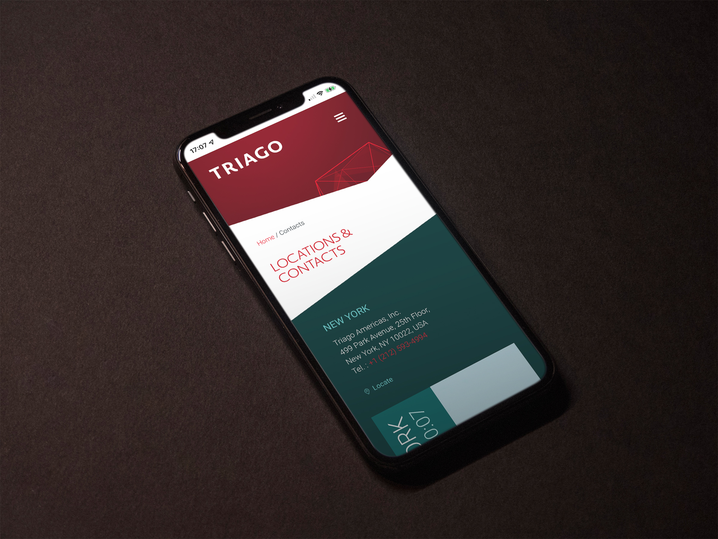
The design aesthetic creates impact, even at small sizes.
-
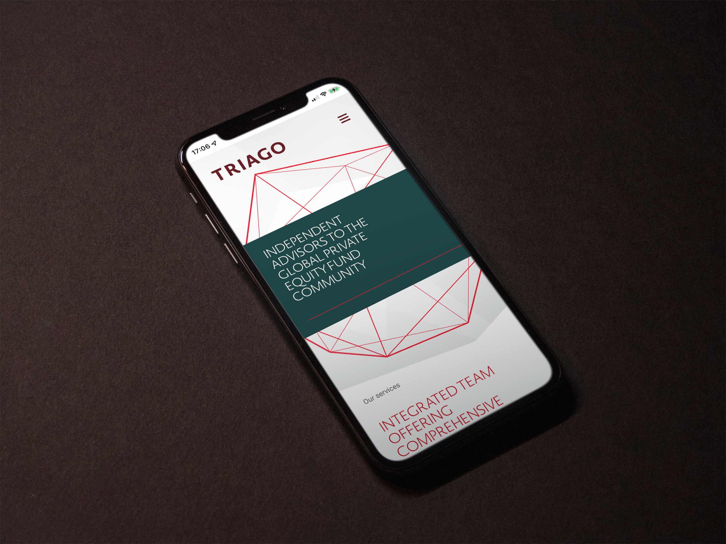
The custom Adobe typekit font usage ensures a branded experience across all viewport sizes.
-
We created and provided an extensive brand and spirit guideline to the client in Paris so that they could work with partners in brand development across all global regions.
-
Brand guidelines capture both strategic and brand direction for third party adoption.