Brand identity

Unspun

A playful identity created for a straight-talking PR agency.

Unspun is a different kind of PR agency. Their core value? Remove the spin so commonly associated with stories. Our work included brand identity, visual identity design, creation of brand guidelines and production of print design and collateral.

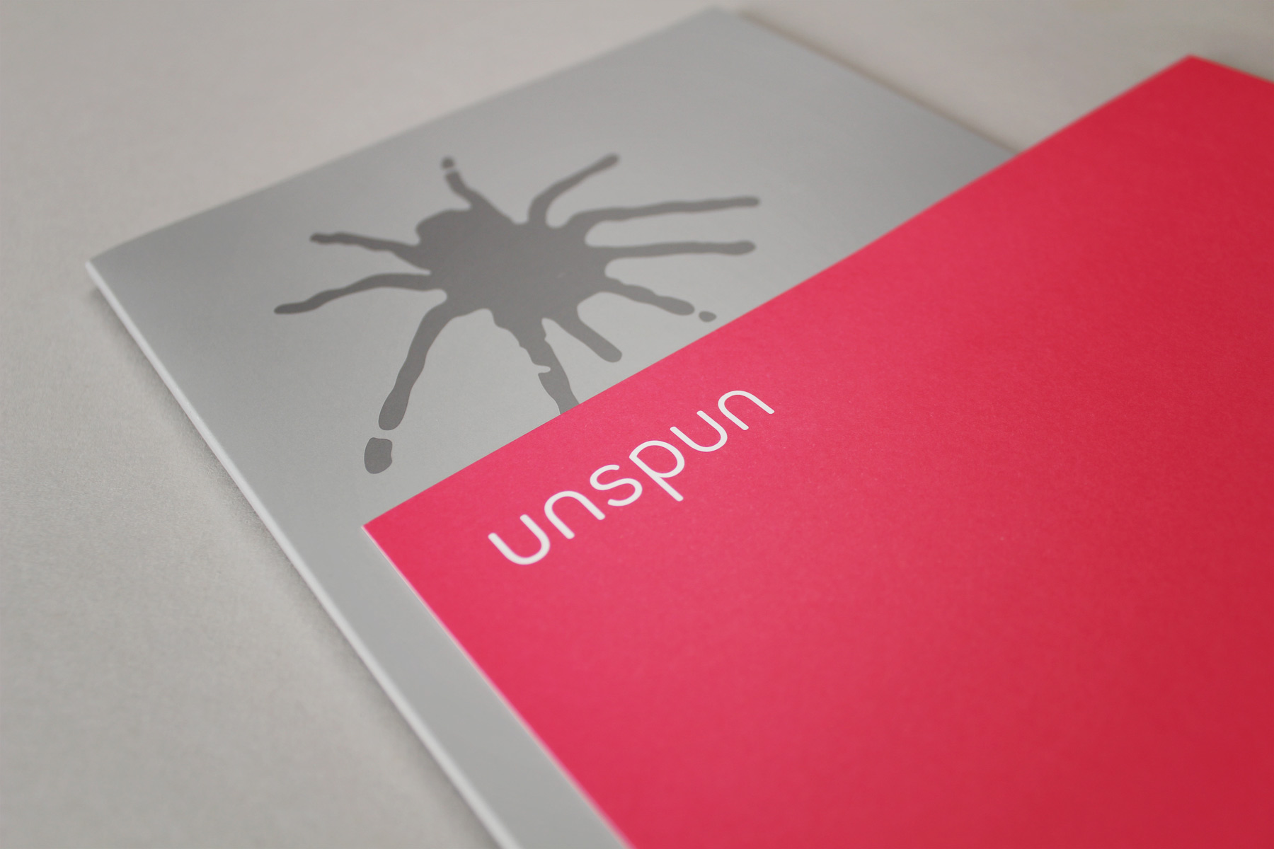
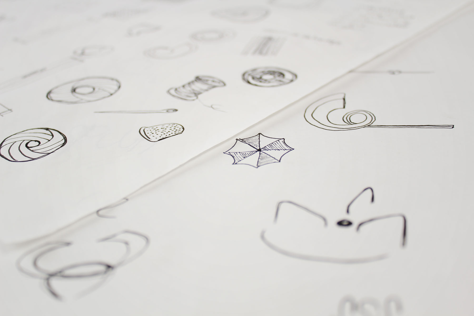
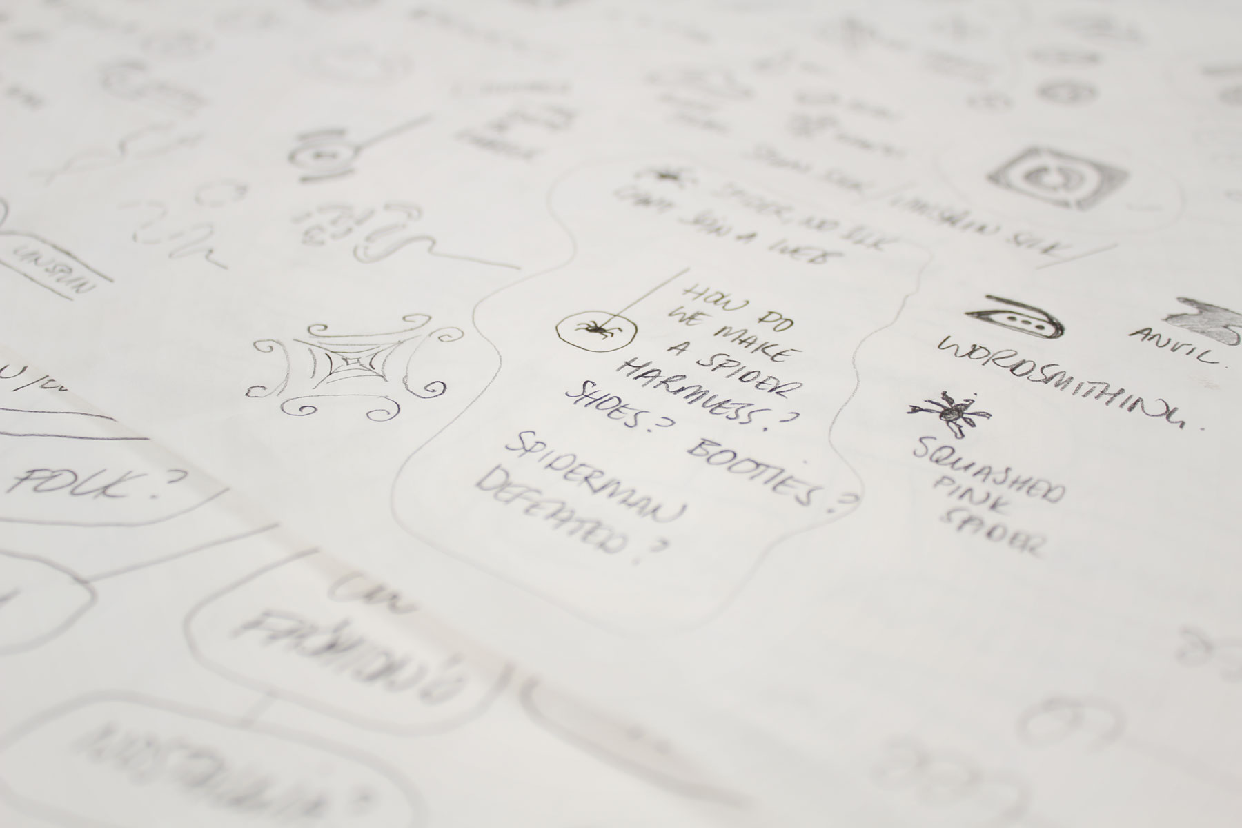
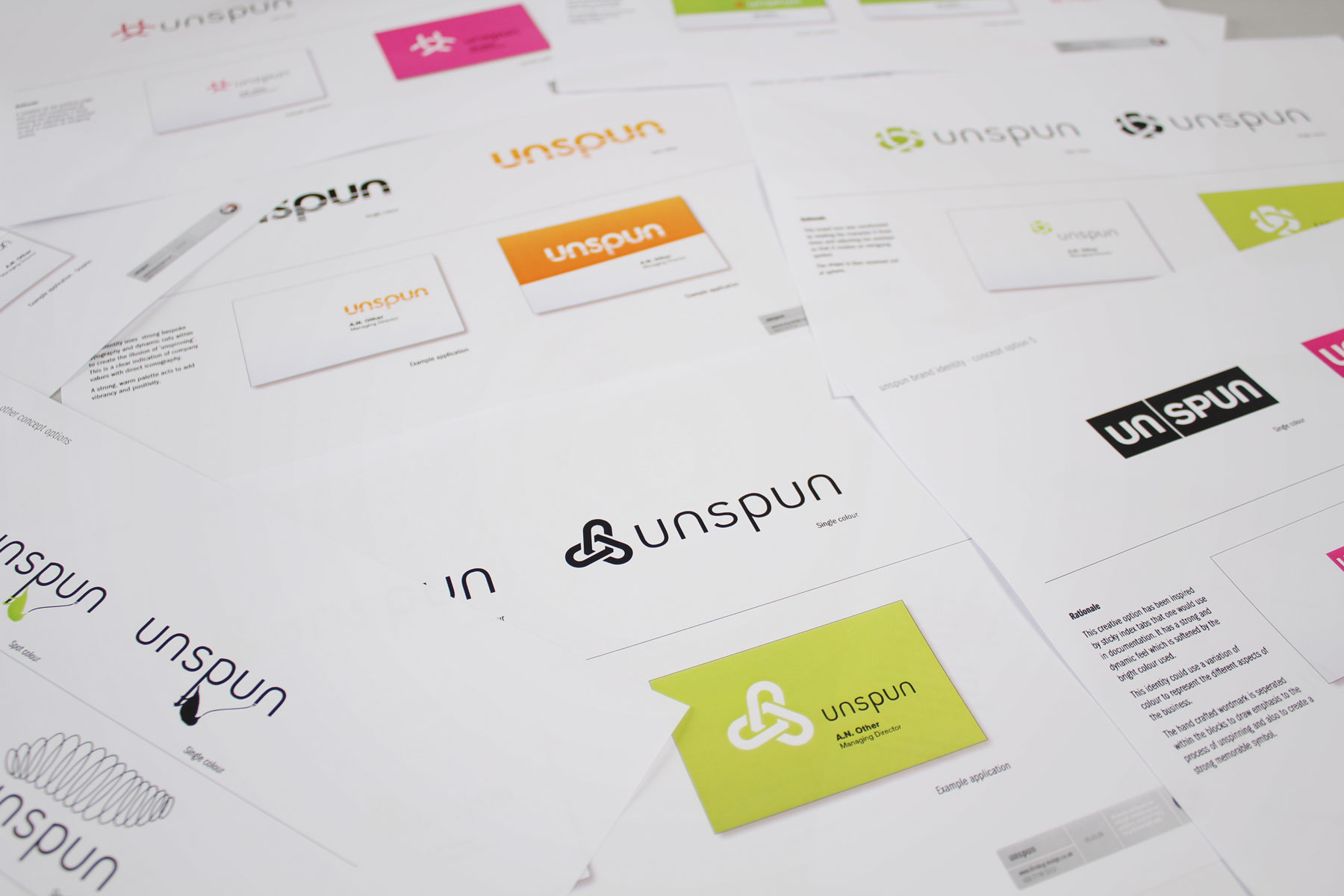
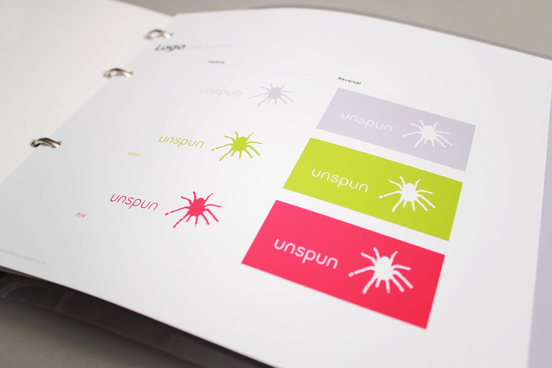
The spider wins through! The final identity is the perfect combination, with a memorable visual icon wrapped in a contemporary brand mark.

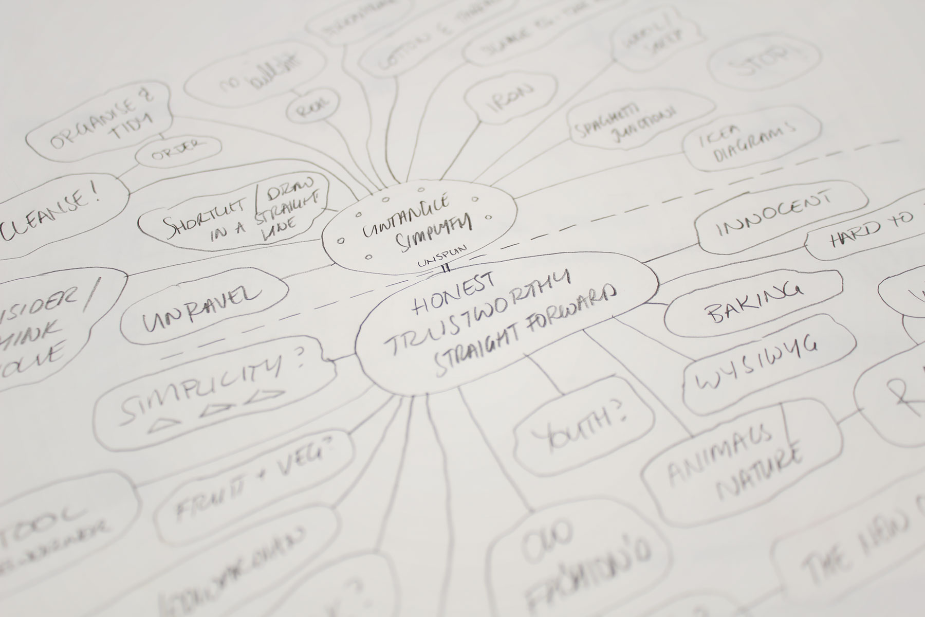
Firedog was briefed on the client's quest to rid the world of ‘spin’.

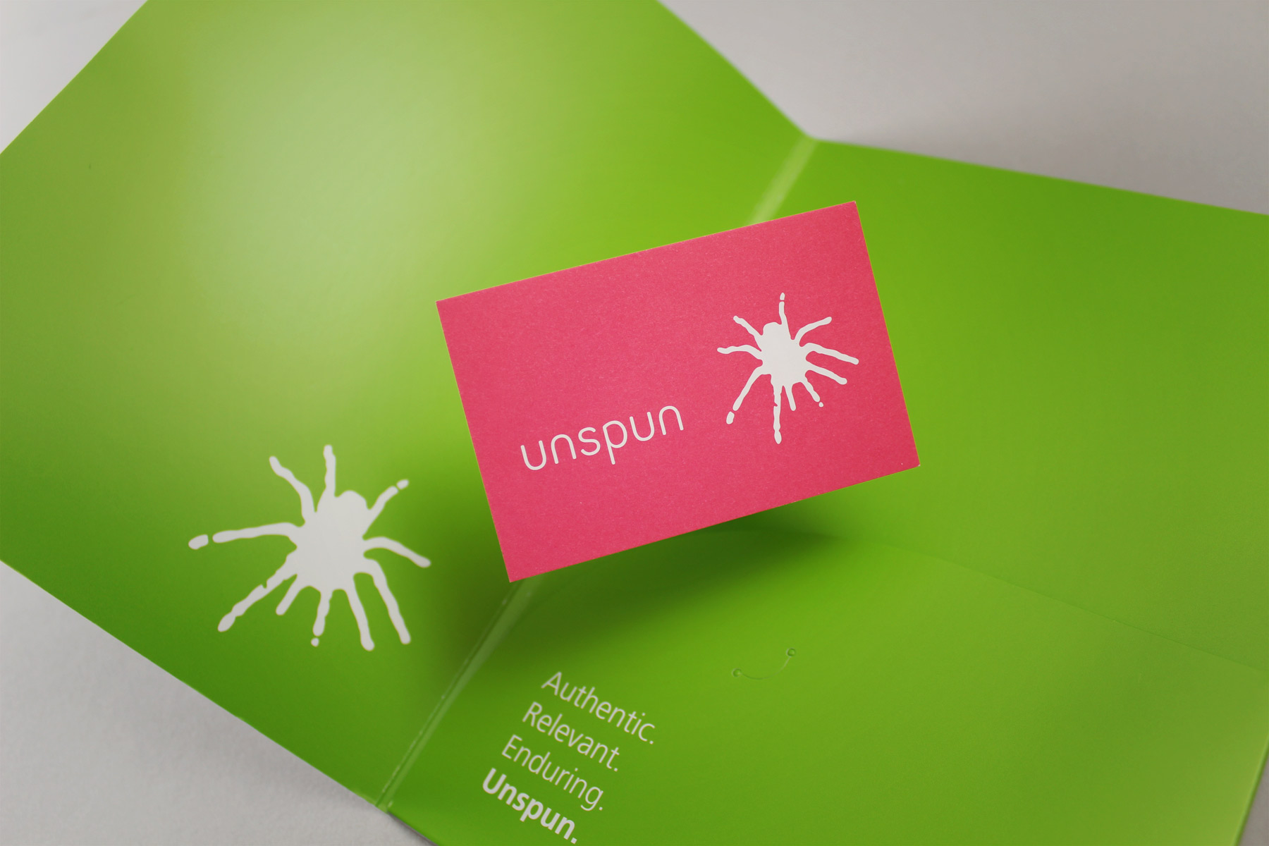
The founders of Unspun set out to create a communications agency based on their belief that honesty and authenticity deliver the best results. In their quest to rid the world of ‘spin’, Firedog was approached to produce a brand that reflected that ethos. Ensuring memorability and immediate brand positioning, Firedog’s playful ‘spider’ identity sat perfectly with the client’s against-the-grain approach. Removed from its web and stripped of ‘spin’, the spider logo appears in vibrant block colours aside clean typography and straight-talking copy.

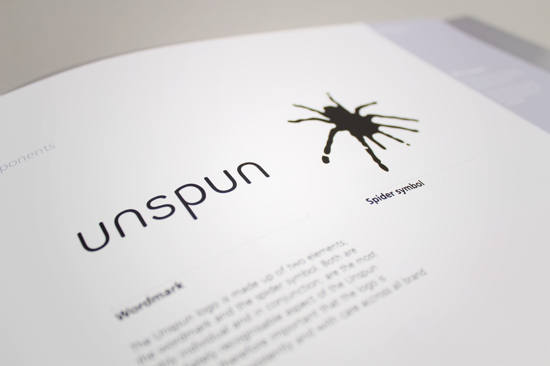
While bland and traditional made way for bold and eye-catching, a key consideration was that their serious approach to business was not lost.

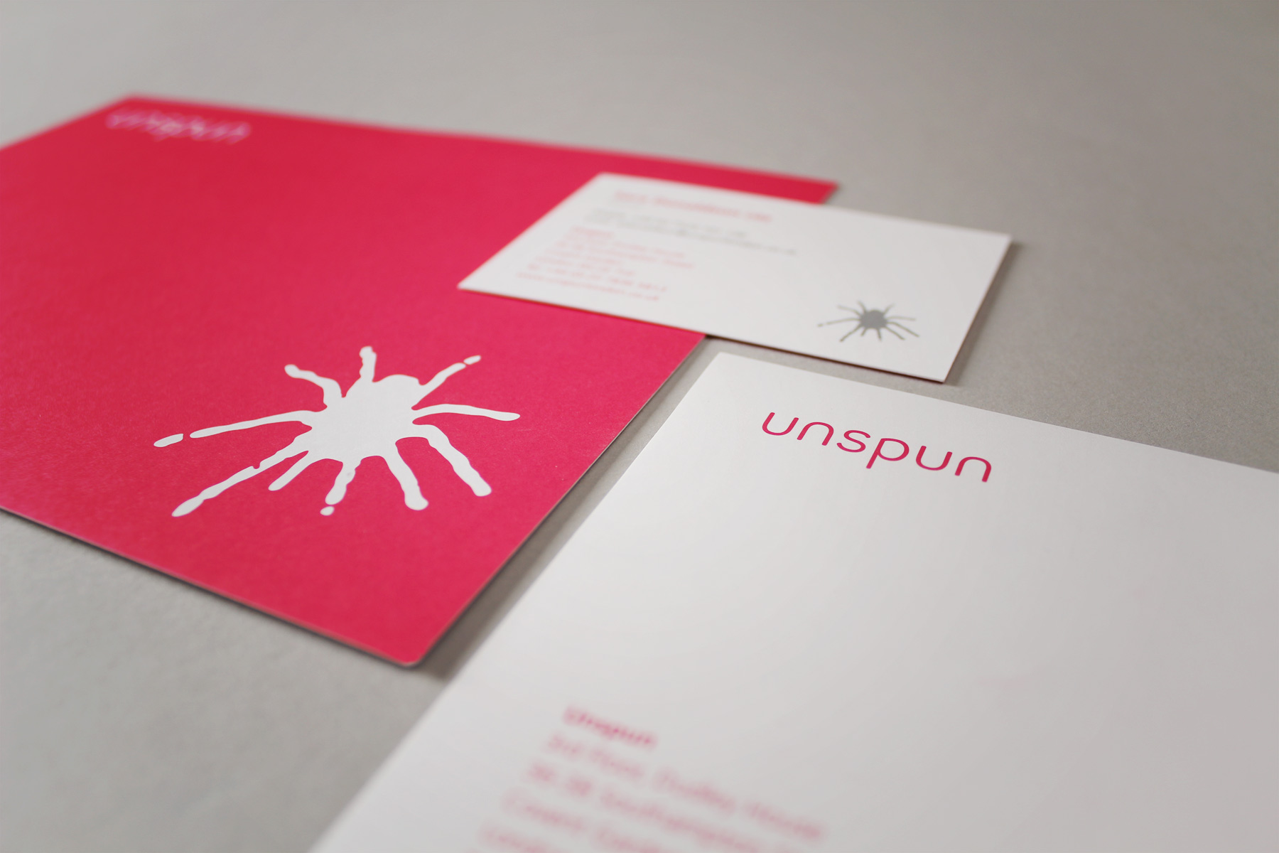
While bland and traditional made way for bold and eye-catching, a key consideration was that their serious approach to business was not lost. With this in mind a precise set of guidelines were created, acting as essential reference in taking the identity forward and protecting the brand’s core qualities. Additionally, multiple versions of the main stationery suite were created utilising the more neutral colours from the identity. These extra versions ensure that whoever the company is talking to, the tone of the communication will be just right.

The deliverables included a full set of corporate stationery, folders and datasheets.

Expertise Spotlight

The Kaboodle symbol is beautifully simple with a really subtle play in dimensions.

Branding

View case studies
The simple yet vivid colour palette ensures both standout and a hint of the dynamic nature of the business.
Sign up for our Firedog Newsletter
* = required field