Sustainable energy brand identity

Zest EV Charging

Firedog has created a bright and cheerful sustainable energy brand identity for a UK Nationwide EV charging network. The core symbol features a bright hummingbird and is representative of natural energy.

Zest is a public EV charging network which is naturally synchronised with people's lives. The business provides funded end-to-end charge point solutions for a range of sectors. The idea is to put an EV charging point in a public space where a user is most likely to be visiting for a number of hours. Such as gyms, shopping centres and anything beyond the traditional fuel stop forecourt. Firedog has been involved in the start up phase providing a simple bootstrapped solution of brand positioning, brand identity creation, visual look and feel as well as an initial set of brand / spirit guidelines.

We worked with client provided research and aligned strategic terms alongside our creative direction.

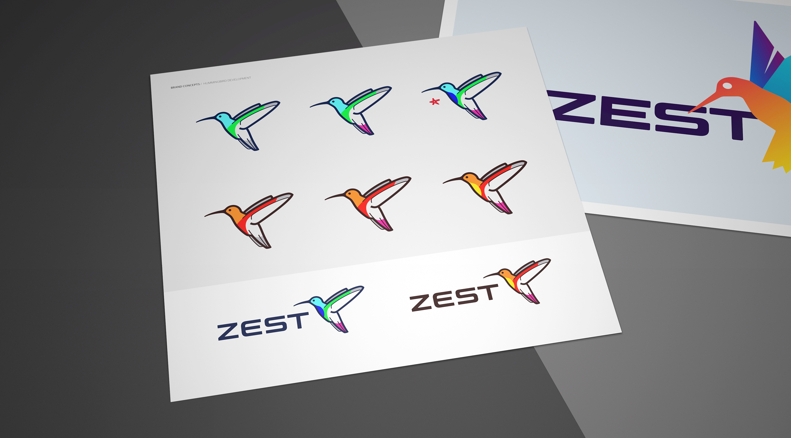
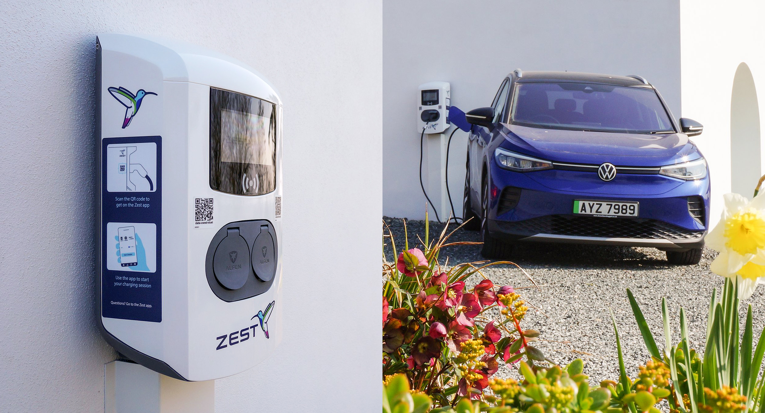
The Zest branding needed to appeal to both consumer and business segments.

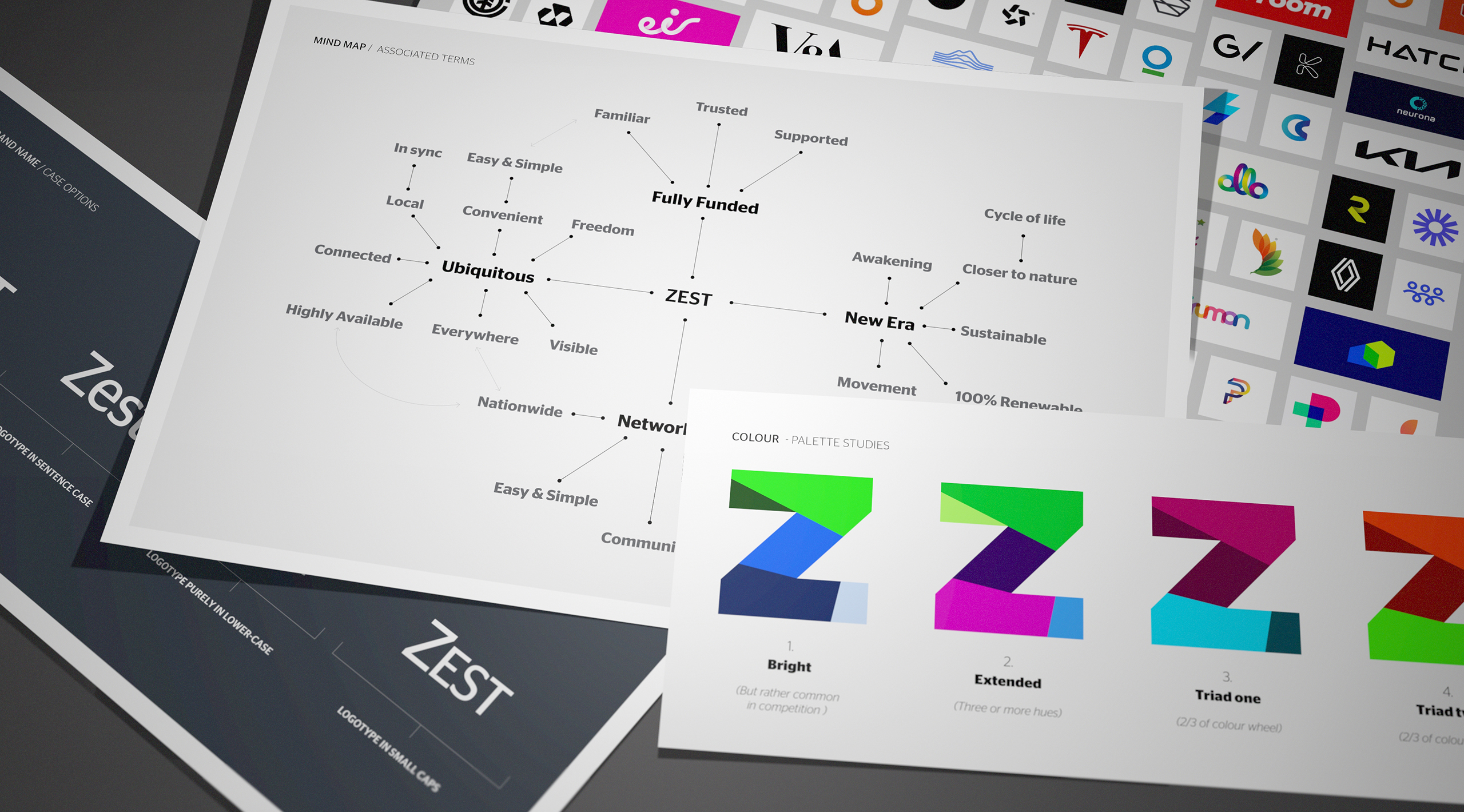
The Zest team appointed Firedog based on our previous experience and provided us with an early stage market plan and product positioning. This contained an audience breakdown alongside a series of brand and product positions. A brand character matrix provided insights into the emotional and functional needs of the consumer. From a consumer perspective, the cultural EV movement is driven by conscious users taking action in personal ways. At the same time, Zest is a commercial proposition for site owners providing a simple solution to EV charging deployment. The model is fully funded and removes financial barriers to investment in infrastructure. Therefore, the branding needed to appeal to both consumer and business segments. Both are environmentally committed but we needed to strike a balance between fun and formality.

Early logo concepts covered a number of directions from using the unique Z initial though to ideas of adopting natural and wildlife cues.

The sustainability factor is a huge emotional driver for both audiences, so the need for an associated natural icon became clear.

We developed a number of conceptual directions. These covered options such as type only, using the uncommon Z initial, looking at net zero metaphors and finally, using icons of positive creatures. The latter proposed animals connected with the associated brand values; brightness, agility and sustainability. All the provided concepts use clean and simple corporate identity principals yet harnessed bright colours and custom type in order to appear friendly and positive. The sustainability factor is a huge emotional driver for both audiences, so the need for an associated natural icon became clear.

We struck upon this idea of natural energy and particularly animals which created their own sources of energy or were synonymous with graceful agility and movement.

We looked at animals which used energy in interesting ways.

We studied all kinds of creatures associated to “positive natural energy”. Some animals like the manta ray generate their own energy – but are at times not necessarily positive outside of the electrical sense. We then looked at animals which used energy in interesting ways. The shortlisted creatures became the firefly and the hummingbird. The firefly is interesting because it becomes a little aerial lightbulb at night. It’s a little burst of self created energy. The hummingbird is interesting because it harnesses it’s own energy in such an efficient and awe inspiring sense. They consume up to double their body weight in a day flapping their wings up to 65 times a second. They feed on nectar moving their tongue in and out about 15 times a second. What a bright burst of natural energy!

The final chosen brand logo balances EV auto style typography alongside a bright and cheerful hummingbird in mid flight.
We always provide a branding system built on flexible principals. Artwork contains left aligned, stacked and freestyle artwork combinations.
The symbol strikes a balance between serious business and consumer playfulness.

The visual identity creates a universal look and feel system which brings all the branded elements together.

The visual identity encompasses the branding. It creates a universal look and feel system which brings all the branded elements together. Firstly, for colour; we wanted to eschew the principals of electrical energy. Therefore, we used a series of complimentary acidic tones. We supplied a typographic language, an image look and feel and advice on strategic messaging. We also supplied an indication of suggested symbology and iconography. We used a large amount of white space and crisp layout elements in order to constrain what is a very bright colour palette. The look and feel capitalises on an angular framing device in conjunction with the brand imagery.

We create an extended visual identity as part and parcel of the branding system. This covers off styling for typography, colour, imagery and bespoke graphic devices.
The combination of emotive imagery and a strong angular framing element creates a cohesive look and feel. The colour palette speaks to the origins of electrical energy through its use of acidic colours.

The use of the graphic device brings a unique visual language into the renewables brand identity.

The use of the graphic device brings a unique visual language into the sustainable energy brand identity. It frames the imagery in such a way that the angular crop becomes an easily recalled shape. This is used in branding in order to both unify an identity and also to aid recall of the branding. The graphic device is based on a system whereby the angle is retained but can be placed anywhere on the canvas. It just needs to follow a couple of rules. While the colour and the position is variable, the brand stripes need to both be consistant in size and also in their width relation to each other. This system is systematically noted within the guidelines for future brand work. The sustainable energy brand has secured an initial £30 Million investment from specialist sustainable economy private equity business, Zouk Capital. Furthermore, this investment is supported by the UK Government’s Charging Infrastructure Investment Fund (CIIF) which is also managed on behalf of Zouk Capital. The CIIF fund was established by the UK Government in 2019 and backed by HM Treasury to help develop public charging infrastructure points for electric vehicles throughout the UK. We continue to work with the business on developing brand custodianship and are developing a phase two of visual identity roll-out and execution.

The prototype charging units have been rolling out across the United Kingdom.
Sign up for our Firedog Newsletter
* = required field