-

The primary brand application contained a strong Blast wordmark rendered in a suite of hifi colours.
-

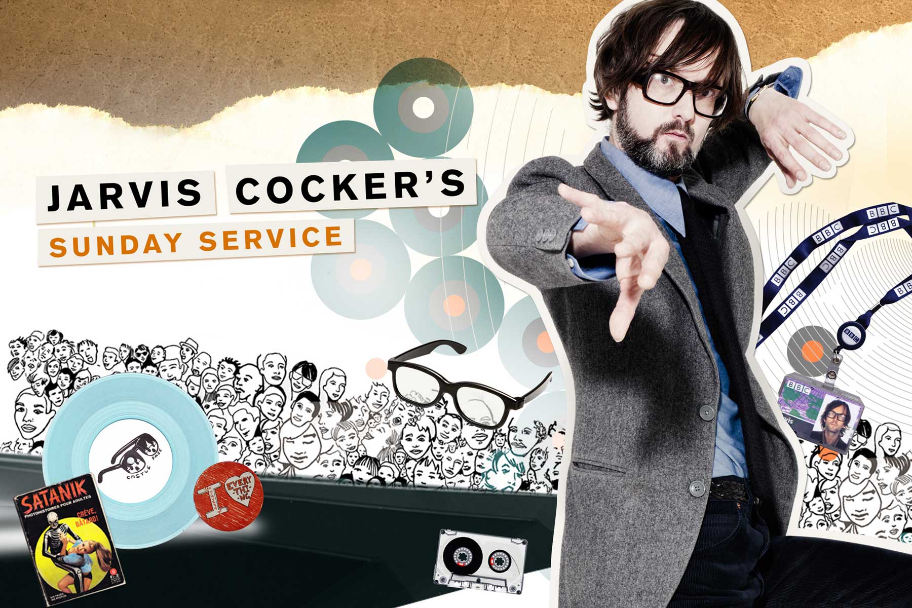
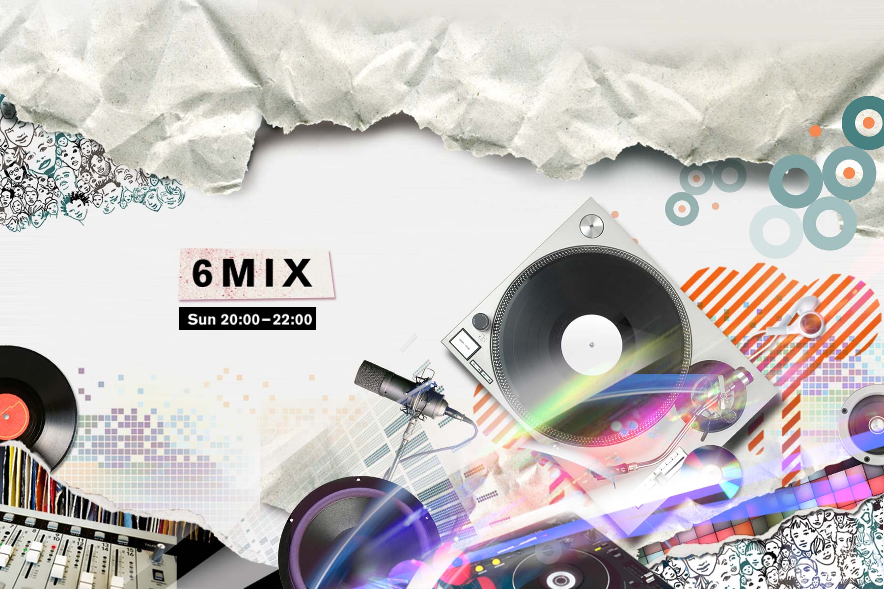
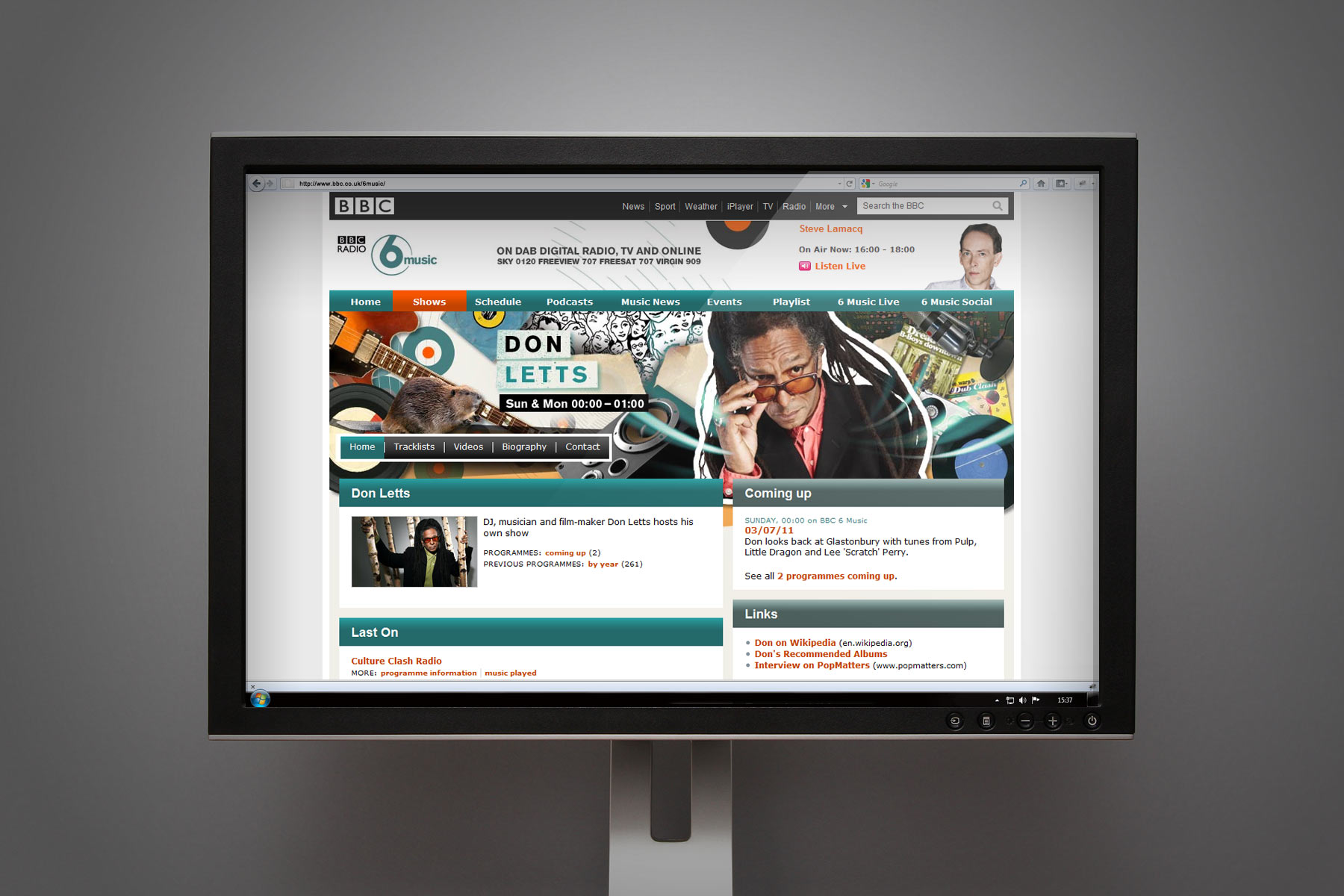
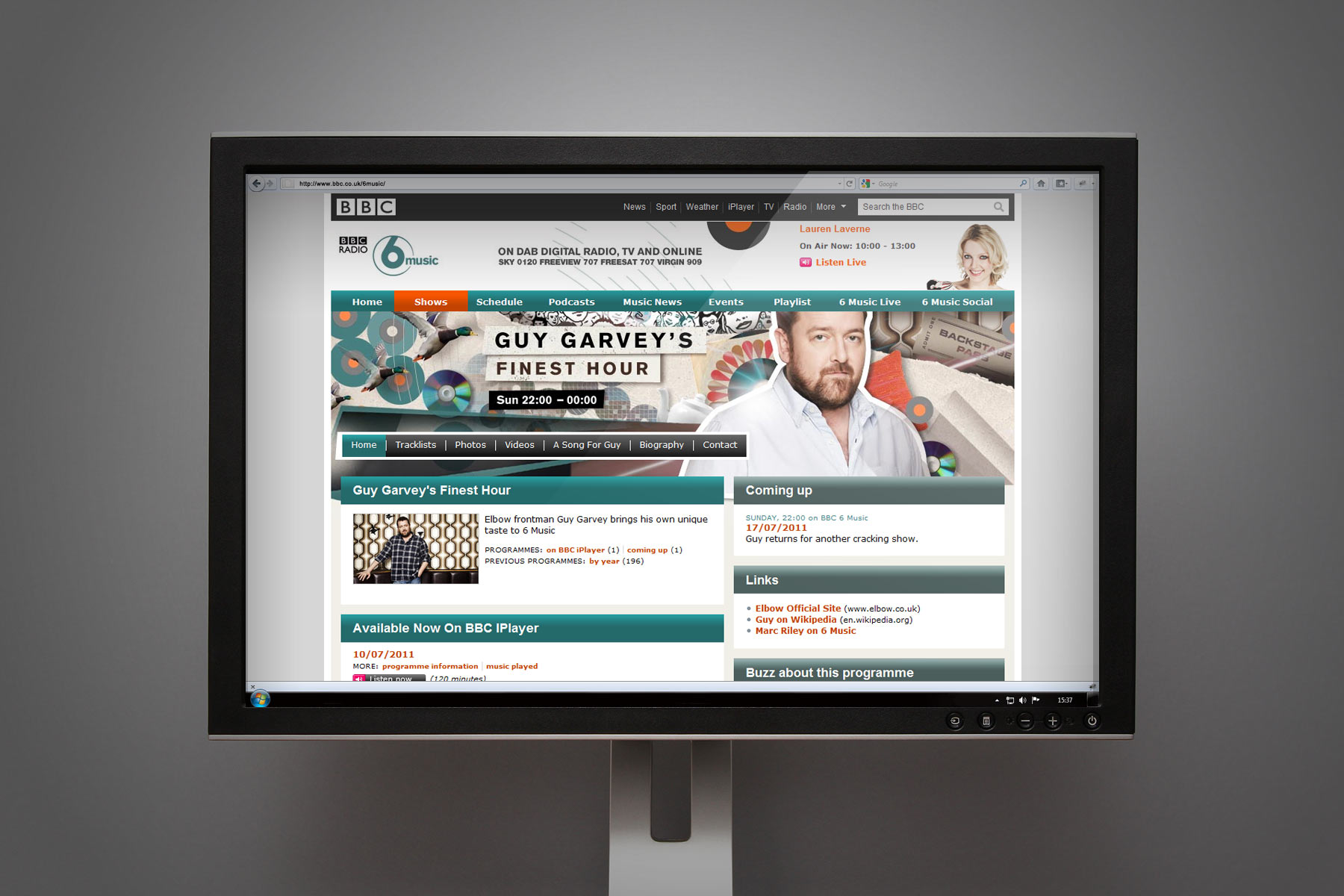
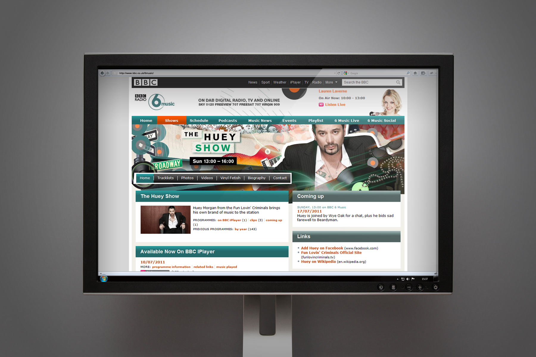
Whilst the look and feel consistantly represented the overall 6music branding, each show page carried its own spirit and message through the careful selection of graphic bric-a-brac.
-

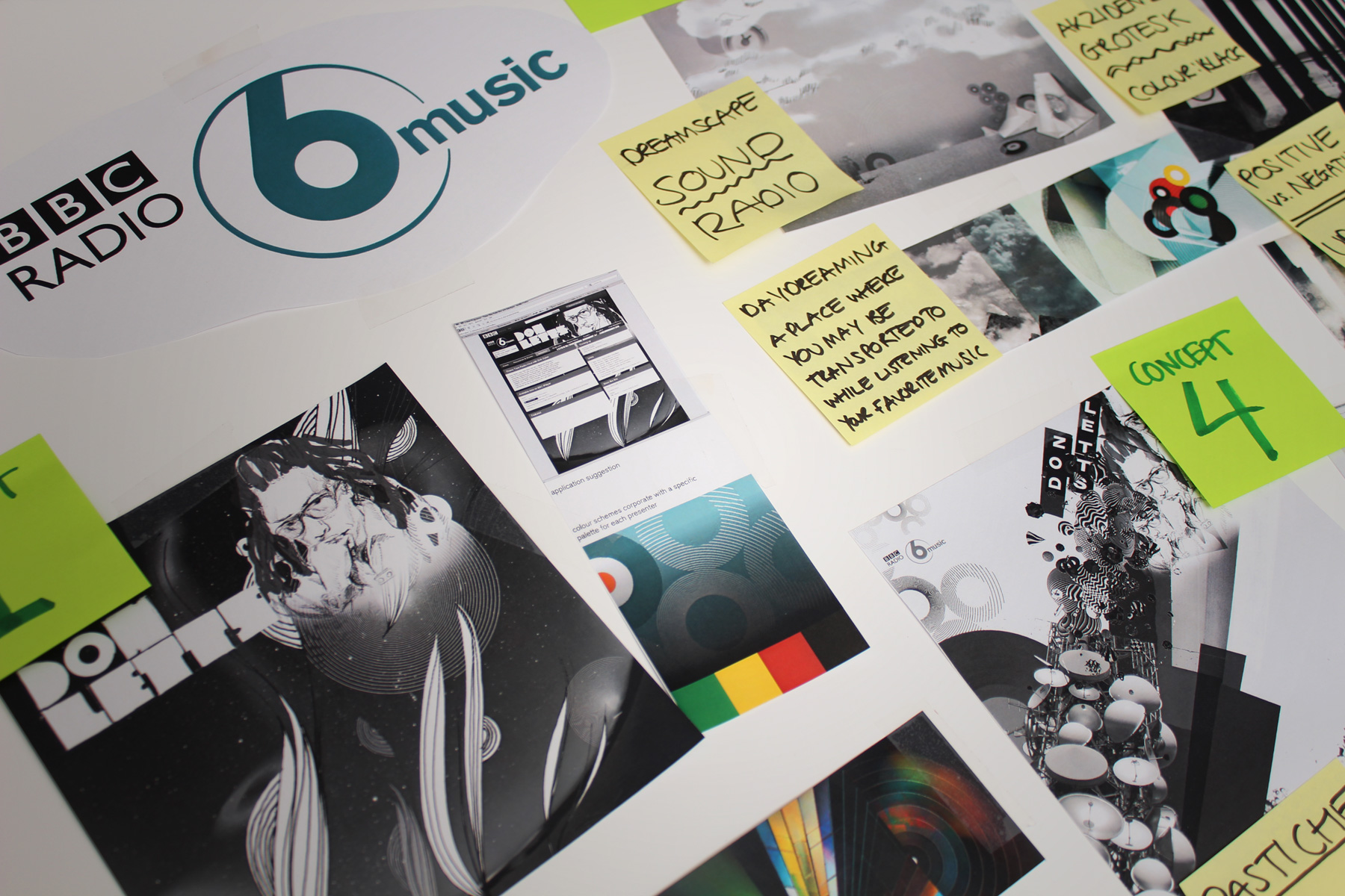
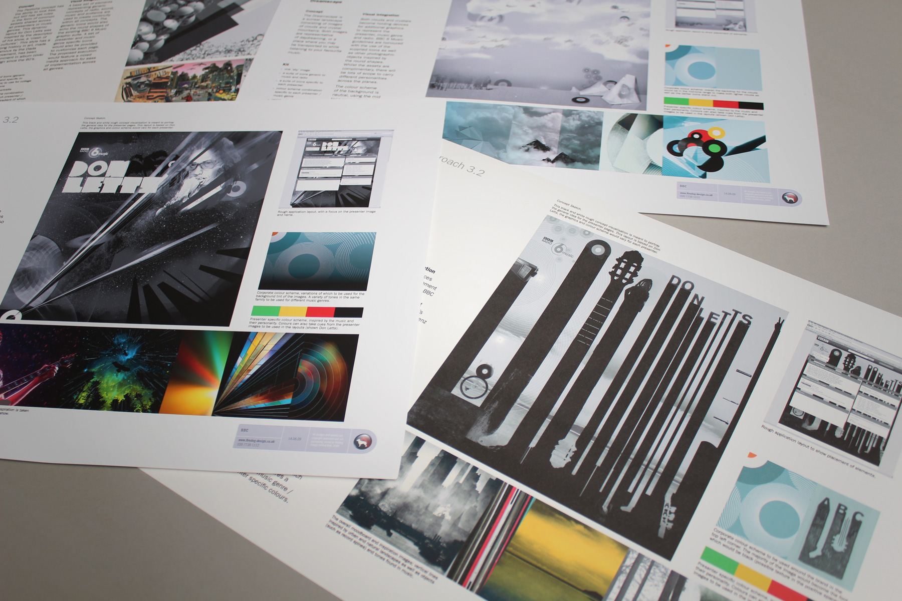
We were invited to pitch alongside four other creative agencies. We set about creating ideas that were cerebral and individual.
-

All our ideas worked off the belief that whilst the 6music listeners varied their tastes in genres, they could all be seen to be independent thinkers.
-

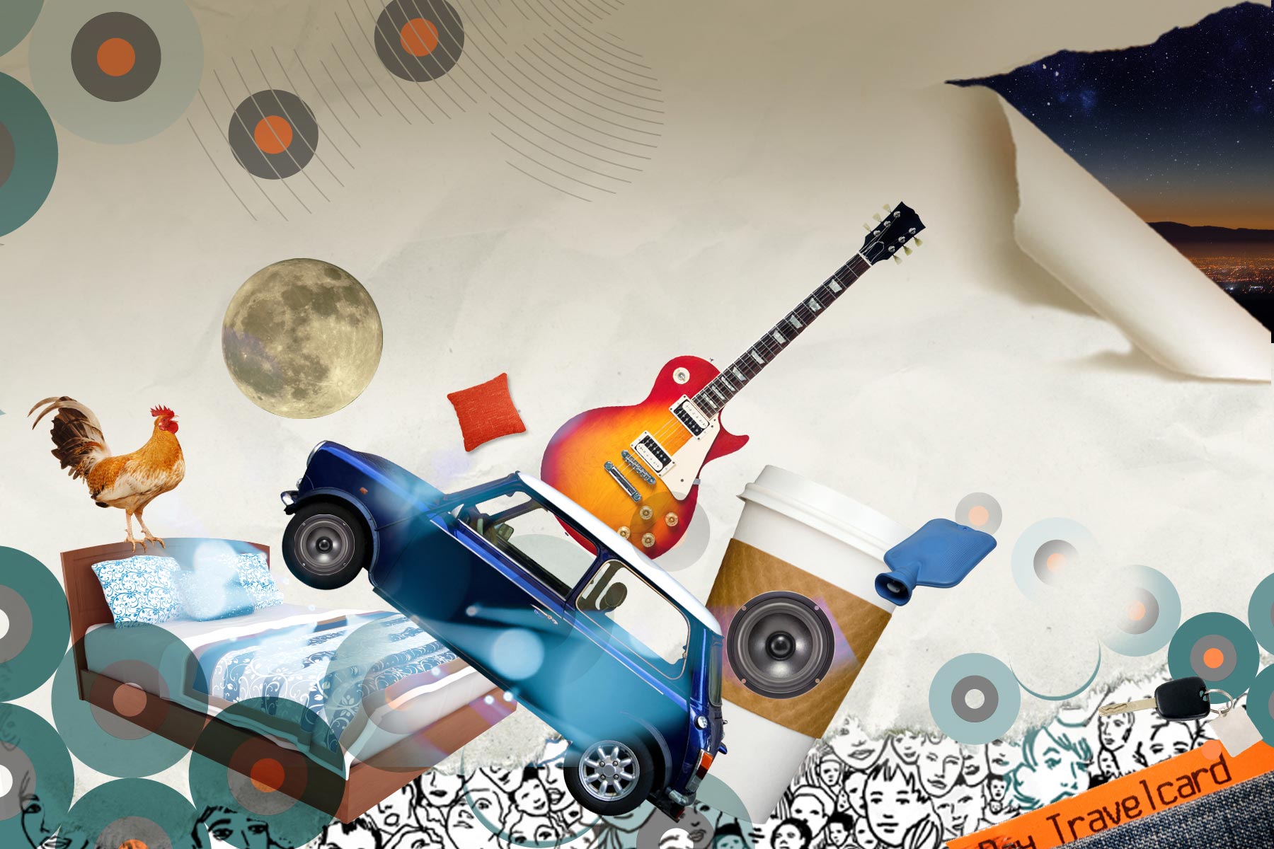
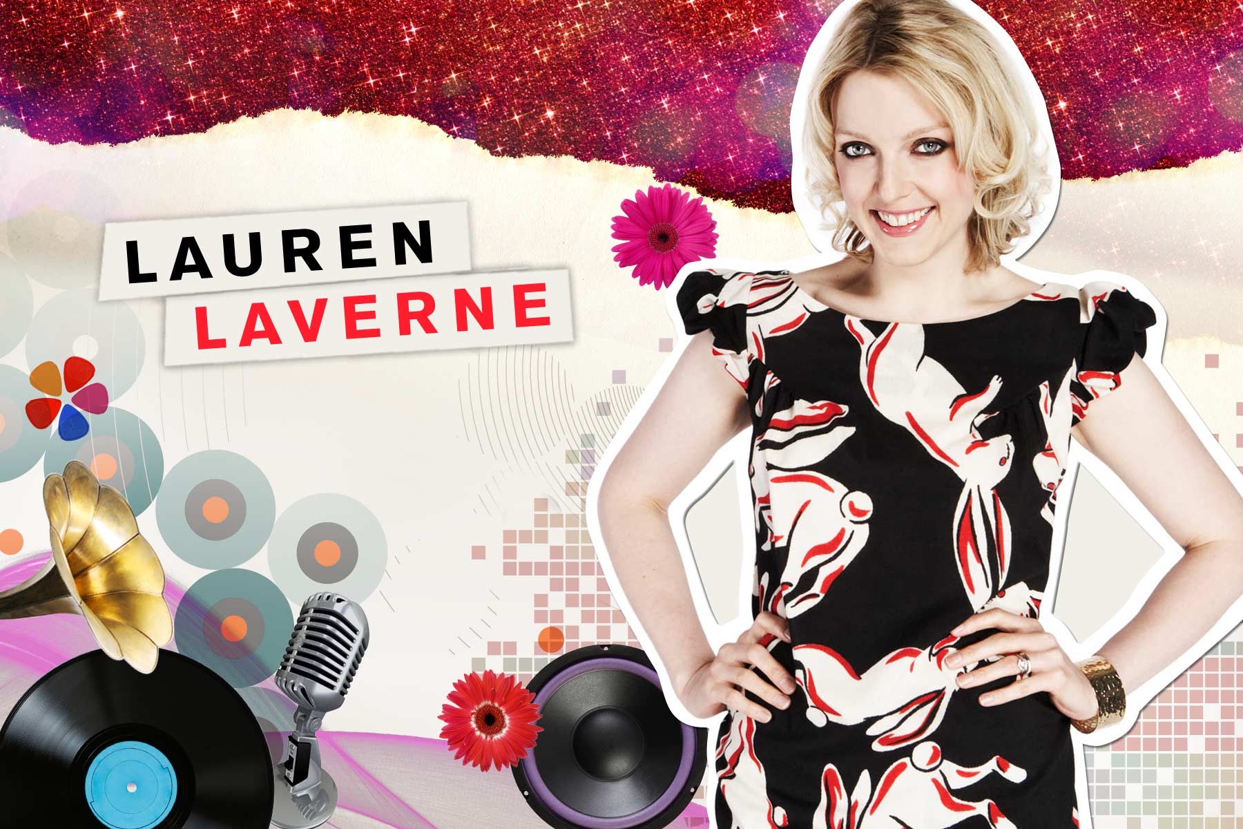
The concept which won the pitch was formed by combining portraits of the presenters with found objects. Inducing an individual and often comedic result.
-

The deliverables also included a set of generic templates so that the BBC team could add new shows. Also, this template helped for guest DJs, collaborations or other special events.
-

Each show page carries the personality and style of the presenter across to the audience.
-

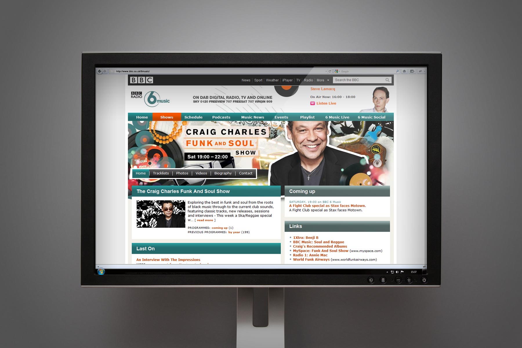
The BBC team chose to the build of the 6music site across a number of suppliers - Our creative digital branding slotted neatly within the new interface language.
-

The presenters pages were unified via the consistant quality of the portraiture, the community illlustration and the use of abstract light wave imagery.
-

The subtle use of colour and complexity hints at the presenter style of music and show.
-

The show names are locked up into panels falling within the show graphics - Keeping vital information on a legible background.
-

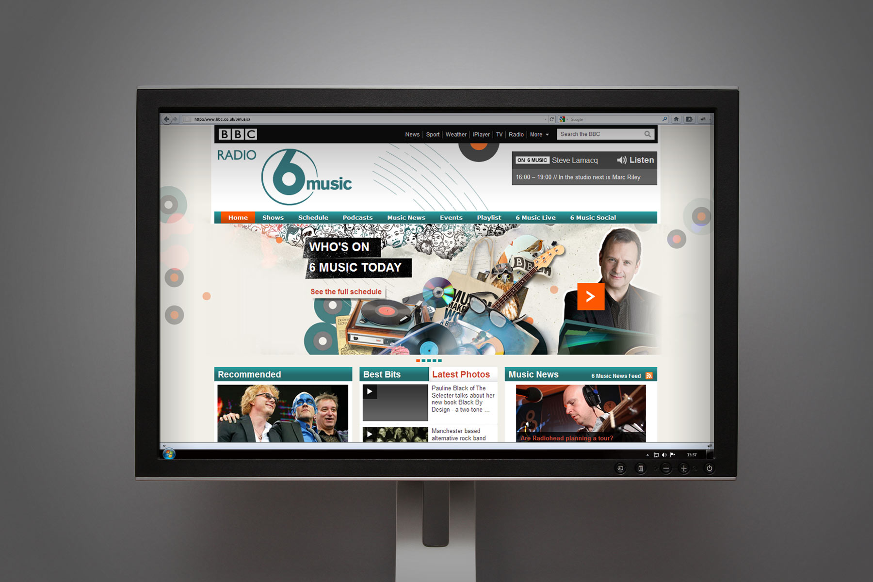
The BBC team have been able to take the brand toolkit and have developed further pages, such as the 6music home page here.
-

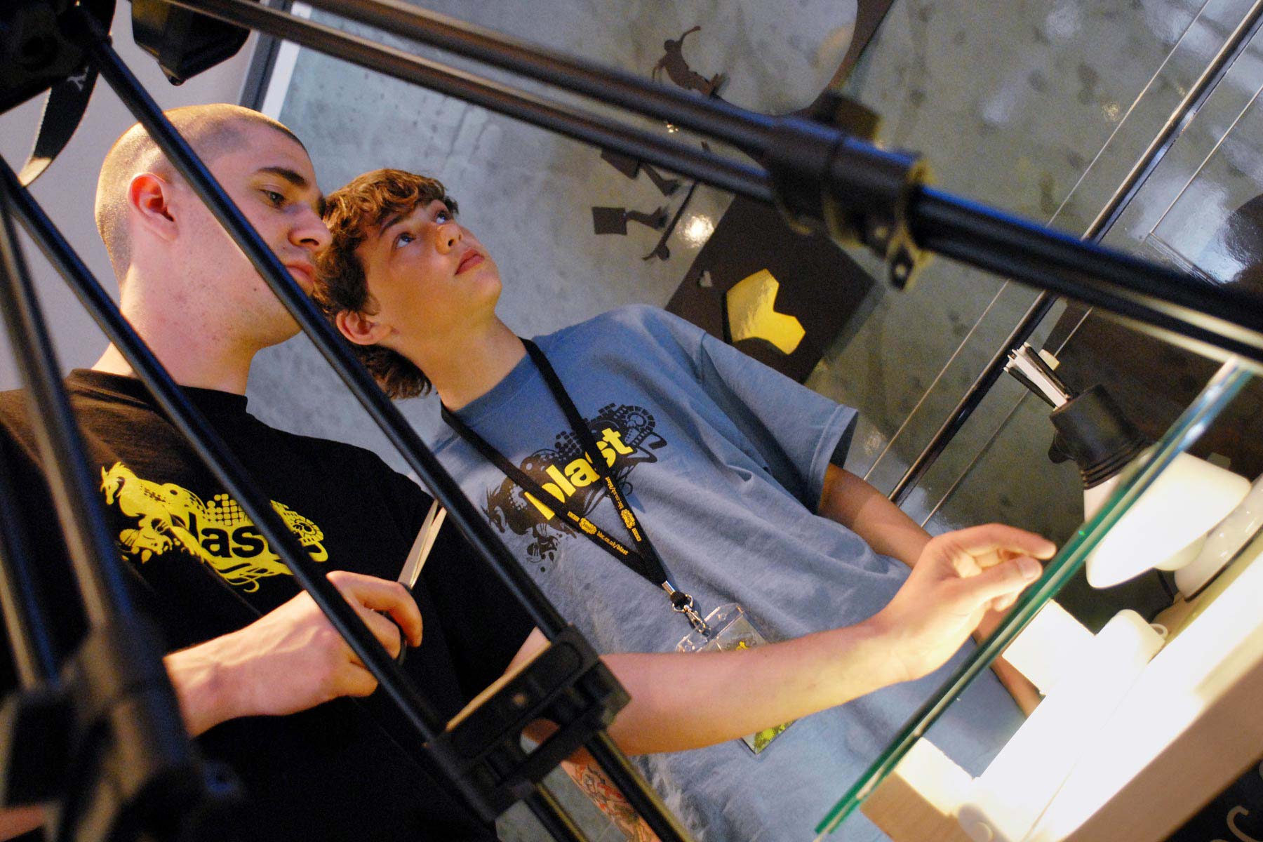
The target audience engaged both in workshops and learning environments and also utilised the supporting online creative social network.
-

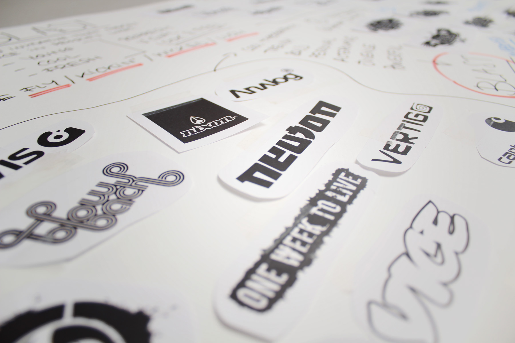
In our background research we explored the audiences inspirations in media and defined our brand around established patterns.
-

We created the brand in such a way that it has the ability to change its environment according to the will of the user. We went as far as uploading an editable brand template - So that the creative audience could make the identity theirs.
-

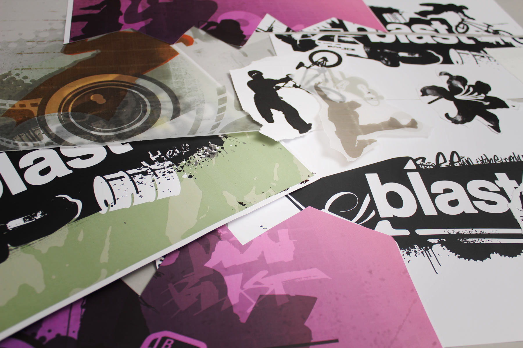
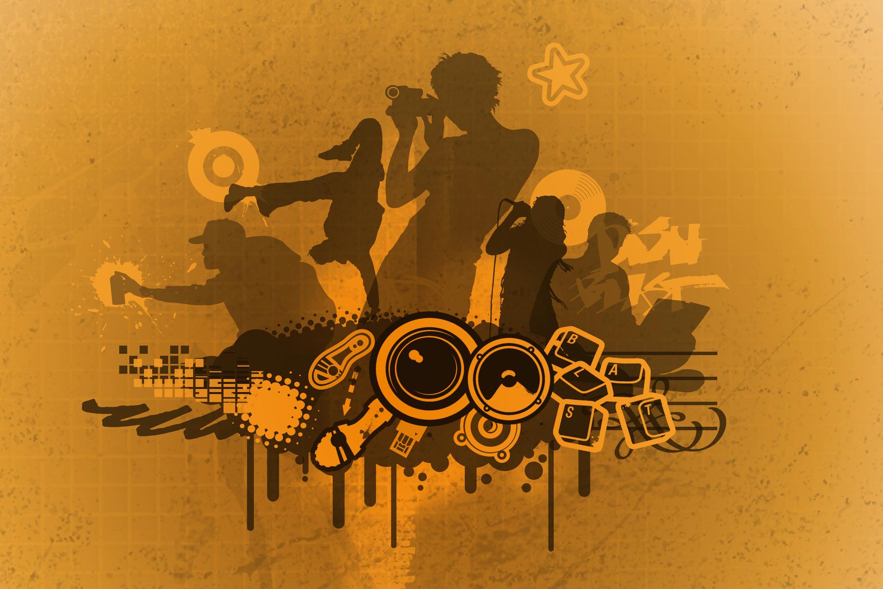
The supporting visual identity behind the brand featured a series of composite and seperate illustrations around the five core creative disciplines.
-

When combining the illustration assets together with layout devices, an instantly recognisable look and feel is created.
-

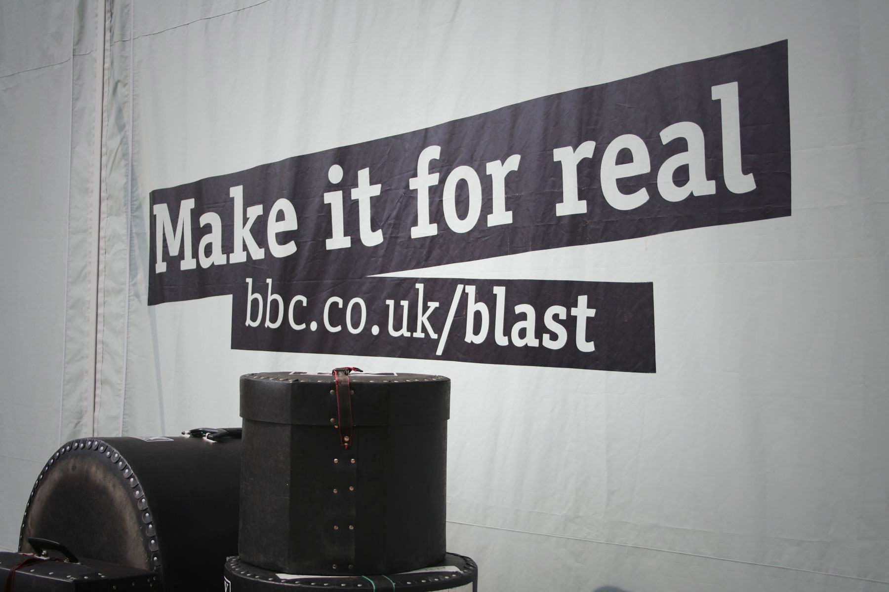
We created all the brand messaging. The strapline encourages young people to have the confidence to turn their skills in producing creativity for real, as opposed to just a vision.
-

The brand graphic devices were created with an exceptionally freestyle framework. This generated a dynamic visual identity which did not look tired or dull.
-

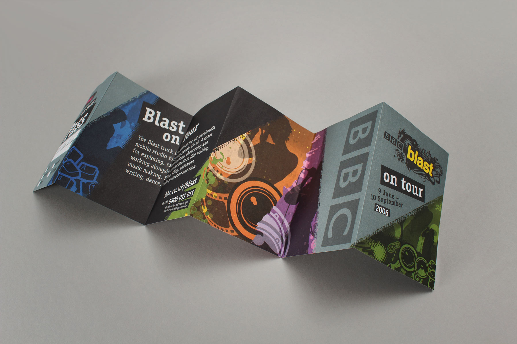
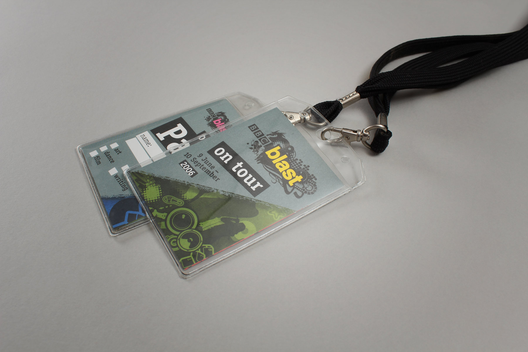
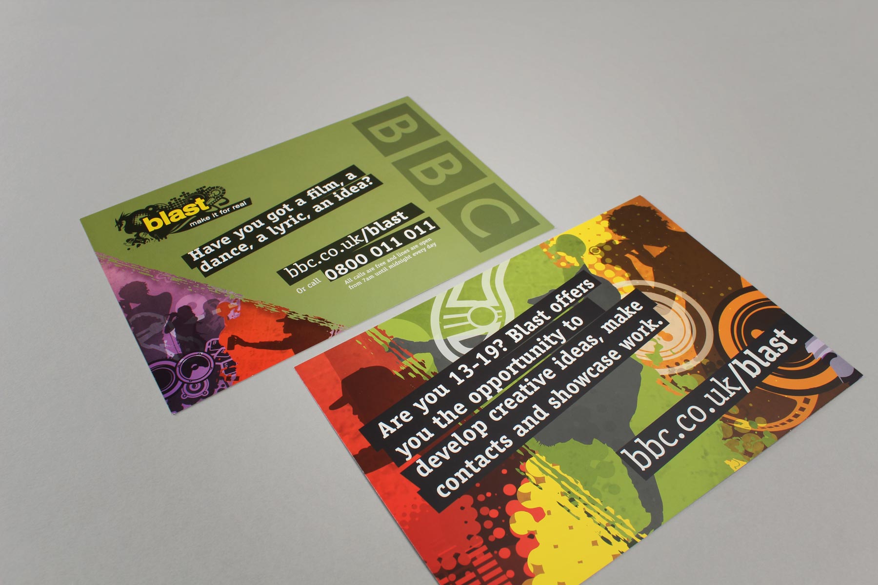
The online and brand media was greatly supported by a large amount of print merchandising, created for the Blast roadshow.
-

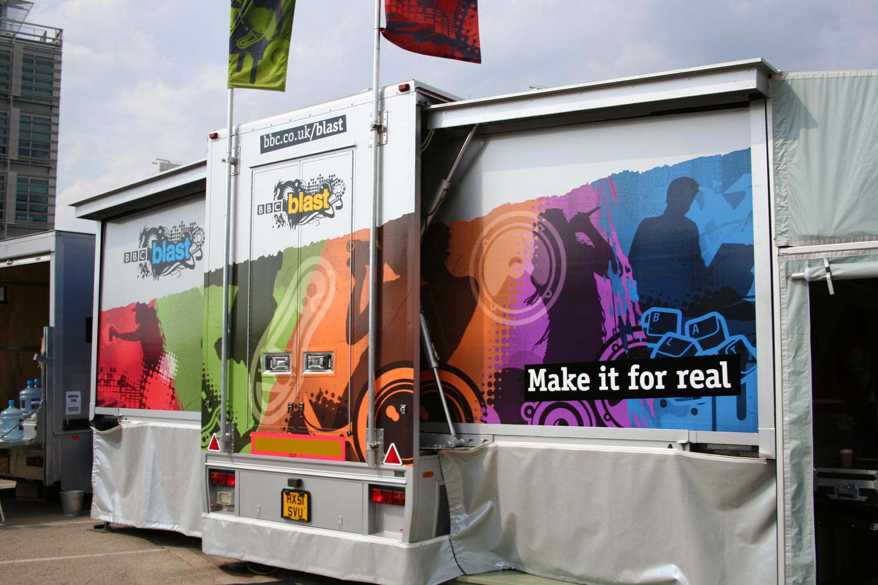
A powerful application for the brand was a set of articulated trucks which toured the UK for a period of eight months, designed to bring creativity to the far reaches of the community.
-

We created a number of branded illustrations, a punk inspired typographic feel and a harmonious suite of graphic devices.
-

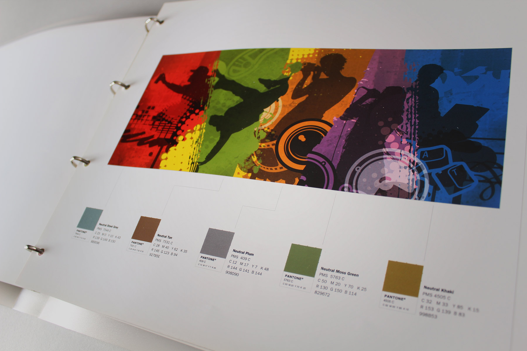
The project was completed with an extensive fifty page brand and spirit guide which aided the BBC internal staff in extending the brand into the future.
-

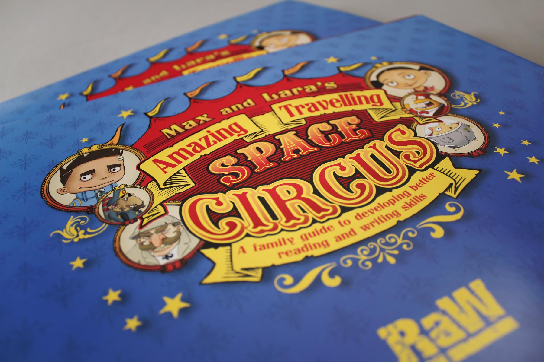
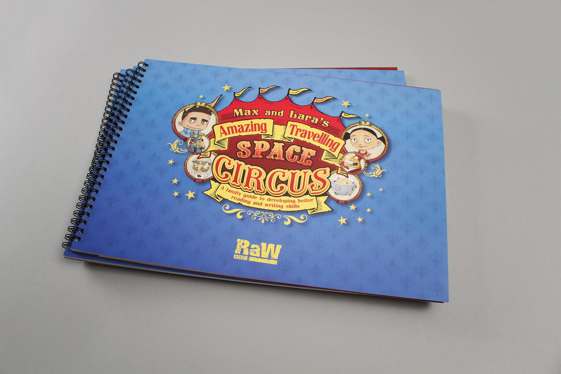
The publication title weaves intrigue and sets up the story about to unfold.
-

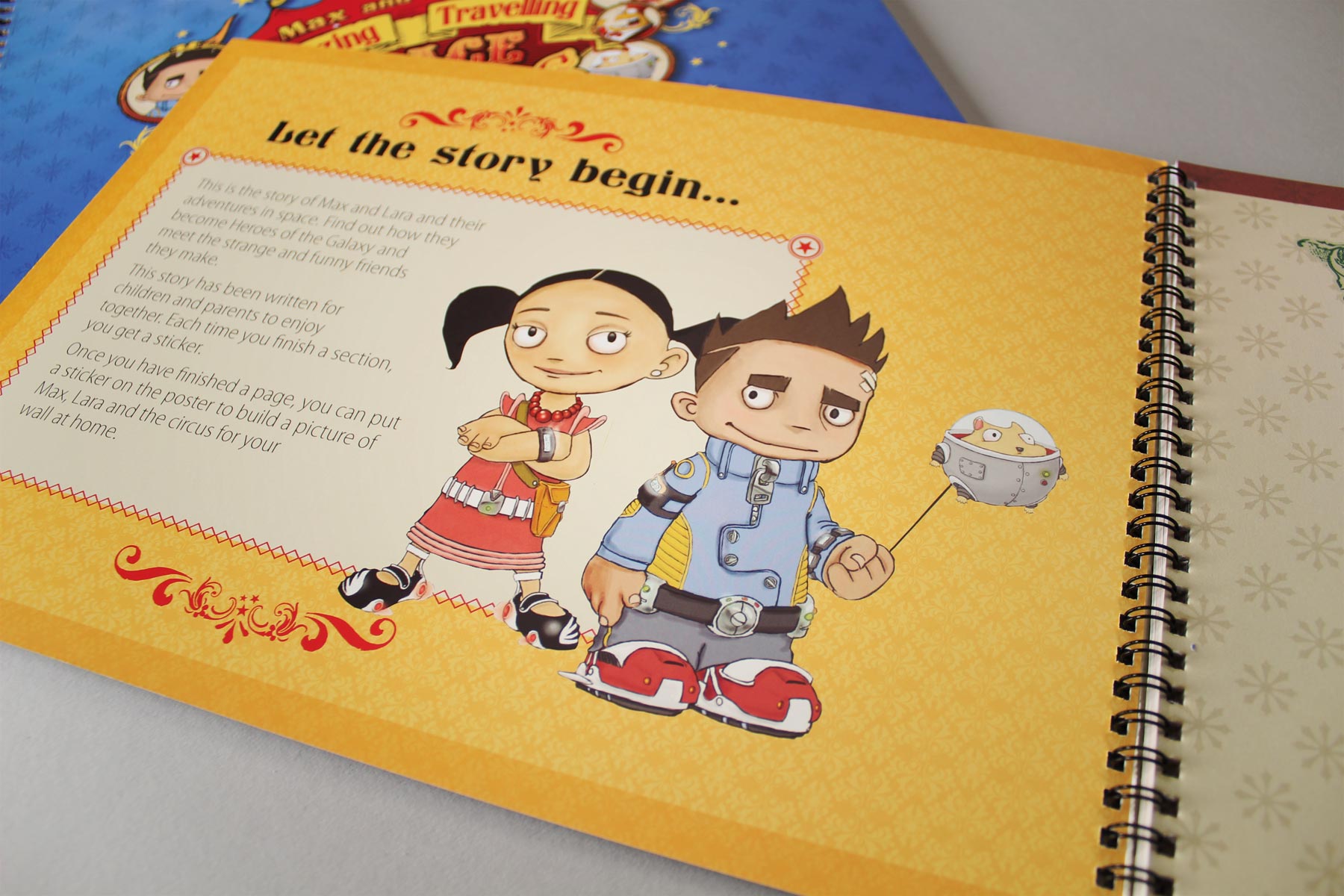
Max and Lara are a representation of adventurous young people and their ability to approach challenges with an open mind.
-

The graphic title area has been carefully crafted to convey a circus type feel - The overall size of the publication being a custom larger than A4 size, gives it an impressive impact.
-

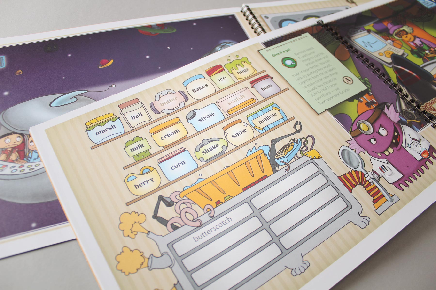
The concept of space circus allowed us to create a myriad of weird characters - Such as Kooloo the space hamster.
-

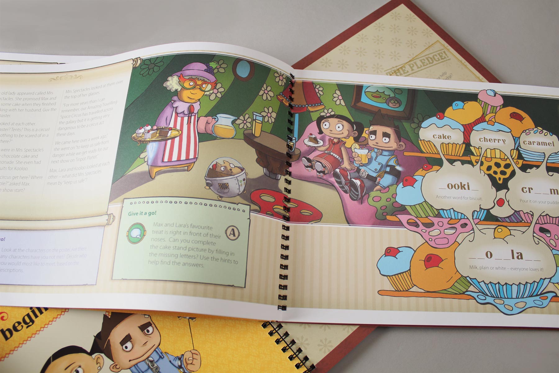
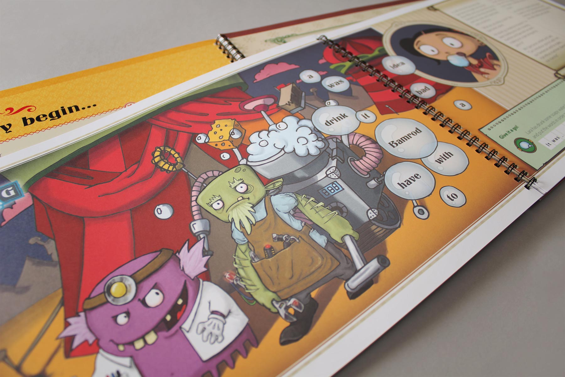
The characters and story were sketched up loosely before being digitally illustrated and formed.
-

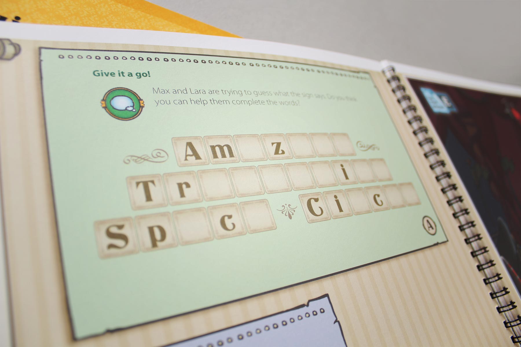
This editorial device allowed the audience to fully engage with the stories little challenges.
-

The learning remit is cleverly disguised within an immersive story-telling environment.
-

A relatively tight family of typefaces and a layout grid held the chaotic content together.
-

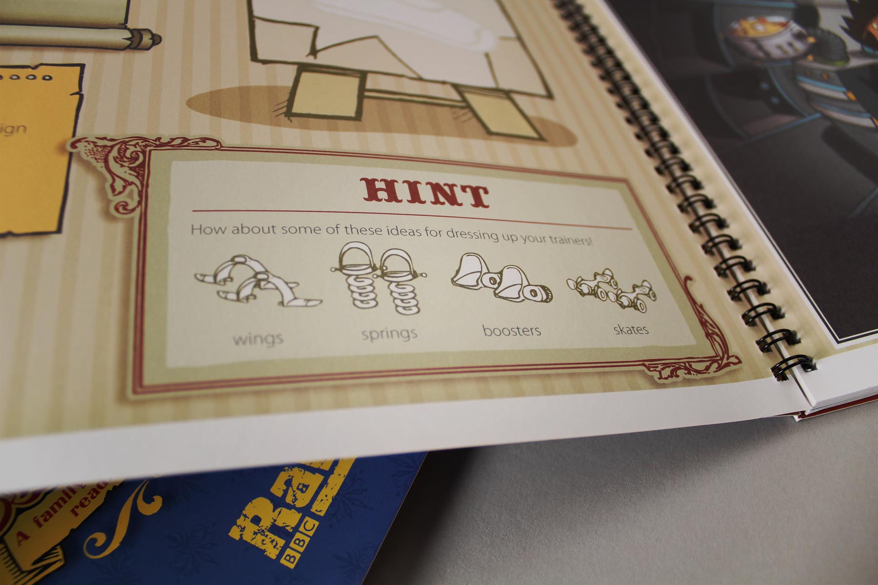
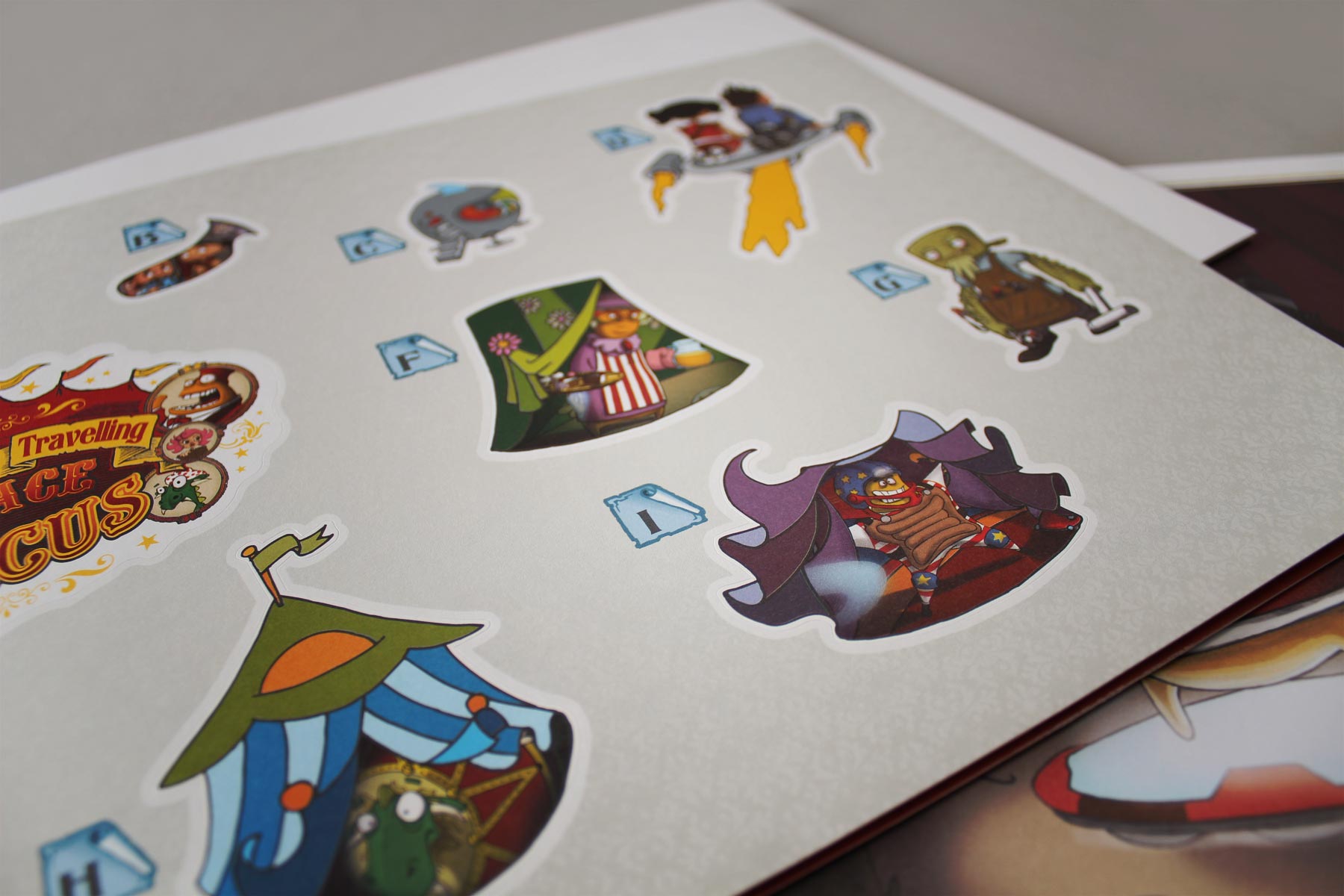
The book shipped with sticker sheets and a large poster where the readers could track their progress.
-

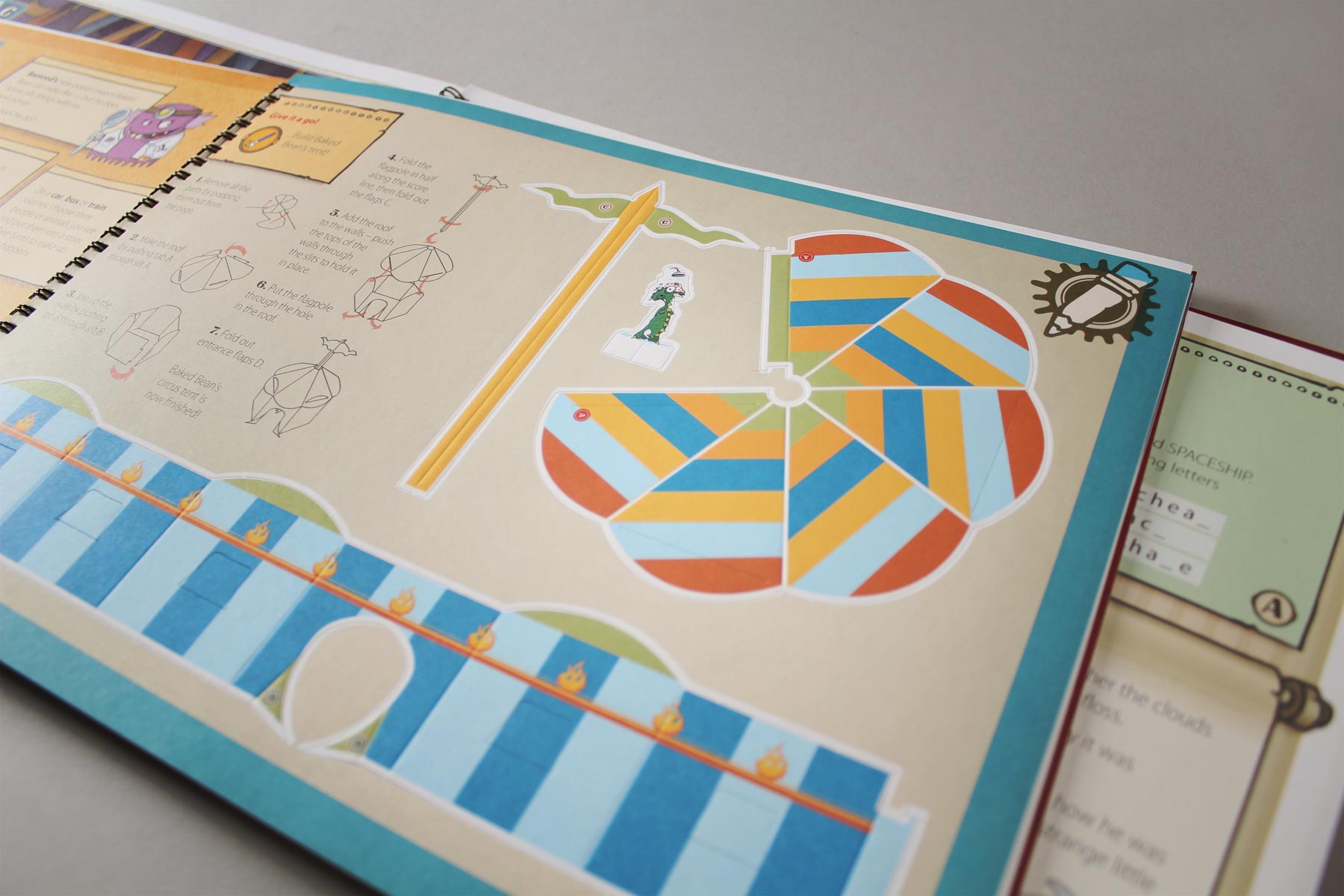
A second activity sheet allowed the young audience to build certain elements from the story.
-

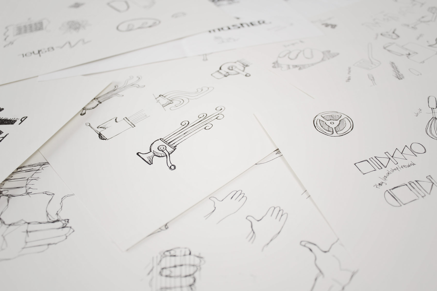
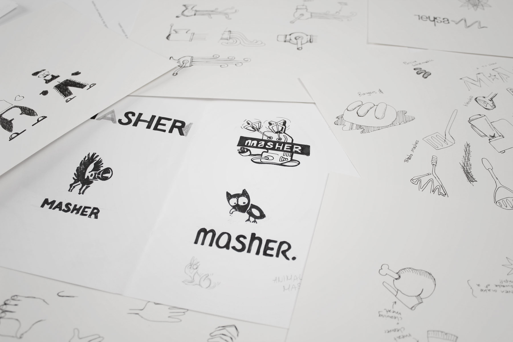
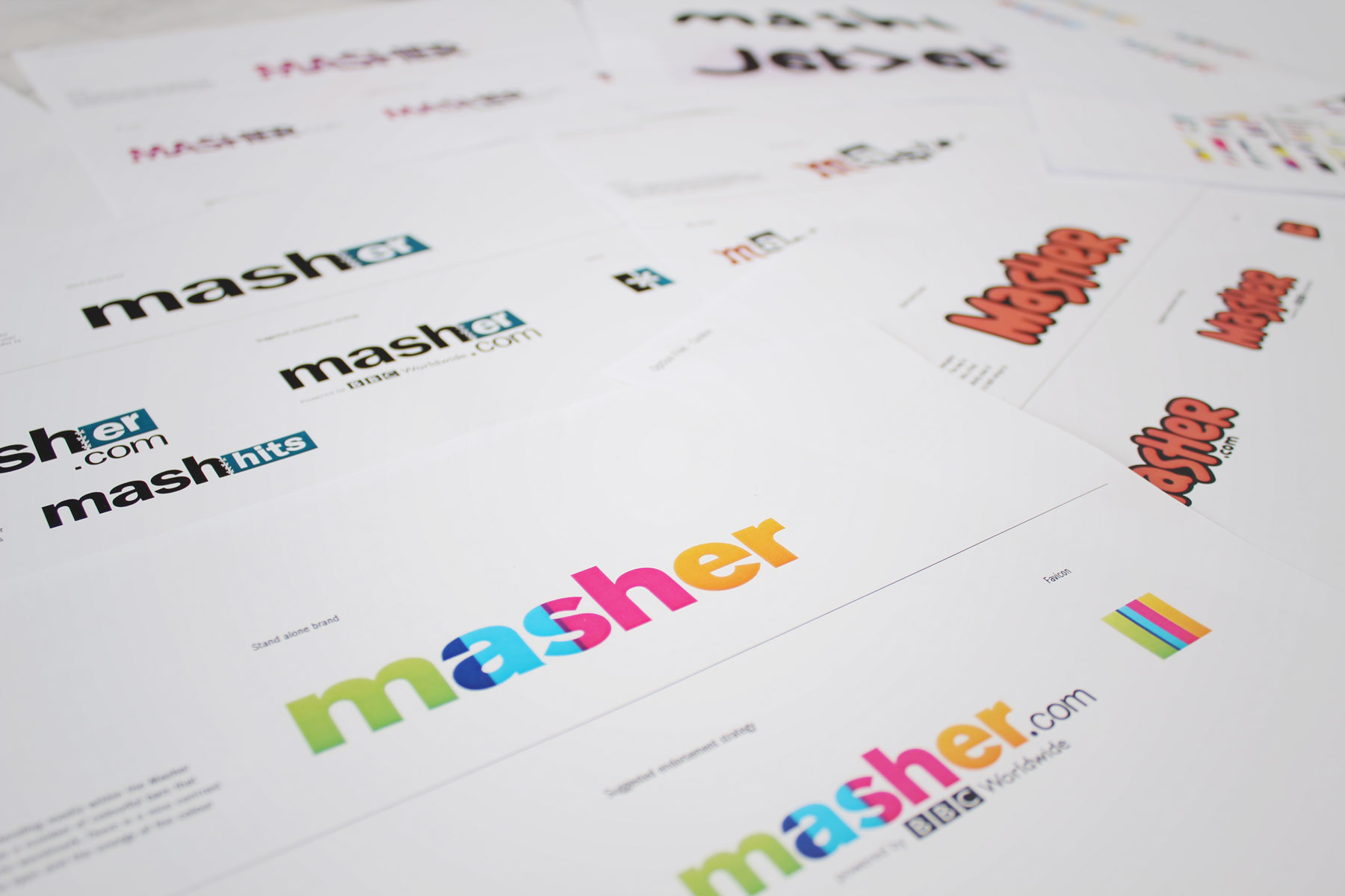
We got to grip with the theme of Mashing and sketched out ways in which this could be portrayed in a quirky and memorable way.
-

Often we would venture into territory which may have been a little random.
-

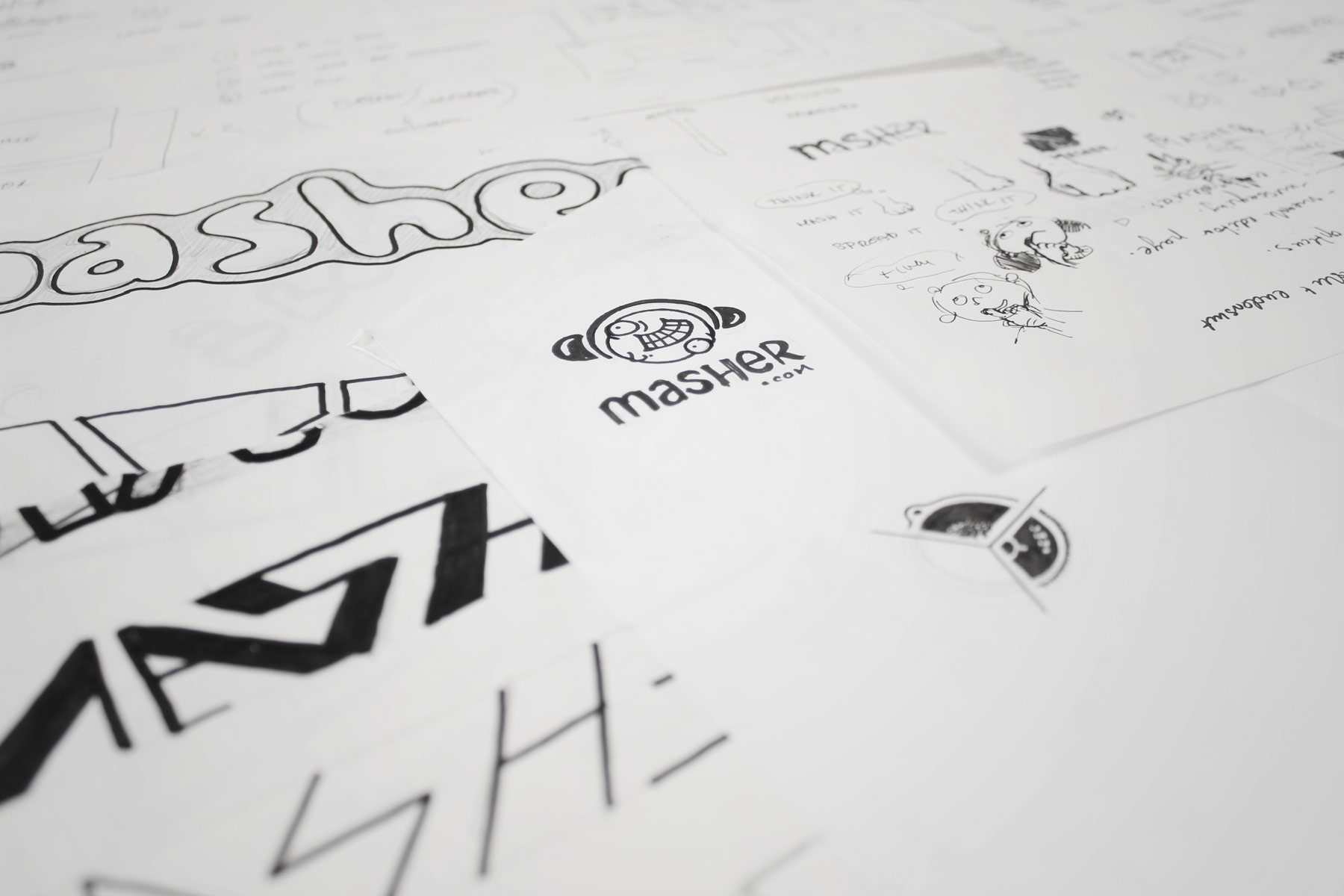
We wanted the brand to have a memorable type treatment, so we experimented with both hand cut and machined type.
-

The next stage took our ideas and applied a somewhat more formal visual language.
-

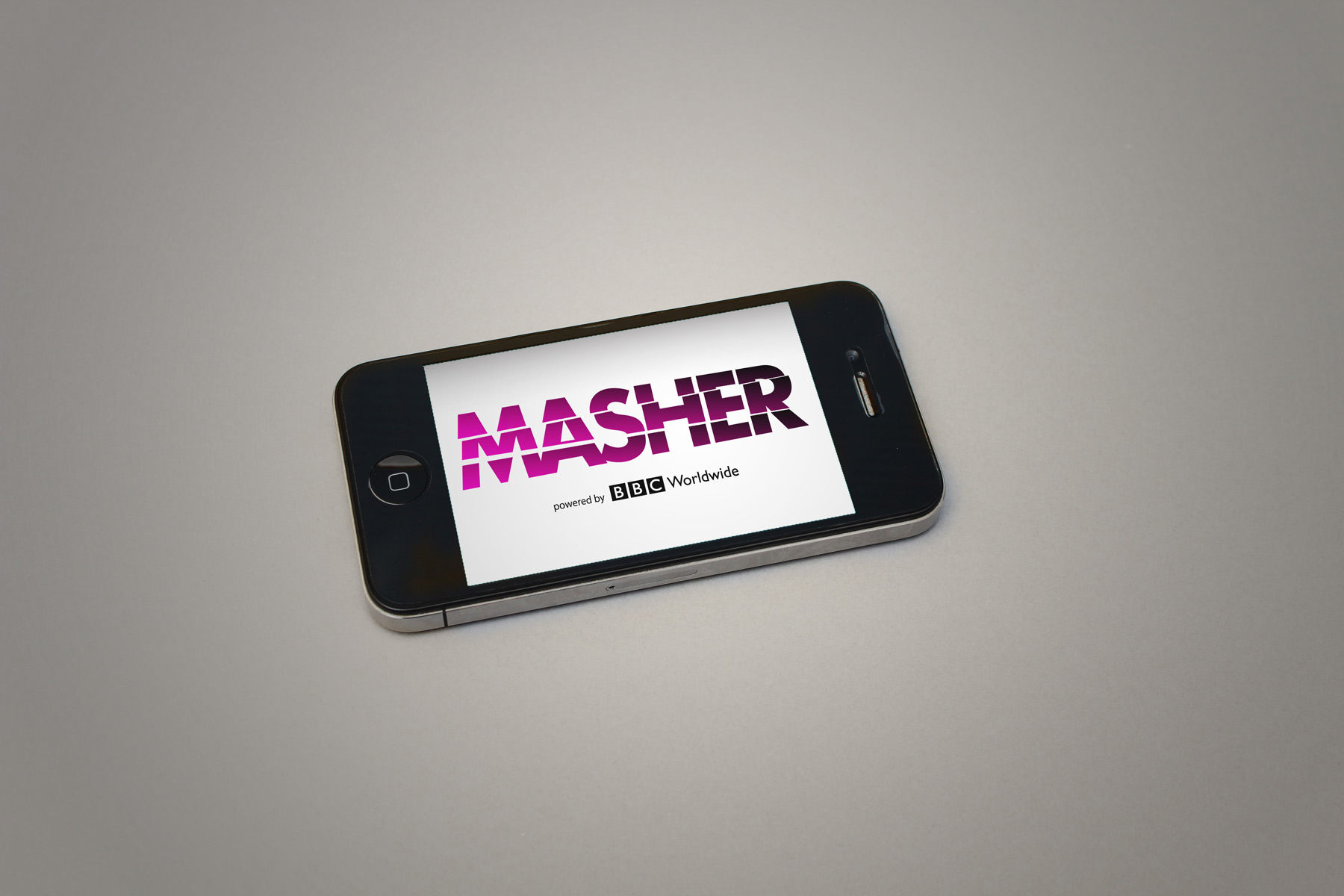
The Masher identity is inspired by the notion of dicing and slicing content - Hence the wordmark has been cut into numerous parts, a graphic representation of this idea.
-

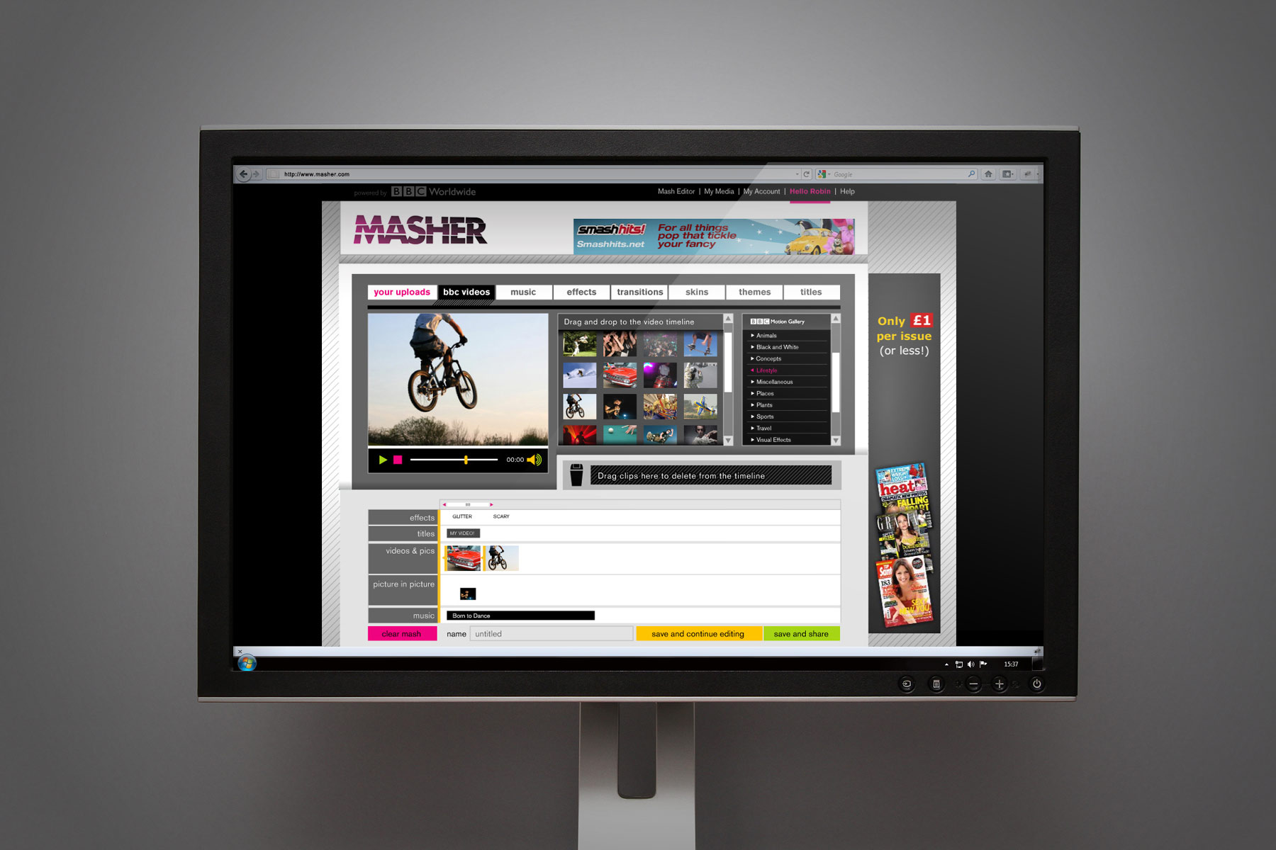
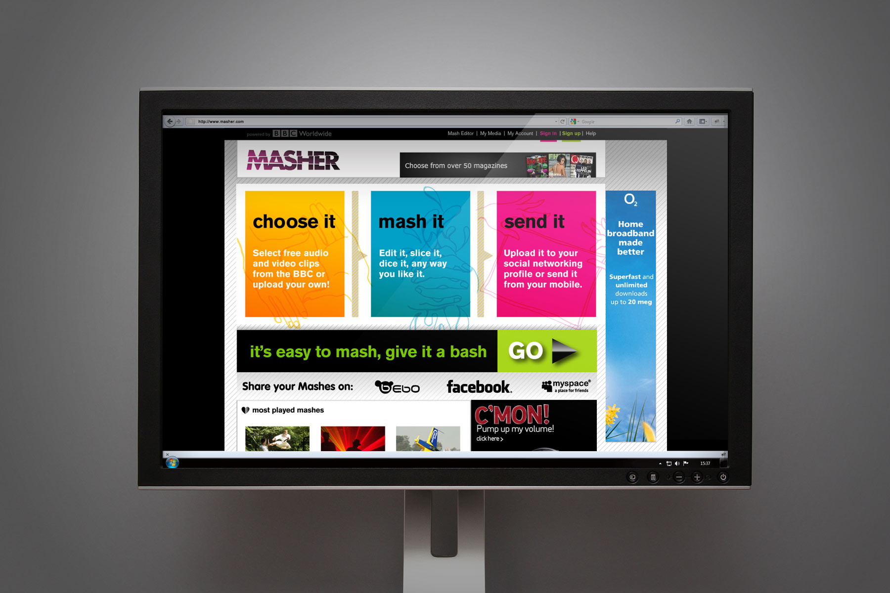
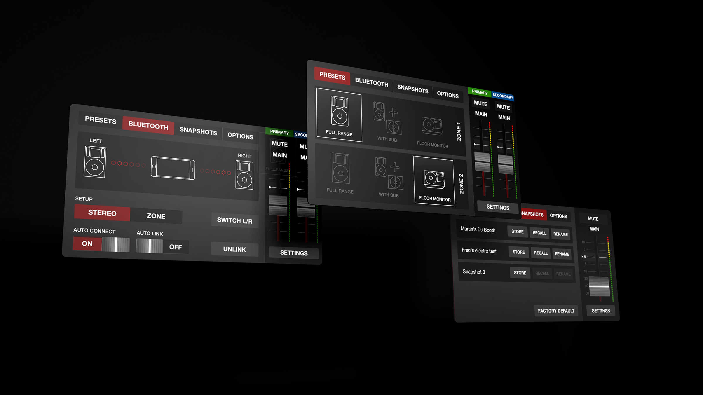
We also advised on the design of the software interface, creating a unique yet functional feel.
-

The original look and feel used strong colour to convey the different functions behind the product.
-

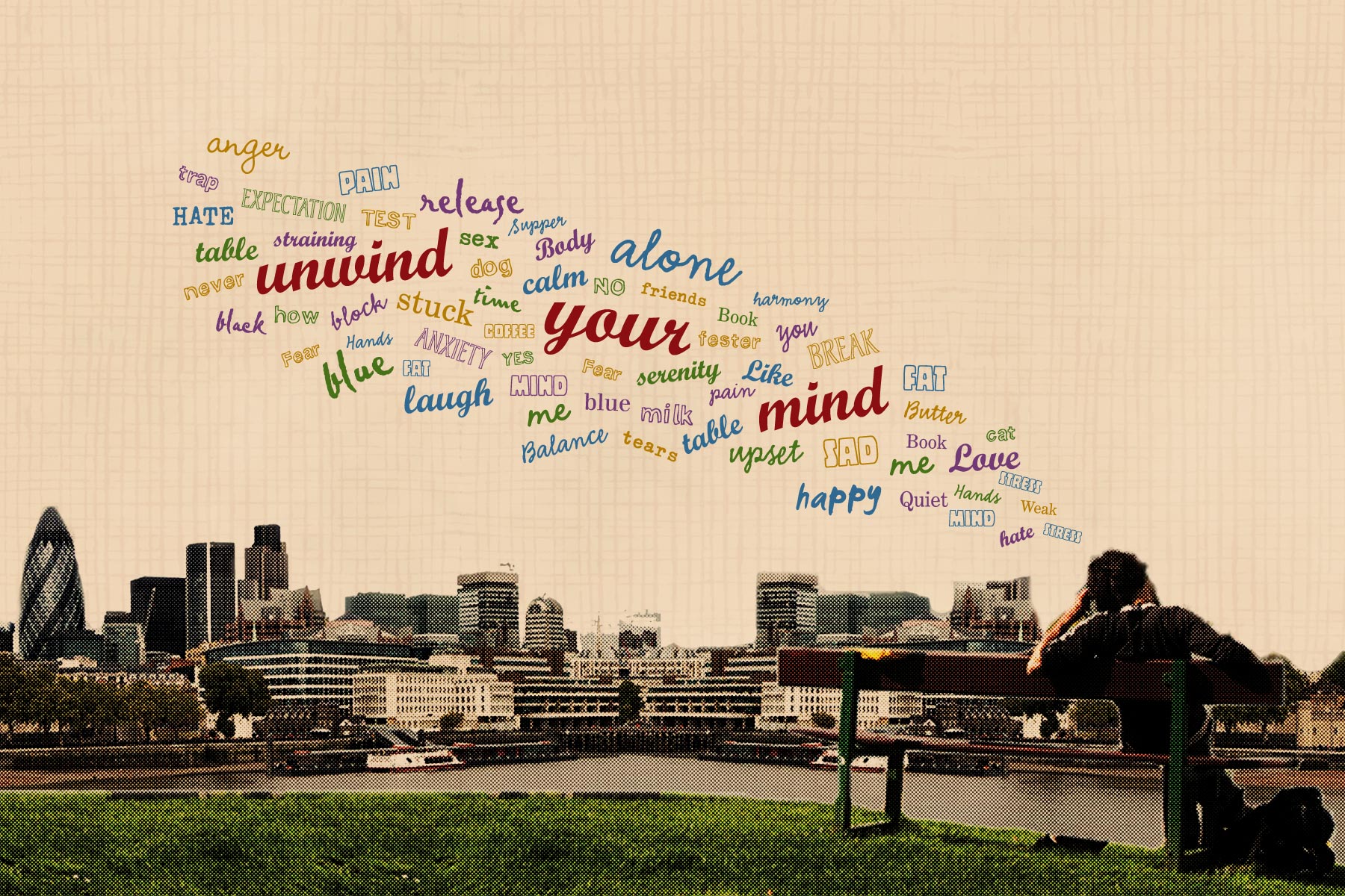
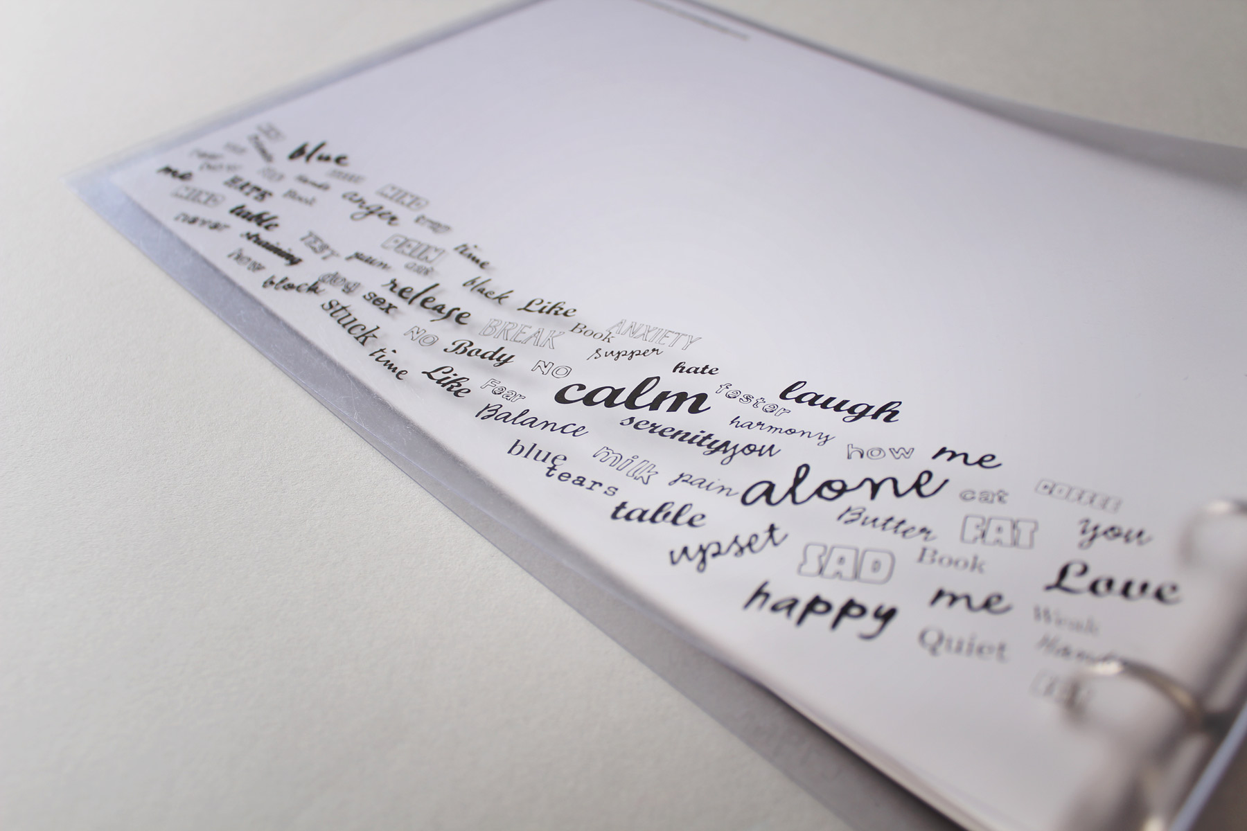
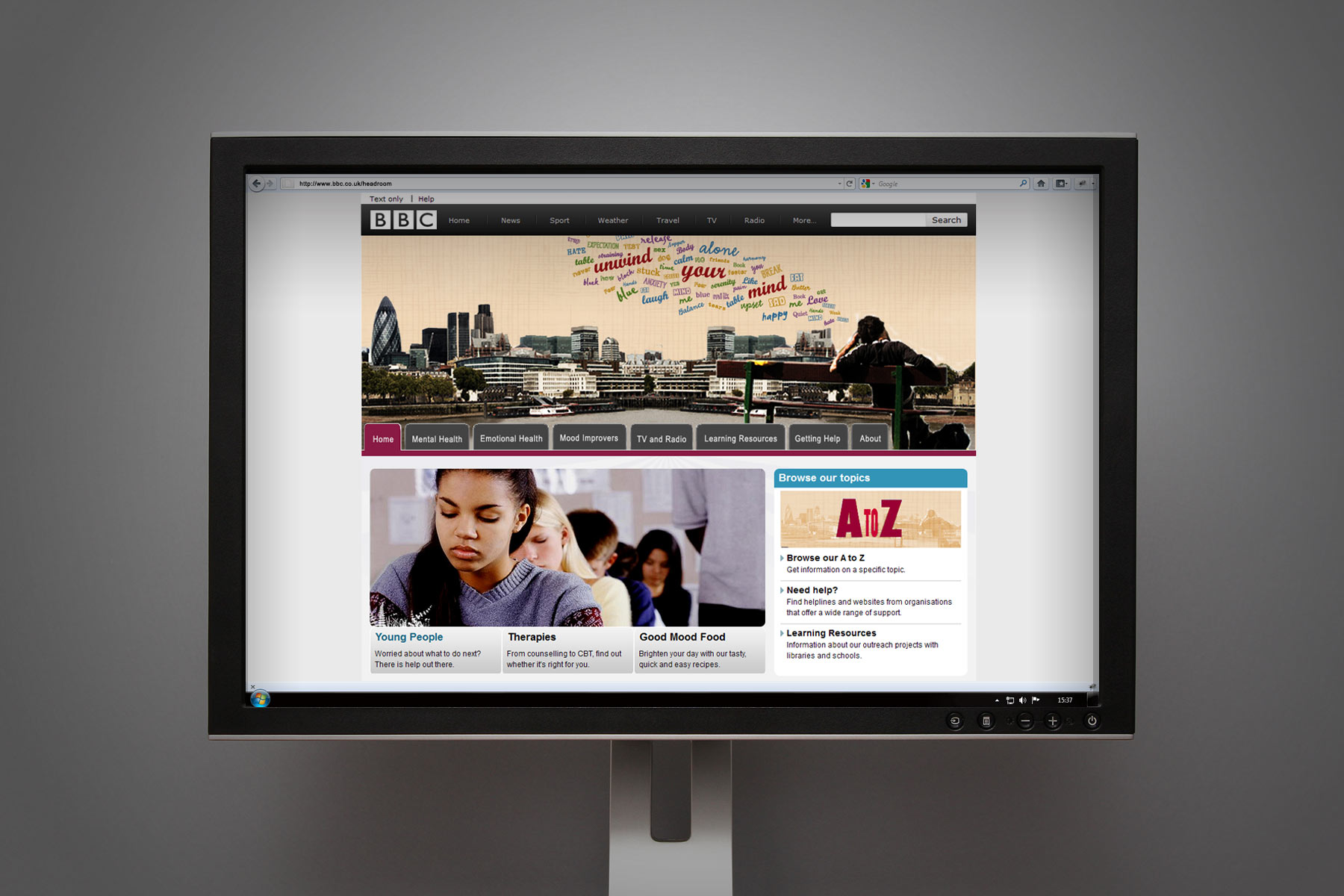
A person sits within a typical british landscape, the graphics indicating all the issues that may trouble the modern mind.
-

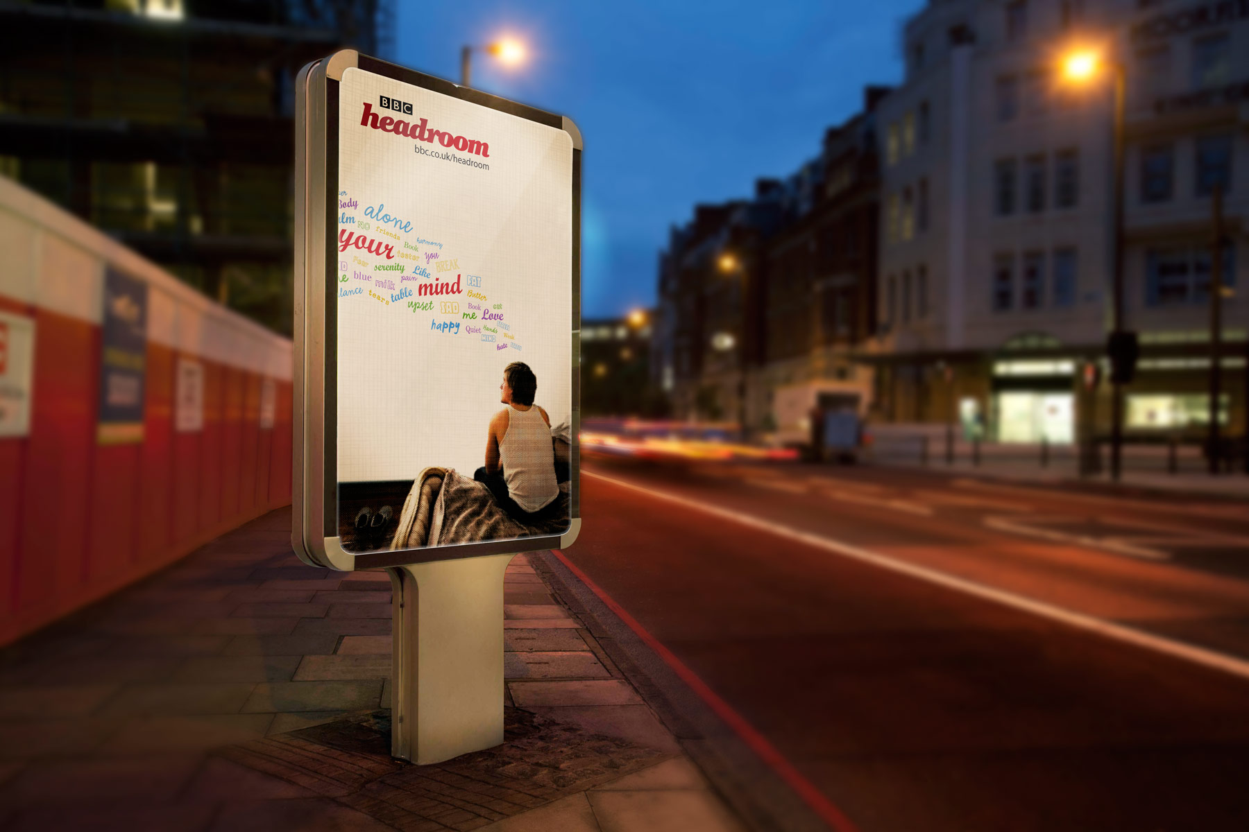
The unique and simple graphic language ensures standout amongst an often frenetic marketing environment.
-

The headroom brand is rendered in a semi formal cut serif italic, which is accessible yet somewhat respected.
-

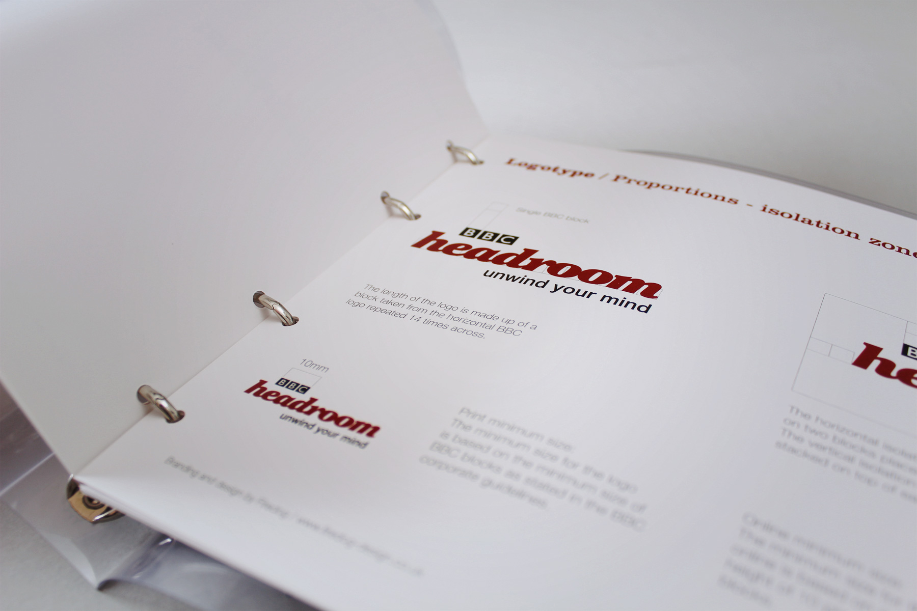
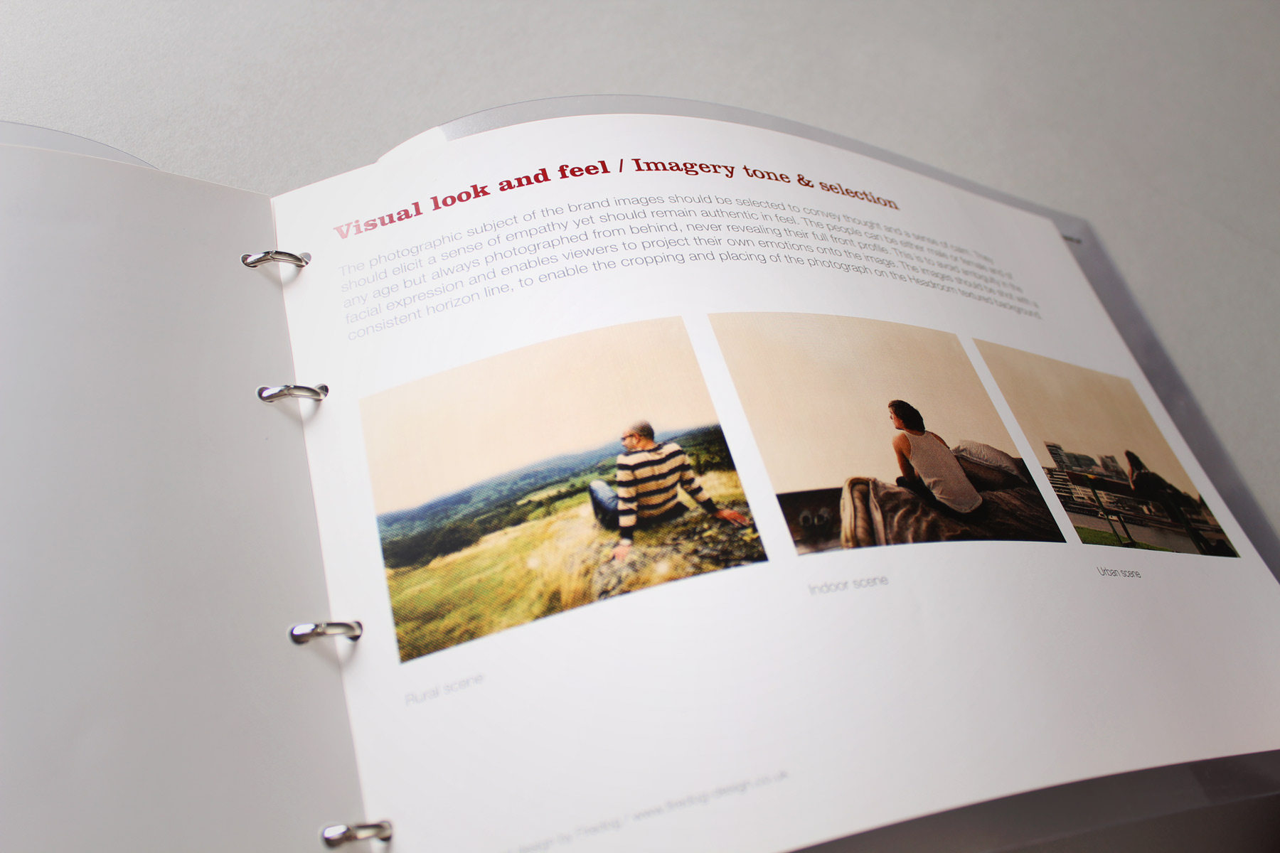
Included in the project, a full set of guidelines enabled the internal BBC team to extend the project.
-

The primary brand device ensured that the campaign and branding tied together successfully.
-

The guidelines show the look and feel adapted to the online environment.
-

We allowed for a suite of imagery to support the brand communications.
-

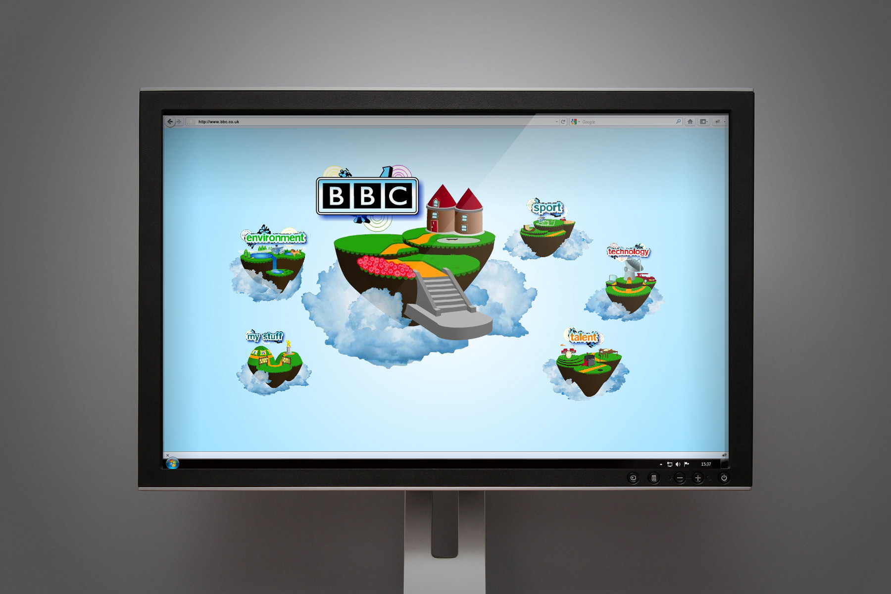
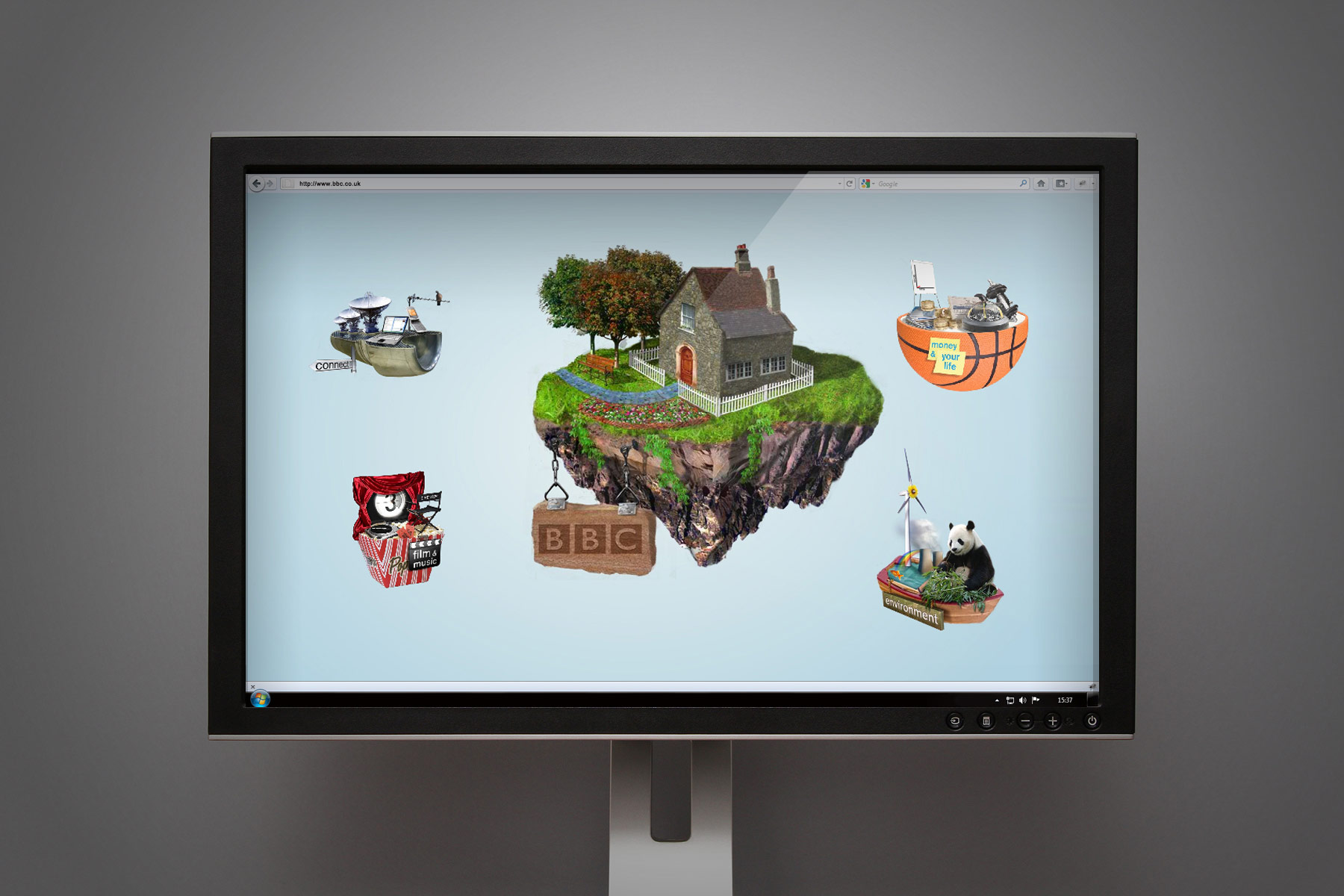
In order to break down the perceptions of online browsing, we used an island based freestyle user journey. This application shows the ten year old interface style.
-

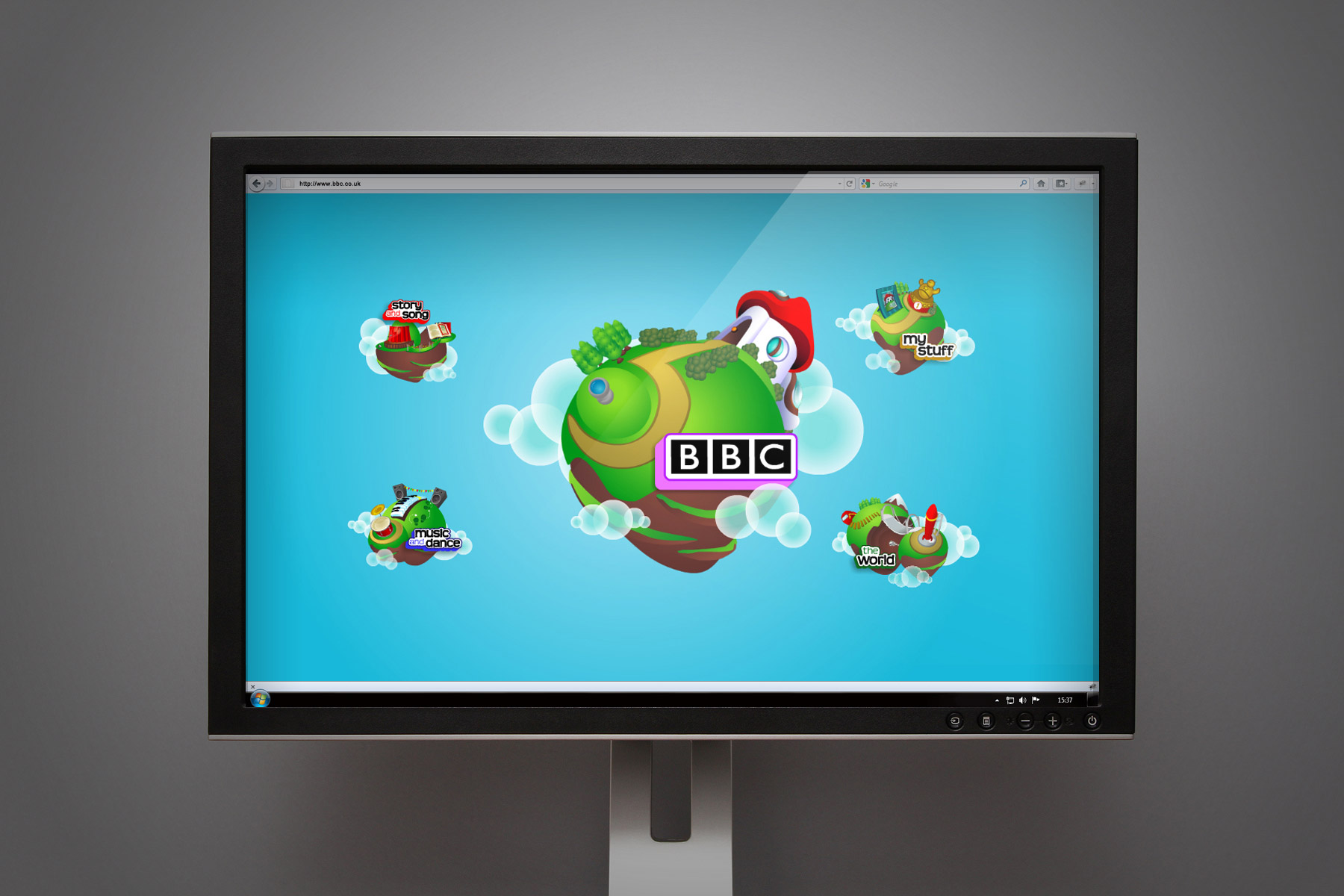
Research users were able to hop from subject to subject, browsing topics via selecting islands. Jumping on an island would bring up another set of surrounding islands. The journey feels as if one is moving laterally through the interface itself. This image shows the 15 year old interface.
-

We were tasked by the BBC project team to make sure that the research stimuli did not feel like a website. We designed three environments - This one is for the seven year old age group.
-

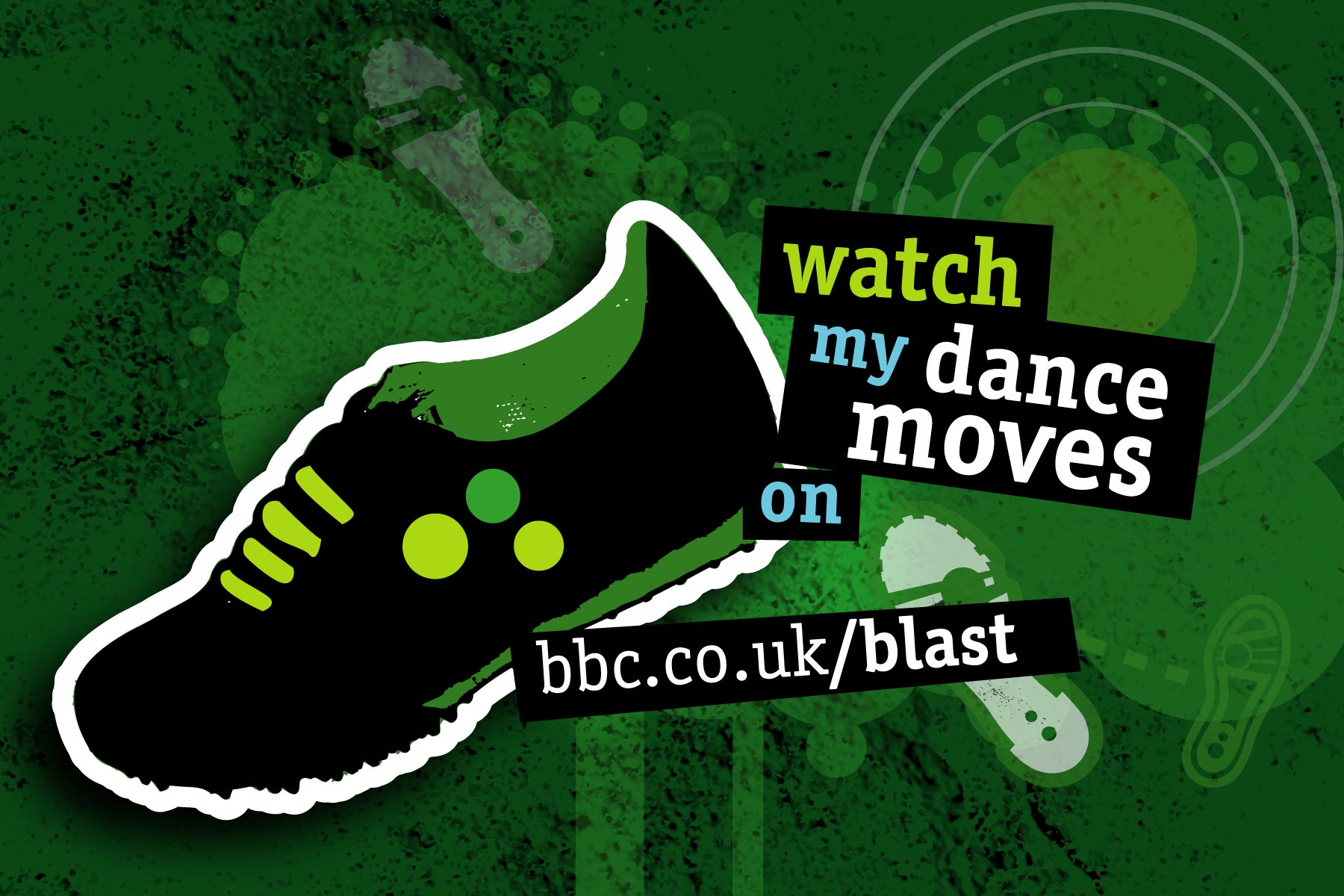
We provided assets for all creative disciplines - For example, dance within this image. We also created assets for mobile and the Blast on Tour roadshow environment.
-

The Blast communities are encouraged to tag their art and the assets are openly provided to all.
-

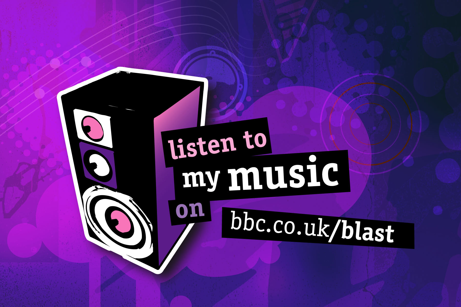
The assets all follow the Blast look and feel, with primary shapes and bright supporting colours. We provided assets which helped capitalise on referral linking.
-

Following the success of our work on BBC Blast, we were asked to provide a large suite of digital brand assets, which could be used across the audiences desktops and social networks. Here is a still from the animated screensaver.
