Visual Identity and Website

Asante Capital

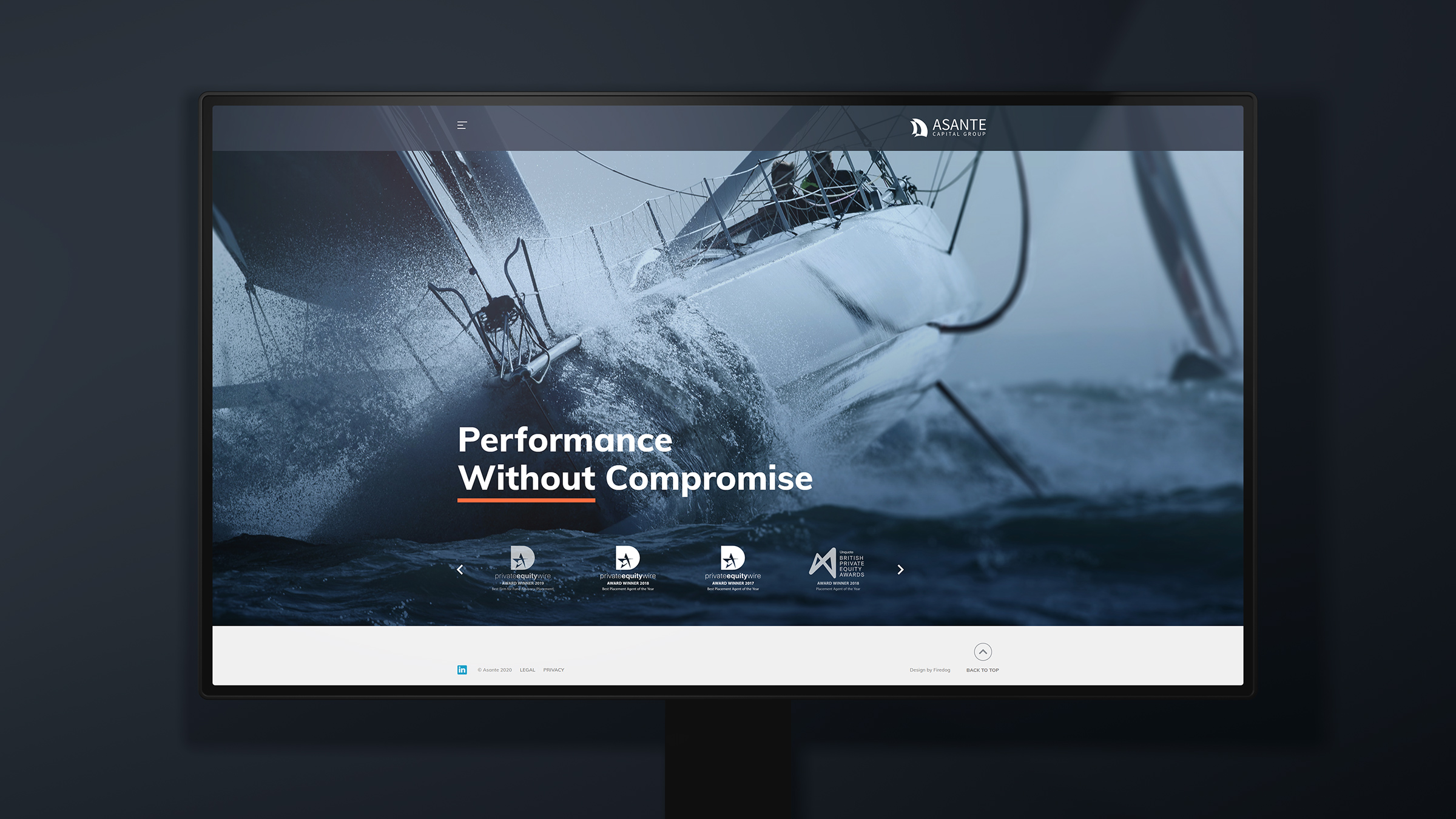
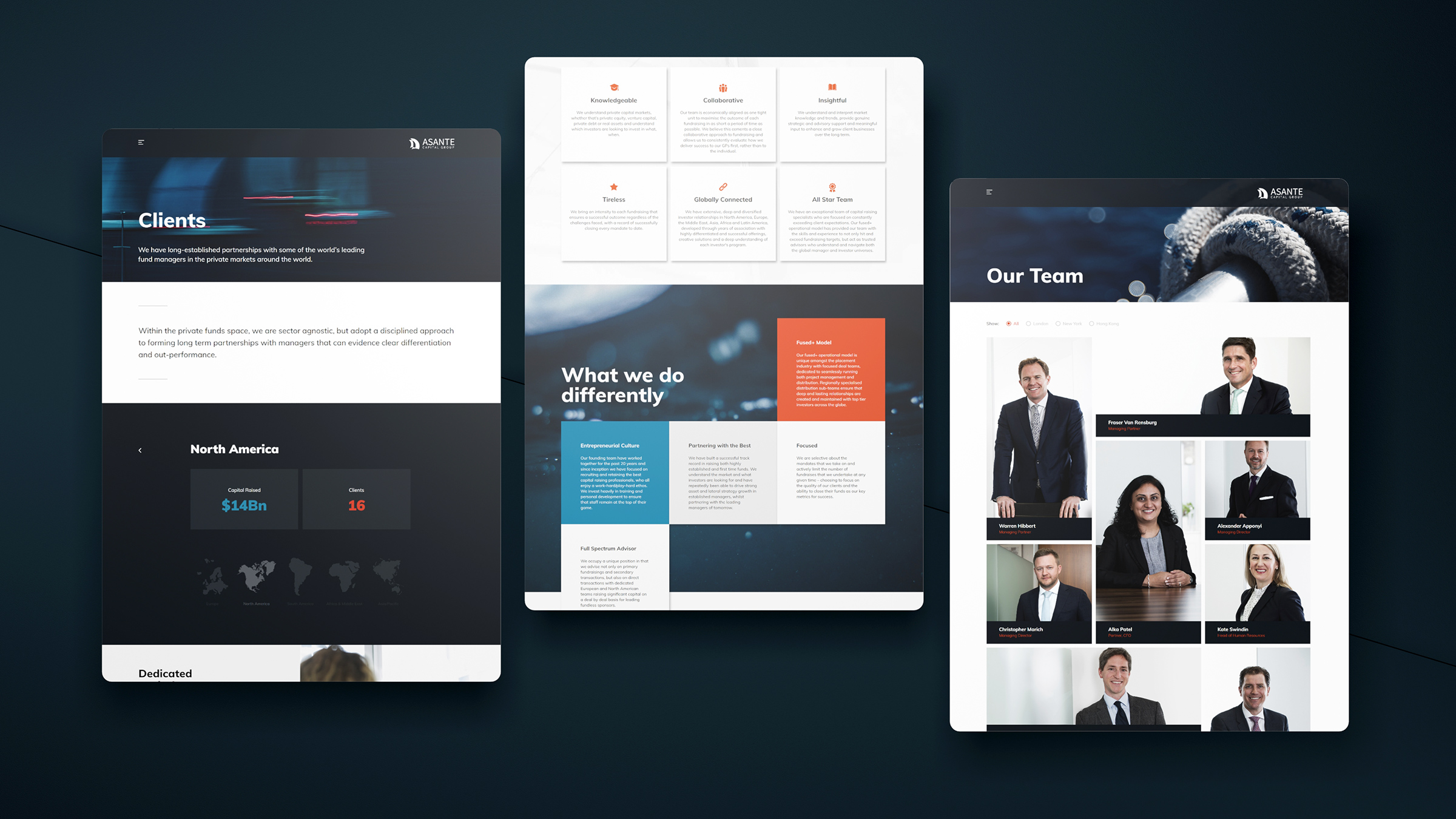
Firedog designed and built an engaging financial services website for Asante Capital Group. Rather than populate the site with reams of information, we used a far more visual and infographical approach.

Asante is a leading, independent global advisory and private markets placement group. Simply put, they assist in the raising of capital for funds and investment vehicles around the world. They operate out of London, New York and Hong Kong. We engaged Asante on developing their visual identity, creating an enhanced online digital brand as well as the design, UX and build of a Wordpress website.

We aligned performance sailing with the service ethic of the business - a product without compromise.

It was imperative to build an online experience which would be incredibly quick to digest.

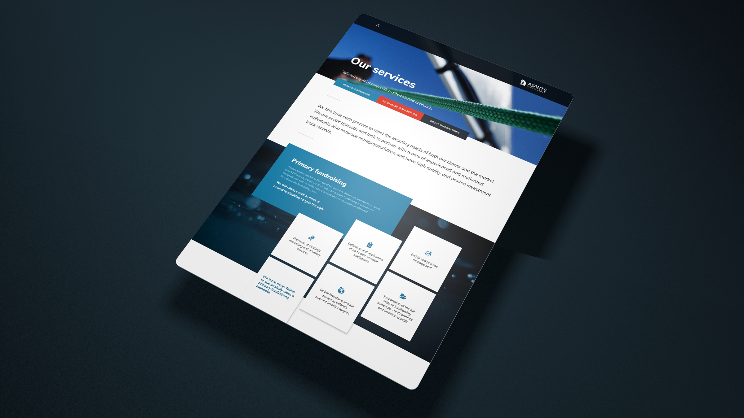
In discussion with the client it became quickly evident that their prospective audience would look to spend very little time finding out information online, let alone trawling aimlessly through yet another financial services website. Therefore, it was imperative to build an online experience which would be incredibly quick to digest yet still be able to offer all the credibility befitting of a suitable prospective business partnership. We decided on three major sections of the site responsible for audience conversion. The first section outlined Asante’s legacy and credibility through succinct sector positioning and purpose. The second section outlined the services offered in a simple infographical cascade of high-level points using engaging parallax style animation. Finally, the third section presented Asante’s client experience using both a regional and investment class taxonomy. This allows users to drill down to experience relative to their own requirements.

Prototyping provides a pretty decent view of structure way before initial design concepts are created.

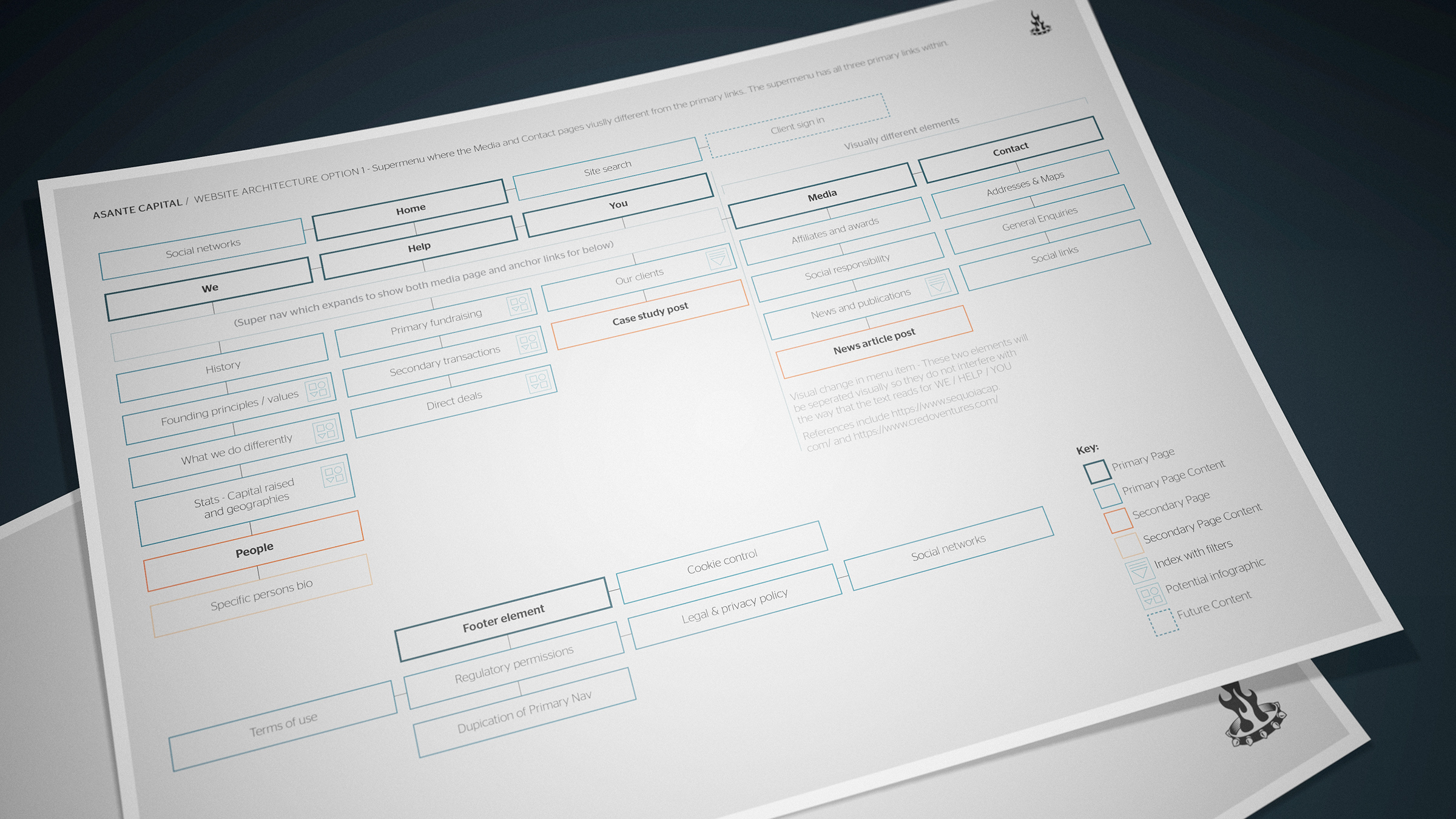
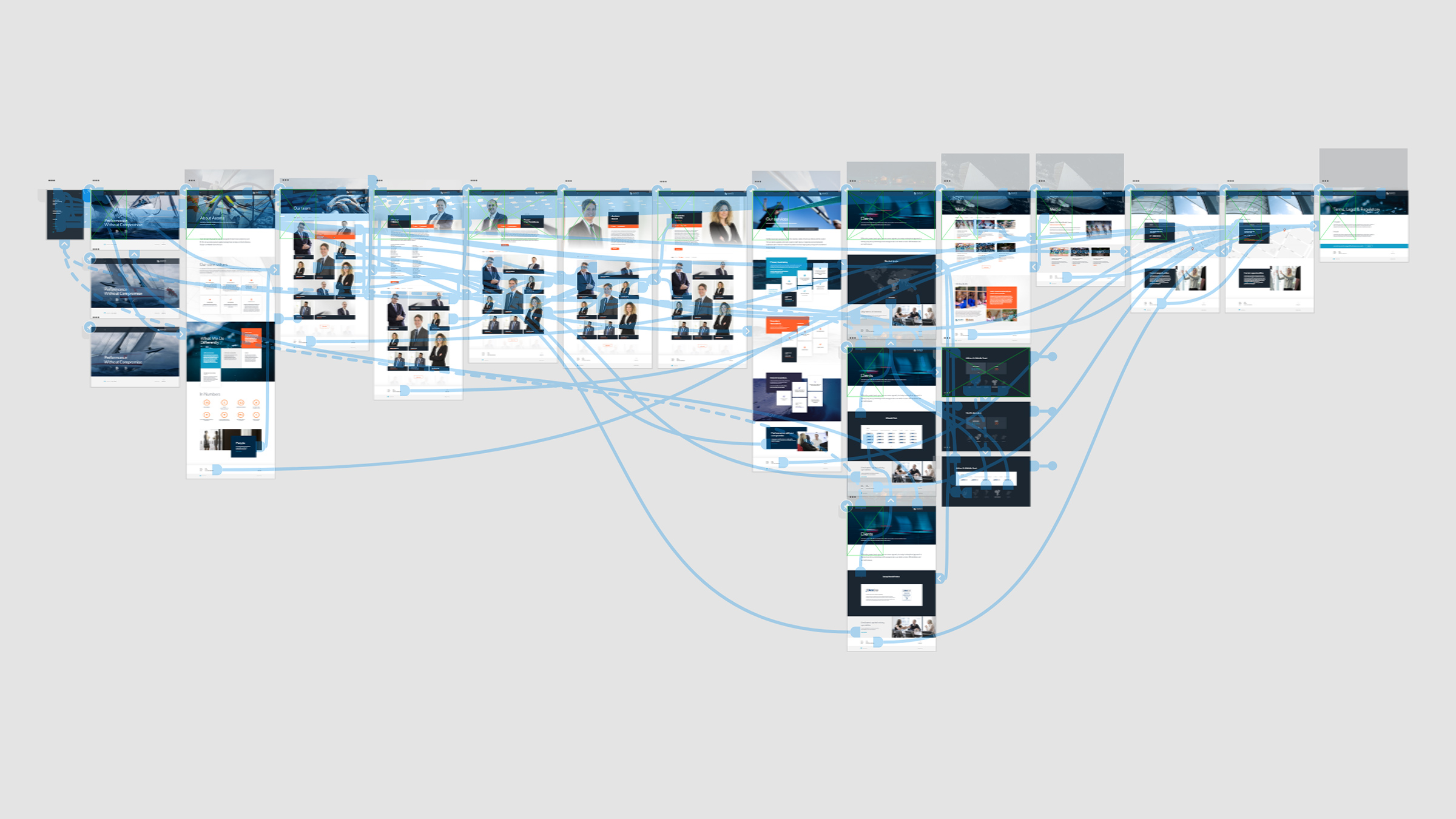
We mapped out the key sections within a site architecture diagram and followed through with structural box model prototyping which afforded the client team an ability to make a call on overall site content depth and structure. This methodology uses online navigable website previews which provide a pretty decent view of structure way before initial design concepts are created. It also helps define the design aesthetic as the creative team can immediately see the level of detail required. In this case, we knew the content would be limited and therefore we concentrated on filling out the site experience with imagery and animation.

We explored many avenues associated with the nautical theme before settling on performance sailing.

We looked at image concepts close to the nautical theme: Solo diving, performance sports and adventure exploration.

The client was keen to refresh their visual identity without the greater remit of undertaking a full brand refresh. We recreated their core colour palette and provided an updated typographical look and feel. As we were not refreshing their brand mark, we were to retain an overall nautical positioning. We didn’t want to default to just continuing using their existing sailing imagery, so we still went through the creative process of building an image identity. We looked at image concepts close to the nautical theme: Solo diving, performance sports and adventure exploration.

We developed in page animations for the loading of content in order to build upon the fluid nature of the website.
Whilst each of the site sections has a deliberately different content strategy, the entire site hangs together because of the consistent application of digital brand identity.

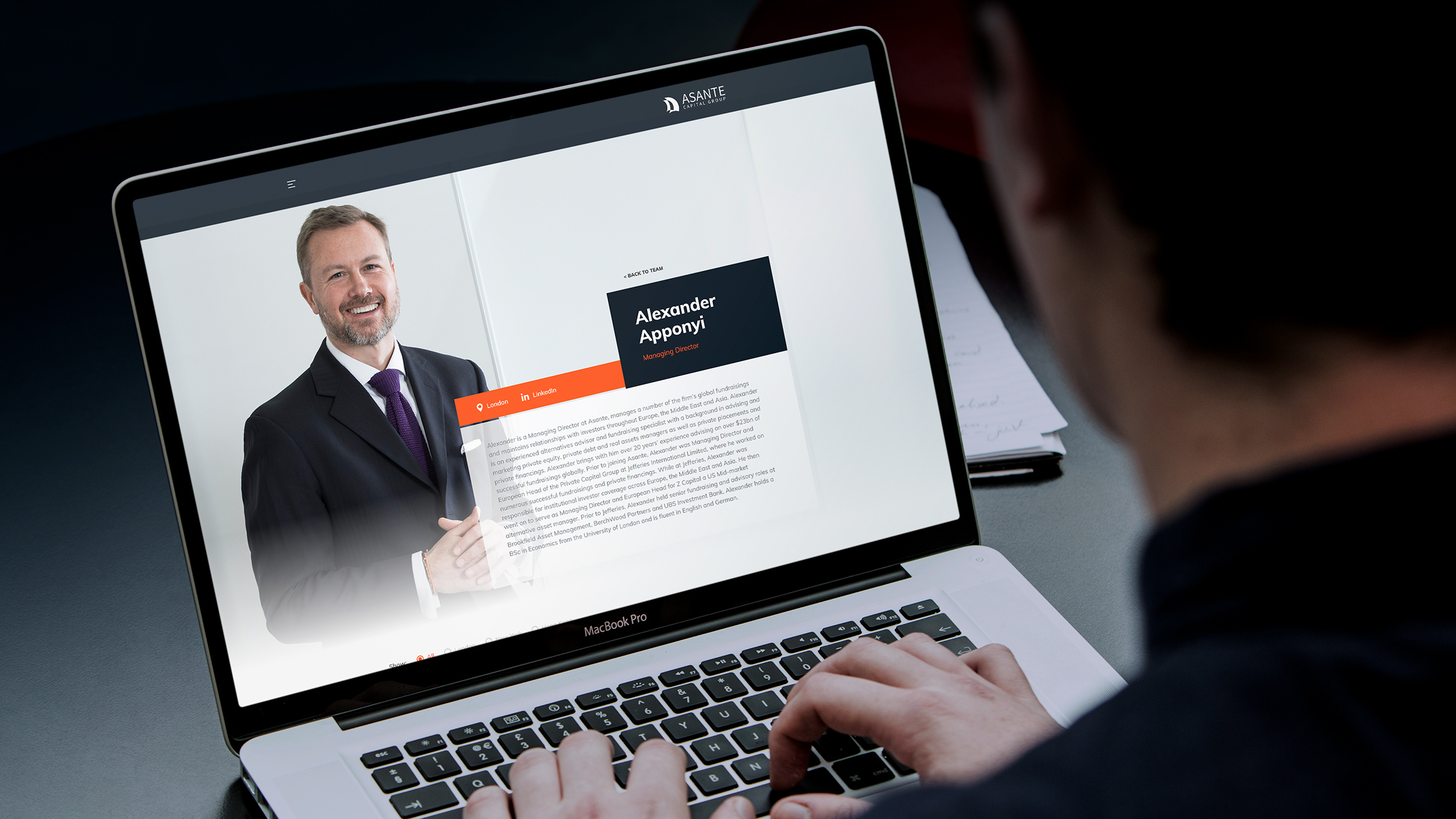
The sharp and professionally shot portraiture used with an expansive full screen style takes the site to a whole new level.

The client settled on a combination of performance sailing combined with a series of ambient water abstracts which were to be used as backgrounds and passive content. We commissioned a portrait photographer to capture all the London based staff in a variety of non-standard poses. We then also provided a shooting brief for New York and London so that the imagery would appear cohesive and standardised. In order to add to the interest, we built layout options into the staff bio page so that the web authors could choose a layout which best suited the portrait image. The sharp and professionally shot portraiture used with an expansive full screen style takes the site to a whole new level.

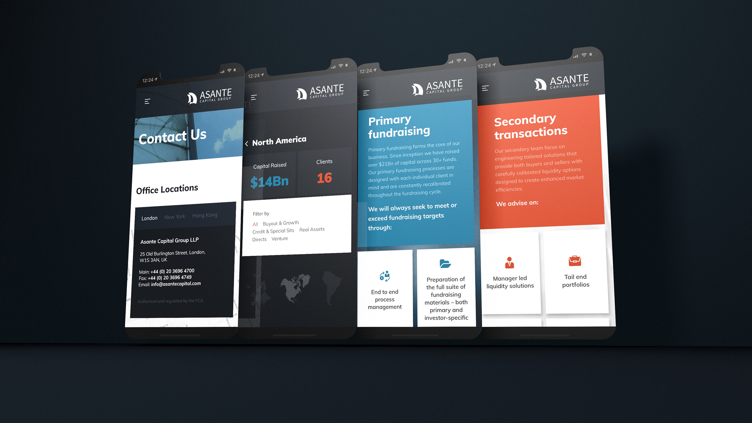
The limited use of content applied to interesting infographic modules greatly assists consumption on smaller viewports.

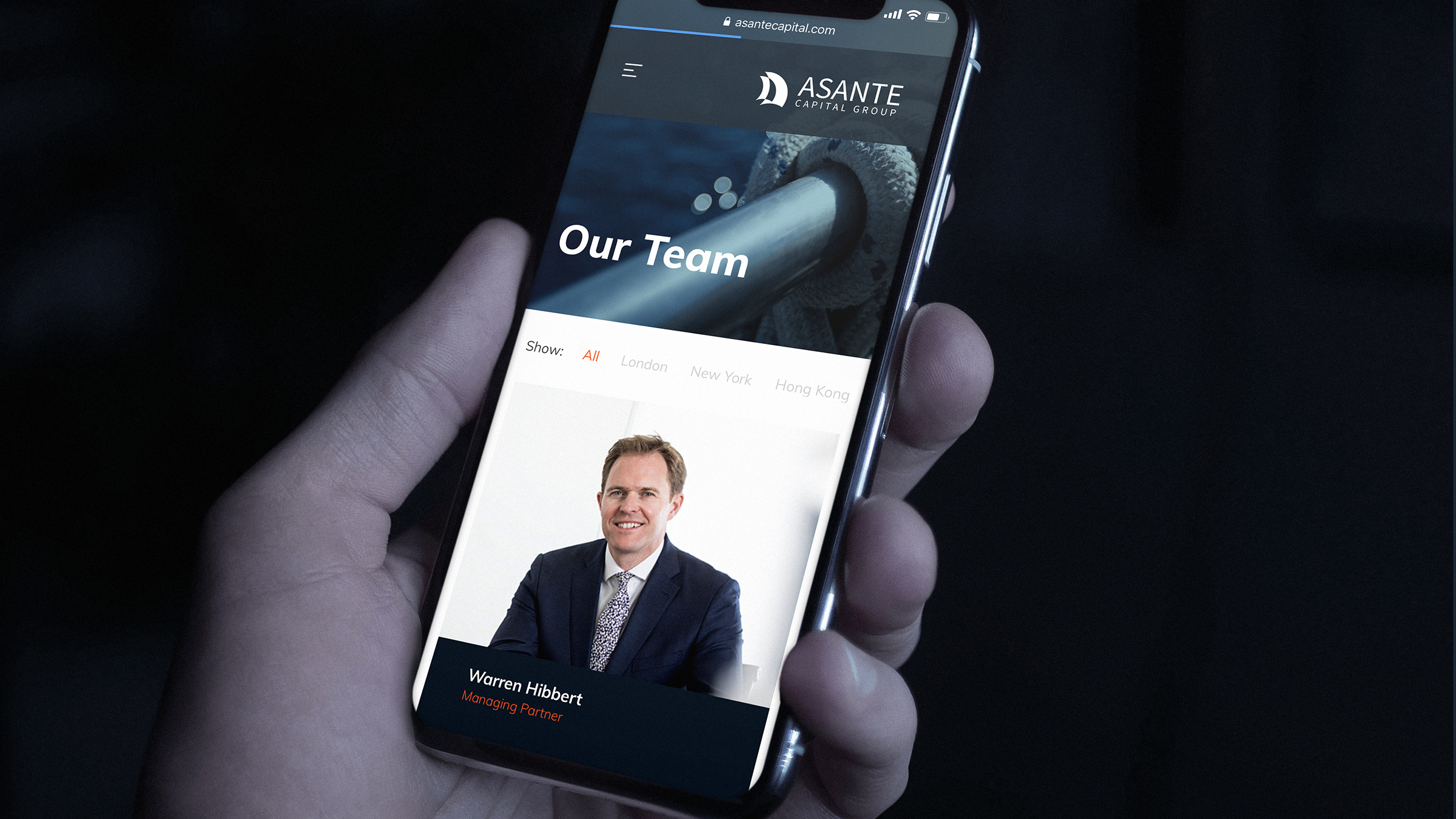
The site strictly adheres to best practice in responsive design ensuring clarity on every device viewport.

The site strictly adheres to best practice in responsive design ensuring clarity on every device viewport. The team pages, for instance, contain a number of image format crops to ensure speedy delivery of content across wireless data. Finally, in order to empower client-side authors, we created an extensive help guide which goes through all the key editorial site functions. The resulting financial services website is a homage to simple content delivery, online digital branding and rapid user experience.