Venture Capital Brand Identity

Braavos Capital

A contemporary financial brand identity for a London based venture capital and private equity business specialising in emerging sectors.

Braavos is a growth-stage, multi-sector venture capital business with unique access to the entire portfolio of spin-out companies originating from research conducted within the University of Oxford. The Braavos name is taken from a fictional trading city within the hit book and television series; "Game of Thrones". The city is known for its economic strength and technical prowess. The business is composed of a number of premier league financial figures including Firedog's long standing client Magda Wierzycka, Founder and Executive Chairman of Sygnia. Firedog has created the financial brand identity, strategic brand positioning, logo design, visual identity, look and feel, communications templates and a fully responsive financial services website.

Our approach to brand concept development includes image references and a series of sketched brand concepts.

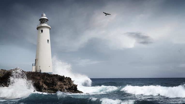
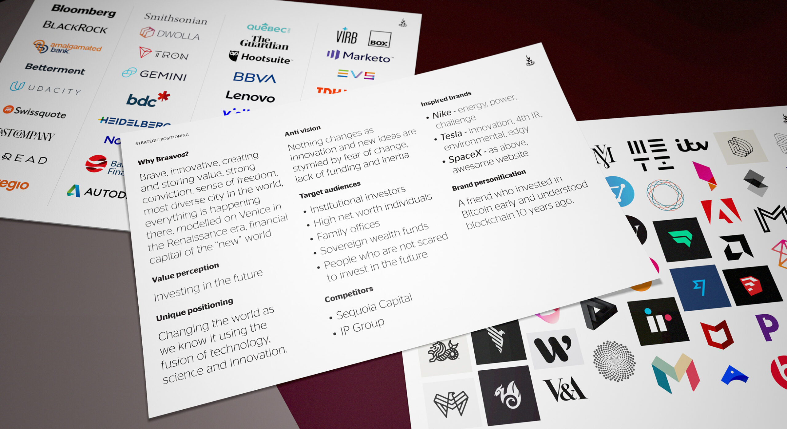
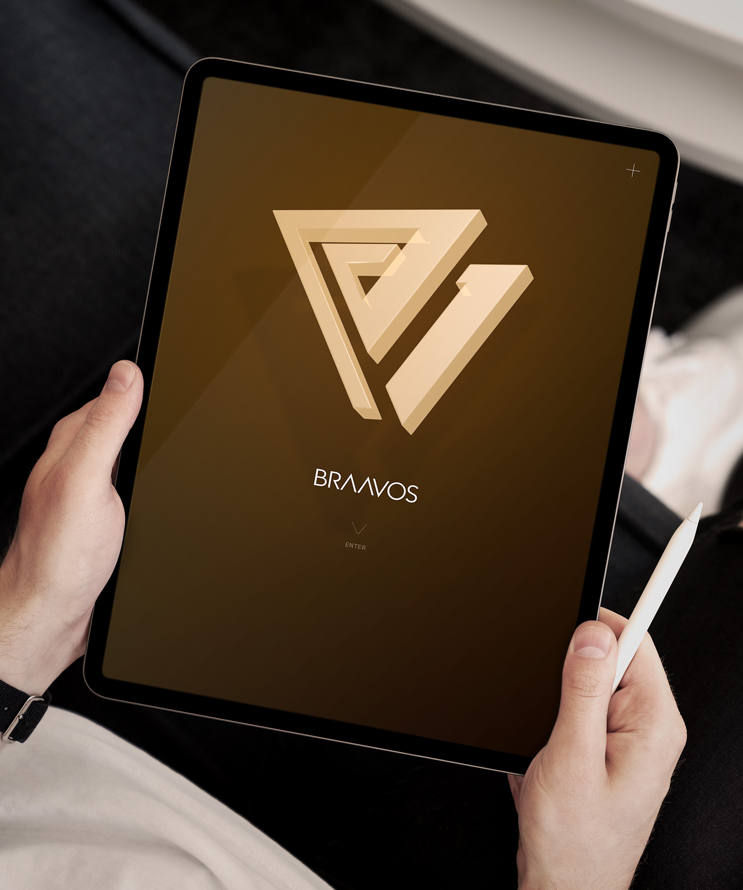
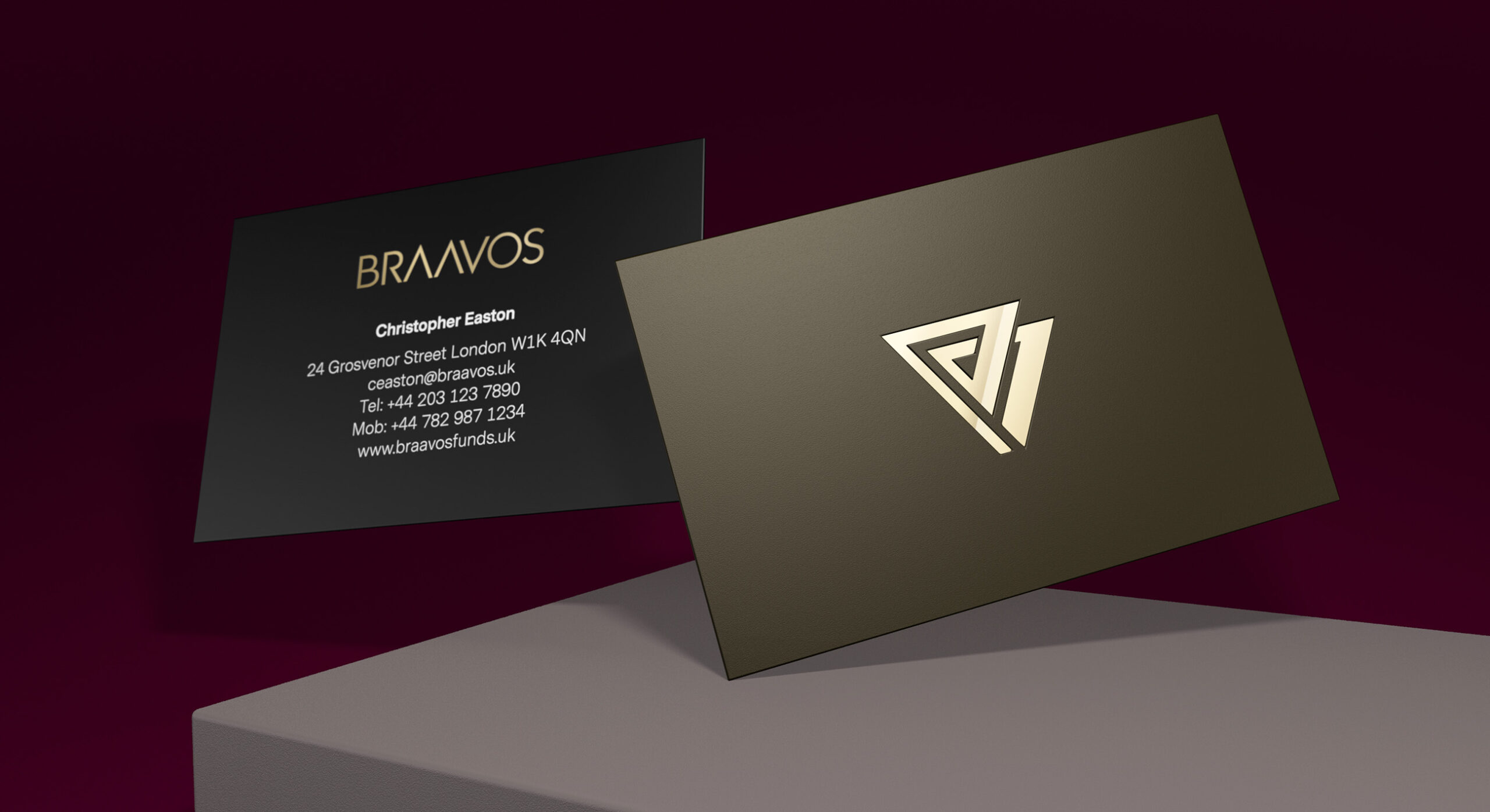
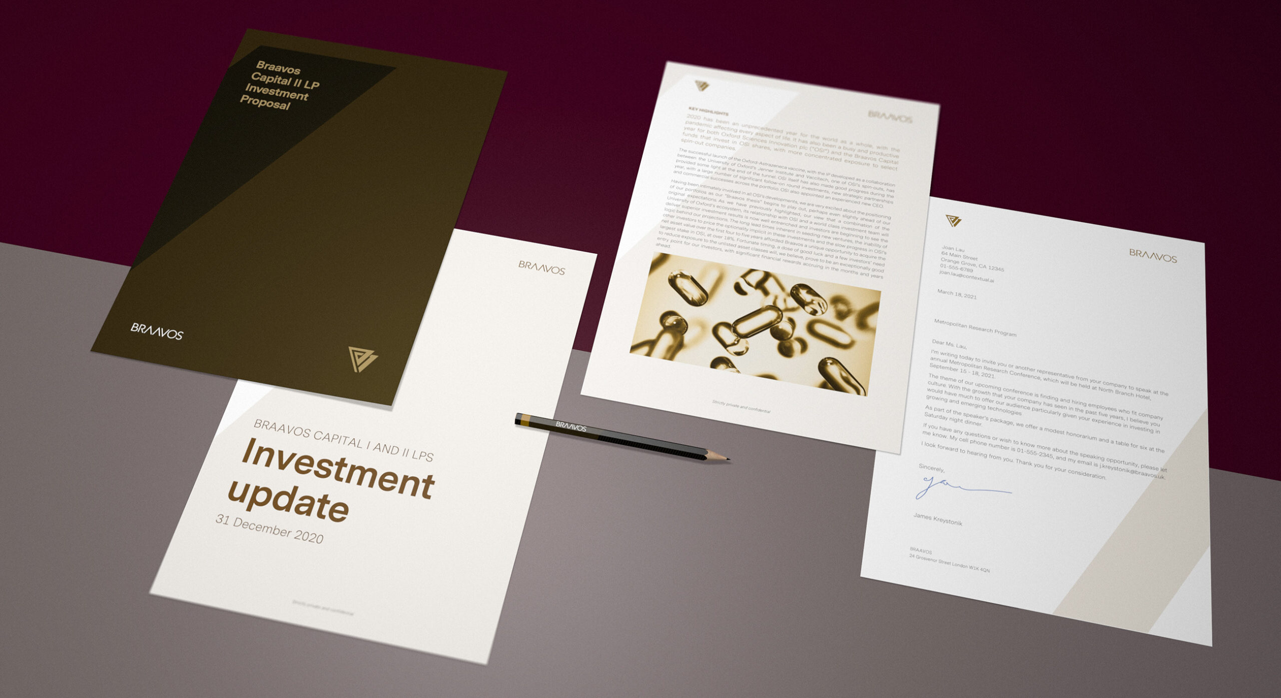
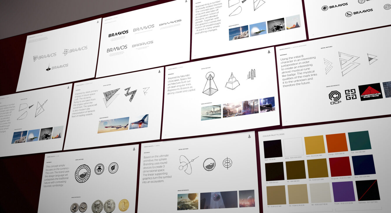
A inspirational, future focussed brand identity inspired by positive visionary thinking.

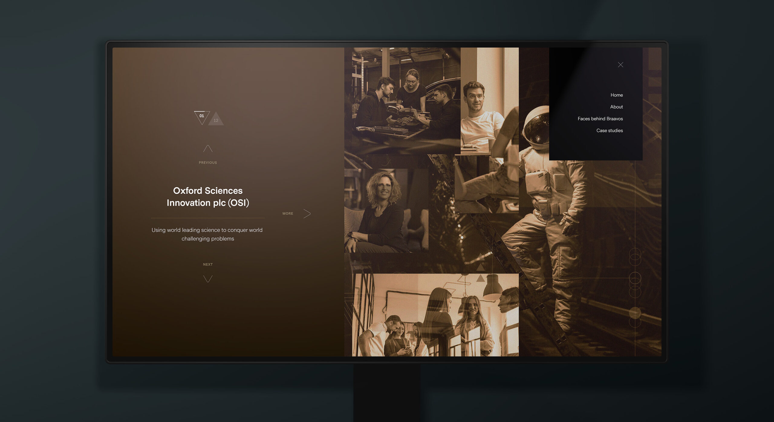
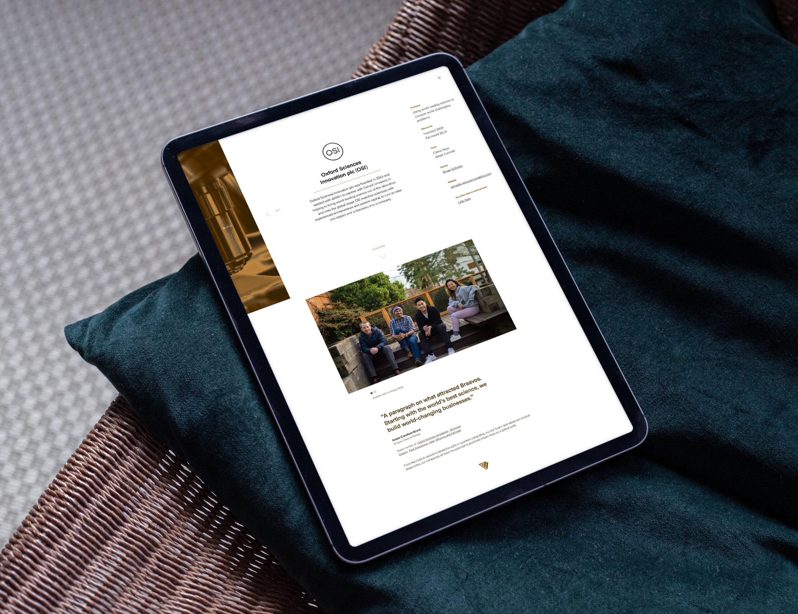
Braavos is instrumental in sponsoring innovation across the United Kingdom and the rest of the world. The venture capital business is a major shareholder in OSI (Oxford Sciences Innovation Plc). Braavos capitalises on an automatic stake in all qualifying spin-out investment opportunities. Oxford University is rated as the number one research university in the world. This landscape is the key creative driver behind the brand identity created by Firedog Creative. We wanted to convey an association with positive visionary thinking. This included a romantic fascination in contemporary science fiction. The type of feeling created by impressive, glassy space cityscapes – the sun arcing gracefully over the horizon. This mood informed early discussions with the client and it was from this lodestar that we began the creative process.

We used imagery mood boards in order to kickstart the creative process.

Being big sci-fi fans ourselves, we love the imagery of bold technology rendered in sleek forms.

We looked at a myriad of science fiction symbology – from cult films to the “fake” brands featured therein. Dystopian plots aside, we were intrigued by the bold impression of identities within these sources. These brands often use a very strong primary symbol combined with minimal clean typography. We looked at creating iconography from filmic themes; such as a fleet of space craft breaking through a metaphorical barrier. Being big sci-fi fans ourselves, we love the imagery of bold technology rendered in sleek forms. There are a number of brands which have this spirit – clear examples being Musk’s two leading brands: Tesla and Space X. There’s an inspired notion that the future is bright and our species evolved and intelligent.

We created a symbol which had depth yet was brutally simple in its composition.

We wanted to avoid an overly complicated rendered or detailed brand. We looked to create a symbol which had depth yet was brutally simple in its composition. Our brand sketches studied dynamic forms and wedges which represented flying vectors. We also explored the notion of a citadel – A protected house which contained a fantastic orb of innovation. All the brand icons and symbols rendered in pure vector and line with no gradients or superfluous detailing. We struck upon the form of two flying wedges tilted at an angle which created an abstracted B device. This also created an inverted triangle which is a mystical symbol which has all kinds of strong associations. What is more, the inverted V tied very nicely with the BRAAVOS wordmark where the three central characters all have similar triangular shapes. We also reinforced this connection by customising the type, removing the horizontal crossbars in the A characters. This became an inversion of the V character which followed. This further created two driving forces up and one down – an asymmetrical and pleasing balance.

The final branding elements left aligned and centered.
Physically printed proposals are still important in the business. The Braavos equivalent features an arresting Eiko Ojala illustration alongside luxury print techniques.

Rather than trying to explicitly shout out a message, the illustrations cause interest and intrigue via their leftfield subject matter.

The Braavos visual identity utilises an unexpected neutral colour palette centering around a deep and earthy brown hue. This is complemented by touches of matt gold in high end luxury print finishes. A touch of black grounds the branding further and creates a minimalistic contemporary feel. Tints using a lighter version of the hue allow for off white backgrounds. The brand symbol and wordmark can either work together or are often separated on either a vertical or horizontal plane. This brings flexibility in usage and allows for a bit of variety and freedom in layout design. The angles in the symbol are replicated within a wedge device which is used throughout brand communications design. The device appears as a pinstripe clipped path or as a flat vector placed across the page. It provides the ability to create interesting crops and colour usage. We worked with previous Sygnia brand identity illustrator Eiko Ojala to create a series of tonally appropriate brand images. Rather than trying to explicitly shout out a message, the illustrations cause interest and intrigue via their leftfield subject matter.

The financial brand identity extends into the digital space via a series of digital assets and a fully responsive website.

The financial brand identity extends into the digital space via a series of digital assets and a fully responsive website. In keeping with the minimalistic contemporary feel, the website uses a moderate amount of information yet uses a vast array of intriguing animation. This creates a tangible feel which hints at a love for all things techy and futuristic. Within five years, Braavos has had an incredibly rapid growth tangent with OSI being linked to cutting edge medical research success. OSI has also recently doubled its capital investments in underlying startup companies within a single year period. The sponsored spin-out companies have also grown in number from 2 to 6 in a single year. Life sciences promises to be the venture businesses primary focus with a number of dynamic invested companies making up the fund portfolio. Furthermore, the first major exit has secured 15x cash invested – which is a good indicator of things to come. Firedog is very proud to be associated with Braavos. A business and financial brand combining a mix of financial and technology sectors. It’s bang up our street.

Sign up for our Firedog Newsletter
* = required field