Private equity brand and visual identity

MML Capital

A refined yet compelling brand identity for a London HQ Private Equity business specialising in partnership capital.

MML is an international mid-market private equity firm investing in partnership with management teams with an objective to assist in growth and to deliver bold expansion plans. MML has an engaged people centric approach bringing personable character and support to management teams across the United Kingdom, Europe and the USA. We assisted in taking key stakeholders on a journey of discovery providing a rebrand for an established and well respected private equity business. We delivered consultative guidance, a strategic framework, revised sector positioning, brand and visual identity, a fully responsive website, communications design, digital content and a comprehensive set of brand and spirit guidelines.

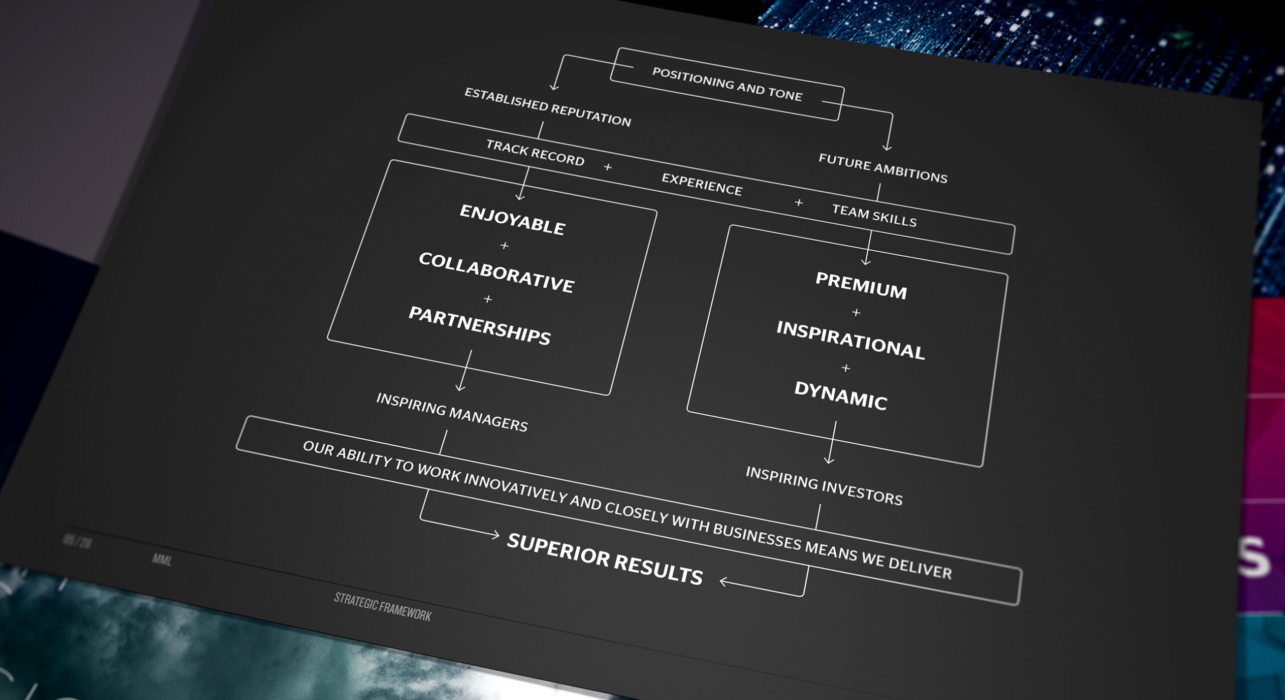
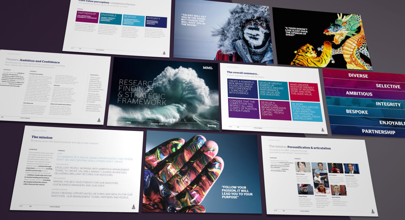
The brand strategic framework created for MML governs future brand positioning

The brief for the new brand: To exude confidence, pride and an ever present entrepreneurial spirit

A confident rebrand created for an urbane business

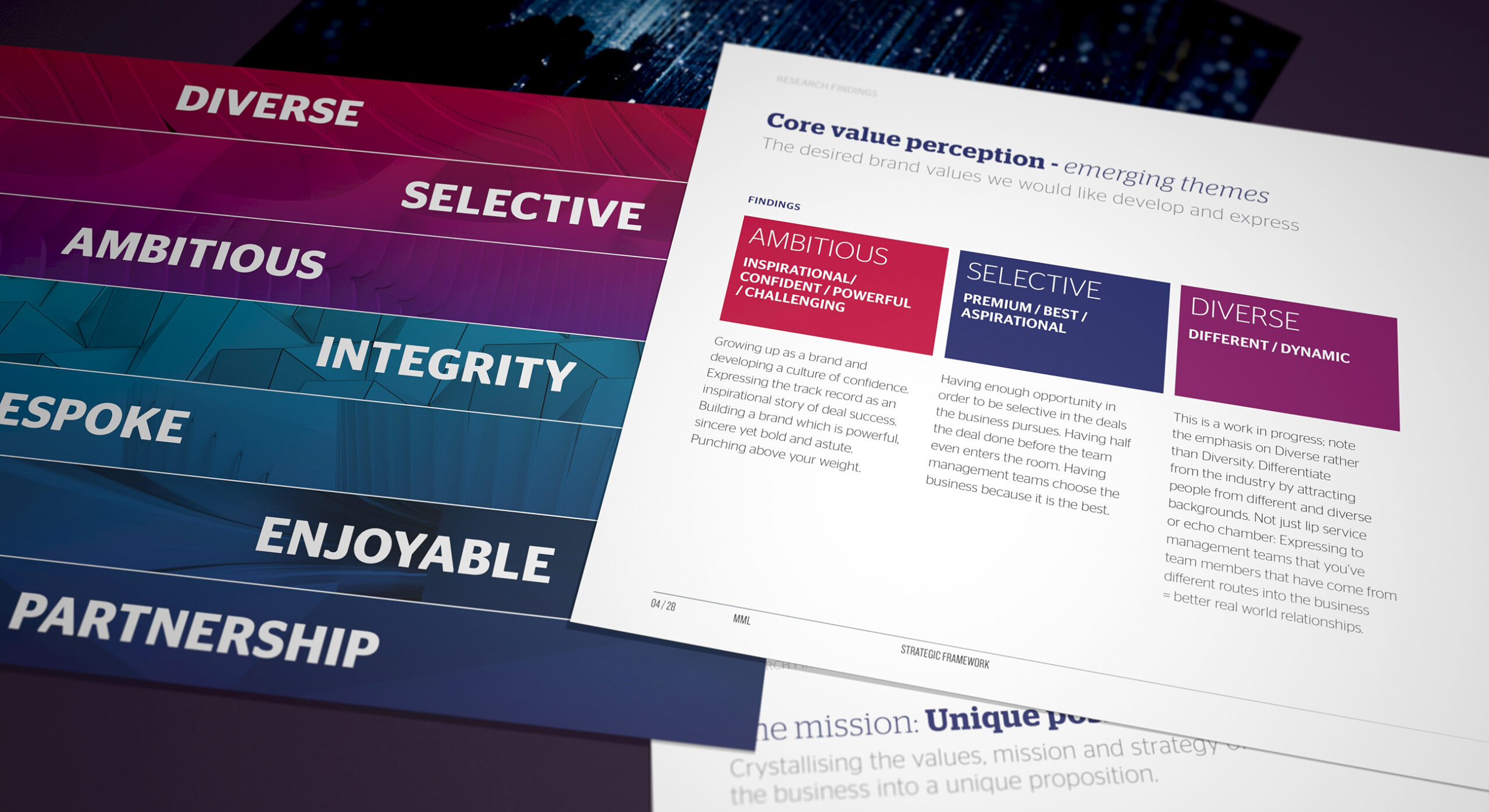
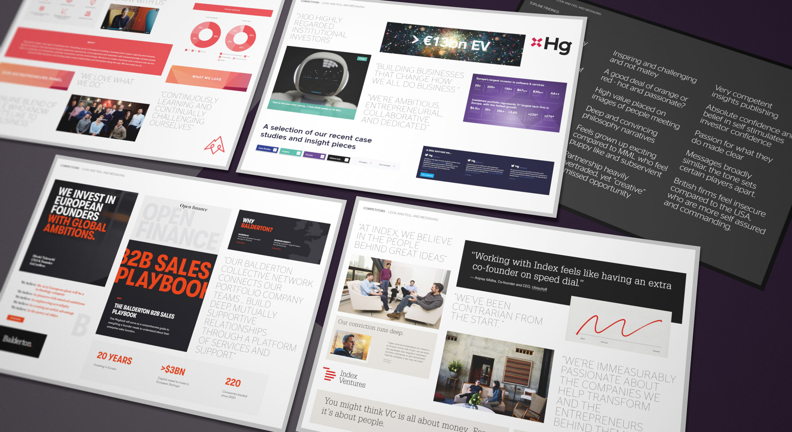
Although the partners don’t like to bang the legacy drum, MML is a specialist growth capital investor with an extensive deal of experience going as far back as 1988. The business has been through a number of evolutionary stages. The client brief expressed a desire to take the business up a number of levels. The new brand is to exude confidence, pride and an ever present entrepreneurial spirit. We started the commission by developing a raft of research programmes utilising qualitative research with both internal and external audiences. We conducted brand positioning workshops with a core client team in the London HQ. We also conducted a number of one-to-one surveys with international management teams and investors. These activities covered both greater Europe and also measured the brand reputation in the United States.

Even though the business is very well established it has a youthful and energised management team

It swiftly emerged through research outcomes that the cultural drivers spanned both established and emerging themes. It became apparent that there are subtle cultural nuances depending on within which region the business operated. MML has established perceptions of being a very cosy, boutique and collaborative operation. We were to retain a contemporary version of these values along with introducing a new set of future focussed emerging values. MML has always been very adept at empowering staff into key management positions and even though the business is very well established it has a youthful and energised management team. The branding needed to represent a culture that is challenging, ambitious and aspirational. However, it still needed to shore up against PE sector perceptions of snootiness and arrogance – what is very much the inverse of the MML nature.

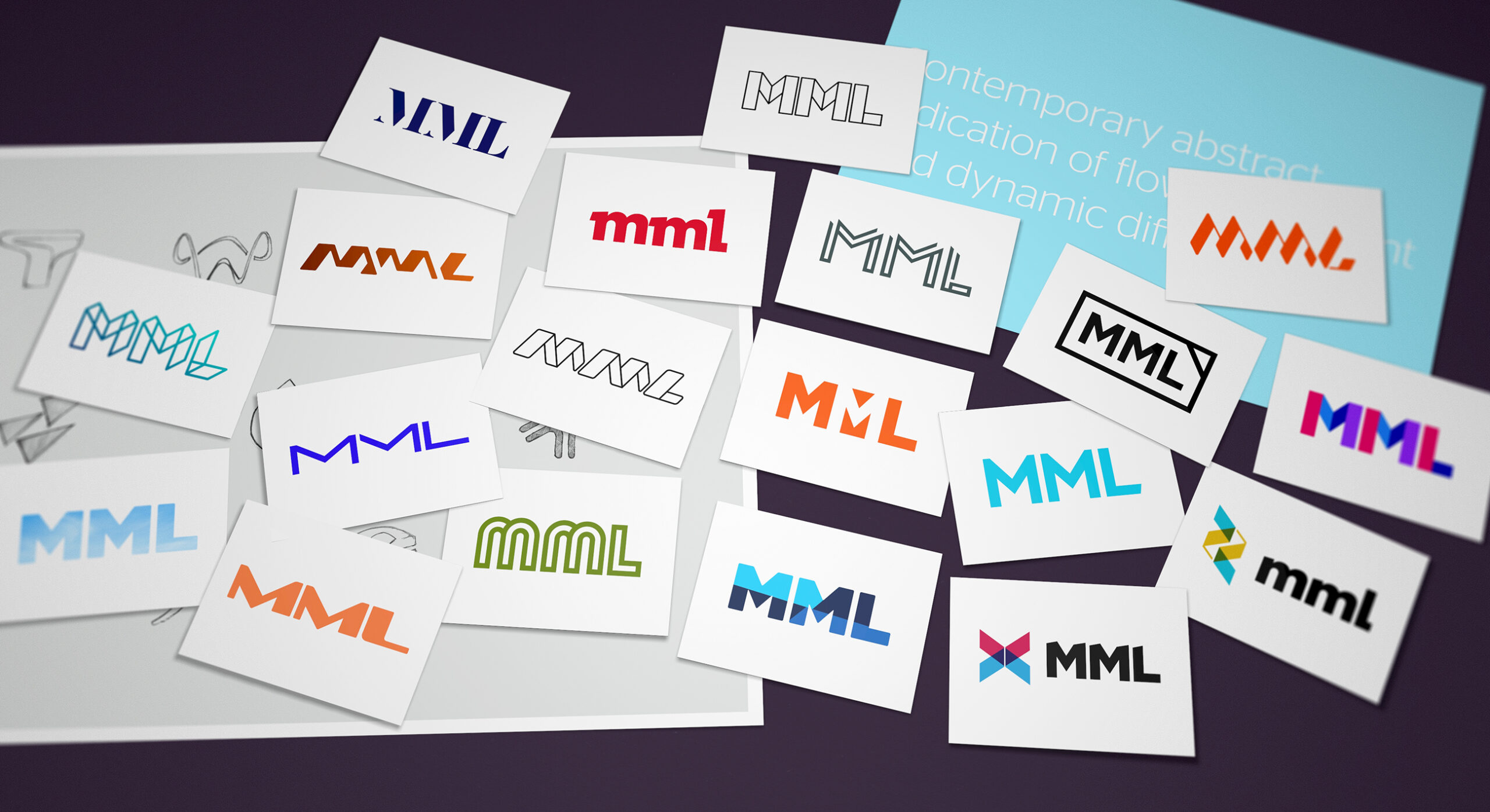
The MML brand name is deeply entrenched. In order to evolve the acronym we sought to fully explore all typographic potential.

Development of an engaging visual identity

Given that we were working with a simple brand name and acronym, Firedog worked hard to conceptualise a visual identity language that accurately expressed the cultural ambitions. We worked up a number of conceptual avenues using bold colour along with supporting evocative illustration techniques. We wanted to create a Private Equity brand both contemporary and warm.

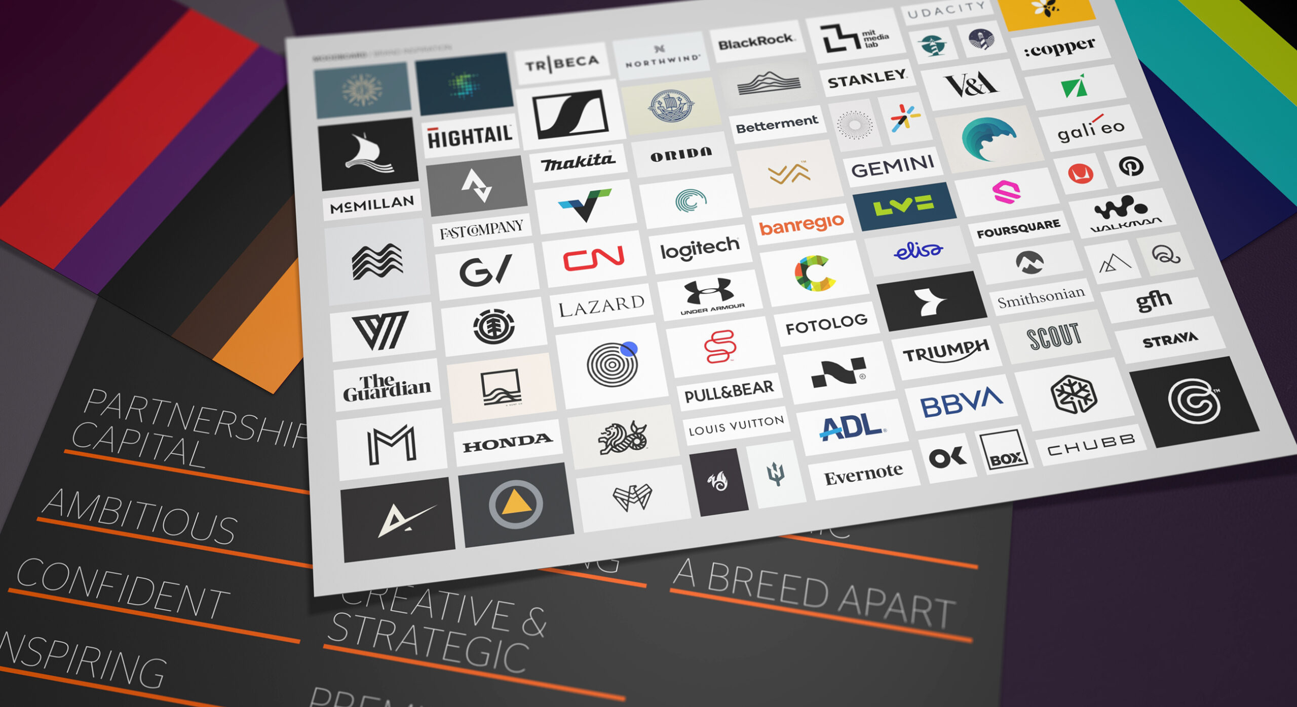
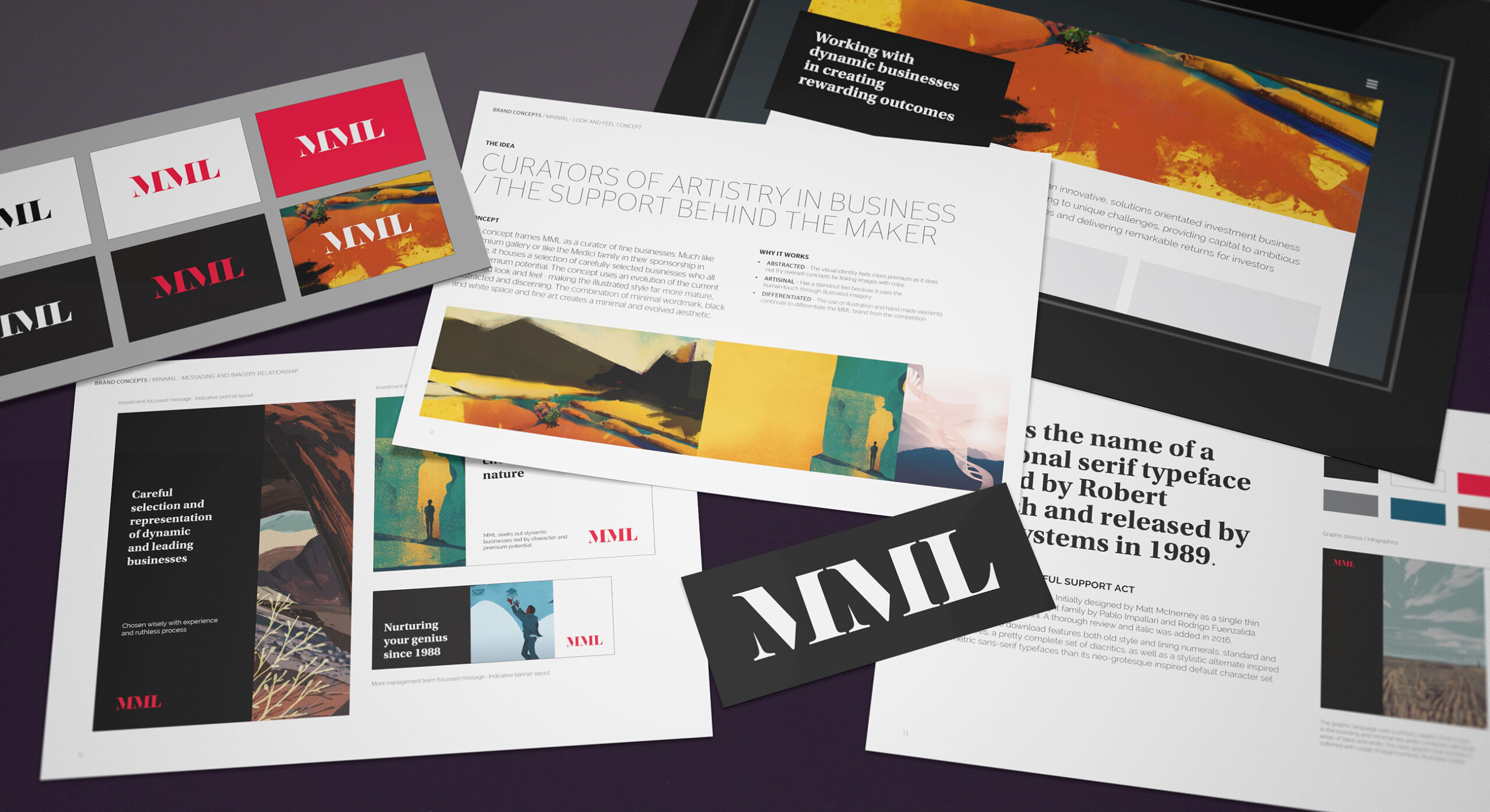
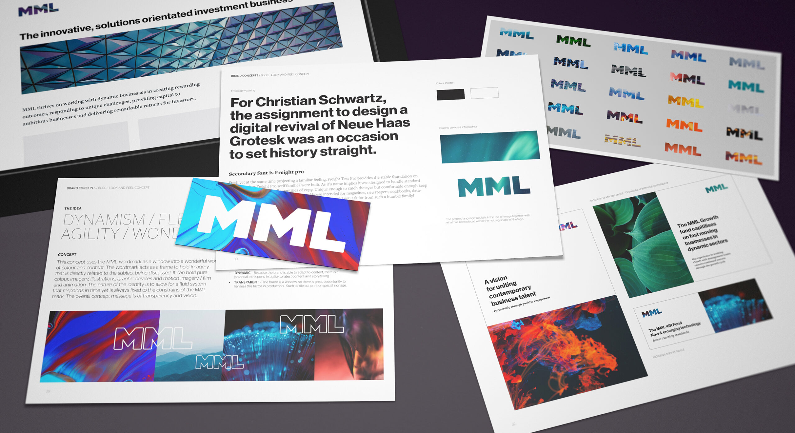
We presented a variety of brand and visual identity concepts in order to explore visual tone and flavour.
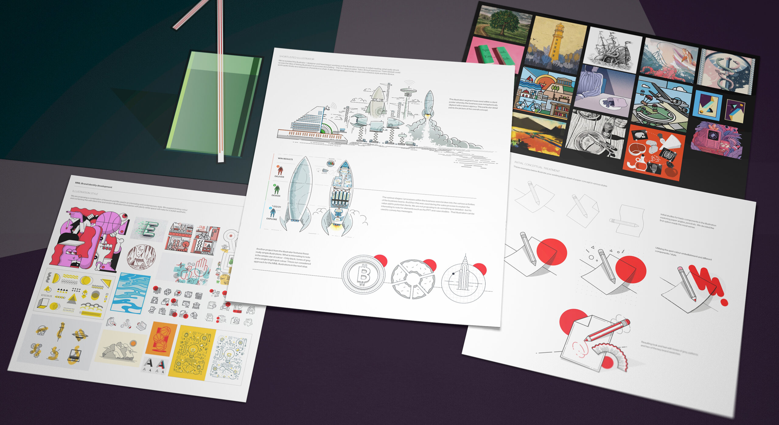
We wanted to add further character to the brand storytelling. We proposed the use of illustrated assets to the client in order to add interest to branded content.

A vibrant brand logotype

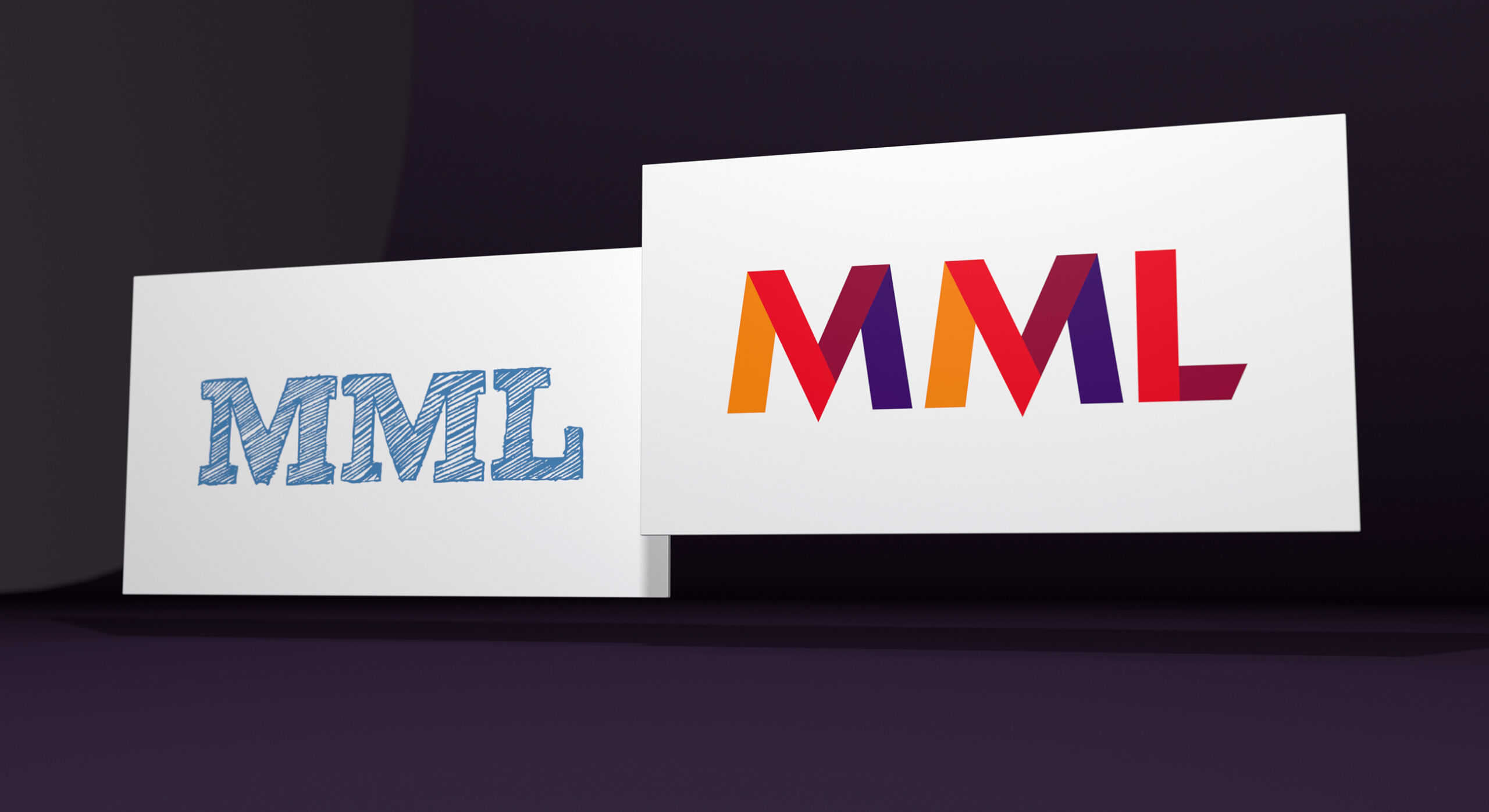
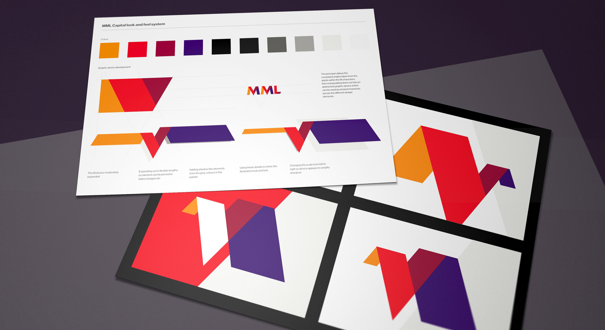
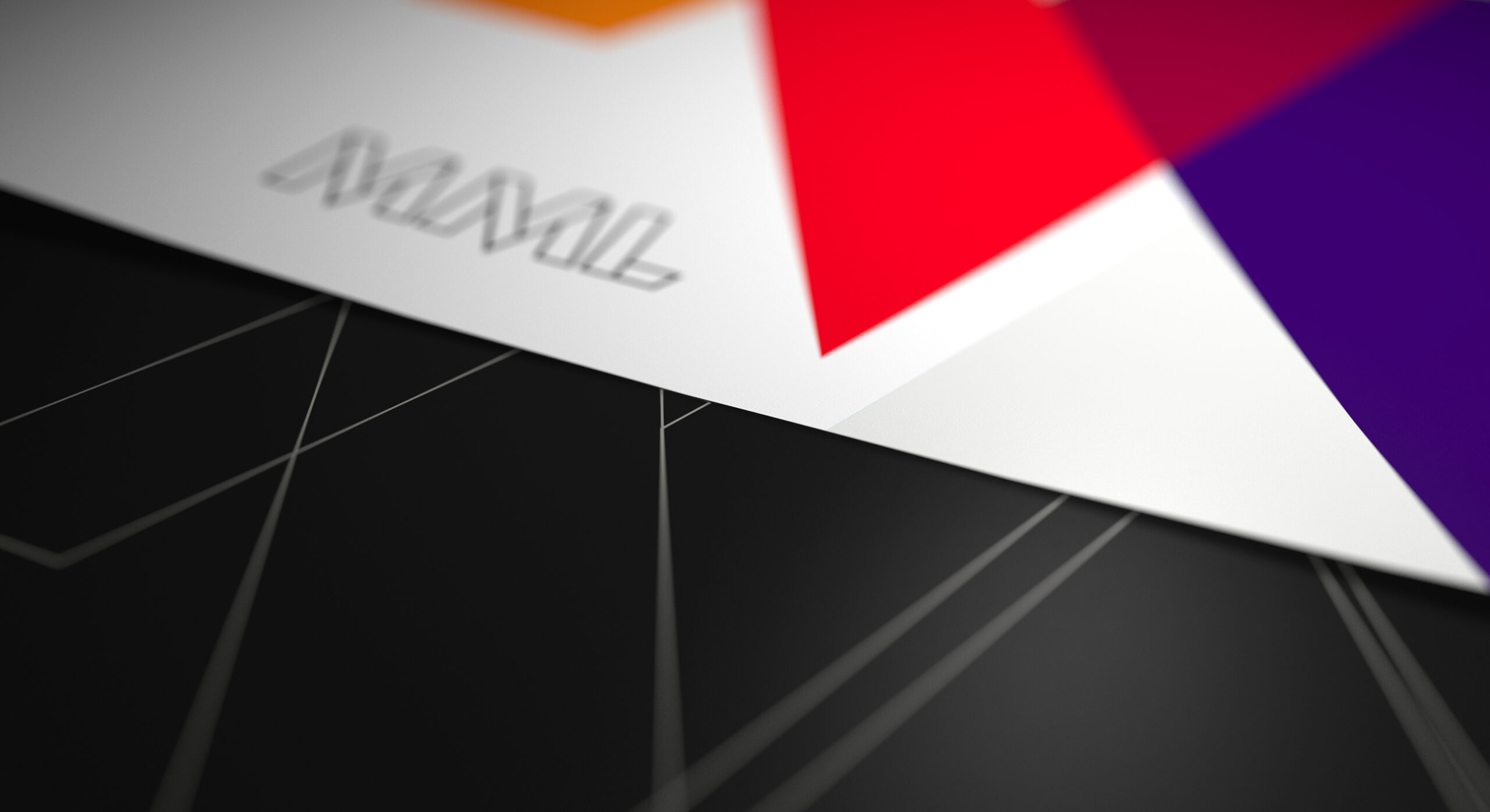
We explored a number of techniques for bringing the MML wordmark to life. We also wanted the logotype to link visually to the rest of the graphic identity. One of our logo concepts used a combination of brightly coloured segments meshed together to create a solid MML symbol. The meeting of vectors represents the merging of ambitions between the MML team and their represented portfolio company management teams.

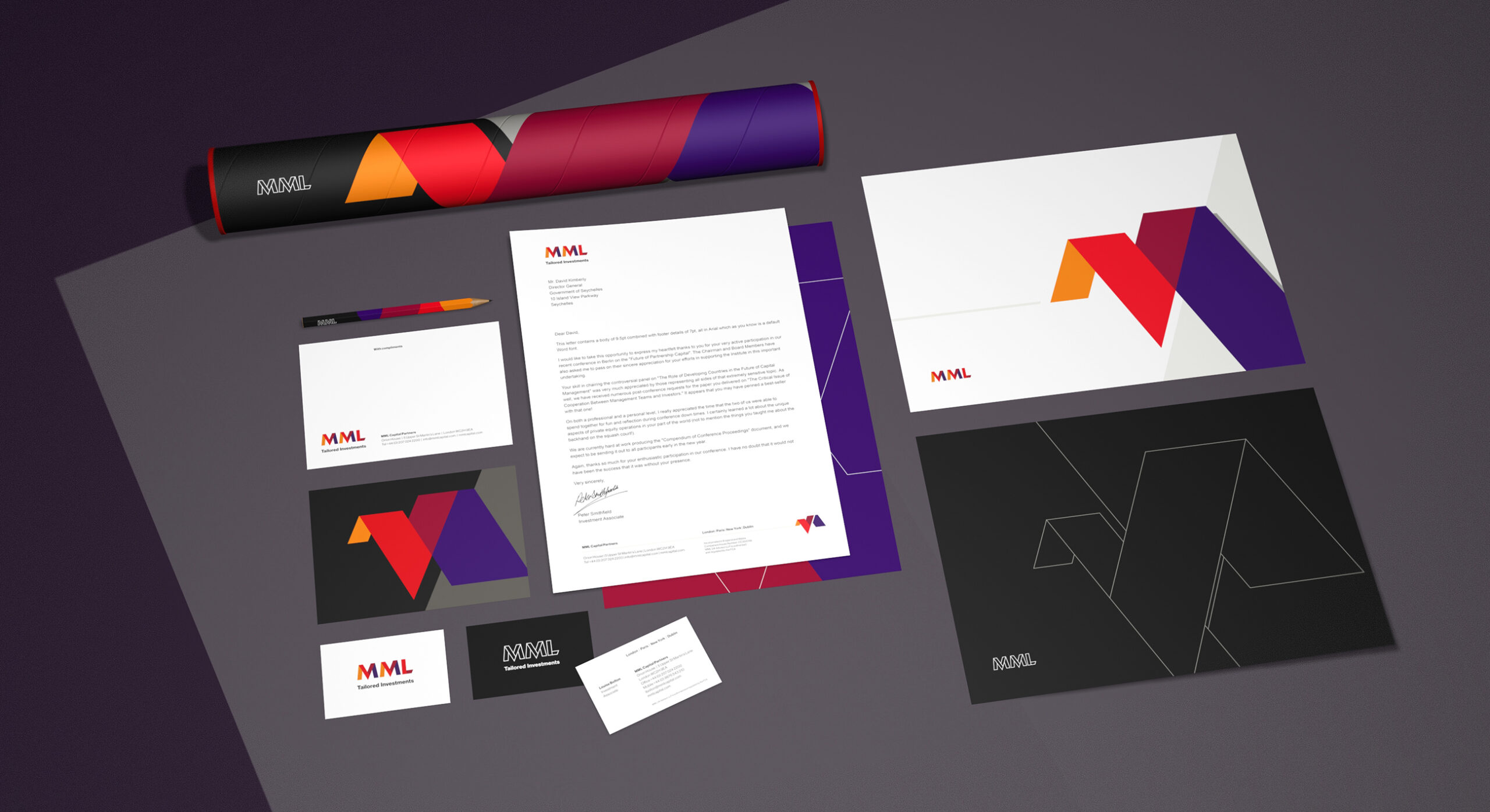
The shortlisted brand logotype is rendered in both full colour and monochrome. The brand is used with or without the sector positioning.
The MML business had evolved so much since the previous brand development. We created a more mature and slick position, yet sought to embody it with a bright tone.

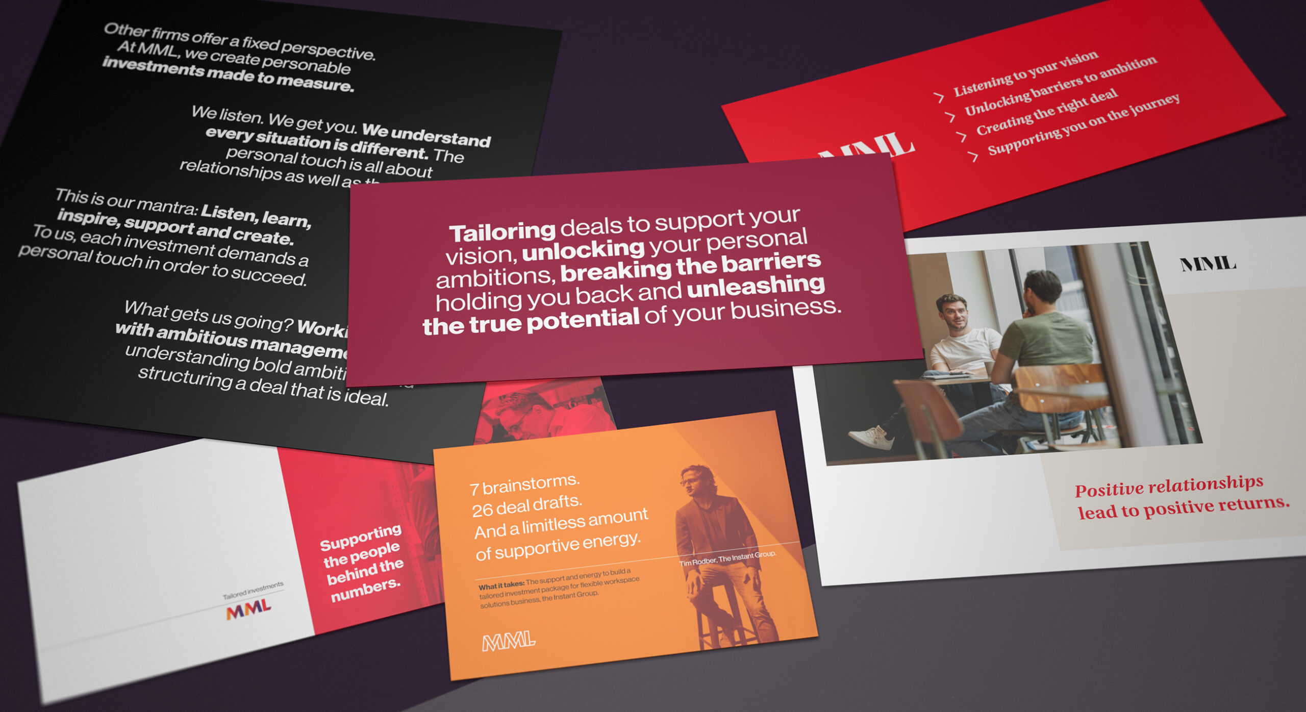
The photographic image language of the brand features natural portraiture of both staff and invested company management teams

Expressing an authentic positioning through messaging, imagery and graphics

The overriding brand position is “Tailored Investments”. This communicates to both key audiences. Firstly, it reassures investors that funds are built upon carefully selected equities. Secondly, it conveys the notion of partnership to management teams; tailoring investments around peoples unique businesses and personal aspirations. We use a set of focussed messaging statements which articulate this top level positioning. We also substantiate the messaging by challenging the client to engage with their existing relationships. This is delivered with authentic wording generated from interviews, Q&A’s and testimonials. The photographic image language of the brand features natural portraiture of both staff and invested company management teams.

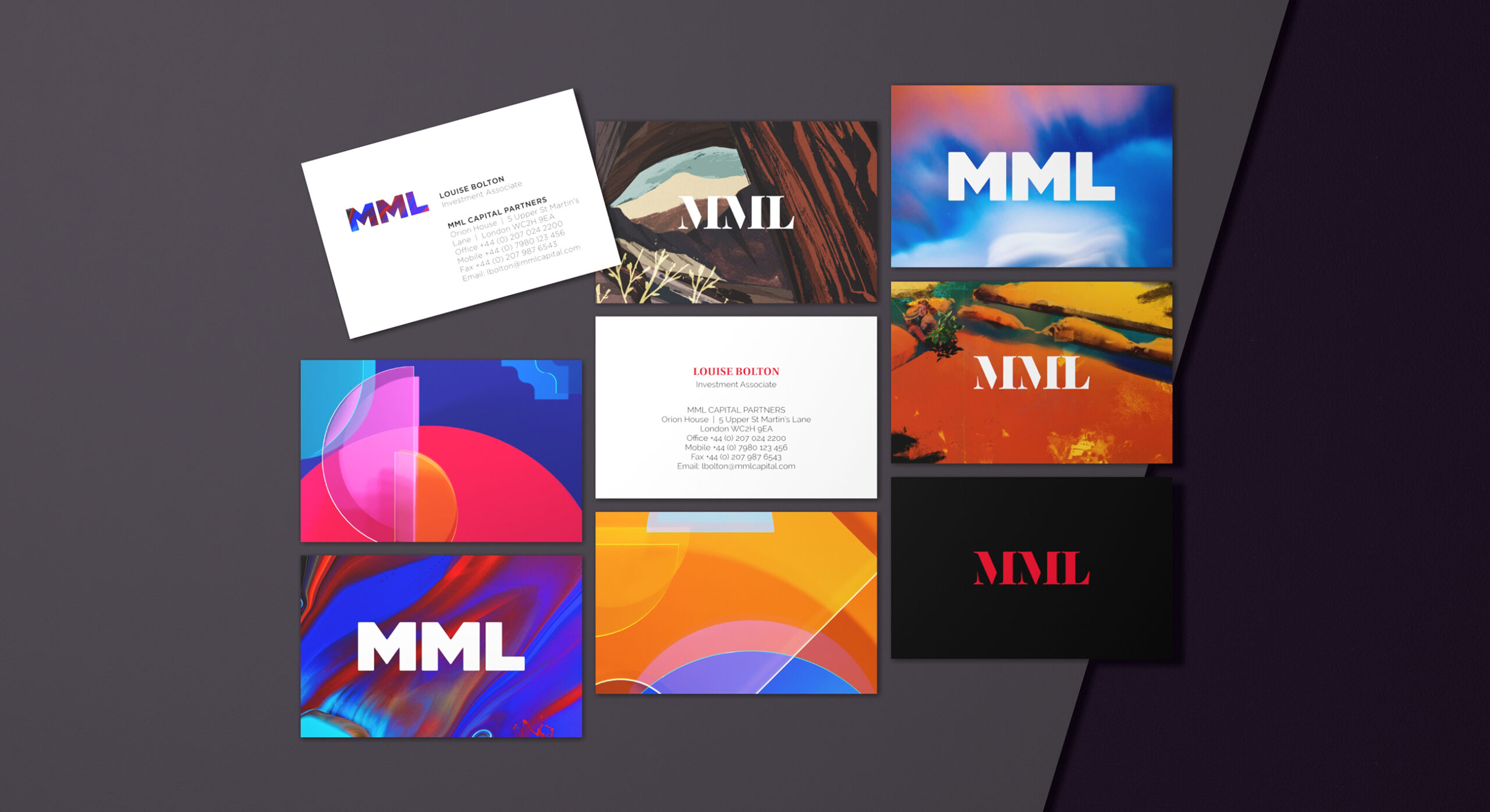
The brand visual identity is supported by secondary graphic assets. These are used in print applications such as stationery, communications and PPT design.

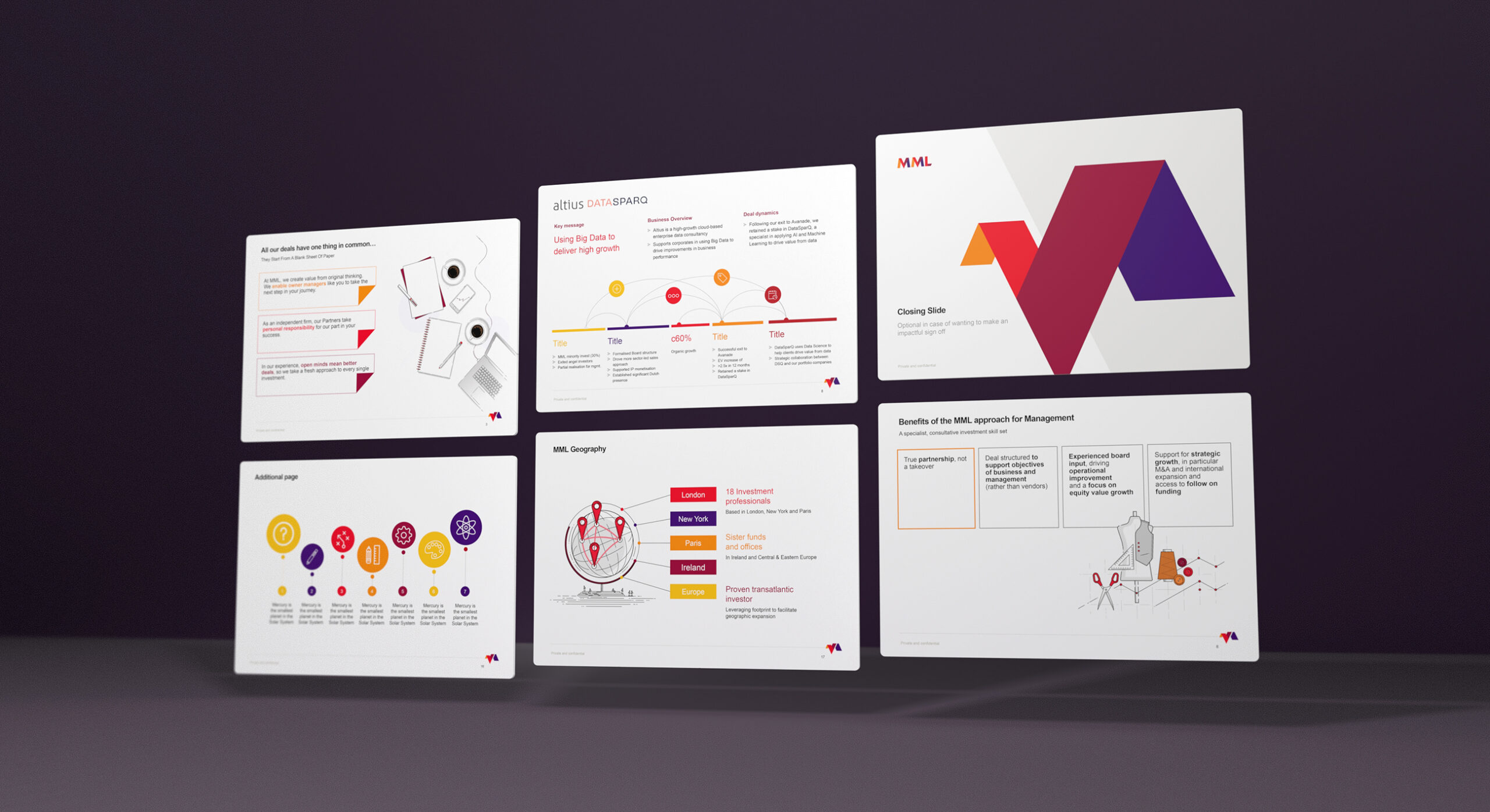
A large part of marketing revolves around face to face meetings. We created a flexible yet robust PPT template which carried the custom branding theme

Extending the visual language into digital and printed communications

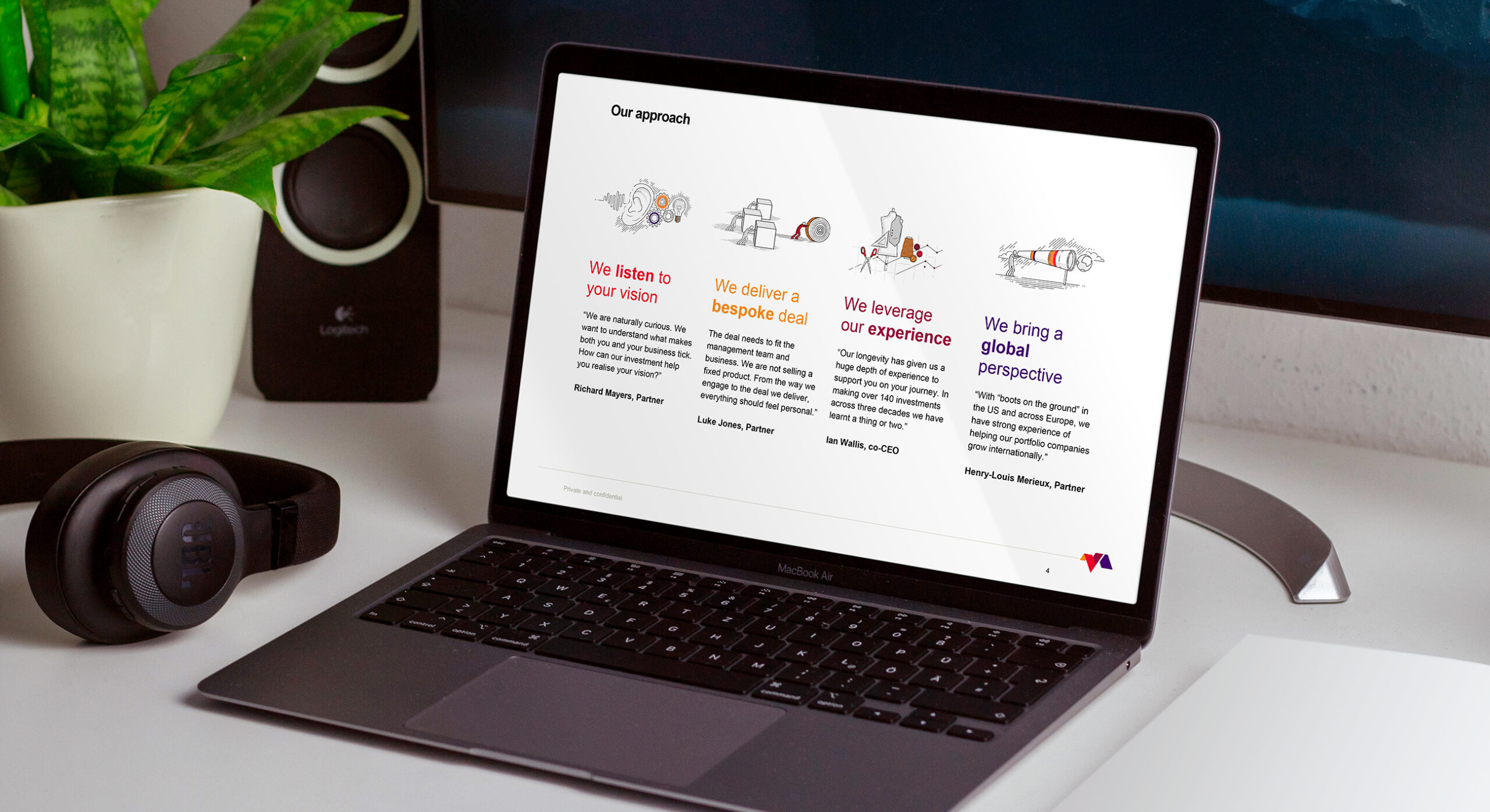
A large part of the MML Capital marketing effort revolves around face to face meetings and discussions. This involves the presentation of company culture, credentials, track record and case studies. We created a flexible yet robust PPT template which carried the custom branding theme. This was also supported by a custom made 50+page PPT deck containing infographics, illustrations and a variety of arresting layouts. This enabled team members to chop and change content suited to their meeting. This further supported the Tailored Investments proposition. The Microsoft Office theme design extended further into an entire suite of formal, proposal and business document templates.

The MML team use PowerPoint on a daily basis. It is imperative that the brand is supported by a comprehensive template file which covers a variety of layout formats.
We provided the client with a 50+ page working PowerPoint book containing a myriad of page layouts and infographics.

Custom brand illustrations add texture to the visual identity

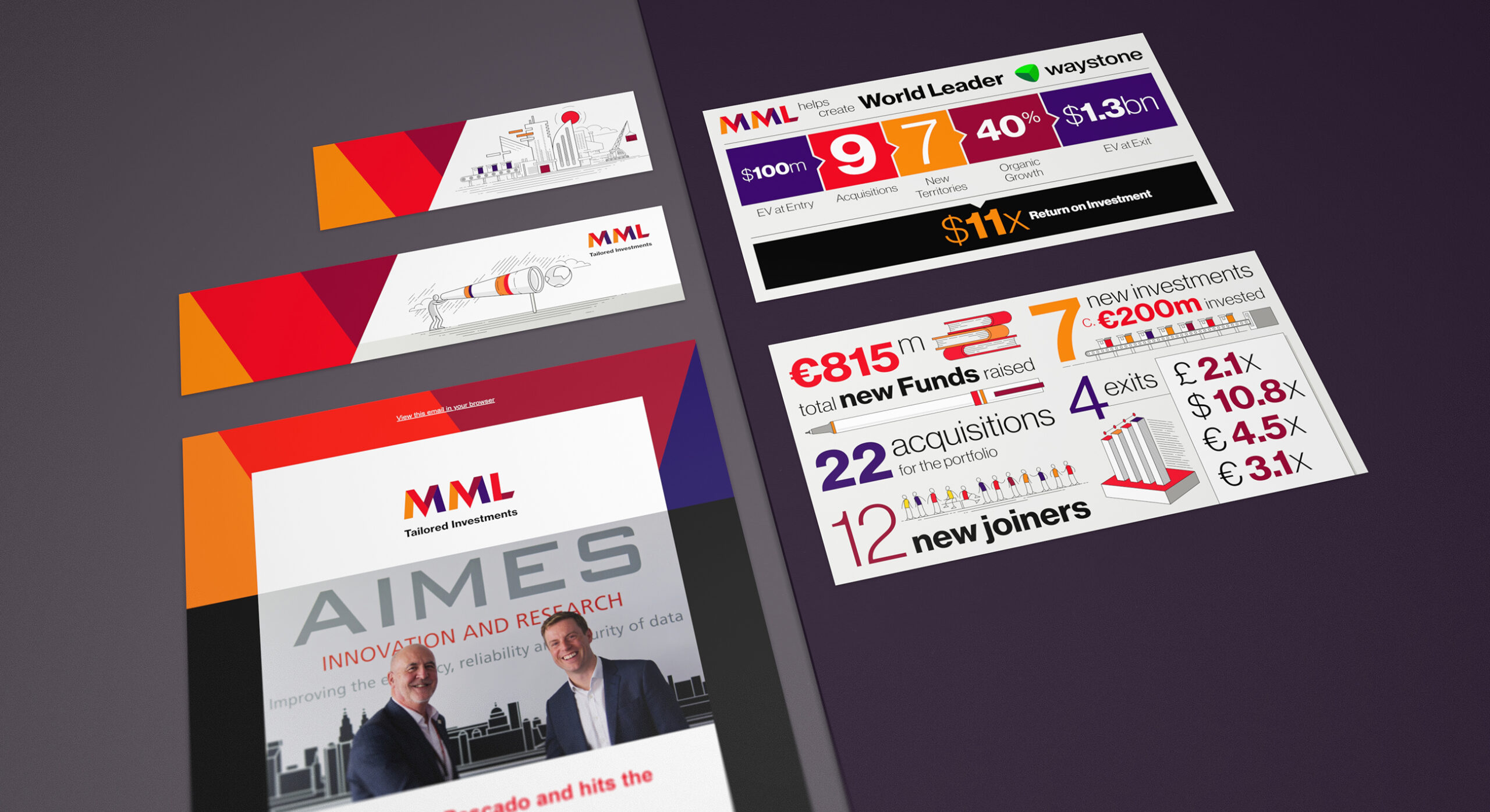
We have provided a suite of illustrations which add flavour to what is a minimal brand aesthetic. These crafted illustrations are used to convey both business concepts and also functional storytelling. The assets are spread across the website and supporting digital publishing applications. A consistant geometric line style and colour application ensures consistency.

Part of the strategic brand consultancy outcomes is the increased publishing of content across the business. We continue to provide the client with a number of social media illustrations, infographics and design layouts to support both on-site and off-site publishing.

The MML Capital website is built in such a way that it can evolve over time, always keeping fresh and relevant.

Delivering a fully responsive website

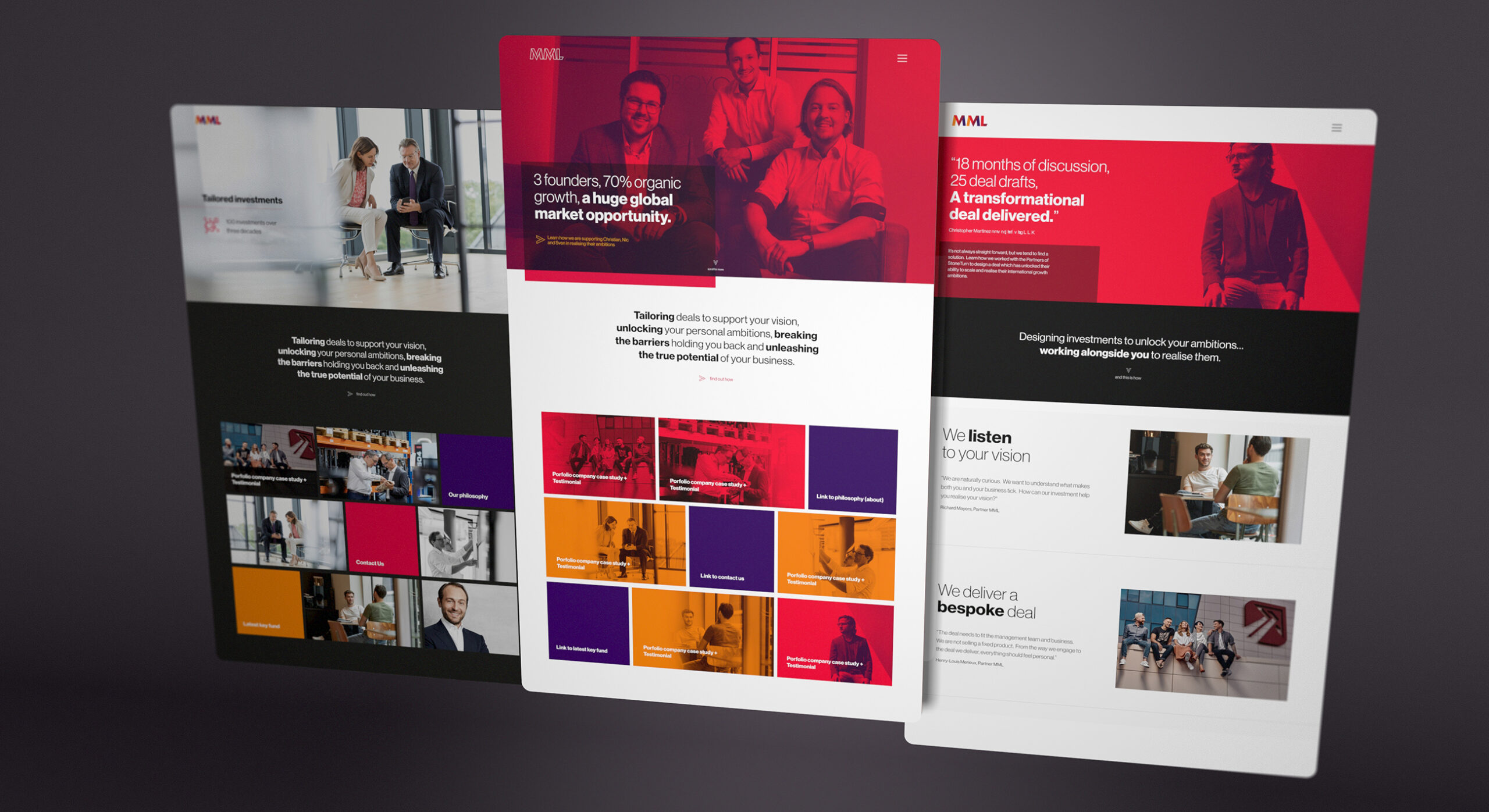
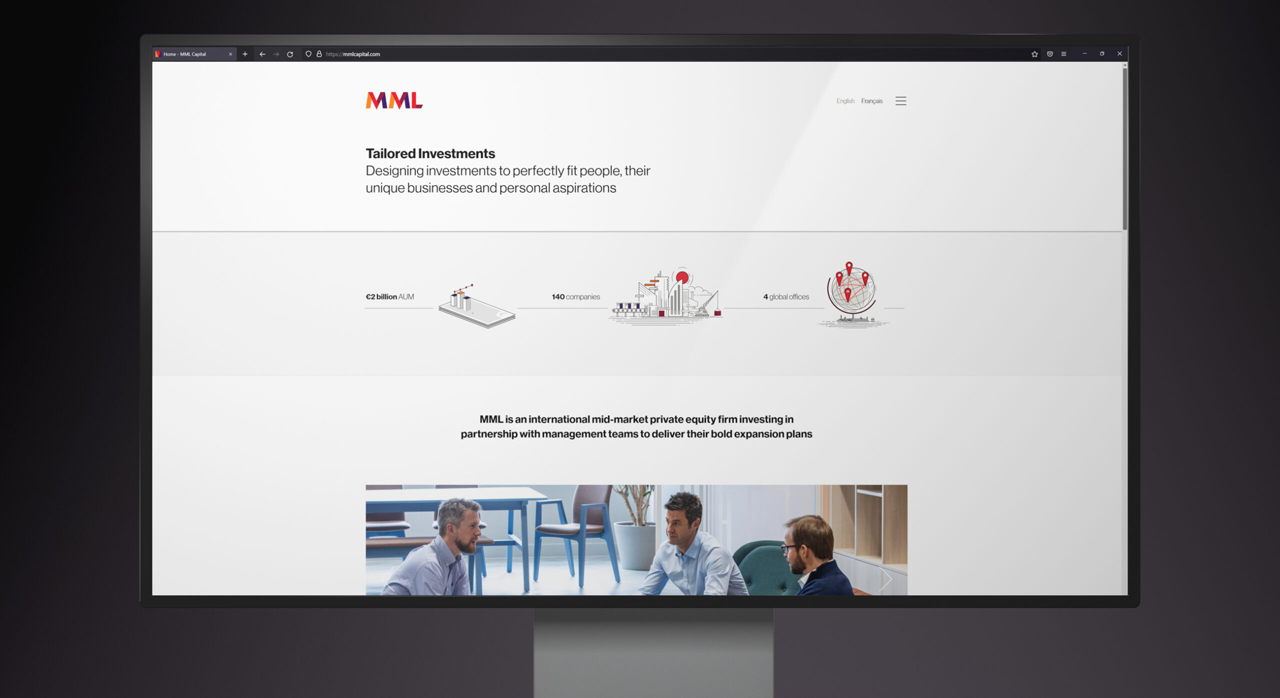
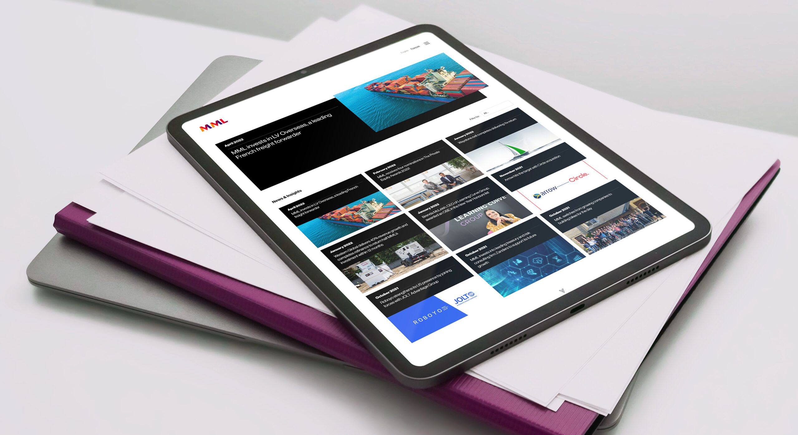
The design and development of a corporate website forms another key component of the rebrand effort. The incumbent website had aged over time and was clunky and hard to navigate. We moved the content management system over to WordPress, which is known for it’s ever evolving and pioneering edge. We coupled this with the adoption of subscription based software bolt-ons which empowered the Firedog design team in creating the theme directly. This allowed us to really obsess about the minutiae detail often overlooked by third party developers. Furthermore, it allows the rapid development of page layouts without locking in code. This provides the client with agility in moving blocks of content laterally across the site without the need for redevelopment. It also allows Firedog to continue to support the client in the creation of new sections, simply and without the friction of having to stop and wait for development cycles. The result is a site that will evolve over time, always keeping fresh and relevant.

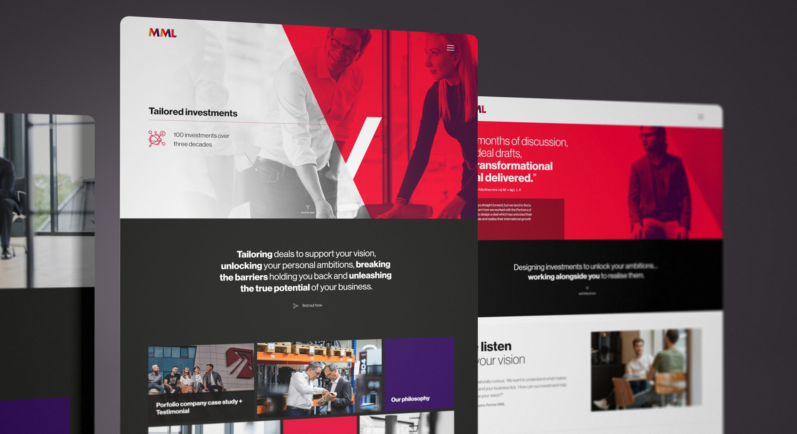
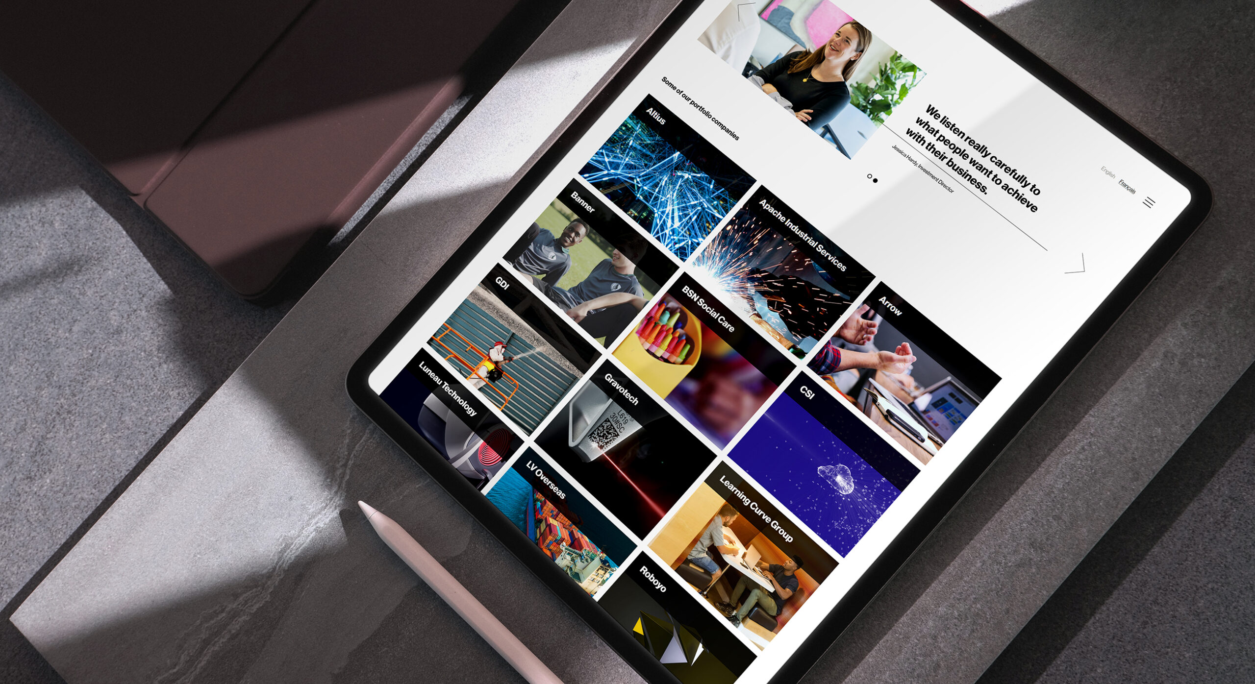
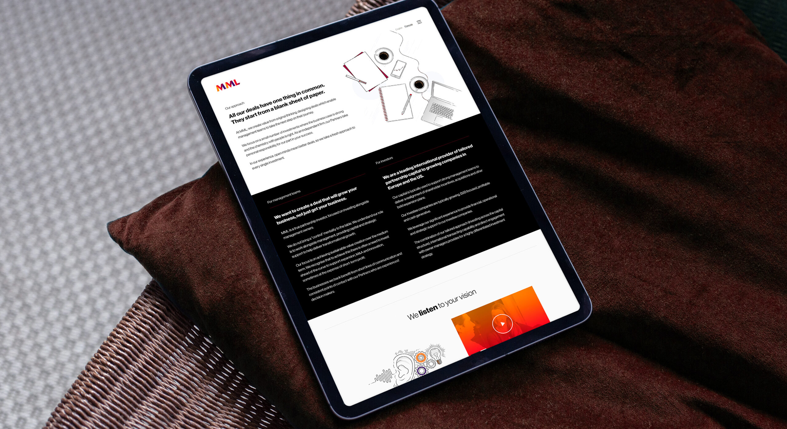
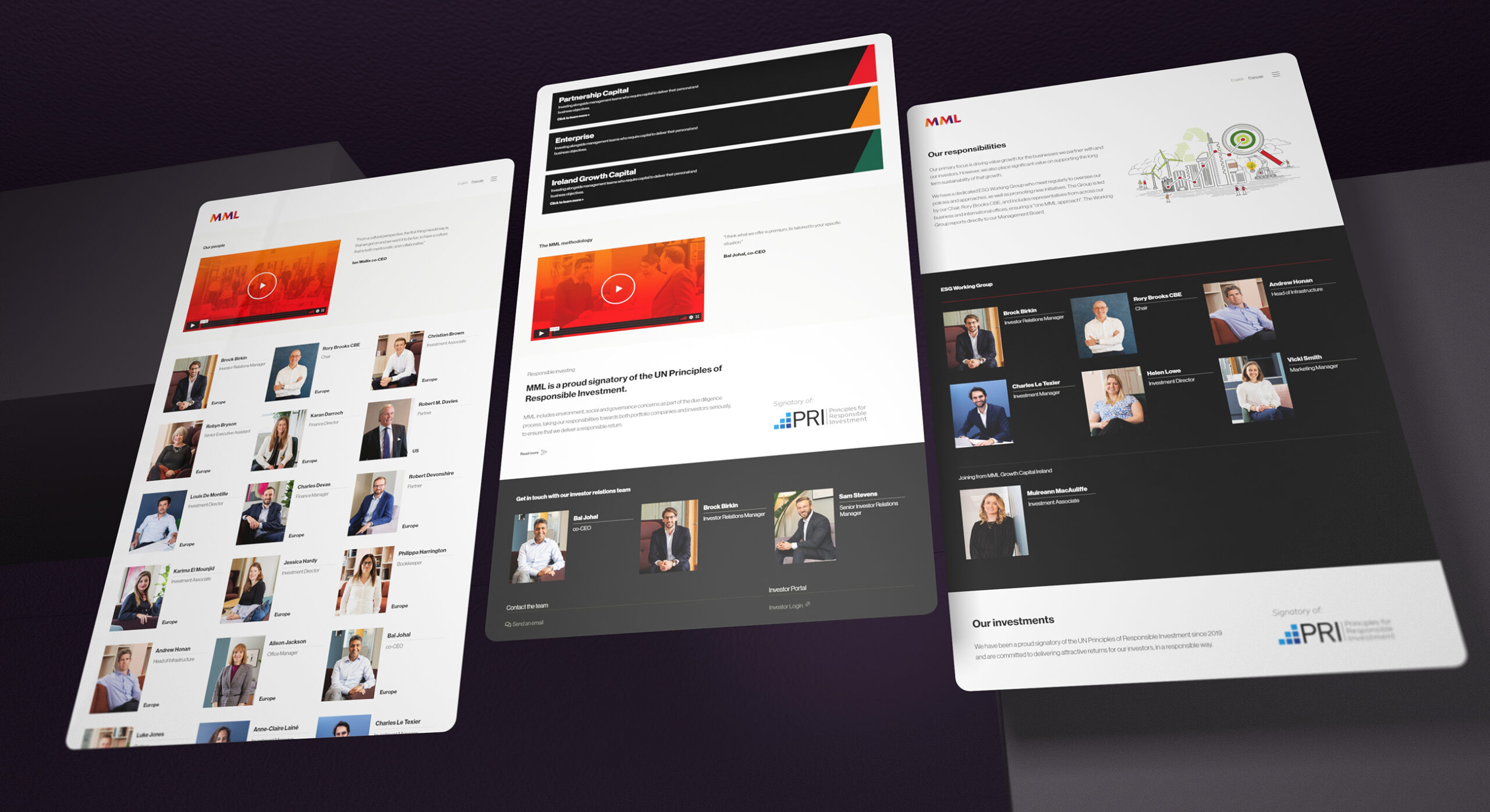
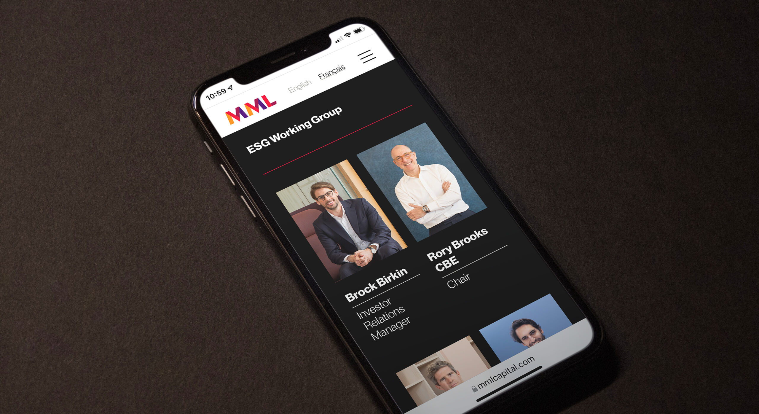
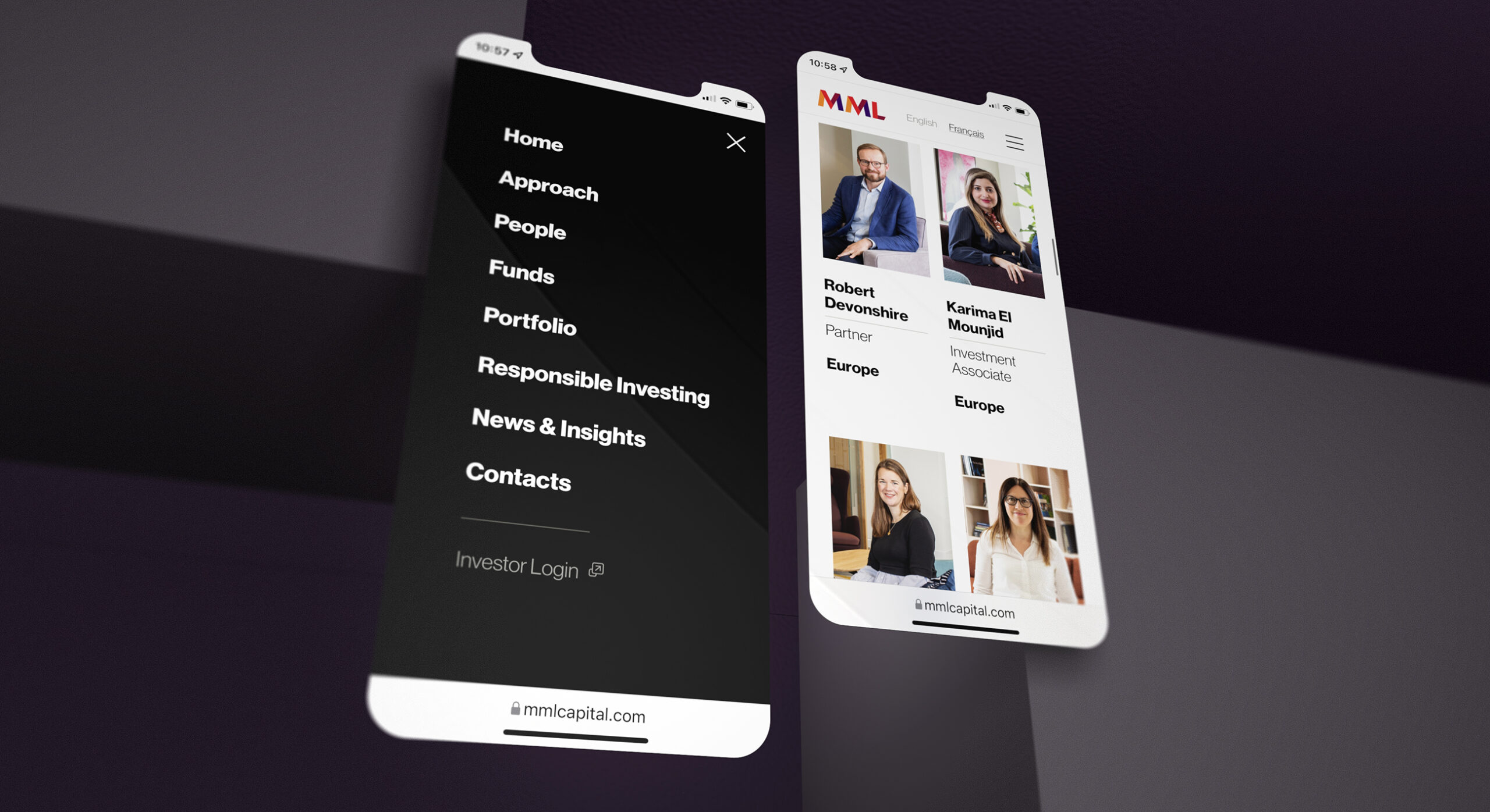
The website design created to support the brand is a combination of clear simplicity and engaging graphics and imagery.
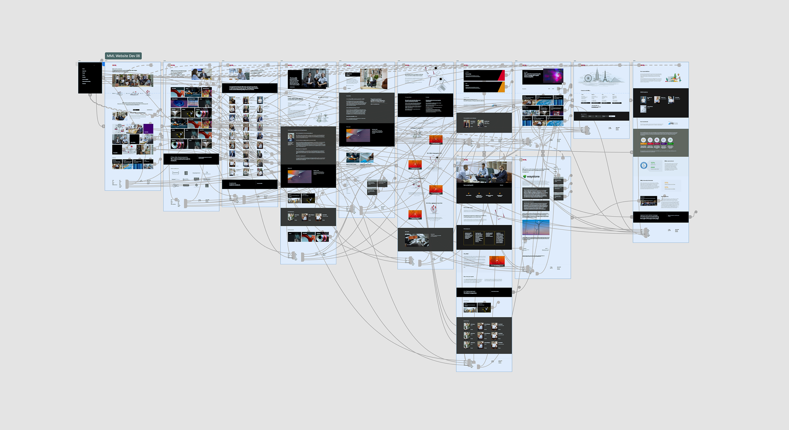
The digital design process is intrinsically governed by user flow and experience. Here, we illustrate an Adobe XD prototype process which provides clients with a full browser based proxy of their upcoming website development.
The website design uses plenty of space and structure in order to reduce clutter. This lessons user friction and therefore represents an enjoyable browsing experience.
Given that mobile usage is second only to desktop devices; we ensured that the site is optimised for delivery out of the office.

Notable outcomes and results

The rebranding effort has been pivotal in driving the MML Capital brand reputation forward. Within the year that the branding has taken place the business has closed the fundraising of their seventh Partnership Capital Fund breaking hard cap to close at €670m. This increases the AUM to €2bn. This involved 22 acquisitions and four landmark exits. The most impressive of which is a milestone exit for Waystone which delivered an 11x 164% IRR and returned 100% of committed capital in a single transaction. Full details can be viewed on the MML website.

When developing a brand symbol, its always critical to develop a simpler one colour version so that it can be used in tricky situations such as embroidery.