-
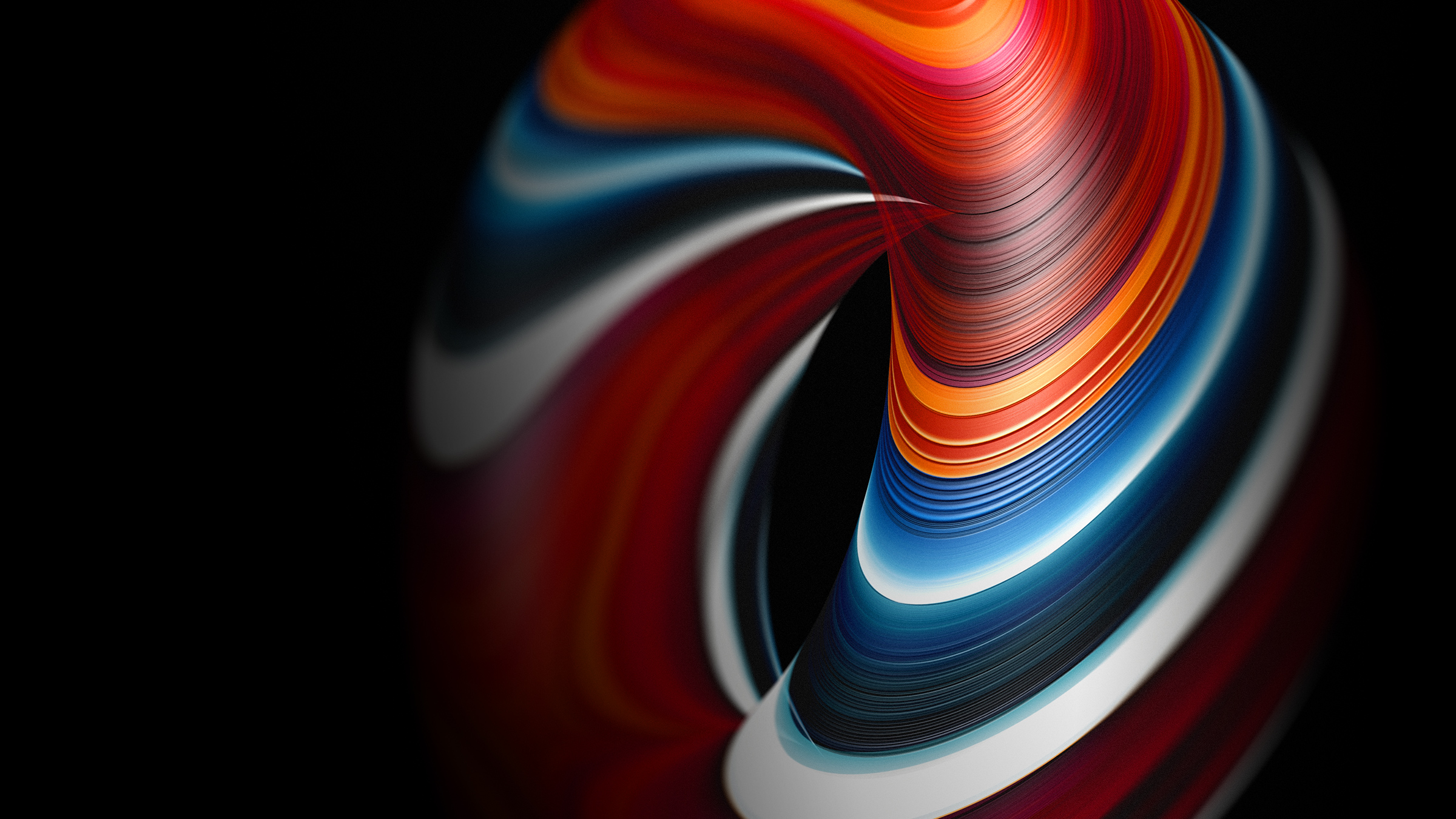
Mineral striations across a wonderfully fluid form.
-
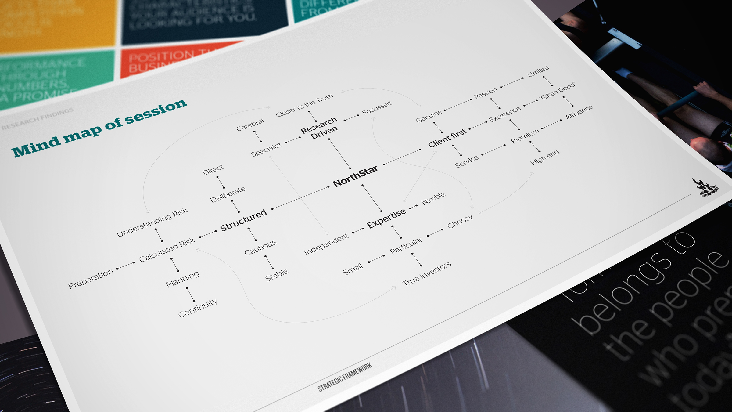
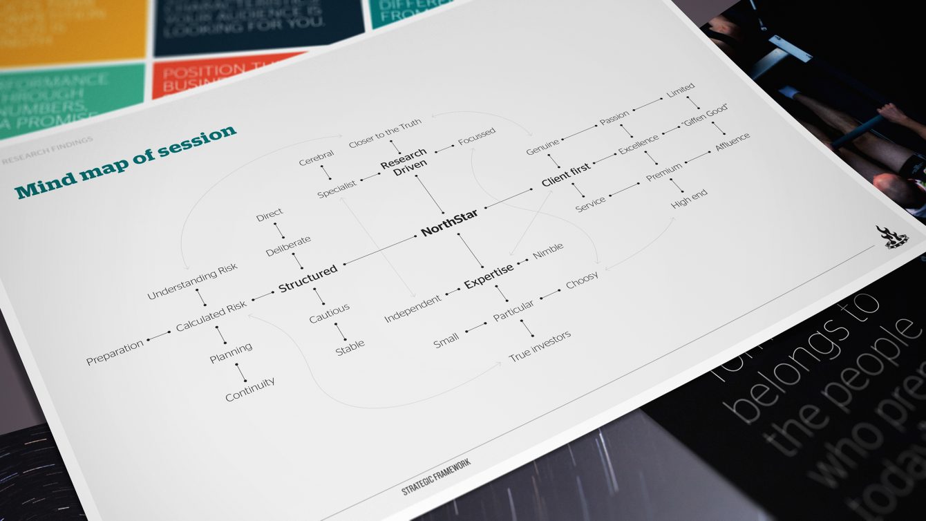
We combined the themes gleaned from research into a positioning mind map.
-
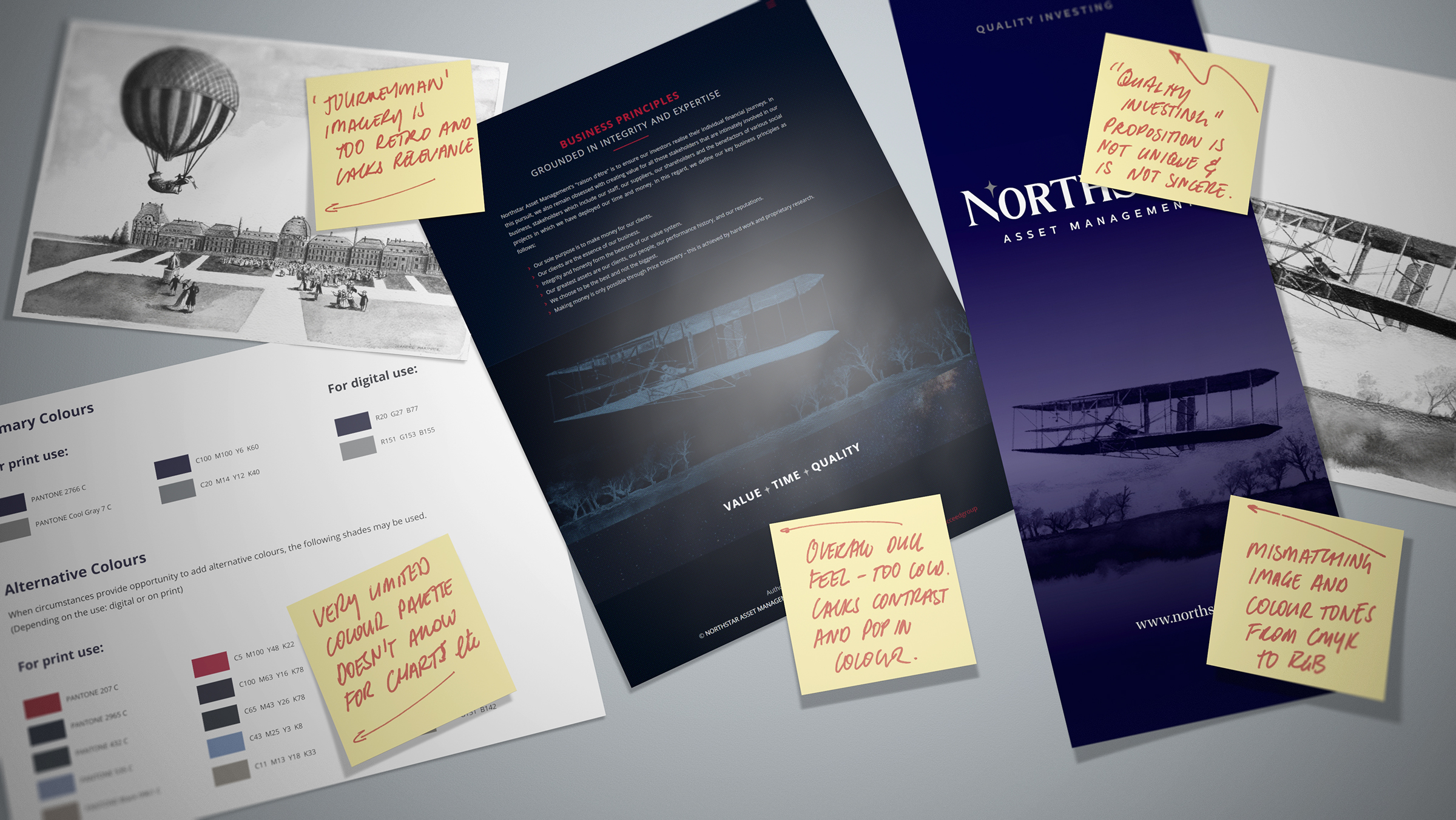
The incumbent brand identity focused around the journeyman. We found the positioning too generic and linked to the sector as a whole.
-
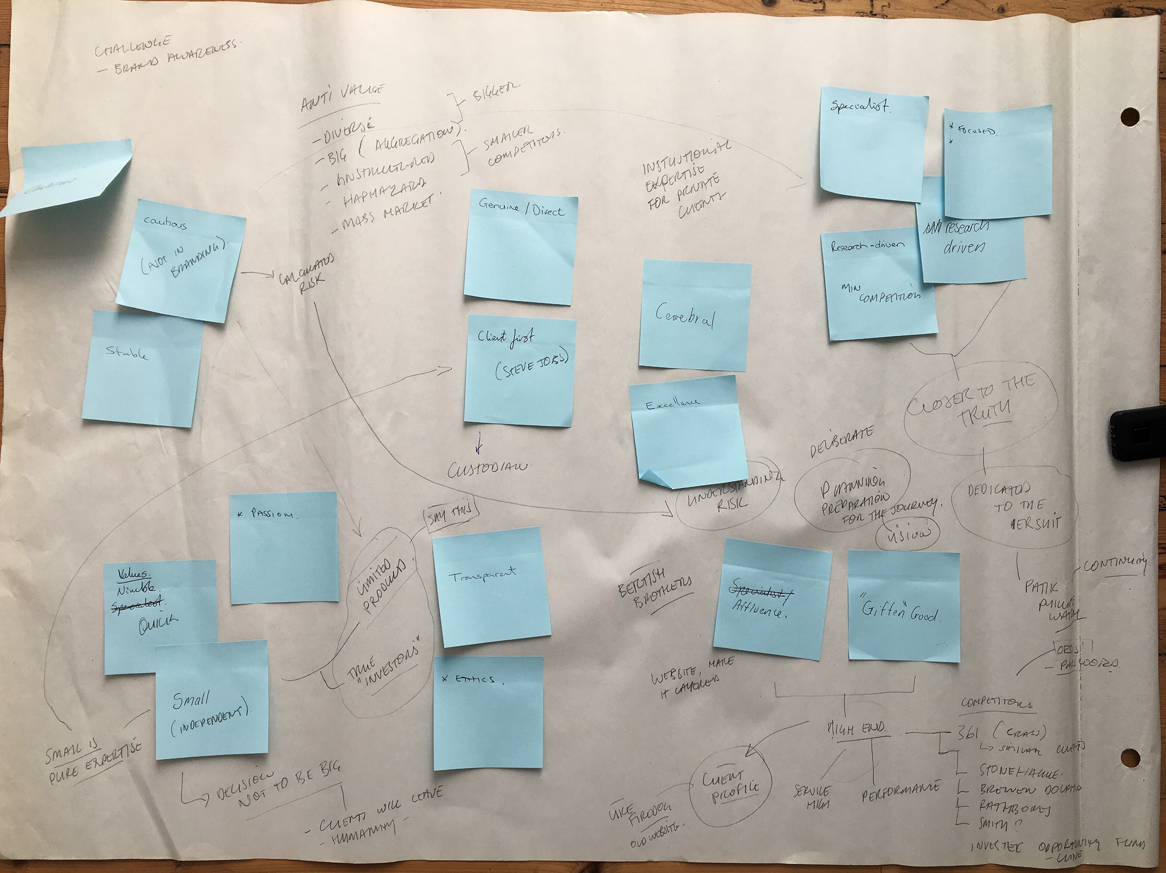
Our very first step in research is to work with the key stakeholders in summarising key brand values.
-
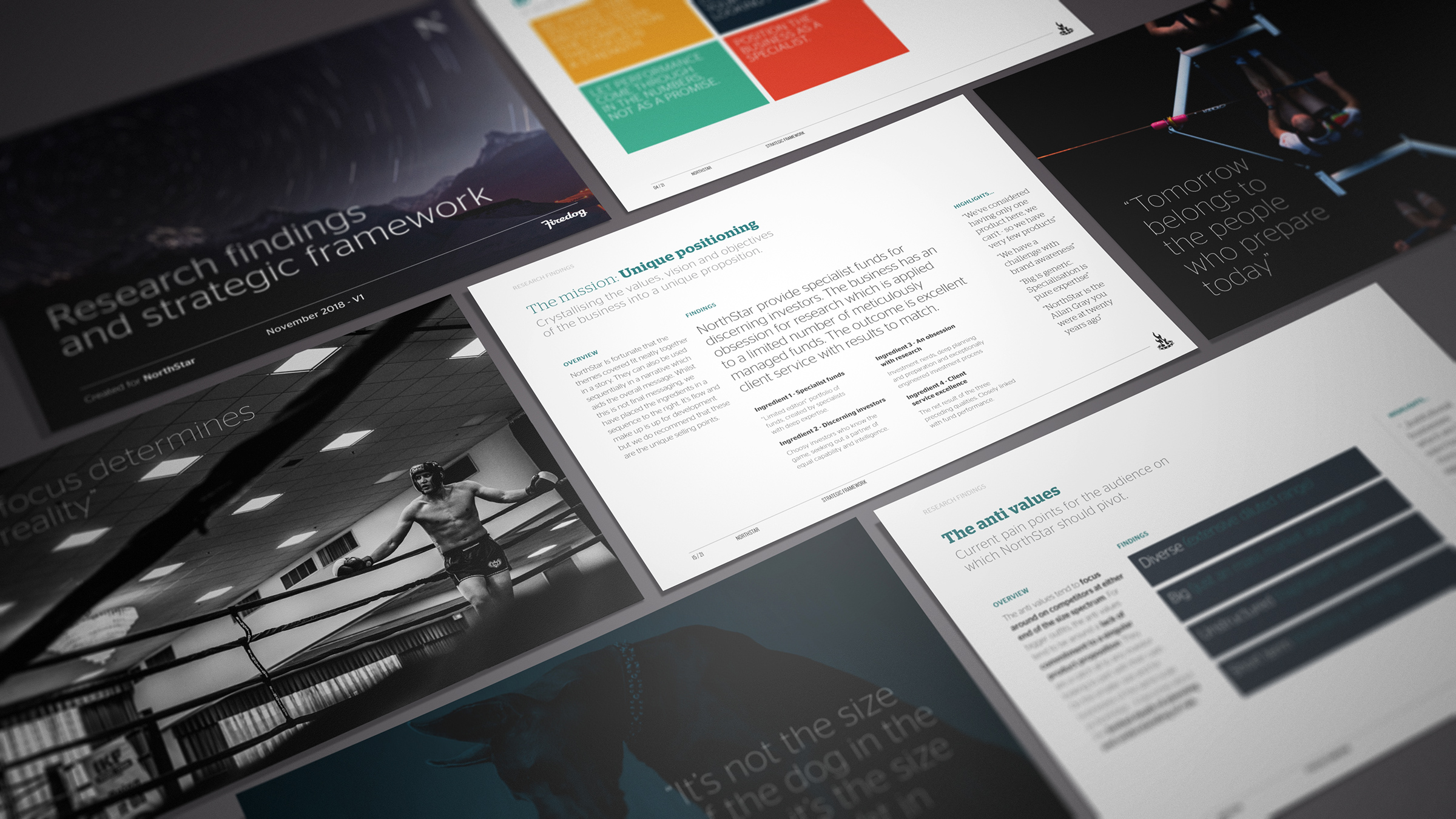
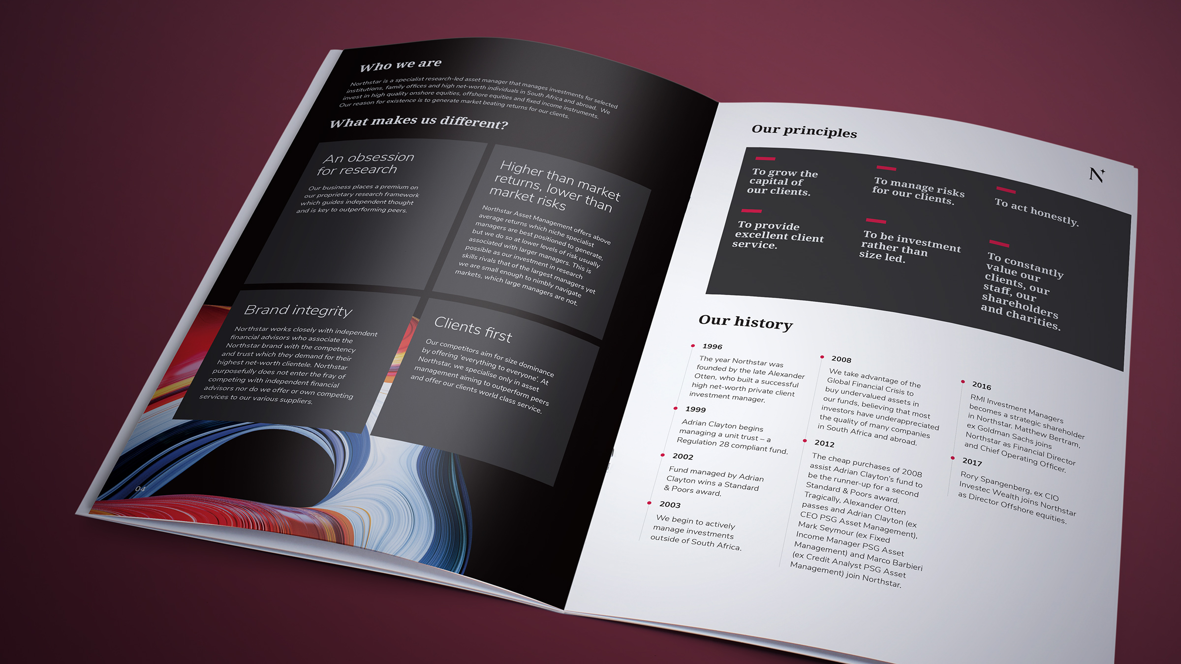
The results of our research efforts were distilled into a thirty page strategic framework that encompassed all the positioning and messaging requirements.
-

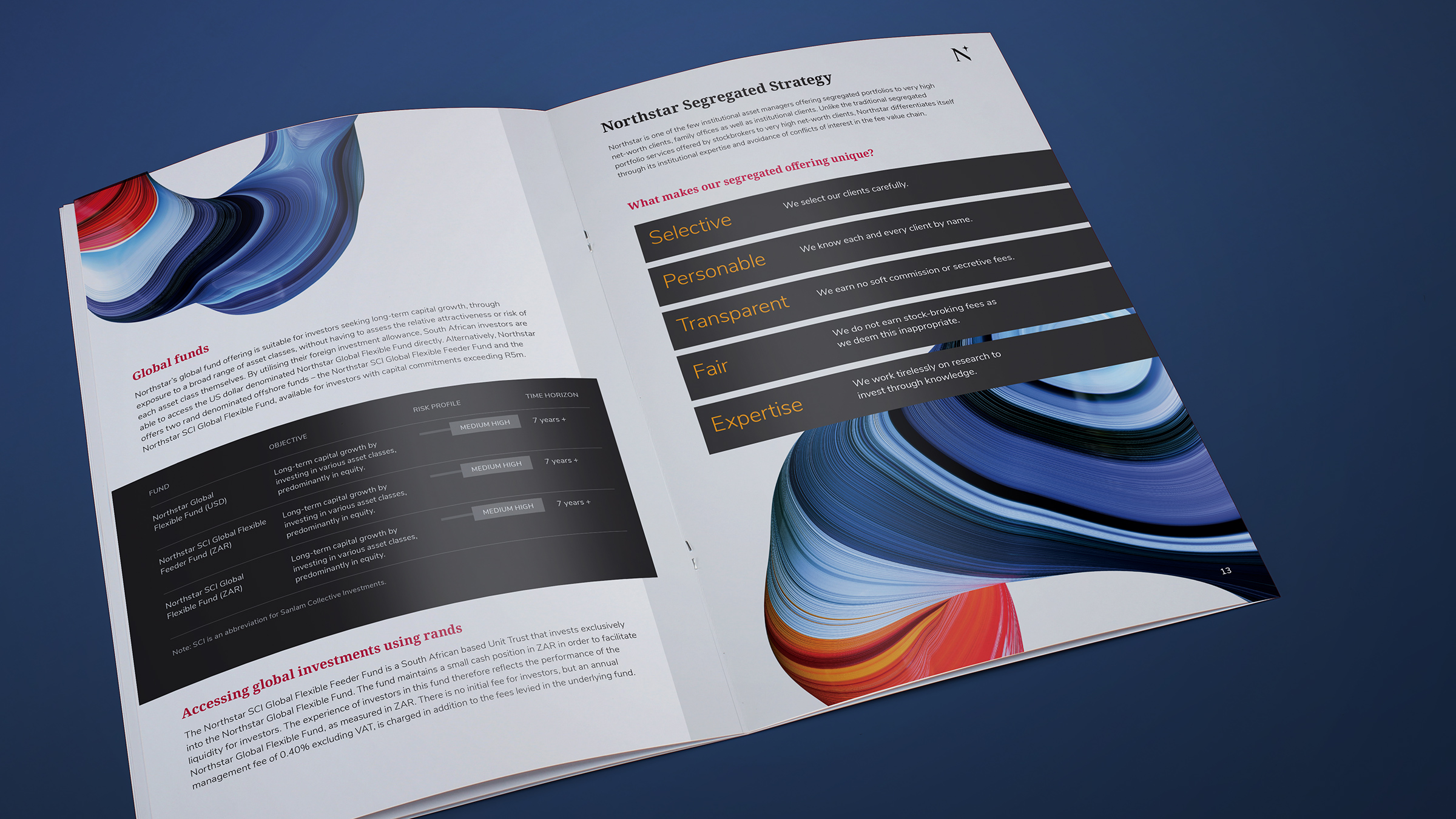
We compressed all the associated brand characteristics into four core pillars of reason.
-
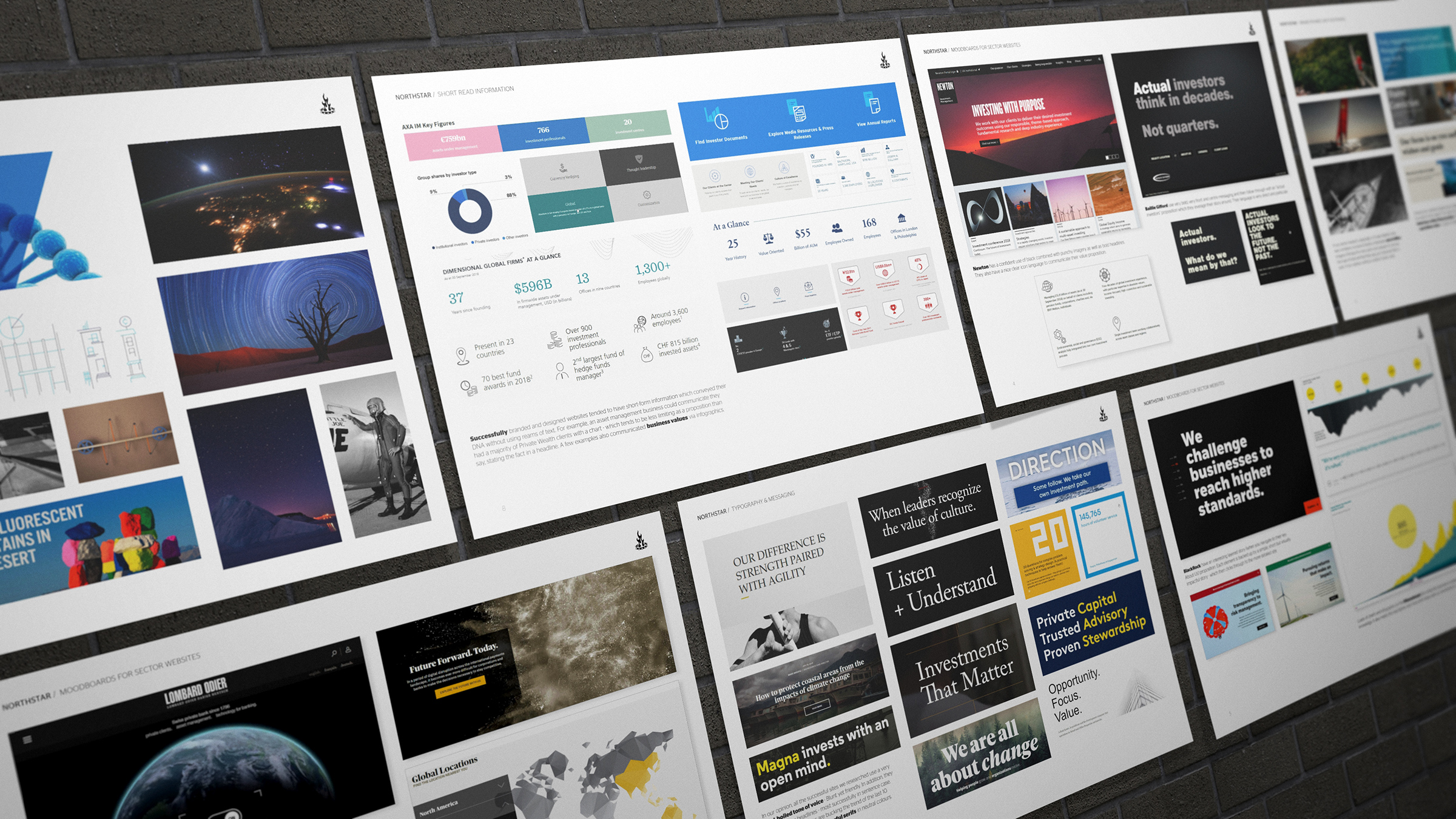
We studied over 50 global competitors to analyse exactly how different brands were positioned. Our method was to create a unique narrative in which to dominate.
-
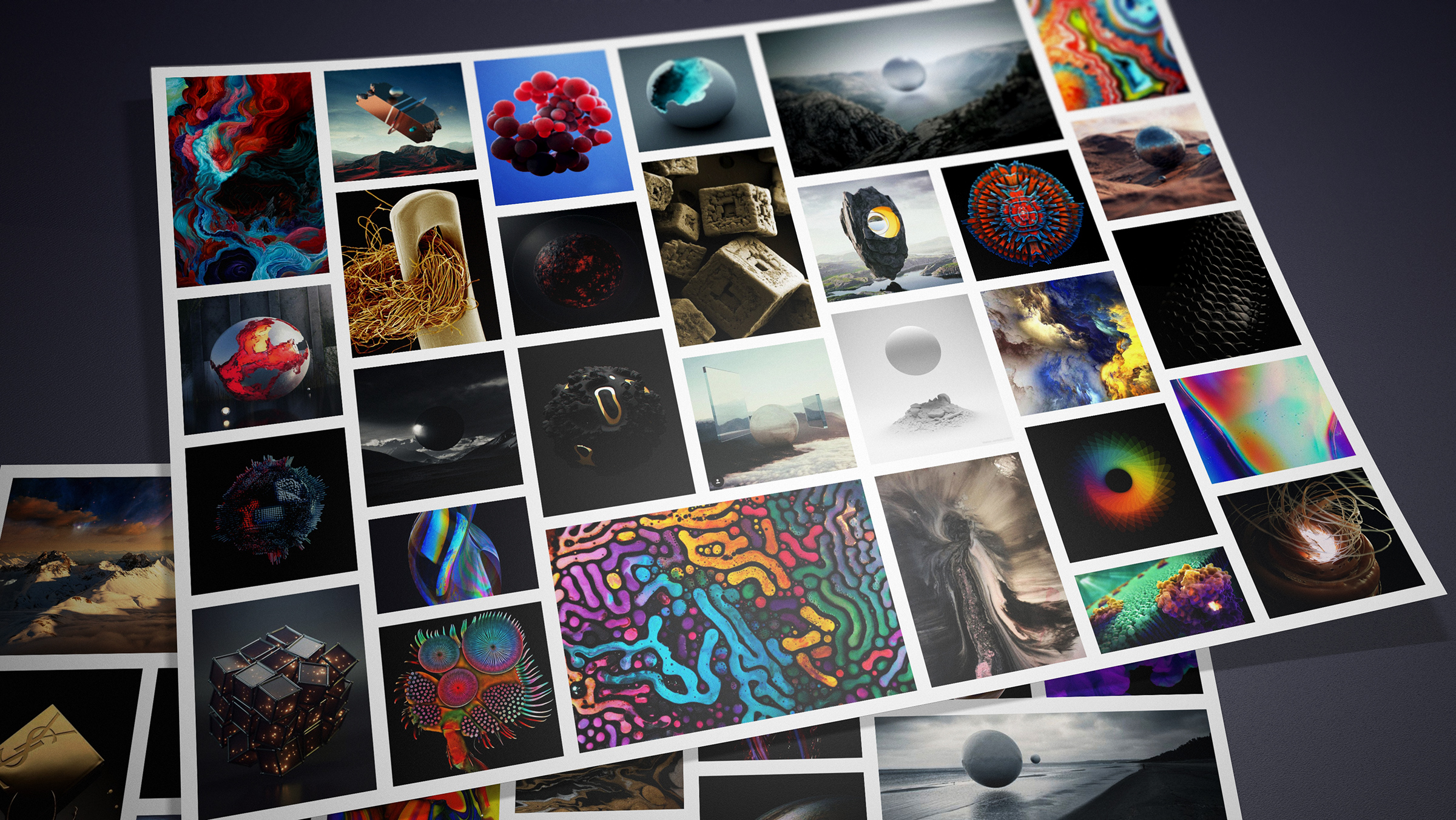
Our visual research explored all kinds of wondrous and imaginative artistic forms.
-
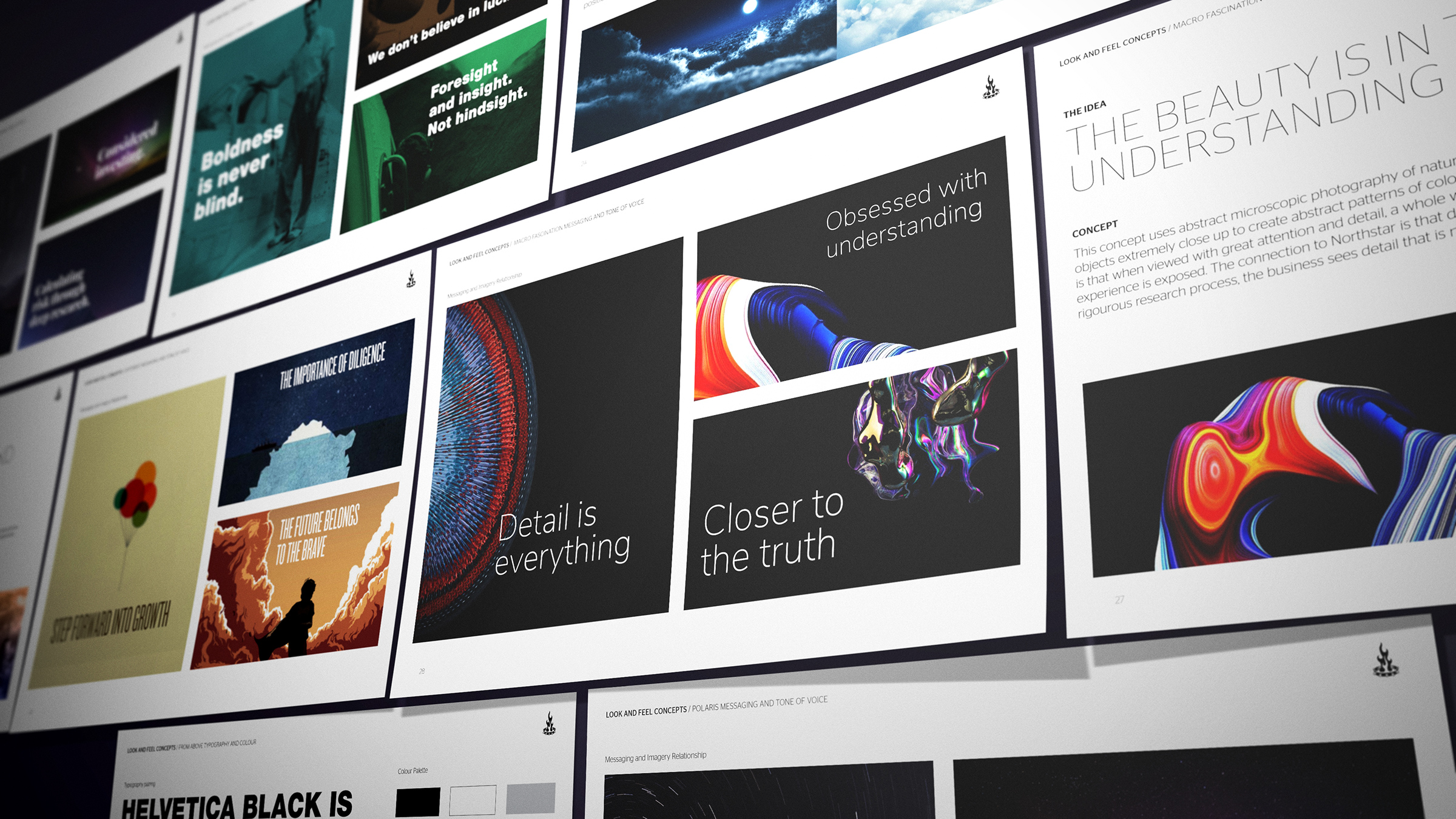
We presented a number of visual concepts designed to articulate the core message. All client stakeholders very quickly seized upon their favoured theme. The creative brief was set!
-

The resulting brand aesthetic is arrestingly unique within the asset management sector.
-
We found the previous wordmark was quite solid and still worked with the adoption of the new symbol.
-
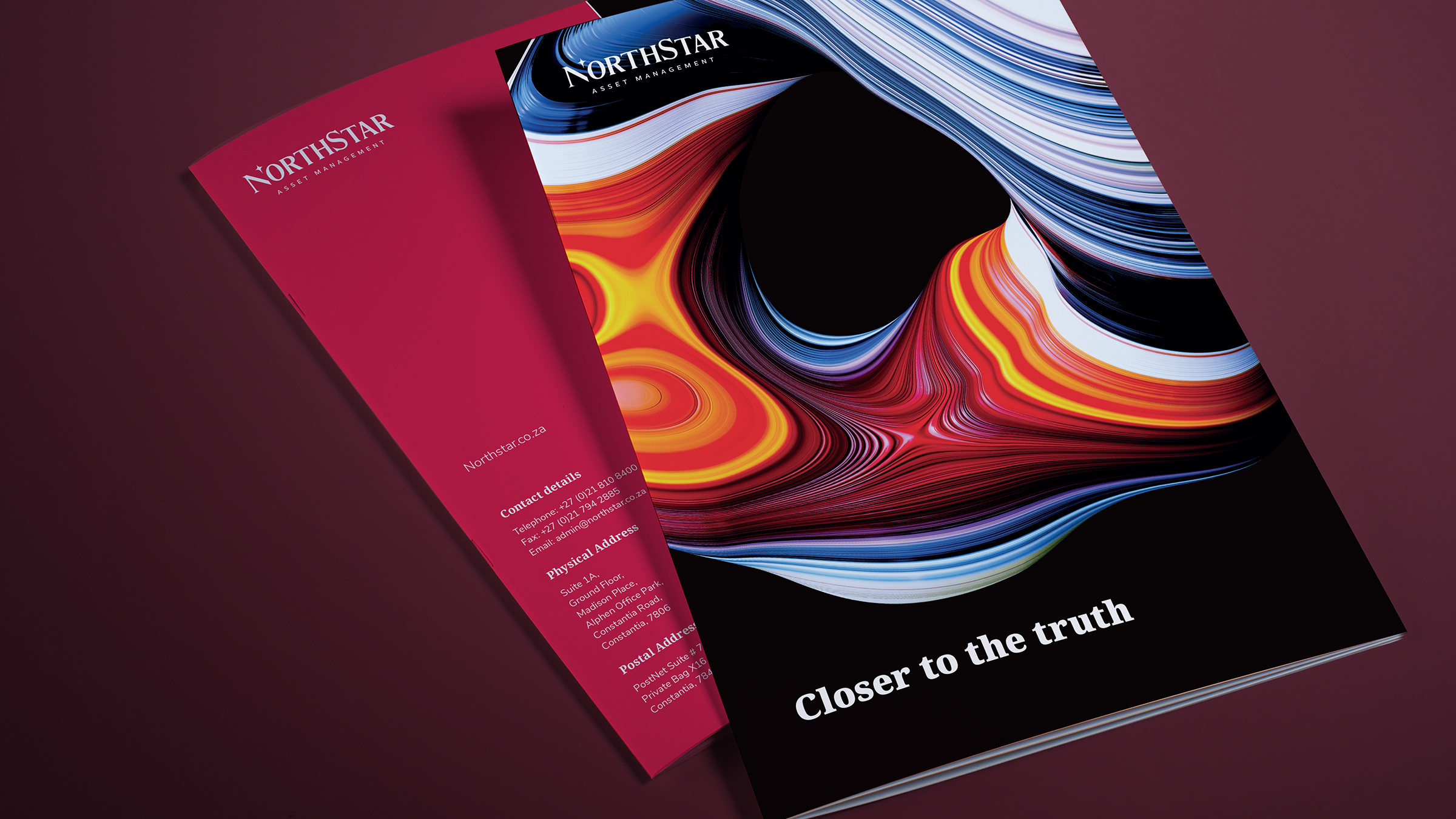
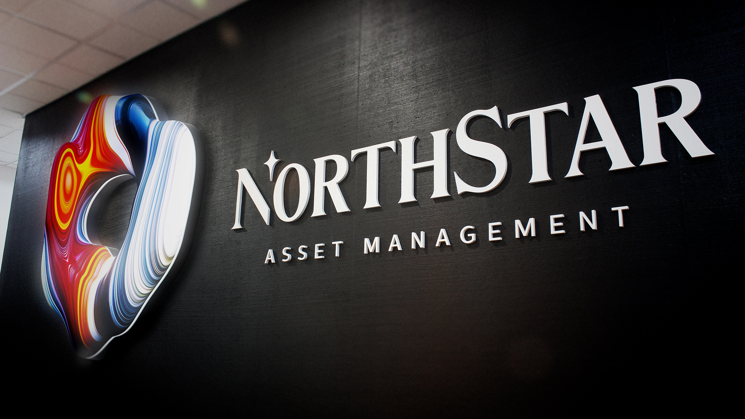
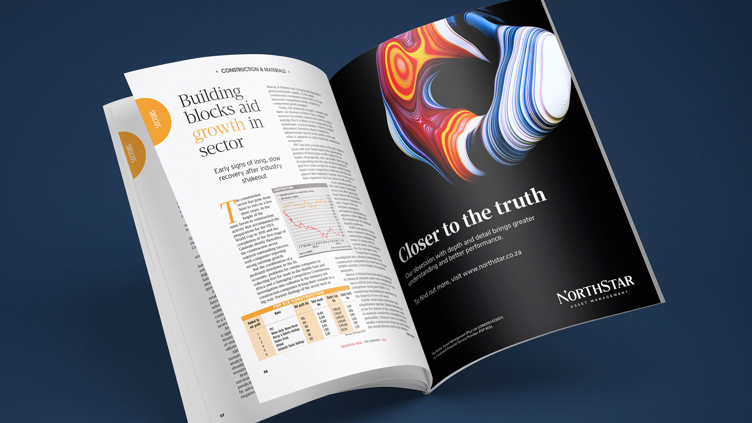
The brand symbol works exceptionally well when tightly cropped. It's abstract nature lends itself to looking at the detail. What is more, the stuffing of image frame conveys the impression of "Closer."
-
The brand was launched into all the associated trade press.
-
The symbol artwork is provided as clipped alpha images which means they can be used on white and dynamically superimposed over graphics.
-
The dark anchor colours allow not only the brand symbol to "pop" but also keep the tone suitably contemporary and un-garish.
-
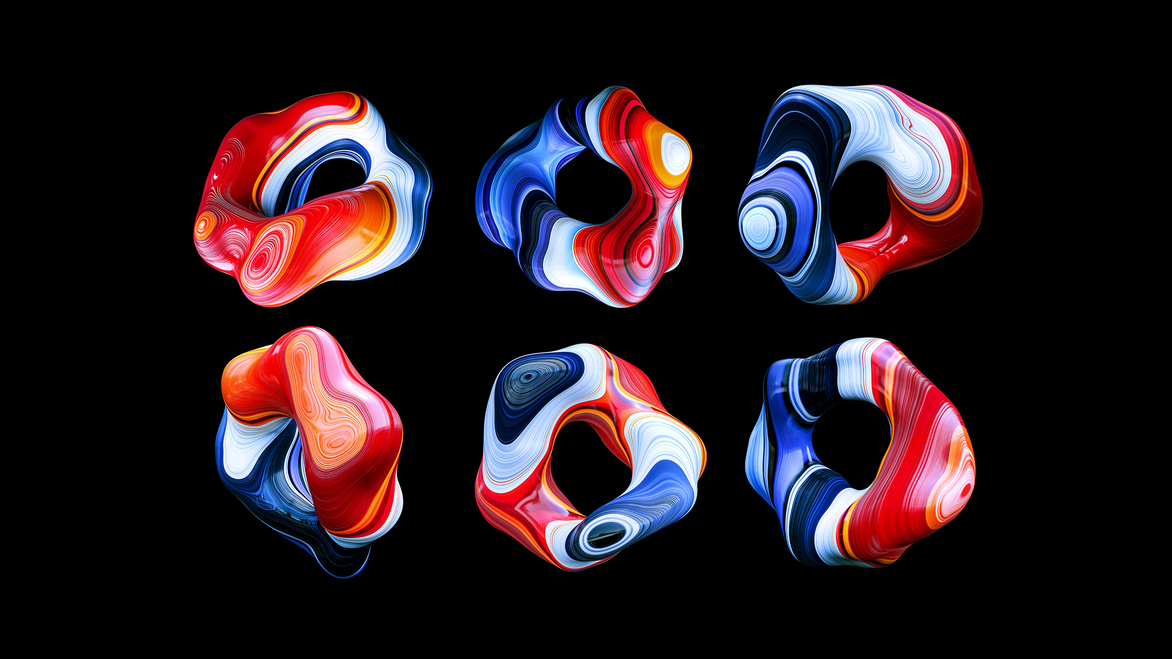
The series of supporting images. The nature of 3D means that now that the forms have been modelled - new images can be created in perpetuity.
-
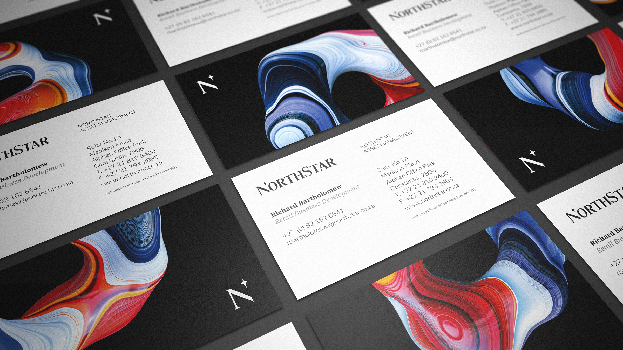
The symbol is used in communications design and works well with the limited colour palette and classic typography.
-
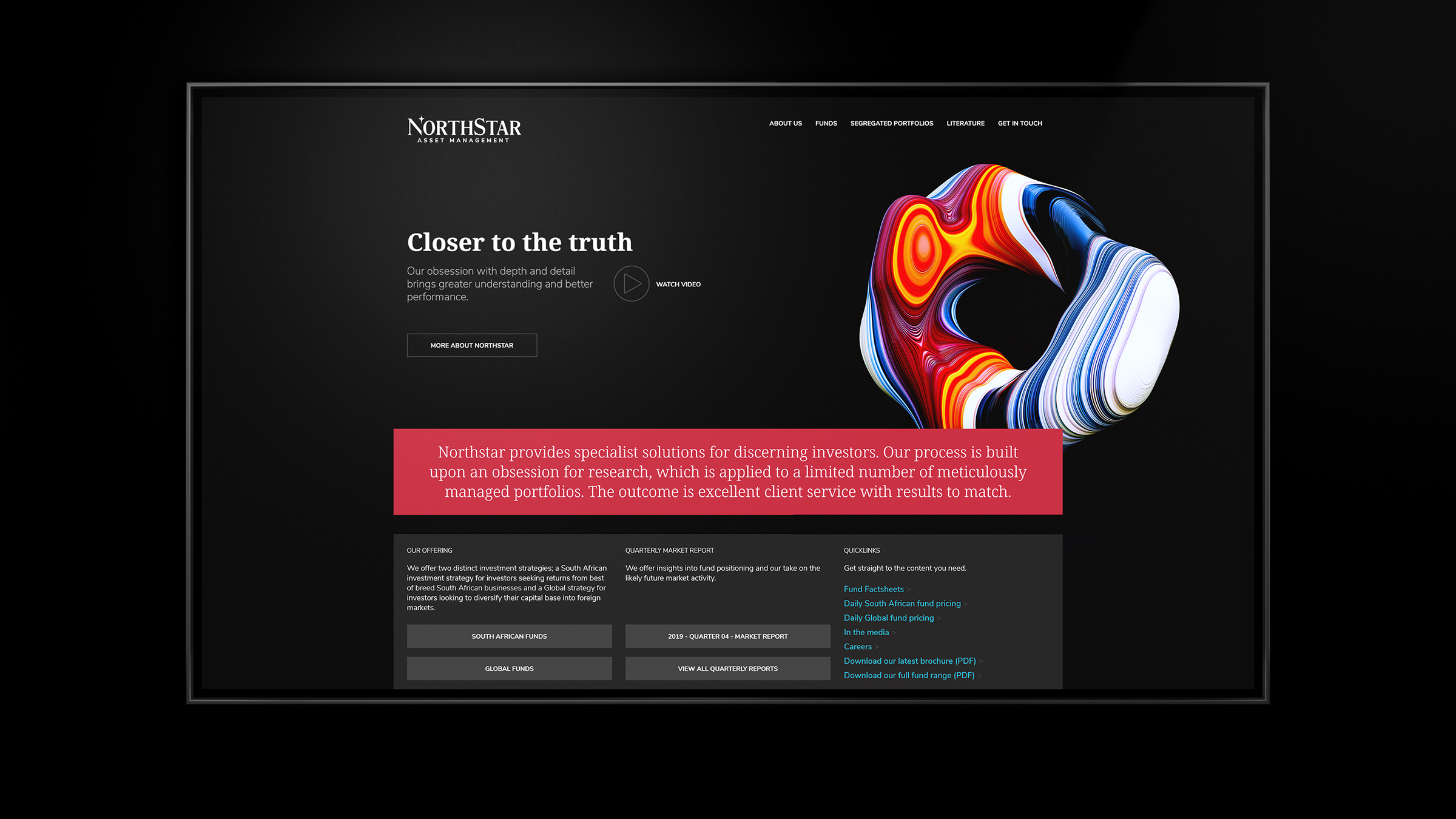
The home page of the site articulates the overall positioning front and center.
-
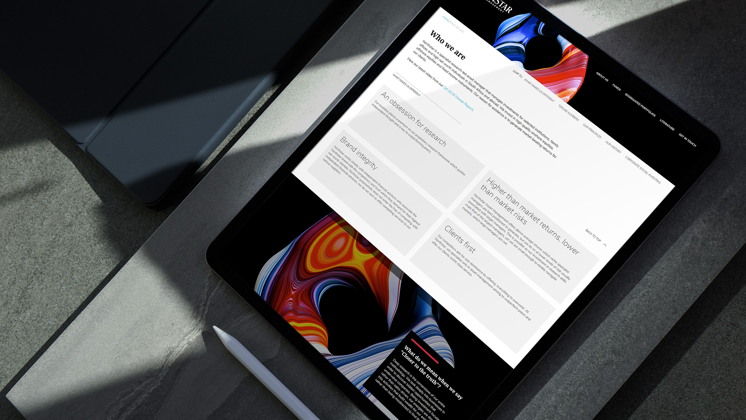
Our website is built to reflect the brand in any device or format.
-
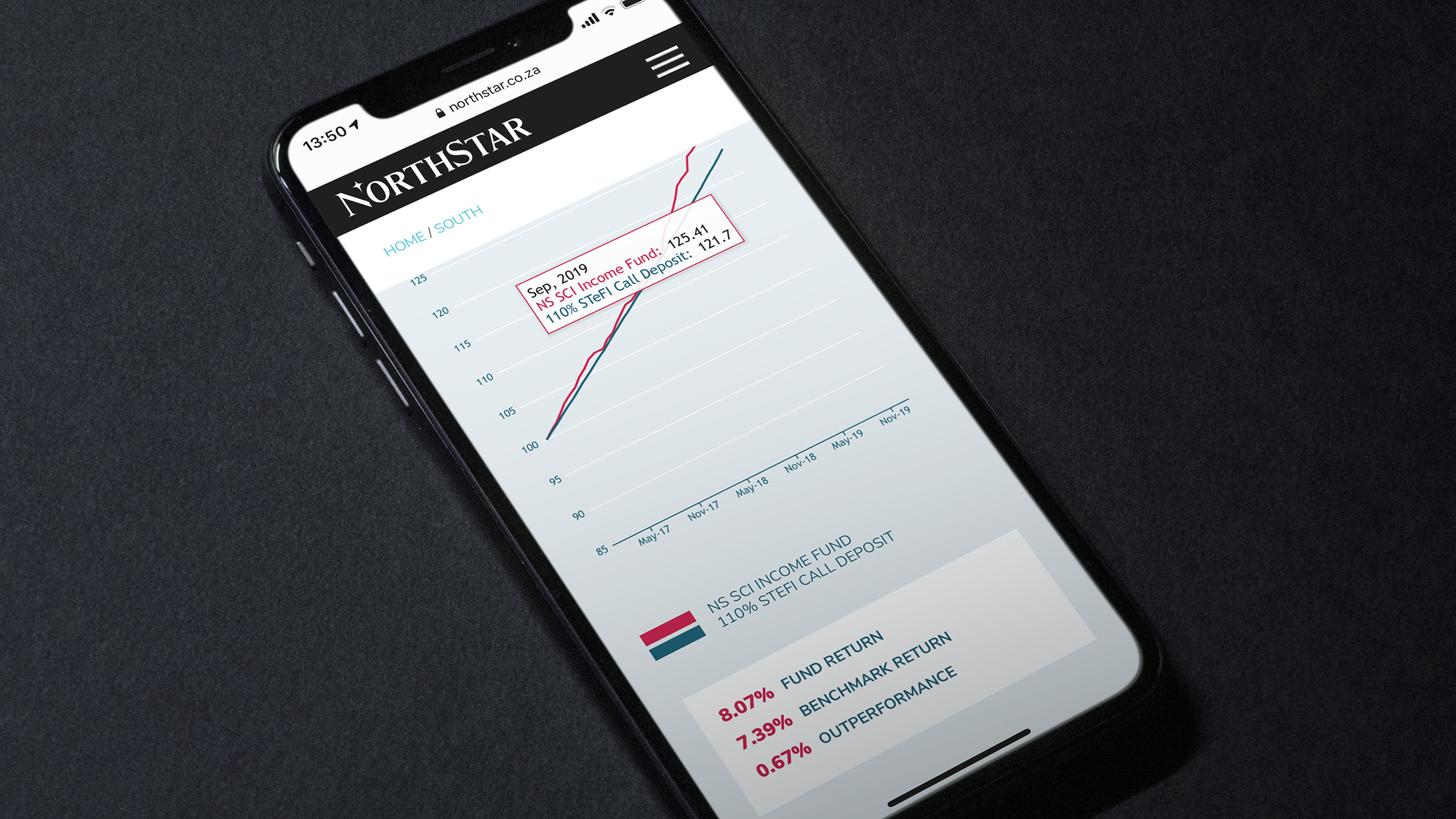
Rendering the charts in the mobile format was always going to be tricky!
-
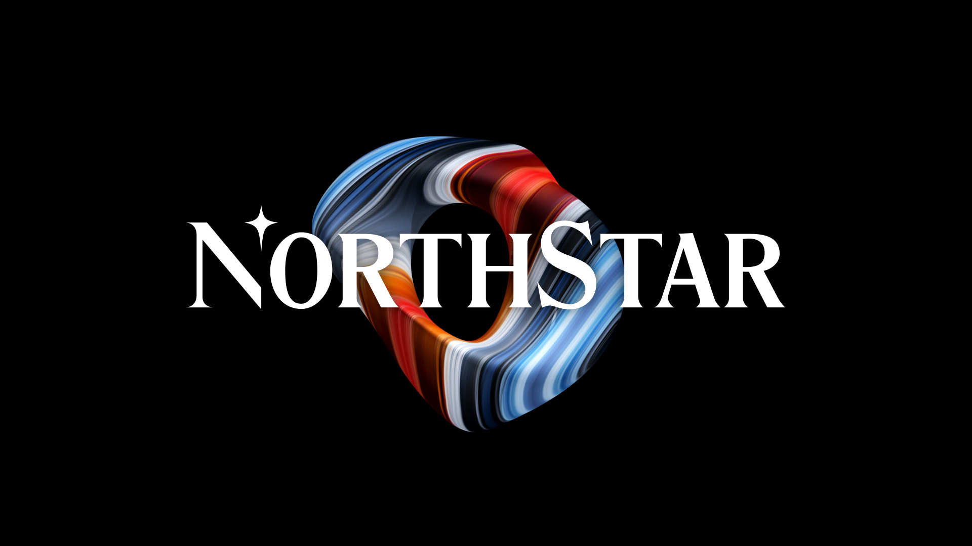
A still from the animated 3D ident.
-
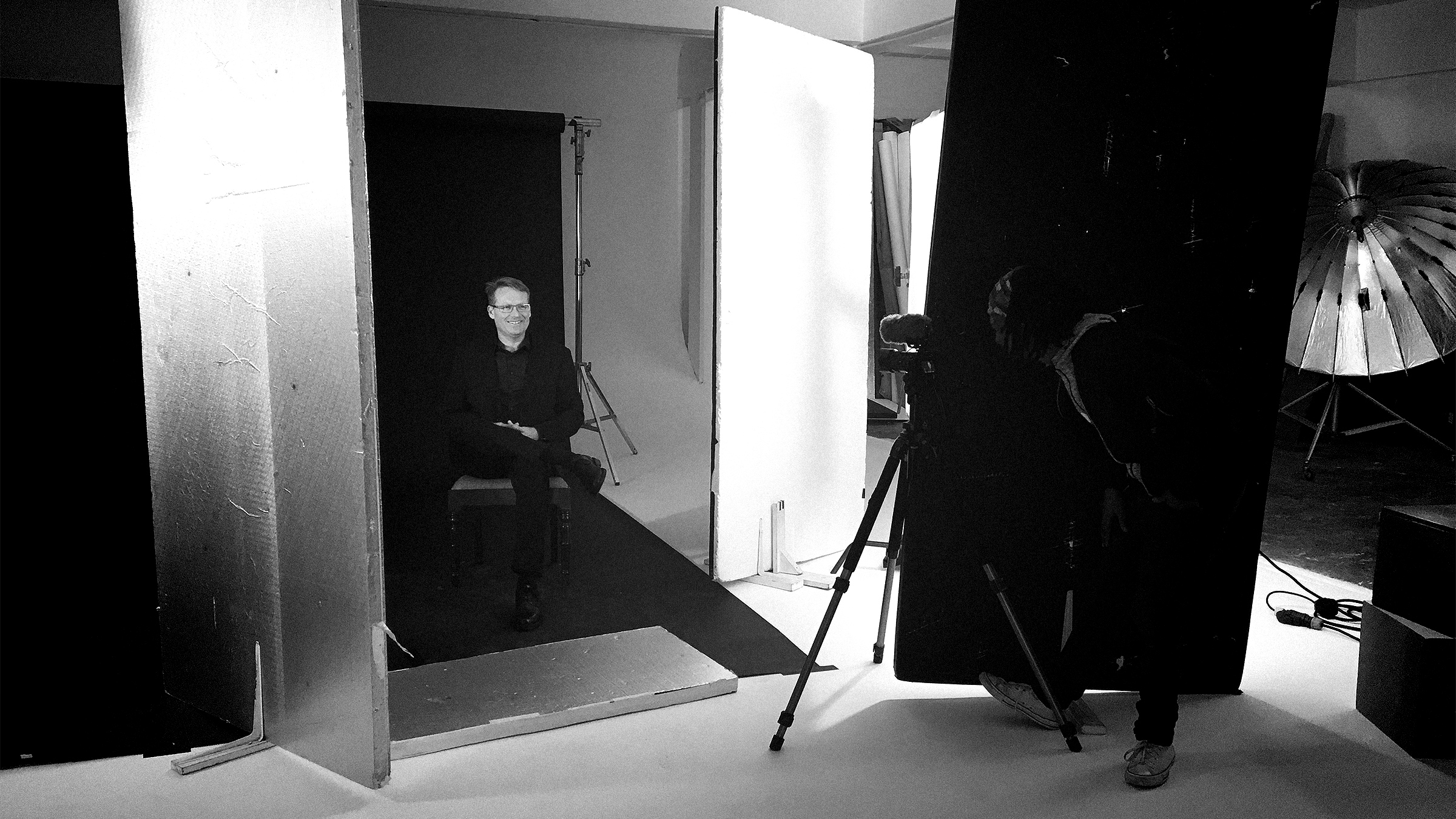
The NorthStar team are filmed in order to narrate the "Closer to the Truth" narrative.
-
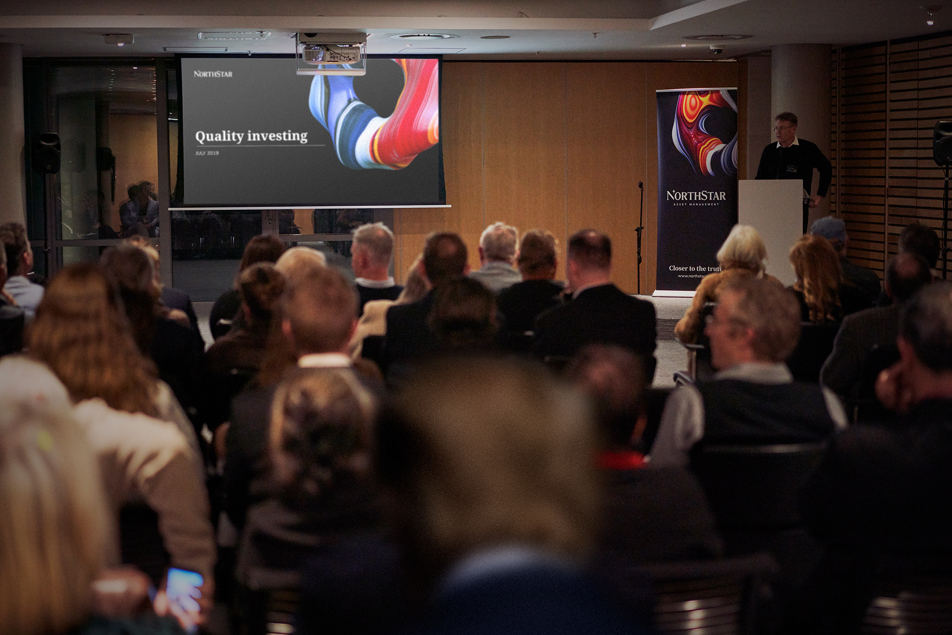
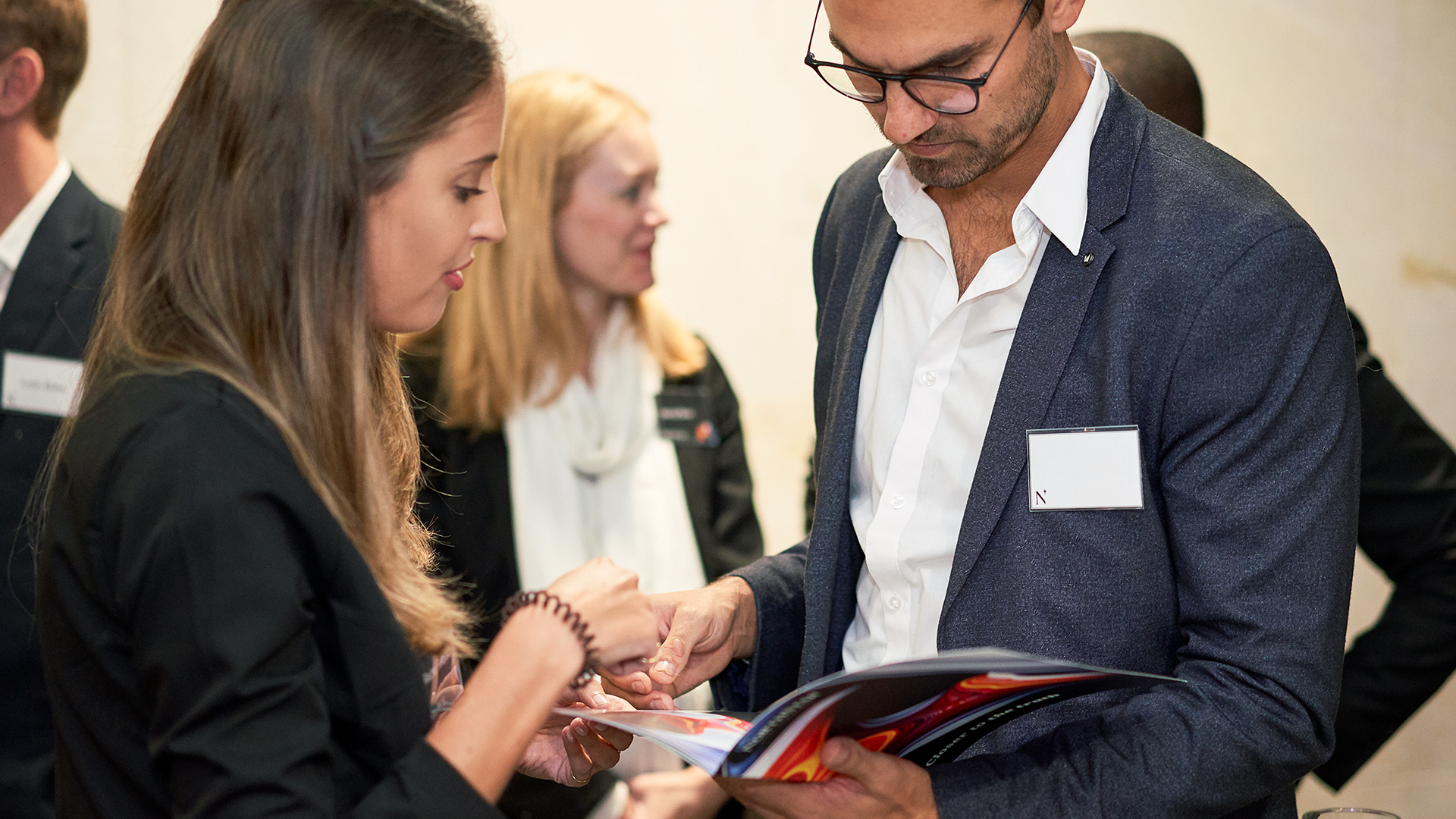
The launch event in the center of Cape Town.
-
Explaining how Northstar adds value.