-
-

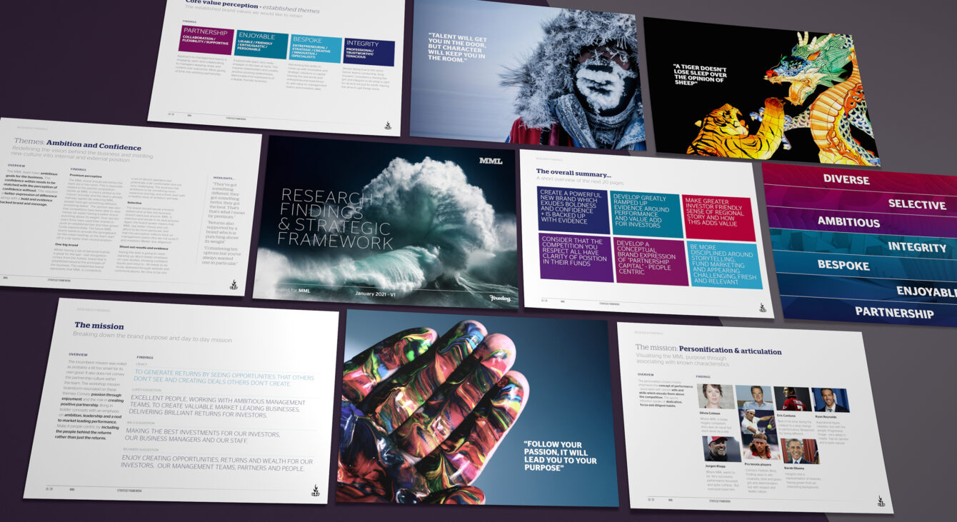
The brand strategic framework created for MML governs future brand positioning
-
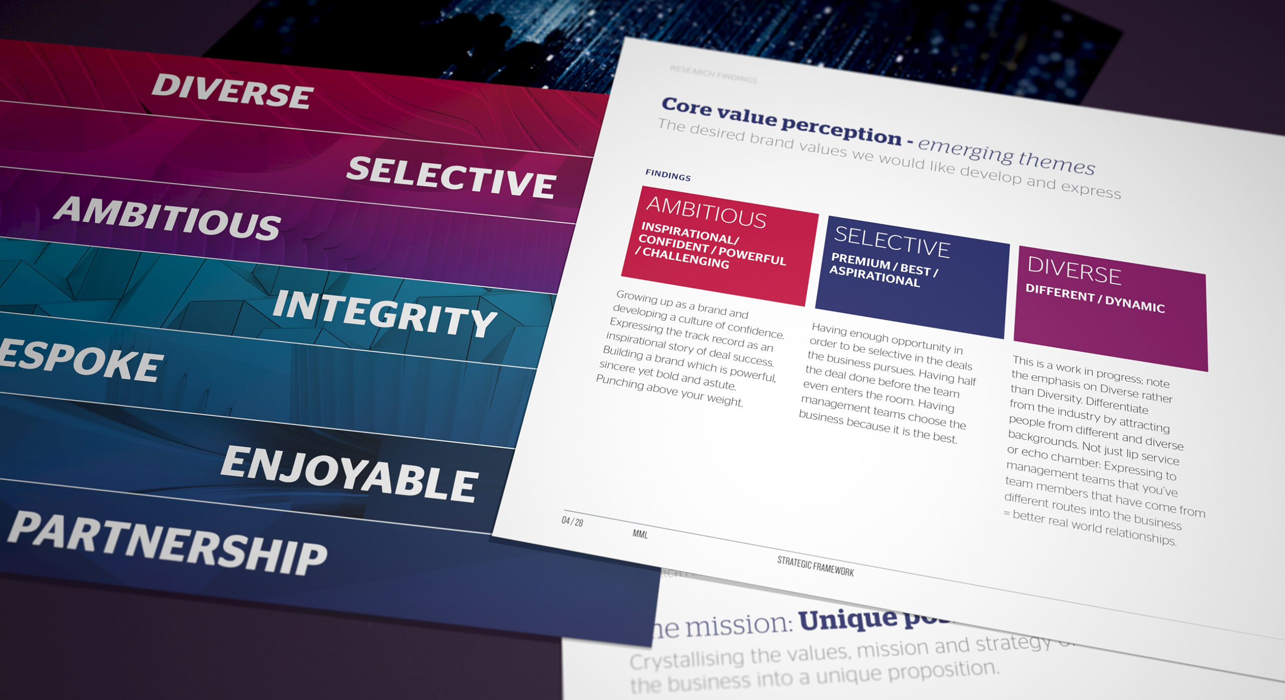
We built a brand value suite based on a pairing of established and emerging themes. This considers both the strengths of the past and also future brand ambitions.
-
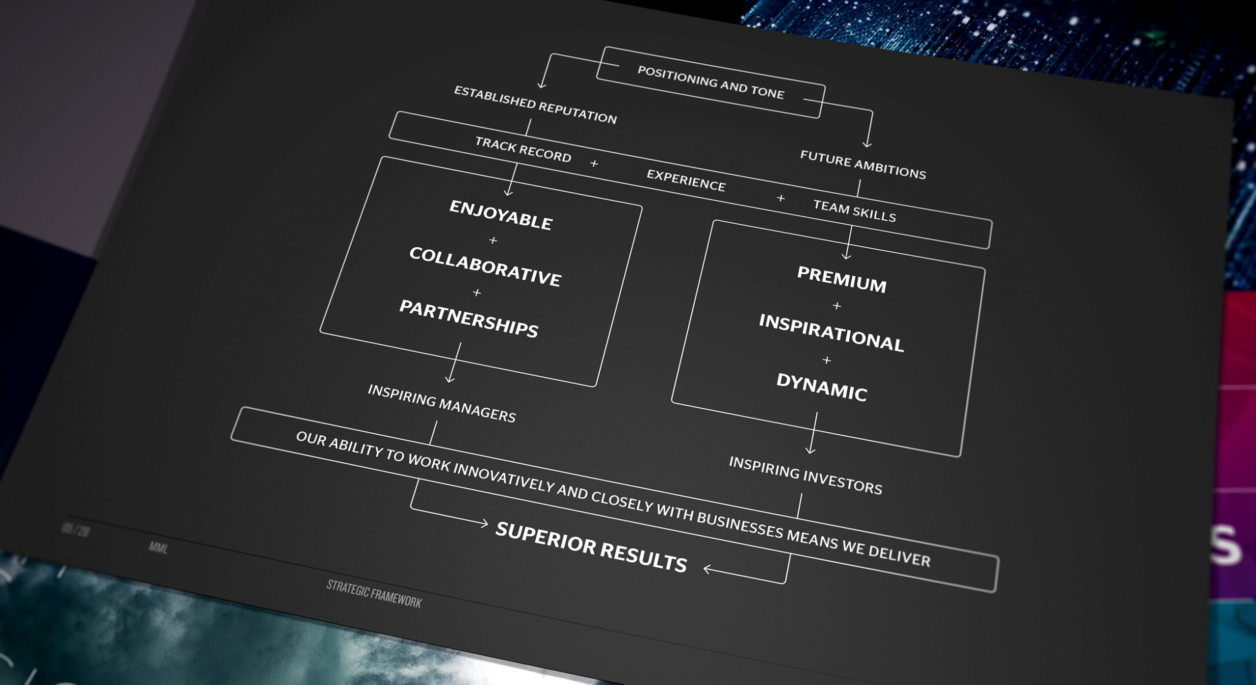
The brand positioning strikes a careful balance between management teams and investors.
-
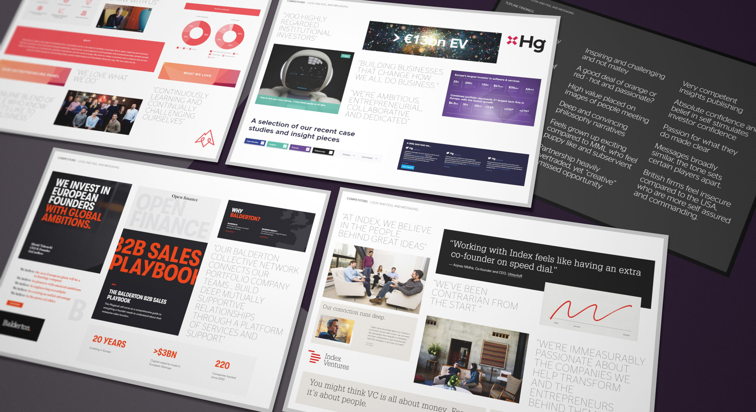
A study of the competitive landscape assists in developing a unique sector brand positioning.
-
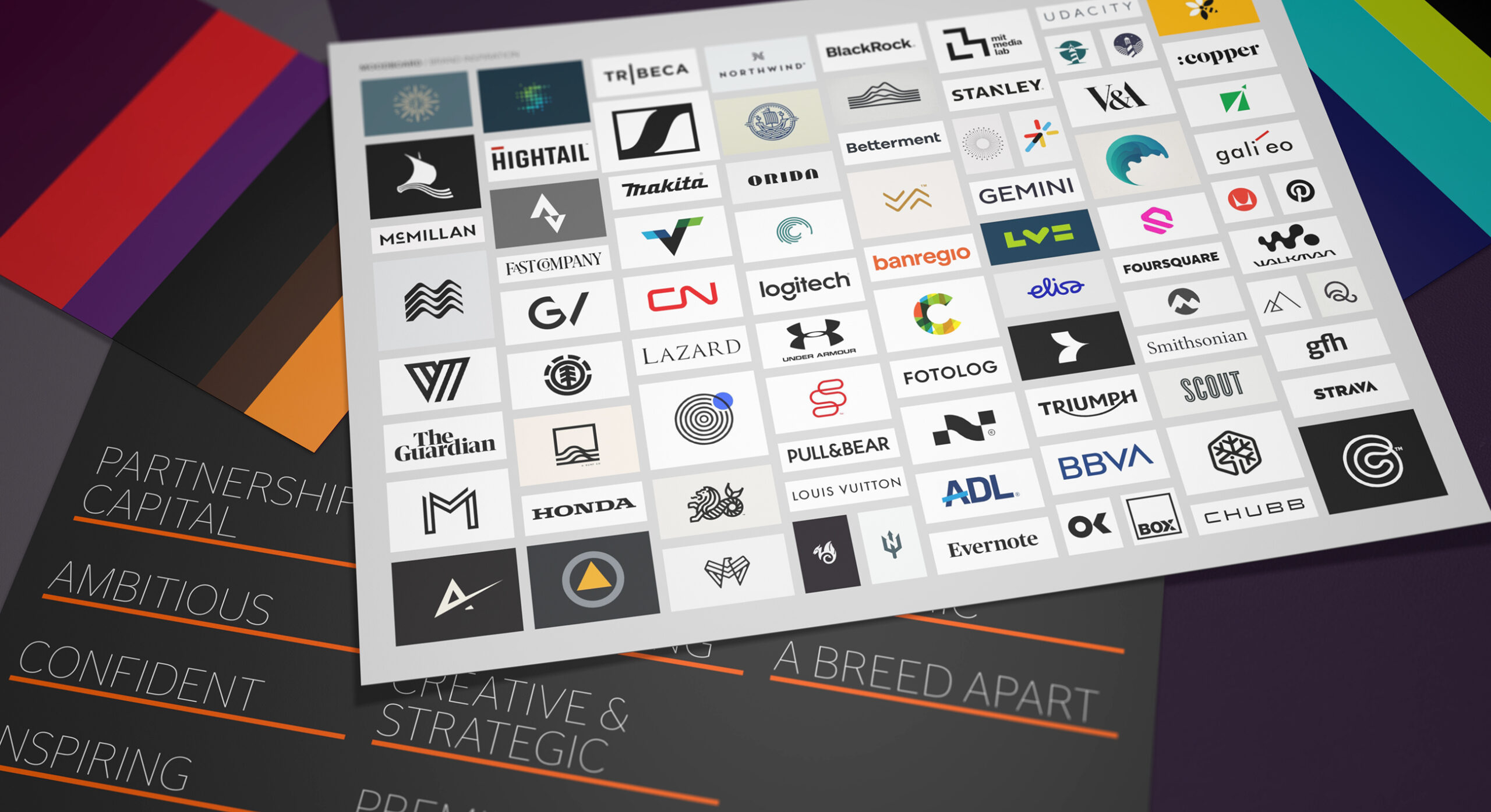
Creating a moodboard of established brand icons helps steer the desired visual brand aesthetic.
-
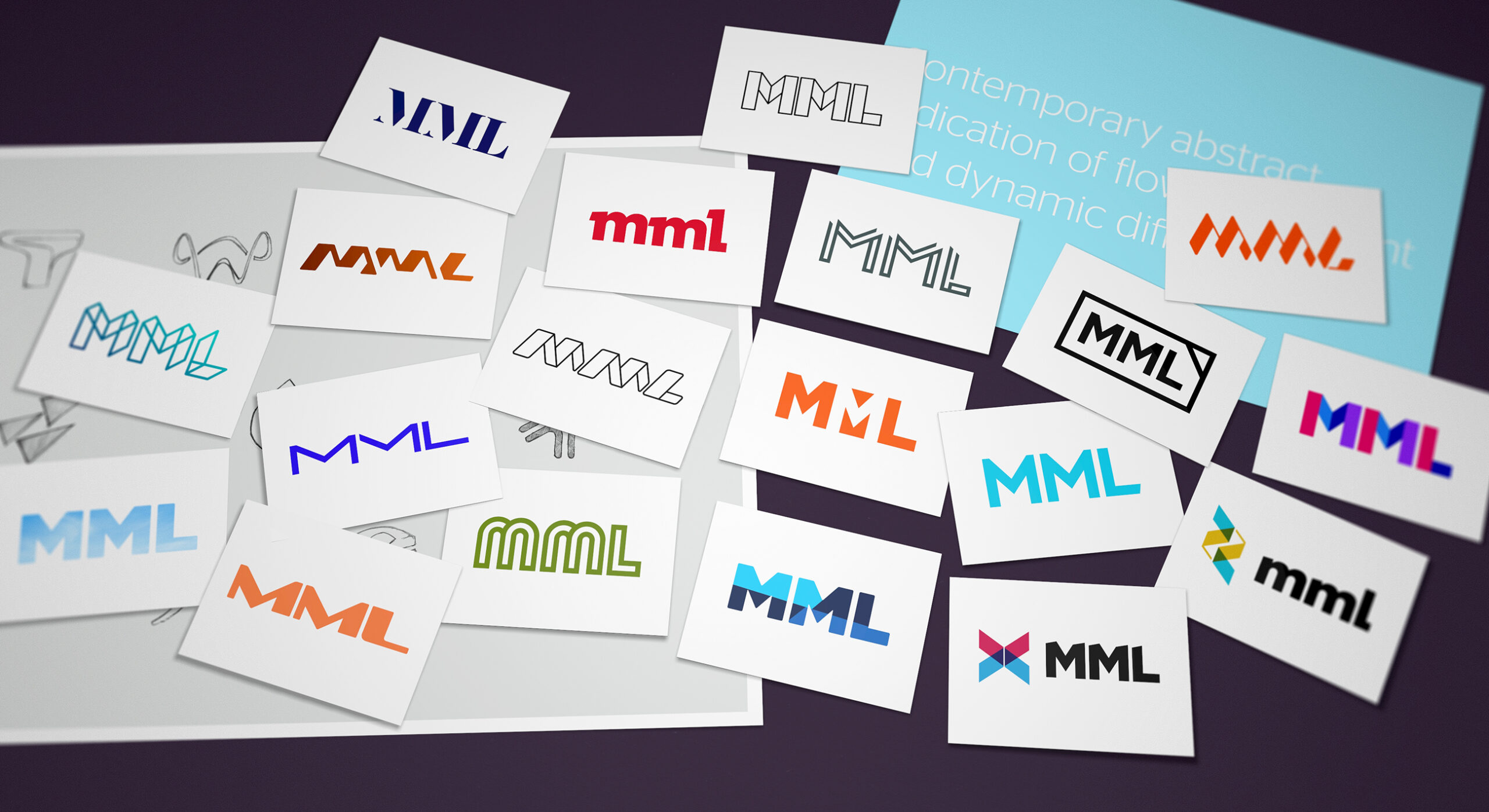
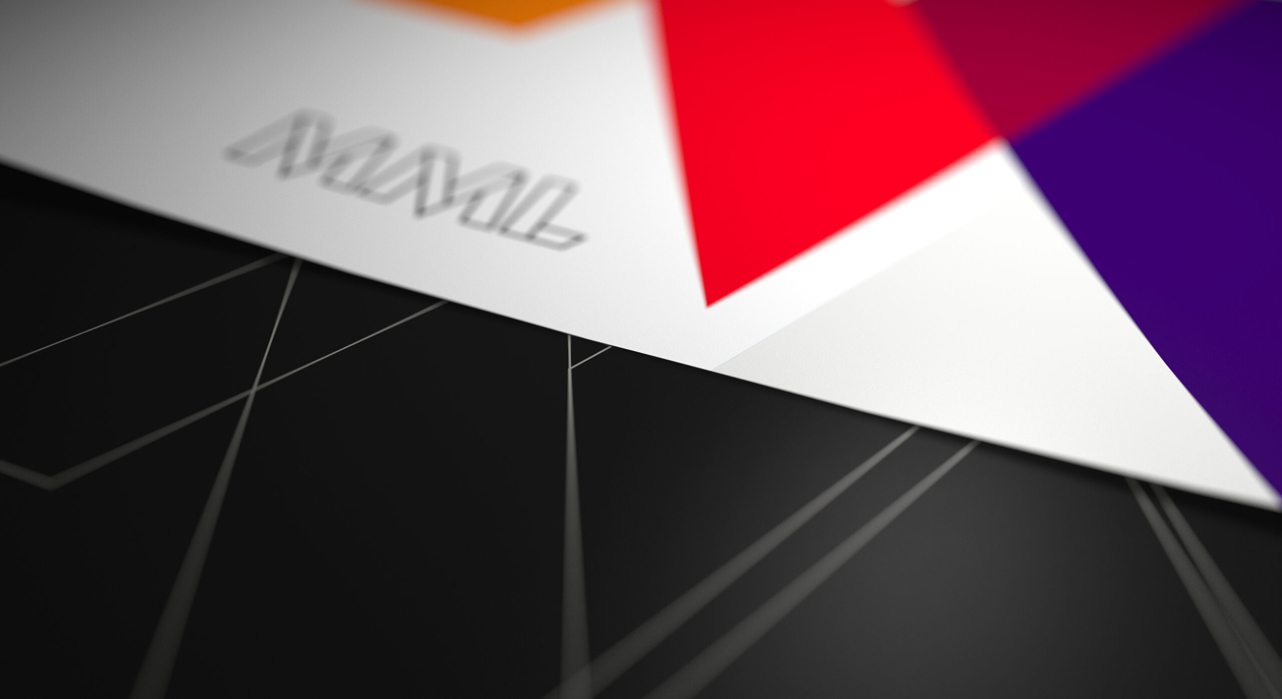
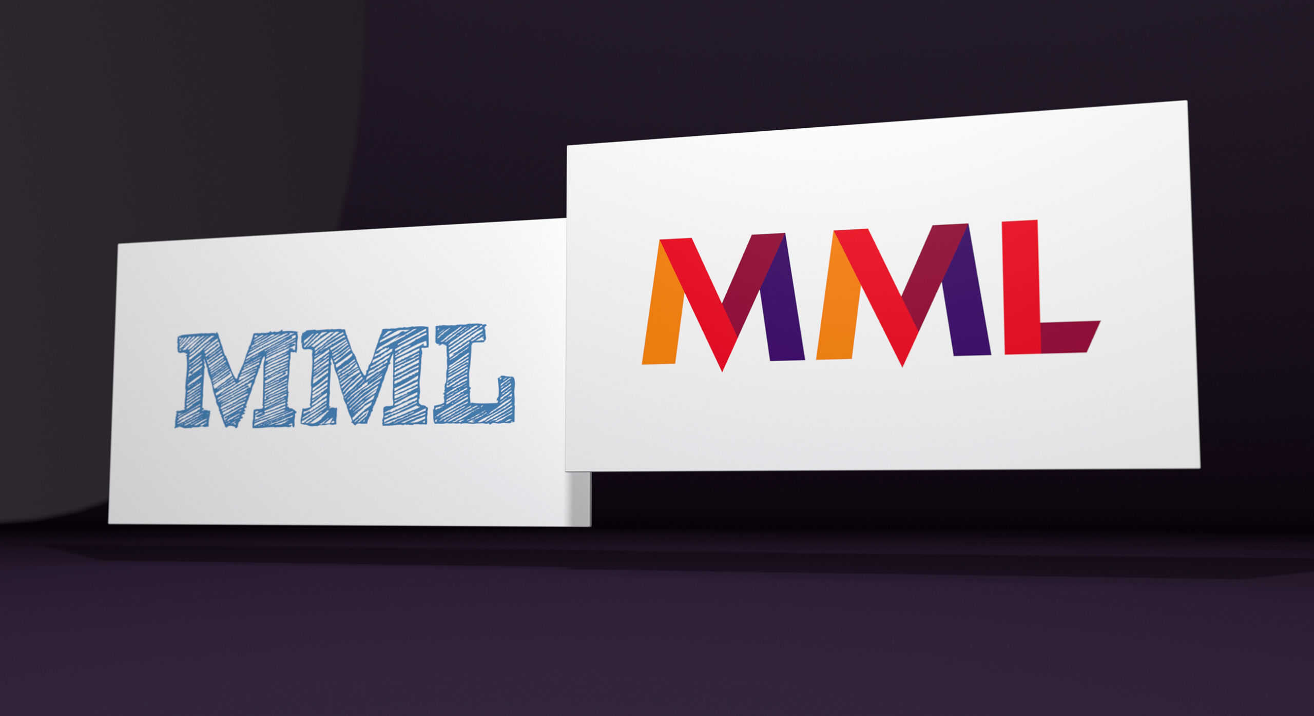
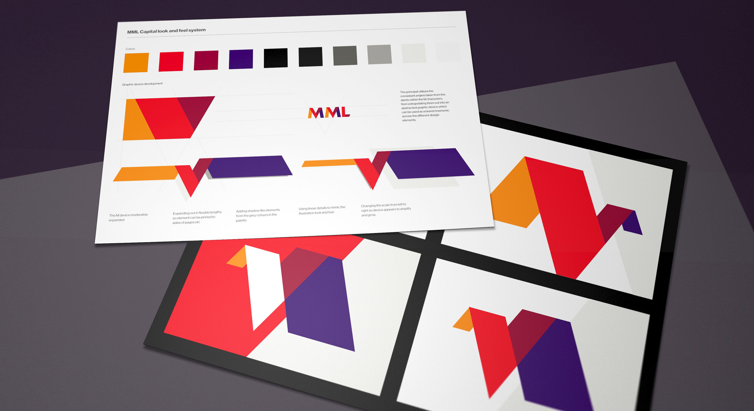
The MML brand name is deeply entrenched. In order to evolve the acronym we sought to fully explore all typographic potential.
-
We presented a variety of brand and visual identity concepts in order to explore visual tone and flavour.
-
When creating branding concepts, we always seek to provide the client with a range of design explorations; from classic to uber-contemporary.
-
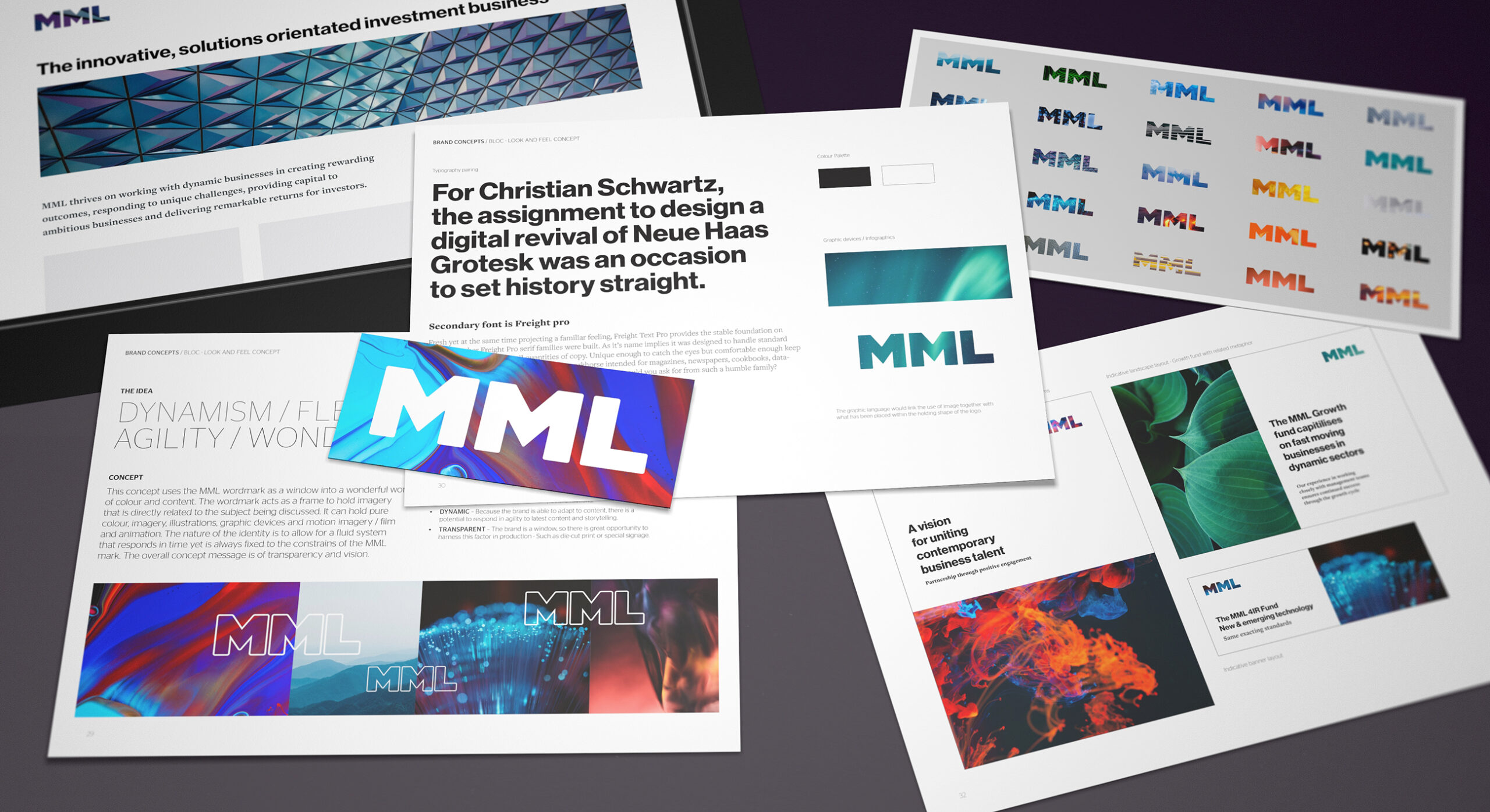
Colour is such a powerful tool in the brand armoury. Here we explore tones from serious to more expressive.
-
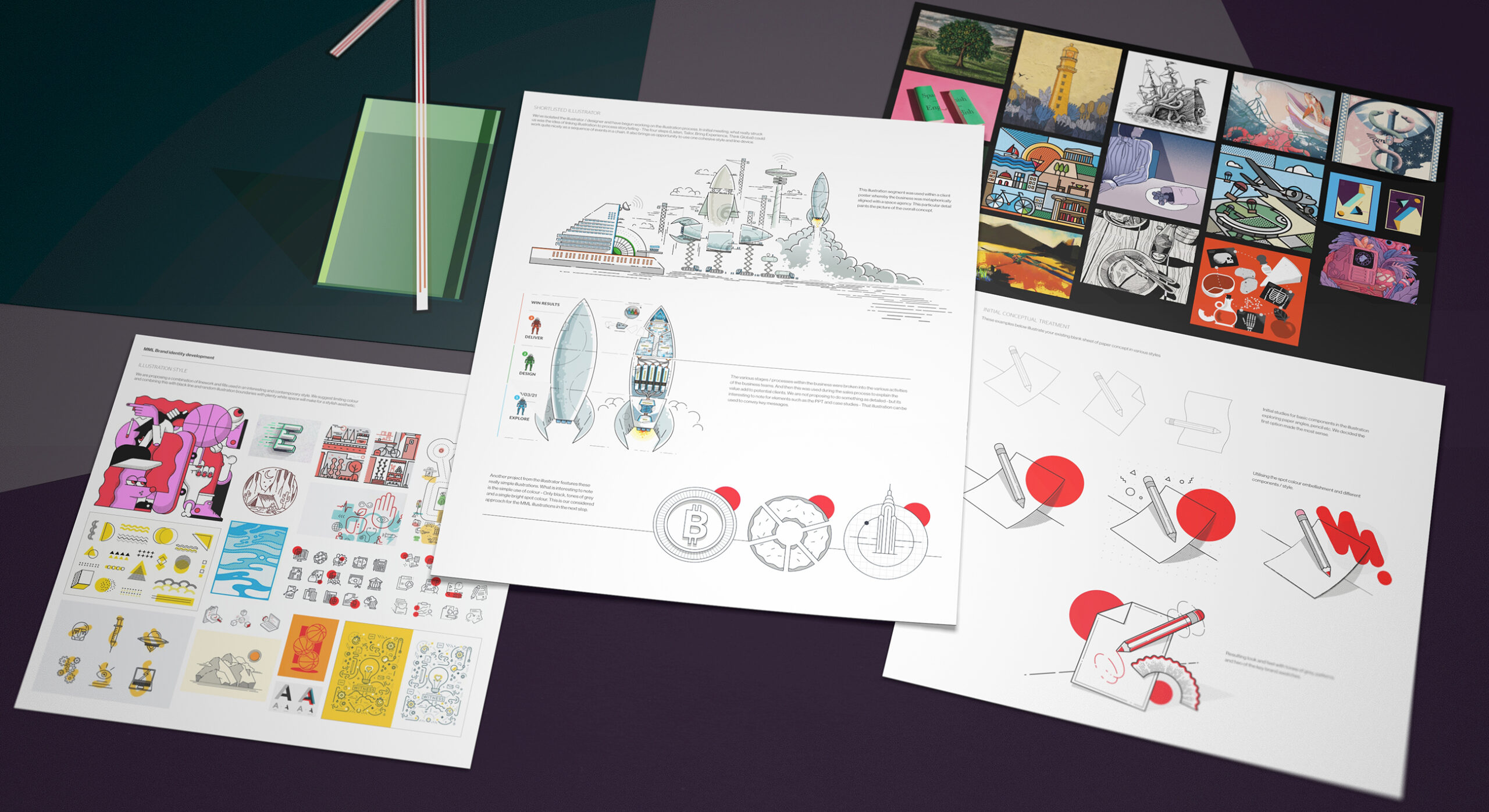
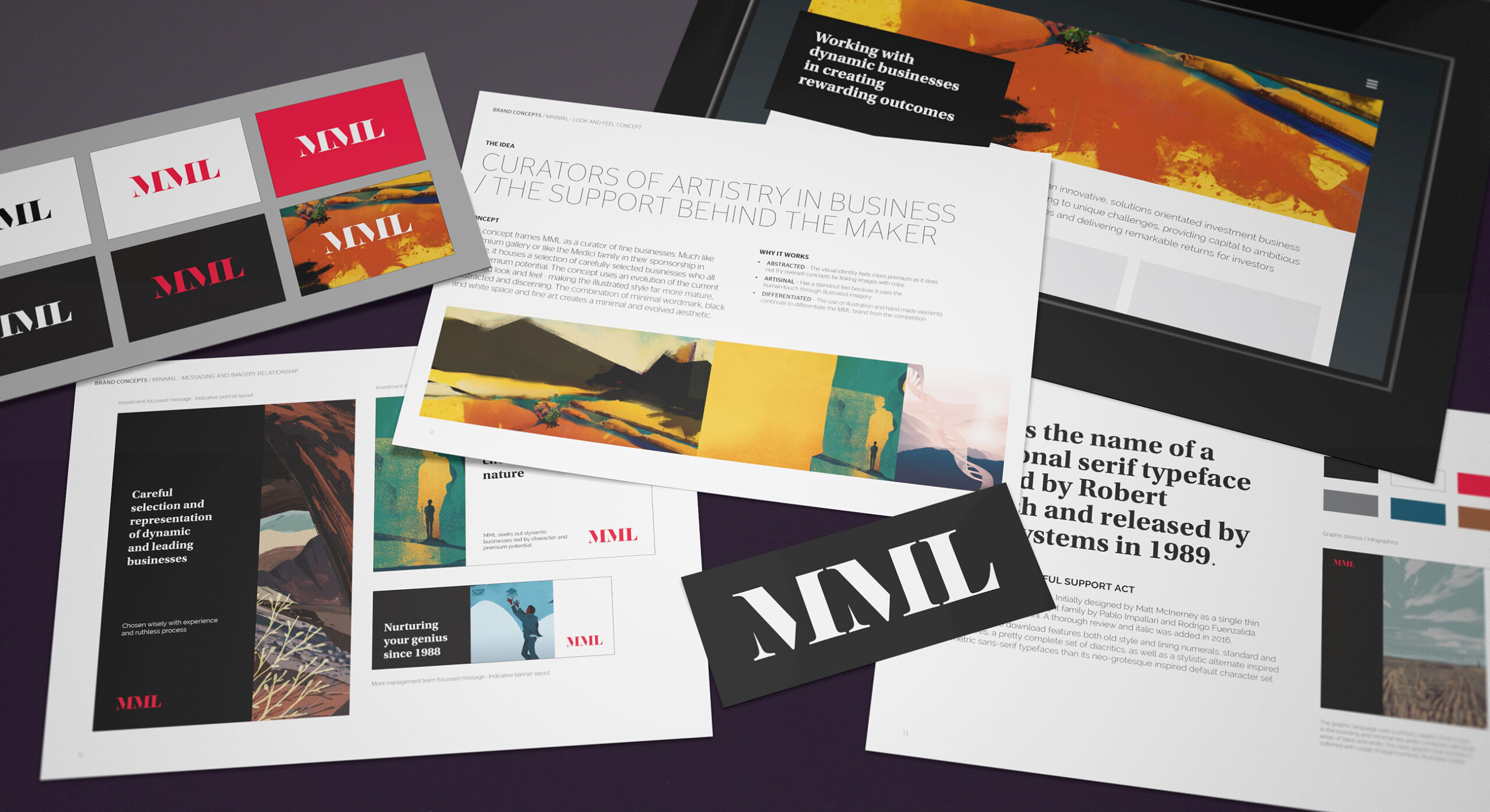
We wanted to add further character to the brand storytelling. We proposed the use of illustrated assets to the client in order to add interest to branded content.
-
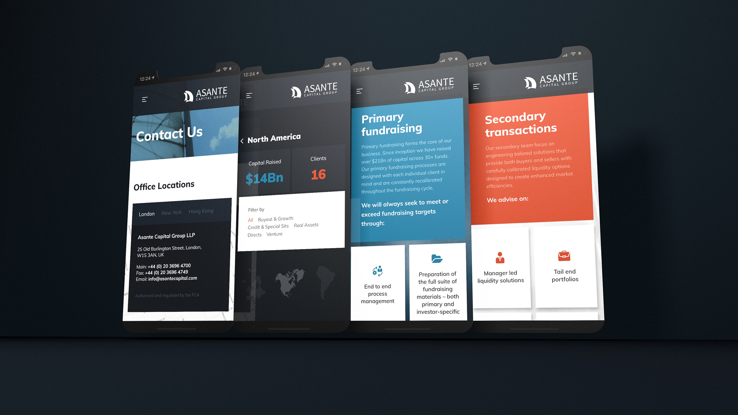
The subsequent stage of digital branding and website design is considered early within the branding exploration in order to ensure continuity and cohesion.
-
We use a combination of bold colour coupled with neutral black and white tones in order to ensure standout without venturing into garish territory.
-

The shortlisted brand logotype is rendered in both full colour and monochrome. The brand is used with or without the sector positioning.
-
The MML business had evolved so much since the previous brand development. We created a more mature and slick position, yet sought to embody it with a bright tone.
-
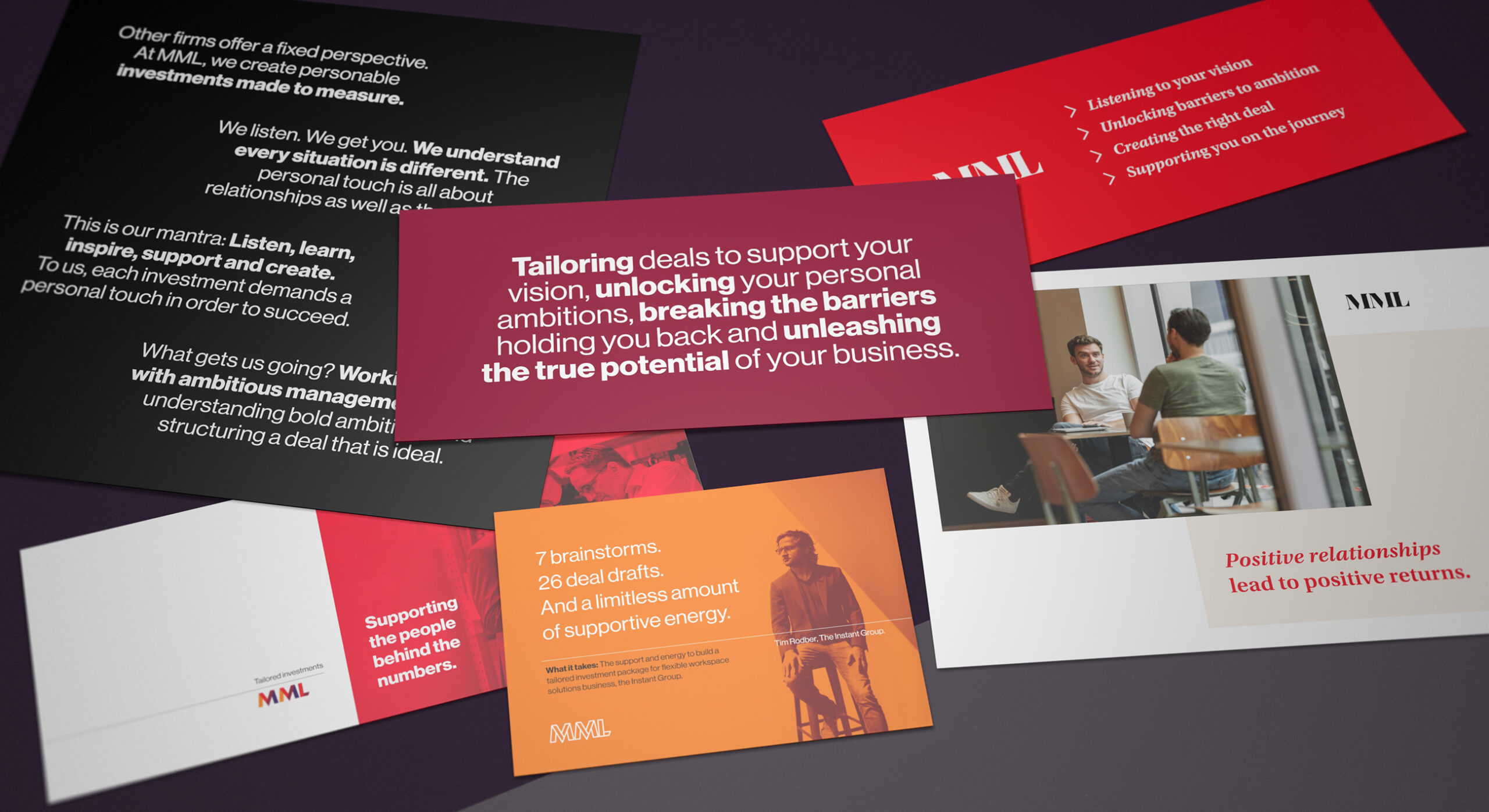
The articulation of brand developed into the succinct: Tailored Investments. This is supported with a number of value statements. We call these the Pillars of Reason insofar as they support the rationale of the top level positioning.
-
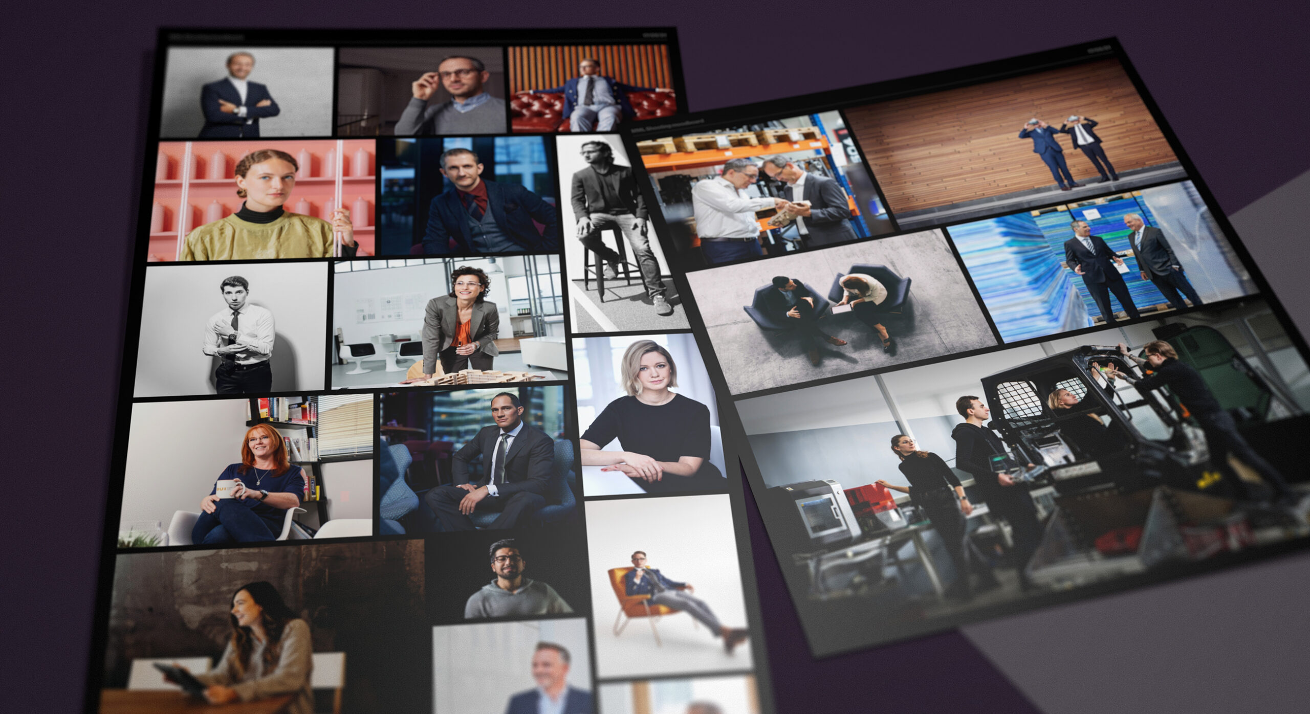
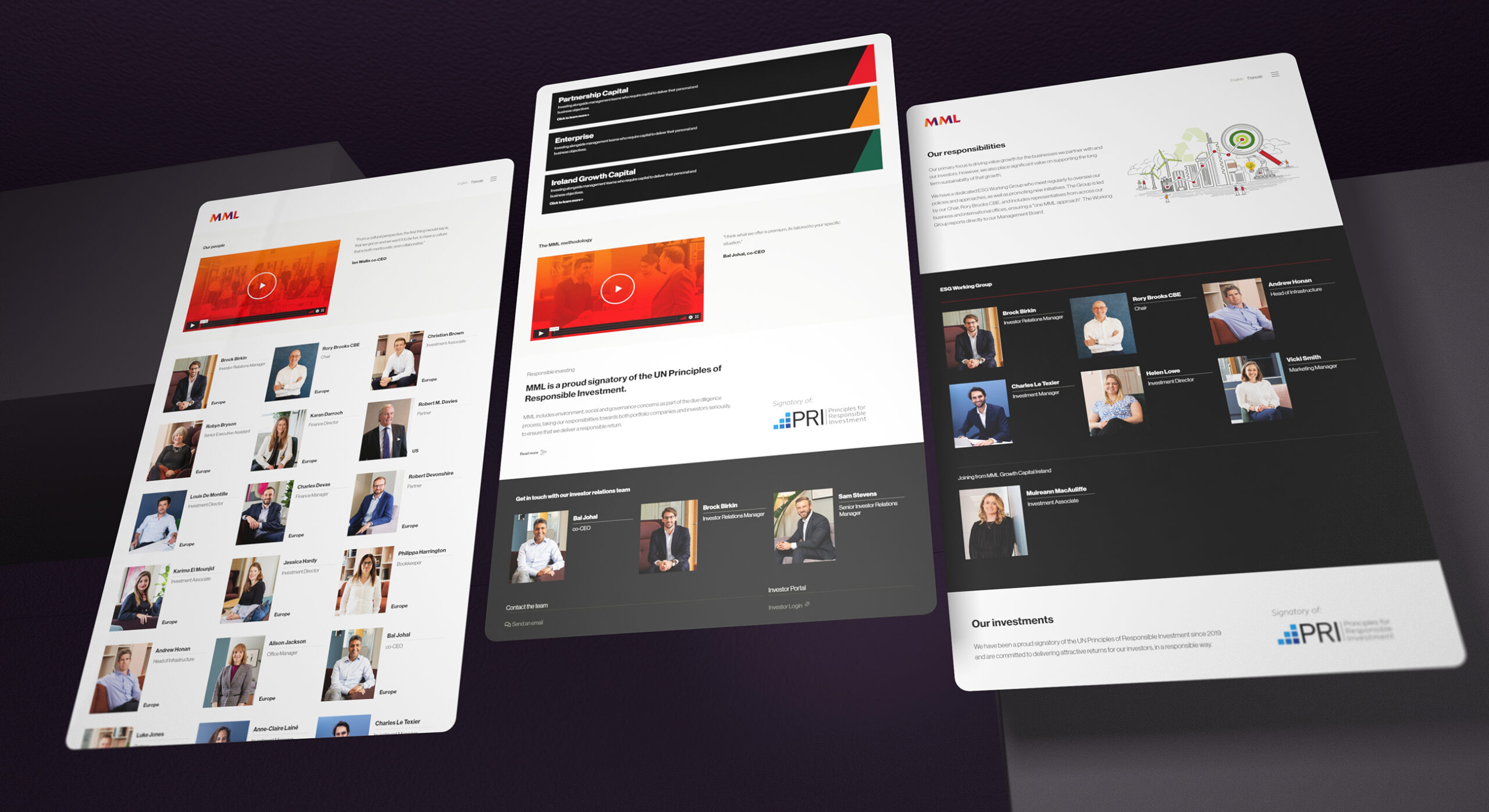
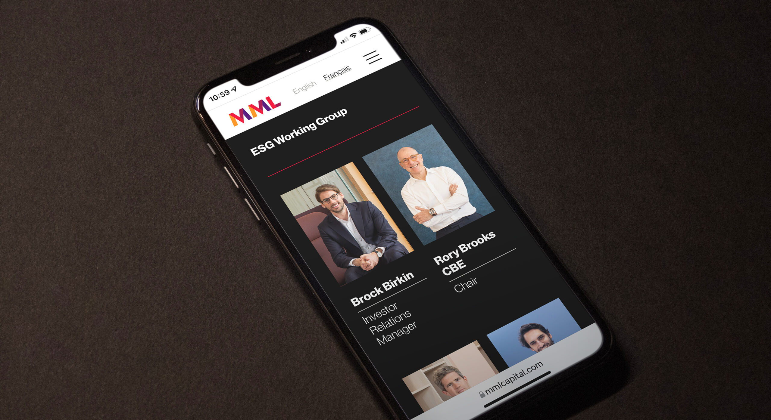
We decided to showcase both staff and management team imagery in order to convey authenticity and proof of living the brand on a daily basis. Commissioned portraiture is combined with Q&A interviews, testimonials and personable storytelling.
-
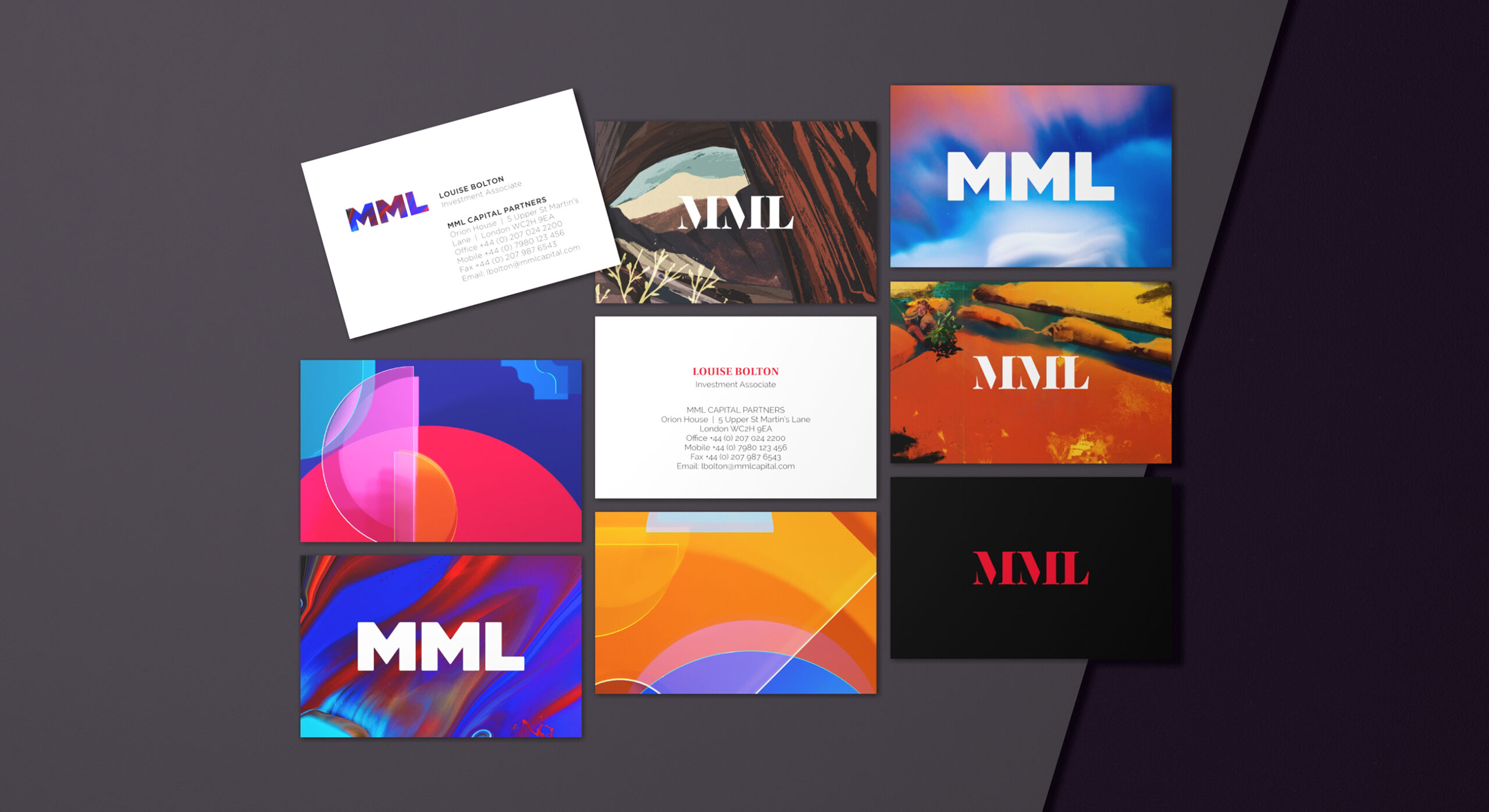
The brand visual identity is supported by secondary graphic assets. These are used in print applications such as stationery, communications and PPT design.
-
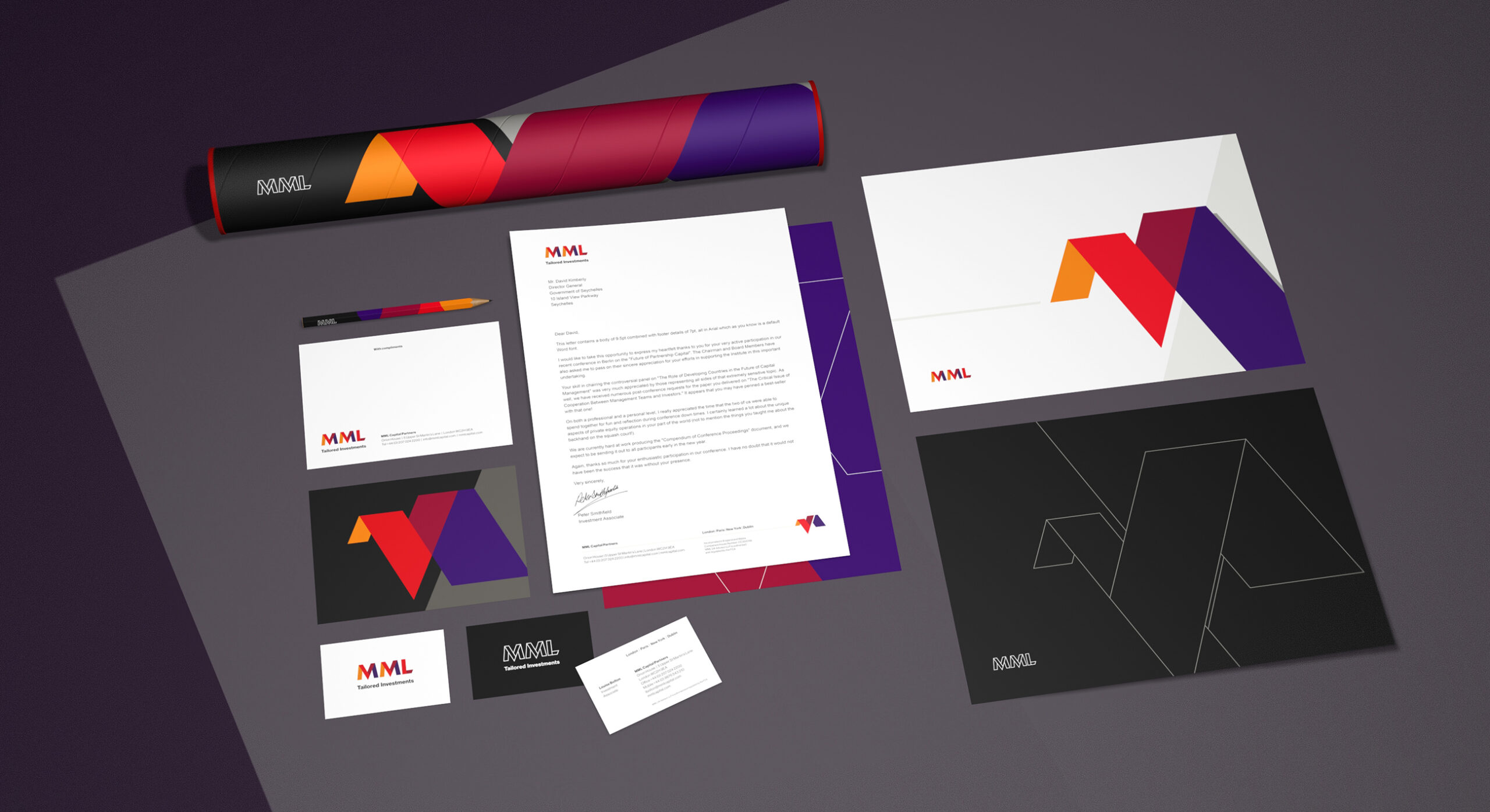
The combination of complimentary colours and graphic devices creates a cohesive brand look and feel.
-
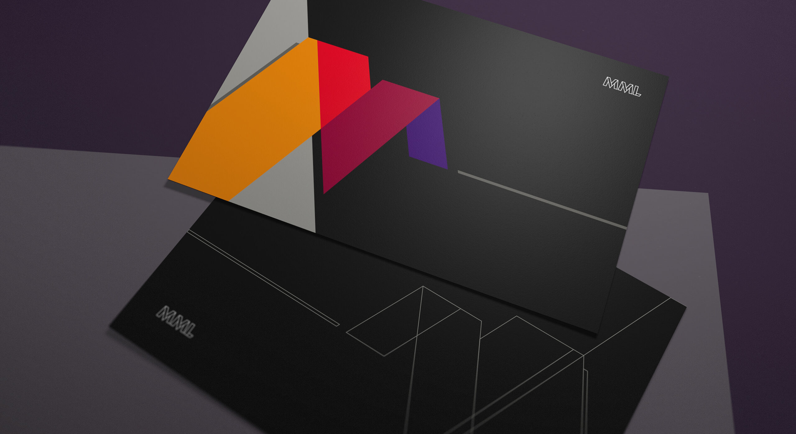
A combination of light and dark tones are applied to the PPT and proposal cover sheets. For example, front cover in white and back cover in black. This adds depth and interest.
-
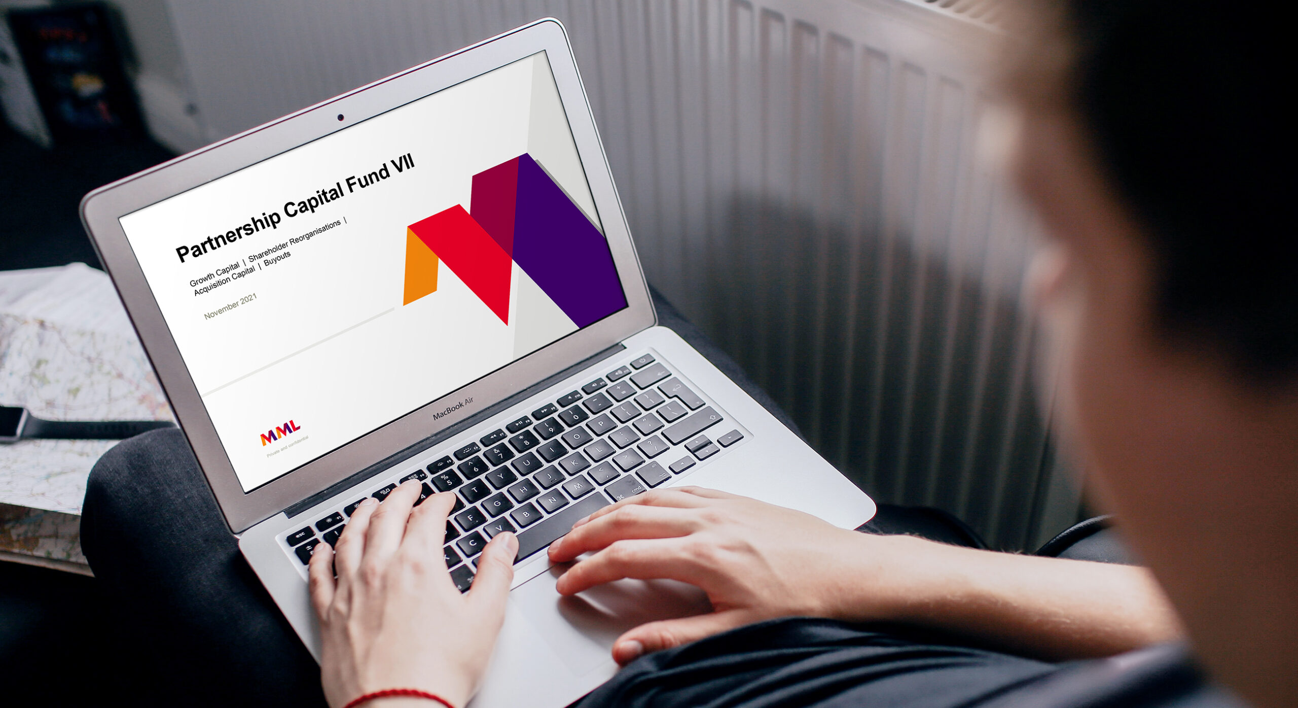
The MML team use PowerPoint on a daily basis. It is imperative that the brand is supported by a comprehensive template file which covers a variety of layout formats.
-
The PowerPoint templates cover both brand storytelling as well as functional infographics design.
-
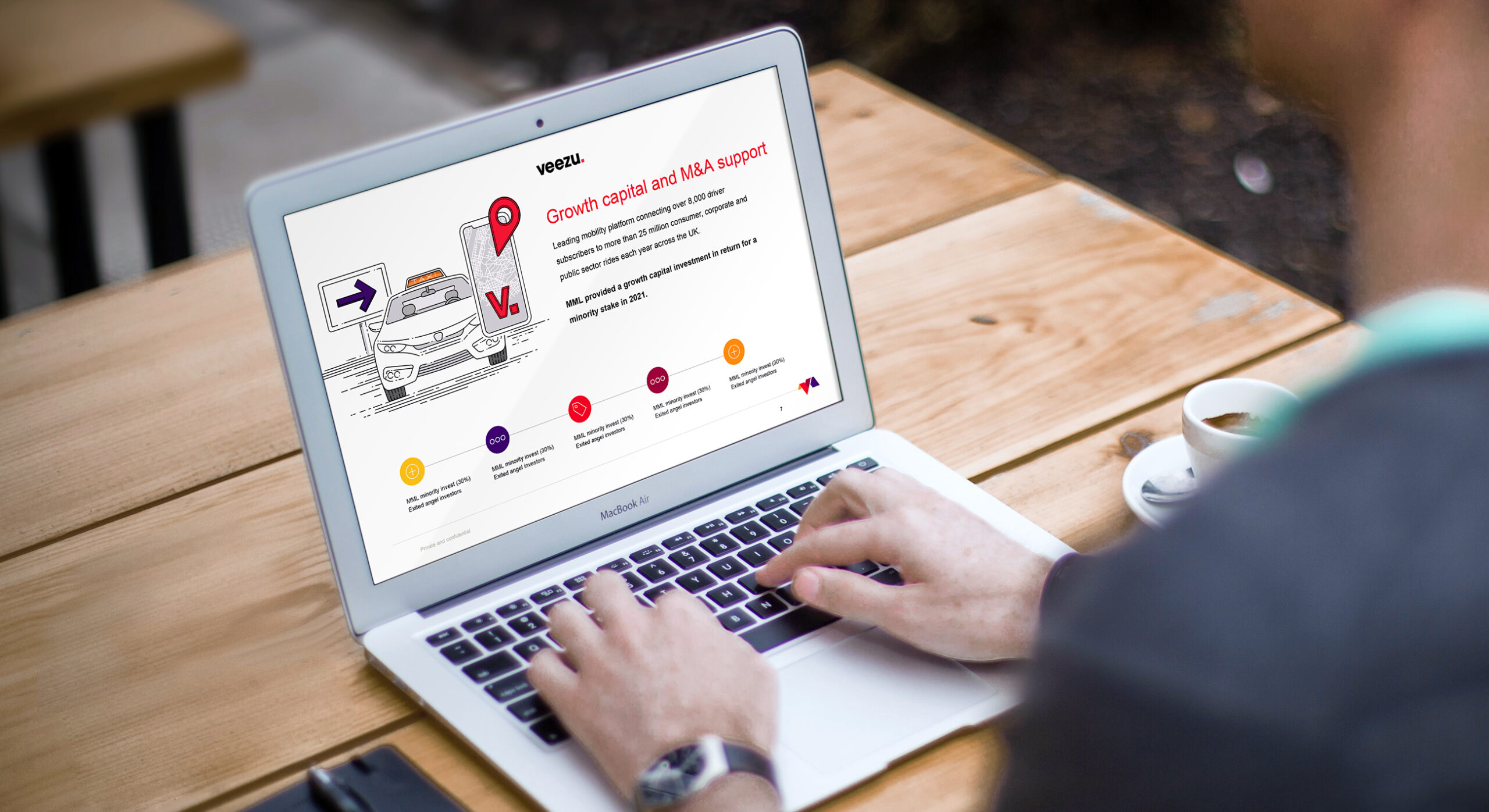
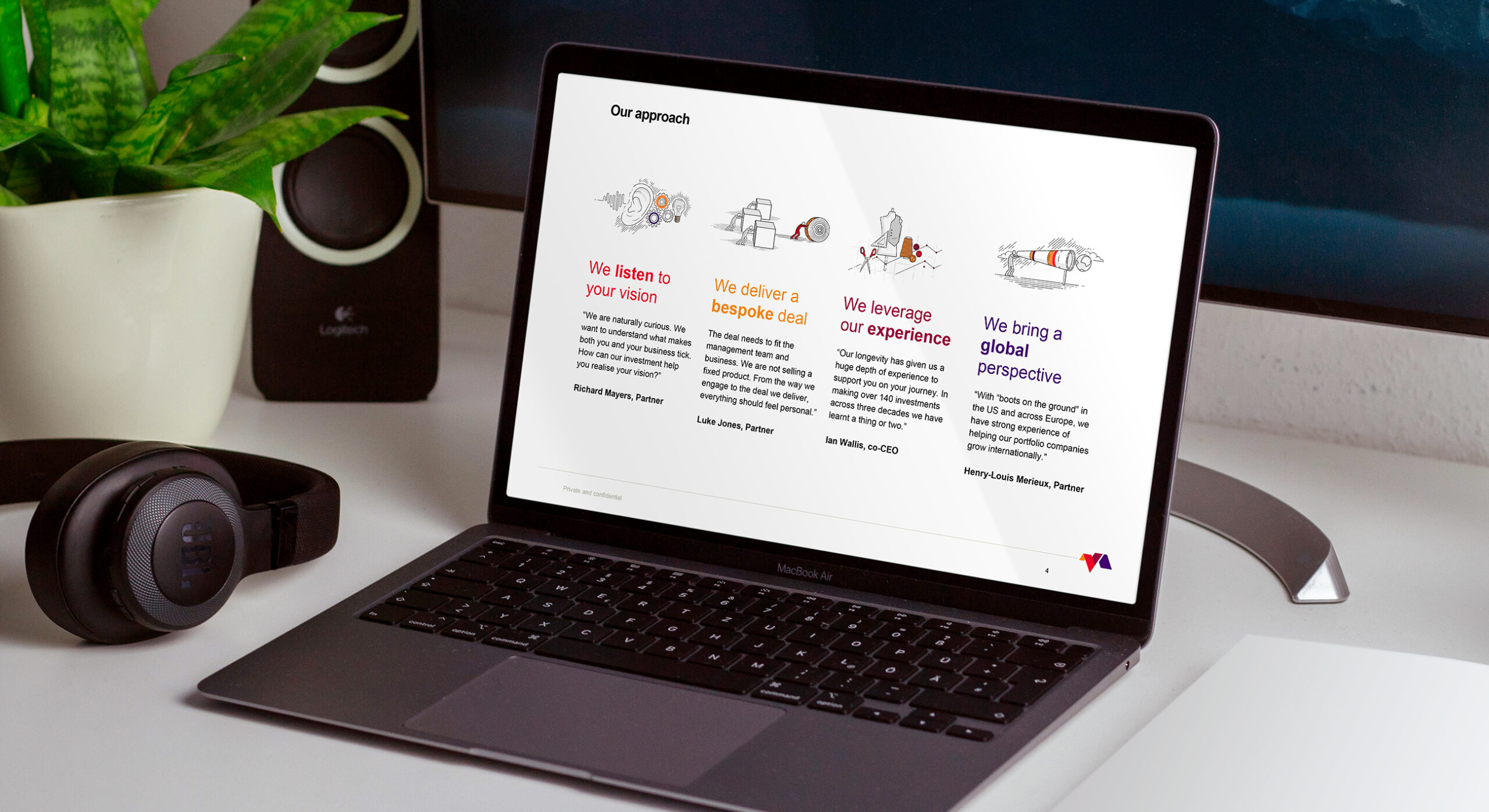
We created a number of unique illustrations for a selection of MML portfolio companies which are used across the website and business communications.
-
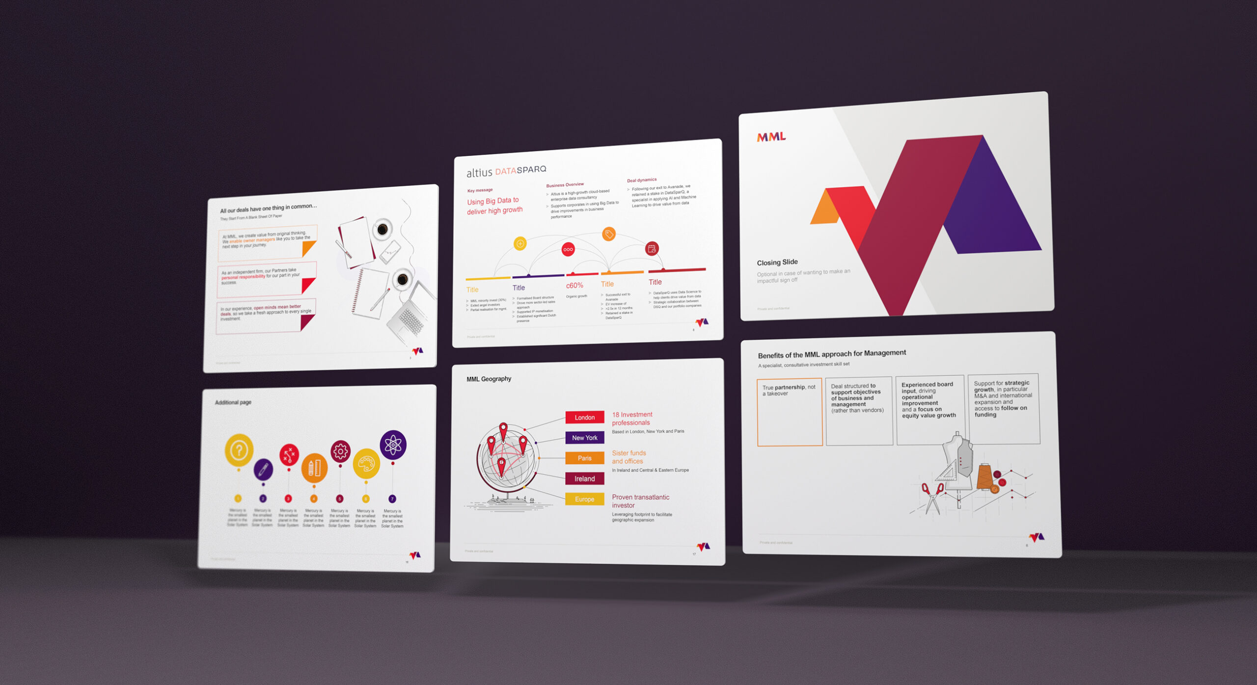
We provided the client with a 50+ page working PowerPoint book containing a myriad of page layouts and infographics.
-

-
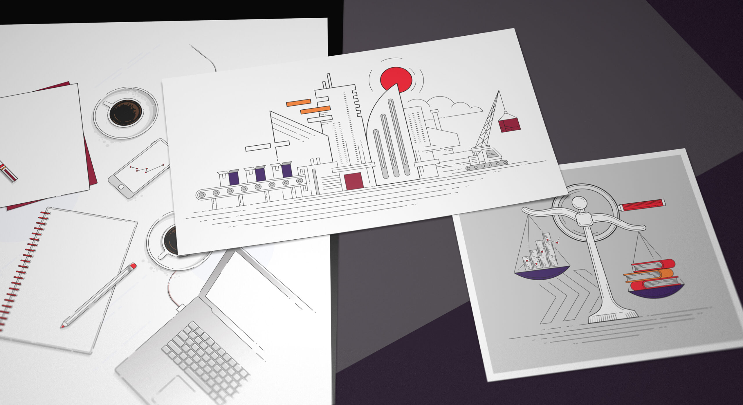
The illustrations are used to convey brand values, support for portfolio companies and also conceptual narratives.
-
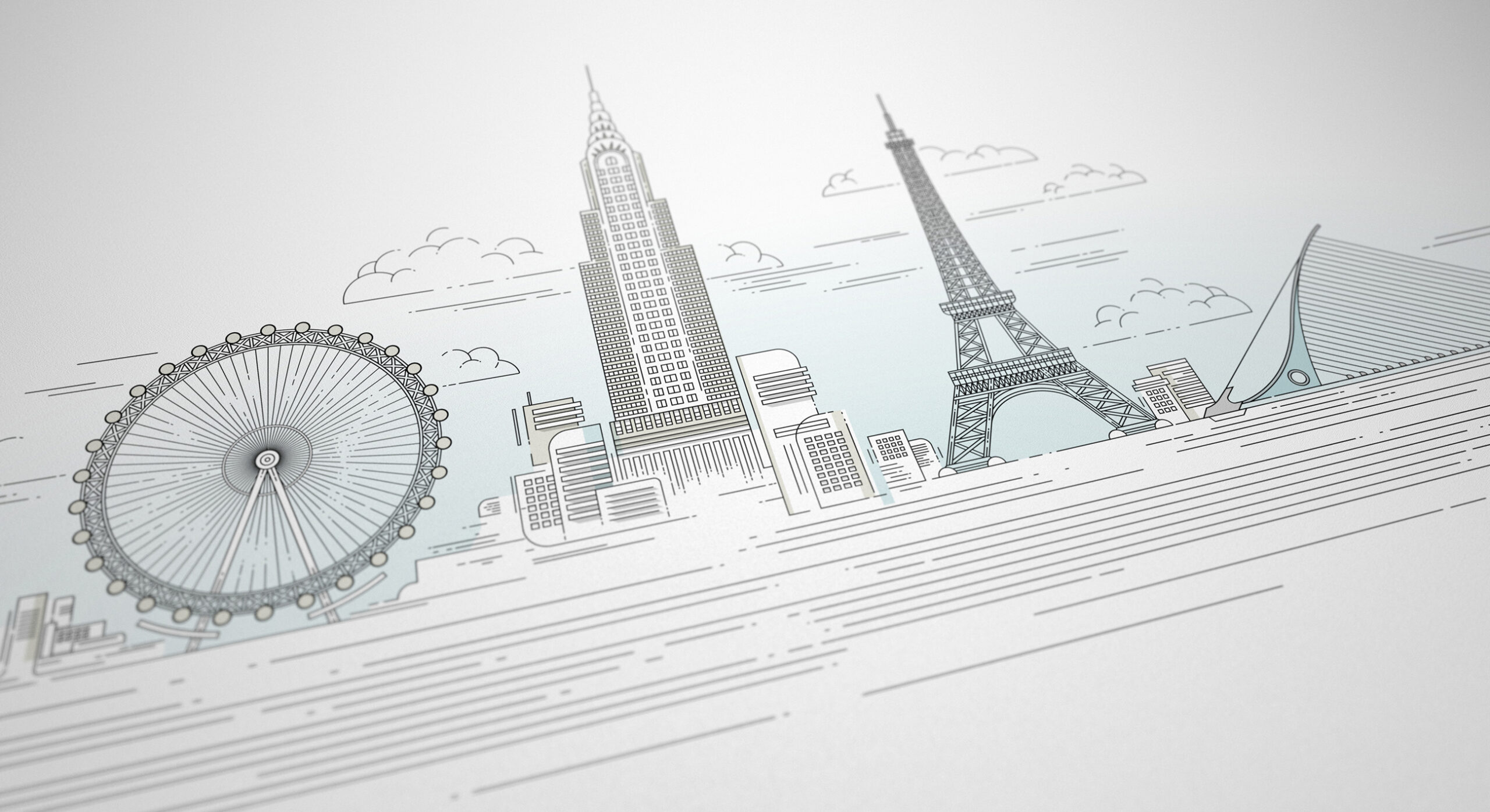
We developed a family of around sixteen illustrations for the brand launch. These are peppered throughout the brand identity. We used a clean and geometric line vector style.
-
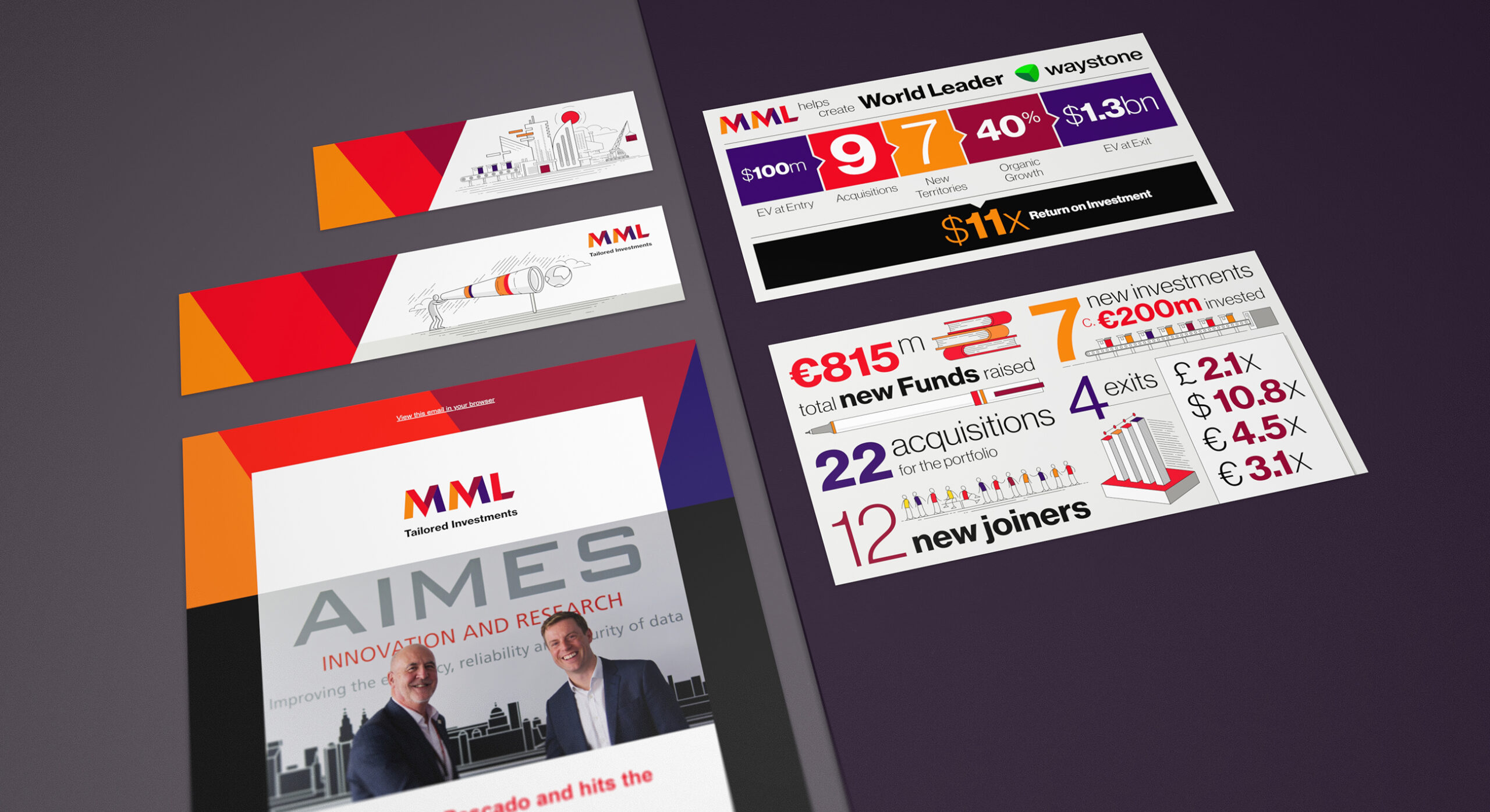
Part of the strategic brand consultancy outcomes is the increased publishing of content across the business. We continue to provide the client with a number of social media illustrations, infographics and design layouts to support both on-site and off-site publishing.
-
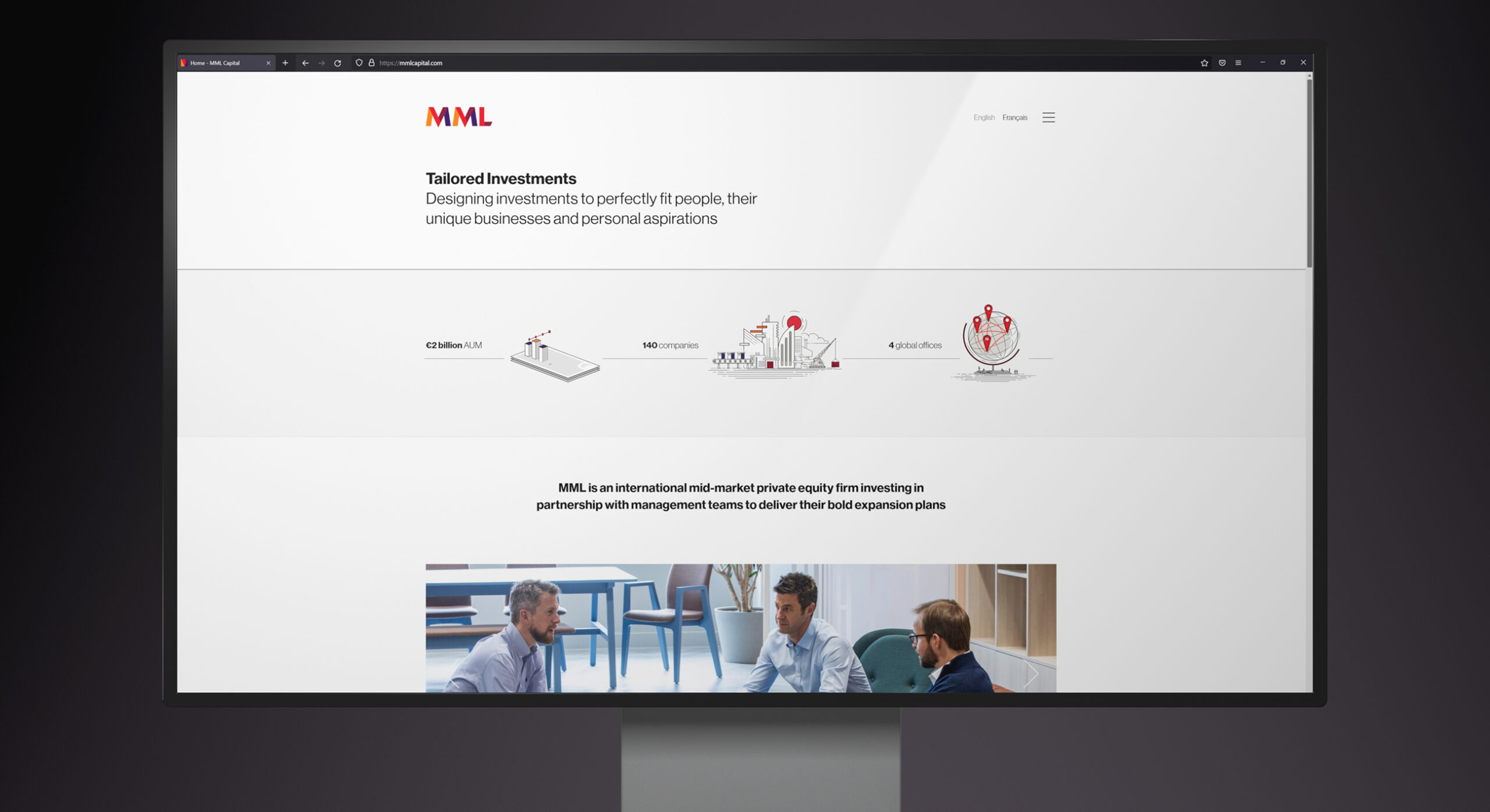
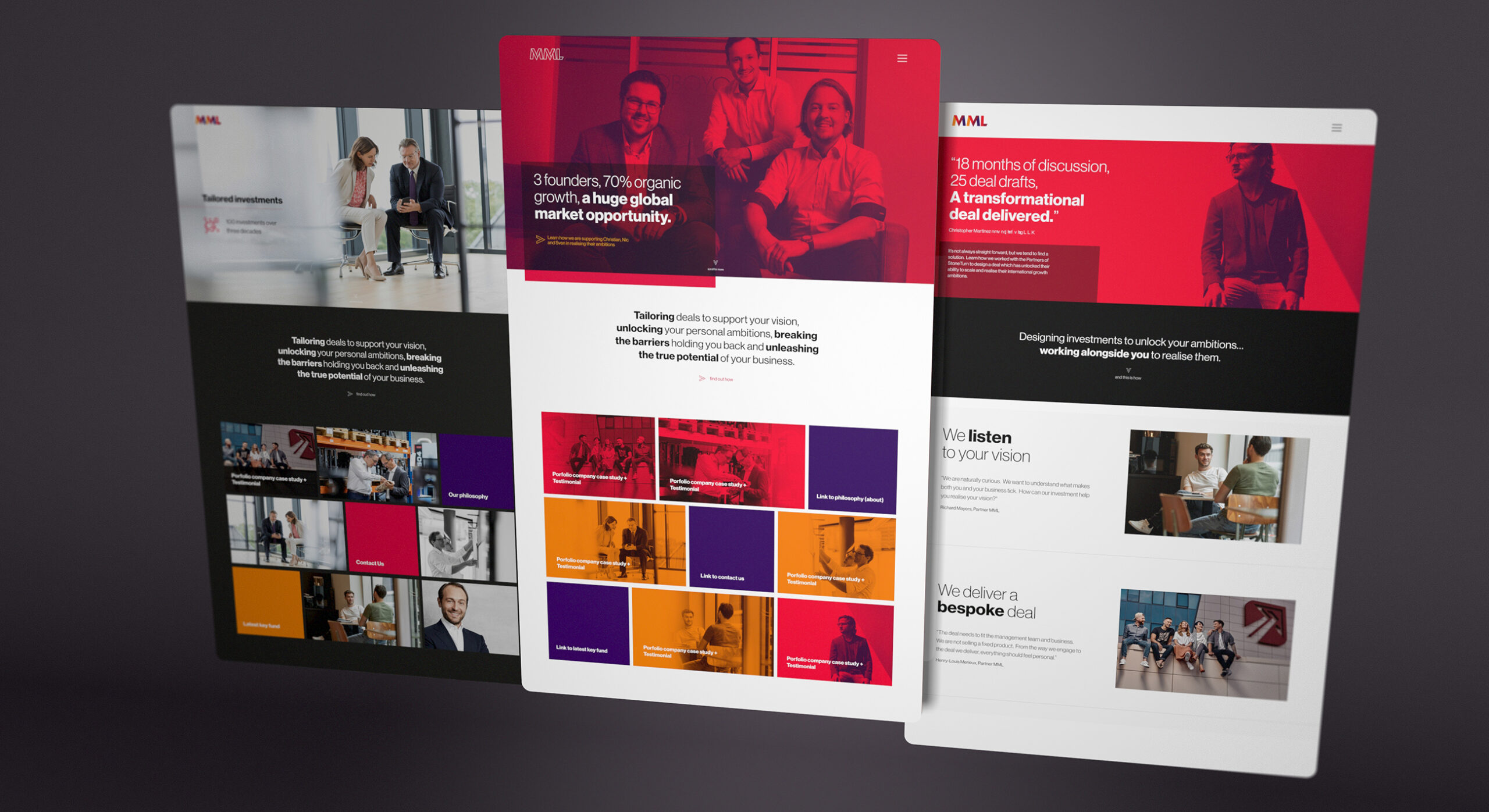
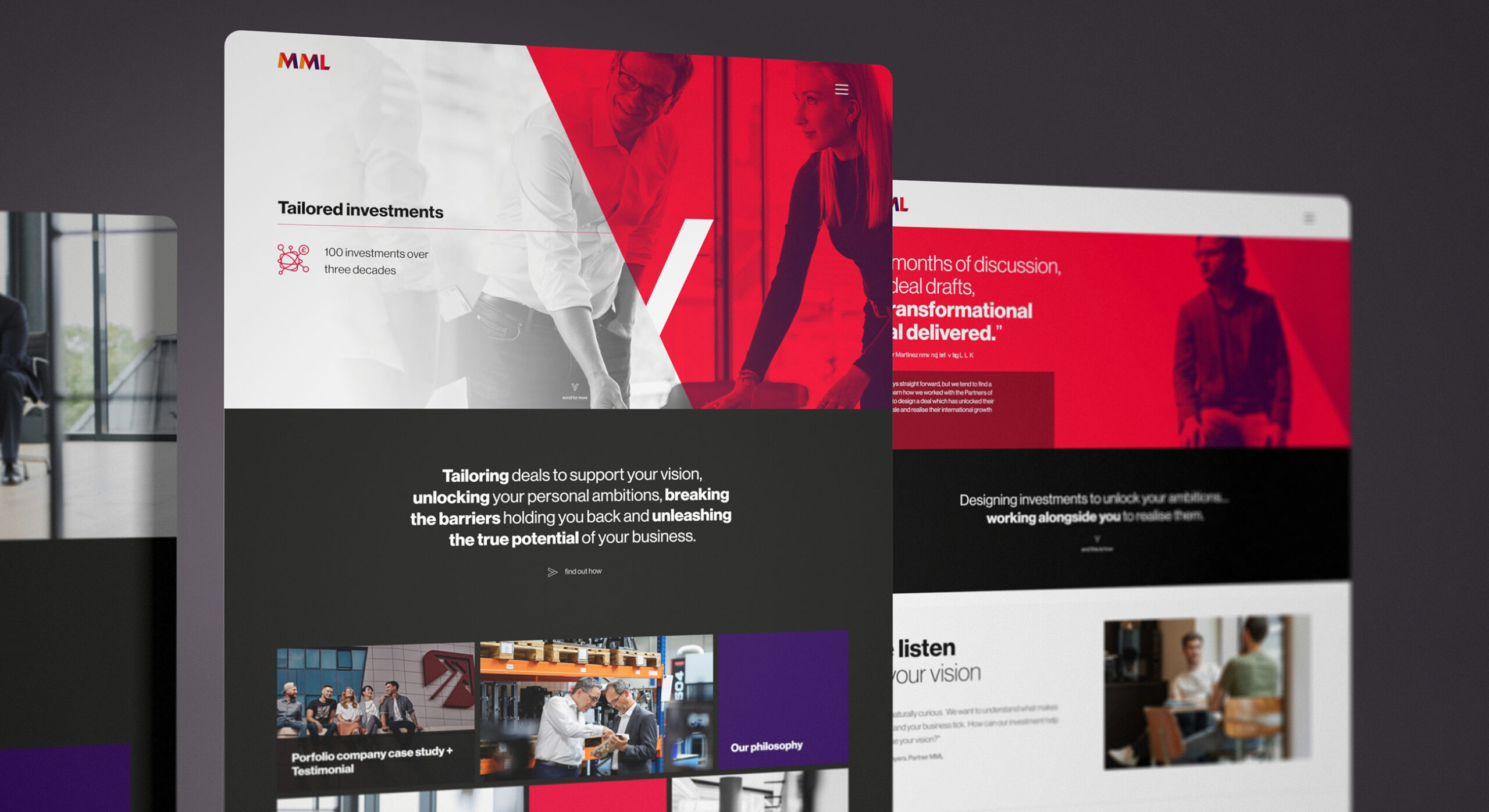
The website design created to support the brand is a combination of clear simplicity and engaging graphics and imagery.
-
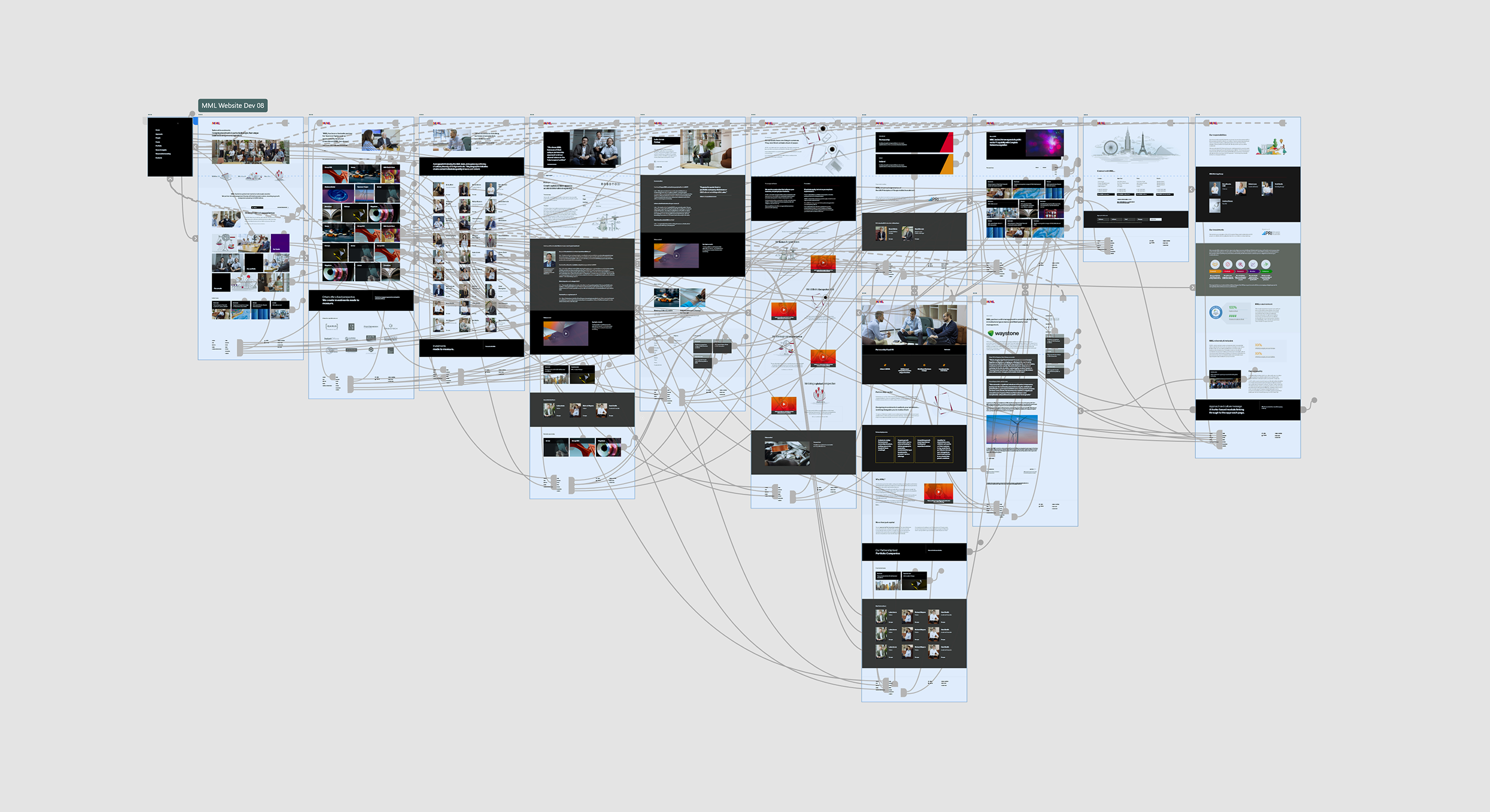
The digital design process is intrinsically governed by user flow and experience. Here, we illustrate an Adobe XD prototype process which provides clients with a full browser based proxy of their upcoming website development.
-
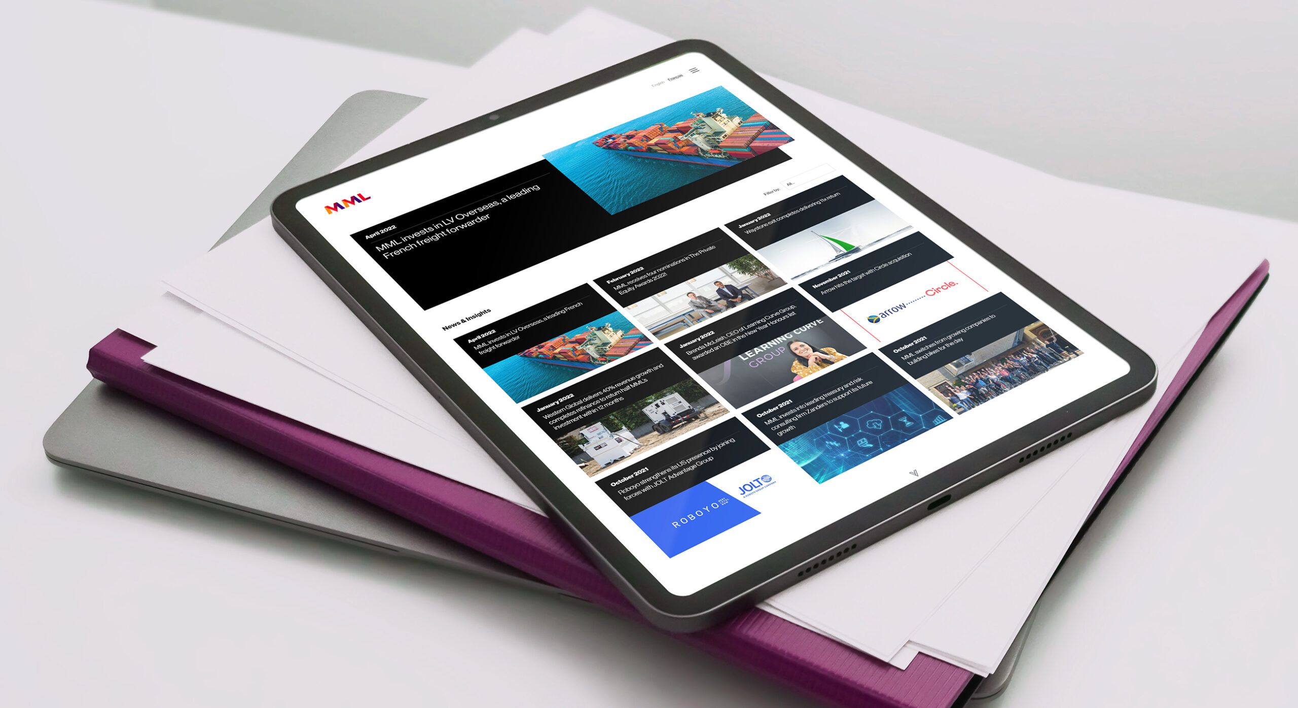
Publishing has become a big part of the brand content strategy. The website ensures clear delivery across all devices.
-
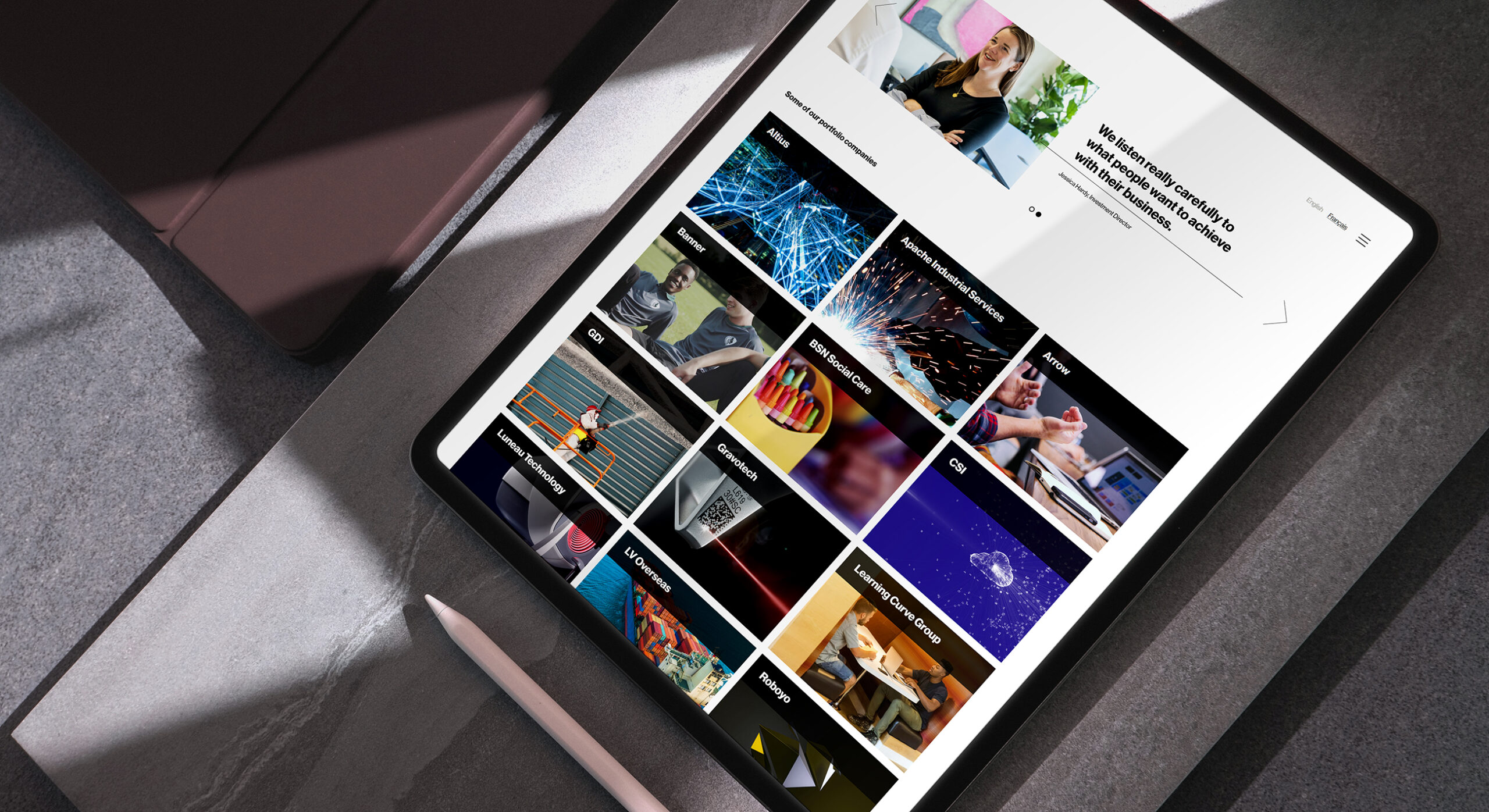
The invested portfolio companies represent MML's track record in the business. We ensured a data and content led structure which aided easy digestion of key facts and investor information.
-
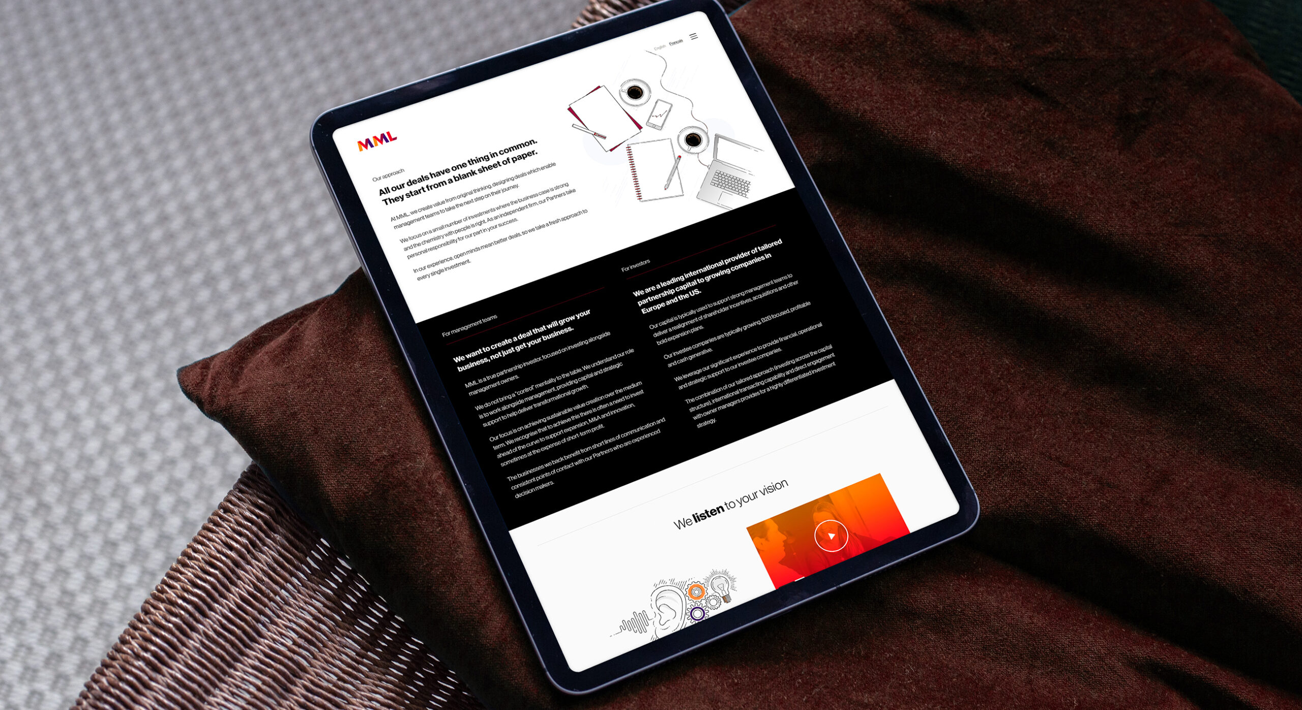
The website design uses plenty of space and structure in order to reduce clutter. This lessons user friction and therefore represents an enjoyable browsing experience.
-
We empowered design teams rather than developers in page creation. This ensures less of a generic templated feel and encourages diversity of content types across the website. This ensures a drop in screen fatigue and keeps the web visitors engaged.
-
We knew that we wanted to use the client portraiture in a number of layout dimensions. We therefore ensured that our photographer provided ample image info within the frame.
-
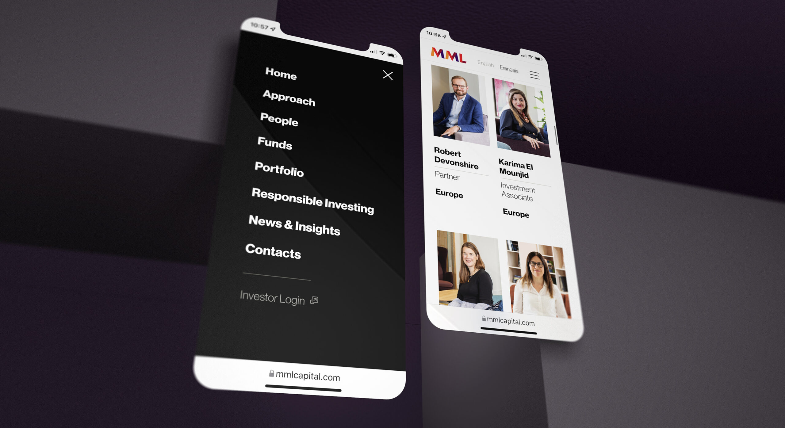
Given that mobile usage is second only to desktop devices; we ensured that the site is optimised for delivery out of the office.
-

When developing a brand symbol, its always critical to develop a simpler one colour version so that it can be used in tricky situations such as embroidery.