-
-
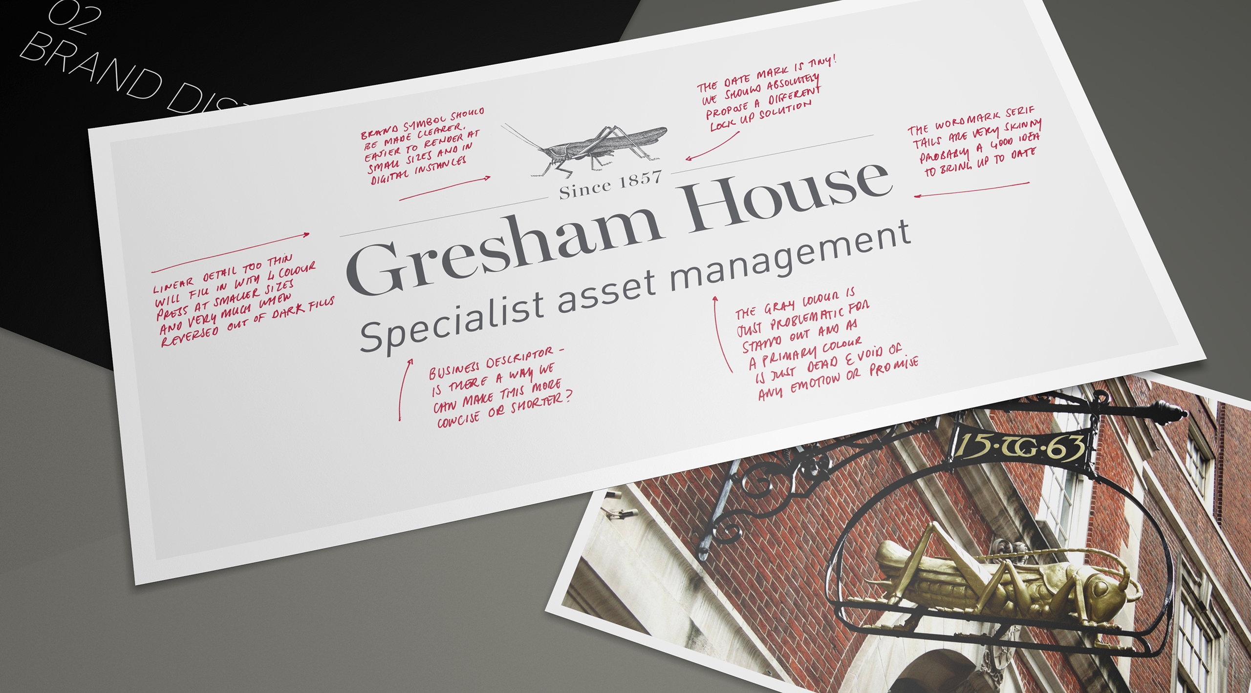
Gresham House is an established brand yet had some legibility issues. Tasked with working out what to evolve, we created a brief for the creative process.
-
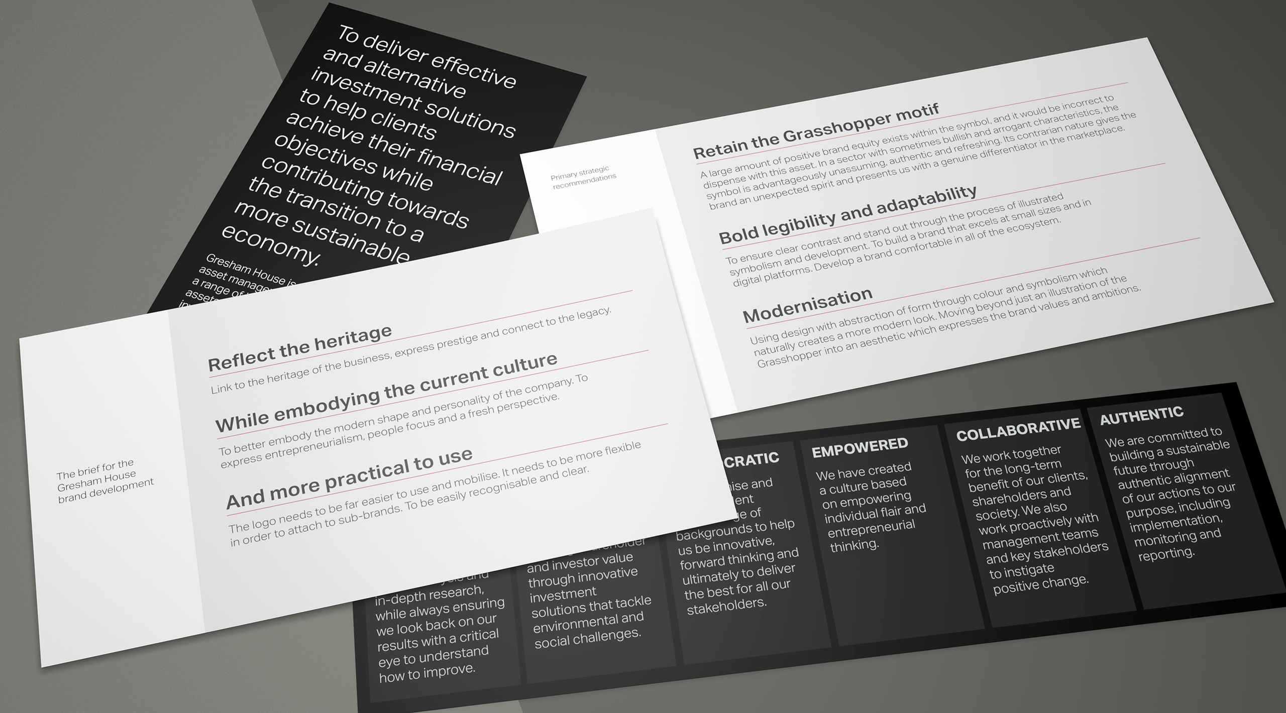
Beyond representing the values, the brand is required to fulfill a set of key goals and methods.
-
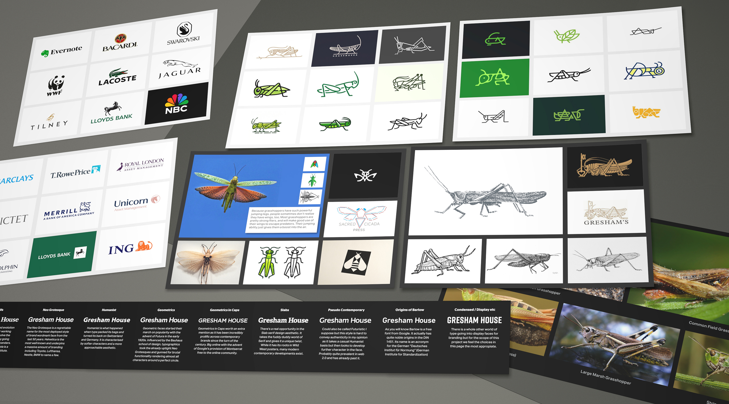
We conducted a research exercise whereby we studied a raft of grasshopper icons and treatments. It's a challenging little creature, with much detail and structure.
-
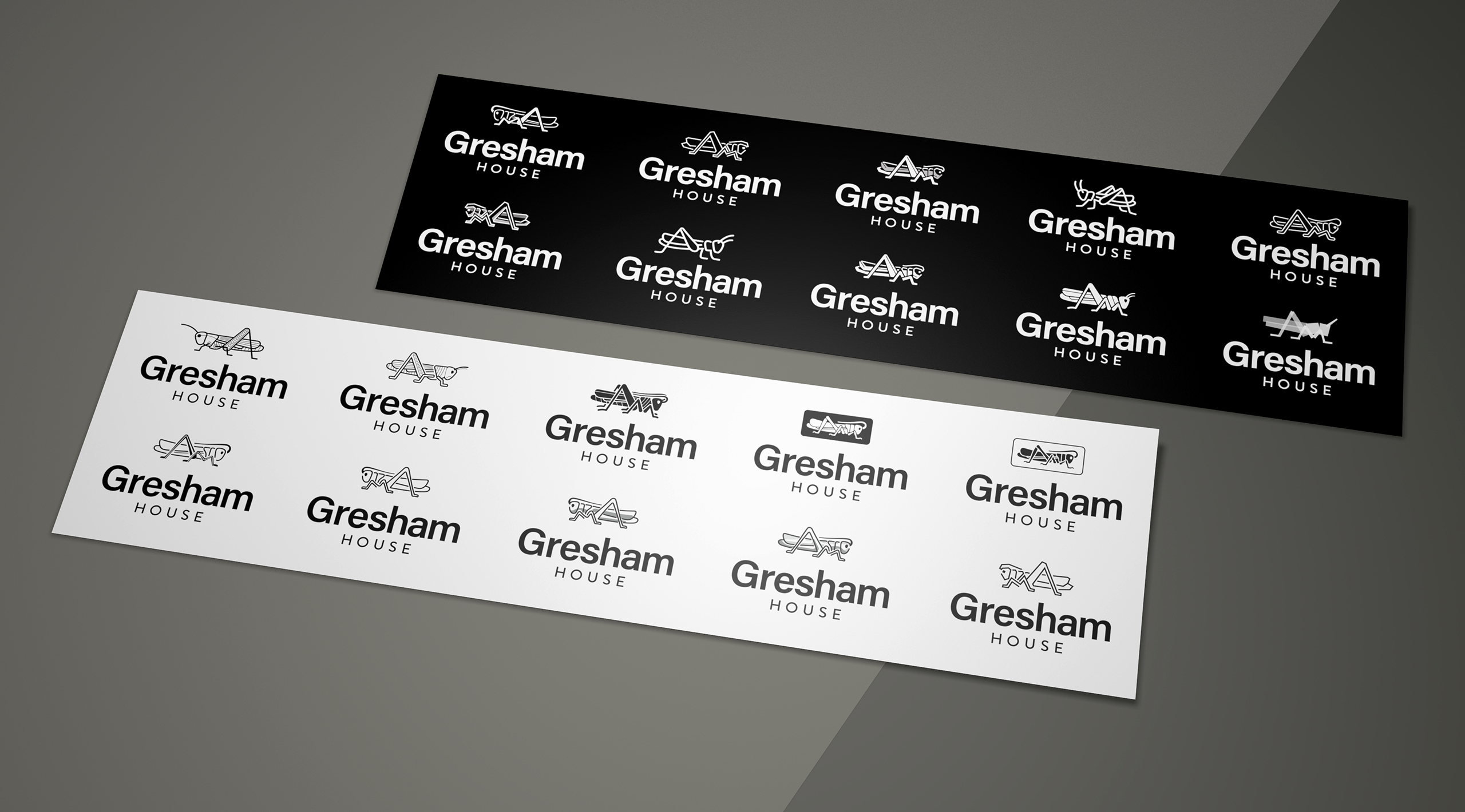
We started the process in black and white as a standard step in our creativity. It has to work with one colour first, before the subjective and illustrative nature of colour applies.
-
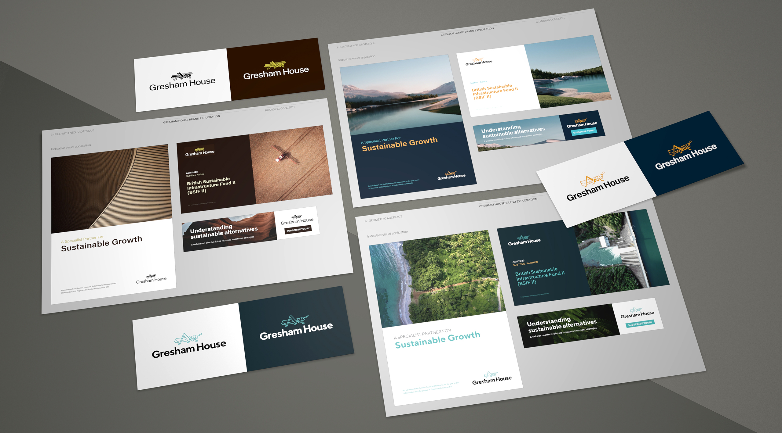
We provided a good deal of development stages. Collaboration with the client became a key development stage.
-
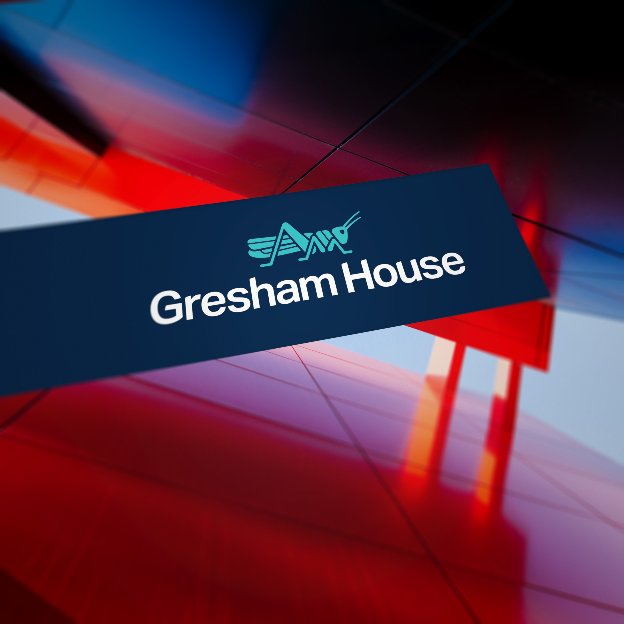
The new Gresham House logo features a bold symbol and clear typography.
-
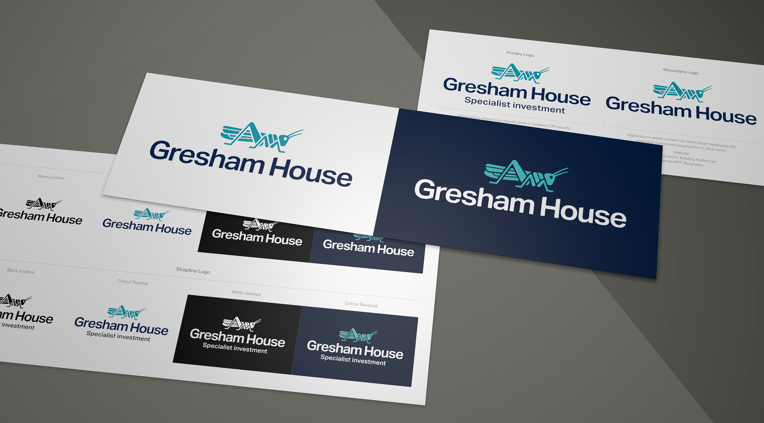
We created brand lock ups and variations for colour process.
-
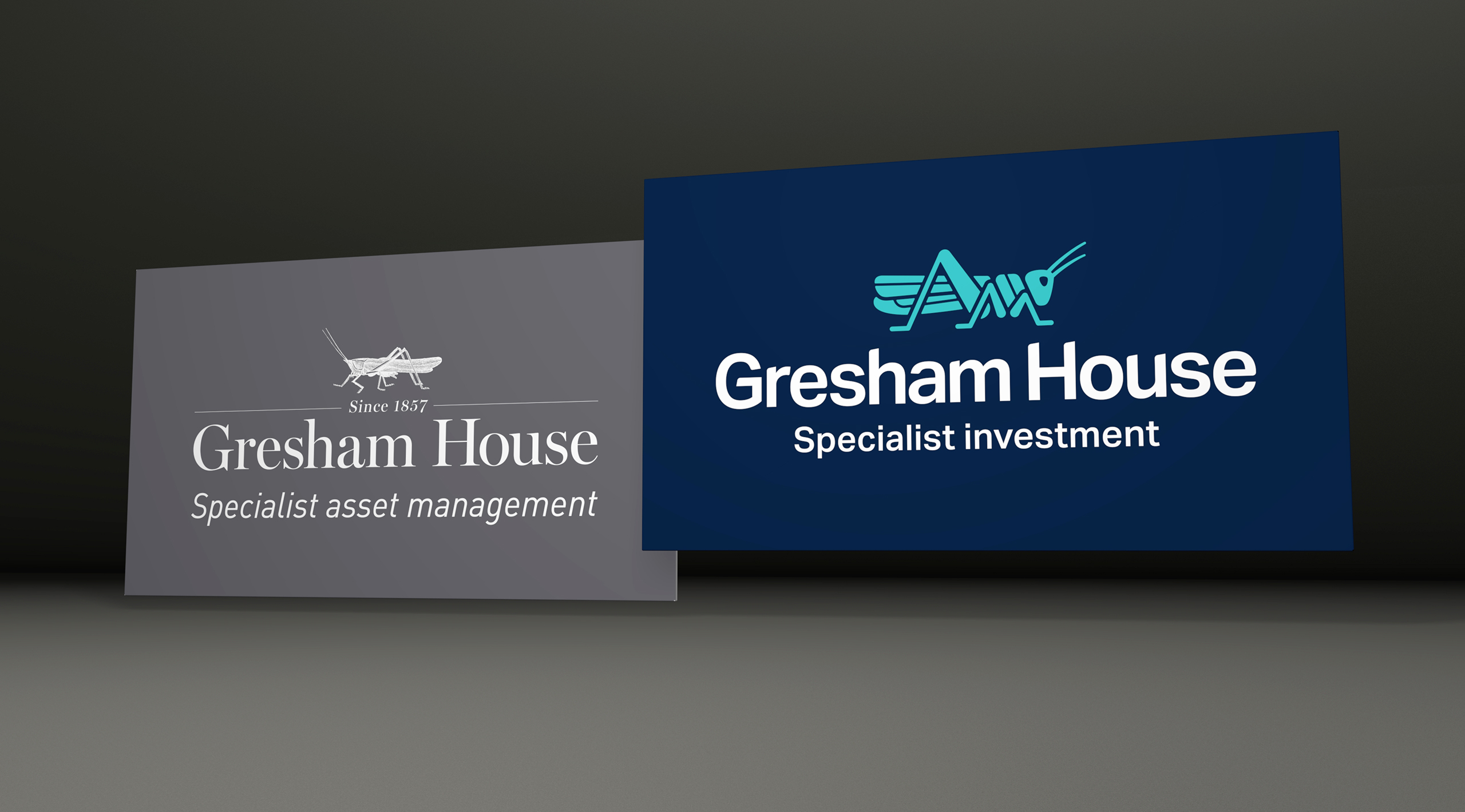
The much-improved new logo alongside the incumbent branding.
-
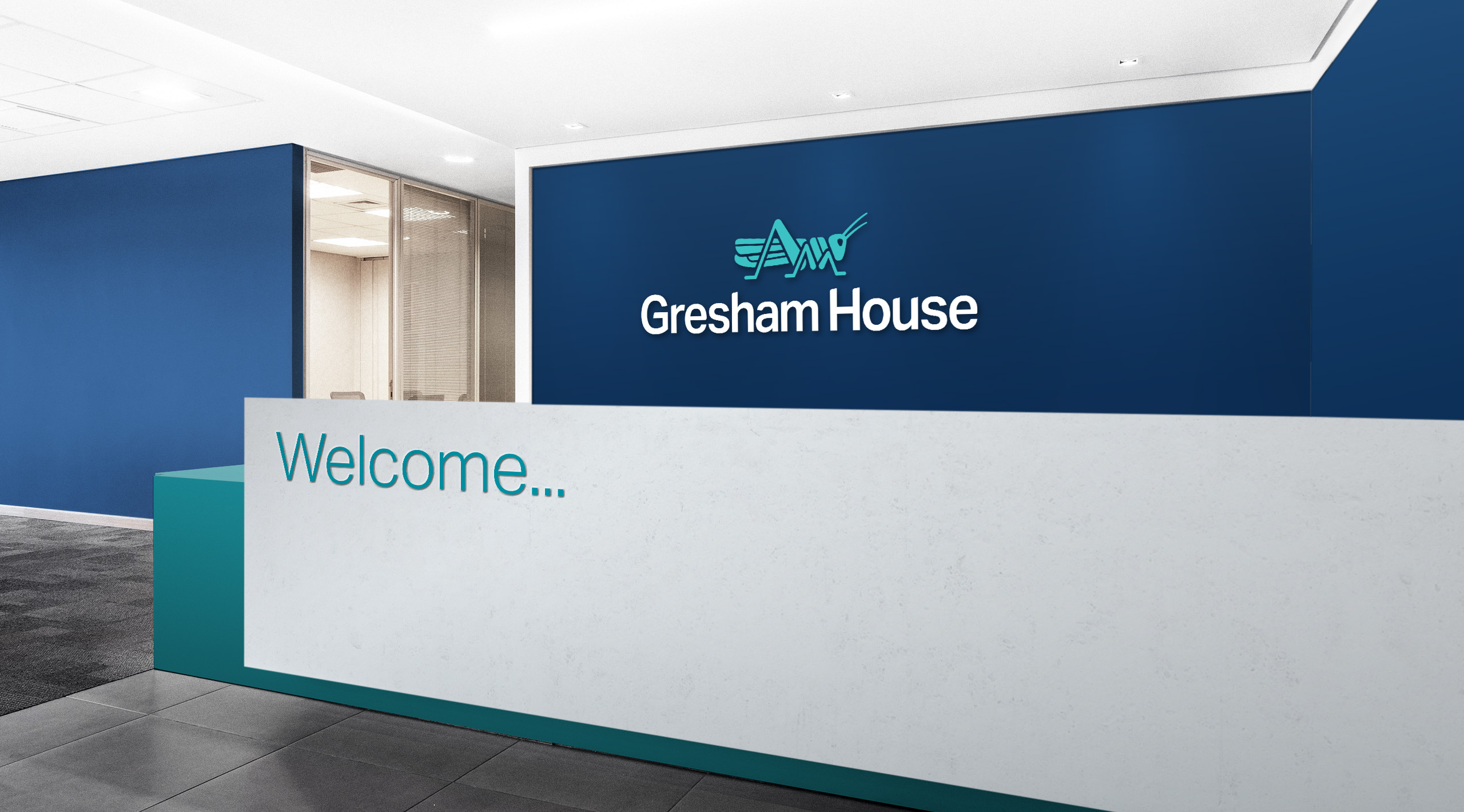
Using colour to create a lighter brand aesthetic. The dark blue anchors the more primary teal.
-
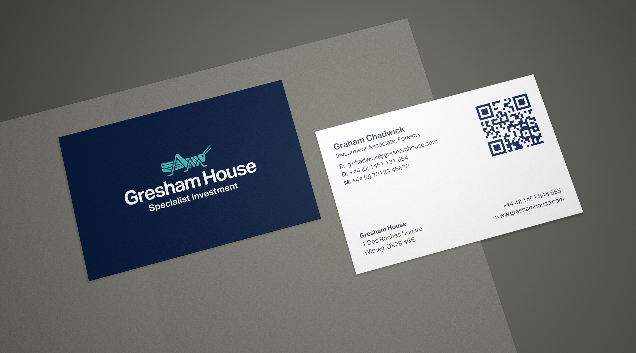
We provided guidelines for stationery, communications and literature.
-
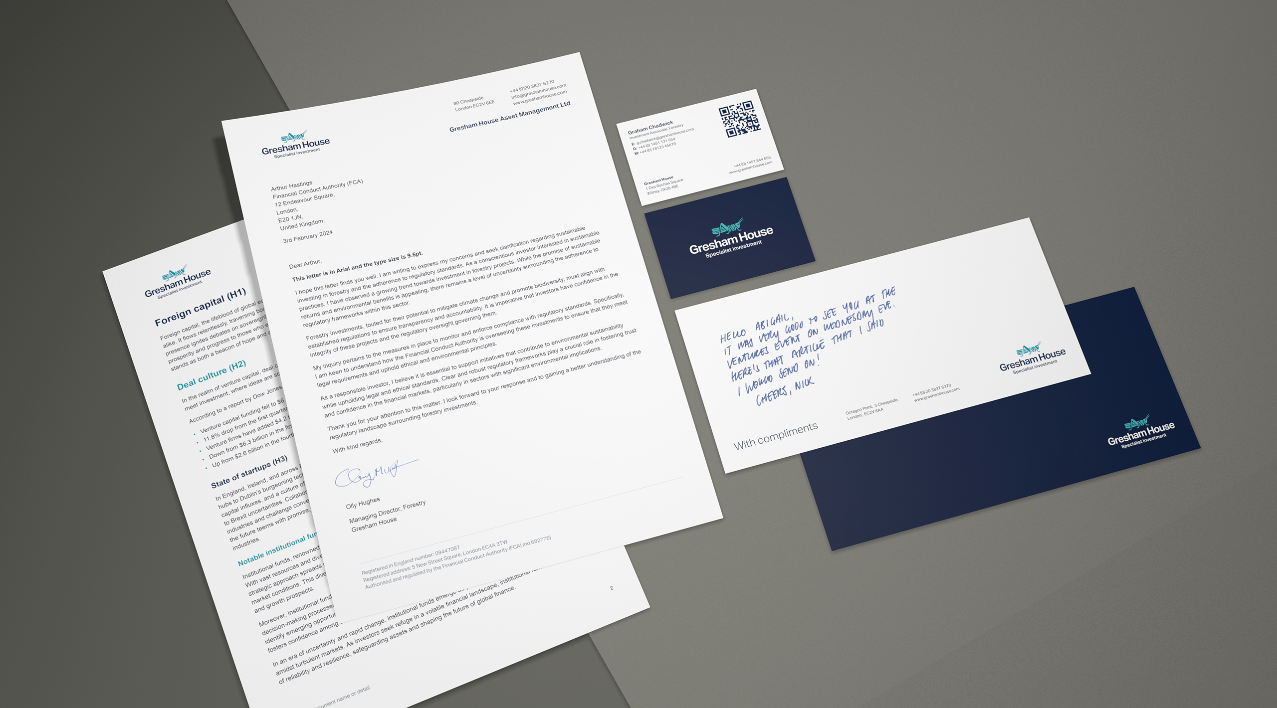
Clean, clear and precise stationery which aids communication, not hinders it.
-
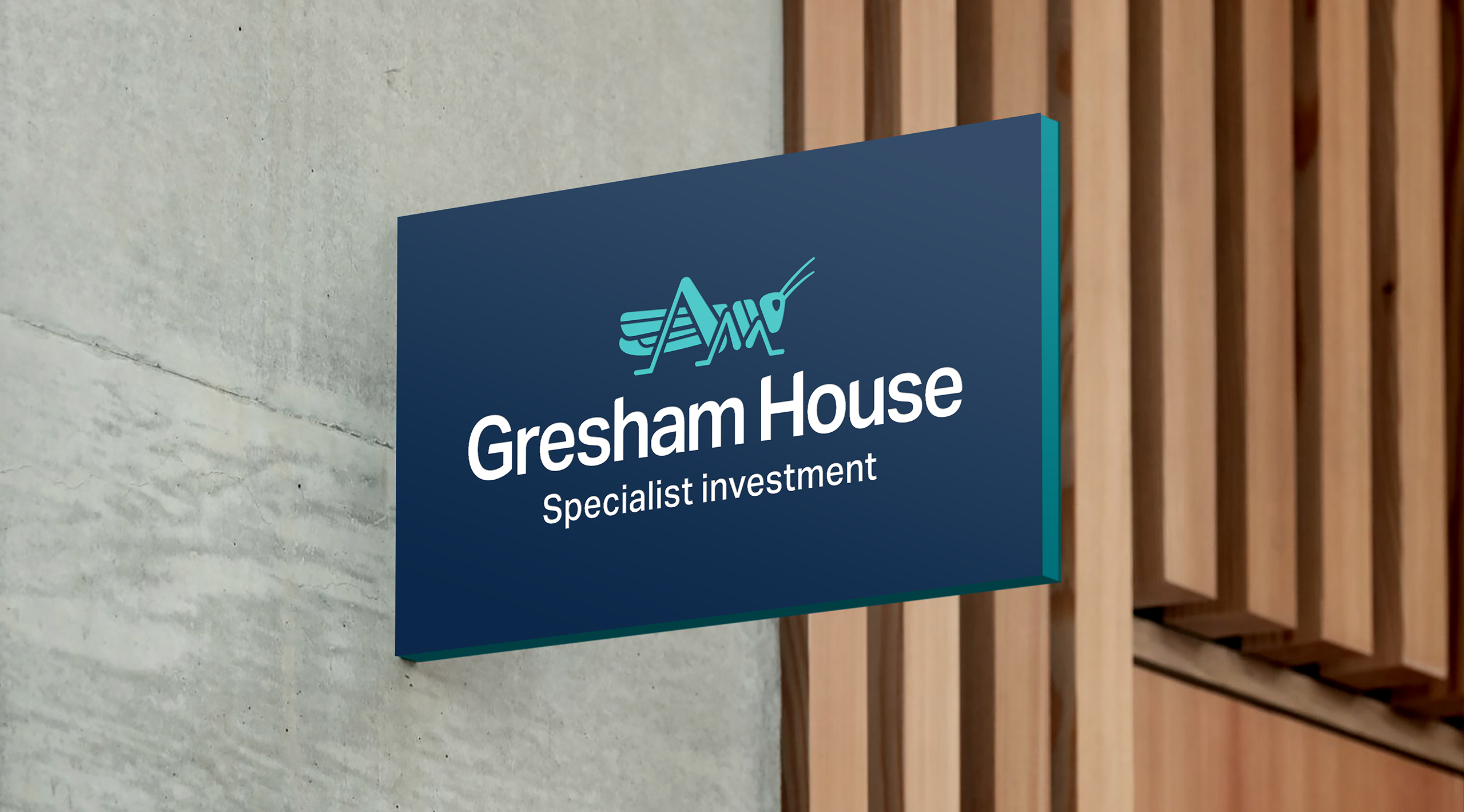
Crisp, clear and legible with great standout at distance.
-
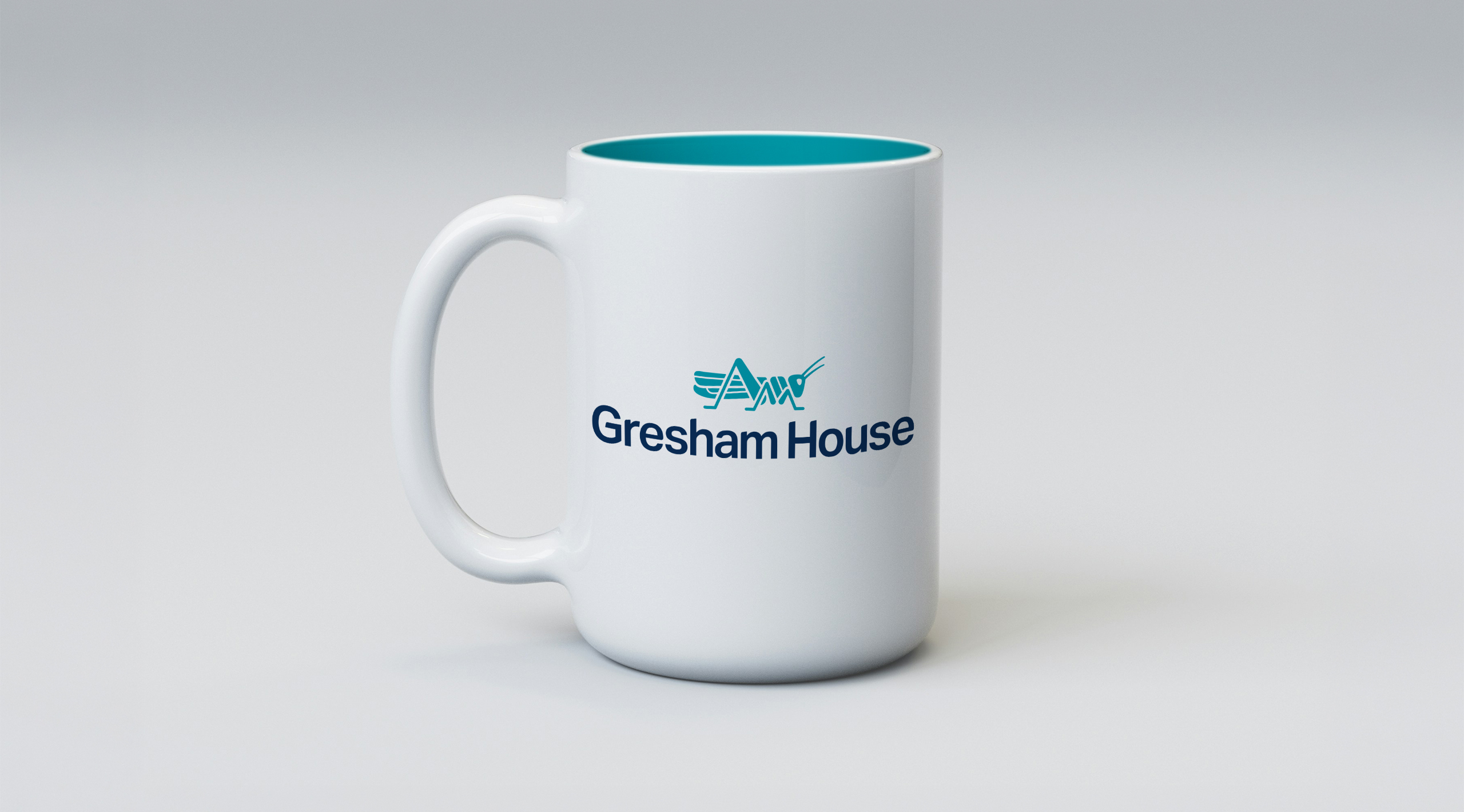
The brand in application on a spot of merch.
-
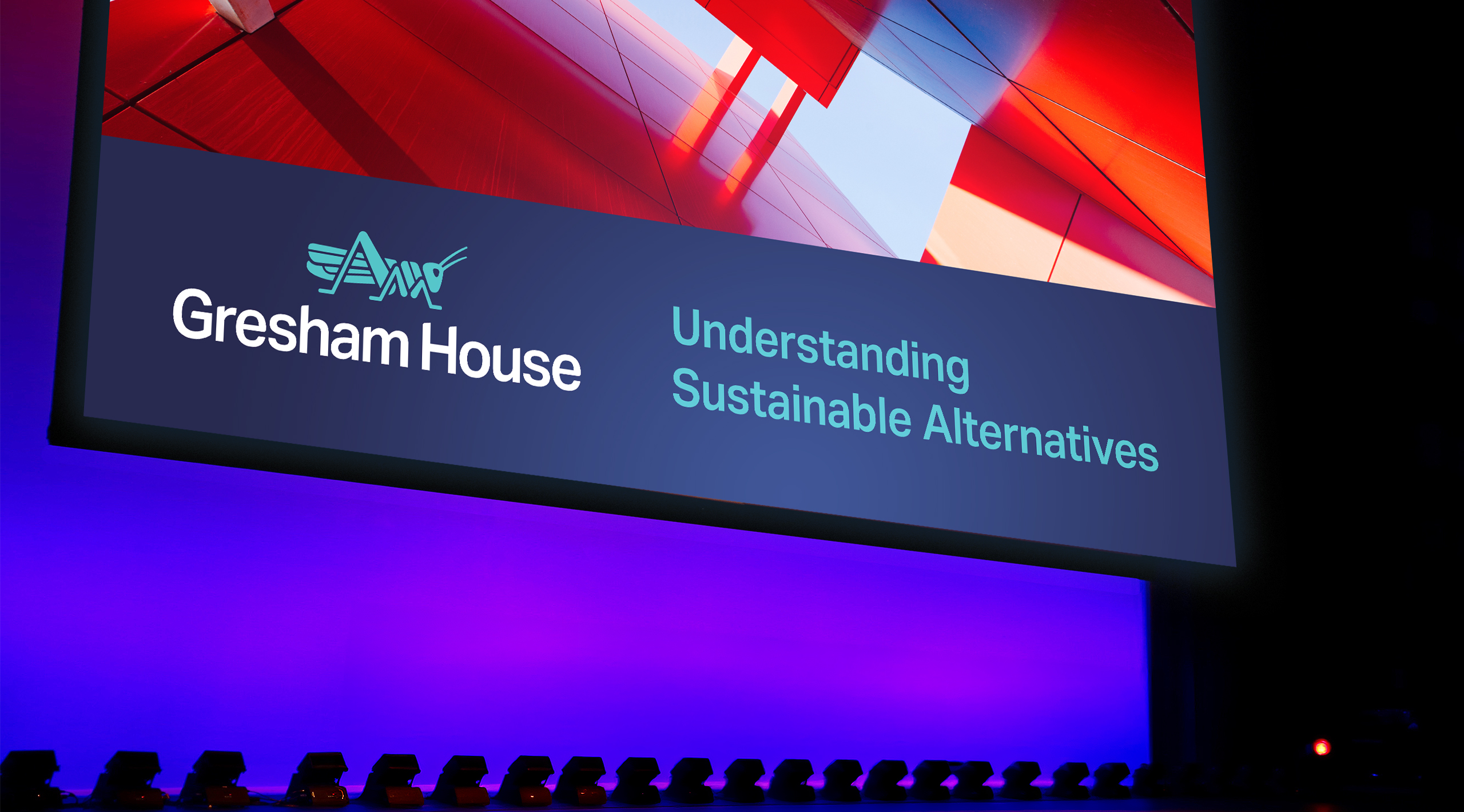
The branding works exceptionally well reversed out of a dark background - Especially for transmitted colour such as displays.
-
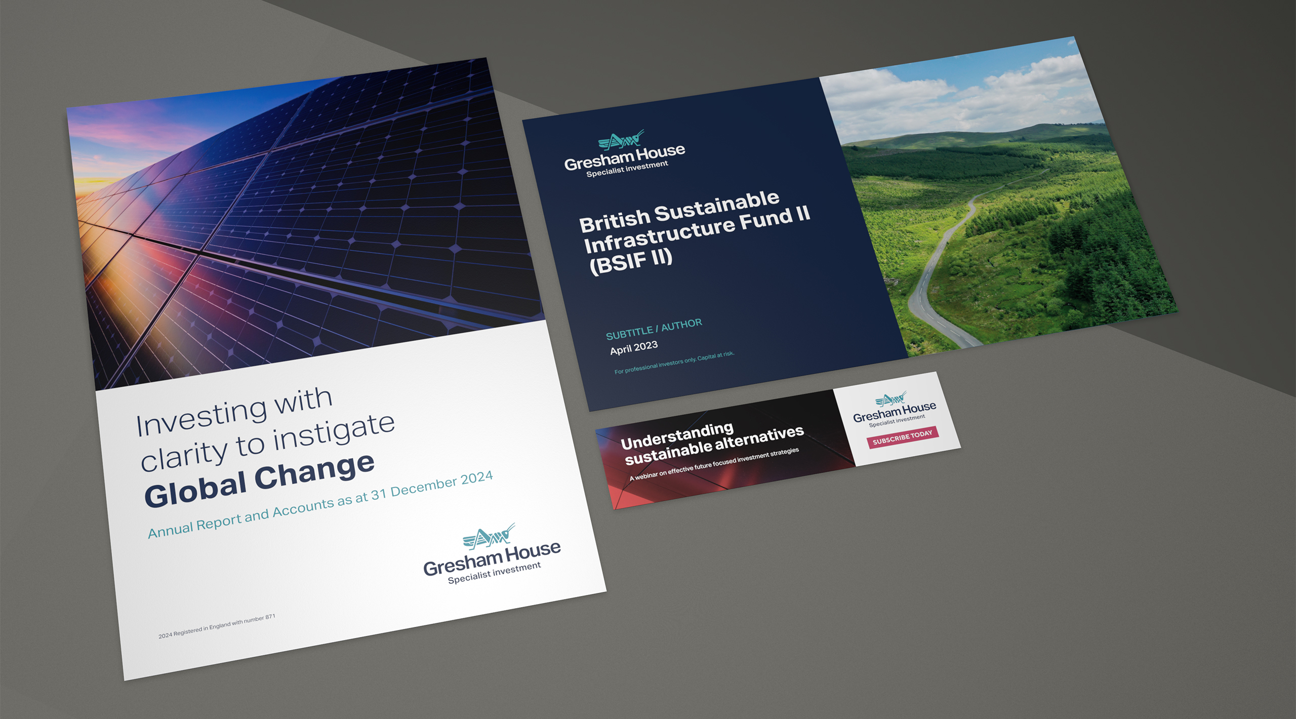
The brand visual identity incorporates the brand colour, typographic styling and control alongside art direction for imagery.
-
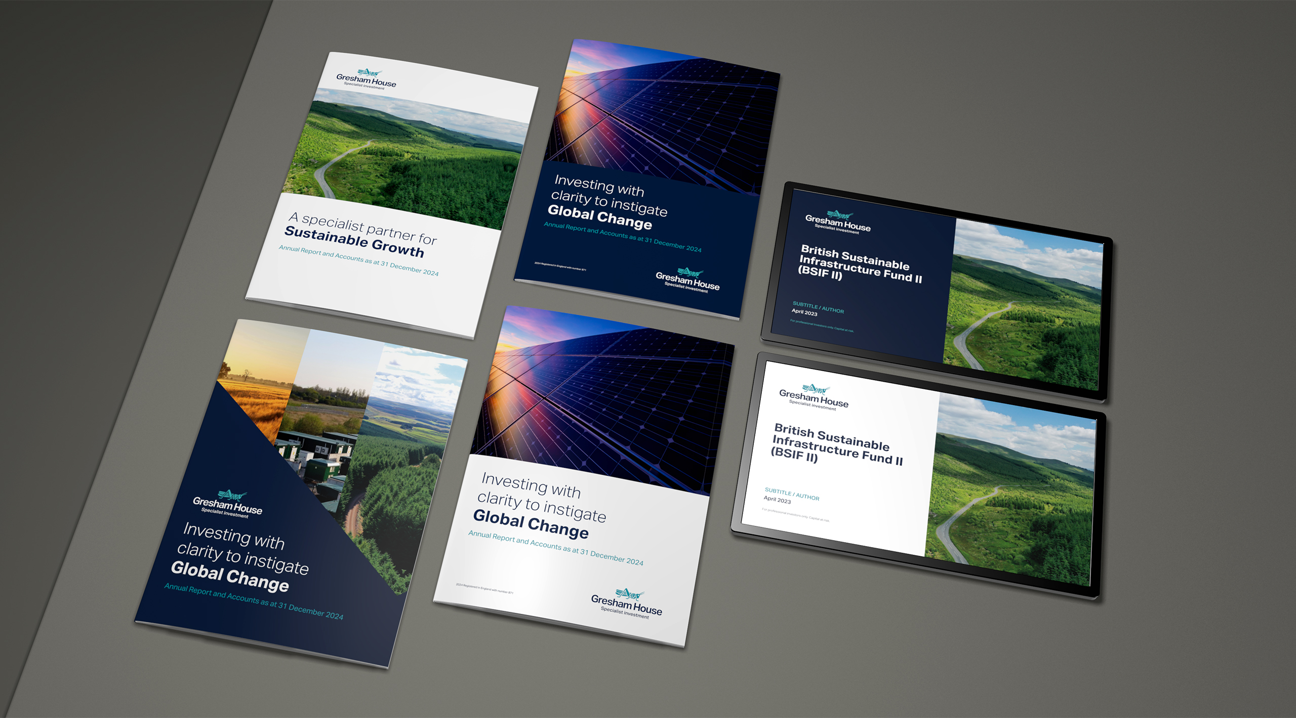
The strong demarcation of colour and white space assists with providing a background for titling and typography
-
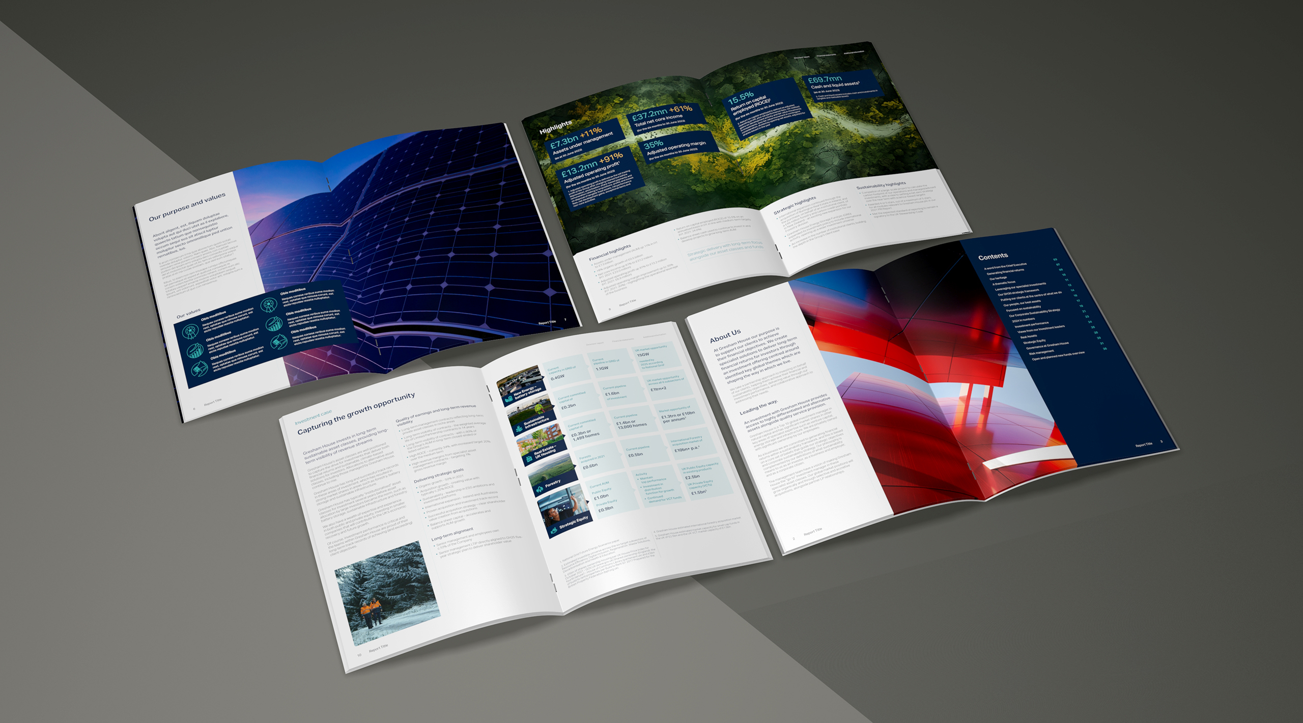
We provided Adobe Indesign literature style kits so that the internal publications teams could easily follow through with annual reports and other brochures.
-
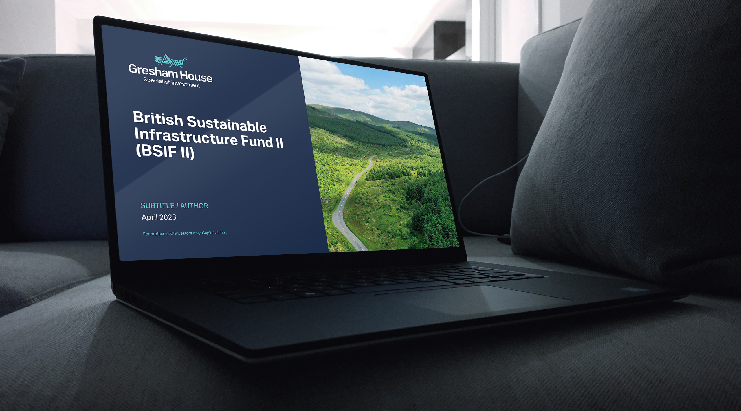
The application of branding and visual identity to Microsoft apps such as PPT is key to providing branded materials.
-
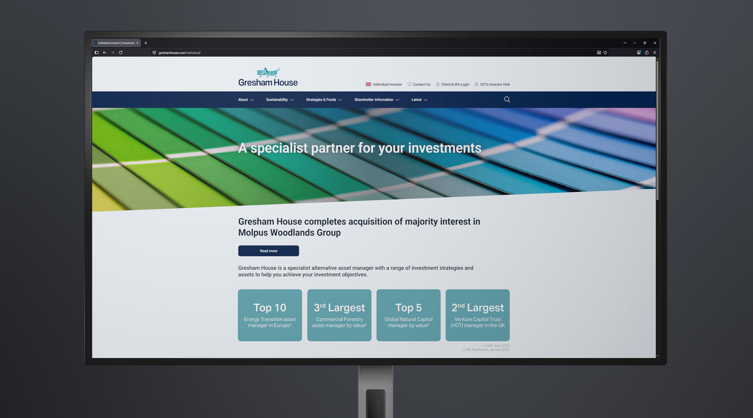
Whilst the website design was outside of our remit - We provided assistance in the roll out of a newly refreshed website.
-
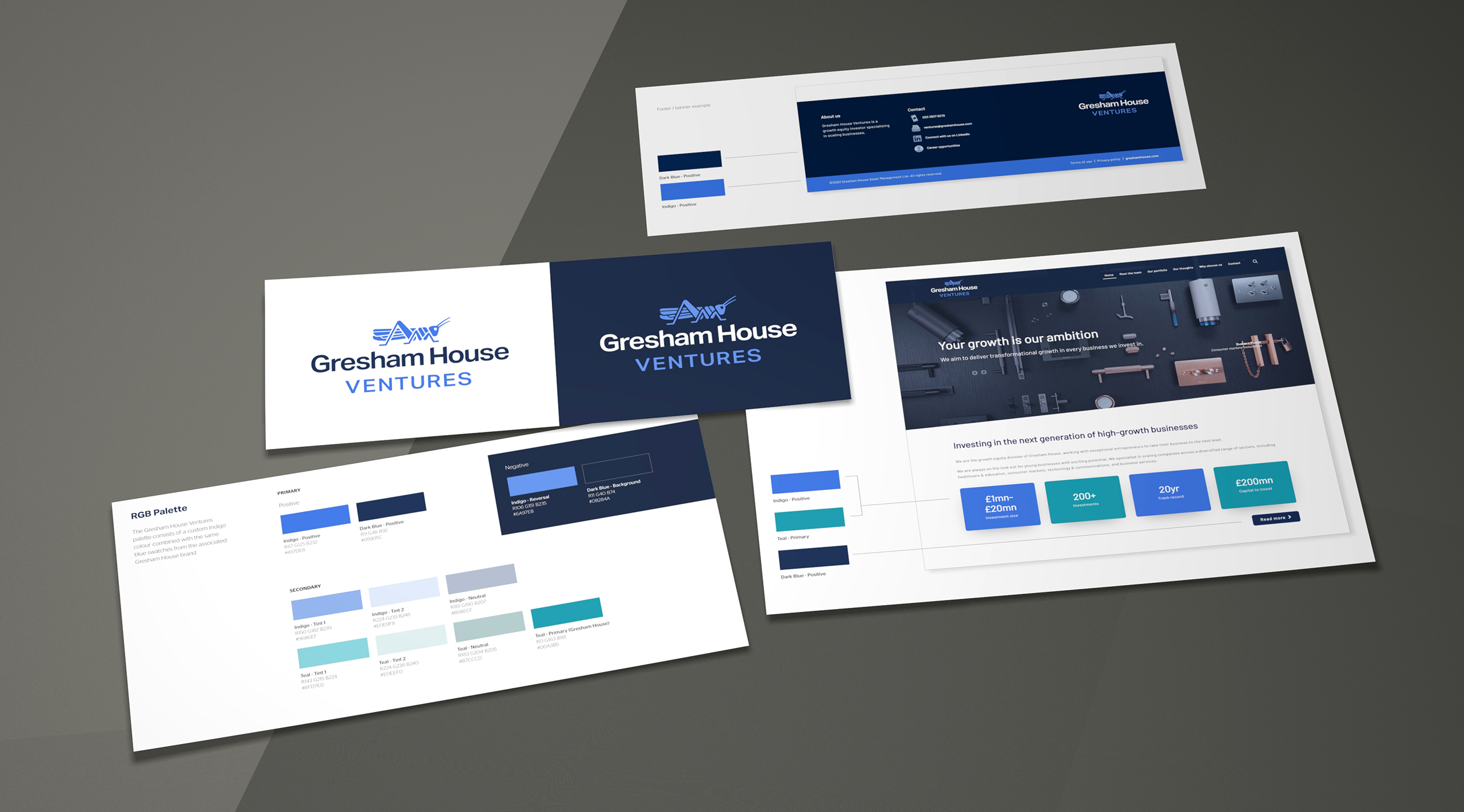
We provided a sub brand for Gresham House Ventures. The connection to the primary brand was of most importance - hence the simple change of colour and supporting business unit suffix.
-
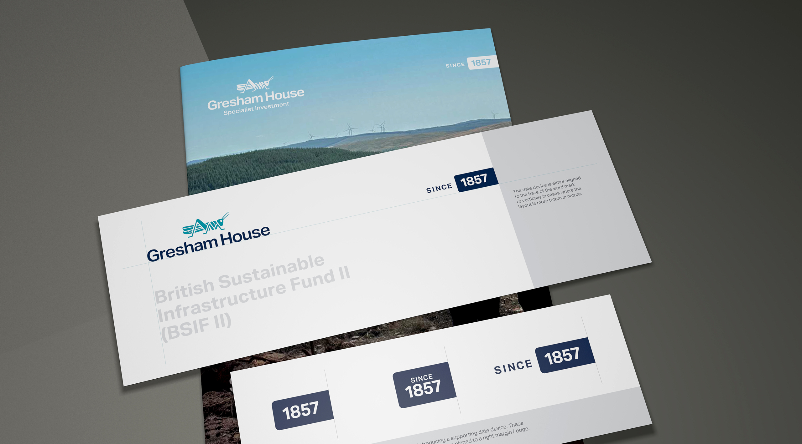
One of our strategic recommendations is to rather not lock the company origin date within the brand logotype. We suggested to rather use a supporting graphic device which could be removed or added without confusing the primary brand.
-
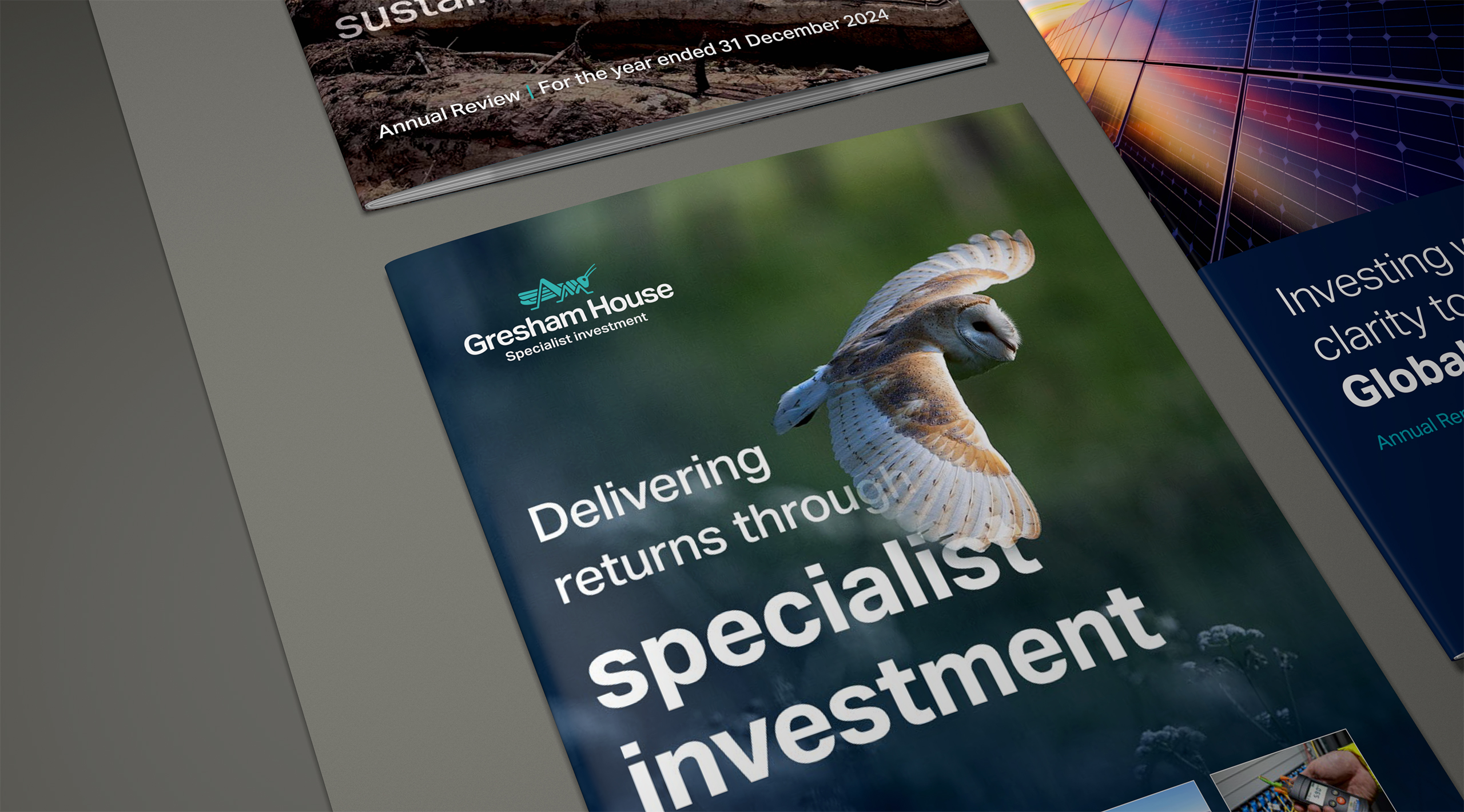
We worked together with the internal design team providing guidance for upcoming reports and communications.
-
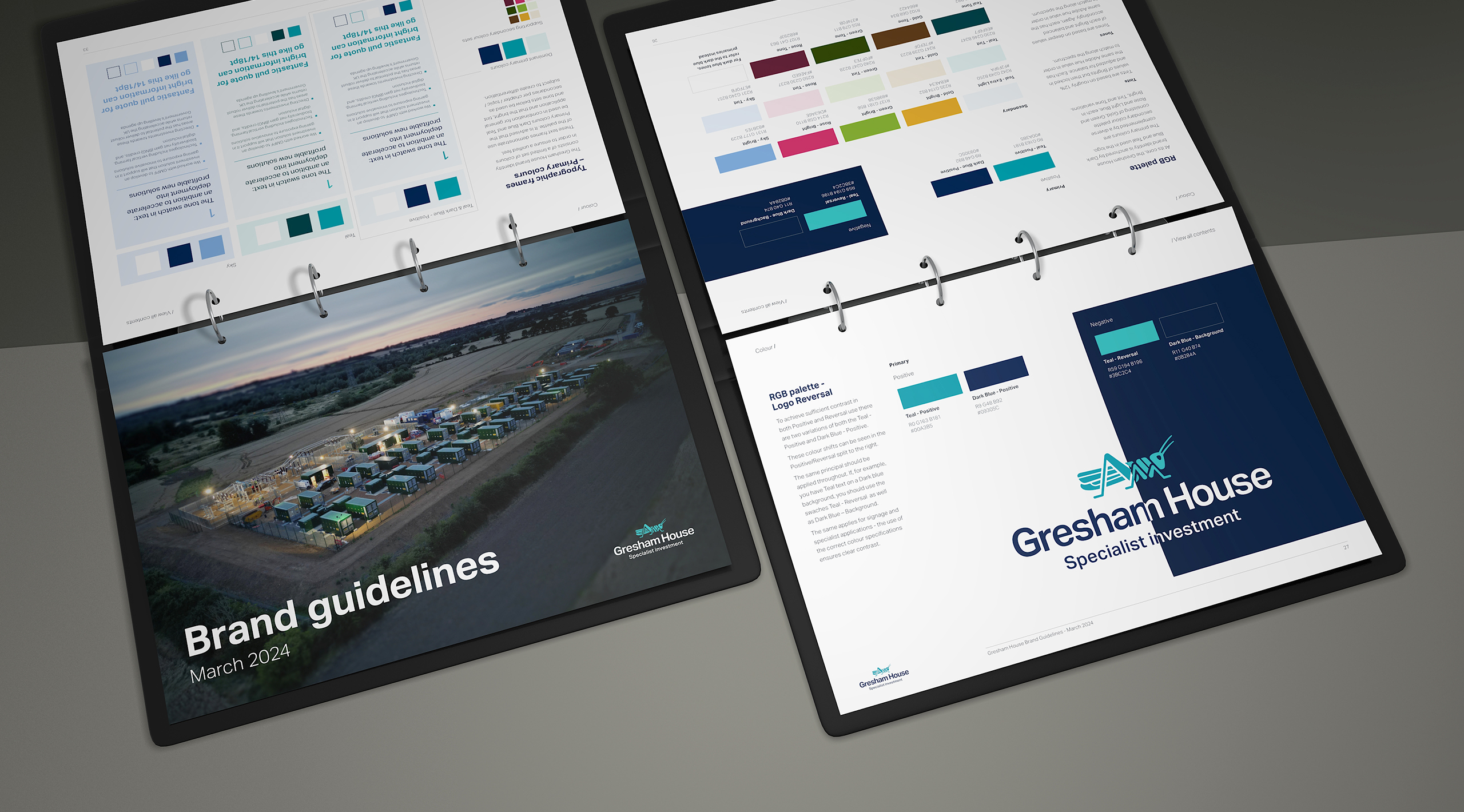
The brand is supported by a comprehensive interactive brand tool kit. This assists in the consistency of brand roll out.
-
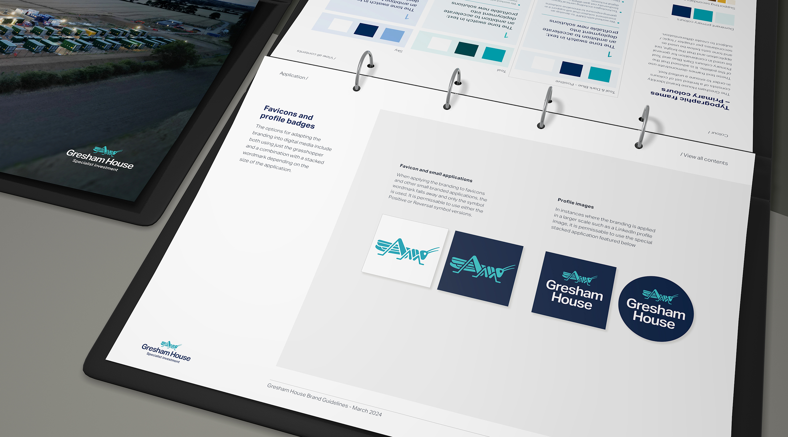
This page shows the brand in application for Favicons and other small branded applications.