
​

Brand Identity

East City Grill and YakiNiku

Firedog created the brand and visual identity for East City Grill and Yakiniku, two complementary dining concepts that bring South African fire cooking and Japanese grilling traditions together under one roof.

Designed as a pair of sister brands, East City Grill and Yakiniku transform a single venue into one of Cape Town's most talked-about dining destinations. Beginning with YakiNiku, we went on to create a complete brand architecture and visual identity system for East City Grill that connects both experiences while giving each a distinct yet complementary personality. The setting is equally distinctive. East City Grill and YakiNiku occupy 84 Harrington Street, a landmark development in Cape Town's East City precinct. Designed by Wolf & Wolf Architects, the project has become internationally recognised for its pioneering use of hemp-based construction and at twelve stories, is widely regarded as the world's tallest hemp building.

Expertise

Sector

/ Retail

Topics

Our very first remit was to take a hard to read working logo and transform it into a far more impactful brand identity.

The YakiNiku starter

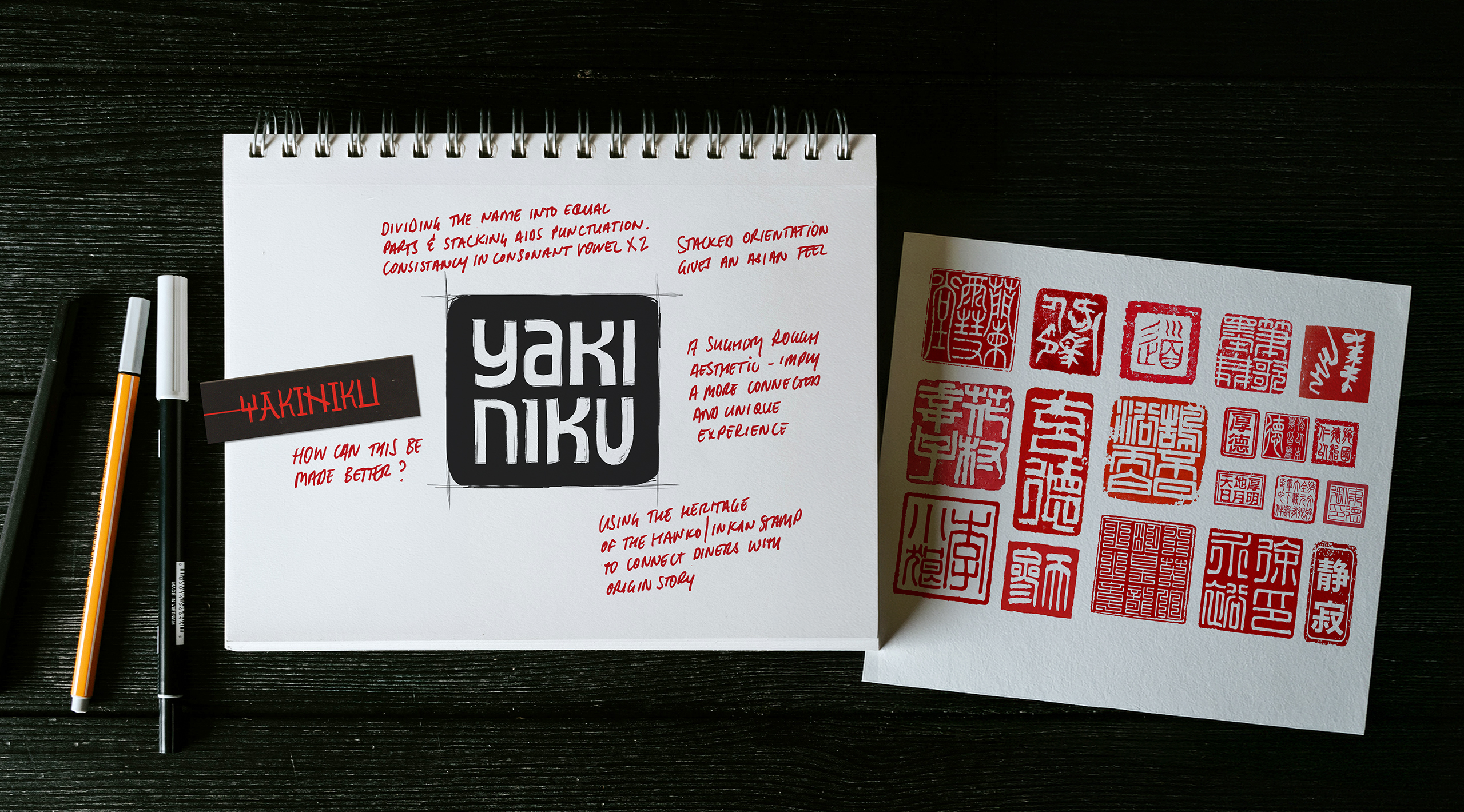
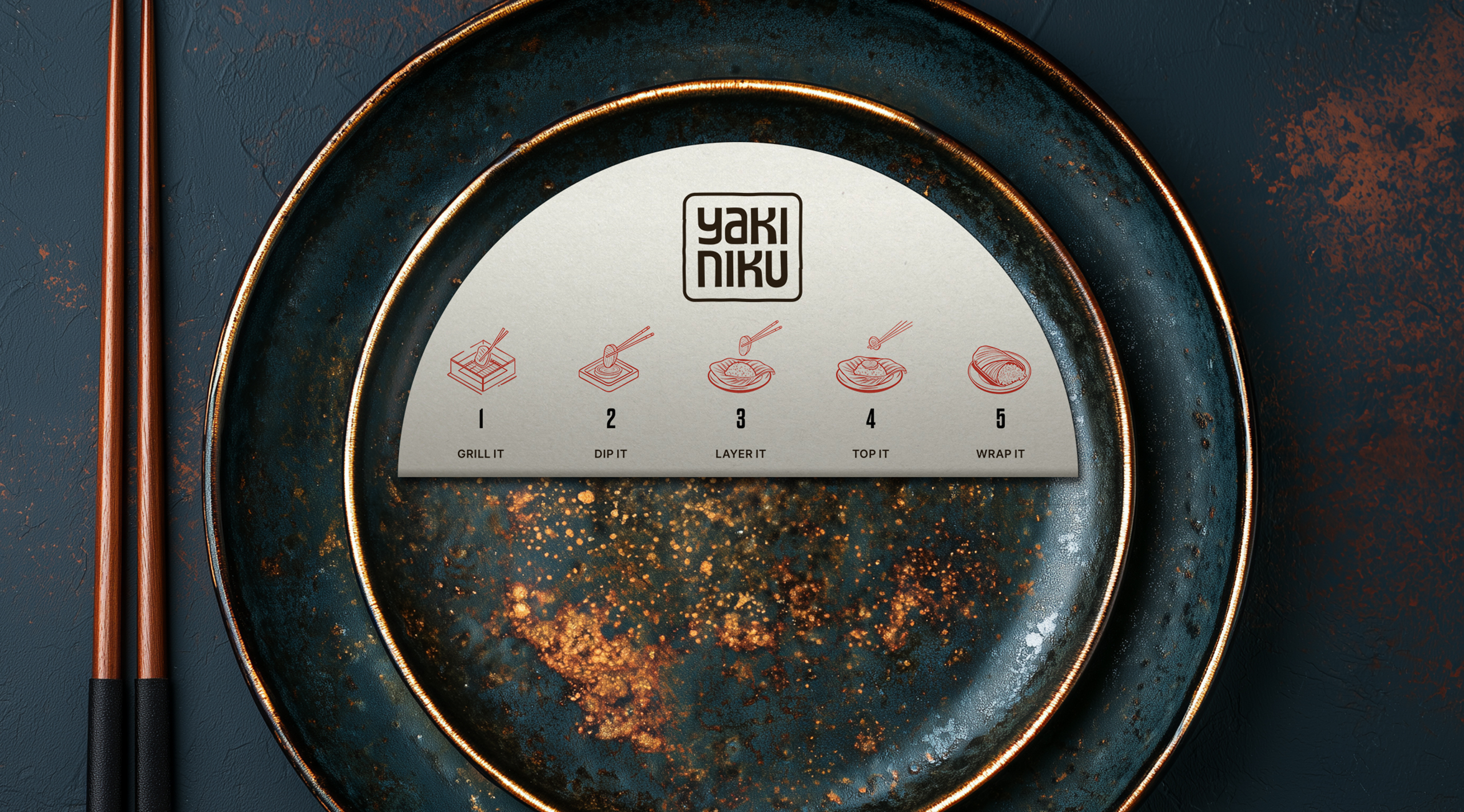
YakiNiku is a style of Japanese barbecue dining in which guests cook their own food at the table. At YakiNiku, diners gather around integrated smokeless grills to grill premium cuts of Wagyu, alongside a selection of sauces, sides and accompaniments that turn the meal into a shared experience rich in interaction and theatre. A simple working version of the YakiNiku brand existed as a prototype. Following a proactive proposal for a more refined solution, we were briefed to develop the initial idea into a full brand and visual identity. We believed that the existing brand could be both simpler and more powerful. The wordmark ran on a single line and its styling felt patronising, relying on pseudo-Asian flavourings. The challenge with Asian design cues is that, if they aren’t handled carefully and with respect, they can quickly cheapen the overall impression. We wanted to improve the legibility of the YakiNiku wordmark while creating an Asian-inspired visual language that felt contemporary and natural to the audience. We noticed the fortuitous structure of the name itself. It has two distinct parts, four syllables, and a repeating consonant-vowel pattern throughout. The opportunity was to render the wordmark in a way that made better use of those qualities and create a stronger visual impression.

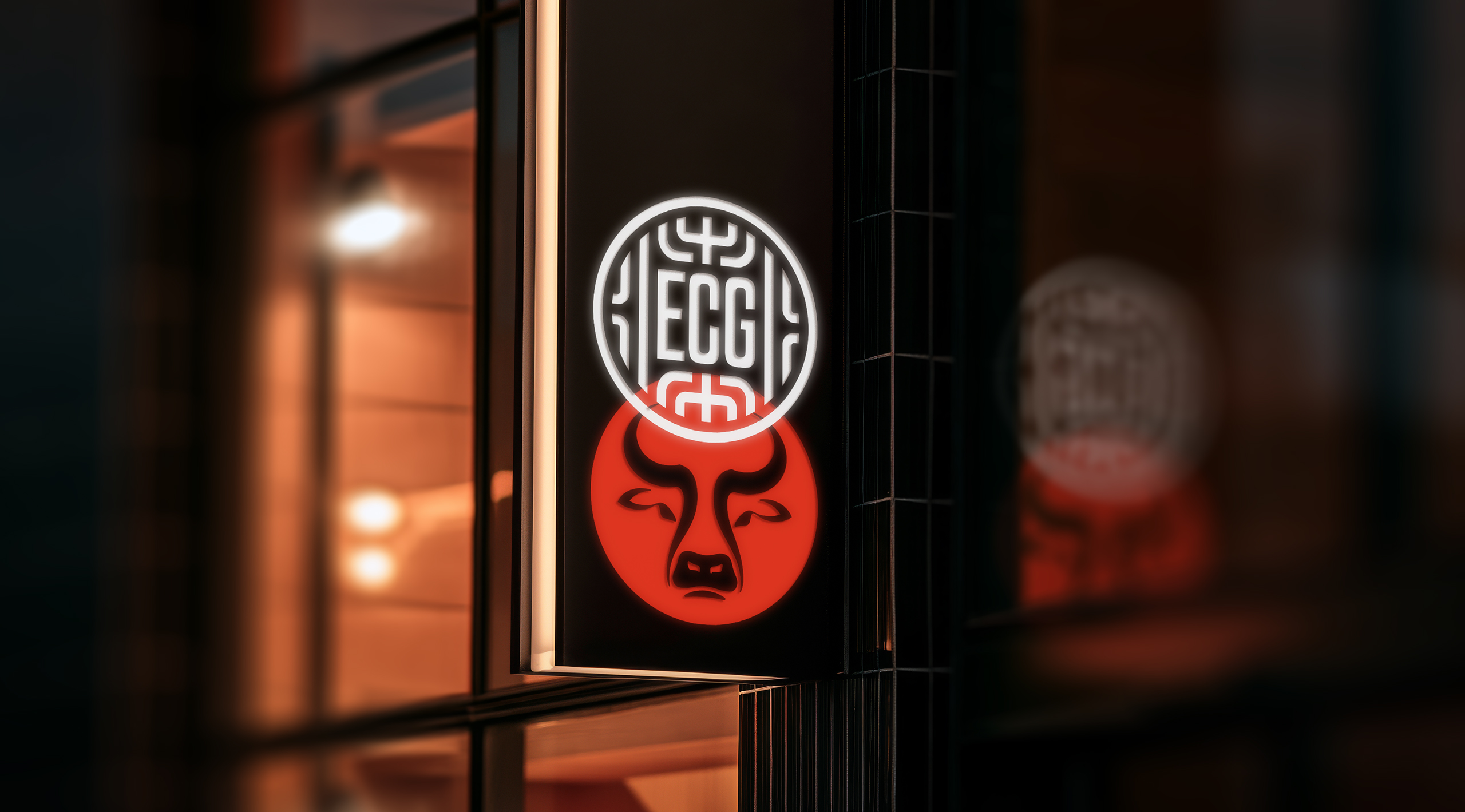
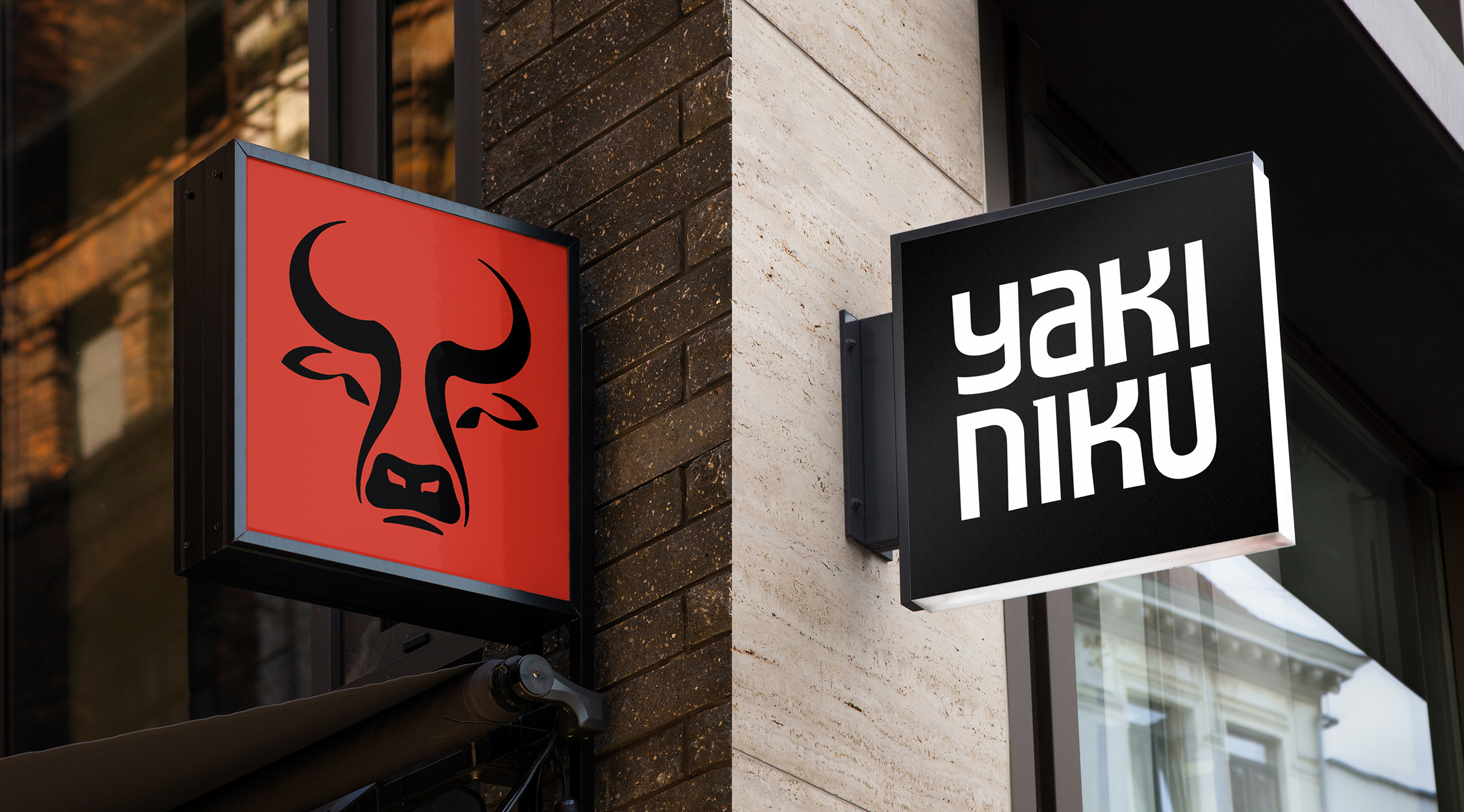
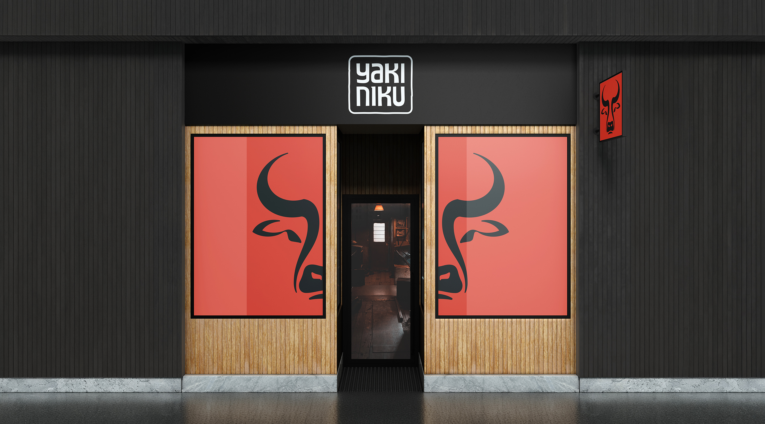
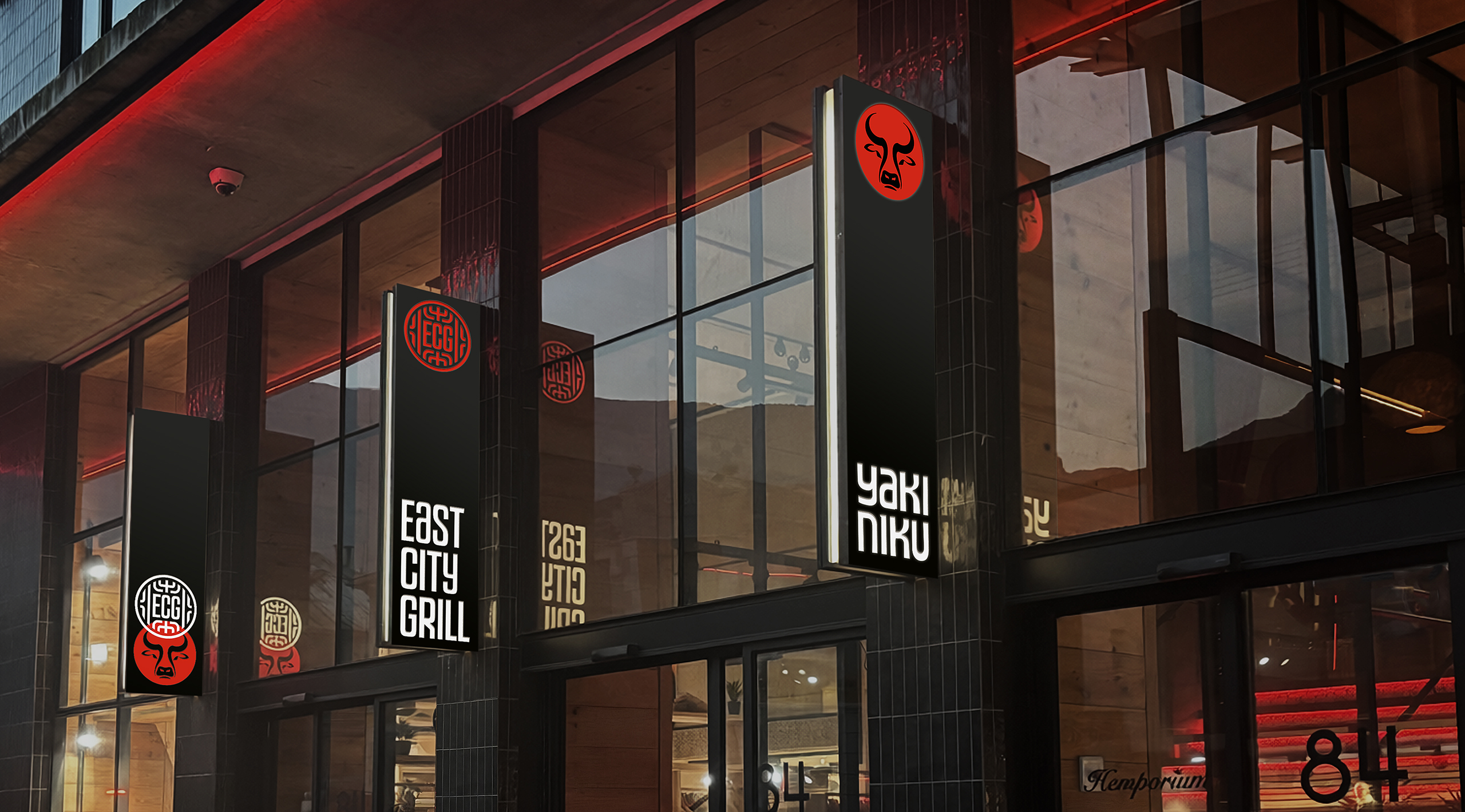
Early design concept stages applied to indicative signage shows immediate impact through the choice of primary ingredients and bold colour.

We felt the mark echoed Chef Jaycee's commitment to craftsmanship, quality and attention to detail.

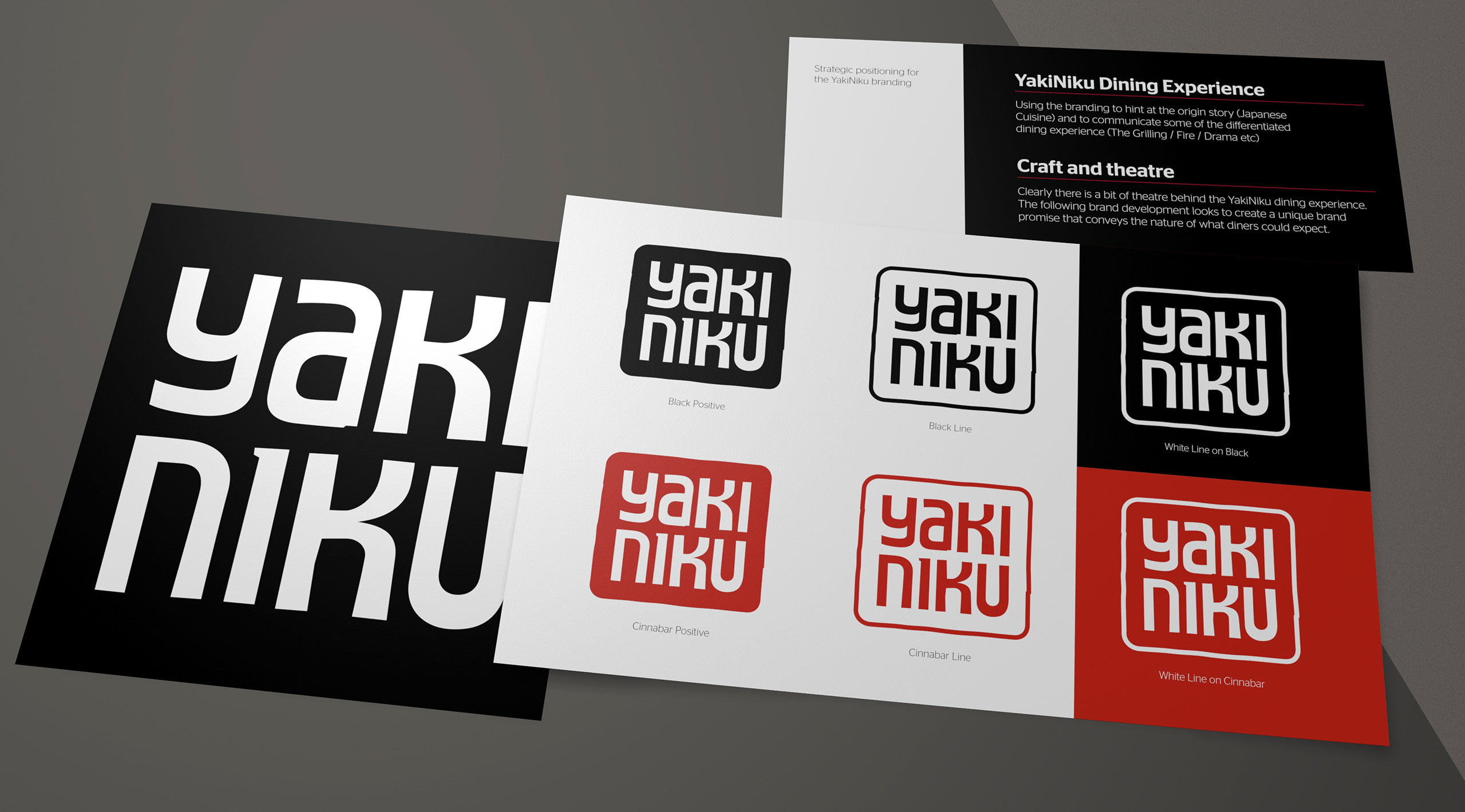
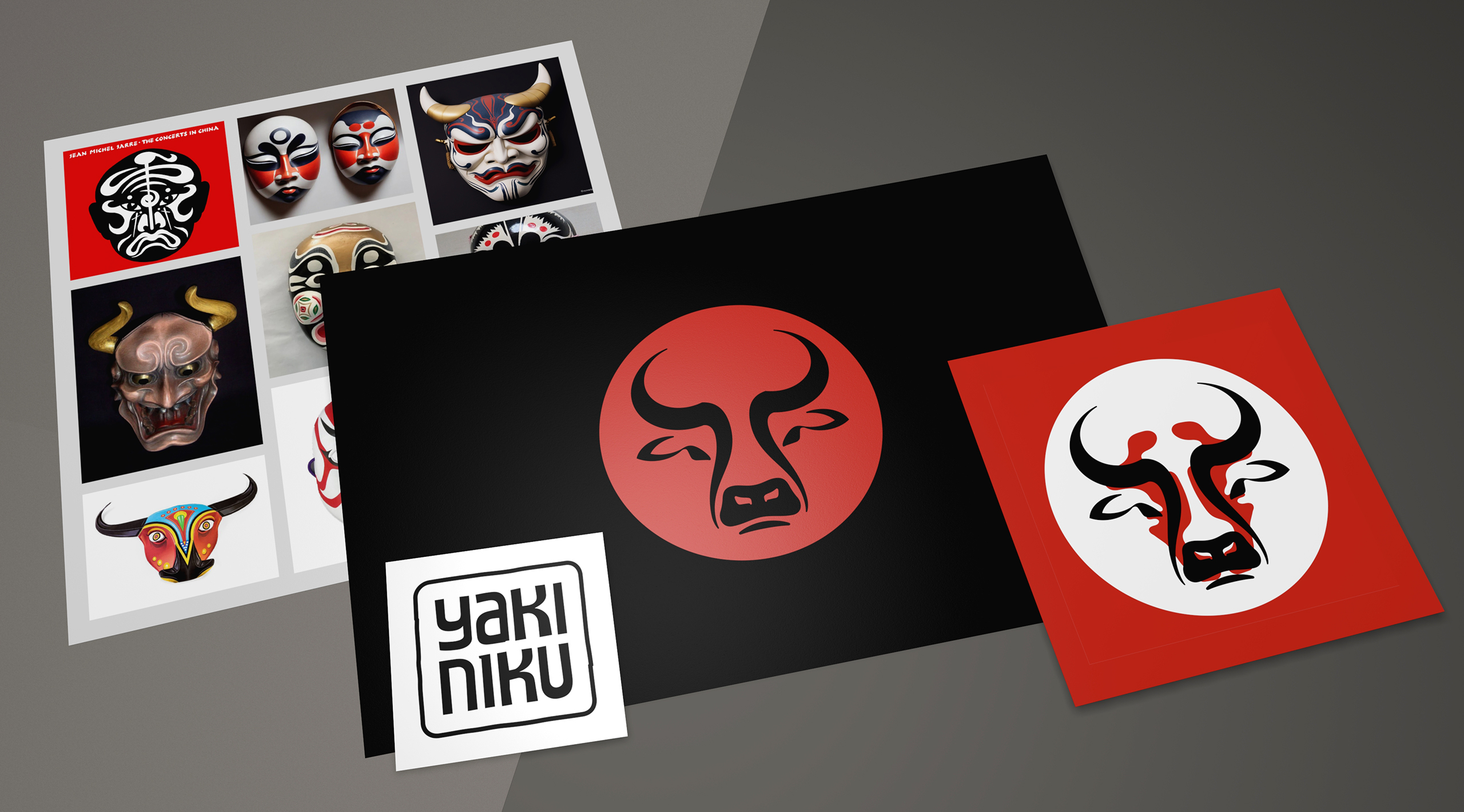
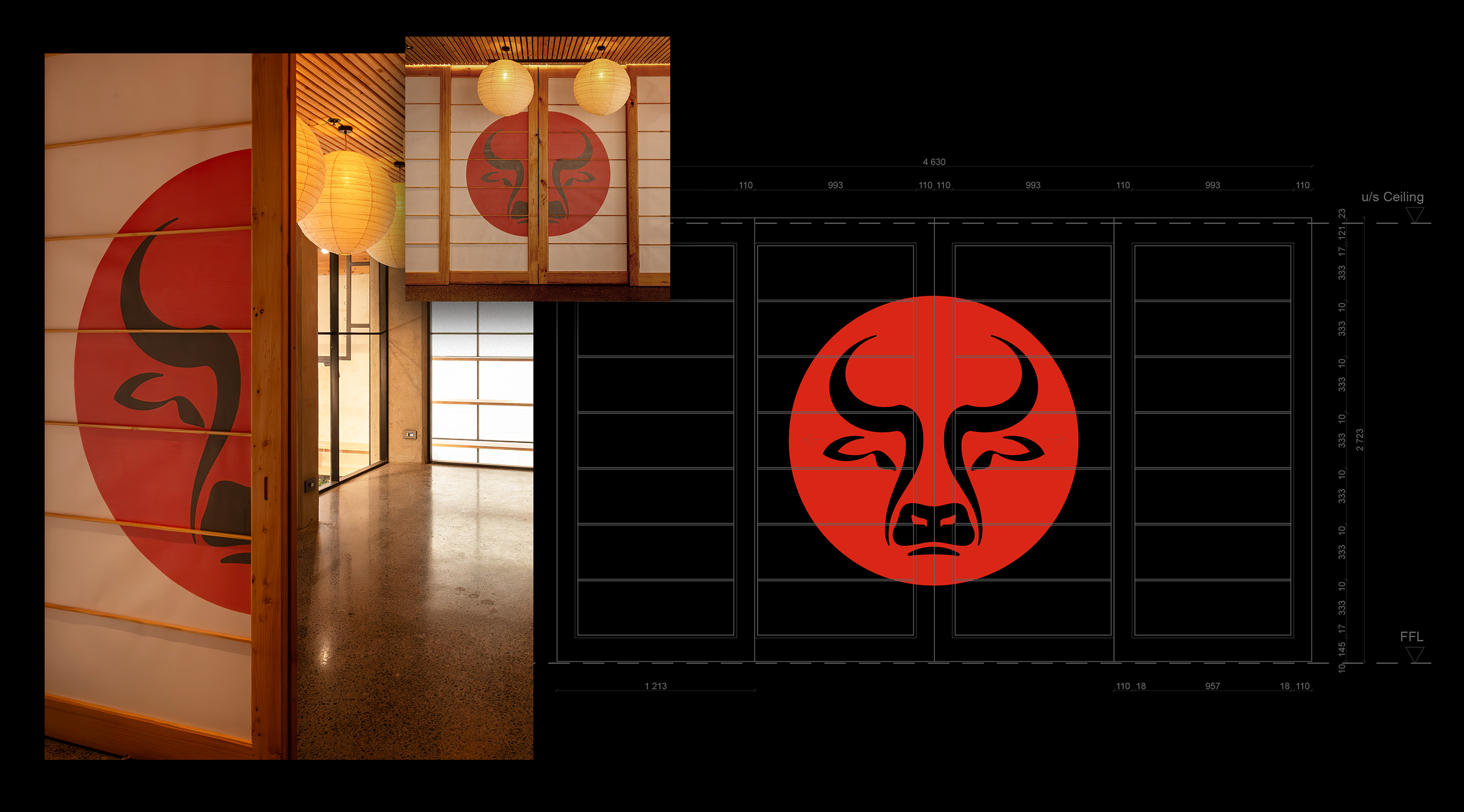
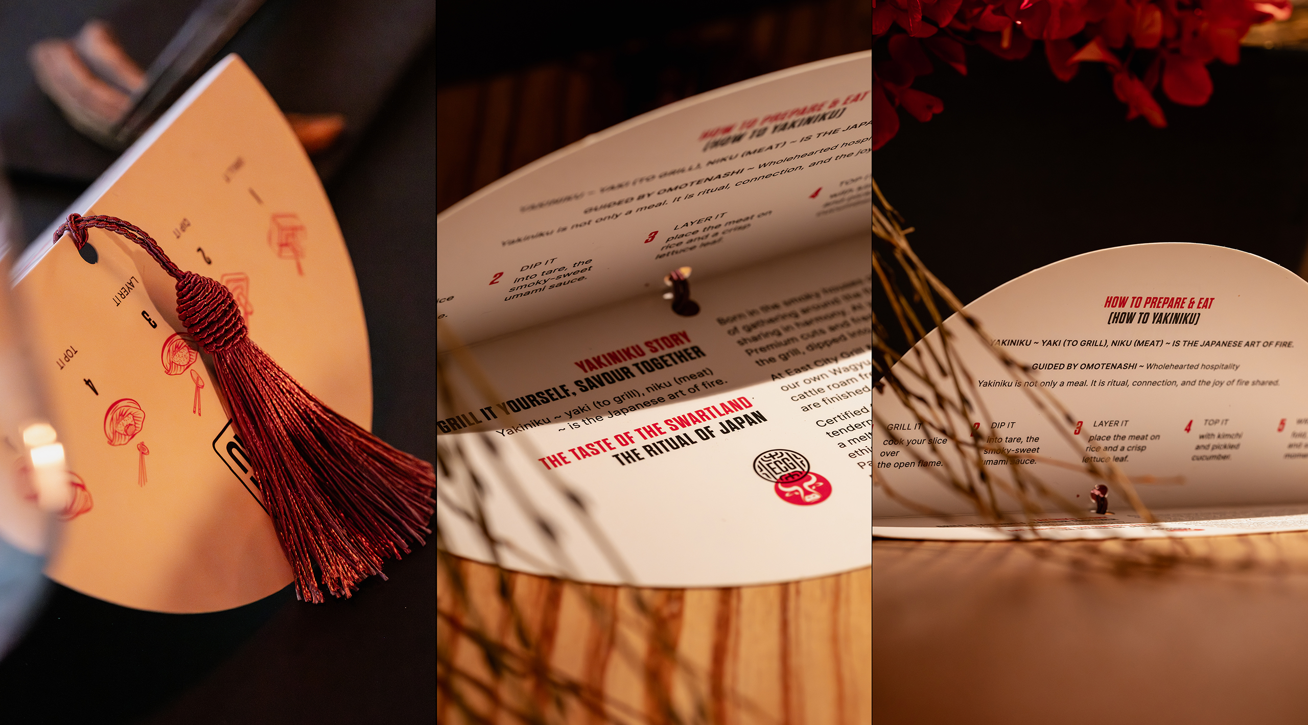
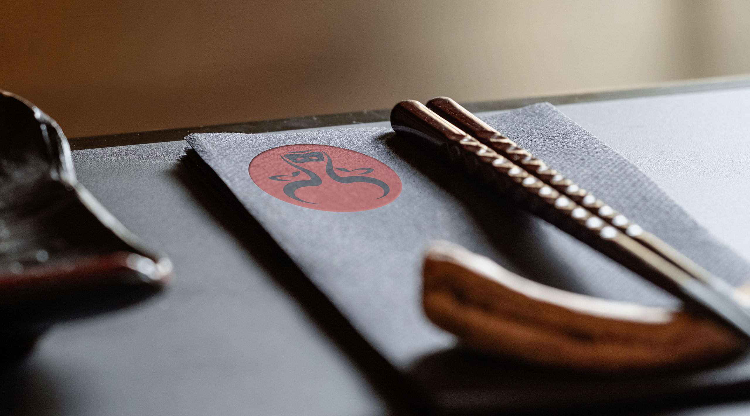
We conducted extensive research into both classical and contemporary Japanese design. Throughout, we noticed a clear respect for space, balance and restraint. We were also drawn to our favourite colour palette of black, red and white. Used together, these colours create impact and demand attention. We started by stacking the two terms within YakiNiku, immediately improving legibility. We then introduced a play between uppercase and lowercase letterforms, selecting the combination that best aided readability. To contain the wordmark, we created a Hanko-inspired stamp device. A hanko stamp, or the resulting inkan imprint, is a personal seal traditionally used in Japan in place of a signature. Found on everything from official documents to paintings, calligraphy and other creative works, it serves as a mark of identity, authorship and authenticity. We felt the mark echoed Chef Jaycee’s commitment to craftsmanship, quality and attention to detail. We kept the device deliberately minimal, retaining a contemporary feel while acknowledging the cultural reference. We also created a cow’s head icon to act as a supporting symbol. The mark was inspired by the graphic simplicity found in Japanese Noh theatre masks. These forms convey great drama through the use of bold contrast and highly reduced shapes.

Developmental Yaki Niku brand mock-ups created whilst 84 Harrington street was being built.

The East City Grill main course

Once we had established the branding theme for YakiNiku, we were briefed on the master brand for East City Grill. ECG, as it is commonly known, is both the sister brand and host to YakiNiku. It accounts for the majority of covers and occupies most of the restaurant’s floorspace. The dining experience is more familiar than YakiNiku. Food is prepared on the kitchen grill and served to diners in the traditional way. That said, the menu remains deeply inspired by Asian flavours and techniques. This is not a typical grill house. Our remit was to create a sister brand that worked alongside YakiNiku while conveying a more Western dining experience. The East City Grill name itself carries a pleasing ambiguity, referencing both Cape Town’s East City precinct and the influence of the East on its culinary style. It is a simple idea, but a surprisingly effective one.

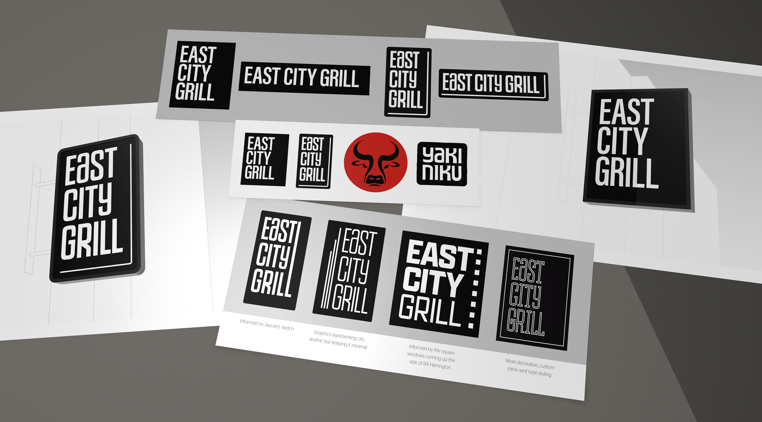
The East City Grill brand identity design grew out of the YakiNiku concepts. We needed to visually link the identities.
The 84 Harrington landmark location, in the East City precinct of Cape Town.

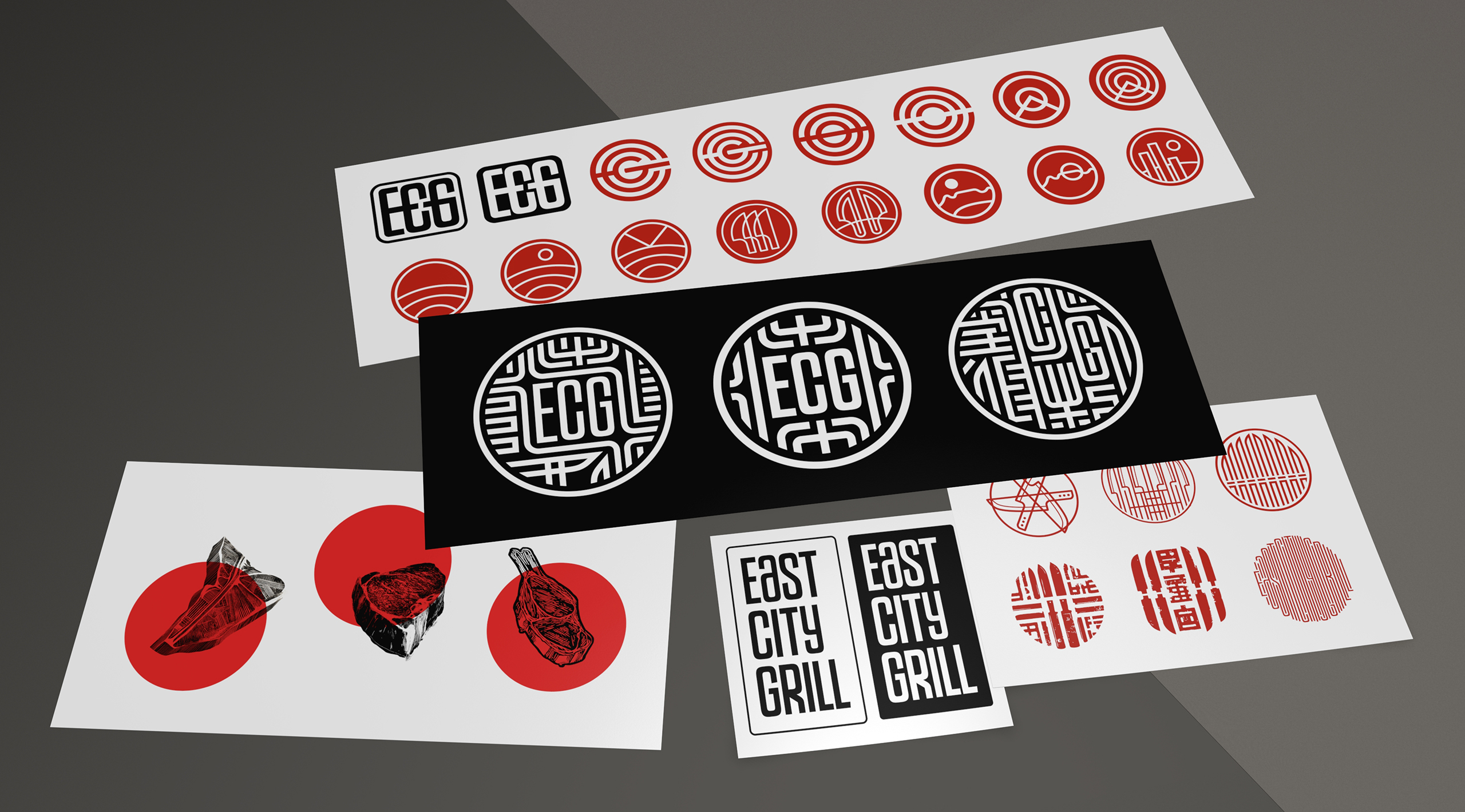
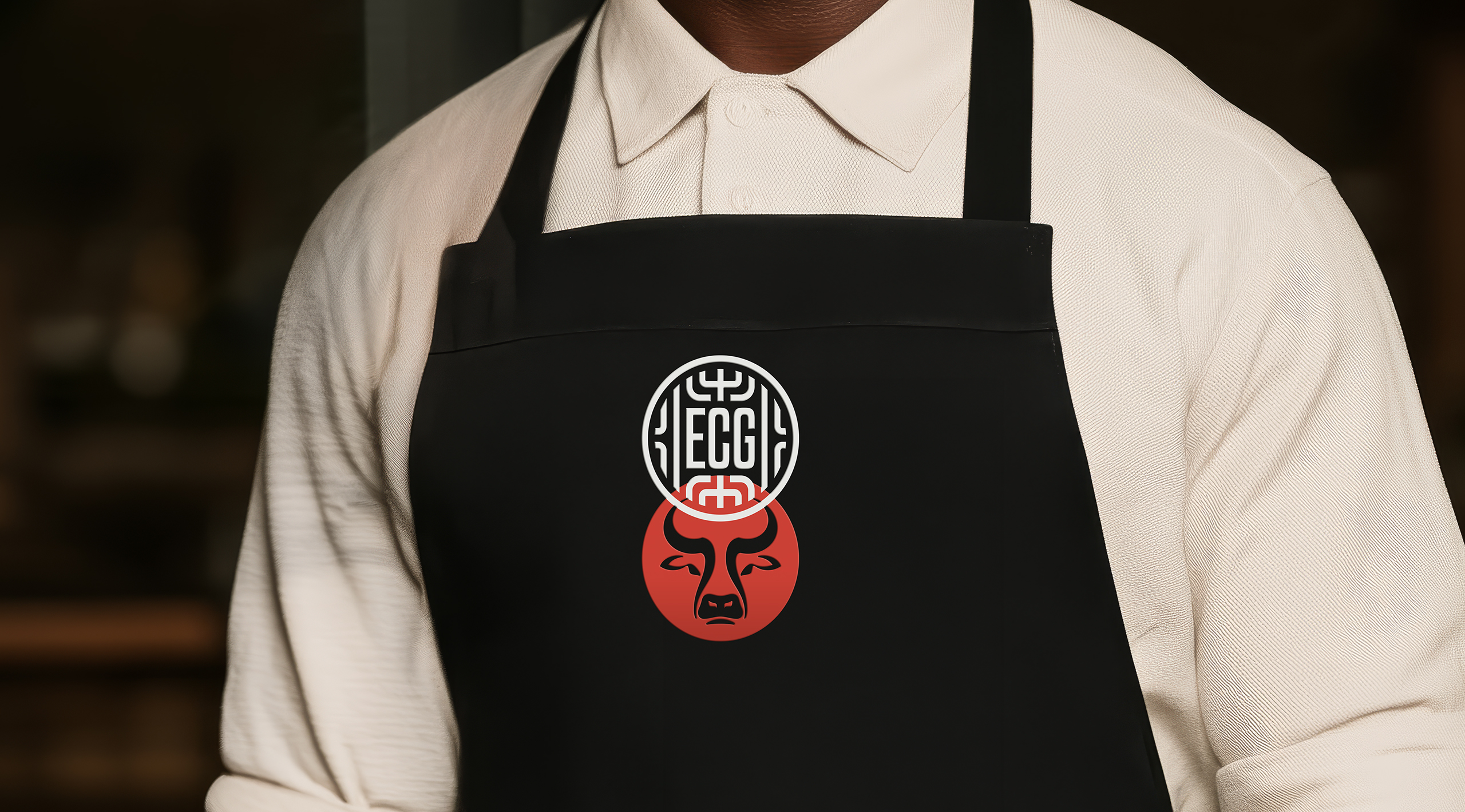
The ECG symbol linework is formed from forks and grilling tools, arranged in a mirrored composition around the monogram.

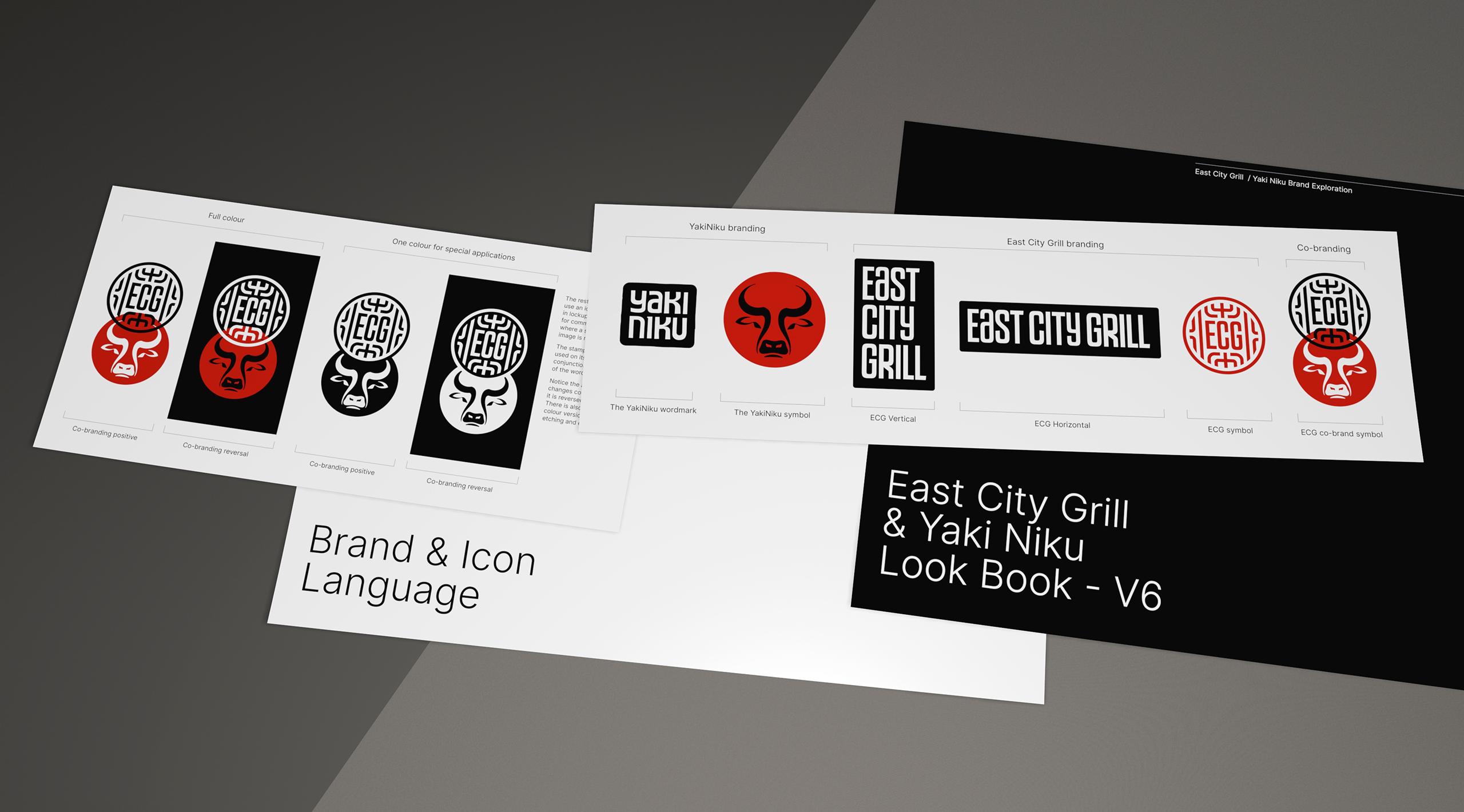
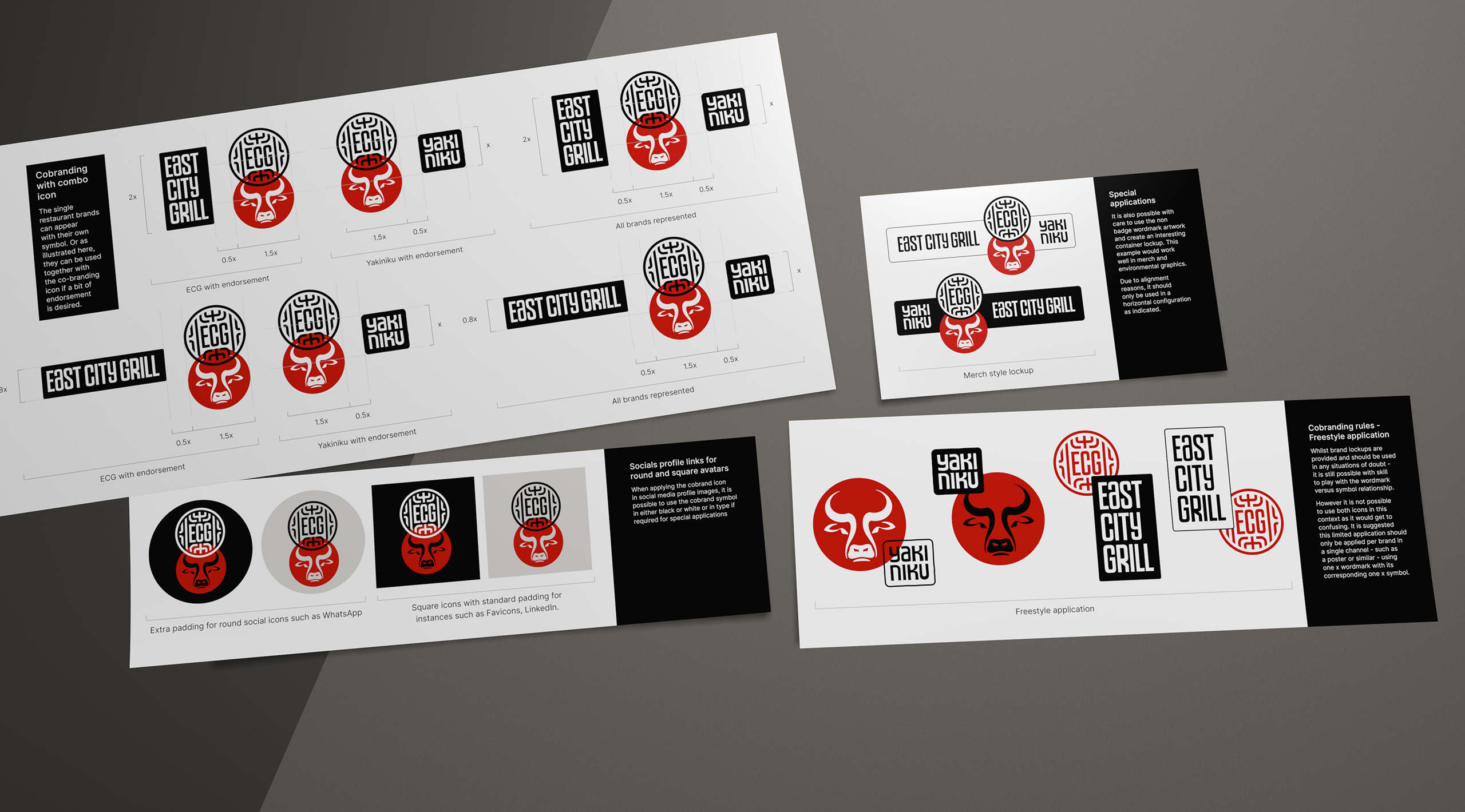
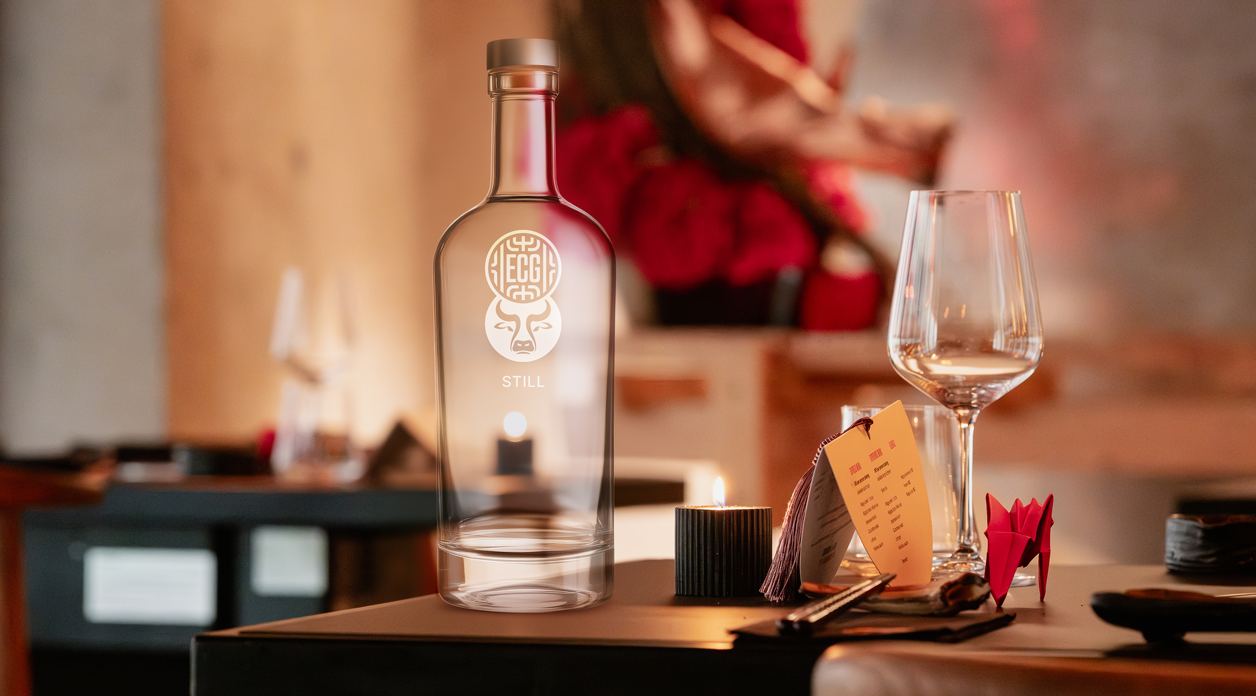
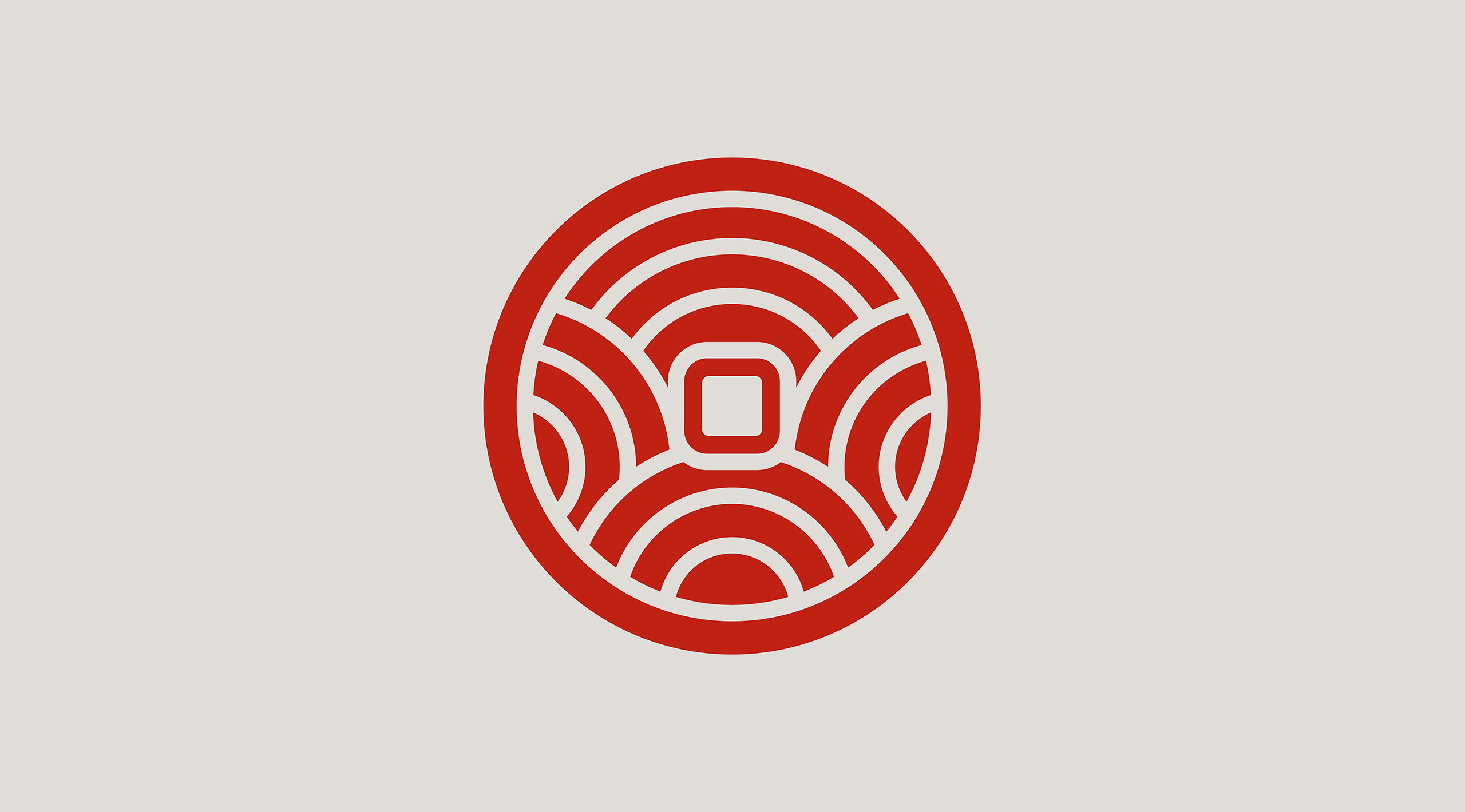
The client team requested a standalone symbol for East City Grill, allowing it to balance naturally with the YakiNiku wordmark and stamp. We explored a wide range of concepts before settling on a monogram solution built around the ECG abbreviation. The resulting mark carries some of the qualities of a Hanko stamp, but with more universal contemporary forms. The linework is formed from forks and grilling tools, arranged in a mirrored composition around the monogram. During the process, we struck upon the idea of combining both marks into a shared brand symbol. The result works remarkably well as a co-branded device, allowing the relationship between East City Grill and YakiNiku to be expressed in a simple and memorable way. Rather than create a rigid corporate brand architecture, we developed a flexible system in which the symbols can be used independently or together. We provided a range of recommended lockups and relationship models, allowing the brand family to adapt to different applications while maintaining a strong and consistent visual language.

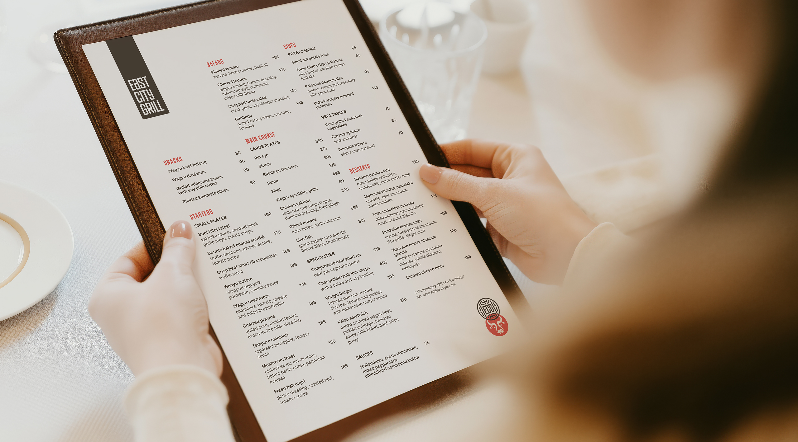
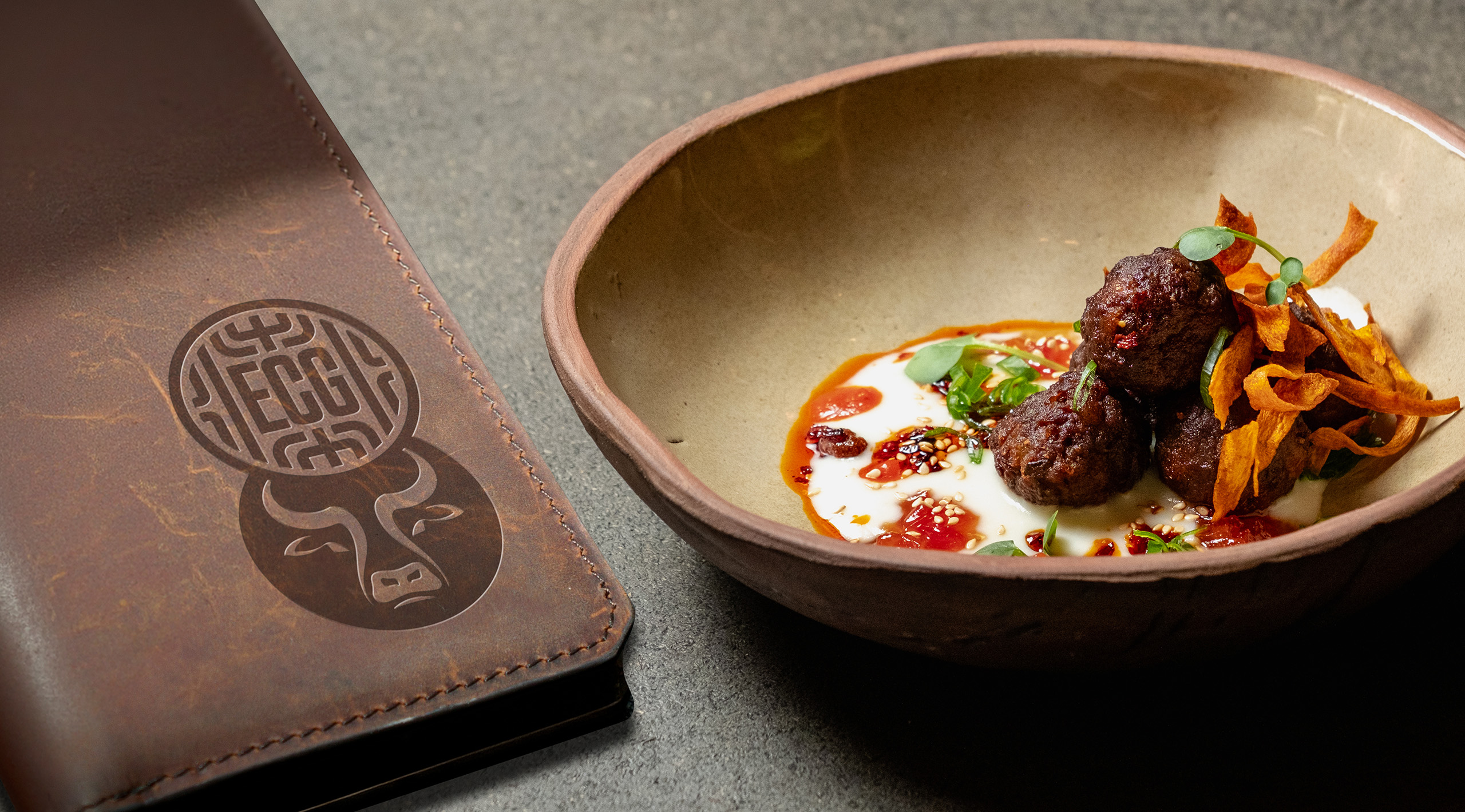
The ECG menu features the wordmark totem and the co-branding symbols.

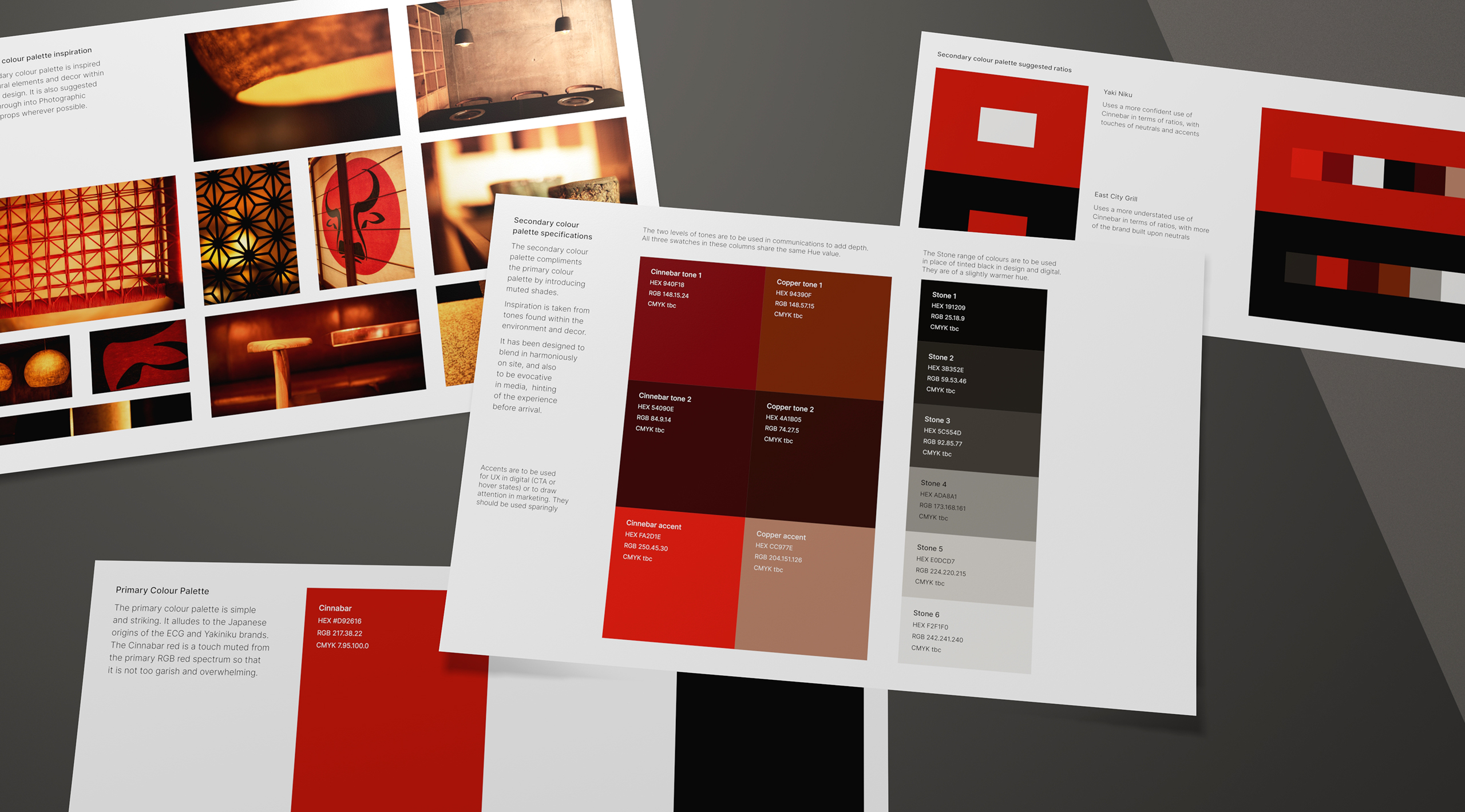
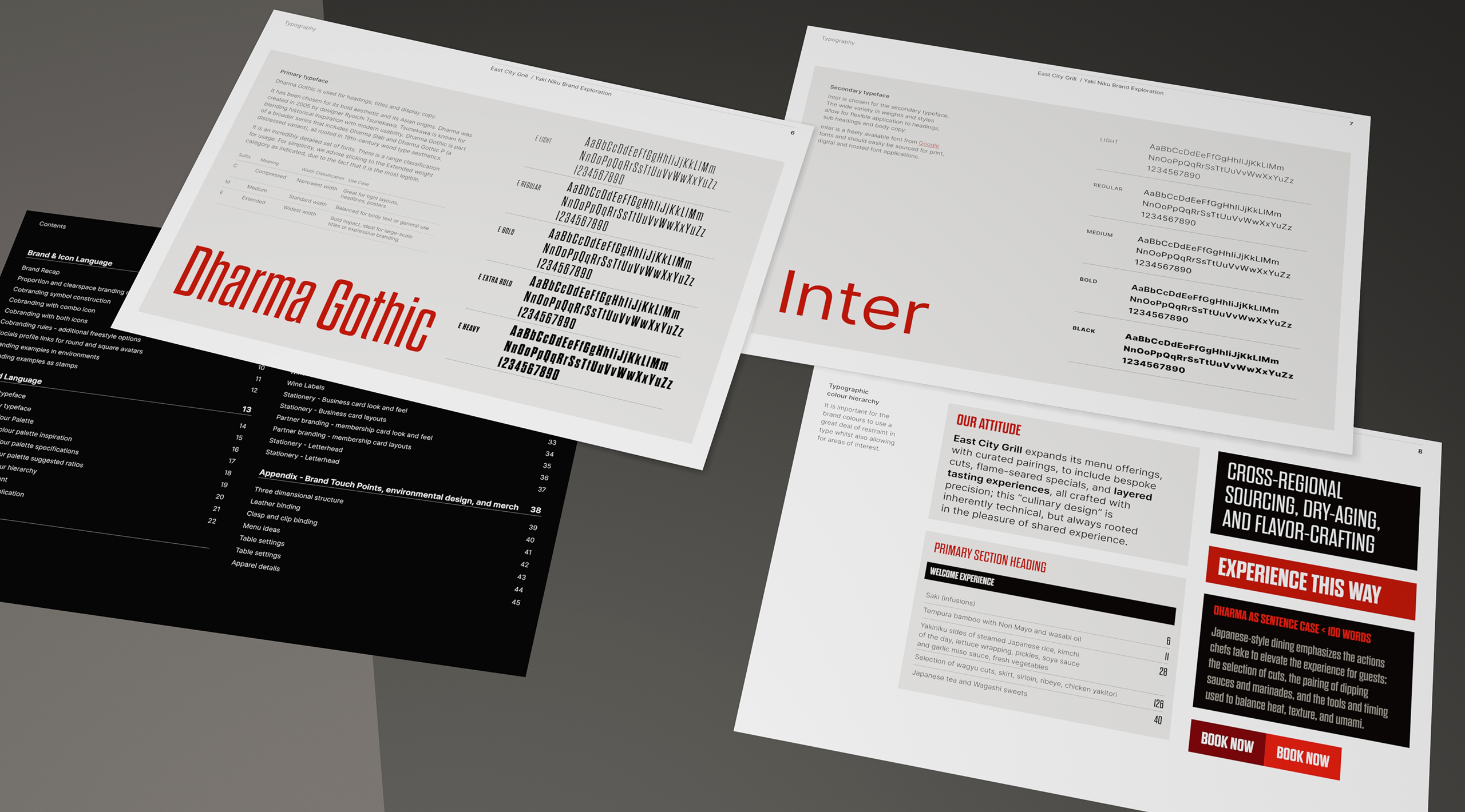
As part of the branding process, we compile developments into a brand workbook, building the narrative and design system over time.

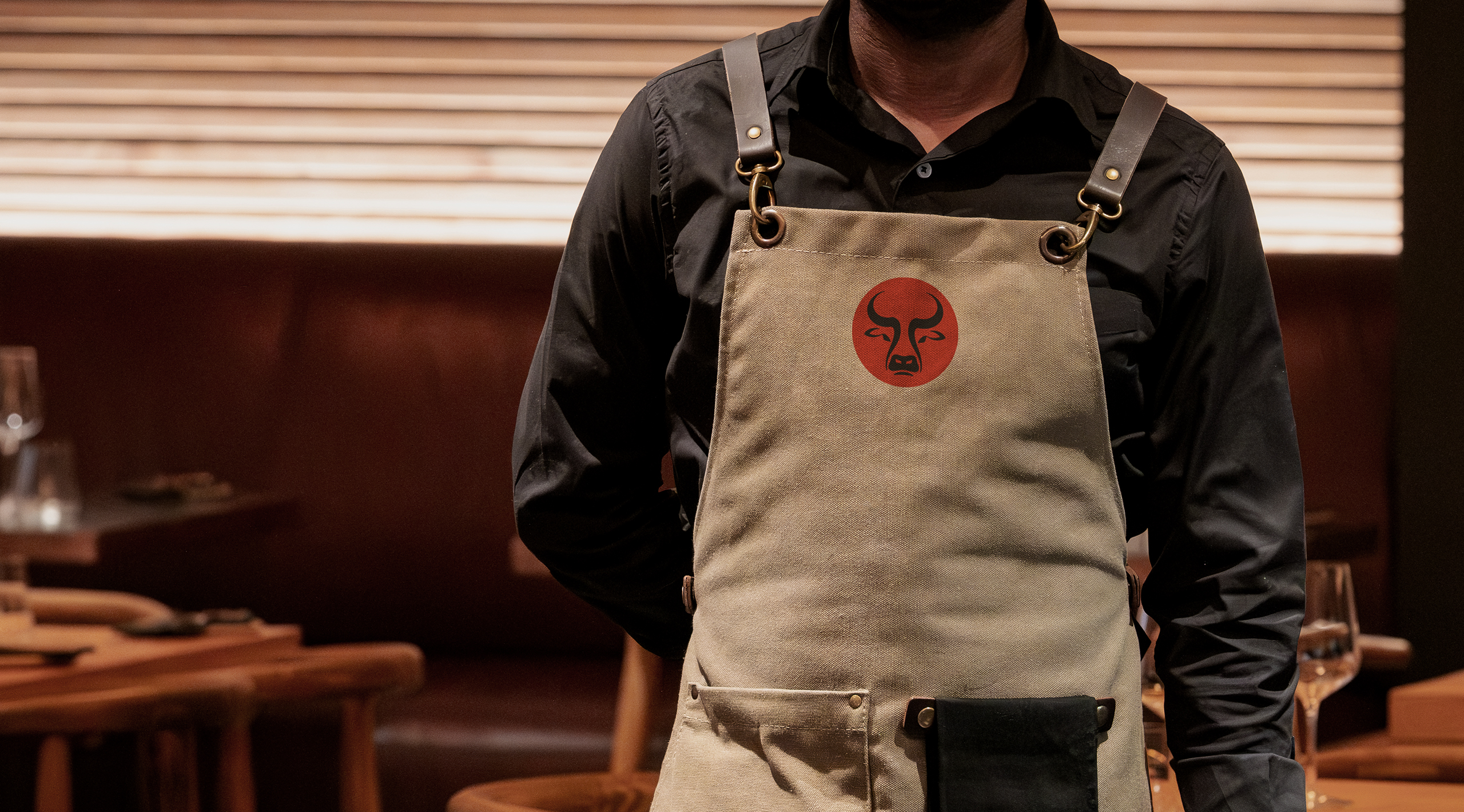
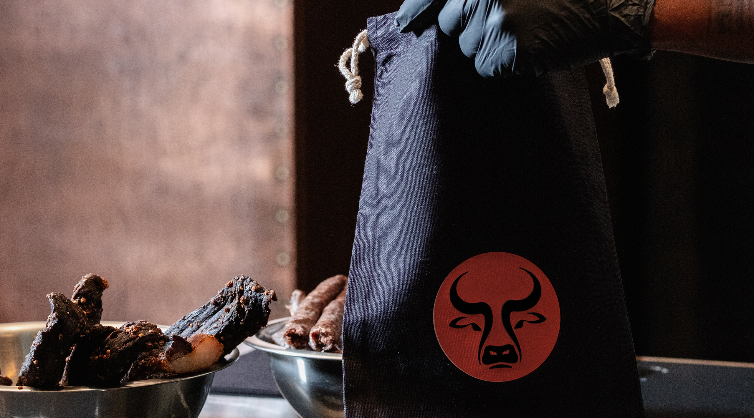
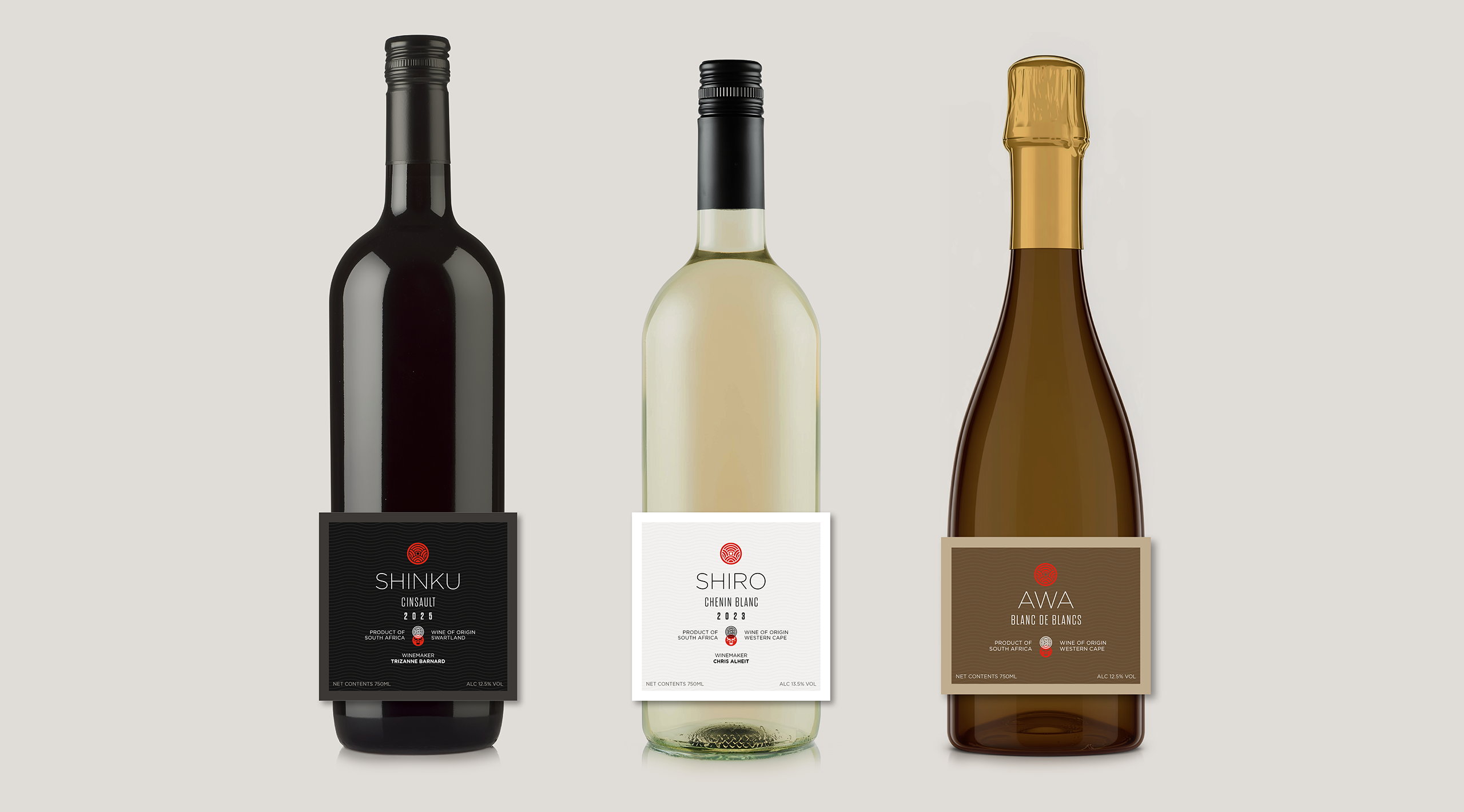
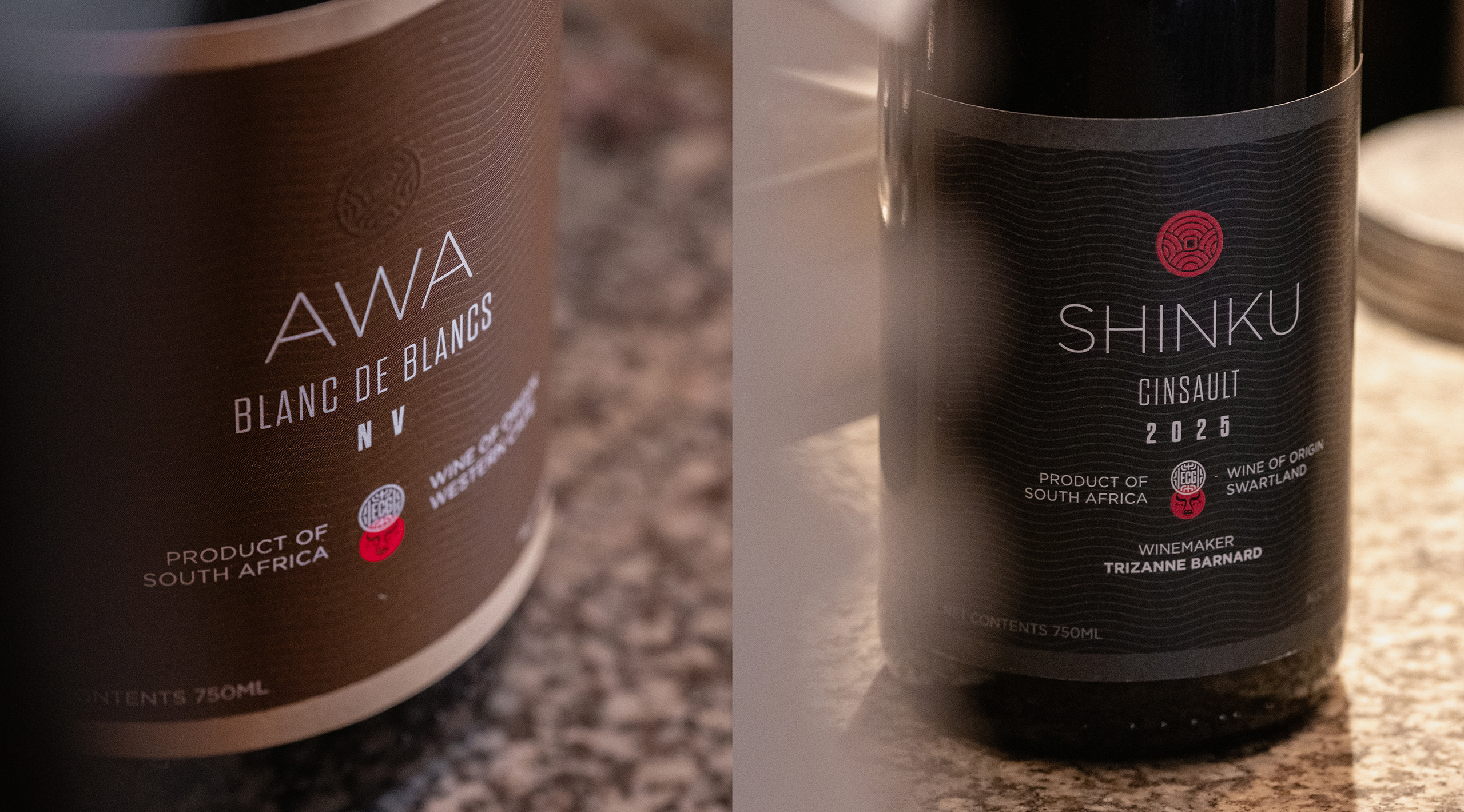
As part of the branding process, we compile developments into a brand workbook, building the narrative and design system over time. The ECG system includes guidance for primary and secondary colour palettes, typography, type hierarchy, photography, iconography and brand application principles. We also created an extensive suite of brand communications. These include menus for both ECG and YakiNiku, signage and environmental graphics, livery, uniforms, merchandise, stationery, packaging, social media assets, launch communications, advertising, promotional materials, digital content and website guidance. We were also honoured to create a series of house wine names and labels. Shinku, the red, takes its name from the Japanese word for deep crimson. Shiro, the white, references the Japanese word for white. Awa, the Cap Classique, takes its name from the Japanese word for bubbles and foam.

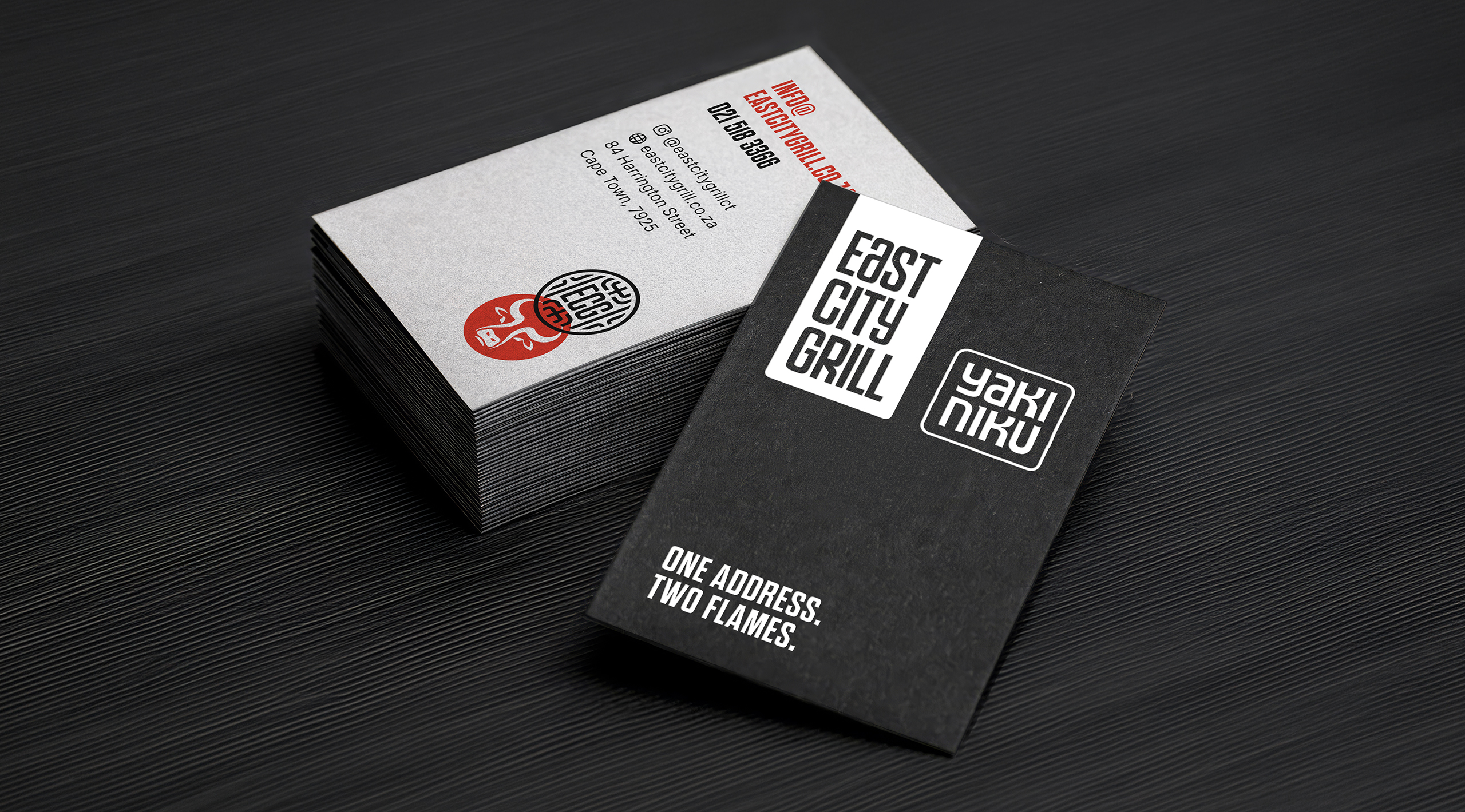
The business card with the supporting statement - One Address. Two Flames.
The three different house wines and their labels.

One of the most important contributors to the launch has been an exceptional PR and content creation programme.

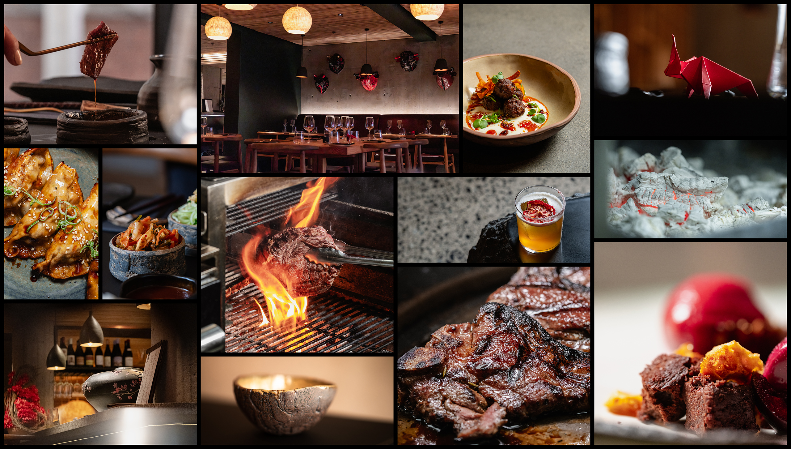
Beyond the identity itself, one of the most important contributors to the launch has been an exceptional PR and content creation programme. The imagery featured throughout this case study includes work by food and hospitality photographer Dale Herbst, whose ability to capture both the food and the experience has become an important part of the brand story. The photography presents dishes in their best light while reinforcing the warmth and atmosphere of the environment itself. The carefully considered colour grading also aligns naturally with the brand palette, creating a consistent visual experience across both the restaurant and its communications. Combined with a well-executed PR strategy, this imagery has helped establish East City Grill and YakiNiku as one of Cape Town’s most talked-about dining destinations, generating extensive media coverage and public attention. We also worked in conjunction with web developer Jeroen Seynhaeve who is an existing partner to the restaurant owners. Jeroen did a great job of taking our brand and creating the group and individual brand websites for ECG and YakiNiku.

Imagery shot by Dale Herbst.

At its heart, East City Grill and YakiNiku combine the bold, fire-led traditions of South African braai culture with the precision and ritual of Japanese dining.

The sweet finish

The restaurants have been busy from the outset. Executive Chef Jaycee Ferreira has created a genuine masterstroke of East meets West. Drill down a little further and the proposition becomes even more interesting. At its heart, East City Grill and YakiNiku combine the bold, fire-led traditions of South African braai culture with the precision and ritual of Japanese dining. What prevents the concept from becoming another fusion cliché is the depth of thought behind it. From a dedicated Wagyu breeding programme in the Swartland to imported Japanese grills, premium rice sourced from Japan and a dining experience rooted in authentic yakiniku traditions, the concept has substance at every level. Rather than simply blending influences, it celebrates the strengths of both cultures with care and conviction.

Our contribution was to create a gestalt brand system capable of bringing these stories together. The result is a distinctive visual language that feels contemporary, recognisable and culturally respectful. Rather than relying on obvious visual stereotypes, the identity draws on subtle references to Japanese design principles, creating a family of brands that feel connected, memorable and entirely their own. The results continue to stack up favourably. At the time of writing, East City Grill & YakiNiku holds a 5-star rating on TripAdvisor and the site ranks the restaurant in the top 10% of Cape Town destinations. This is backed up by a 4.8-star Google rating across 138 reviews. Reviewers consistently praise the originality of the concept, the quality of the food, the atmosphere and the standard of service. Media coverage from local and national food publications has helped establish East City Grill and YakiNiku as one of Cape Town’s most talked-about new dining destinations.