Website design and build

Aquaterra

A best in field sports site for Aquaterra.

Aquaterra is a charity funded by Islington Council that endeavours to develop and sustain healthier, happier and fitter communities. The charity manages leisure centres across the UK. Our work included digital strategy, architecture & wireframing, website design & build, digital publishing.

We are very happy with the results we have achieved. With a site designed with core functions in mind, you are looking for trends opposite to say a publishing type site. Reduced on page times indicate users being able to retrieve information quickly before exiting or moving on. We also greatly reduced the need to navigate down dead end user journeys by reducing the number of pages drastically with the result of users being better aided through their journeys

Our task was to increase site functionality by presenting it in a user-friendly way, making Aquaterra accessible for all.

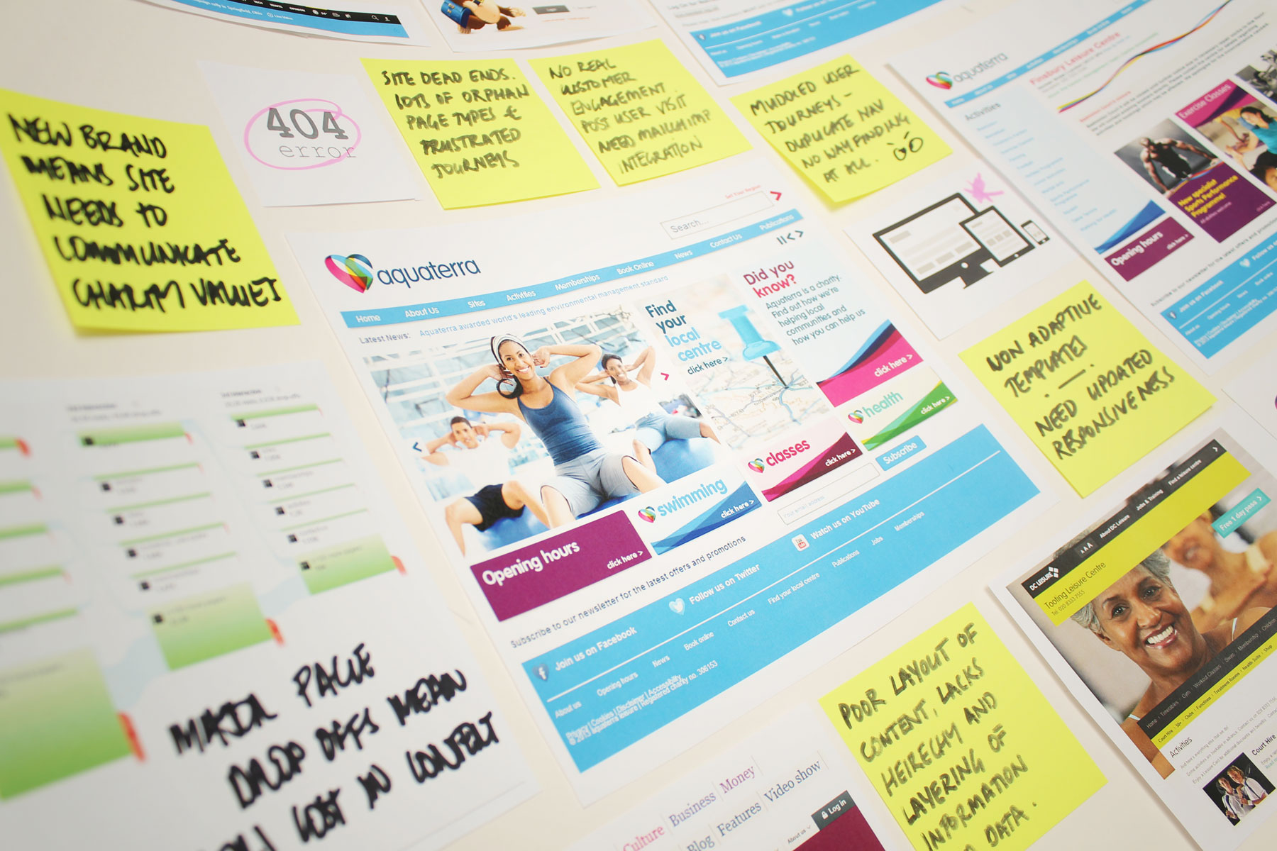
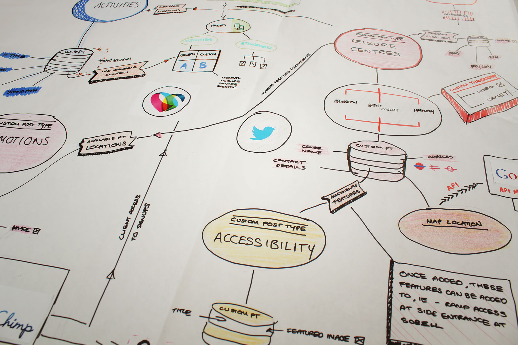
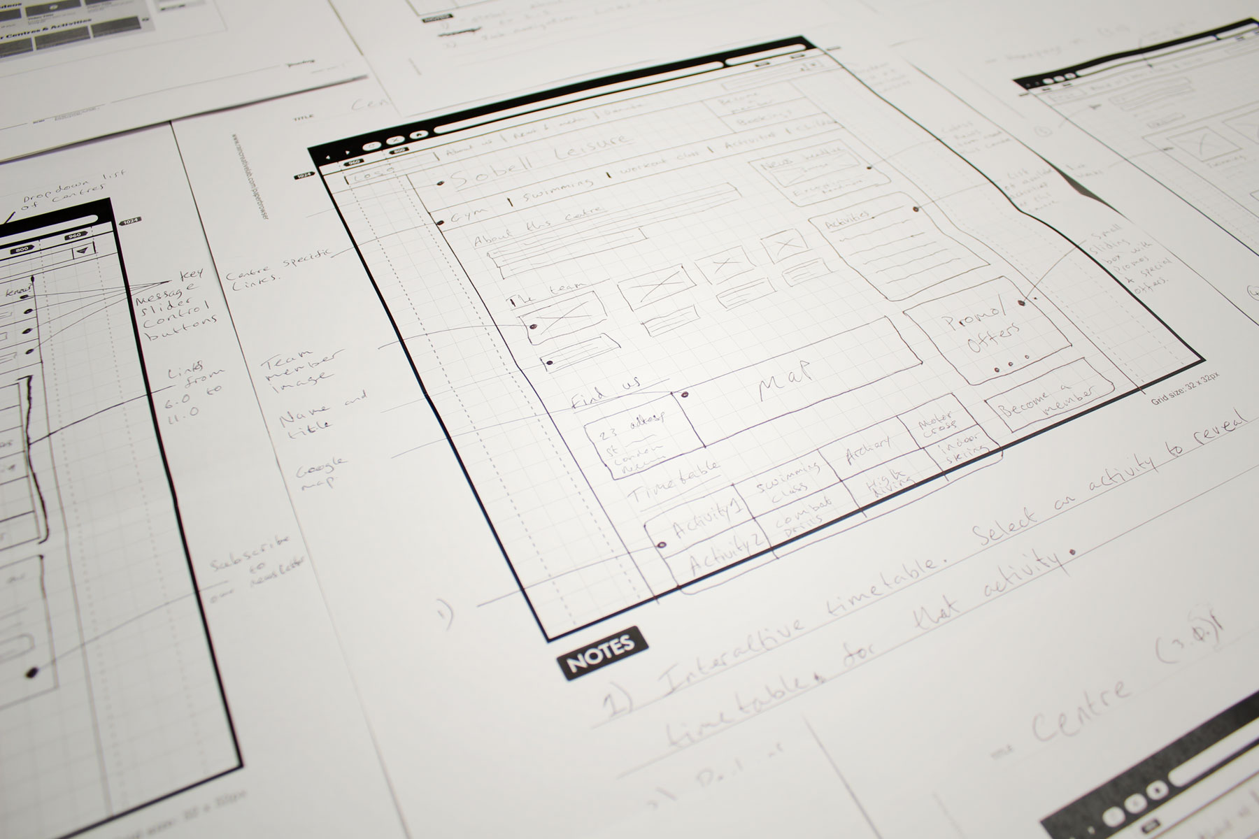
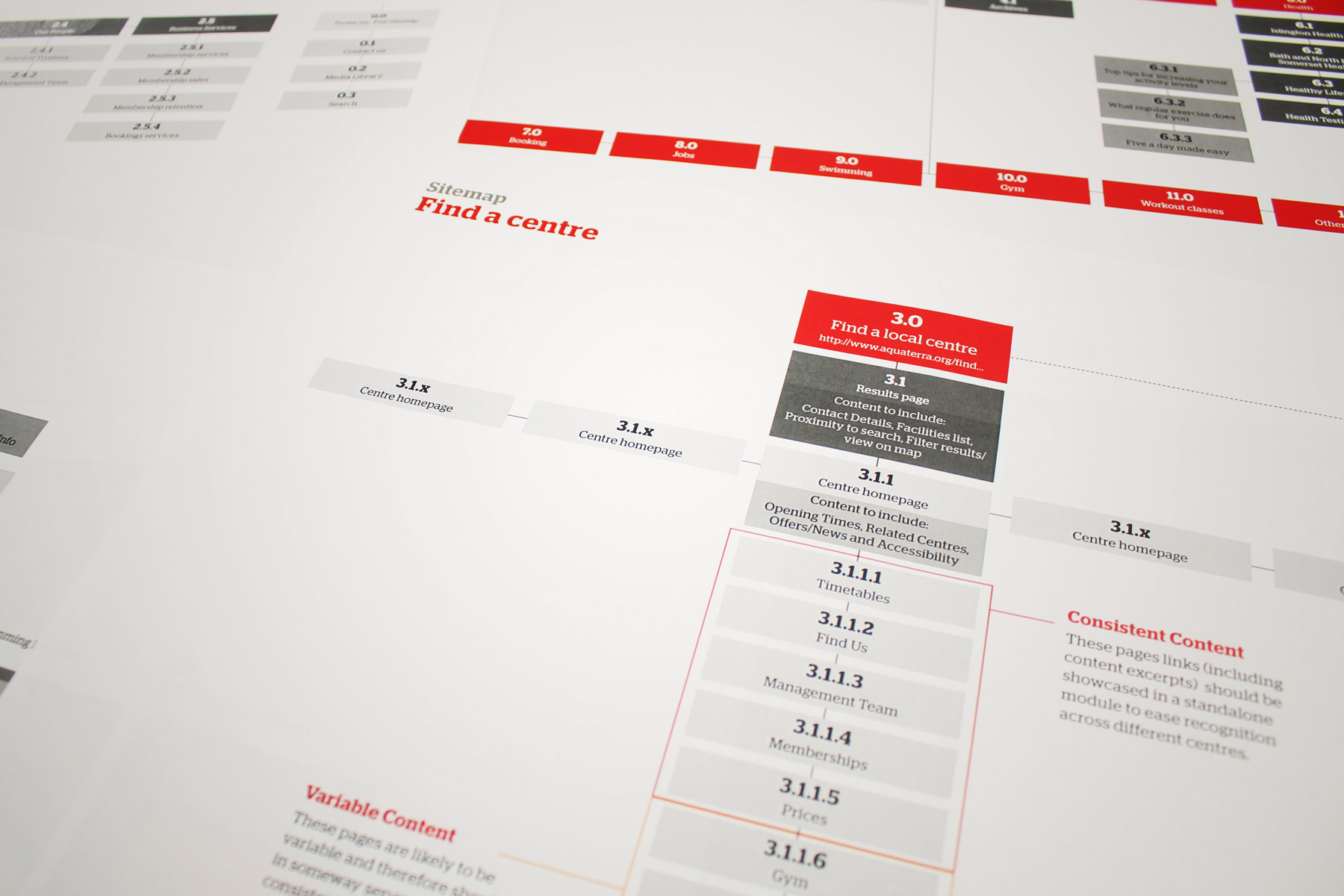
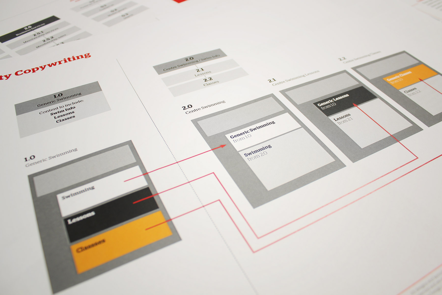
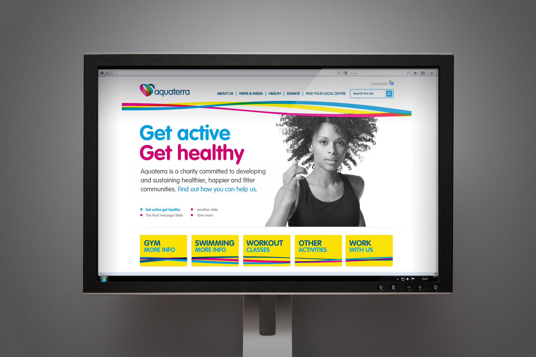
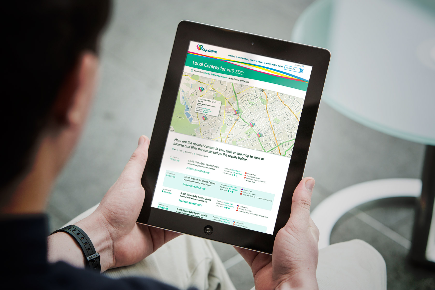
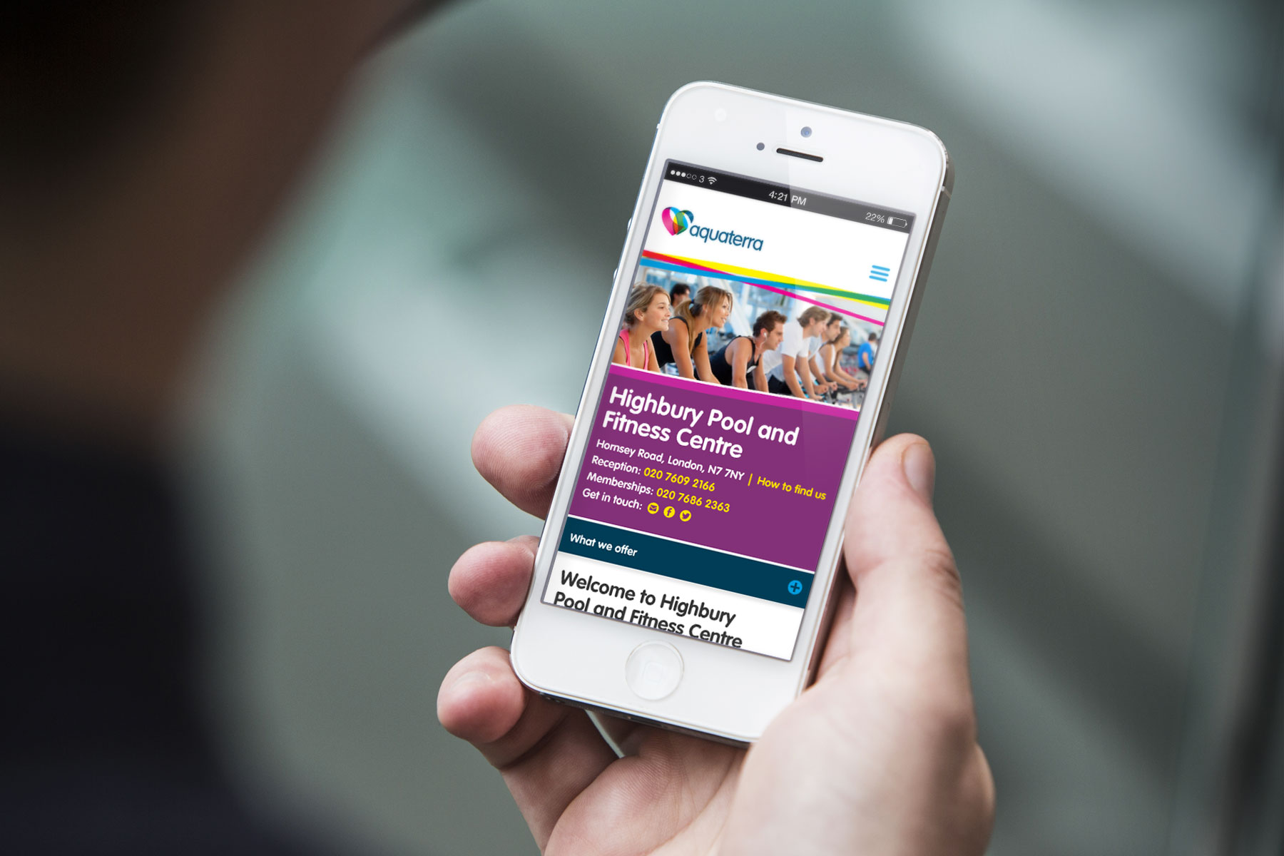
Aquaterra’s existing website was extremely hard to navigate, with duplicate pages and redundant data. Our task was to increase site functionality by presenting it in a user-friendly way, making Aquaterra accessible for all. We were tasked in the creation of a mobile first community HTML 5 website. Content was curated depending on user’s location and interests for an audience ranging from young children to senior citizens. A diverse audience uses Aquaterra’s site: it was therefore paramount that the UX was very strong for all users. We primarily achieved this through simplifying the entire look and feel of the site, employing large typography and outlining key information to increase task completion.

On the phone app, 20 columns were reduced to just a couple in order to optimise usability and mobile usage has increased significantly.

Furthermore, we developed a solution whereby the content was automated according to sport preference and location. We also wanted to represent data in a way that was compatible with the medium used. On the phone app, 20 columns were reduced to just a couple in order to optimise usability and mobile usage has increased significantly. In addition to this, we made the graphical interface including functional buttons much bigger.

We were provided with a brand identity to work from. We wanted to take this identity and bring it to life in the digital environment. We therefore researched our favourite uses of infographics, sporting media and imagery

60% of visits are reaching goals within 1 click, compared to a previous 40%.

Social interaction and sharing have been significantly improved and users complete their goals much quicker. Before, it wasn’t uncommon for users to visit more than 20 pages on a single visit. Now, 60% of visits are successful within 1 click, compared to a previous 40%. Furthermore, greatly improved SEO leads to quicker site usage.  Finally, the entire site now promotes more relevant content via smart tagging and taxonomy design.

Following research of site users, we found that no less than forty percent of users were using the site from a mobile device. We developed the CMS framework around optimising the experience for users on the go.
We adapted the responsive design right down to a single column layout so that mobile users could easily navigate the site without compromising on legibility of content
Sign up for our Firedog Newsletter
* = required field