Brand & Visual Identity

Microbiology Society

Creating a flexible visual identity for the largest learned microbiological society in Europe.

The largest learned microbiological society in Europe, The Microbiology Society is a is a membership charity for scientists interested in microbes, their effects and their practical uses. Our work with the Society extended to brand identity, visual identity, brand and spirit guidelines, website style guidelines and social media skins. We also have provided strategic guidance and design guidelines for their various publications.

We began the process by roughing out concepts as a bedrock for the identity system.

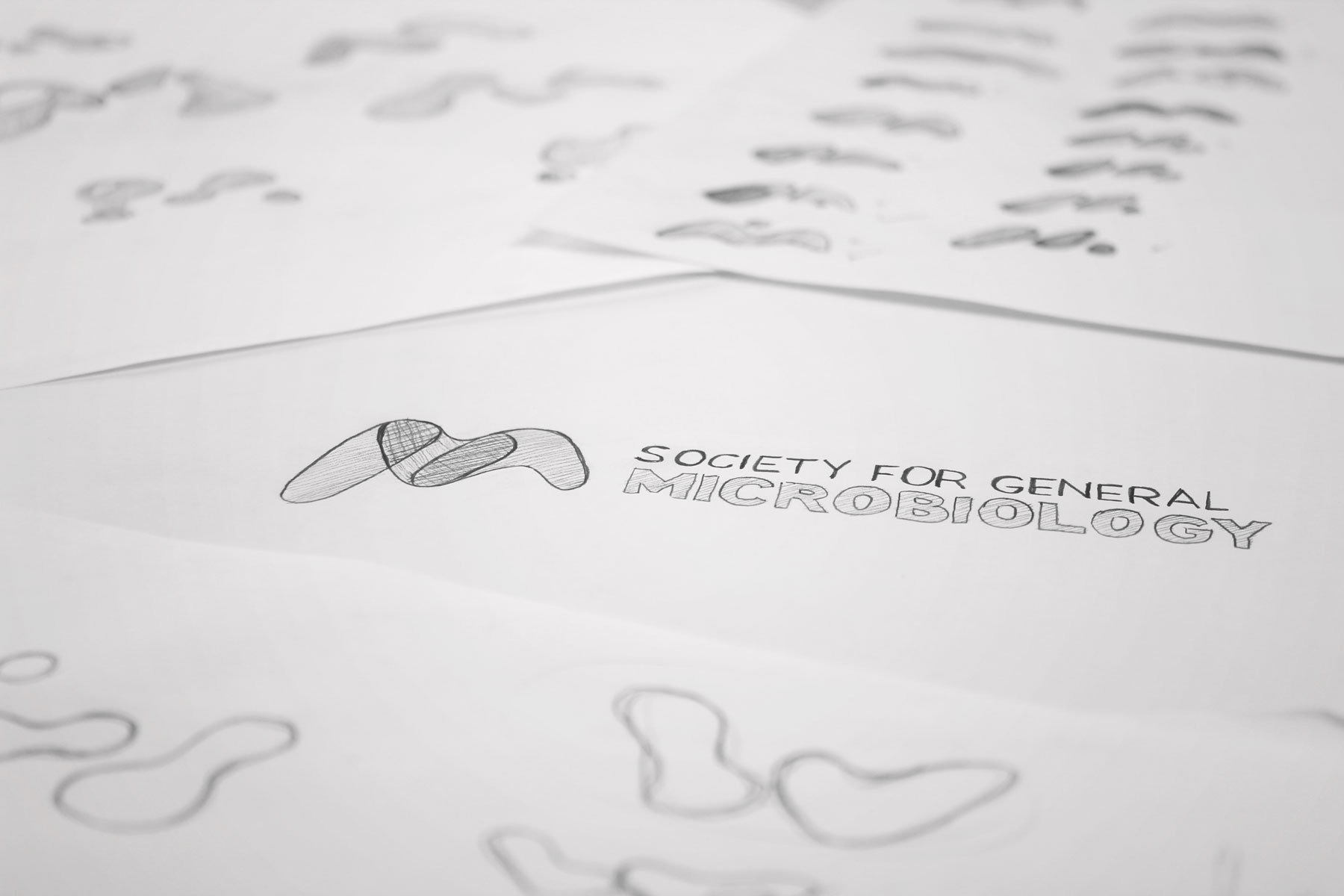
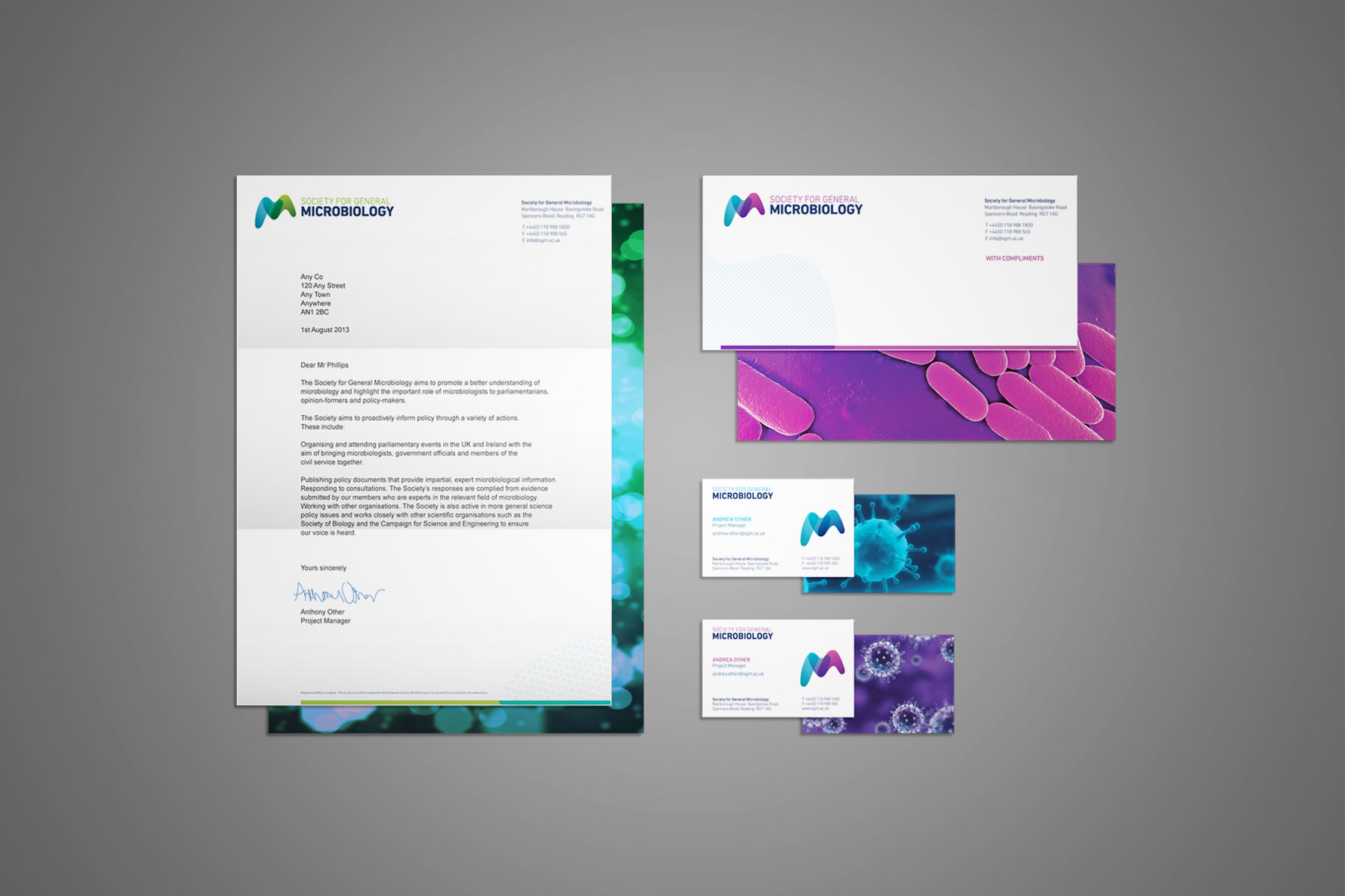
The M device subtly hints towards microbiology without being overly explicit.

The Society for General Microbiology deemed its existing branding to be outdated and uninspiring. Its aim was to build a strong, lasting and consistent brand that reflected the organisation’s forward-thinking approach to microbiology. We made the brand scalable with a distinct icon to increase legibility. We made the brand mark abstract in design so it wouldn’t disenfranchise any particular audience yet bold and striking so that it would be highly legible for the digital domain. Initial development focused on the circular, soft shape of microbes. This evolved into an M device that subtly hints towards microbiology without being overly explicit.

Developing the brand mark in a series of colour combinations adds flexibility and interest.

Developing the brand mark in a series of colour combinations adds flexibility and interest. We replaced the Rotis typeface with DIN Next Pro, a timeless typeface suitable for a professional and educational organization. We provided the organisation with artwork for all print collateral. These templates juxtapose soft, organic shapes with hard, geometric ones. The soft shapes are inspired by the brand mark and are the visual identifiers of microbiology, while the squares and rectangles represent the sharp, analytical minds of the people who work in this domain.

A number of concepts were produced, each focusing on individual elements of our initial brainstorm.

Expertise Spotlight

The Kaboodle symbol is beautifully simple with a really subtle play in dimensions.

Branding

View case studies
Similarly to the business card, the full stationary set shows how the brand can be corporate yet engaging in the same space.

The end result consistently conveys a bright, approachable brand that retains a clean, professional feel.

SGM now owns a timeless, professional typeface and a brand mark that will only ever be used on white or light tinted backgrounds. The end result consistently conveys a bright, approachable brand that retains a clean, professional feel. The new branding is fresh, professional and legible, propelling SGM into the digital realm with a brand that truly conveys their core values.

Sign up for our Firedog Newsletter
* = required field