Brand & Visual Identity

Bank Workers Charity

Creating an impactful brand for a contemporary financial charity.

The Bank Workers Charity (formally bankers Benevolent Fund) was established in 1883 and is a London based organisation that exists to help current and former employees in the banking sector. The Firedog remit extended to brand identity, messaging, visual look and feel, marketing collateral, PPT and MS Office templates, website, tactical support and tactical reporting and communications design.

The Bank Workers Charity brand mark is constructed purely out of circular shapes. The transparency and colour creates a modern yet approachable feel.

The Bankers Benevolent Fund, a financial charity, has been around for a number of decades, but not many people were aware of what they do.

With addressing and clarifying their values, offering and vision internally, they needed a fresh, exciting and dynamic new brand to communicate these externally. After changing their name to Bank Workers Charity, they approached Firedog to help them create a modern and distinctive identity to match.
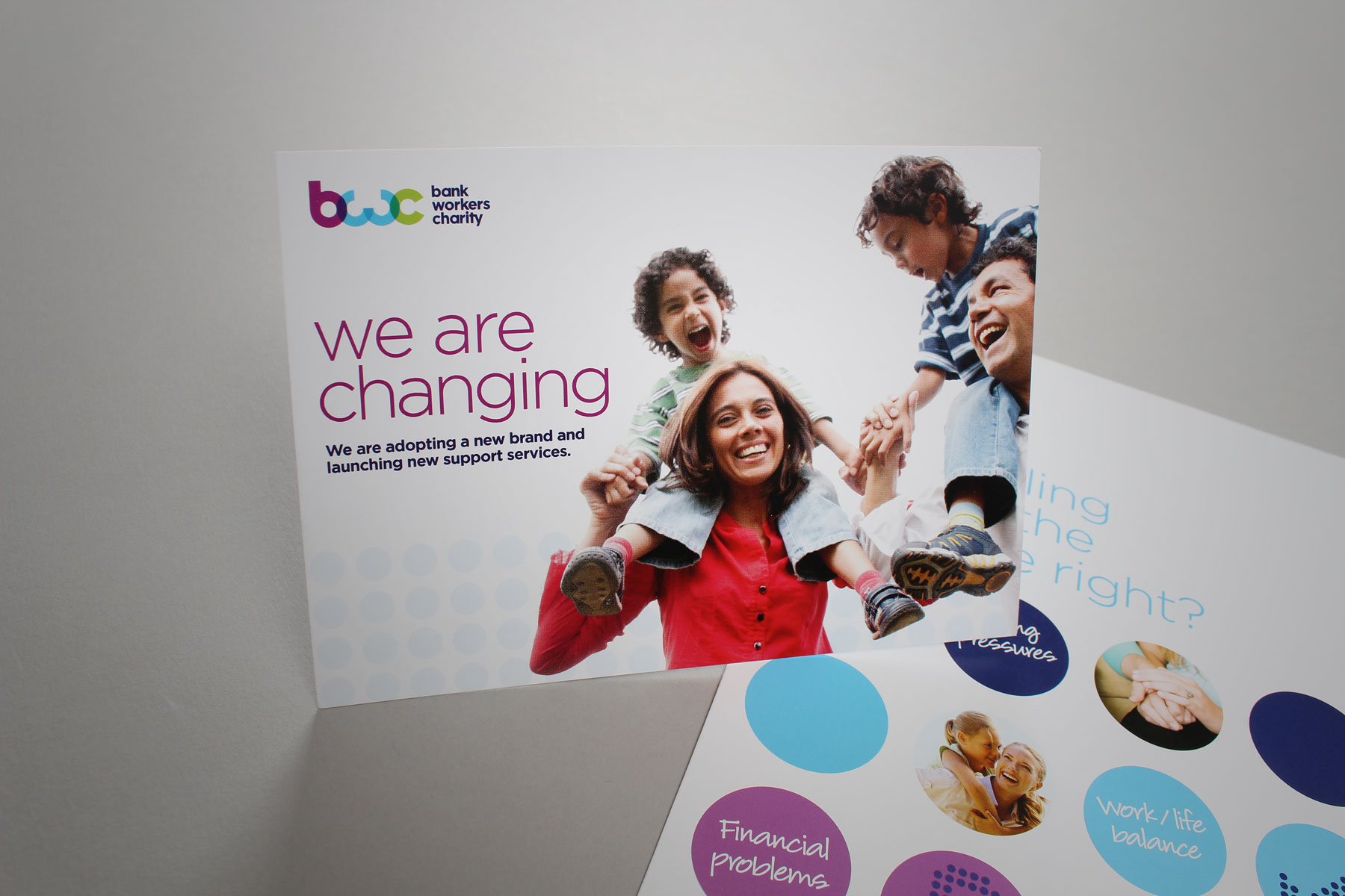
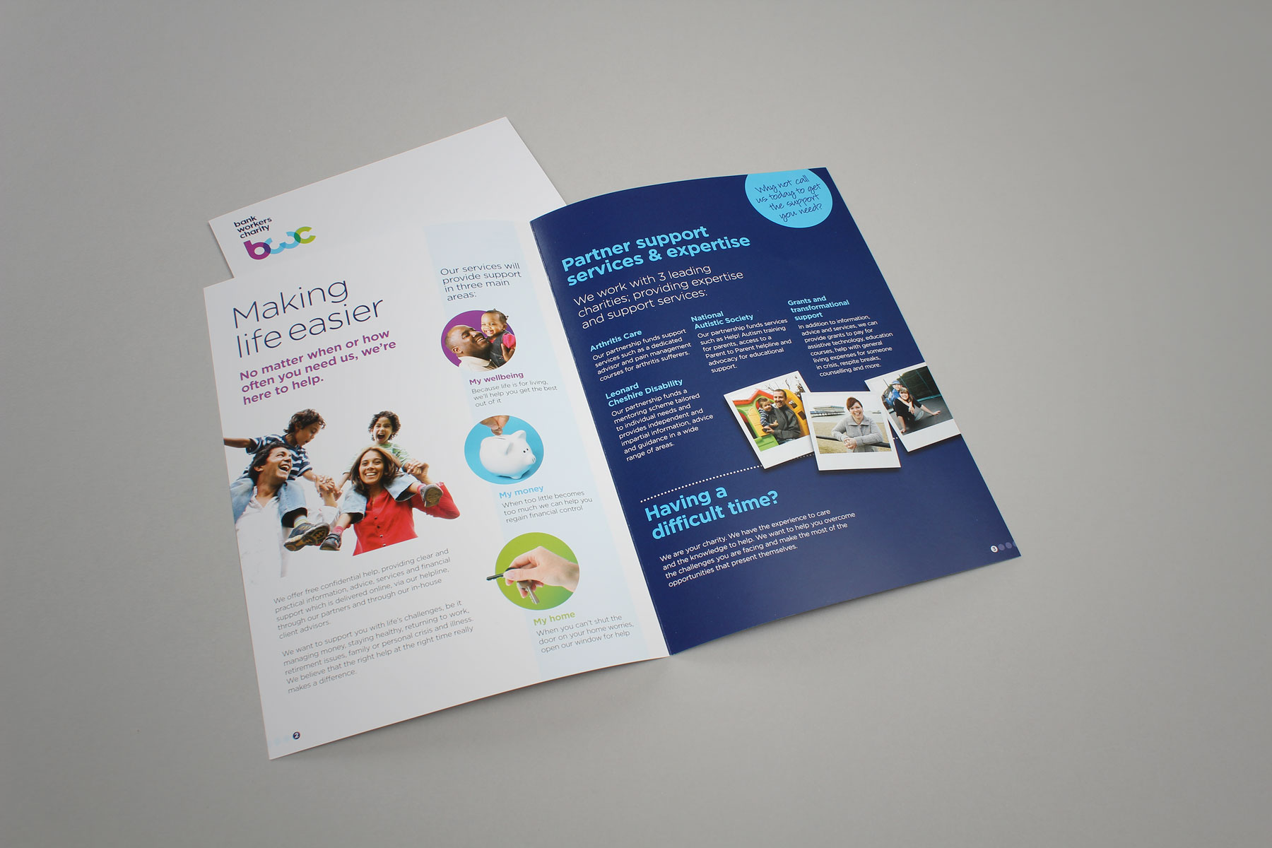
The supporting imagery suite is created from both stock and a series of actual case studies. The tone is confident and assured.

A brand that is confident, distinctive, human and diverse.

Extensive research, brainstorming and discussions made it clear that the positive change occurring within BWC needed to be summed up in a brand that is confident, flexible, distinctive, relevant, human and diverse. This vivid new identity started off with the logo. We created a pure system where the icon letters were all based out of circle geometry. Taking our inspiration from BWCs key values, the overlapping circles representing collaboration and connectivity between people. This logic of transparency combined with a fresh and bright colour palette provides a mark that is both approachable and contemporary.

The primary and simple nature of the logo lends itself well to being easily reproduced across all media.

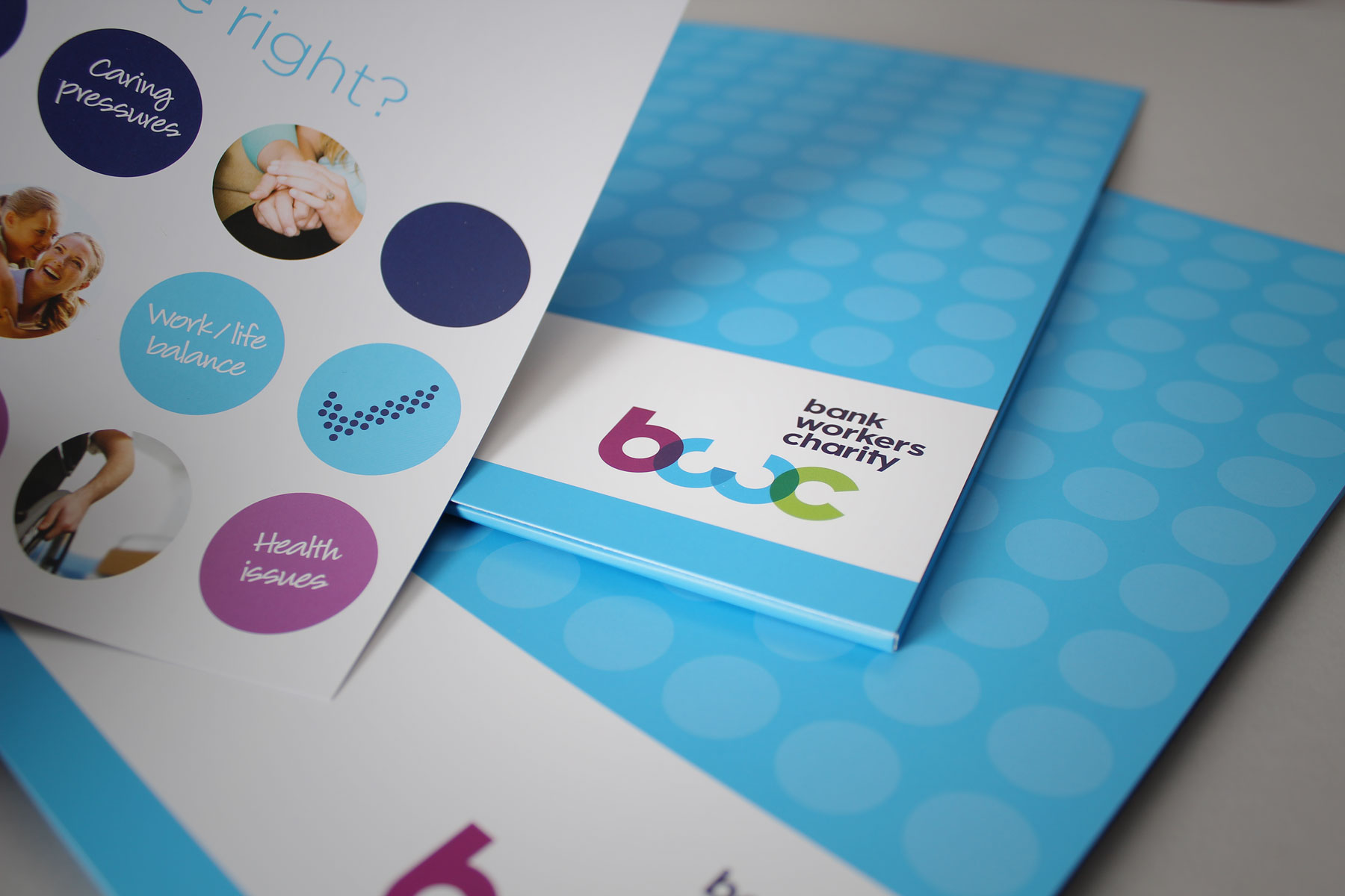
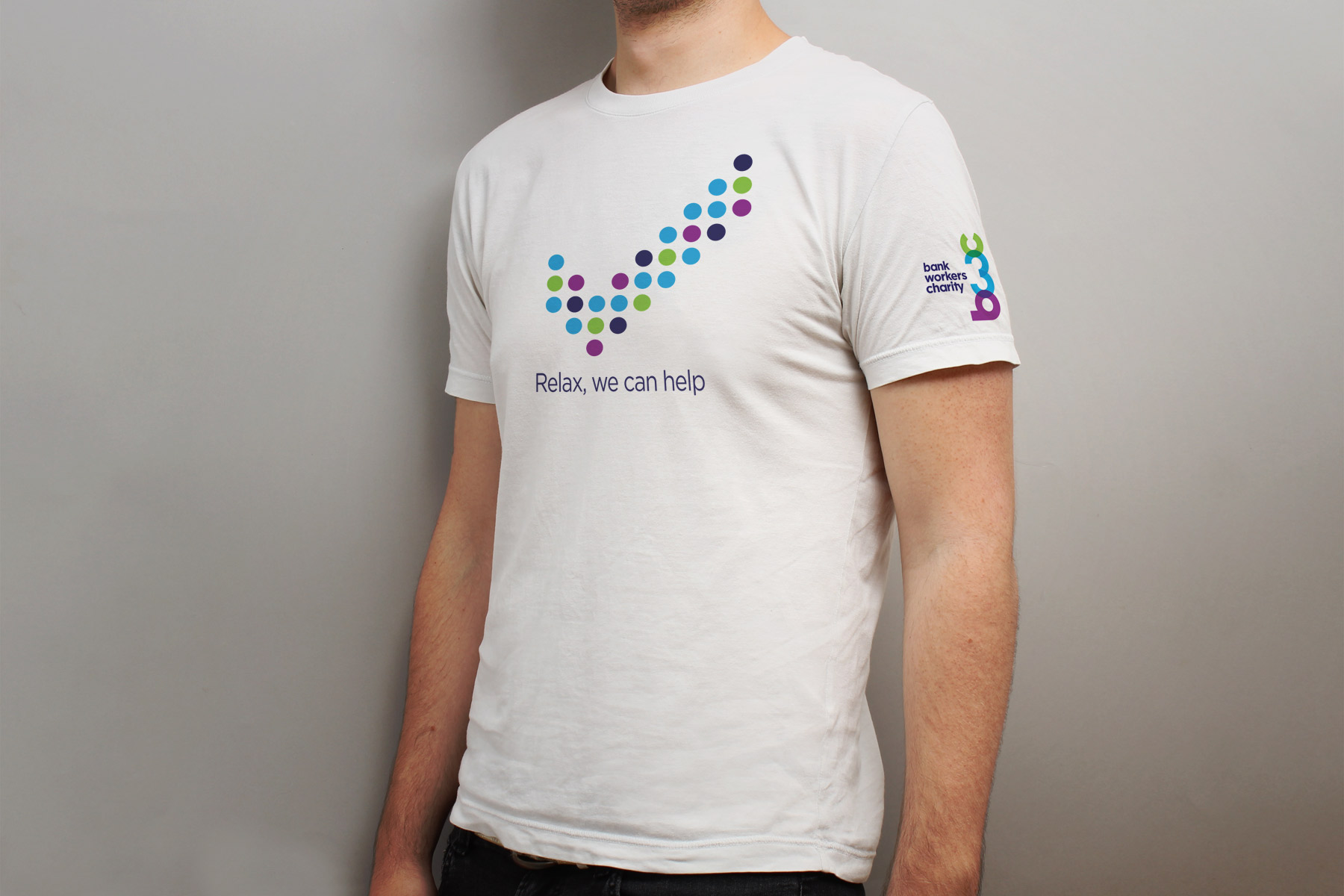
We created unique graphic devices based on the overall circular motif.

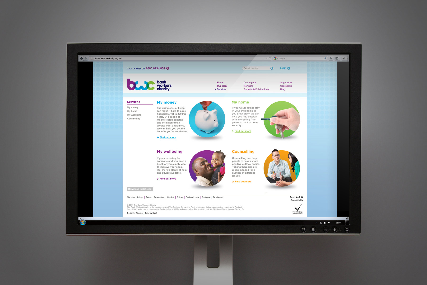
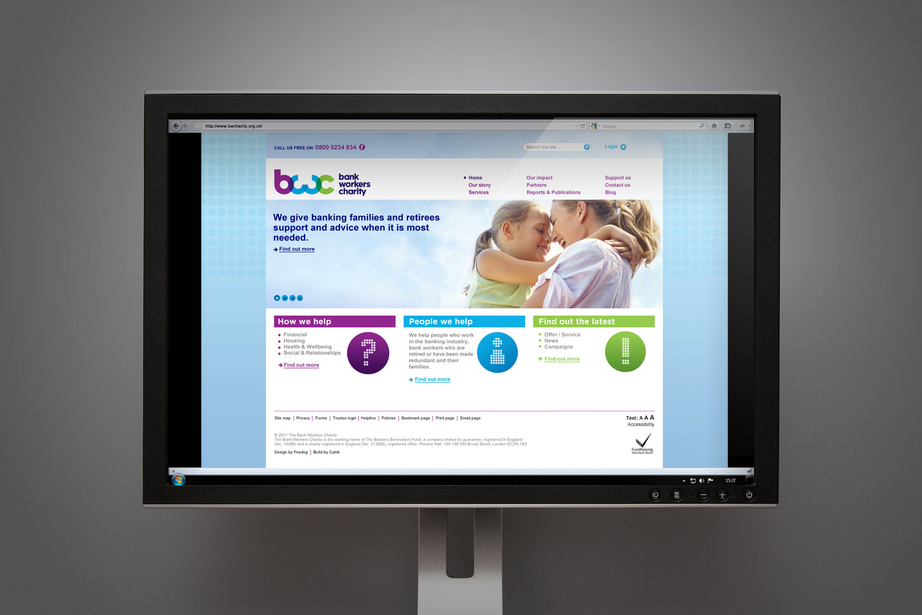
Step two was the visual look-and-feel. The colourful, Impactful logo appears alongside confident, yet down-to-earth messaging, a distinctive type-face and optimistic, warm and engaging imagery. We also created unique graphic devices based on the circle motif. These hold text and imagery, supporting the brand and ensuring the identity becomes recognizable in its own right.

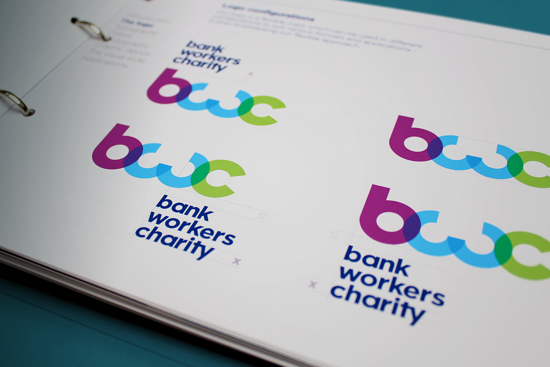
The brand project wrapped up with an extensive set of brand guidelines.
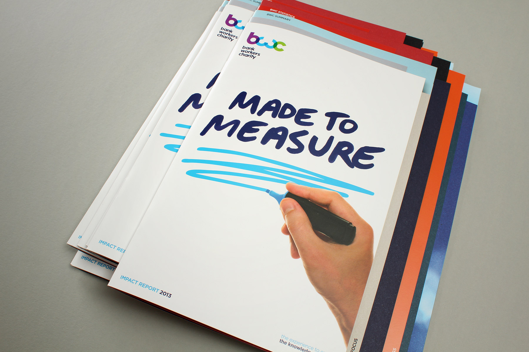
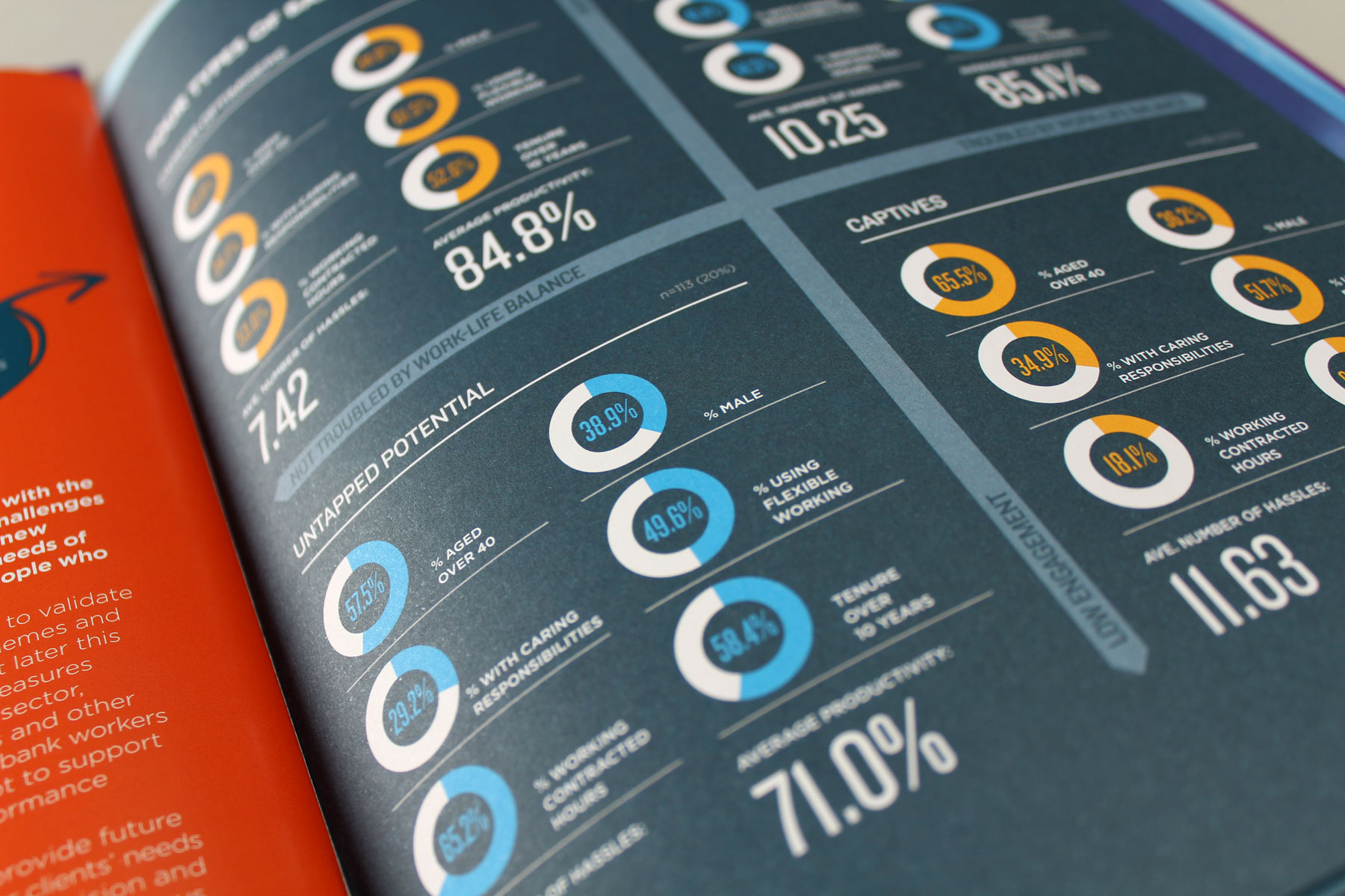
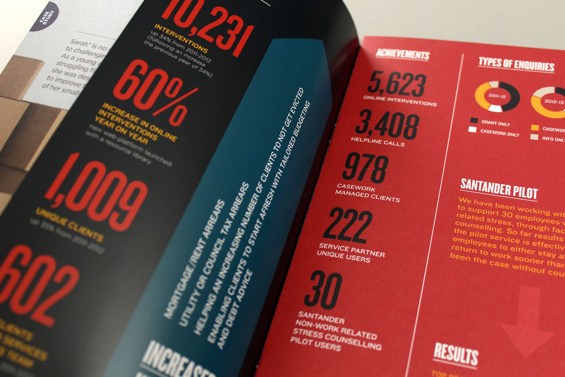
The BWC impact report contains a rich variety of charts and graphs
Firedog continues to work with the BWC on strategic design and implementation.

The BWC launched their new brand on in May 2011 and the response to this re-fresh has been fantastic. Firedog is extremely happy with the initial response and will continue to work with BWC on strategic design and implementation moving forward. We have also supported BWC through the creation of annual impact reports. The charity impact report is a campaign designed to communicate the impact that the charity has generated over the year. Like an annual report, this features numerical information in charts and graphs – as well as real life case studies.

The creation of simple to read graphics aids the legibility of BWC communications
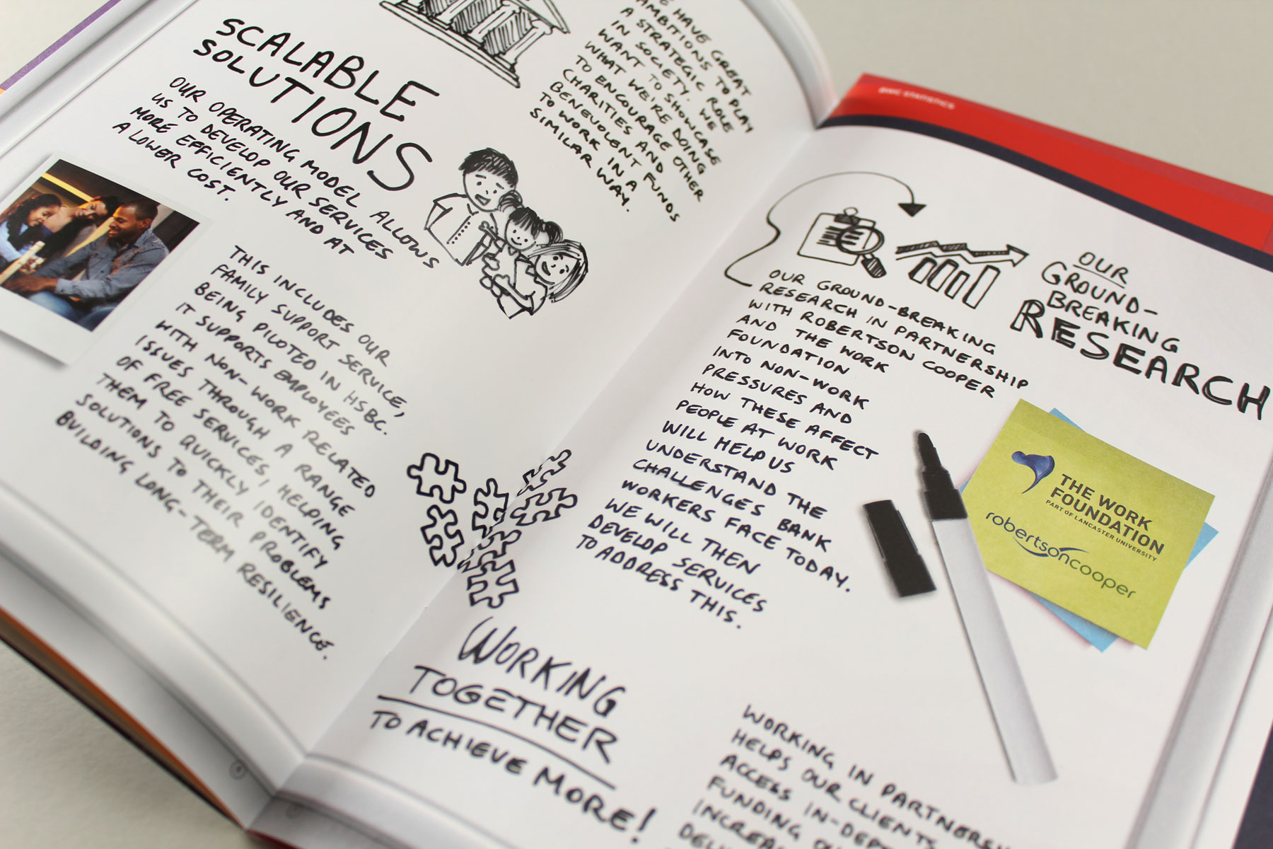
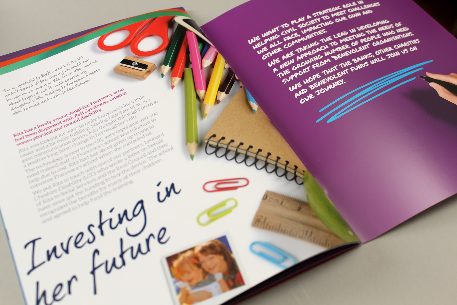
We wanted the printed impact report to reflect the hands on support of the charity - a good deal of the design was created by hand