-

The pro audio brand contains dynamic angles and fresh colours
-

The previous brand mark was not very professionally created.
-

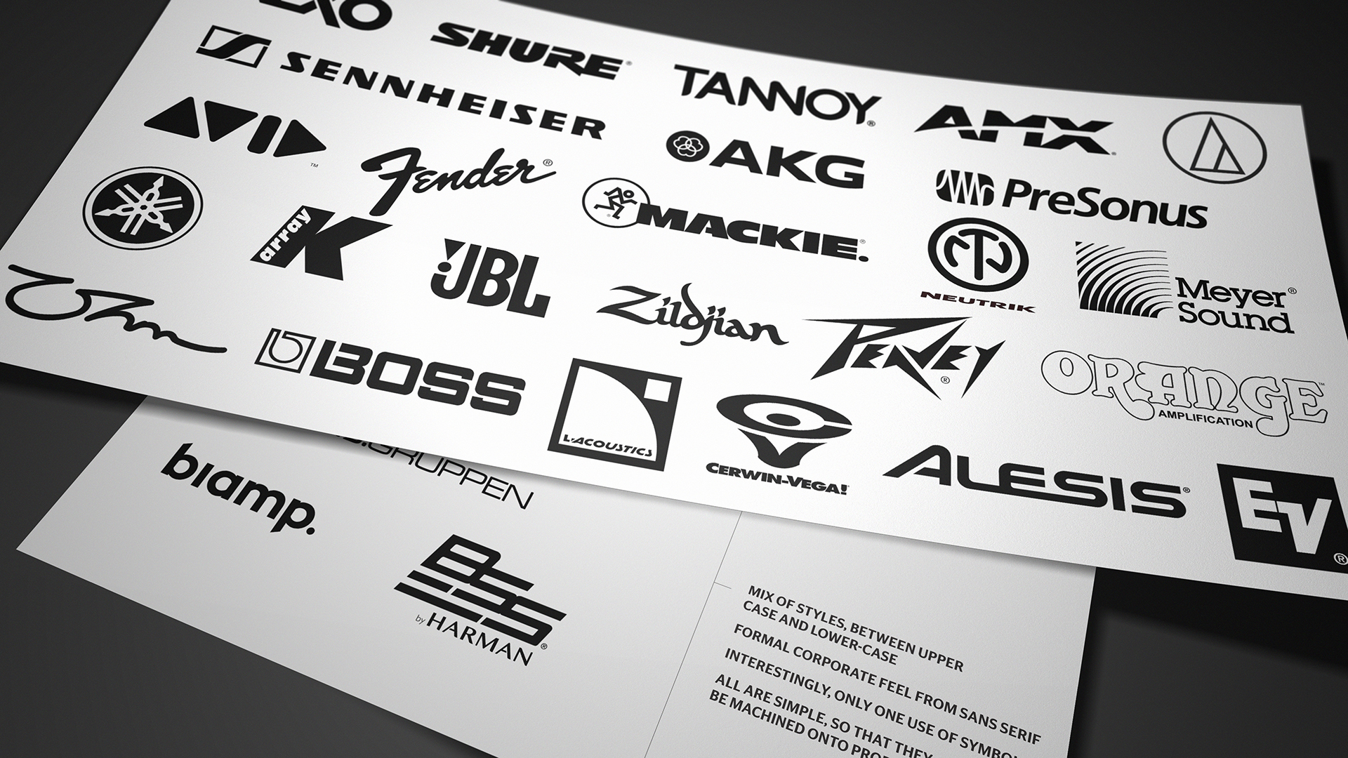
The pro audio brand competitors in the marketplace are far more simplistic and primary.
-

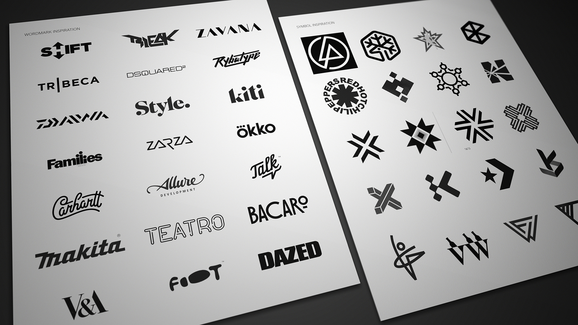
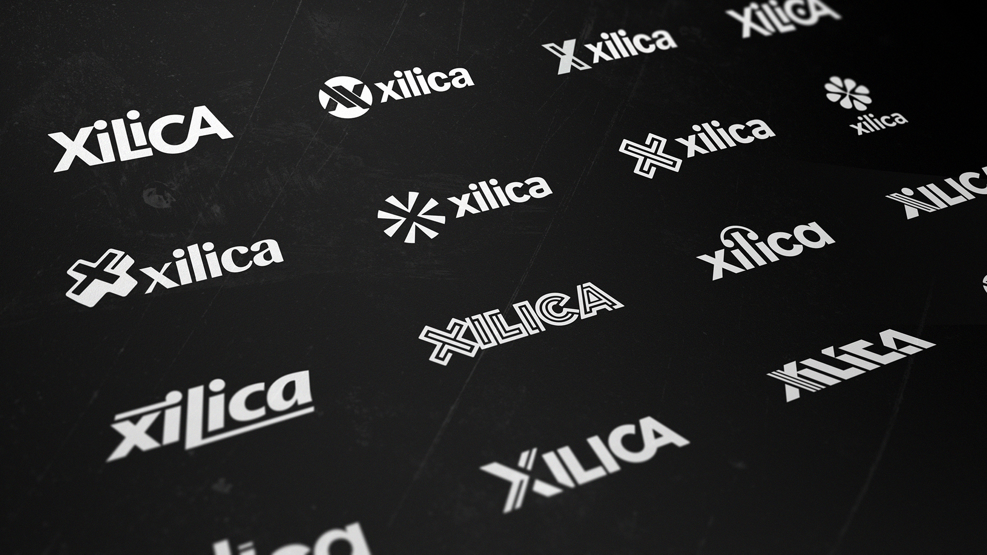
We researched simple flat brands for inspiration.
-

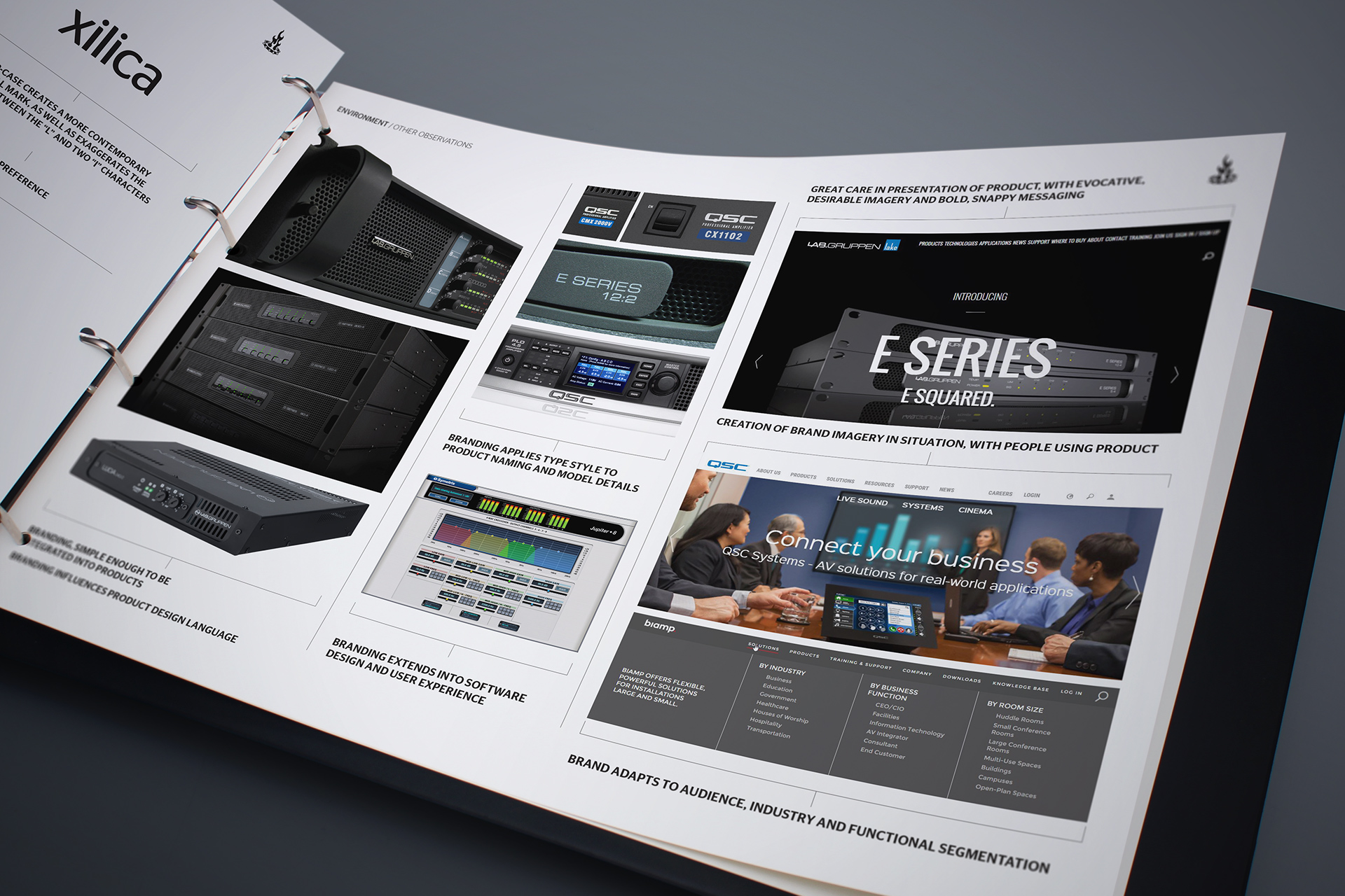
The competitor brands had, in comparison, a very unified visual universe.
-

We set about creating branding concepts which relied on either type customisation or simplistic symbol design. It was important that the solution be as minimal and recognisable as possible.
-

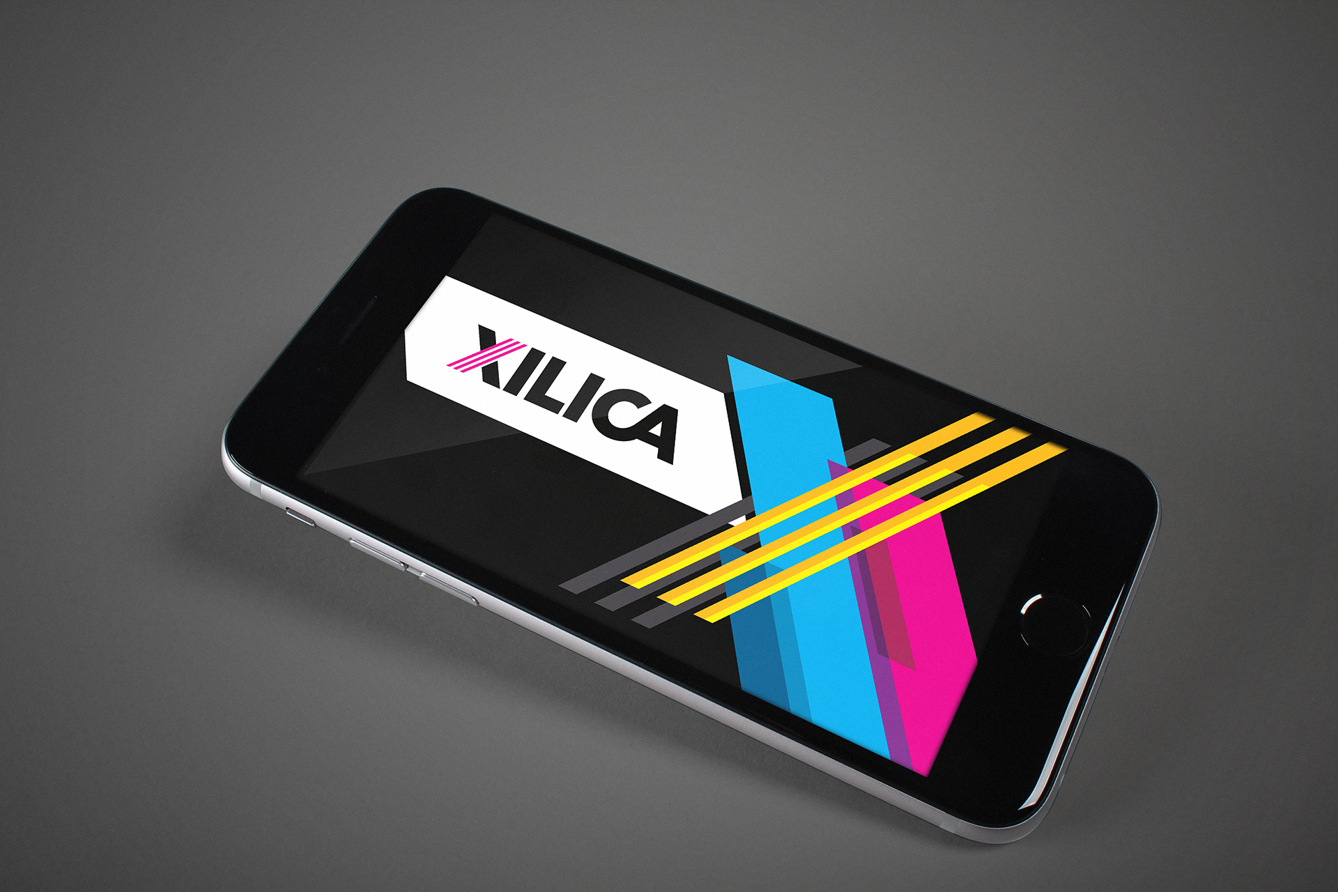
The brand mark has been created to be absolutely strong and identifiable.
-

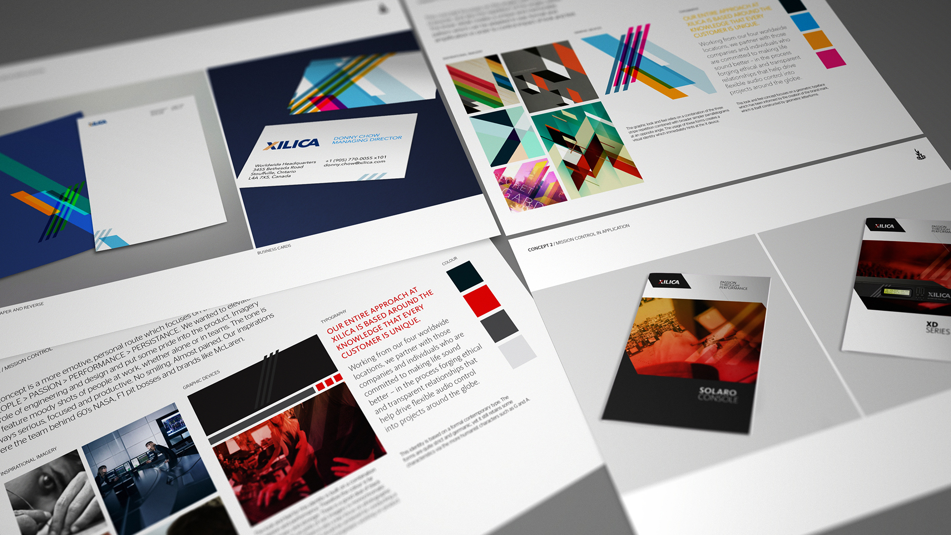
The visual identity concept exploration delved into using the X character as a dynamic shape.
-
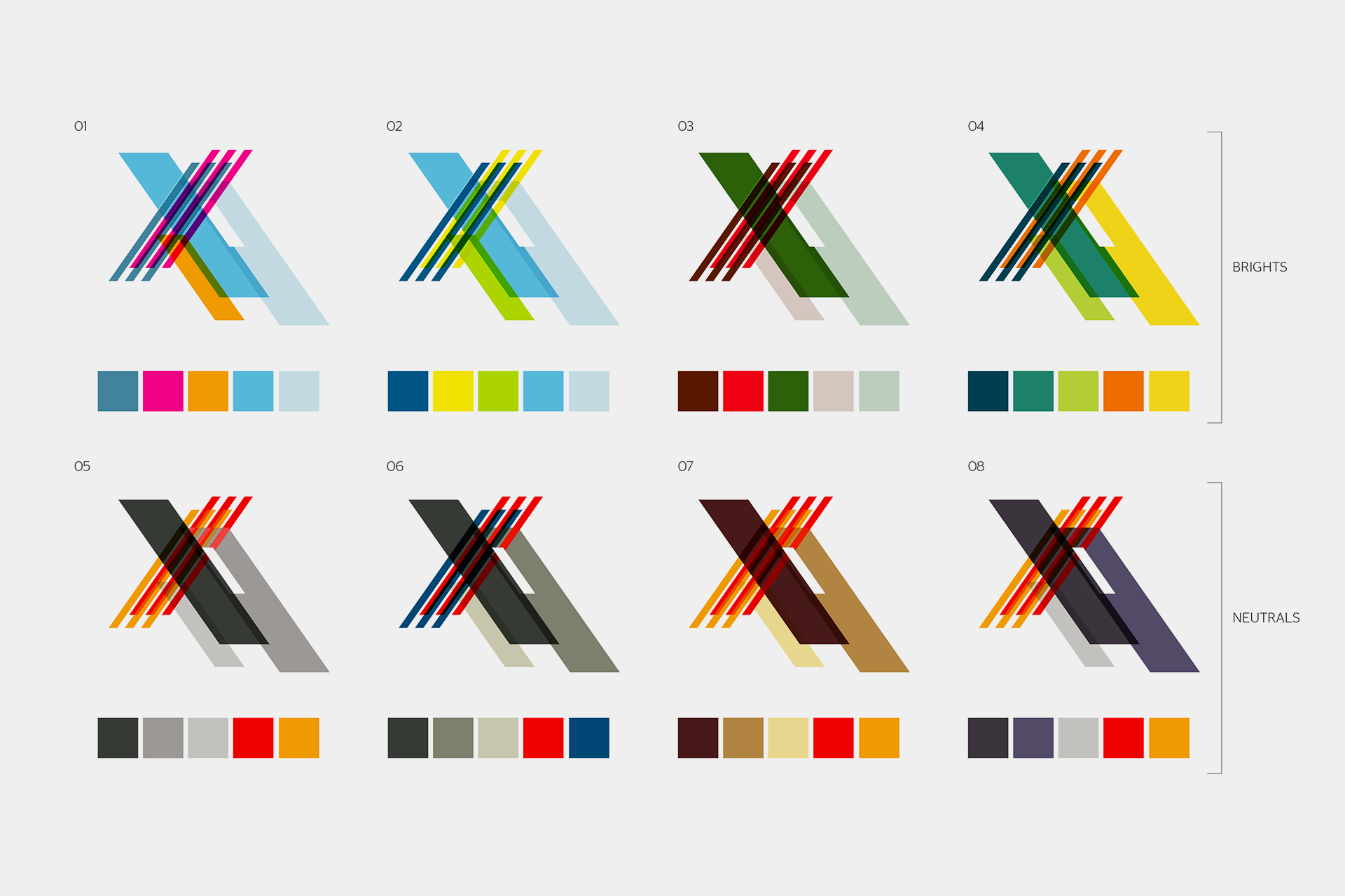
Once settling on a graphic device, the studio explored all the possible colour permutations.
-

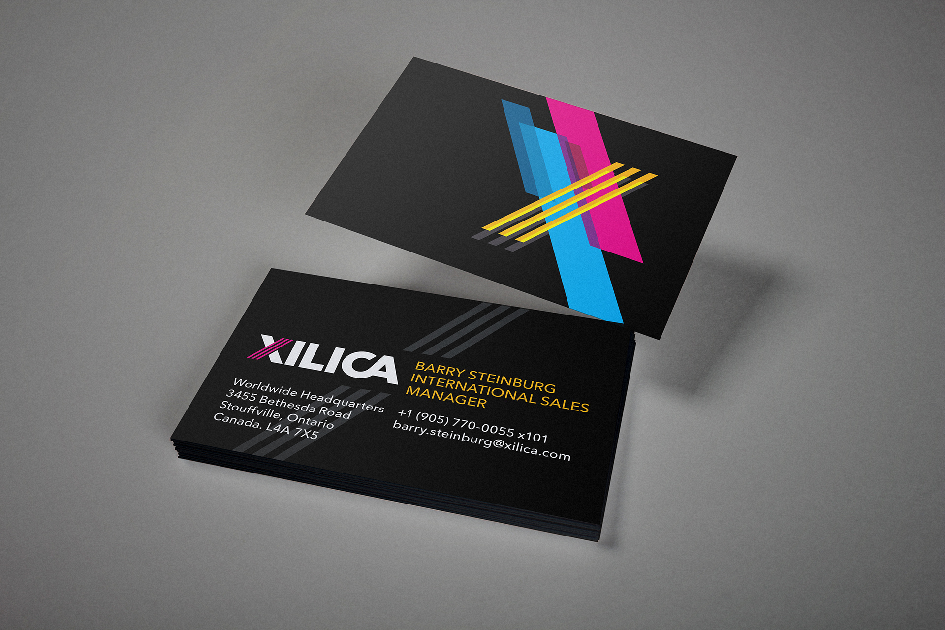
The graphic device is cropped in various combinations.
-

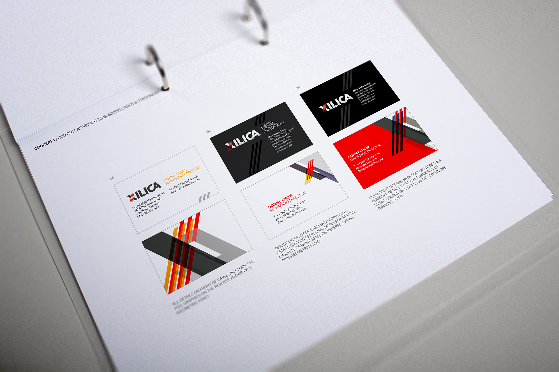
The client had a preference for ultra primary and bright colours set upon the anchor black background.
-

The graphic device is locked up with wordmark in certain applications.
-

The generous use of black grounds the bright colours.
-

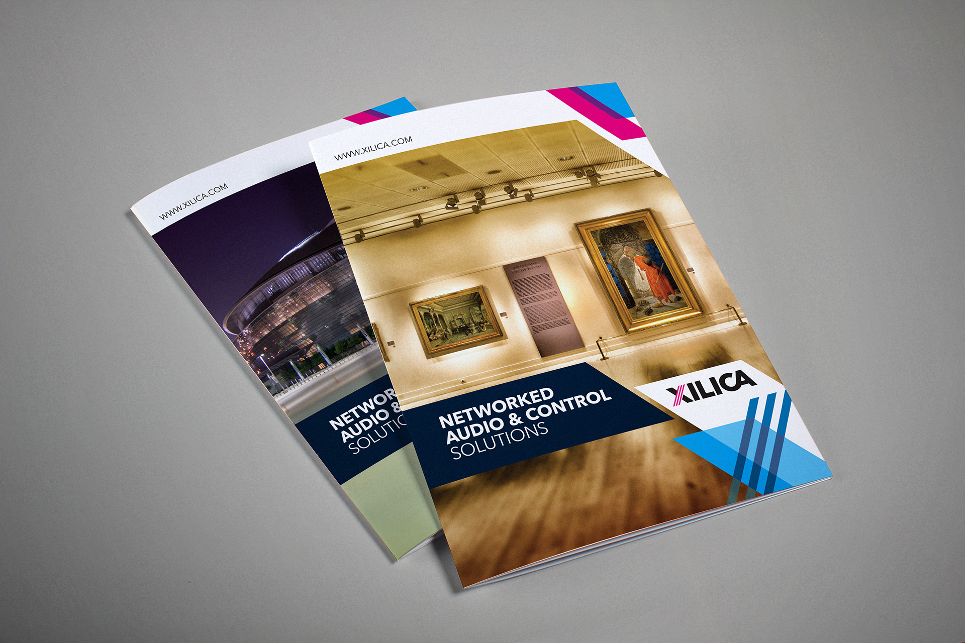
The angles inherited from the symbol and graphic device are used as image, colour and text containers in order to create a flexible identity system.
-

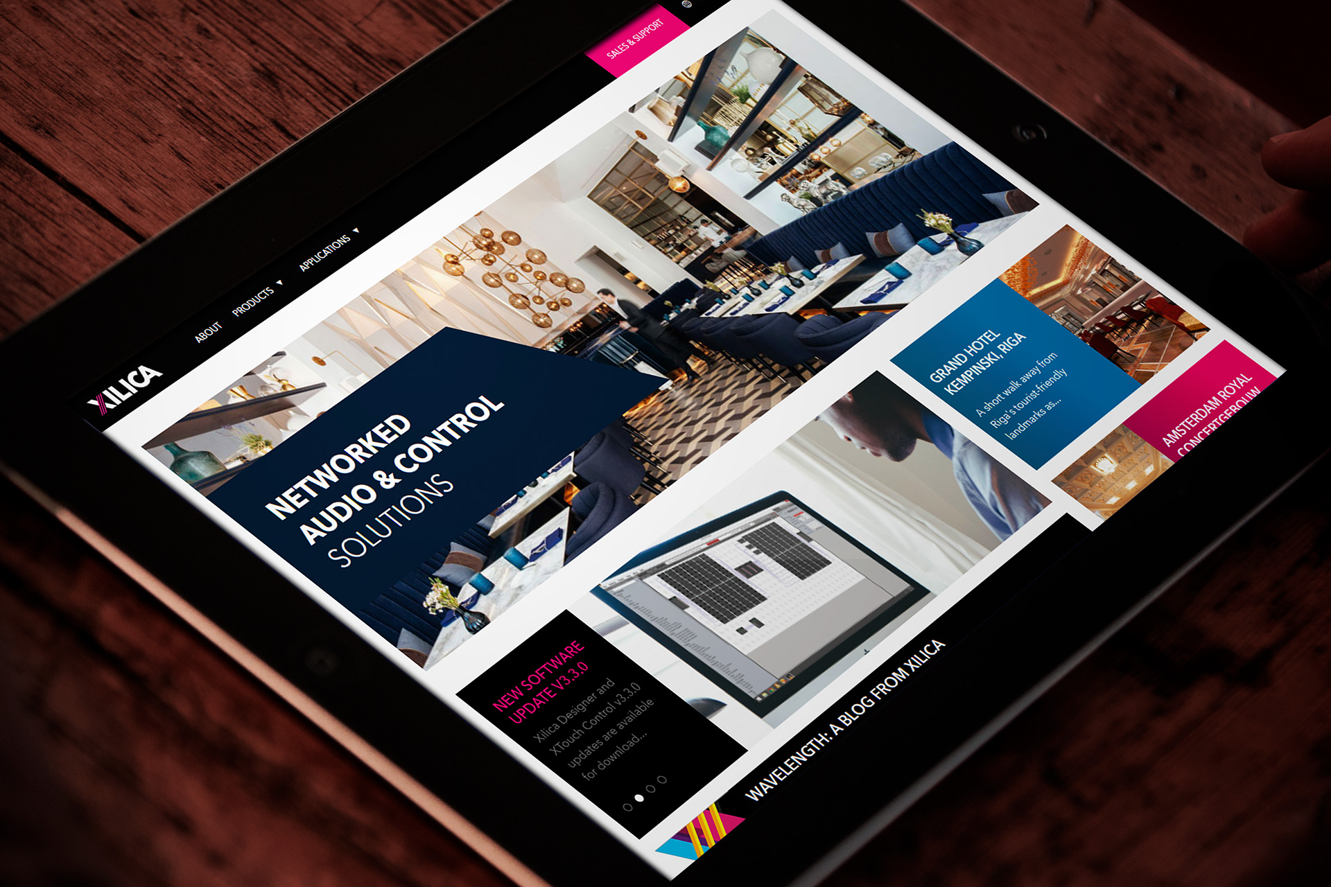
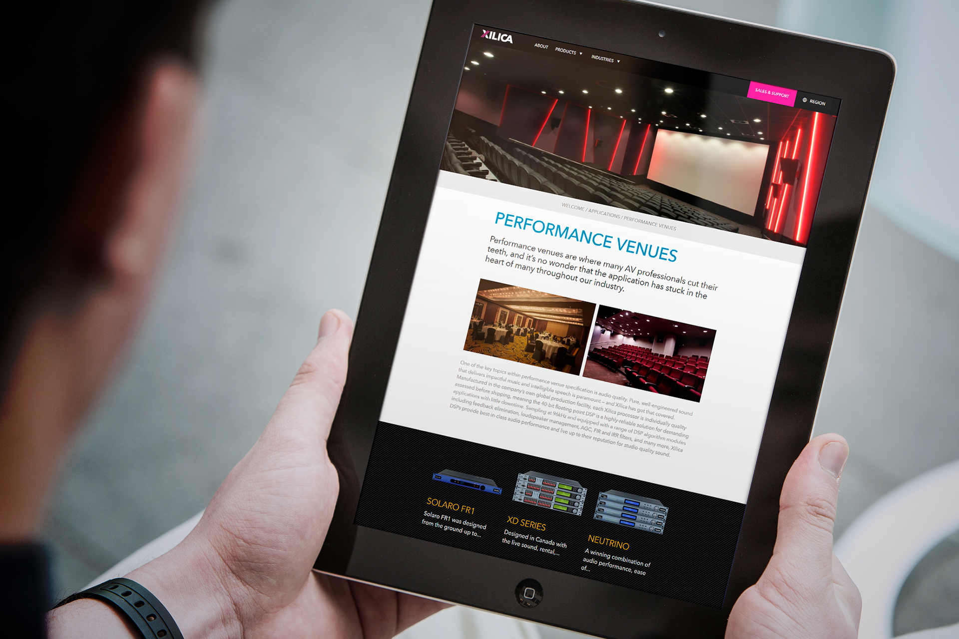
We created the digital branding and web design for the business website.
-

The website operates as a sales vehicle across six global regions.
-

There are sector based pages focused towards certain audiences.
-

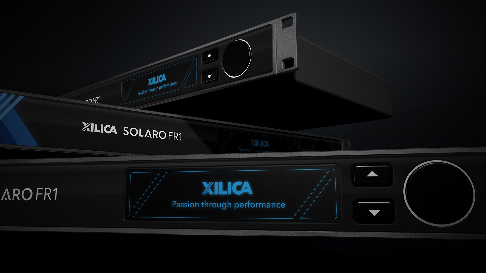
The Solaro FR1 DSP product features a customised LED display and soft touch interface buttons.
-

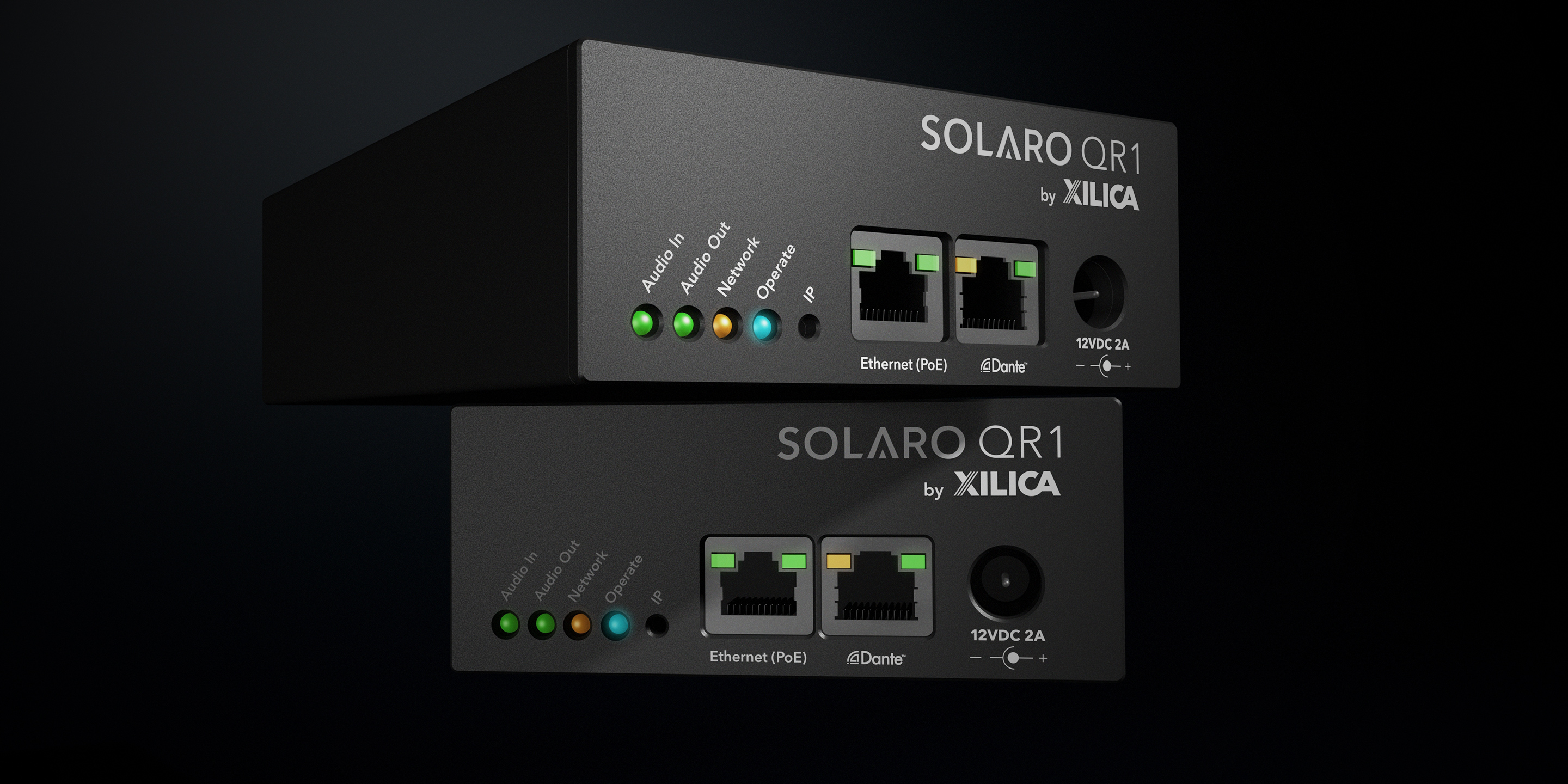
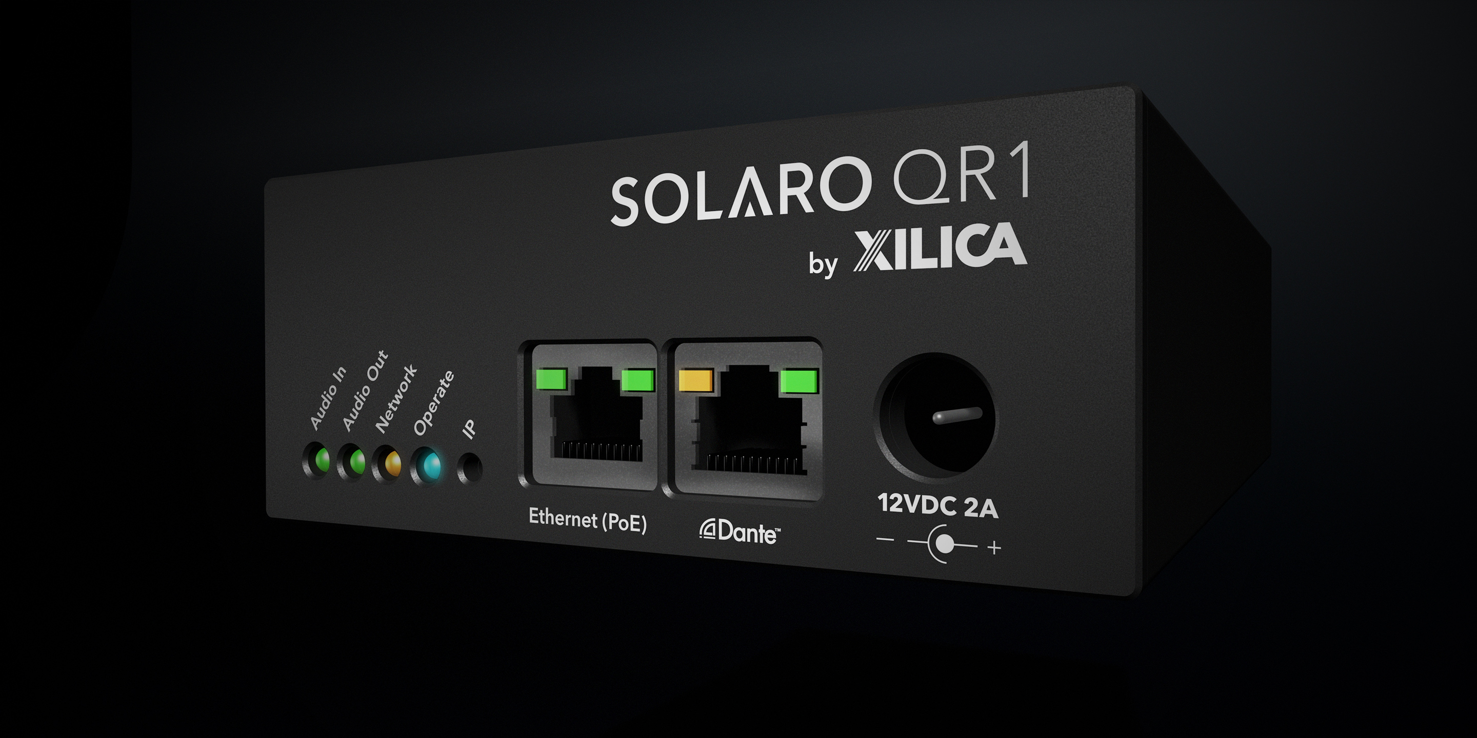
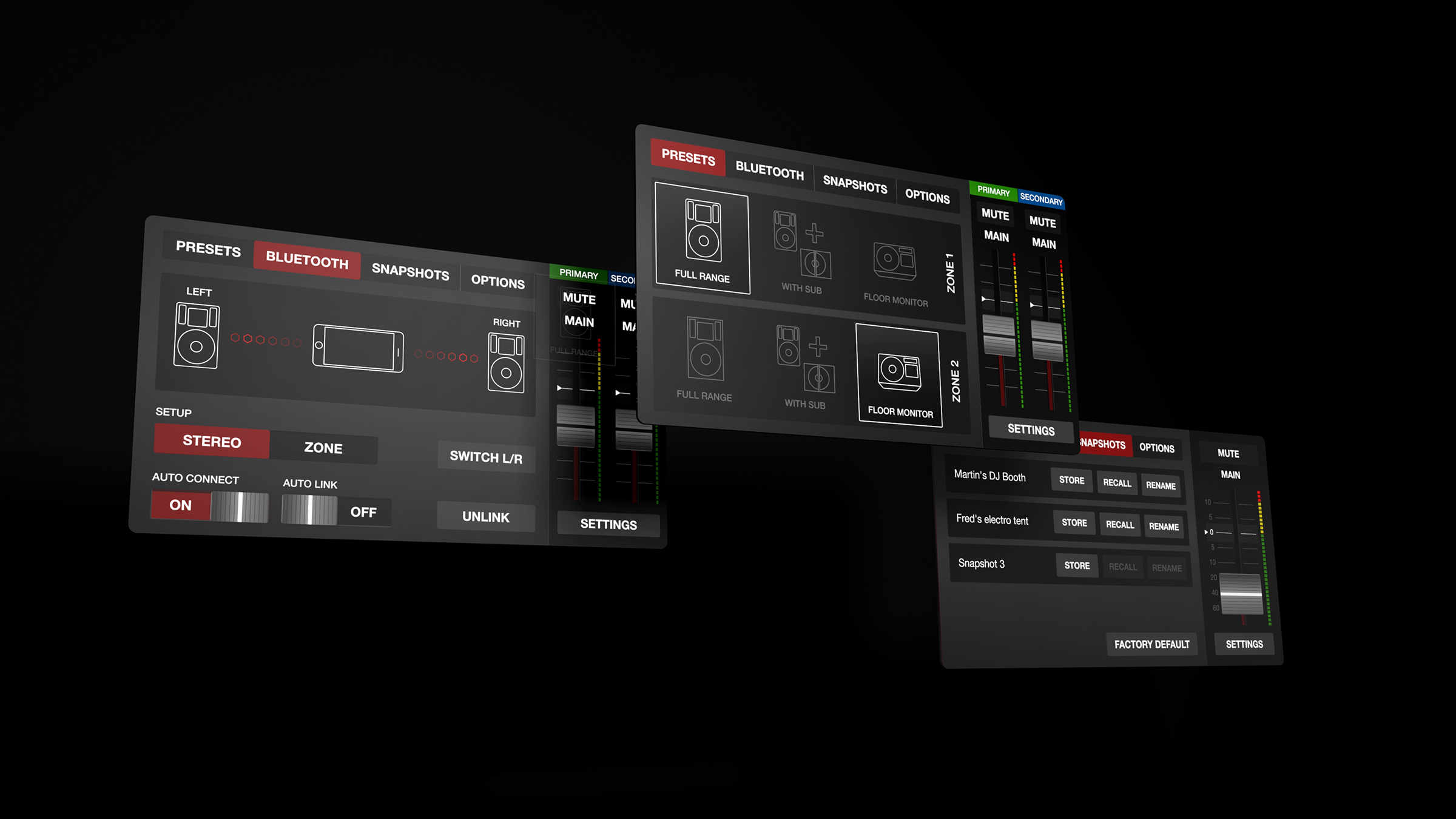
We have also provided visualisation and product design support for their simpler interface units.
-

The result is a consistancy in design language which is far easier to visualise compared to a set of product engineering CAD drawings.
-

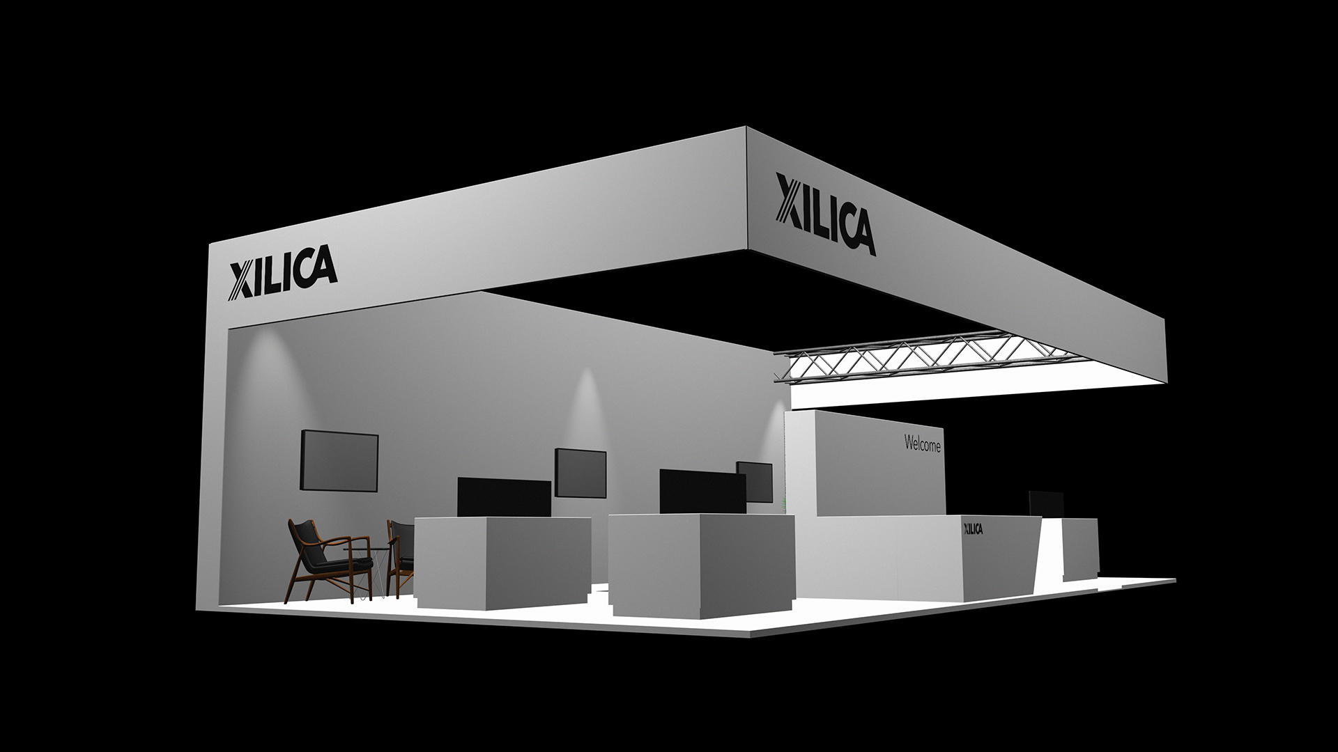
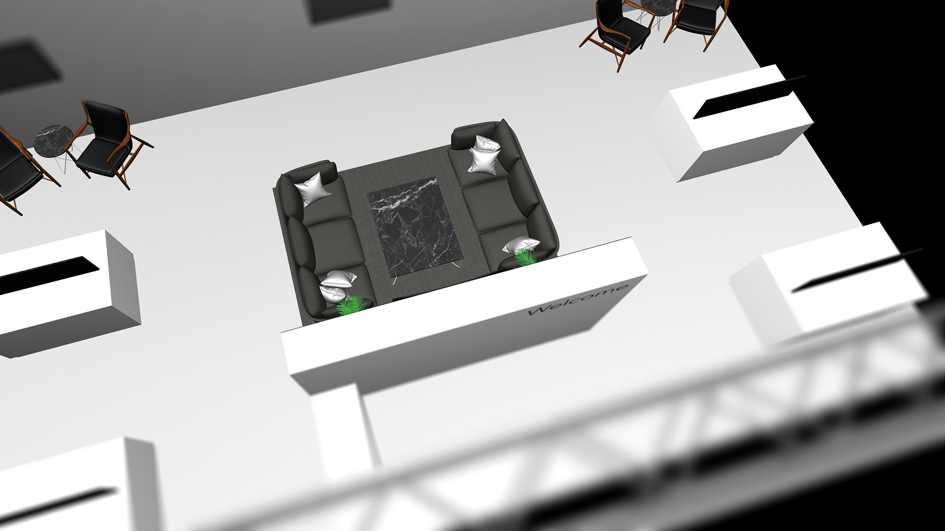
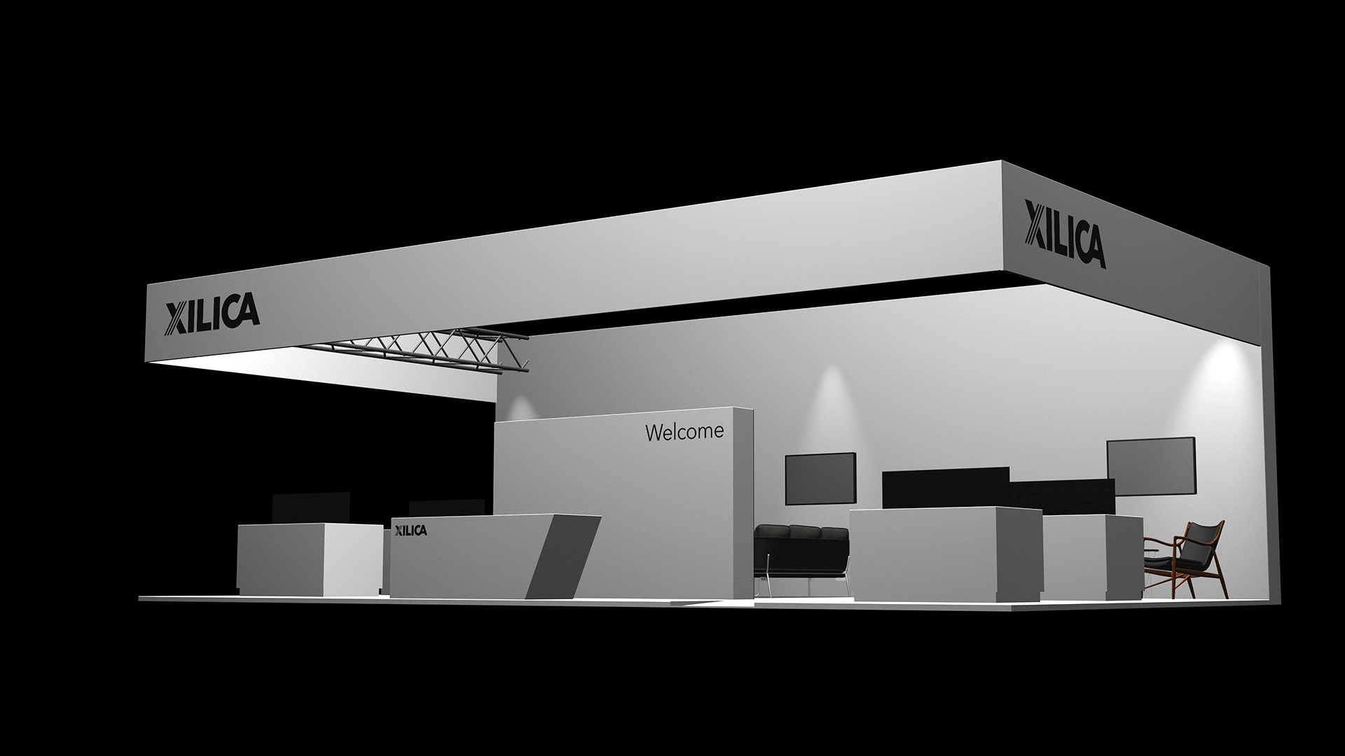
Simple three dimensional event stand designs which help the client visualise their sales environment.
-

Configuring the event materials to ascertain usage of space.
-

The branding extended into three dimensions.
