Brand Identity and website design

Charles Street

A futuristic look and feel for London technology business.

Charles Street Solutions is a London-based communications and IT service provider. They specialise in providing services to the legal and financial sectors. Our deliverables included: telecoms brand identity, messaging, photography with bespoke post production, web design and search engine optimisation.

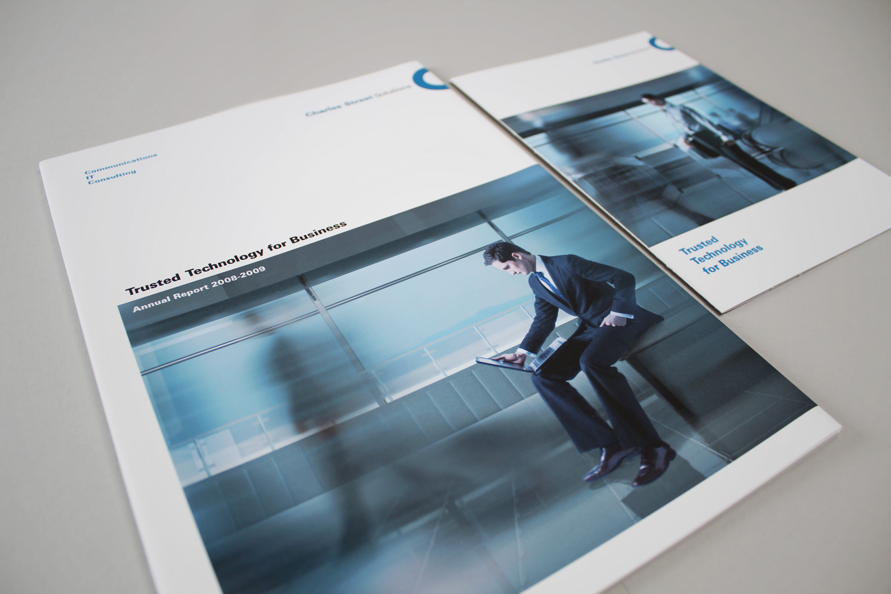
The shots are heavily produced in order to create a futuristic feel. The models and movement blurs have been shot in a blue screen environment and dropped into artificial rendered landscapes.

We supported this language with a bespoke suite of ultra-slick post-produced imagery.

After originally developing the brand back in 2005, we were consulted again early with the task of repositioning the firm as a mid size player following a successful merger. Charles Street had recently acquired another service provider and wanted to move from a boutique offering to more of a corporate point of view. The previous brand applications, in particular the site, were very exclusive, dark and sultry. Whilst this was perfect for a high end boutique operation, it was felt that in order to appeal to a wider corporate audience, the brand needed to be built upon a clean and white foundation. We supported this language with a bespoke suite of ultra-slick post-produced imagery.

The creative concept is loosely based on the poem If by Rudyard Kipling - the idea is that whilst the world is frenetically lost in a daze of confusion, one solitary figure sits calmly - their IT fluid and stable.
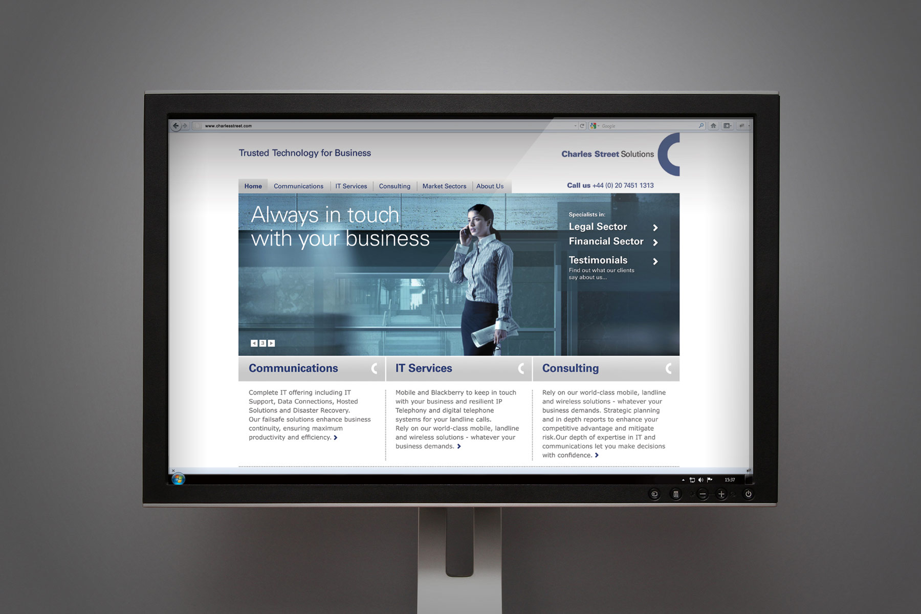
The imagery combines architectural environments combined with studio shot portraits.

The figures were shot in a daylight studio, carefully cut out, positioned and placed onto 3D rendered environments. As security and stability are the cornerstones of the new brand proposition, the art direction for the production ensured a futuristic cool environment whereby the central Charles Street figures represented calm amongst a frenzy of other passing human figures. The result is a visual effect that is both very unique and contemporary. Charles Street has gone on to open a second office, has fine tuned their offer even further and has made an additional two acquisitions.

Website design

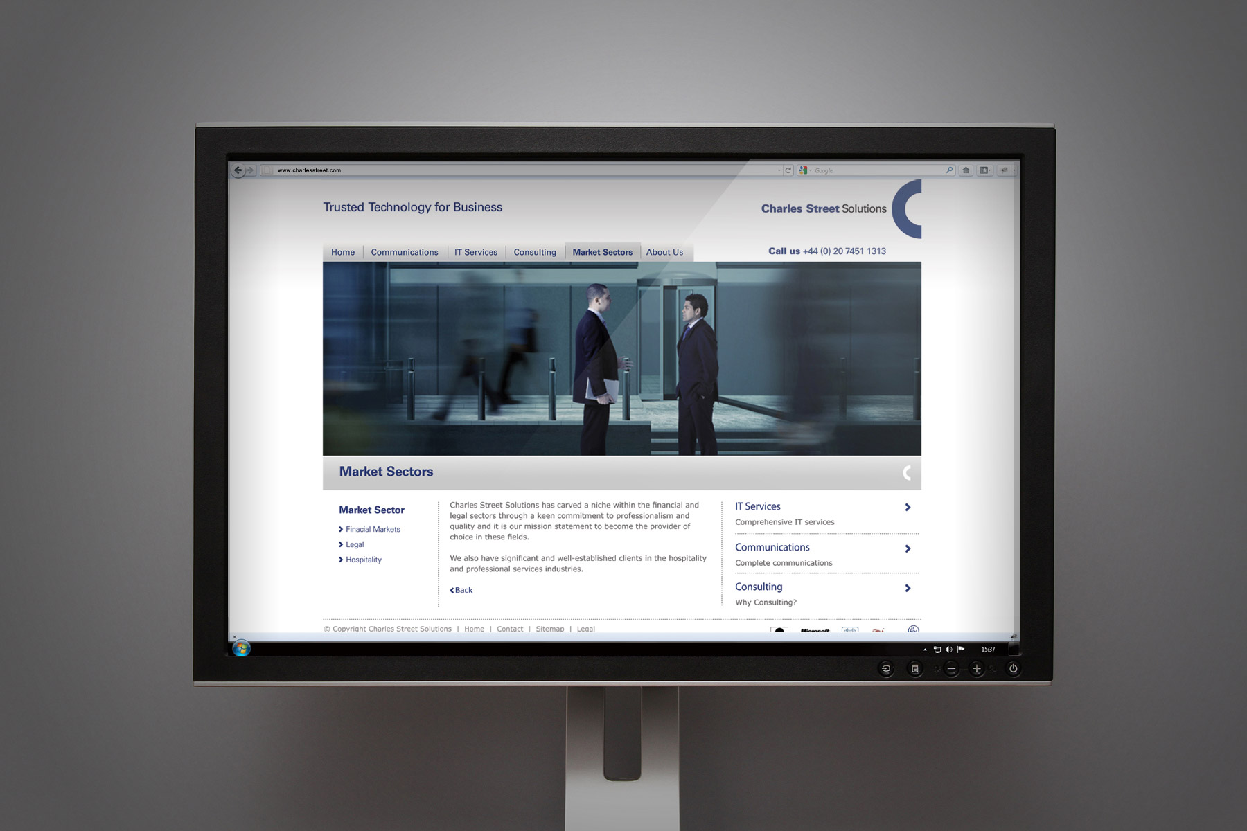
As part of the wider brand refresh Firedog applied the new look and feel to the Charles Street website. The corporate website is one of the key touchpoints for a business-to-business brand and is an essential deliverable for a project of this type. As the company had expanded to become a serious mid-size player in the market they needed to develop their brand to appeal to their growing audience, the website being the key outward facing articulation of this new positioning. Charles Street needed a new strategy in order to present themselves as an established and serious player in the market. Firedog stripped the site down and started again from scratch, creating the architecture, wireframes and strategy whilst considering needs of Charles Street’s core customers. Information architecture was carefully planned to provide easy navigation for every user whatever their reason for visiting the site. A ‘gateway’ layout dominates the homepage, leading the user straight through to one of the three services offered by Charles Street. This is further supported by a page linking strategy throughout, meaning navigation is simple and effective. Firedog used a white background as a clean, clear platform with large scale brand imagery on every page. We applied brand messaging and developed keyword integrated copy for each sector focusing on global reach and brand values for SEO. Succinct and direct copy was developed, using a ‘top-down’ tone-of-voice.

We created the imagery around the business units - Support with collaboration, telephony with mobiles and technology with laptops.
Sign up for our Firedog Newsletter
* = required field