

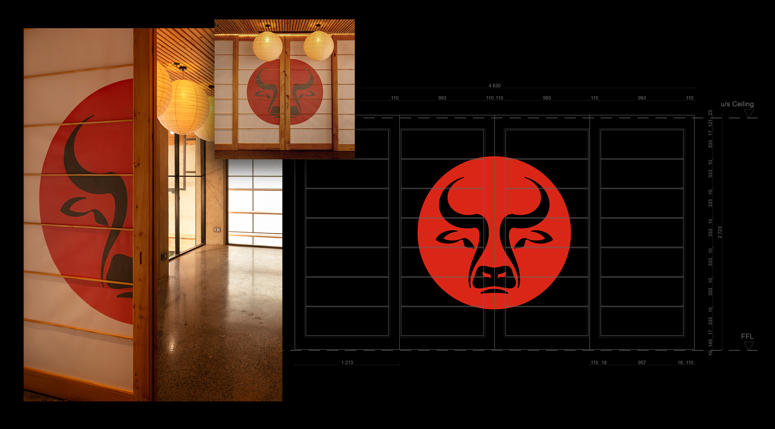
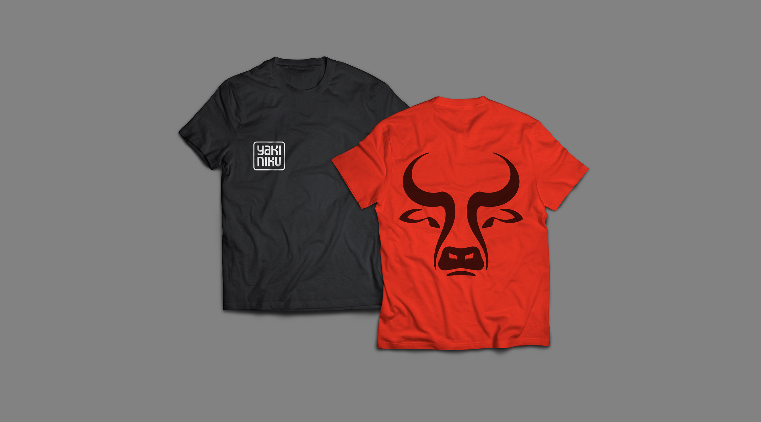
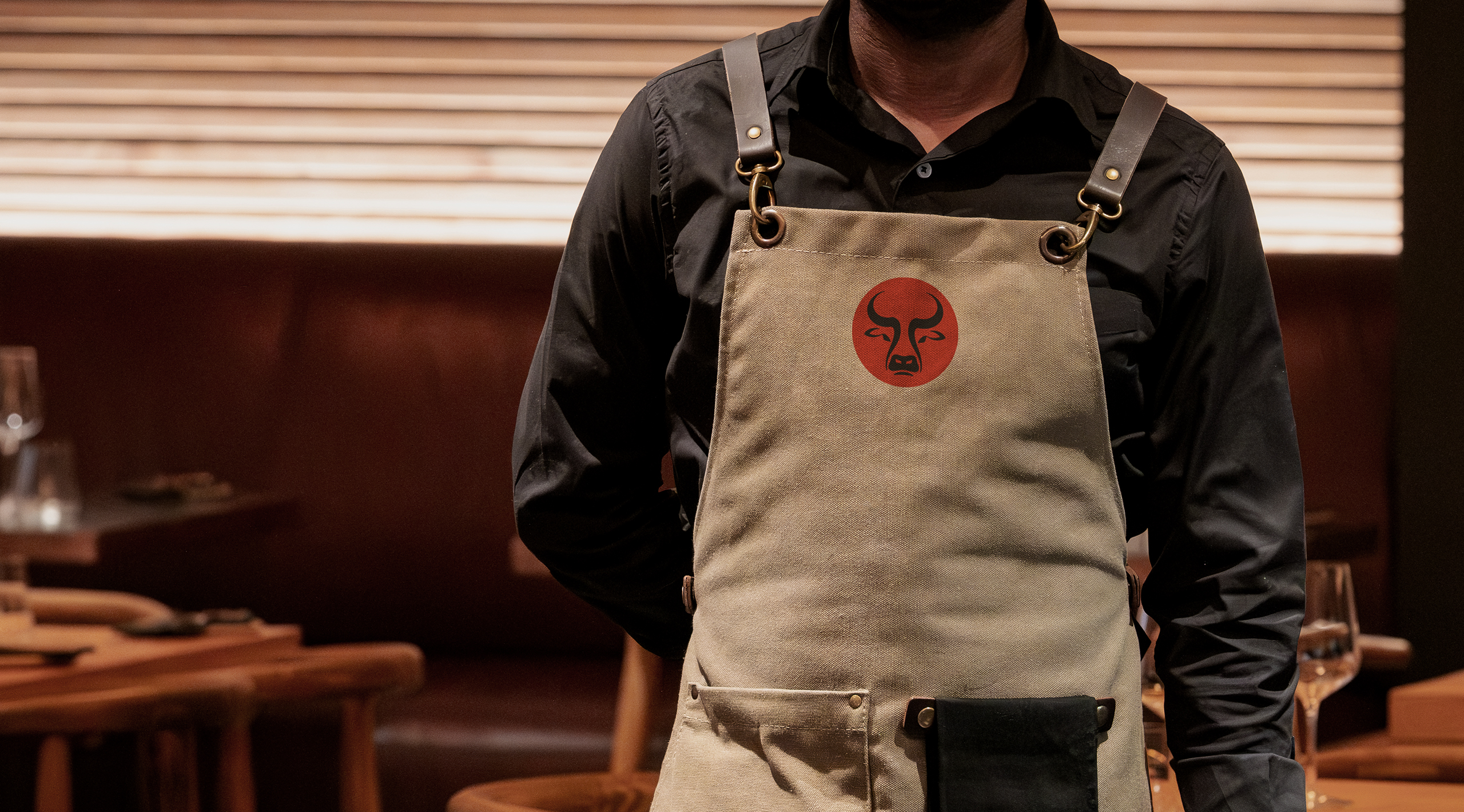
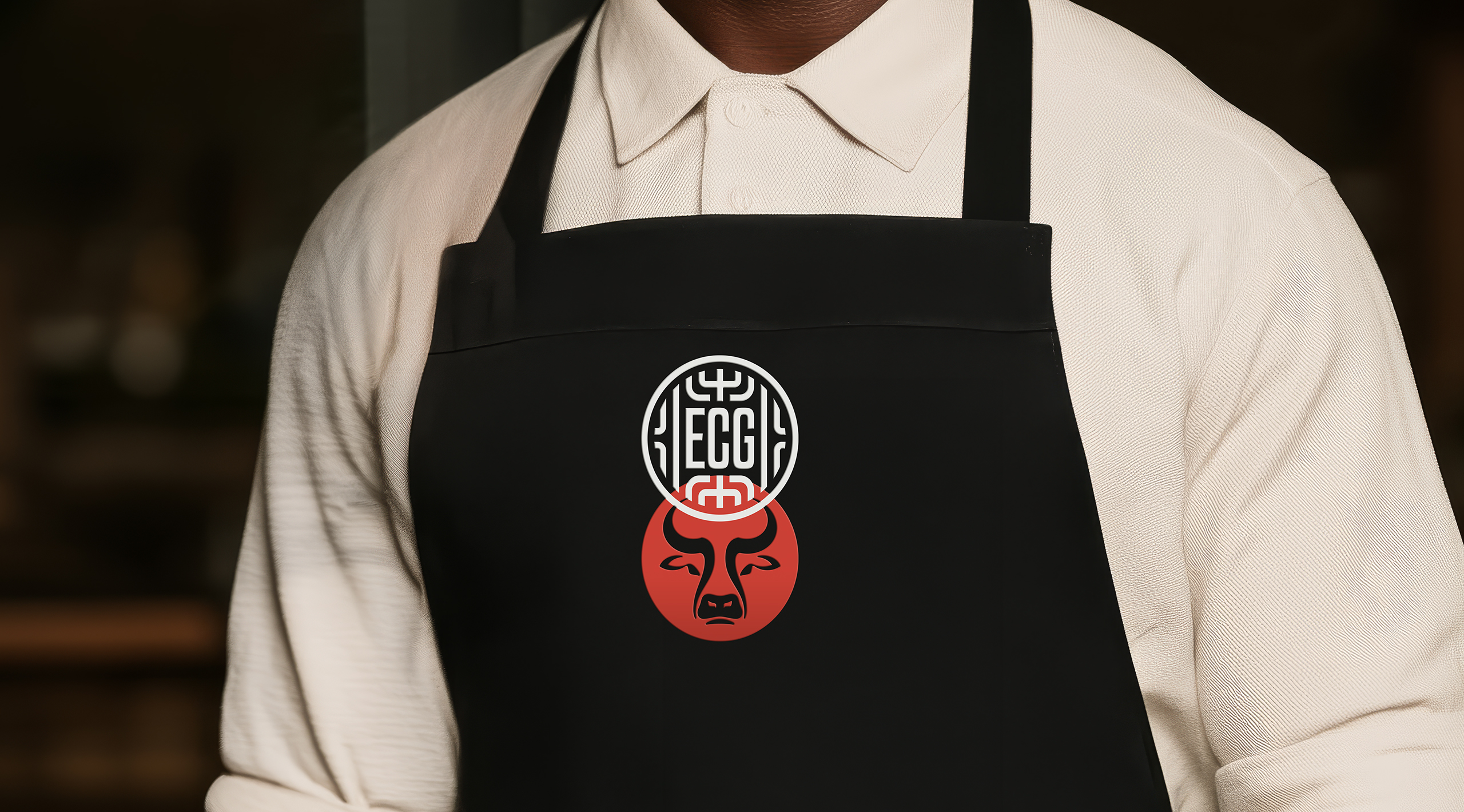
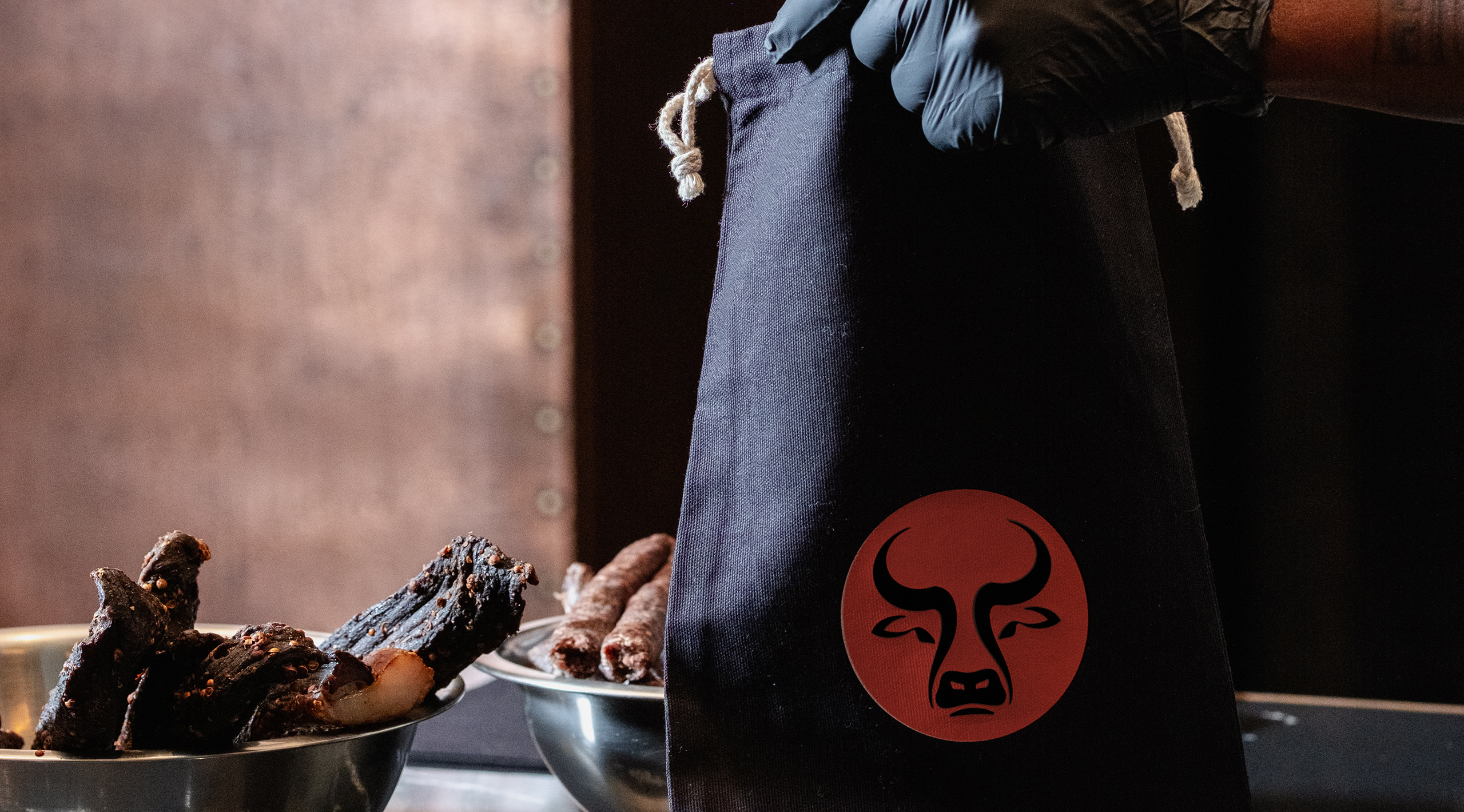
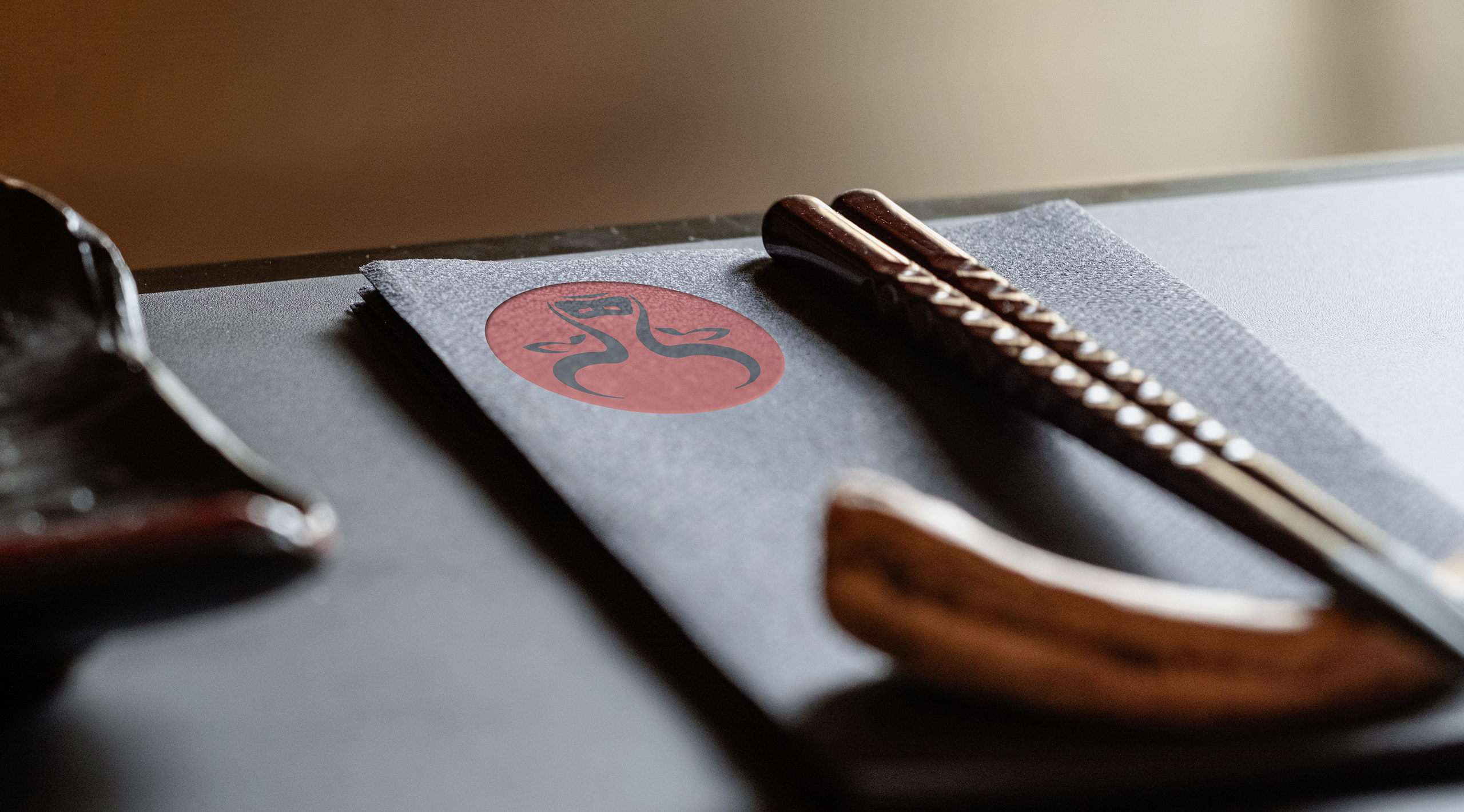

The YakiNiku starter
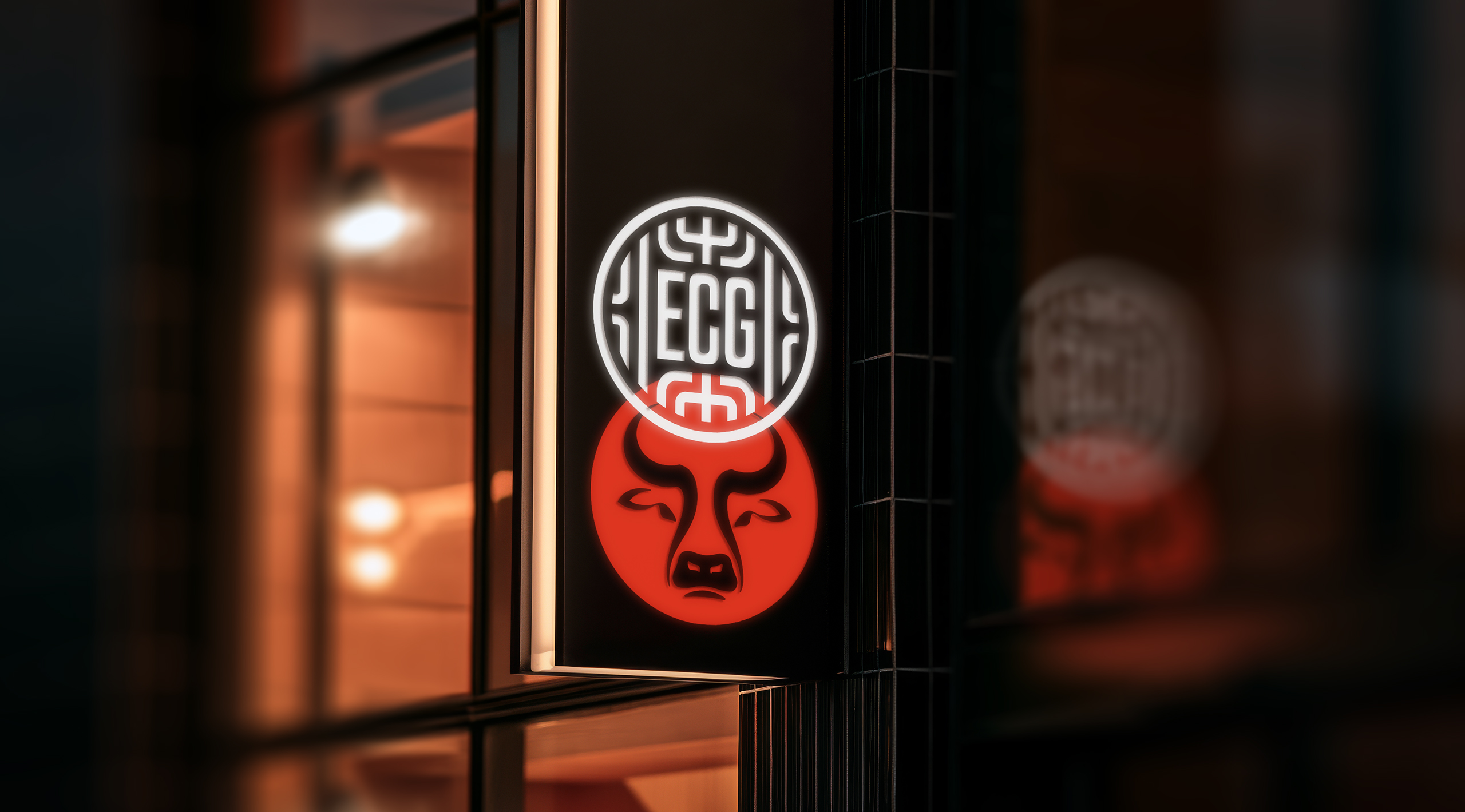
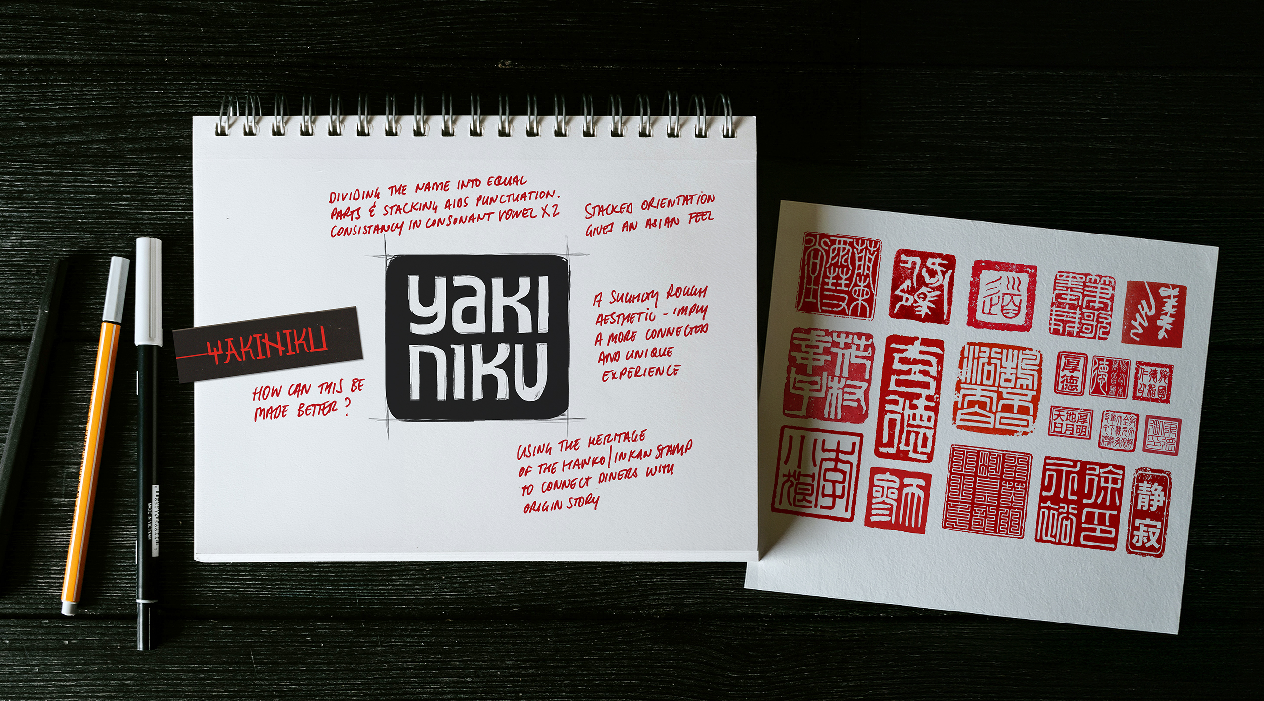
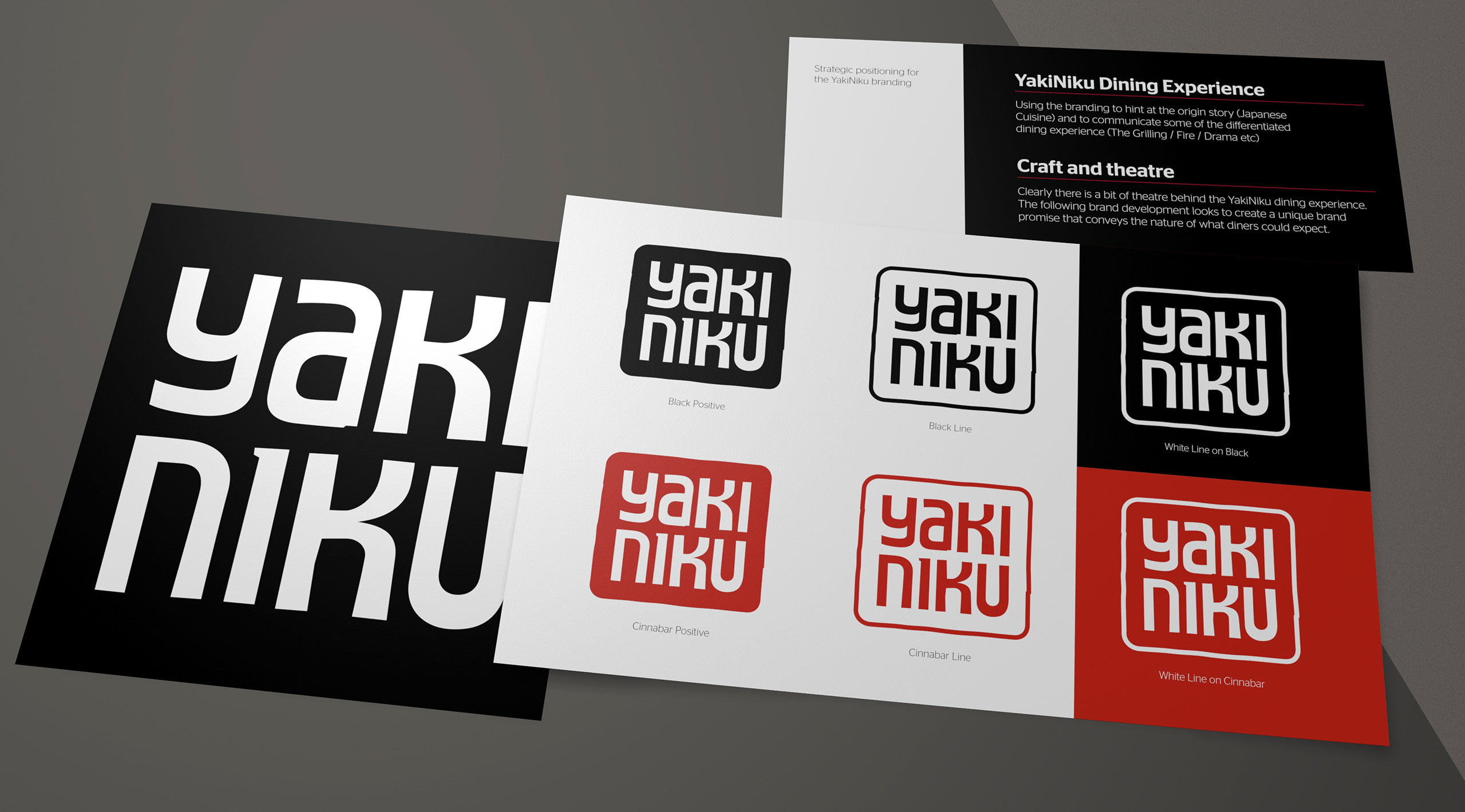
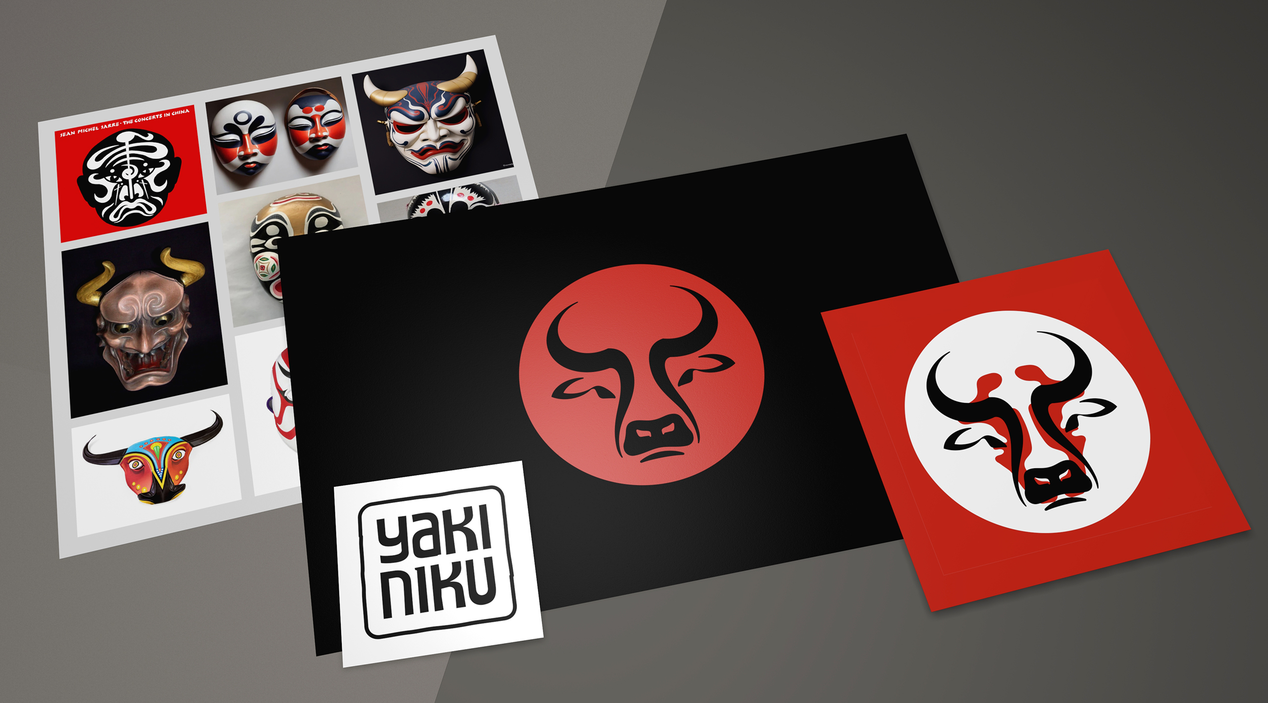
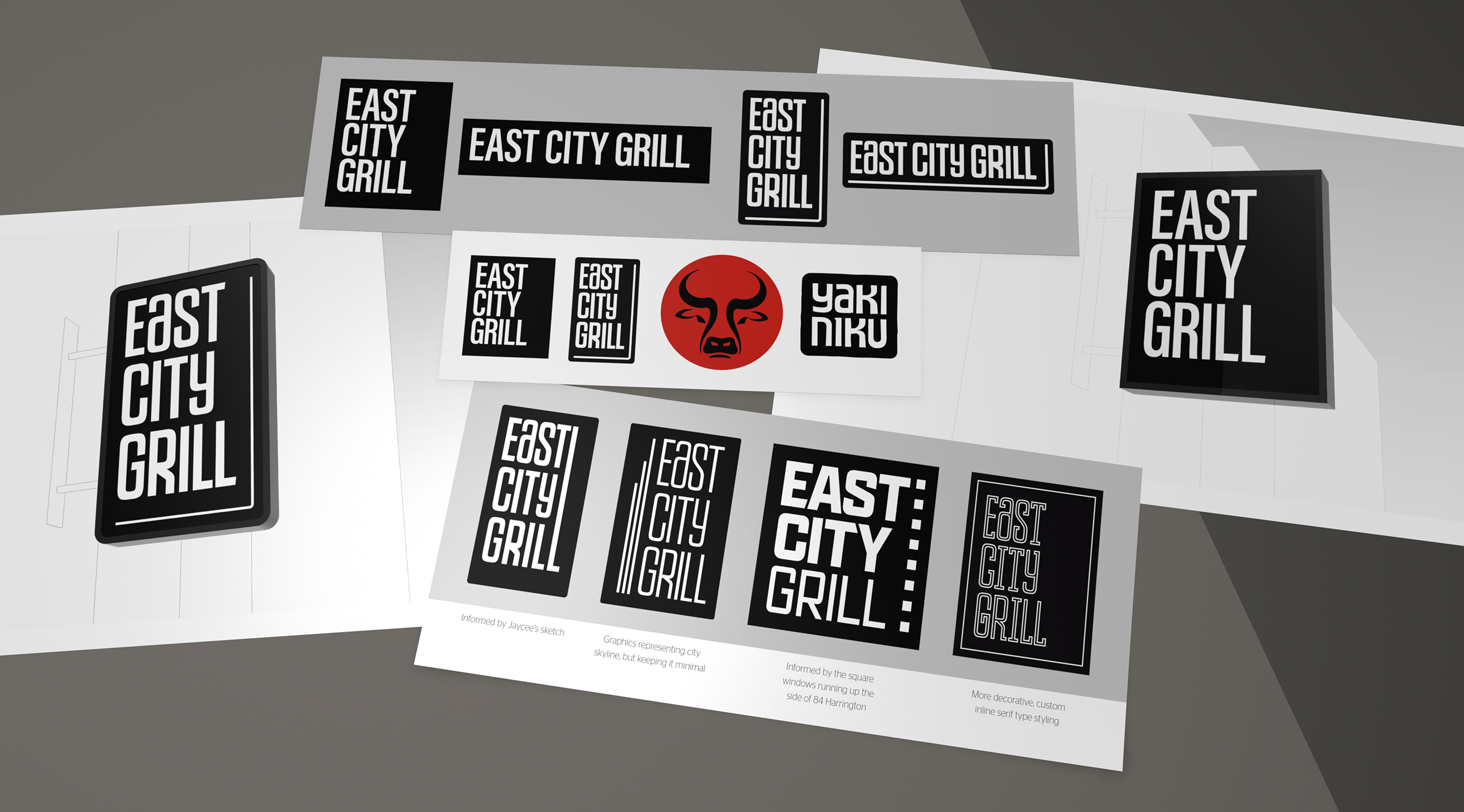
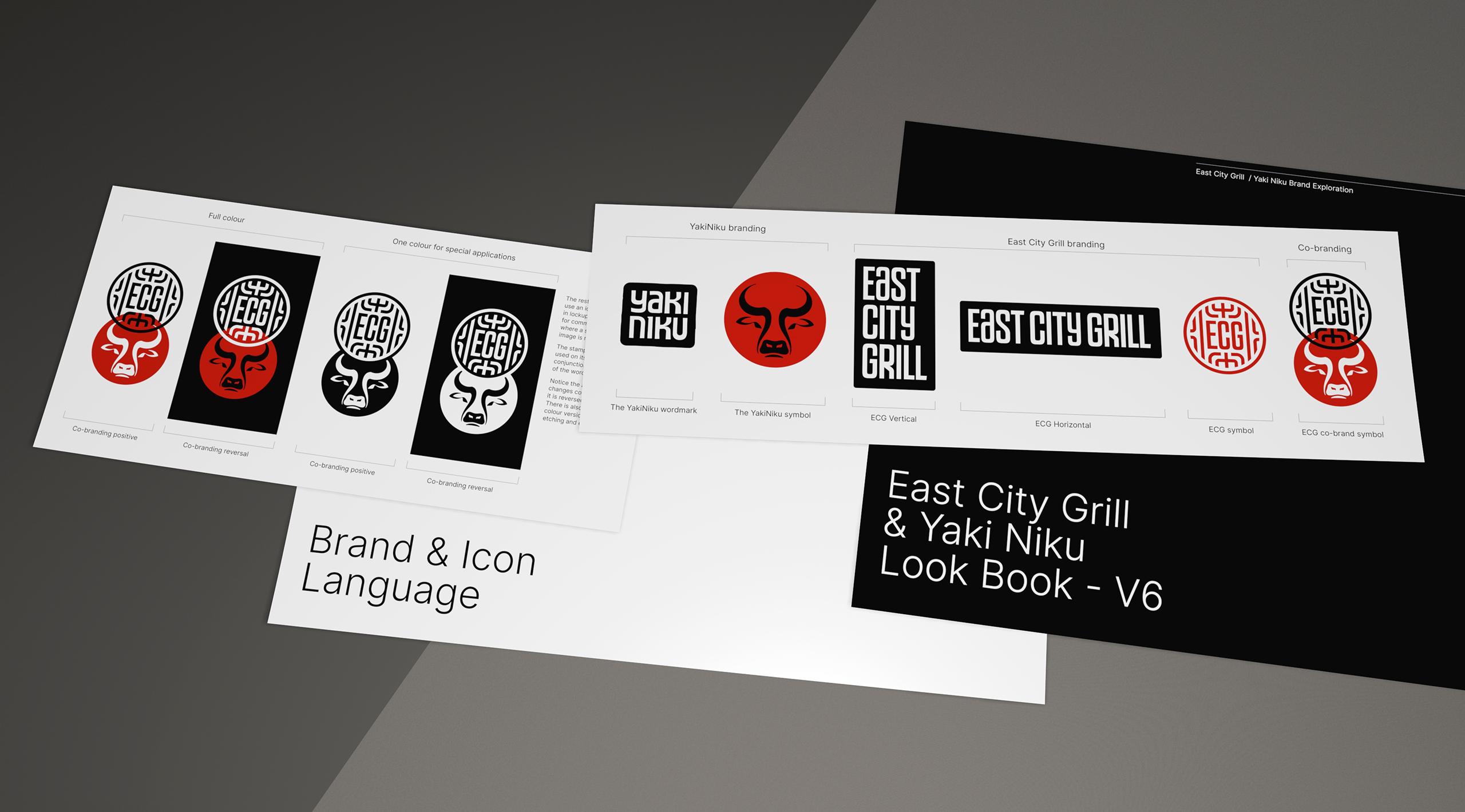
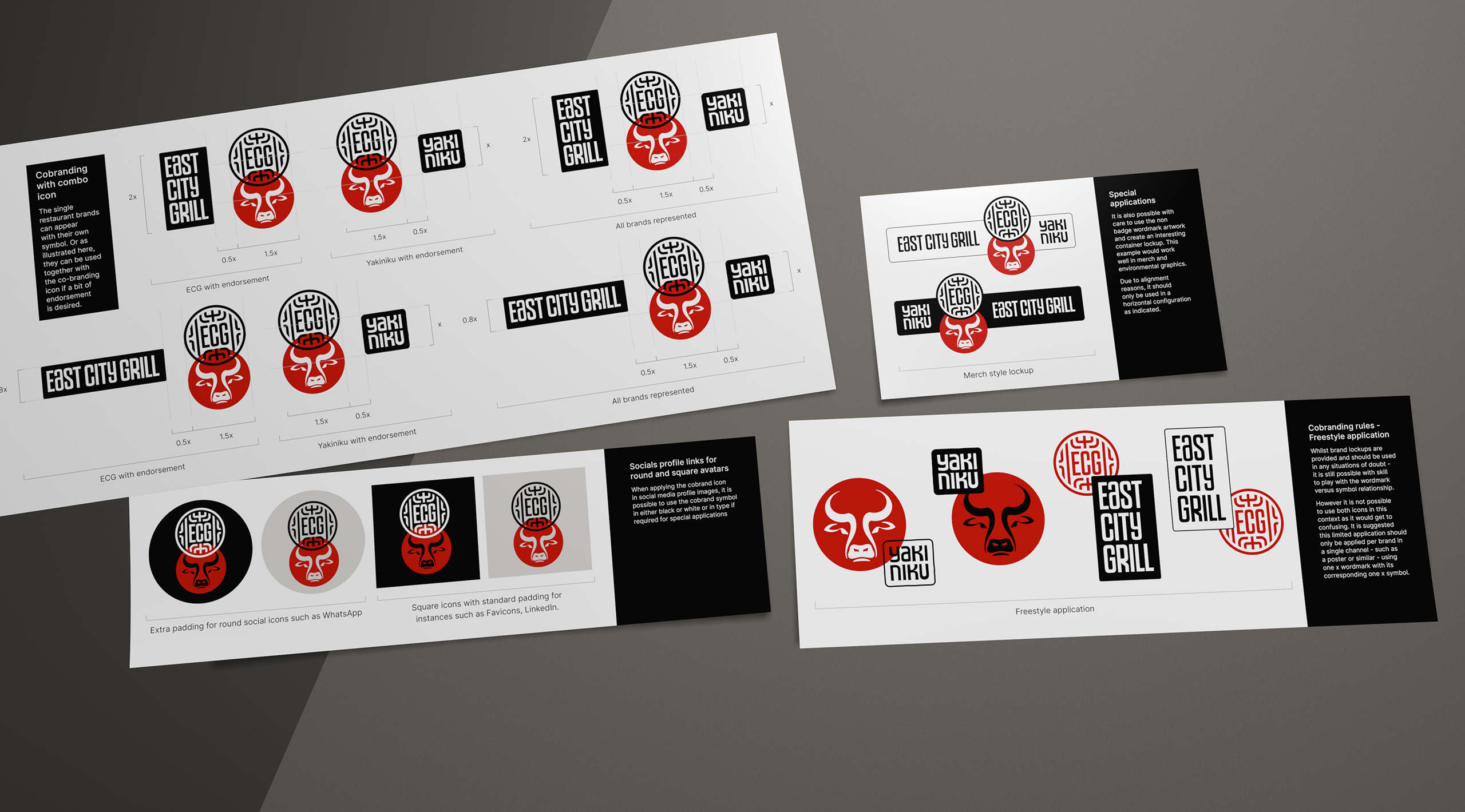
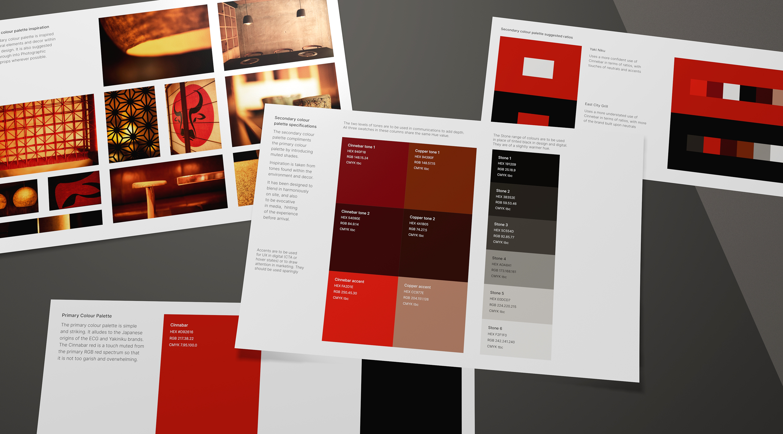
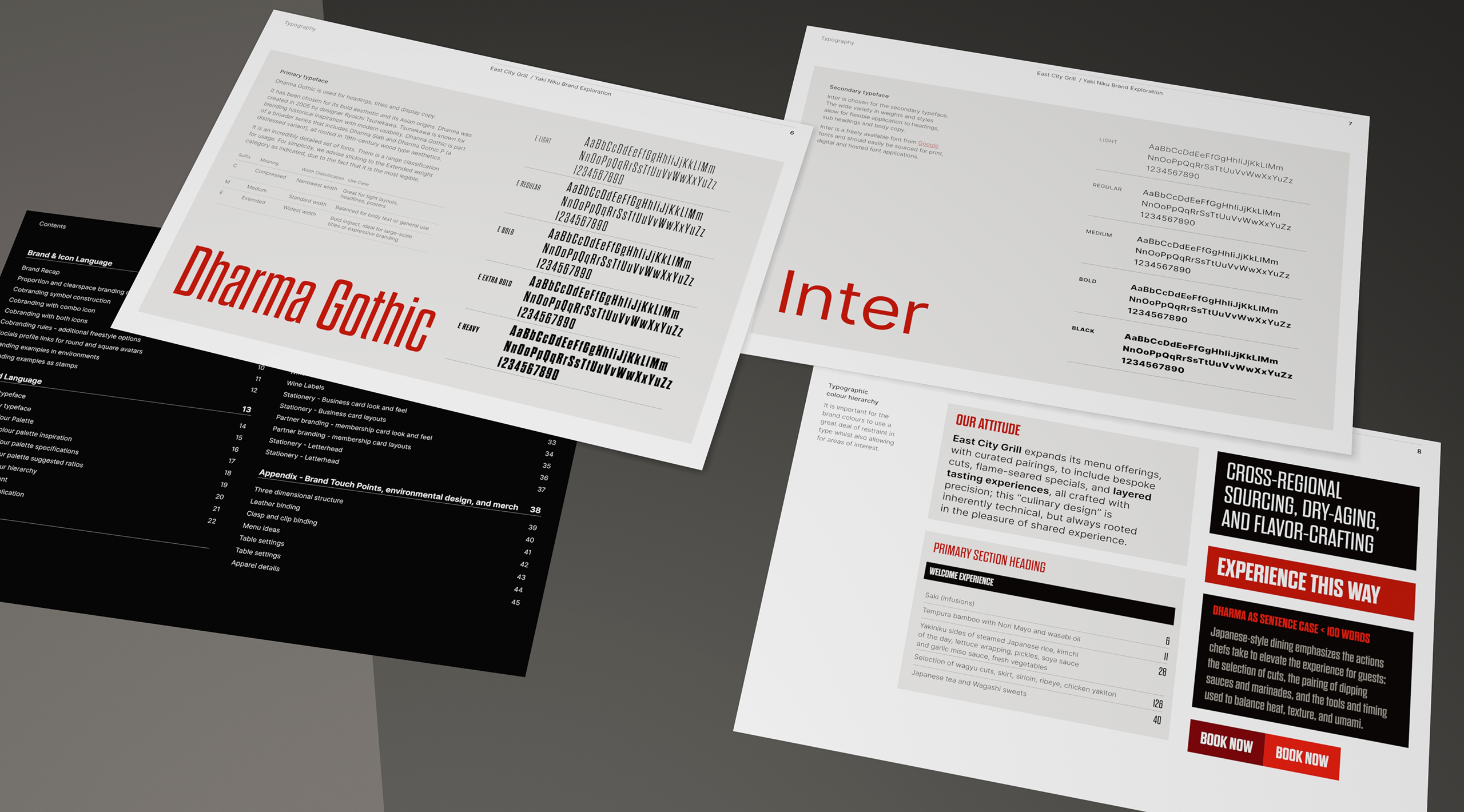
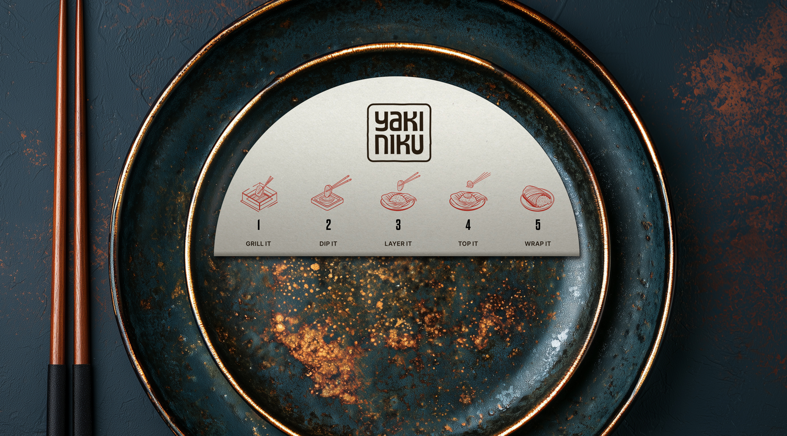
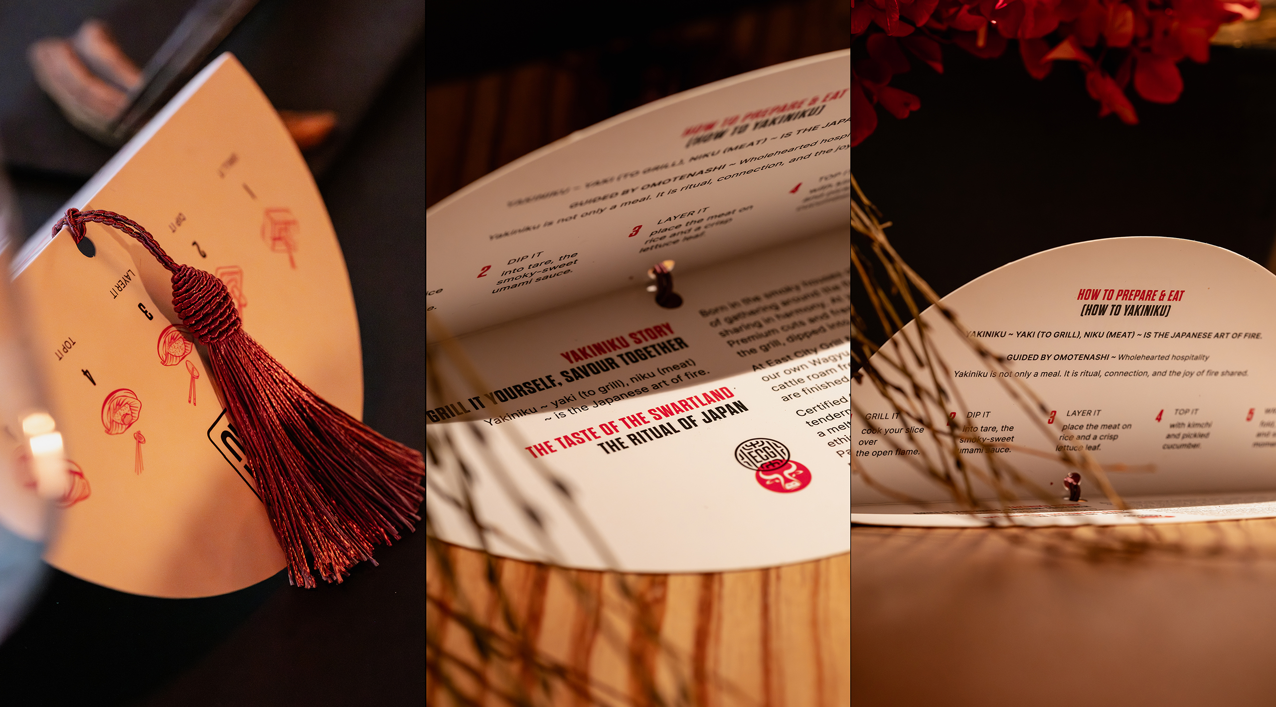
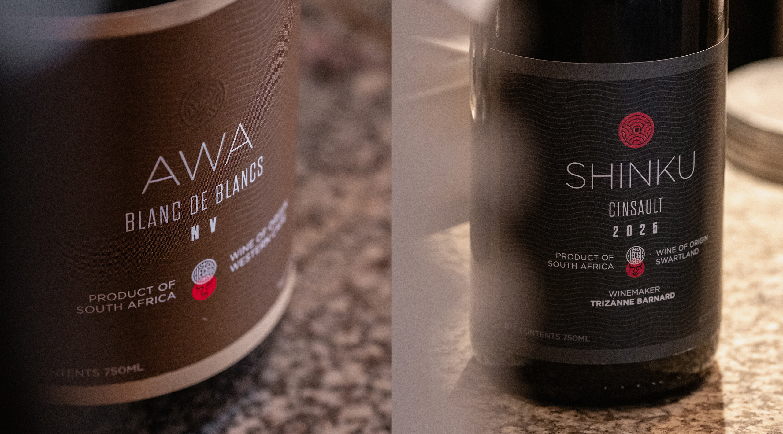
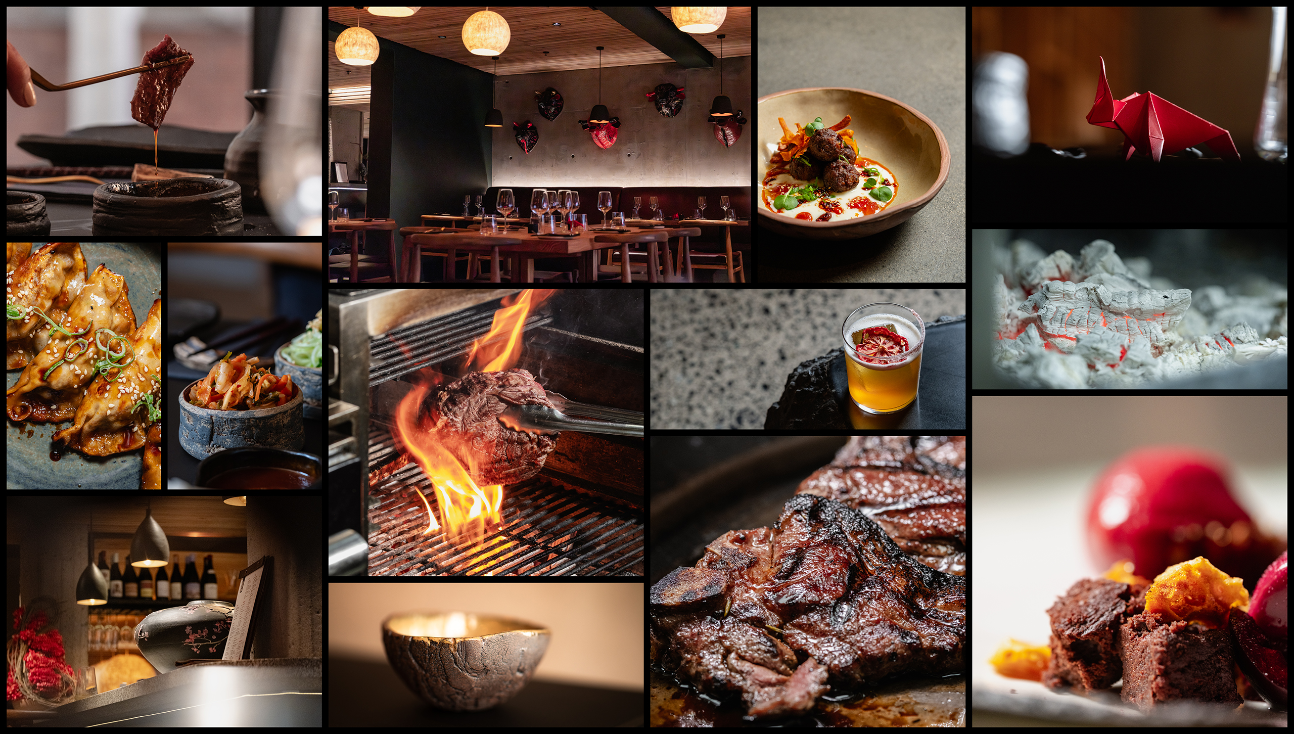
YakiNiku is a style of Japanese barbecue dining in which guests cook their own food at the table. At YakiNiku, diners gather around integrated smokeless grills to grill premium cuts of Wagyu, alongside a selection of sauces, sides and accompaniments that turn the meal into a shared experience rich in interaction and theatre. A simple working version of the YakiNiku brand existed as a prototype. Following a proactive proposal for a more refined solution, we were briefed to develop the initial idea into a full brand and visual identity. We believed that the existing brand could be both simpler and more powerful. The wordmark ran on a single line and its styling felt patronising, relying on pseudo-Asian flavourings. The challenge with Asian design cues is that, if they aren’t handled carefully and with respect, they can quickly cheapen the overall impression. We wanted to improve the legibility of the YakiNiku wordmark while creating an Asian-inspired visual language that felt contemporary and natural to the audience. We noticed the fortuitous structure of the name itself. It has two distinct parts, four syllables, and a repeating consonant-vowel pattern throughout. The opportunity was to render the wordmark in a way that made better use of those qualities and create a stronger visual impression.