Brand identity and website

Harneys

An engaging international legal brand.

Harneys (Harney Westwood & Riegels) is a leading international offshore law firm providing the world. Our remit for Harneys extended to branding, design for print, web design and advertising.

What brings Harneys regional offices together is a strong sense of purpose and values. We wanted to create a cohesive identity vehicle which helped unify the brand.

Harneys commissioned Firedog to develop and move the Harneys brand forward.

A new positioning and re-alignment in keeping with the firm’s 21st century international proposition was needed. The current brand was outdated and lacked the distinct message, positioning, and visual language to differentiate Harneys against their competitors.

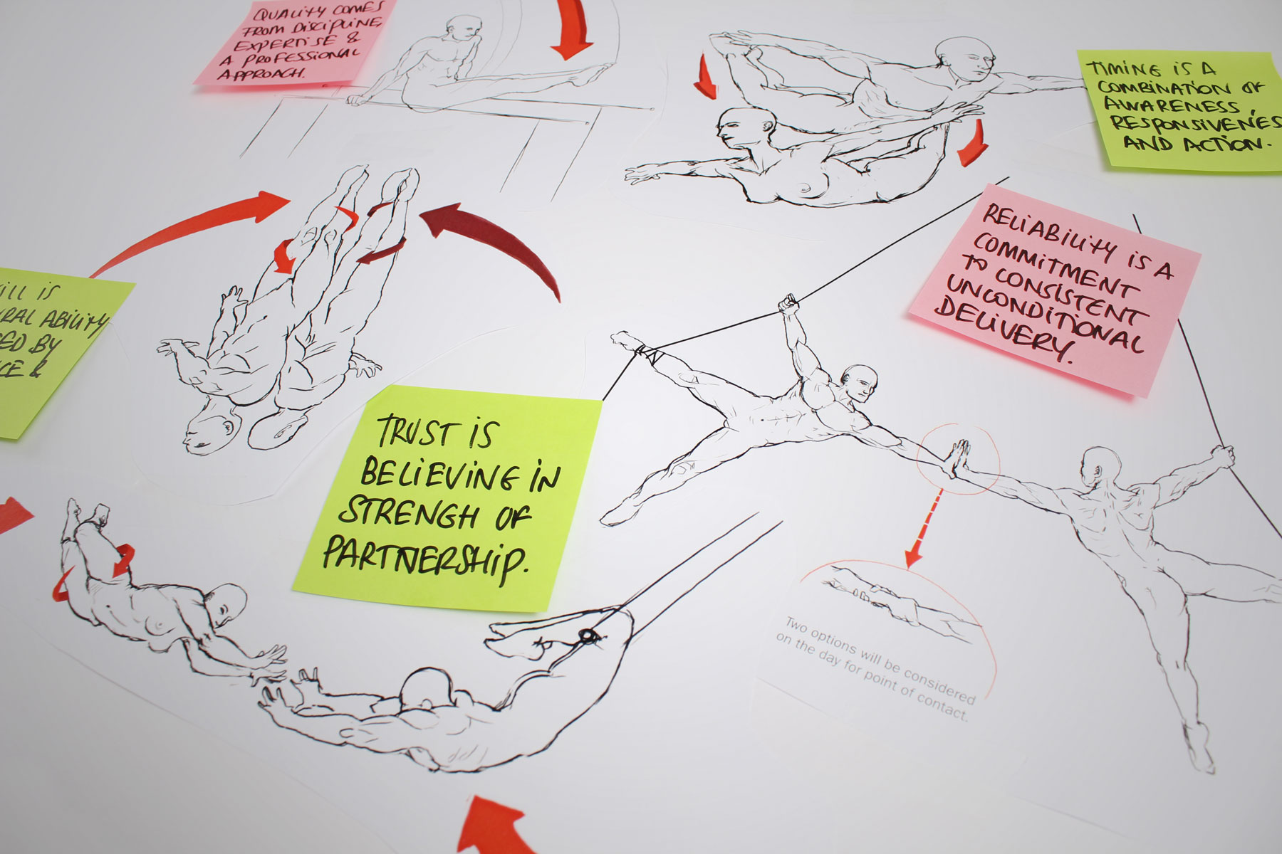
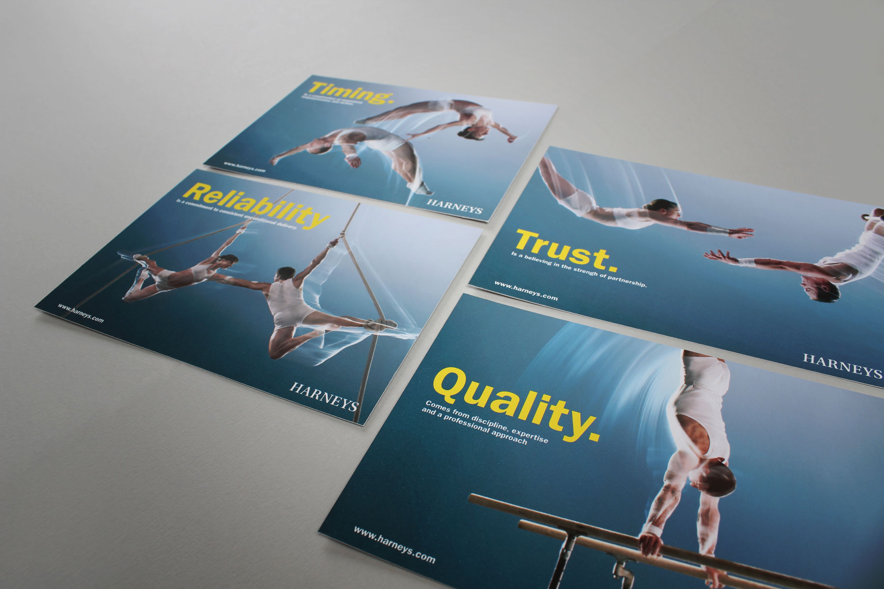
We created a suite of powerful imagery that communicated each of the Harneys business values.

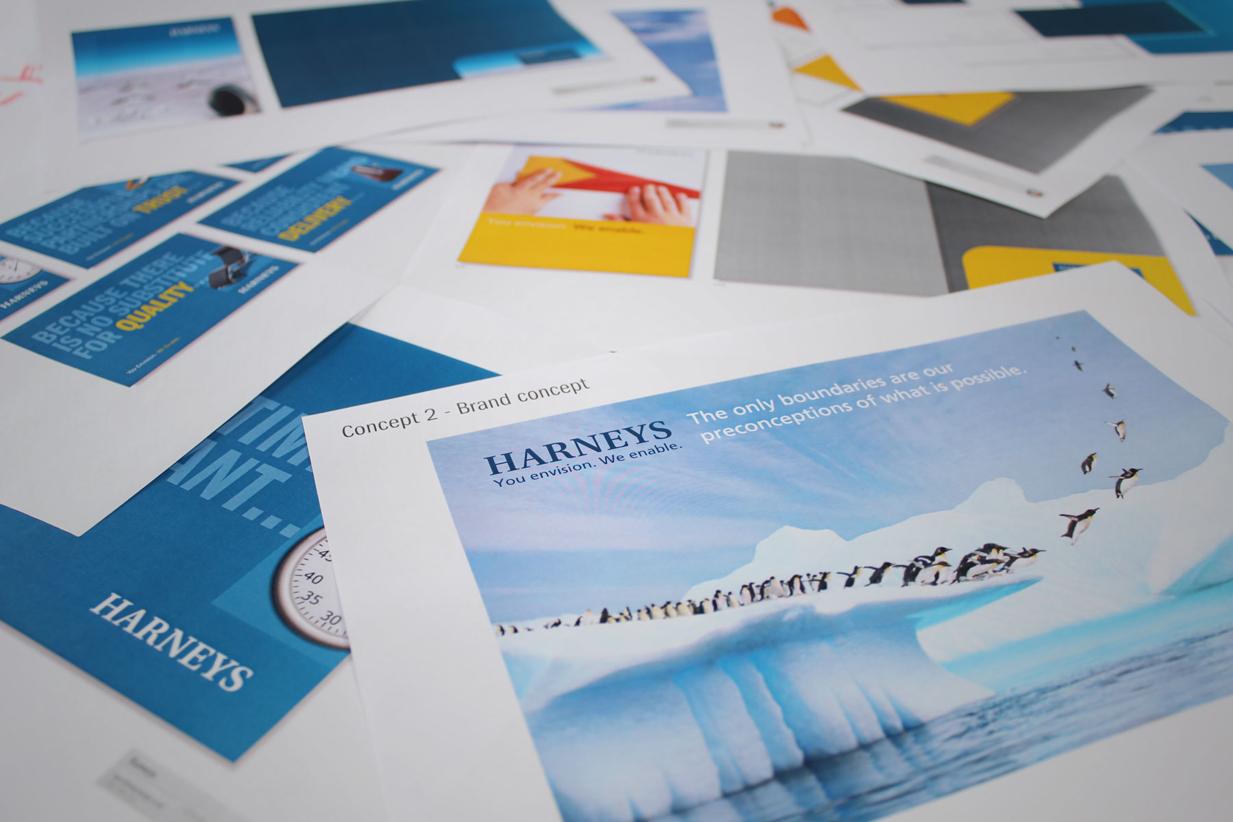
Firedog defined a new positioning and created core messaging to reinforce each of the values, further supported by a unique visual look and feel.

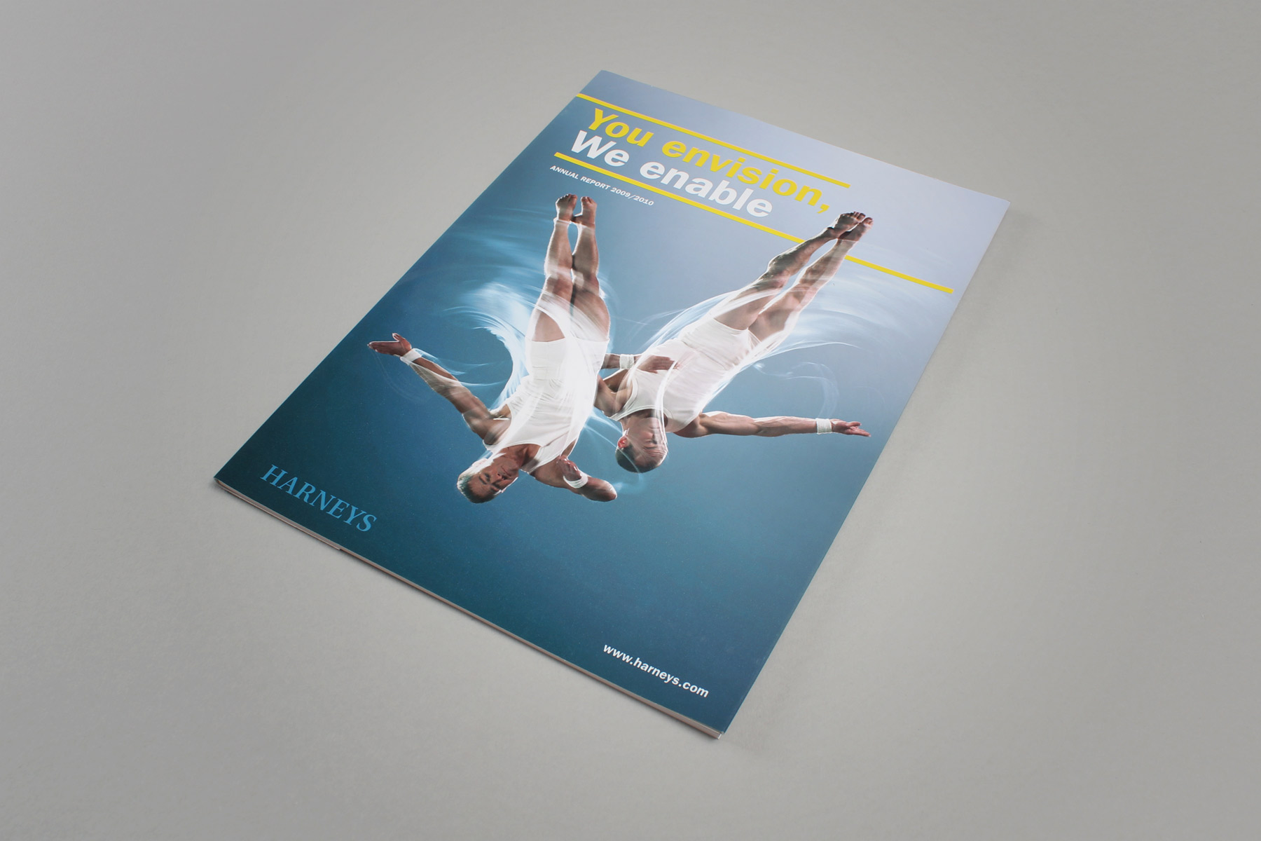
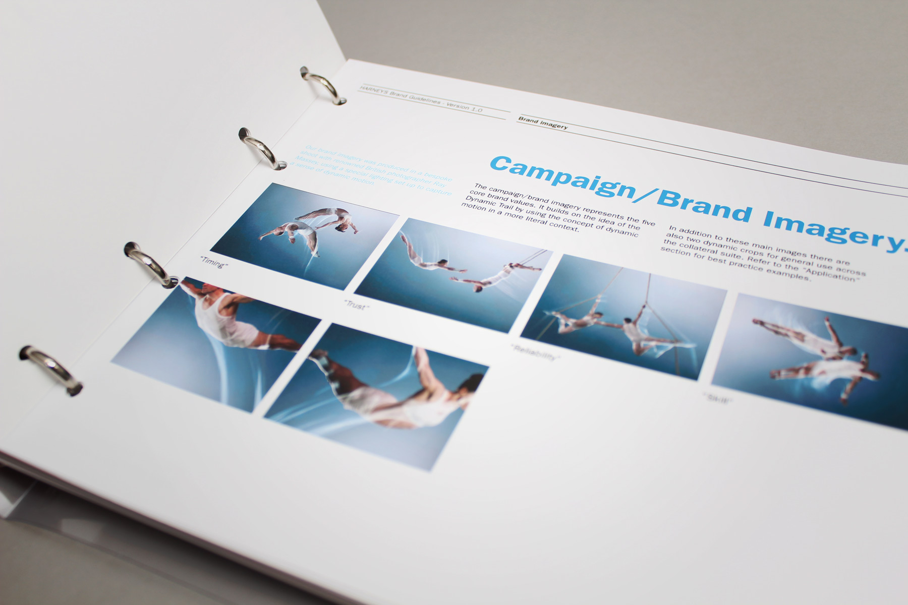
Firedog’s first step was to design and implement bespoke online surveys in order to glean insight concerning current perceptions of the firm. Findings influenced the development of five key values to underpin the brand. Firedog defined a new positioning and created core messaging to reinforce each of the values, further supported by a unique visual look and feel. A dynamic trail visual was developed as a key brand device, representing Harneys’ ability to respond quickly with knowledge and a sense of proactivity and purpose. The brand imagery uses the concept of motion in a more literal context. Firedog appointed renowned aerial artistry photographer Ray Massey to generate high-quality images of skilled acrobats, using lighting and slow shutter techniques to capture light trails from the movement of their bodies.

Expertise Spotlight

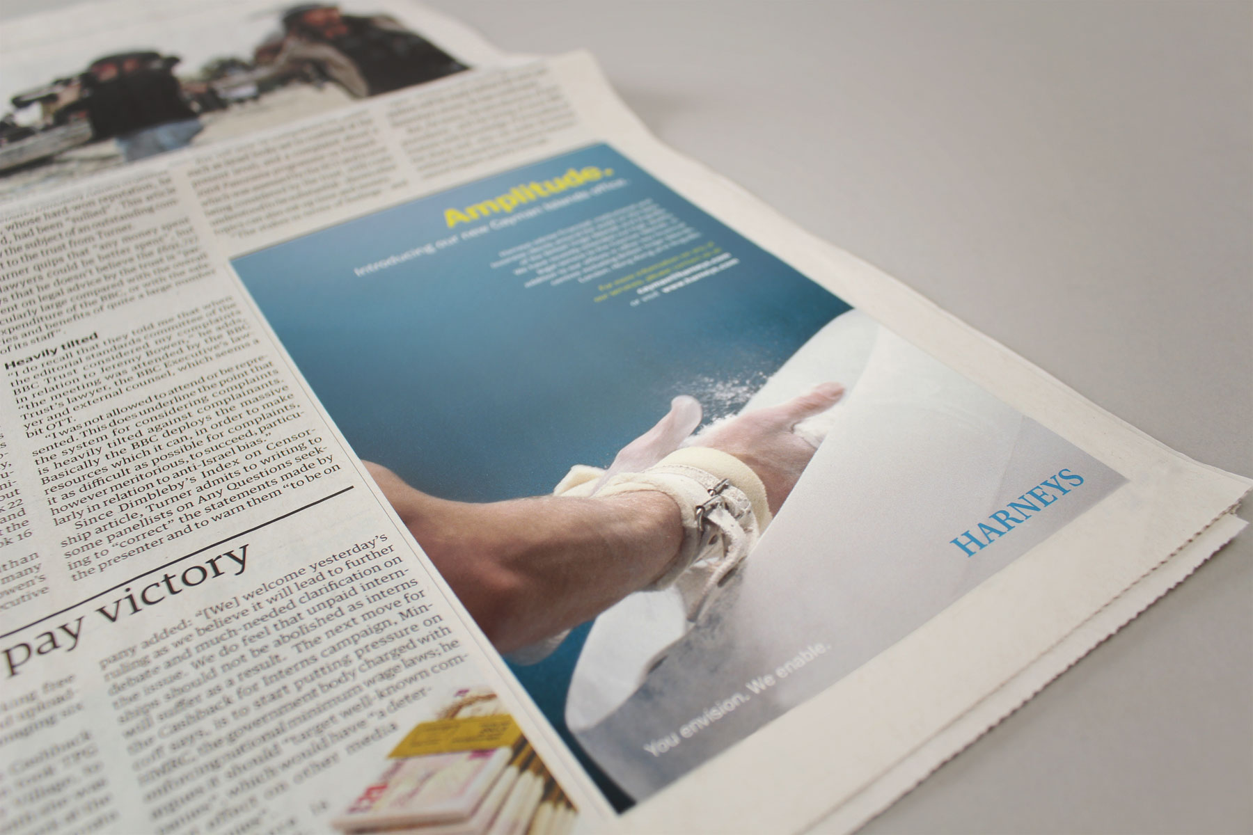
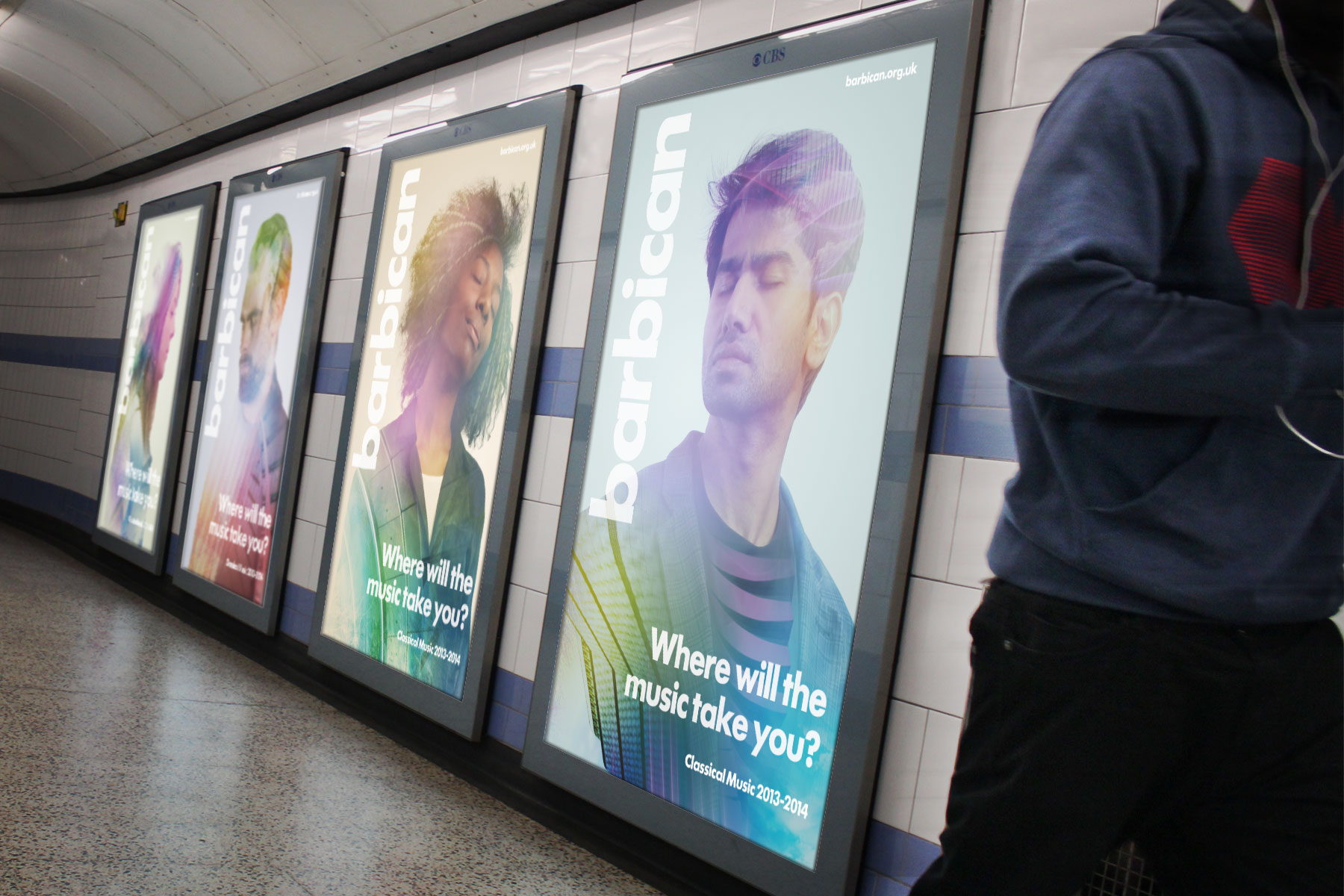
The extensive placement of media on the Tube combined with the broad use of varying assets created a recognisable and striking campaign.

Campaign

View case studies
The suite of brand images captured the business values - Timing, Trust, Reliability, Skill.

The rebrand has helped Harneys to expand across the globe with new offices in Asia and Brazil.

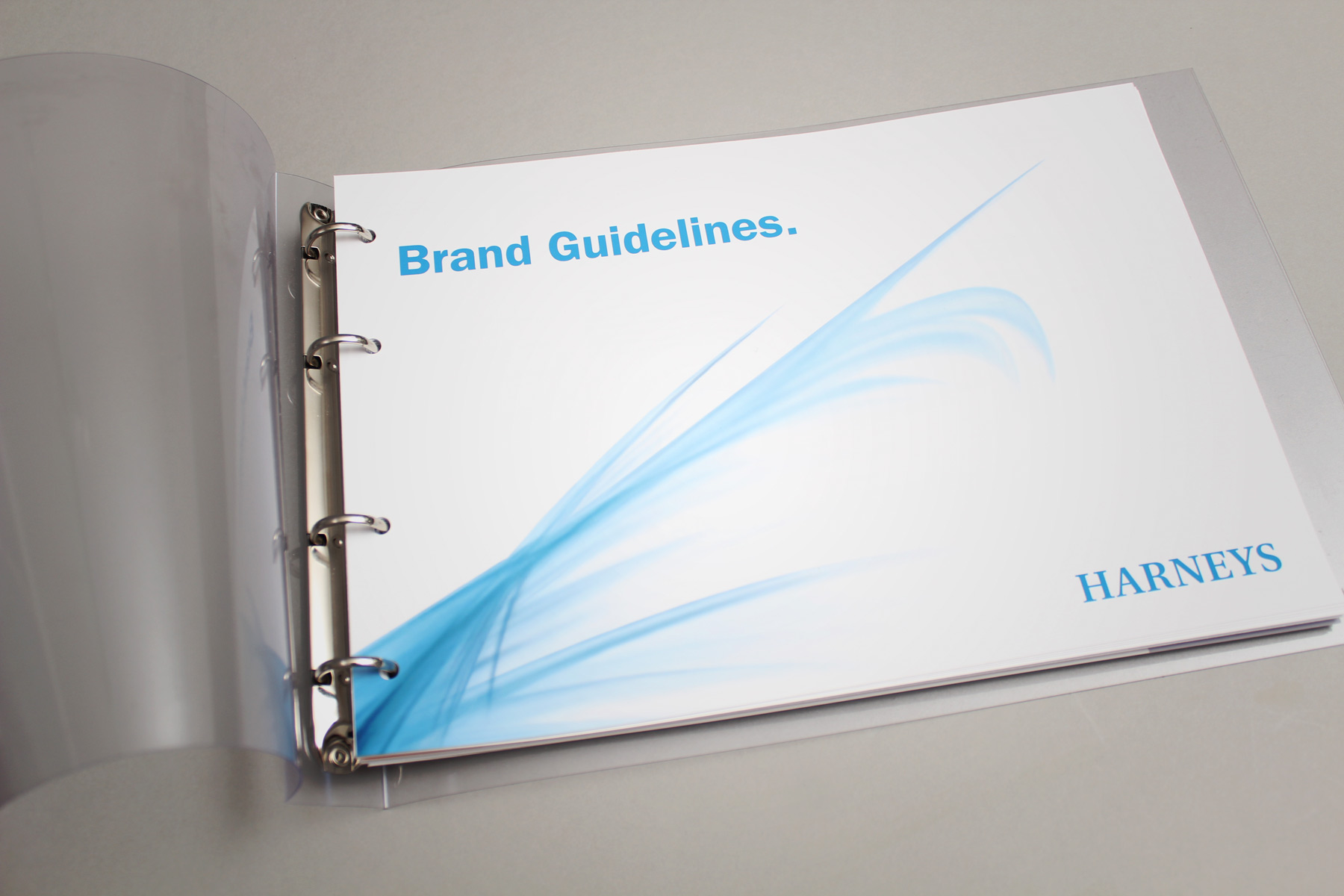
The final brand look and feel is a visually stimulating representation of the values; Trust, Reliability, Timing, Skill and Quality. Corporate guidelines were produced and the visual look and feel applied to a full stationery suite (print and digital), corporate collateral, digital templates, advertising and a fresh and engaging corporate website. The result is a unique, up-to-date and distinctive brand which truly stands out from the competition.  The rebrand has helped Harneys to expand across the globe with new offices in Asia and Brazil.

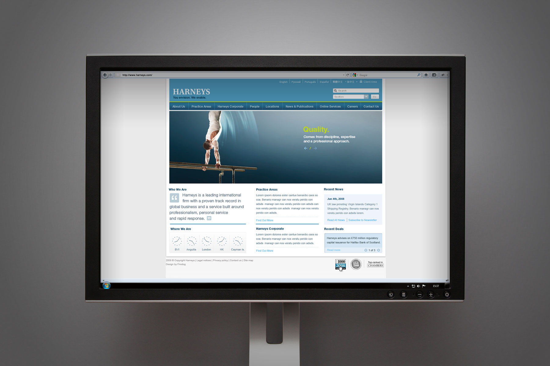
Website design

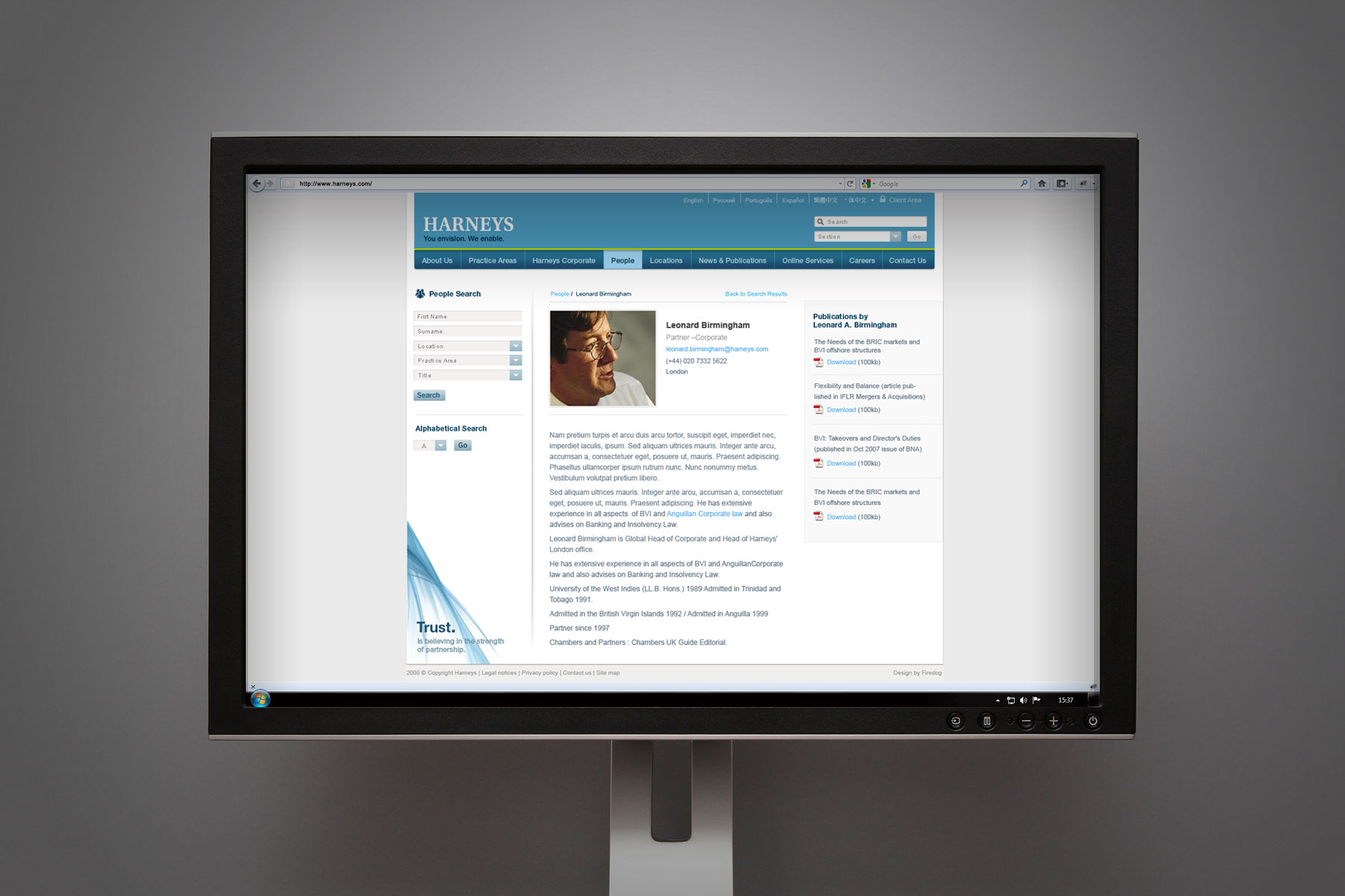
As part of a wider branding project Firedog were tasked to redesign Harneys’ corporate website, in keeping with the new proposition and visual look & feel. As it is a key touchpoint for the brand we designed a fresh and engaging corporate website, using the sophisticated brand elements created by Firedog as part of the global brand development. First steps were content planning, including comprehensive architecture and wireframes to ensure optimum usability for the site. We then designed key template pages, incorporating all brand elements, key brand messaging, dynamic trail visual and bespoke imagery, all created by Firedog, and supplied the layered PSD files to Harneys’ development team. The results are a clear, sophisticated and visually stimulating online articulation of the Harneys brand and service which appeals perfectly to the high net worth individuals and corporations they represent.