Brand identity

Portafina

Firedog has created an engaging retail financial brand for UK pension advisor, Portafina.

The primary brief was to change the name from "Portal Financial" to a more unique and recognisable name in order to have a stronger financial brand presence in the online and SEO environment. Our project remit included extensive employee engagement and research, a strategic framework, brand positioning, a retail financial brand identity, supporting look and feel, advertising and communications templates and a brand and spirit guideline kit.

Providing an early steer on design intention as part of early research phases. Some elements stuck, some are evolved.

Warm customer service delivered by a young, yet competent team.

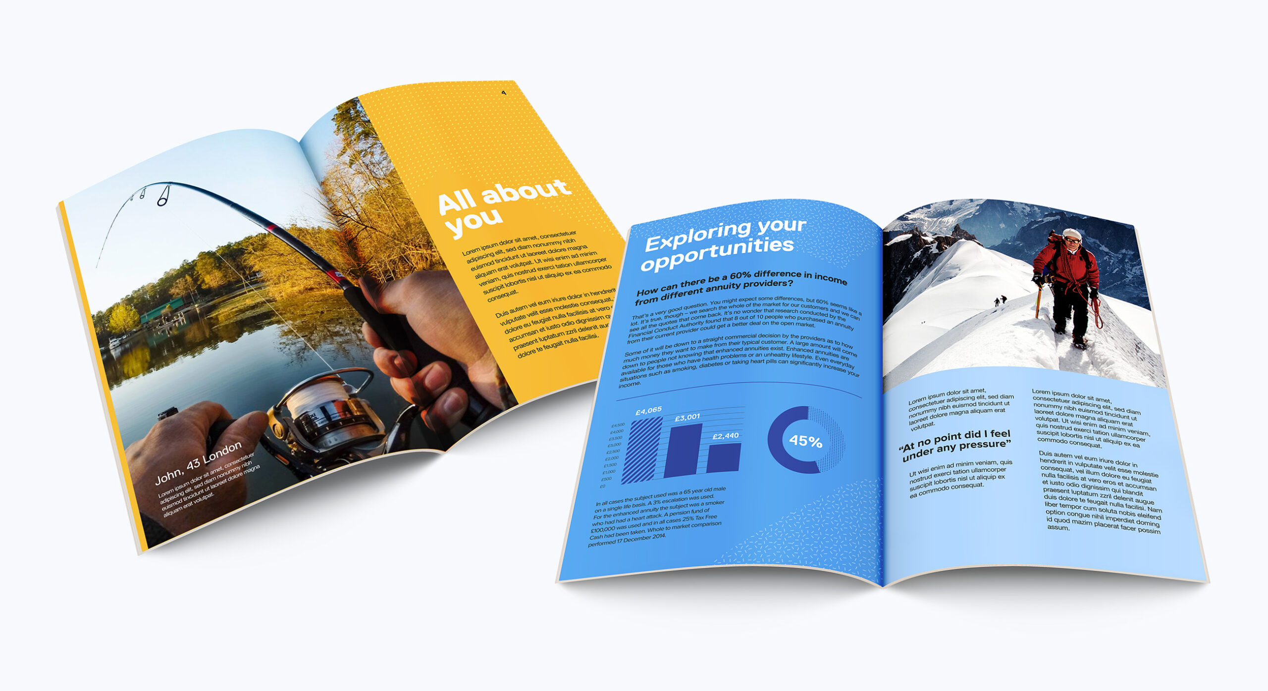
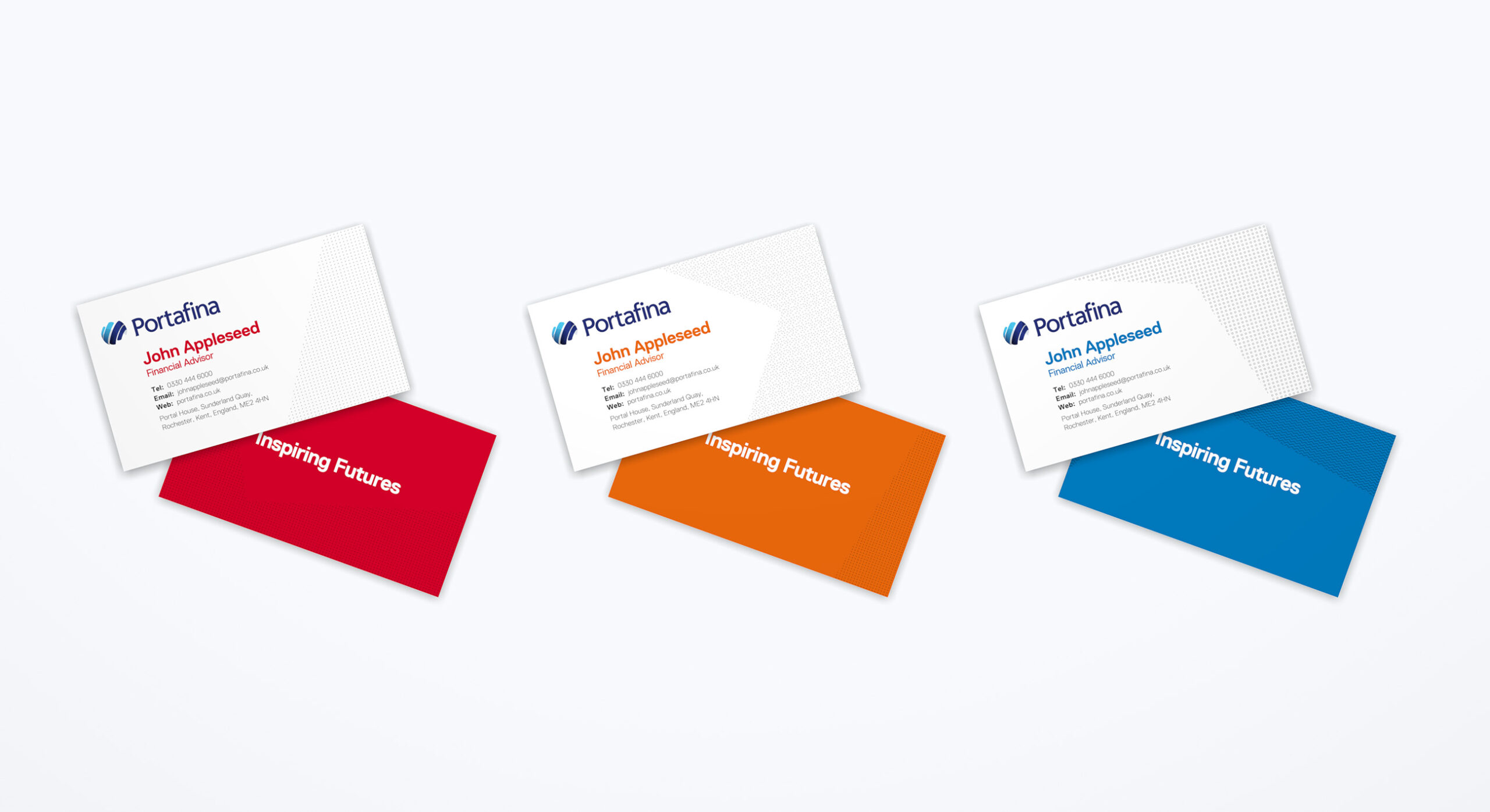
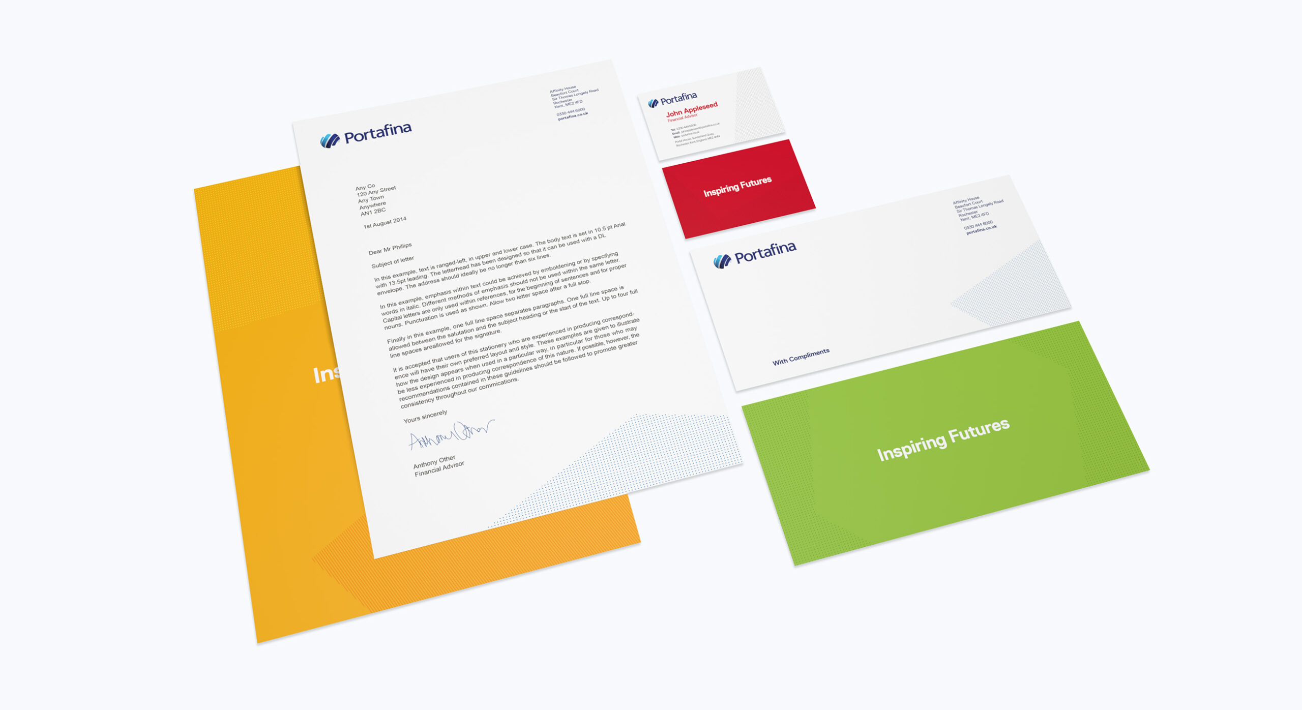
An approachable yet inspirational brand look and feel

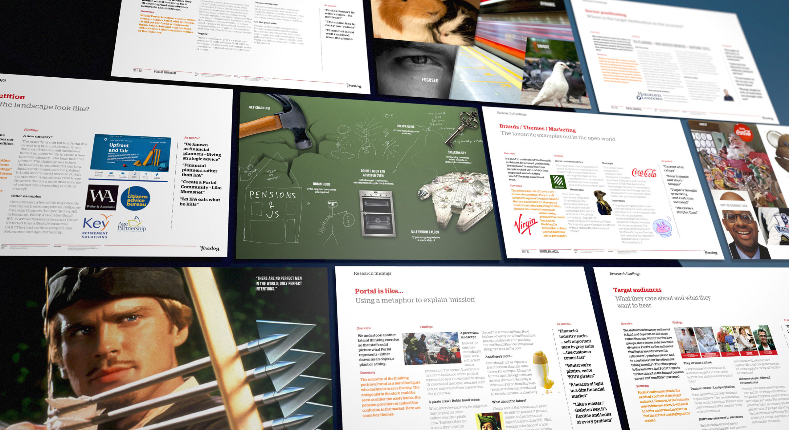
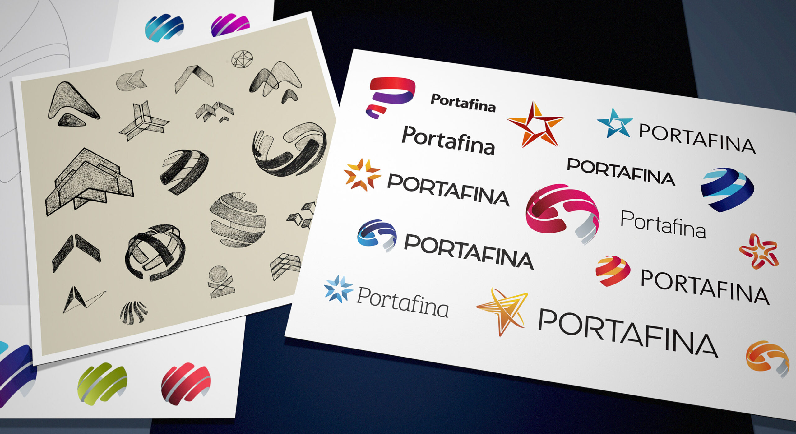
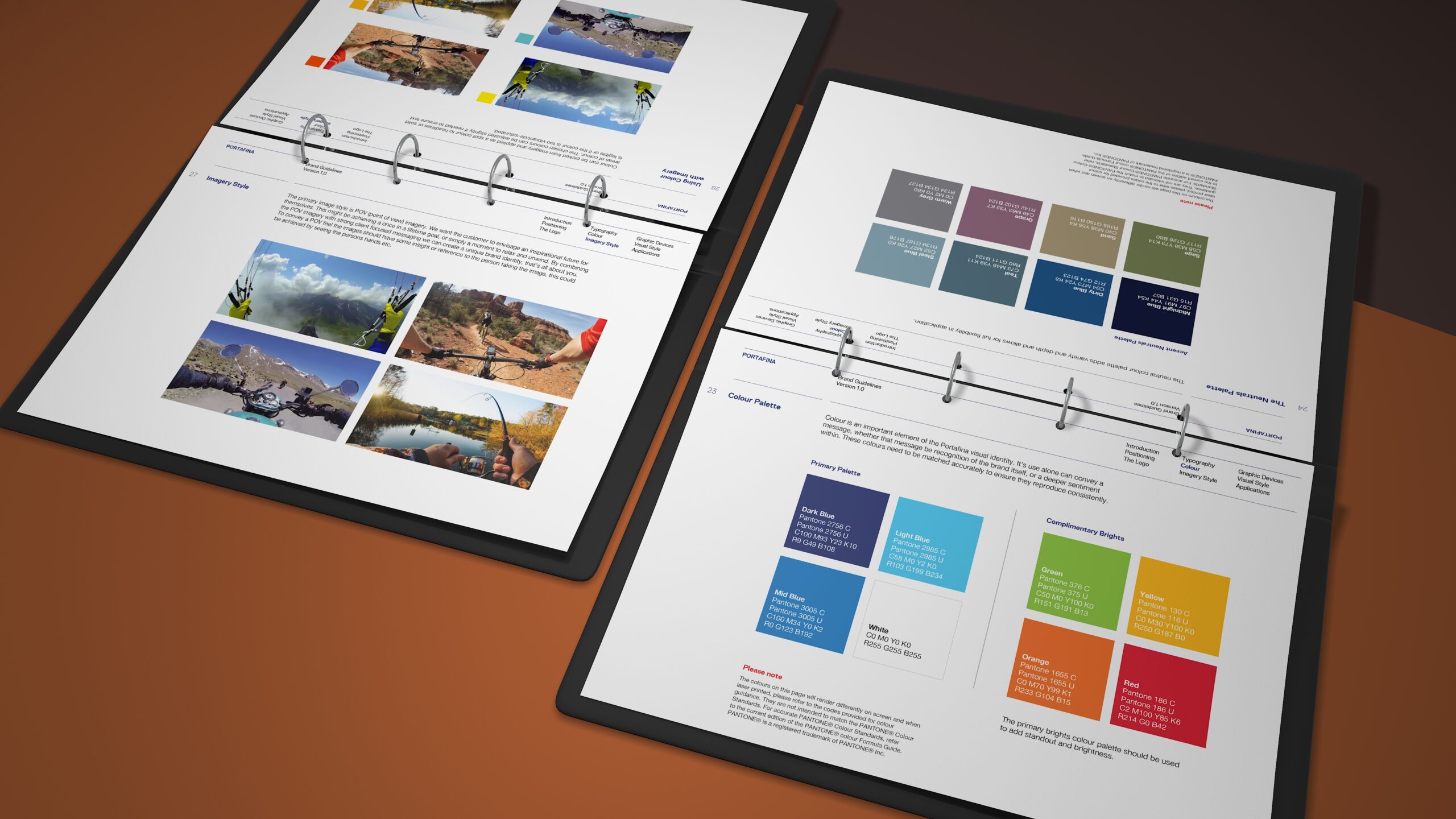
Portafina help consumers access their pension savings through a process called pension release. Simply put, this enables savers to draw down on their existing private pensions and put the capital to work. Either to move it to tax free savings or to use it for other living ambitions. Firedog was briefed on creating an engaging and inspirational brand which reflected the unique business offer. We conducted company wide and prospective client research combined with broad sector and competitor analysis. The findings are summarised in a set of strategic recommendations. It was important that the brand did not follow the established rules of conservative financial services. Rather, it should be more consumer focussed and friendly. Research advised that the business is built upon warm customer service delivered by a young, yet competent team.

Portafina has a diverse team of people offering various levels of customer support. Our creative approach harnessed this property into a visual brand positioning.

Creating a world of "Inspiring Futures"

The brand promises its target audience a future filled with more enjoyment. We developed a positioning which used the tagline “Inspiring Futures”. The message has a play on words being both an adjective but also an active verb. We wanted to create an image which carried the positive message of freedom and unlocked potential. A pension release process takes what can be seen as locked up capital and liberates the assets so that the consumer can use it for more current needs and aspirations. The brand symbol has a global type feel which hints at travel and movement. We supported the messaging with engaging imagery showing a more adventurous spirit. The imagery portrays people enjoying the great outdoors – Getting out there and living while they can. A subset of the image library takes this further by showing a first person perspective. This POV type framing challenges consumers to put themselves in the picture.

The Firedog studio spent a great deal of effort exhausting a myriad of brand concepts. It was vital that the brand was simple, yet fresh and inspiring.
The Portafina brand features a structurally interesting symbol combined with clean, custom typography.
The visual identity is made up of a diverse set of bright hues within a brand colour palette. This is supported by an interesting type family and unique brand graphic devices.
The Portafina image library contains a number of POV (Point of view) images where the frame shows activities viewed from the first person. This enables potential consumers to project themselves into the brand promise.
The POV imagery and consumer focussed messaging makes for arresting advertising campaigns.

Graphic shapes break out to create more engaging and colourful layouts.

The branding combines the bright colour palette with a book of custom patterns. These are overlaid in graphic shapes which break out of the square format in order to create more engaging and colourful layouts. The colour palette is made up of primary tones which create a really vibrant and energetic feel. It is important that the brand feels engaging and nonconformist in its feel. The branding always sits on white, yet the box out device is created using abstracted angles and shapes. All the brand assets have been supplied to the client along with a comprehensive style guide in order for the brand to be further executed across communication channels.

The stationery application utilises various patterning and colour work in order to create a personalised feel.
The brand is supported by a comprehensive set of brand and spirit guidelines which assists in the roll out of the financial brand identity.
Sign up for our Firedog Newsletter
* = required field