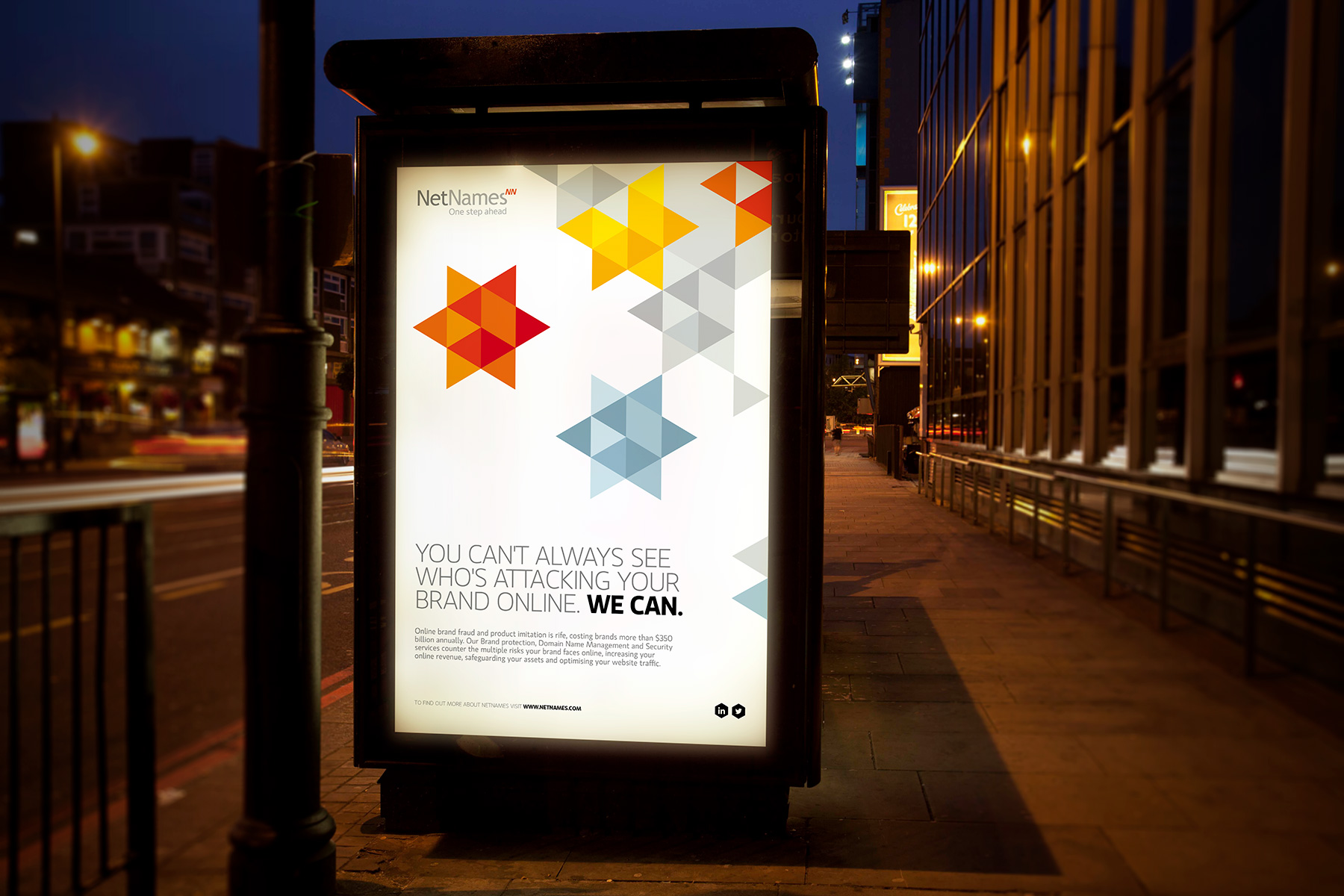
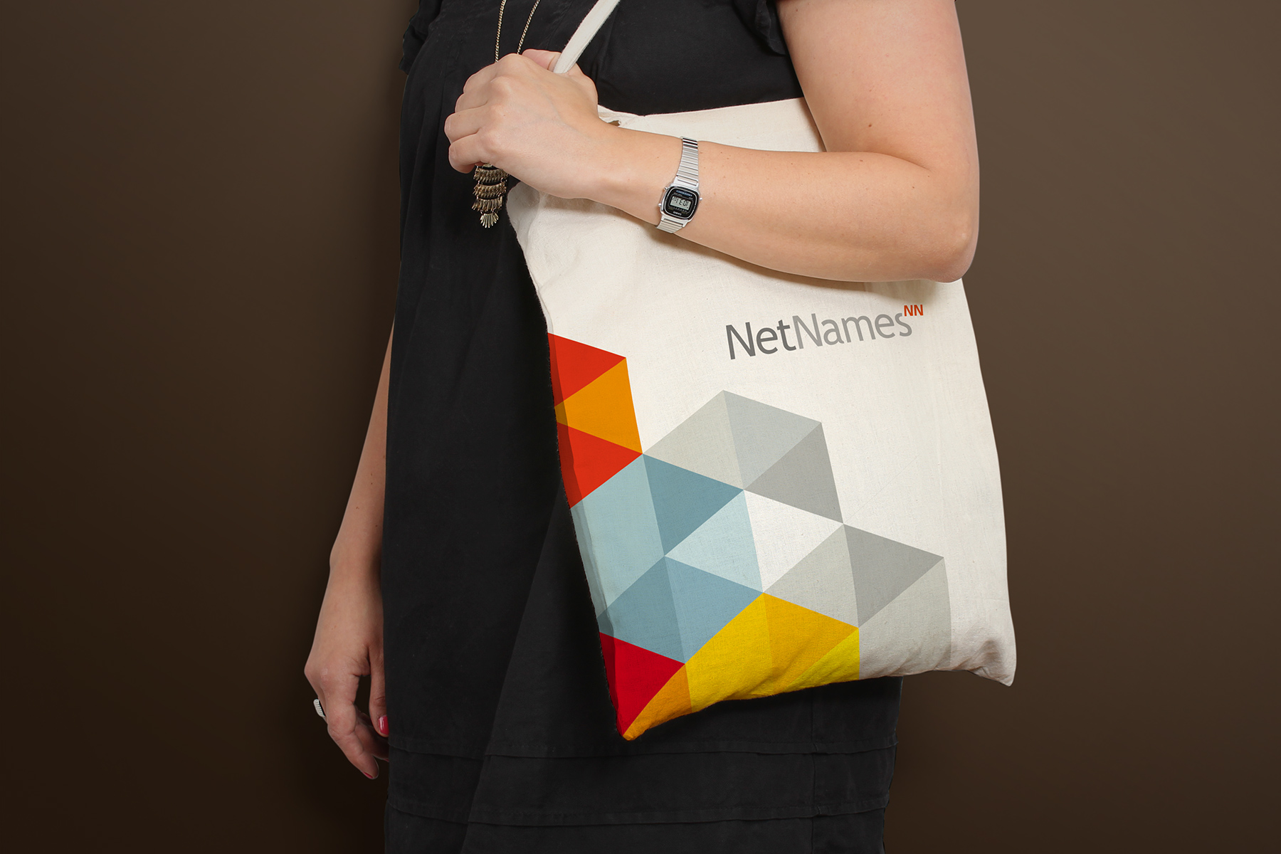
NetNames’ existing identity used the colour orange yet its use of visual assets lacked consistency and a greater brand narrative. Thus, we looked to create a system which would build greater brand recall and presence.
We capitalized on the brand’s existing positive reputation for protection and strength, by developing an associated positioning which supported this key brand promise. We researched deeper to organised systems within nature and struck upon the hexagonal nature of the honeycomb.
We created a flexible hexagonal grid which constrained the identity to particular angles, forms and functions.


We created a unique brand identity system created from a series of building blocks, paired with bright colours and contemporary type.

The resulting brand identity enabled NetNames to create brand stories using unique and quirky iconography which linked to positioning statements.
We created a brand library which enabled internal staff and other third parties to extend the language into day to day communications.


