Case Studies
A full rebrand for the British Horseracing Authority
 The British Horseracing Authority is effectively the guardian of horseracing. This is the UK’s second largest sporting industry and second largest sporting employer. Given this position, it’s essential that the BHA communicates its world-class presence. A full rebrand has provided the governing body with a consistent, powerful and modern new positioning.
The BHA’s existing brand mark was outdated and virtually unrecognisable in a digital context
In its biggest revamp in eight years, the BHA needed to adapt to the digital age. The existing brand mark was virtually unrecognisable in a digital context – partly because the word mark and symbol were inseparable. As the brand mark is also used extensively on merchandise and various paraphernalia, it needed to be bold and distinctive.
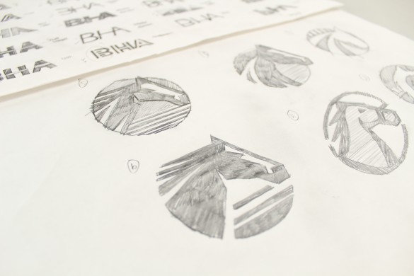
We enhanced the equine symbol
As everybody in the industry refers to the Authority as the BHA, we decided that using this acronym would create a visually stronger identity. Complementing this, we enhanced the equine symbol by giving it a more structured, rounded format. We gave the equine symbol a more structured , rounded format
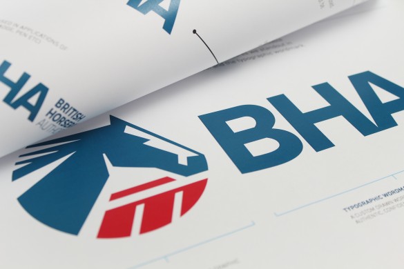
A red, white and blue colour scheme reinforces the BHA’s British values
The new brand mark is easily separable from the word mark, which adds flexibility. We gave the equine symbol a more structured, rounded format. BHA’s existing colour palette failed to add value to the brand. Opting for a red, white and blue colour scheme reinforced the BHA’s British values. The new brand mark is easily separable from the word mark
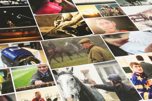
The Firedog team gained unrivalled access to jockeys and went behind the scenes of important racing
Imagery plays a strong role in BHA’s new brand. The existing imagery was inconsistent, outdated and largely cliché. To enhance the brand’s visual look and feel, the Firedog team gained unrivalled backstage access to jockeys and went behind the scenes of important racing. Our freelance photographer spent a day shadowing the people behind the sport.
The new imagery is a fly-0n-the-wall perspective to racing
As a result, the new imagery is a fly on the wall perspective to horseracing and revolves around storytelling. Focusing on this editorial style imagery enables the BHA to retain the traditional, authentic values of horseracing whilst adding a gritty realism. The new imagery is a fly on the wall perspective
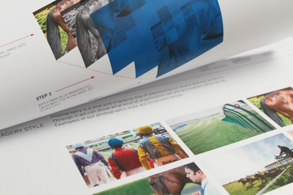
We wanted the new brand look and feel to incorporate the textures and colours associated with horseracing. The print collateral templates feature silks and patterns taken from jockeys’ clothing.
Internal and external publications vary in both content and tone of voice. As internal publications discuss serious procedures, we’ve given them a dark, bold and formal look and feel. The external publications seek to engage, so they largely feature immersive, colourful photography.
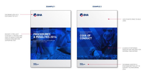
Internal publications have a dark, formal look and feel
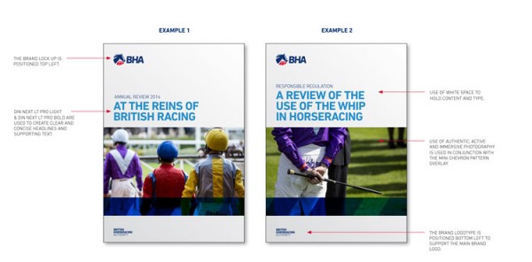
External publications are bright and engaging
For all professionally printed materials, BHA’s new branding uses the DIN Next Pro typeface. It is a modern, distinctive and corporate typeface that communicates confidence and authority. The DIN typeface is versatile; it has a wide range of weights available to ensure full flexibility in application.