-

-

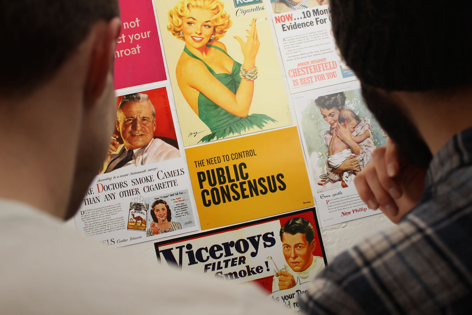
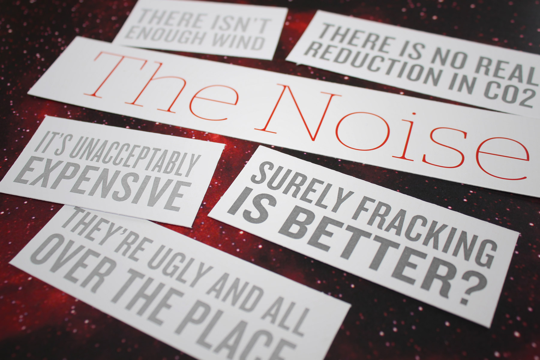
From our discovery process, it quickly became known that public opinion was formed on a bedrock of emotion and biased opinion. Our task was to gently shift perception to a more balanced viewpoint, very much underpinned by factual storytelling.
-

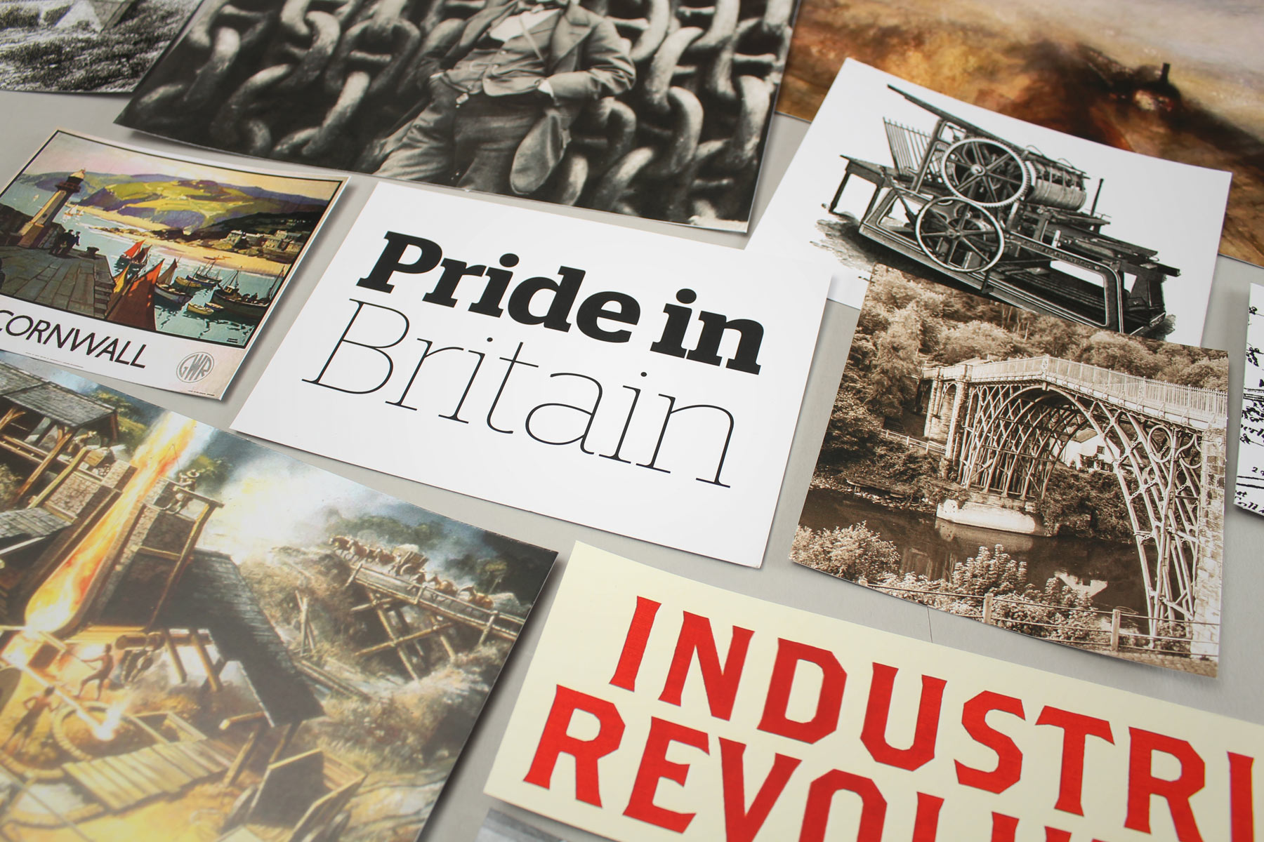
Since the Olympics in 2012, a sense of national pride has thankfully been restored. Our research suggested this should be harnessed to communicate the abundance of an untapped resource, married with Britain's engineering heritage. We decided to look back to project into the future.
-

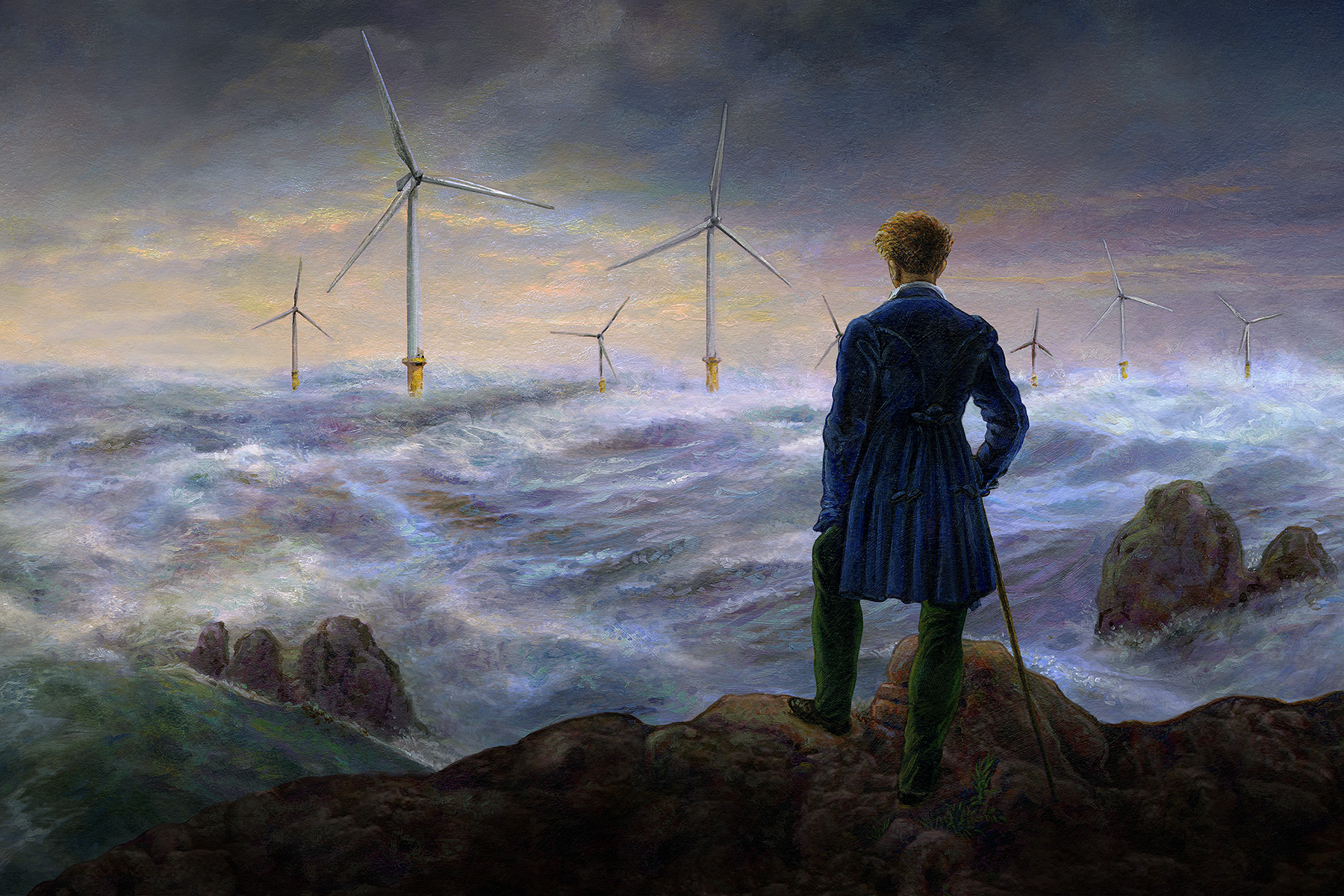
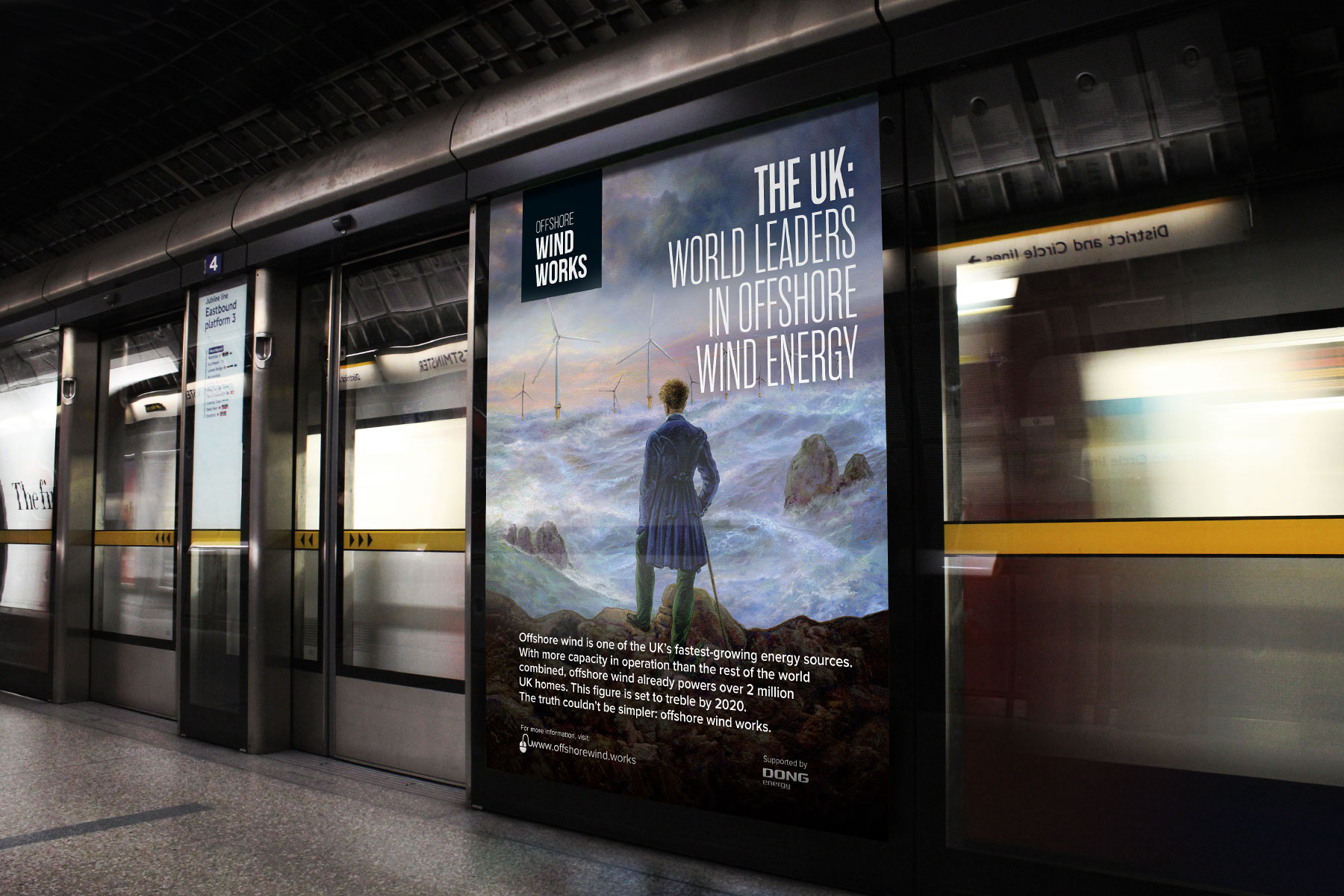
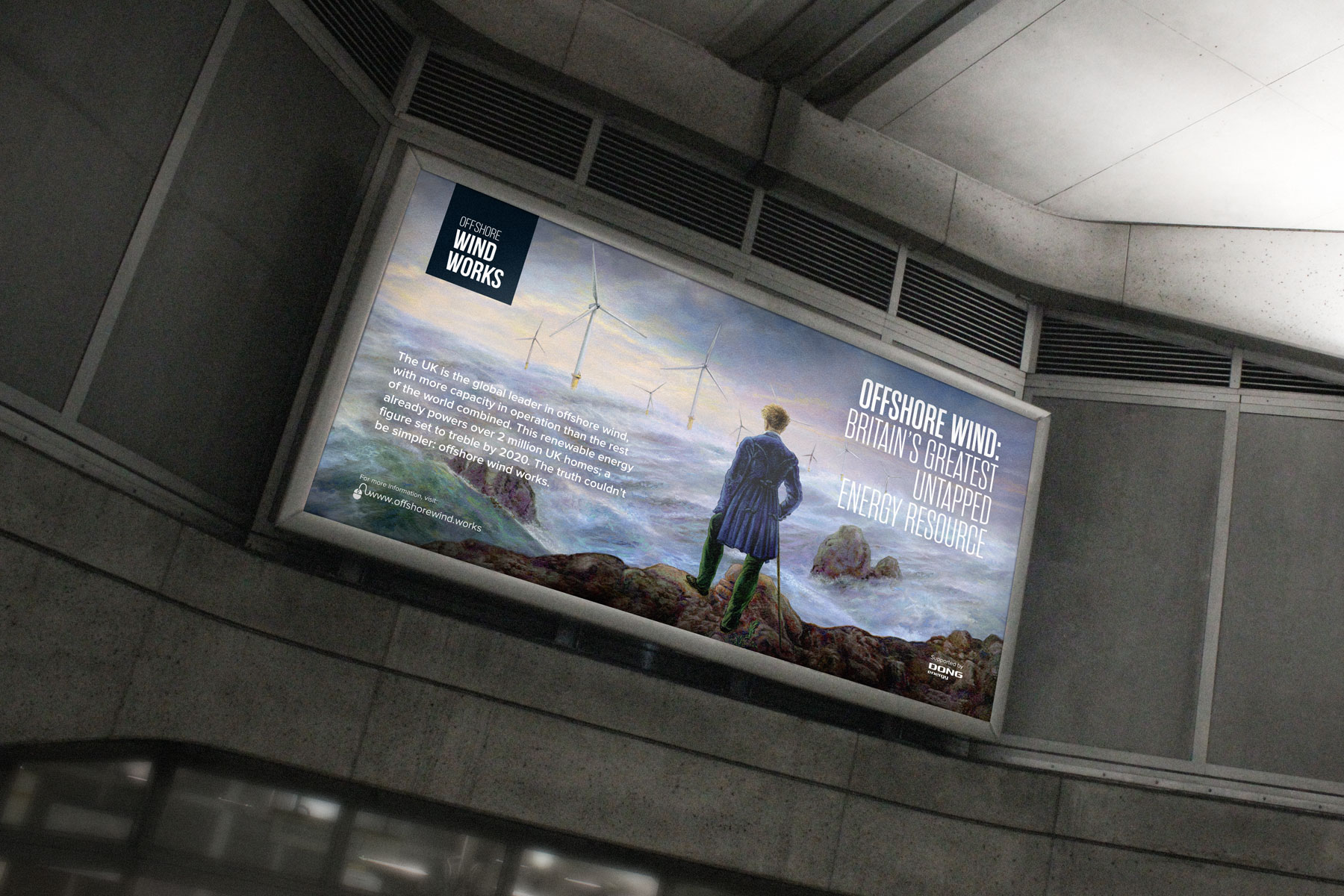
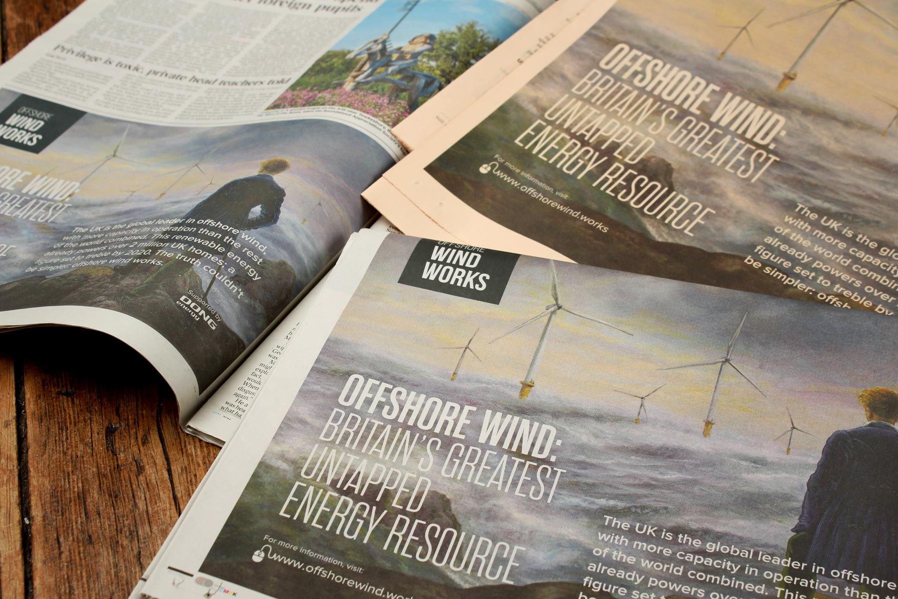
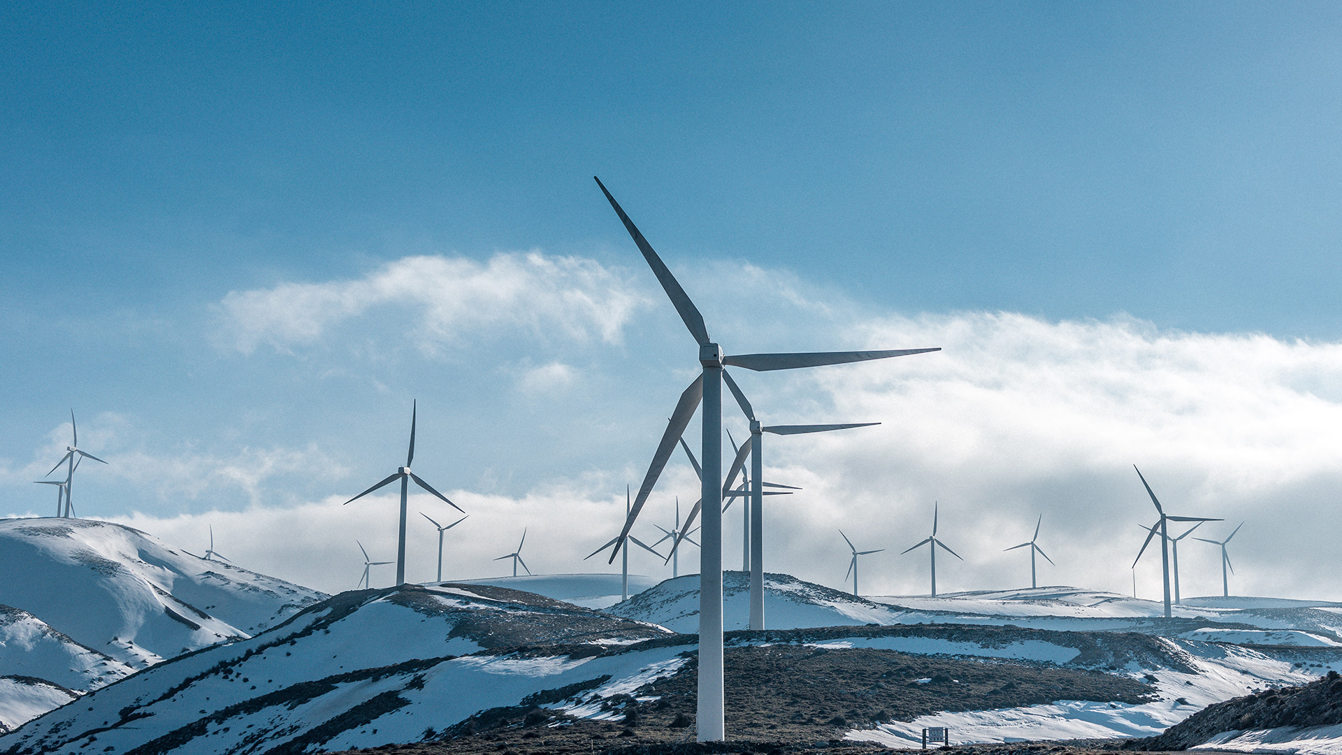
Our homage to Caspar David Friedrich featuring a seascape dotted with wind turbines.
-

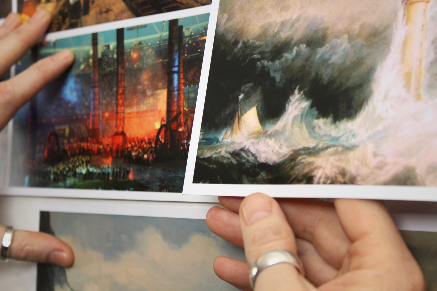
Britain's finest time within the Victorian period not only symbolised a massive growth in industry. It was also a very romantic period, where the uptake of art and culture grew with the UK people. Oil on canvas shows imagination, hard work, determination and technical ability. With this in mind, we commissioned an oil painting to be utilised as the primary asset of the campaign.
-

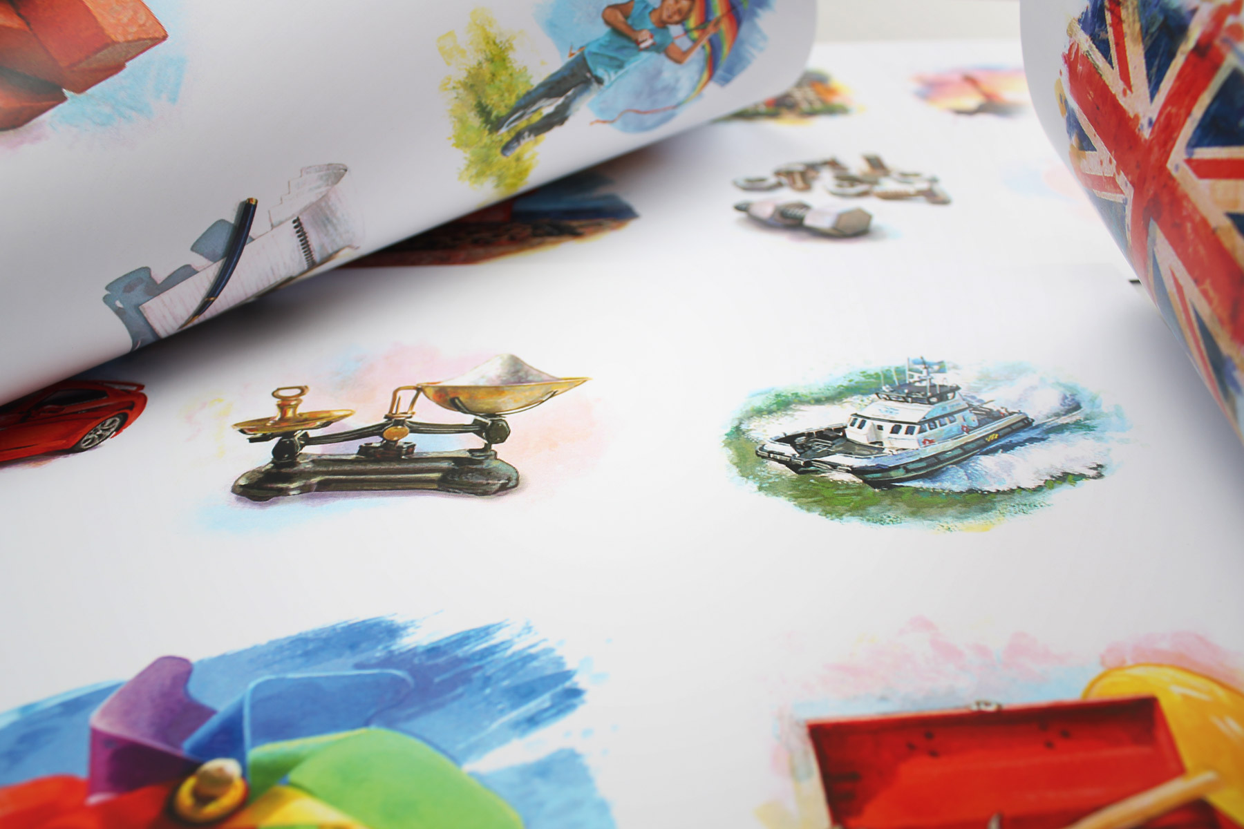
In order to visually connect the editorial content to the campaign visual, we commissioned a series of illustrations that were flowed into the layout of articles.
-

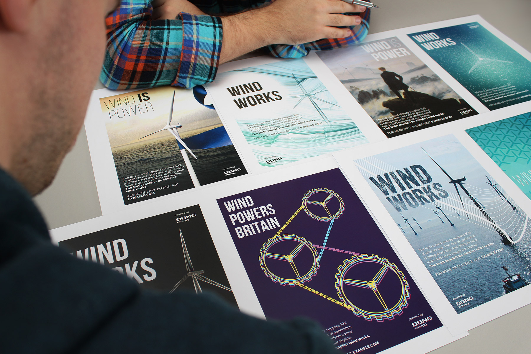
Our core goal was to drive traffic to the online resource and microsite. It was therefore very important to develop a striking campaign visual which told a story in a profound yet simple way. A number of concepts were drawn up to reflect this goal.
-

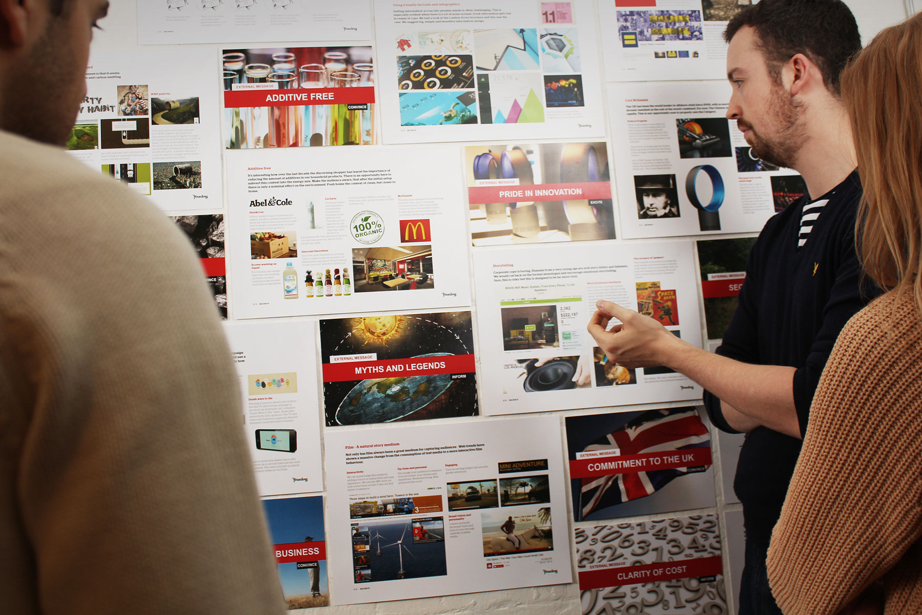
Early market research identified the general public opinion on wind power. There were a number of general themes that needed to be addressed before the UK would adopt it as a perceived viable source of power.
-

Nine positioning strategies were developed to directly target the UK public's concerns. Alongside the positioning, we also developed techniques of delivering responses to arguments in a relevant format. This included: games, articles, interactive walkthroughs and editorial.
-

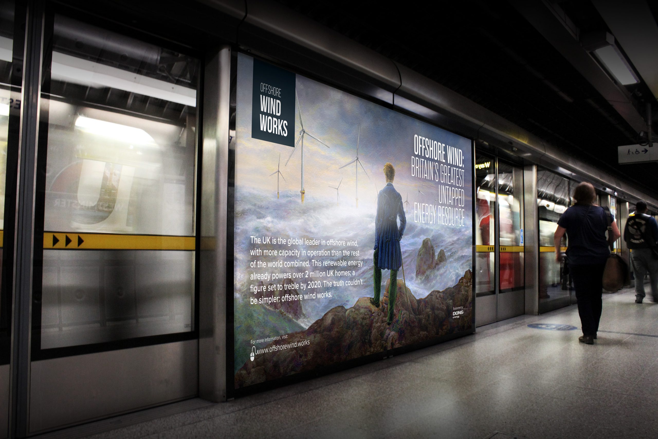
The resulting visual, inspired by Caspar David Friedrich’s key Romantic painting, “Wanderer above the Sea of Fog,” takes the audience back to a period of great romance and nostalgia. It then superimposes modern wind turbines as if it were a Brunelian dream of the future yet to unfold.
-

The campaign was displayed in over 230 sites on the London Underground. A special tactical emphasis was placed at Westminster station, with political stakeholders and party conferences in mind.
-

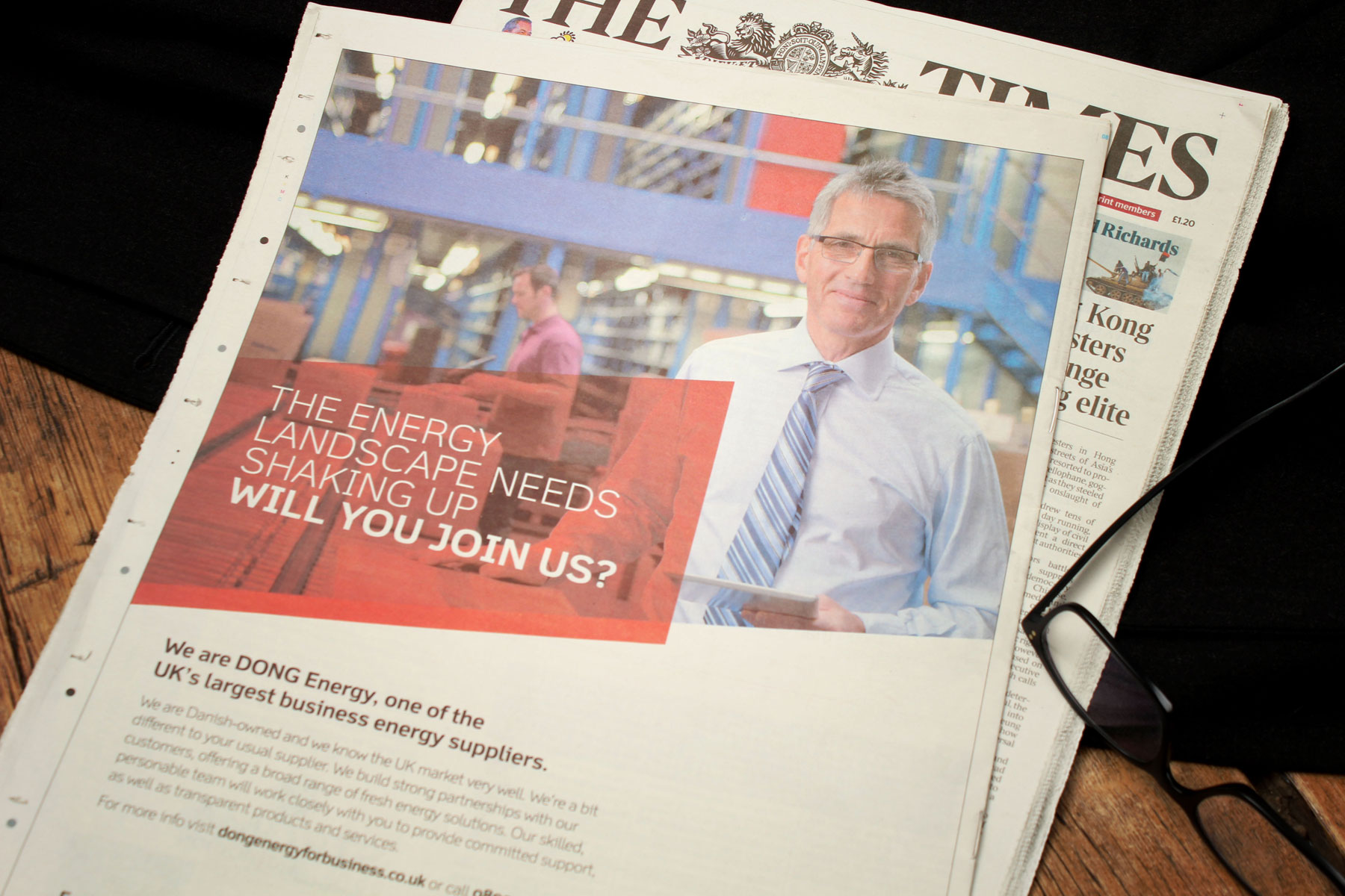
Specific press publications in both the national press - Financial Times, Guardian, The Times, Telegraph - and regional press - in operative areas such as Grimsby, Hull, Liverpool, Hornsea and the North West - were adapted to target key audience segments.
-

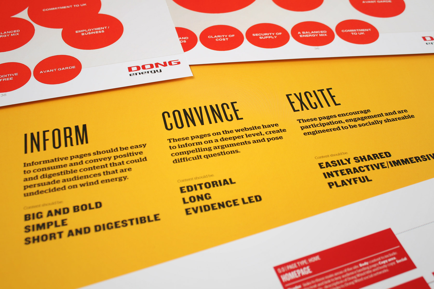
We decided that all digital content fell within one of three categories: Inform, Convince or Excite. These themes focused content towards audiences who had specific content behaviours. For example, evidence-led editorial appealed to sceptics; dynamic gamification for young audiences.
-

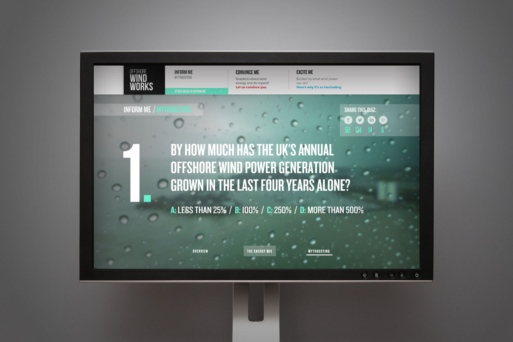
There are a lot of myths and rumours that needed addressing. We felt that the simplest and most shareable method was to create a quick quiz that users could take to gain a better understanding of the effectiveness of offshore wind power.
-

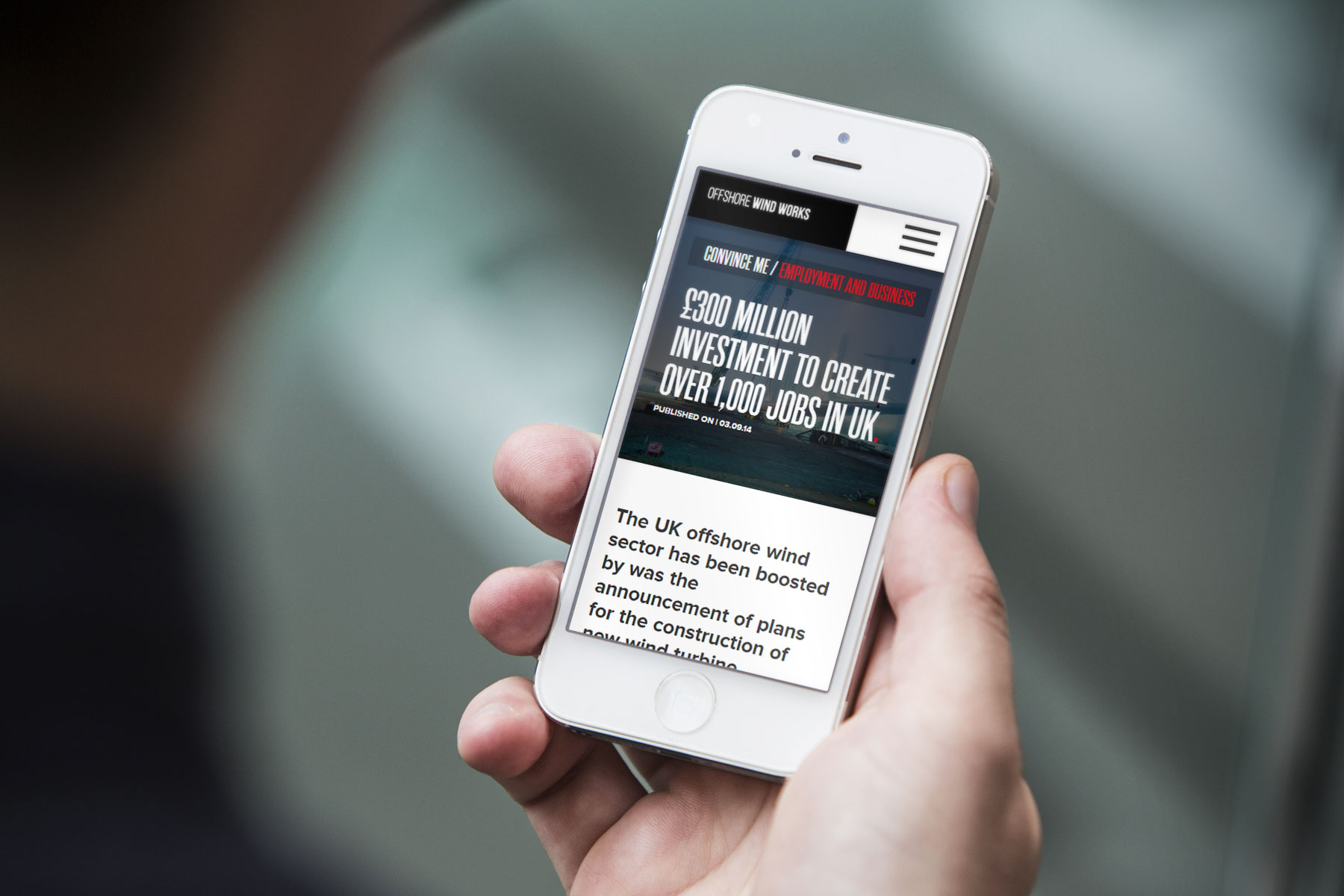
In-depth content was more appropriate delivered via clean and easy to read feature page-types.
-

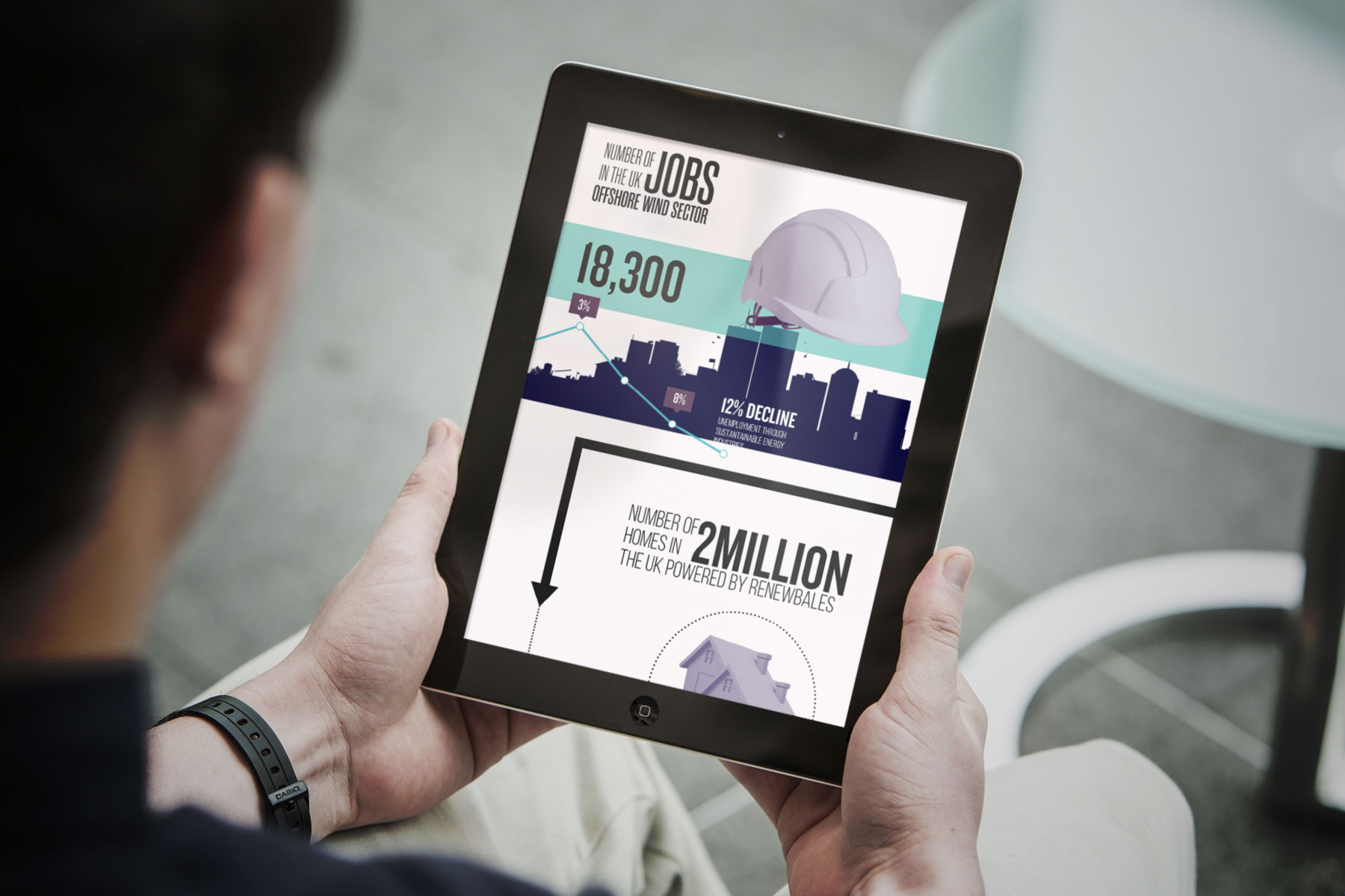
Certain information was more effectively communicated by using an interactive experience. This allowed us to tell the story as well deliver information and data via engaging infographics.
-

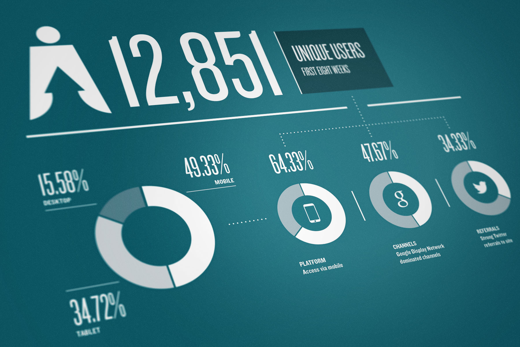
The campaign was hugely successful, generating huge interest in social networks as well as direct traffic from ad campaigns in the press and outdoor. We found that digital advertising through the Google Display Network was particularly successful.
-

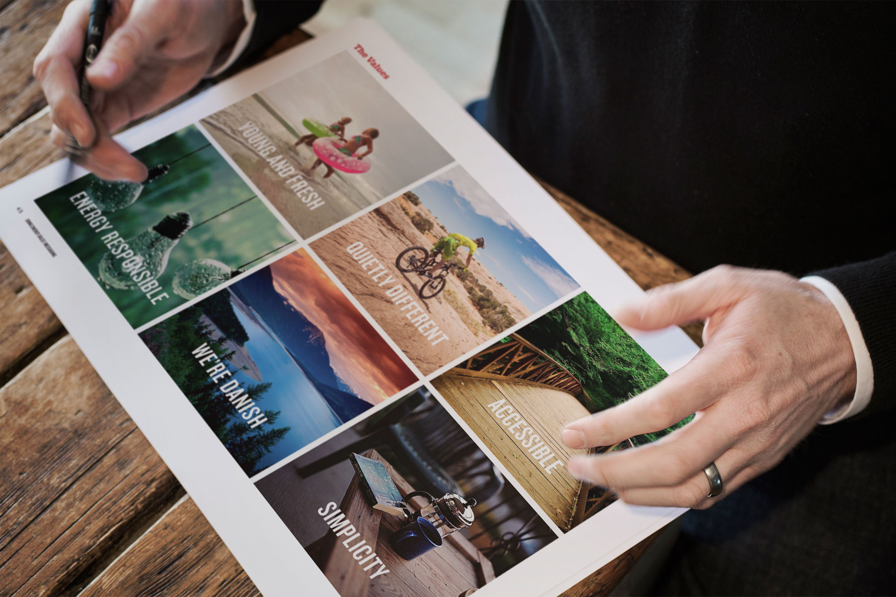
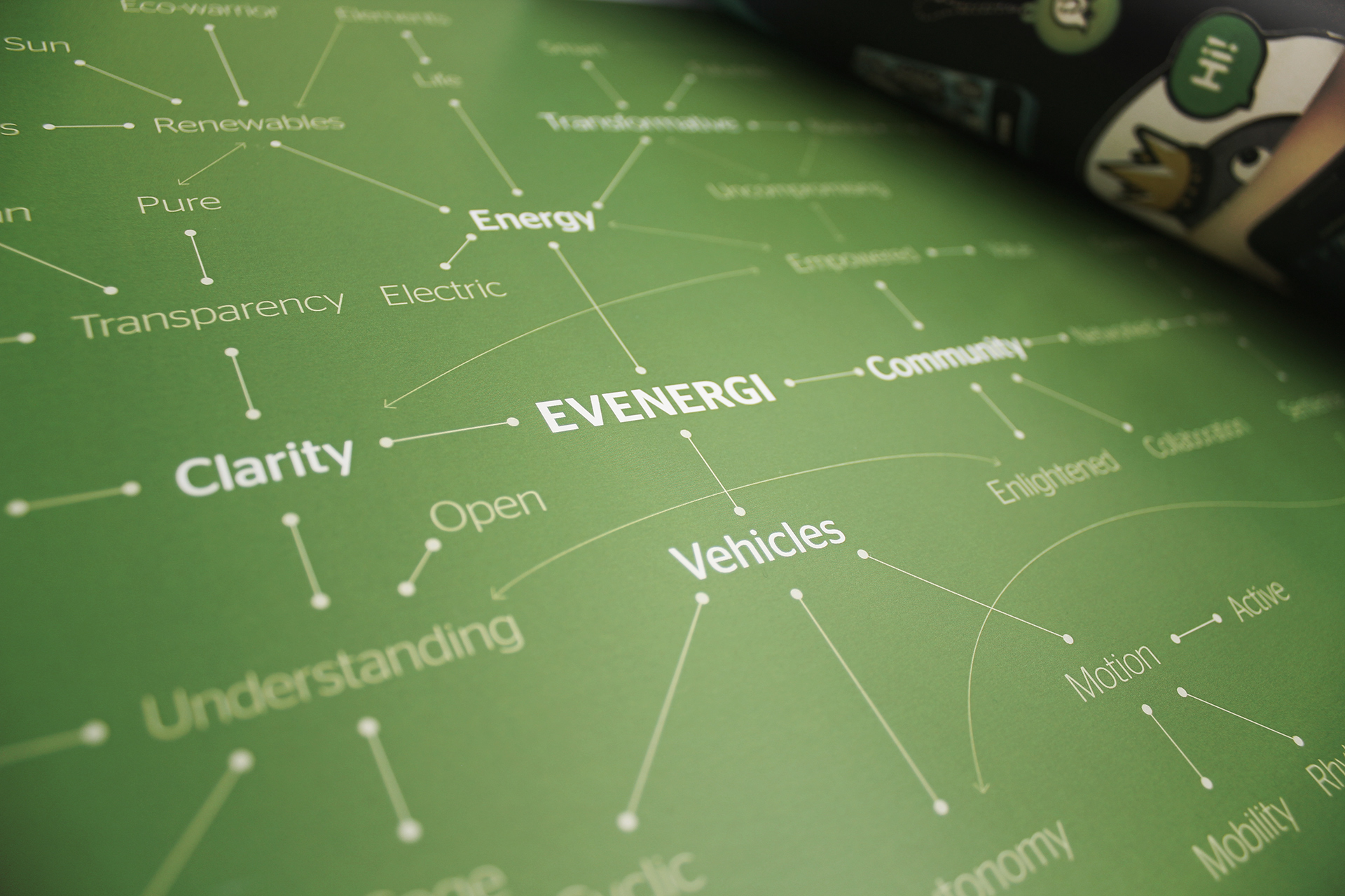
The development of the brand's identity began with research into its values. This research established six key themes.
-

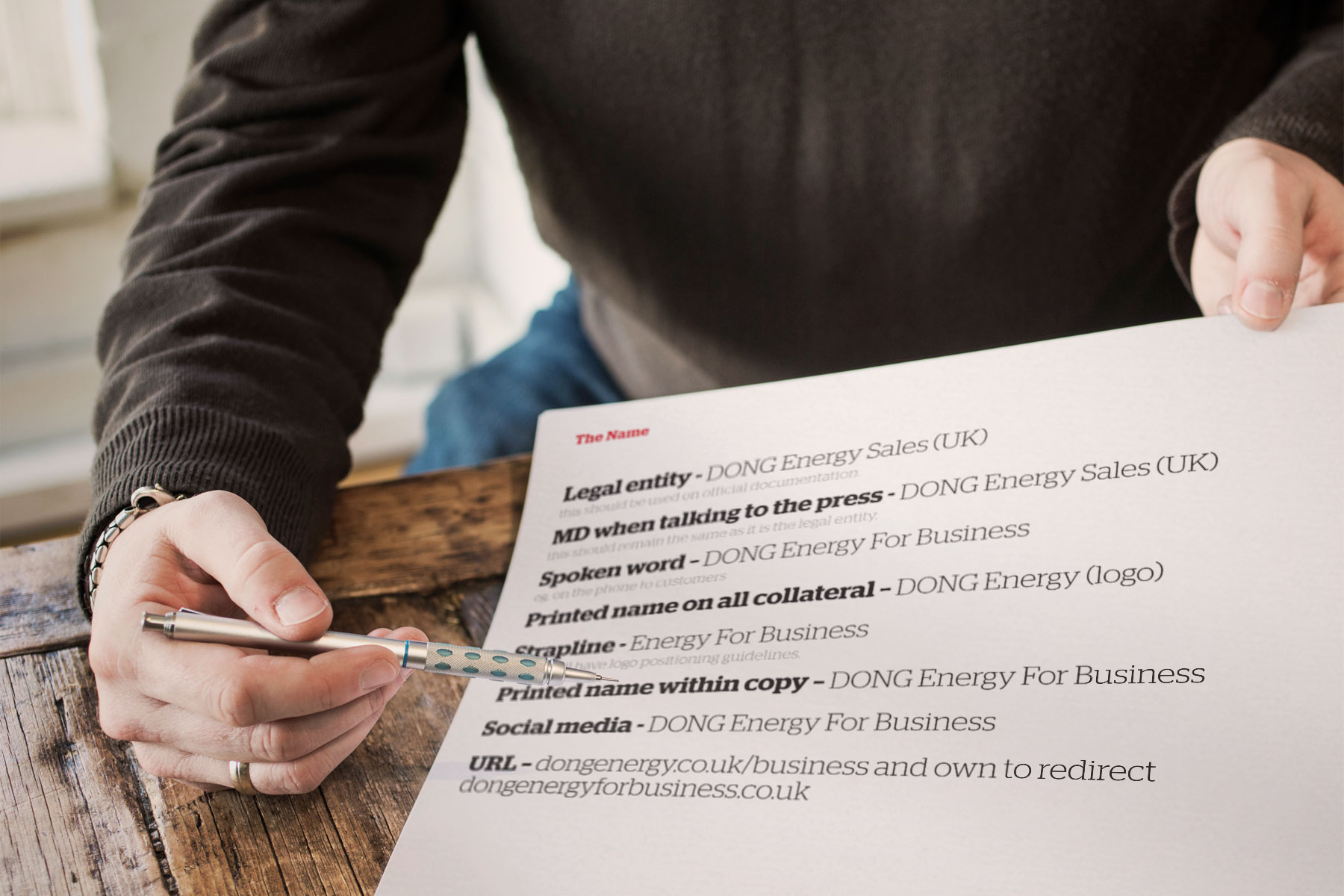
Re-positioning the brand as 'DONG Energy for Business' adds gravitas to the company. Previously known as DONG Energy Sales, an incredibly competitive marketplace called for a more SEO-friendly name.
-

Our remit included planning and strategy, rationalising product propositions, audience segmentation and following through into advertising campaign and website launch.
-

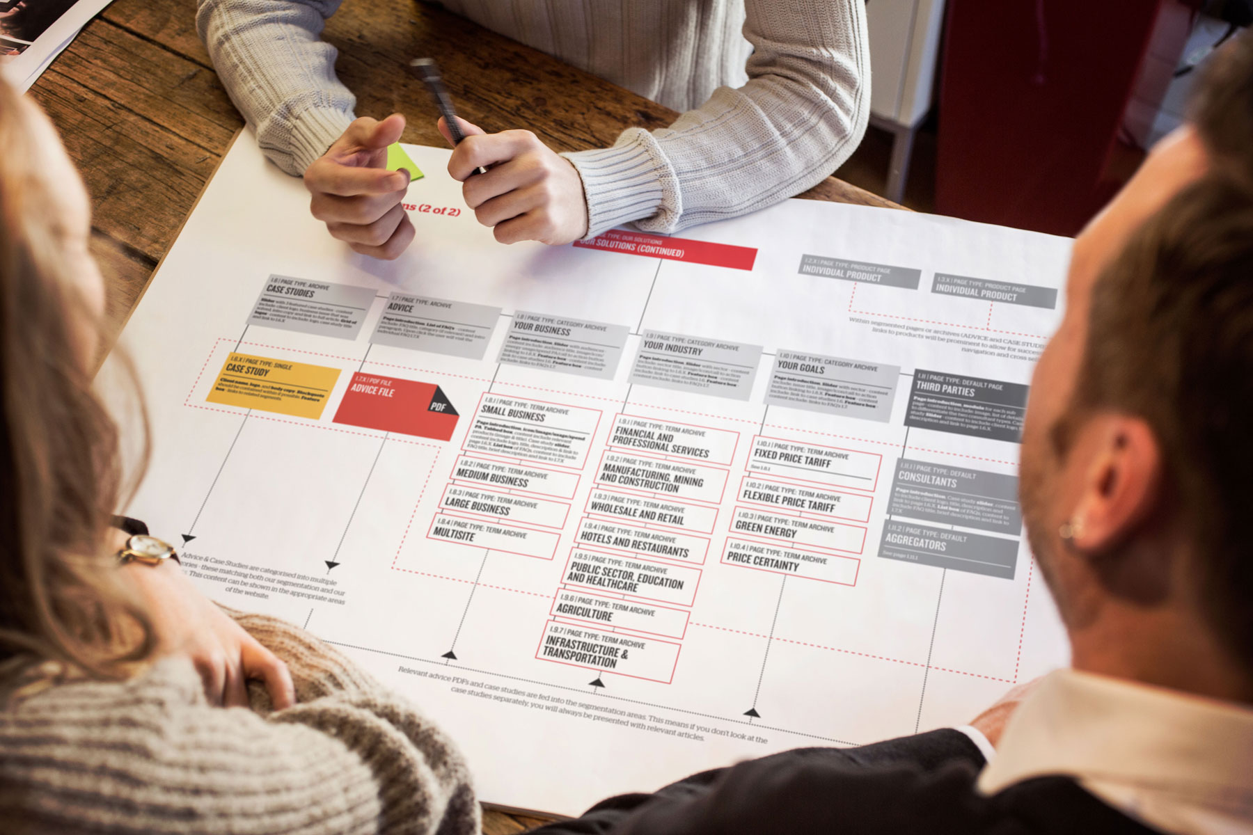
The new online presence has divided the website into structured sections; information is now clearly segmented. Pages were created to optimise search traffic - for example, specific sectors had their own landing page - Energy for Restaurants.
-

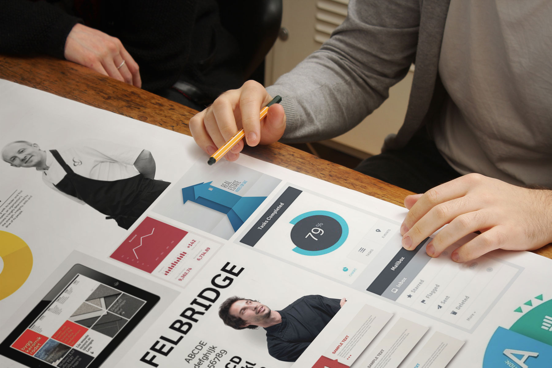
A distinctive look and feel was developed to represent DONG Energy's revived value statements.
-

The new homepage - to add interest, the graphic devices are often combined with cut-out photography. Imagery focuses on people, as research reveals that DONG Energy for Business is a people-centred brand.
-

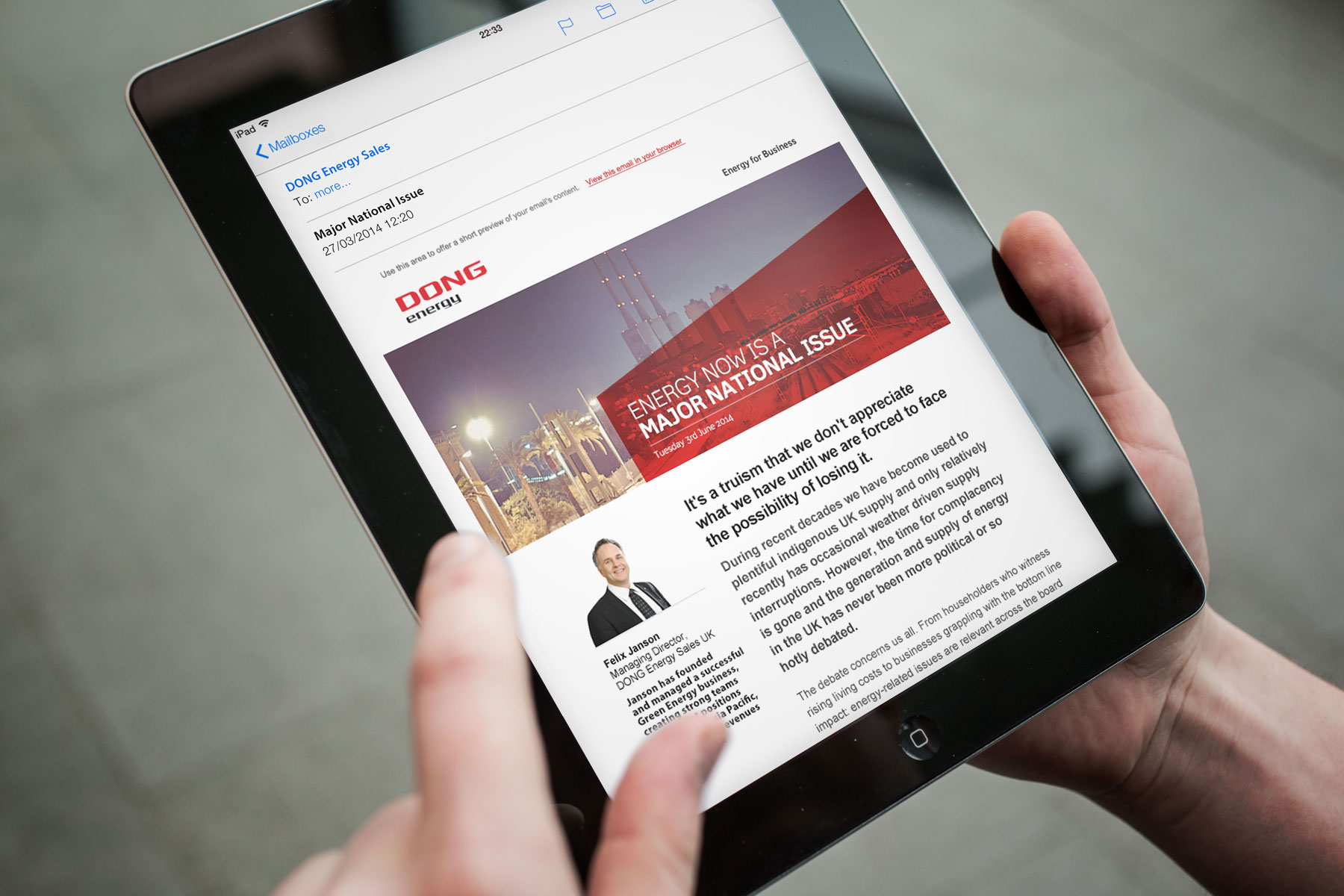
Depending on content and viewing platforms, the graphic device can be scaled up or down. It forms a memorable and recognisable aspect of the brand identity. Mailchimp was used keep current and interested customers up-to-date.
-

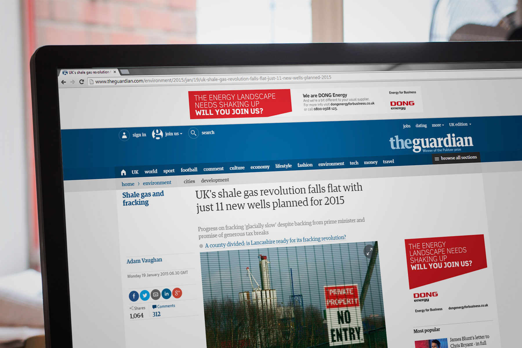
In online spaces, the combination of strong, concise copywriting and bold red colour positions DONG Energy for Business as a memorable and unique brand.
-

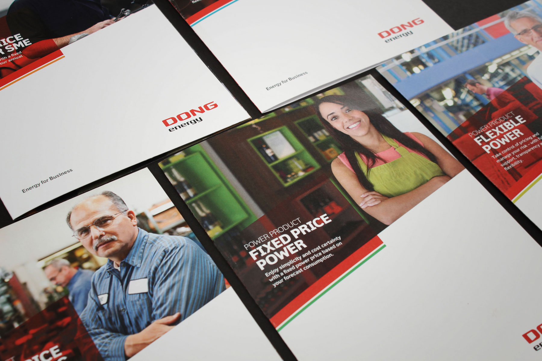
A number of printed materials were produced for the sales team. The look and feel aligns seamlessly with the new website. Strong use of white space enhances the graphic devices and gives DONG Energy for Business a clean, contemporary look and feel.
-

Adverts in the national press position DONG Energy as personable and approachable through copywriting, image selection, and a bright colour palette
