Case Studies
Bakone advisory business branding
Firedog has taken a heritage based corporate identity and transformed it into a new progressive globally relevant brand.
The Firedog Cape Town studio has recently completed a rebrand for a local financial services firm.
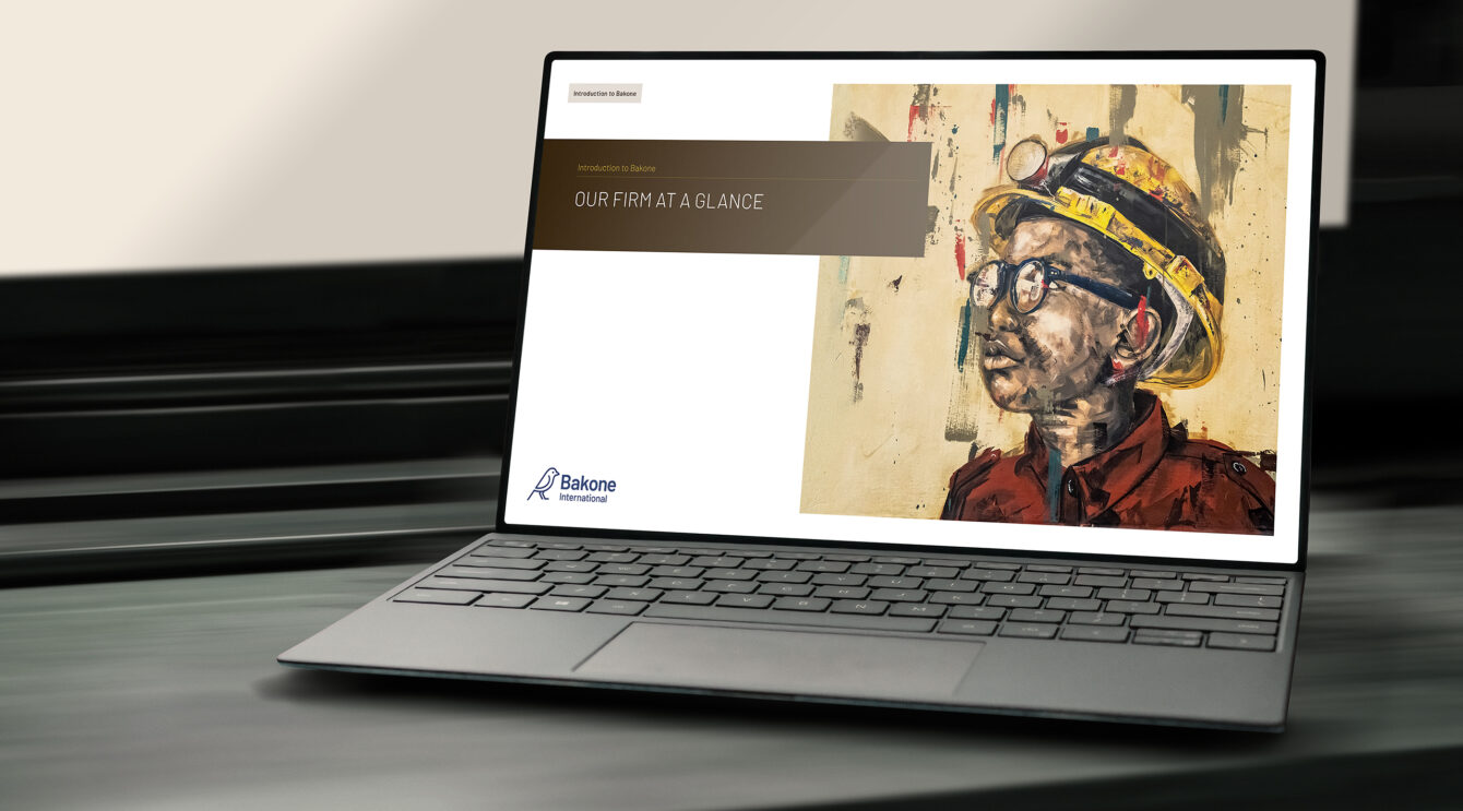
Bakone International is a JHB, South African based investment banking advisory firm. Bakone provides the full suite of advisory services, yet tailored for the African market. The brand had an existing and basic identity containing the silhouette of a scaly feathered finch. We discovered the tribal motif that the finch represented and how it related to the overall heritage of the firm. We researched various creative ways of expressing a finch from simple to more illustrative. We began at the very decorative side of the spectrum by creating linocut style bird illustrations. These had the appearance of classic journal style bird illustrations, with plenty of mark and linear detail.

The client is quite keen on a minimalist feel so in close collaboration we abstracted the bird symbol further and further until we have the minimal icon it is today.
Building upon the symbols minimalism we underpin the identity with a single dark blue. Then for a bit of a more vibrant African touch to root it in our locale, we add a vibrant gold. Then from locking in that Hue variable we provide an extended palette of earthy tones. This adoption of a bright colour immediately adds just a touch of levity to what is a contemporary swiss style corporate brand. We then further root the identity by working together with the client on selecting a local artist in order to commission a bespoke suite of imagery. We worked with Sizwe Khosa on providing a series of portraits of young African boys. These artworks are thread through the identity and feature in key locations such as website home page and digital presentation covers.
View the financial services case study on the Firedog ZA site.


