Case Studies
Bouygues UK updated website design and build
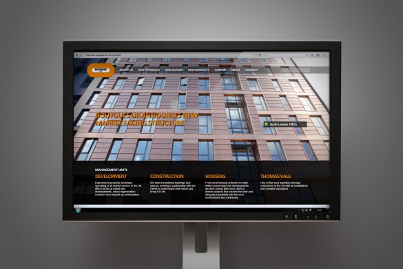 We have recently updated the Bouygues UK website design with extensive changes following the acquisition of companies across the UK. This move required a new market facing structure for the company and therefore an extensive update to the site to reflect the changes.
The main challenge of this project was finding a way to show the new structure of the company under the Bouygues UK name which gave users the information they needed quickly but didn’t alienate the clients of the newly acquired companies.
Firedog have been working with Bouygues since 2011 when we worked on their brand strategy and positioning project, following this we designed and built their website and worked on many smaller projects with Bouygues UK.
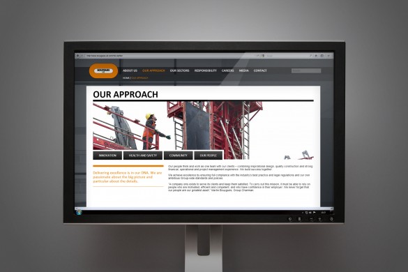
The original website was one of our largest builds with multiple page types and an extensive projects area which showcased the company and their identified values. For the site update in June 2013 we had to reduce the number of case studies shown so that there was more of a focus on the different companies within the new structure and how they were split by both expertise and location within the UK.
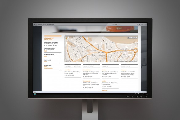
The new website contains the same style of full page imagery as the previous site but we needed to show more information on the homepage identifying the different areas of the company. As there is a brand new management team we updated the design of the ‘who we are’ page and created interactive maps to show the regional areas of each of the management units.
Merging four companies into one website was a challenge when it came to data and we ensured that the site was planned to not bombard users with information that wouldn’t be relevant, cause information overload or alienate their current clients by giving the management units new names.
We are extremely proud of the results and the site is now viewed by four times more users each month due to the acquisition companies traffic to the site.
