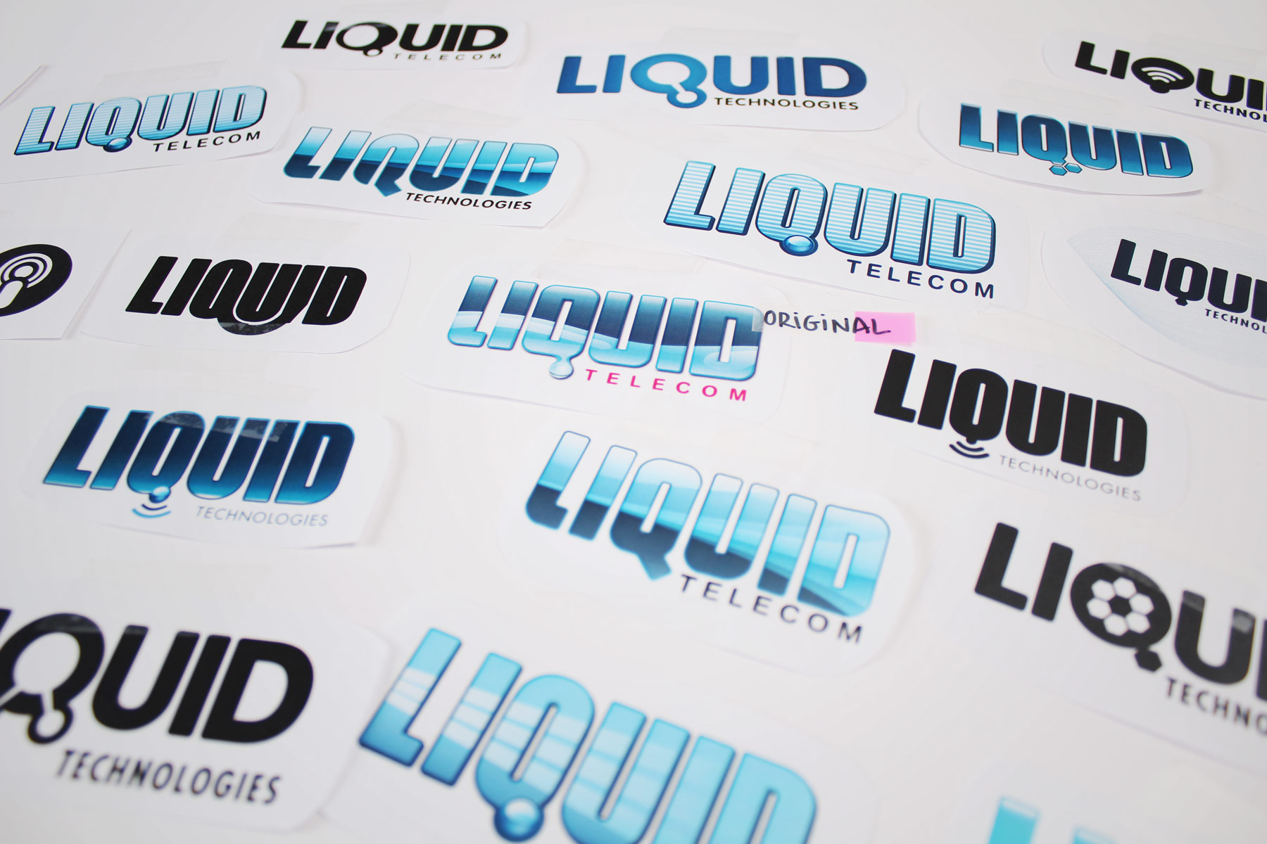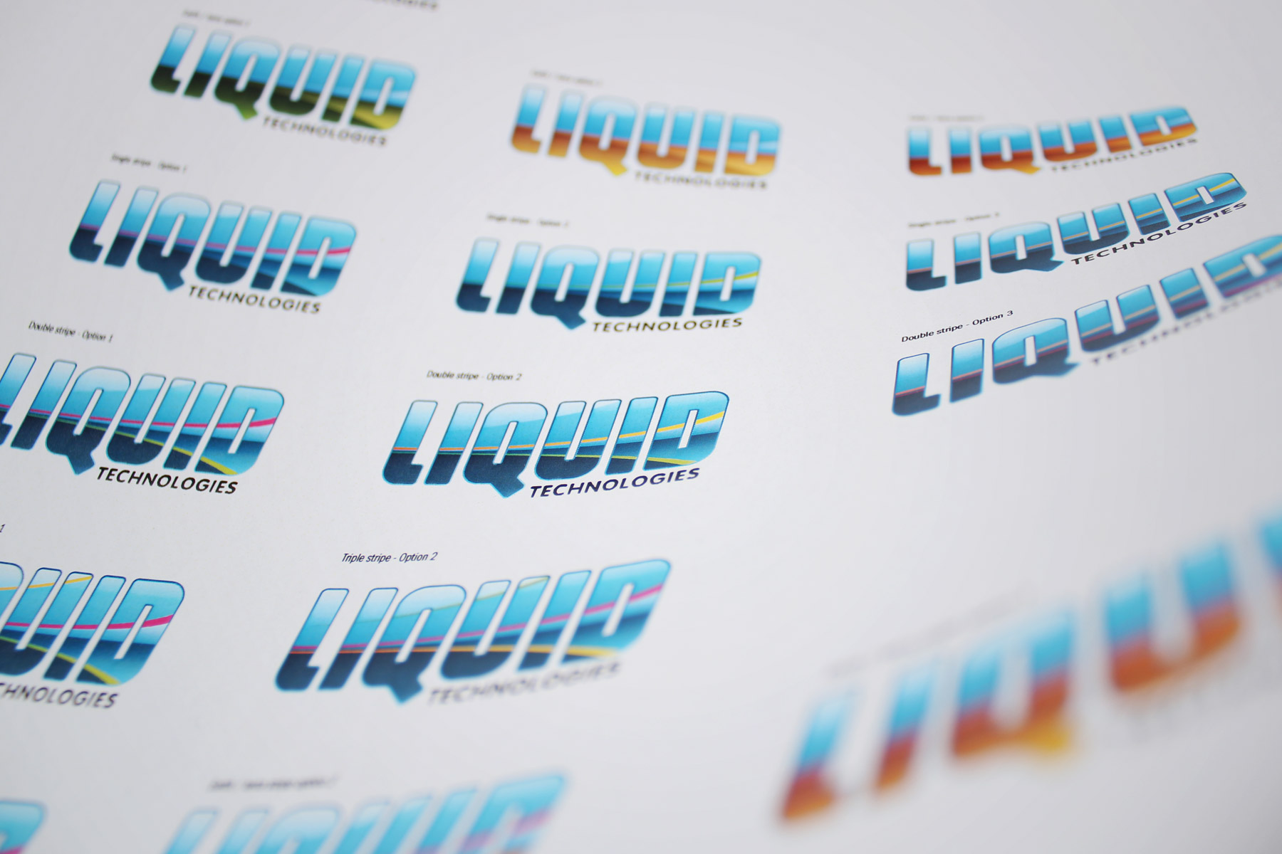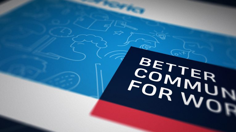
The new wordmark replaced the water device use previously with a high tech fibre visual language. We also tweaked the colour making it more fresh and acidic.
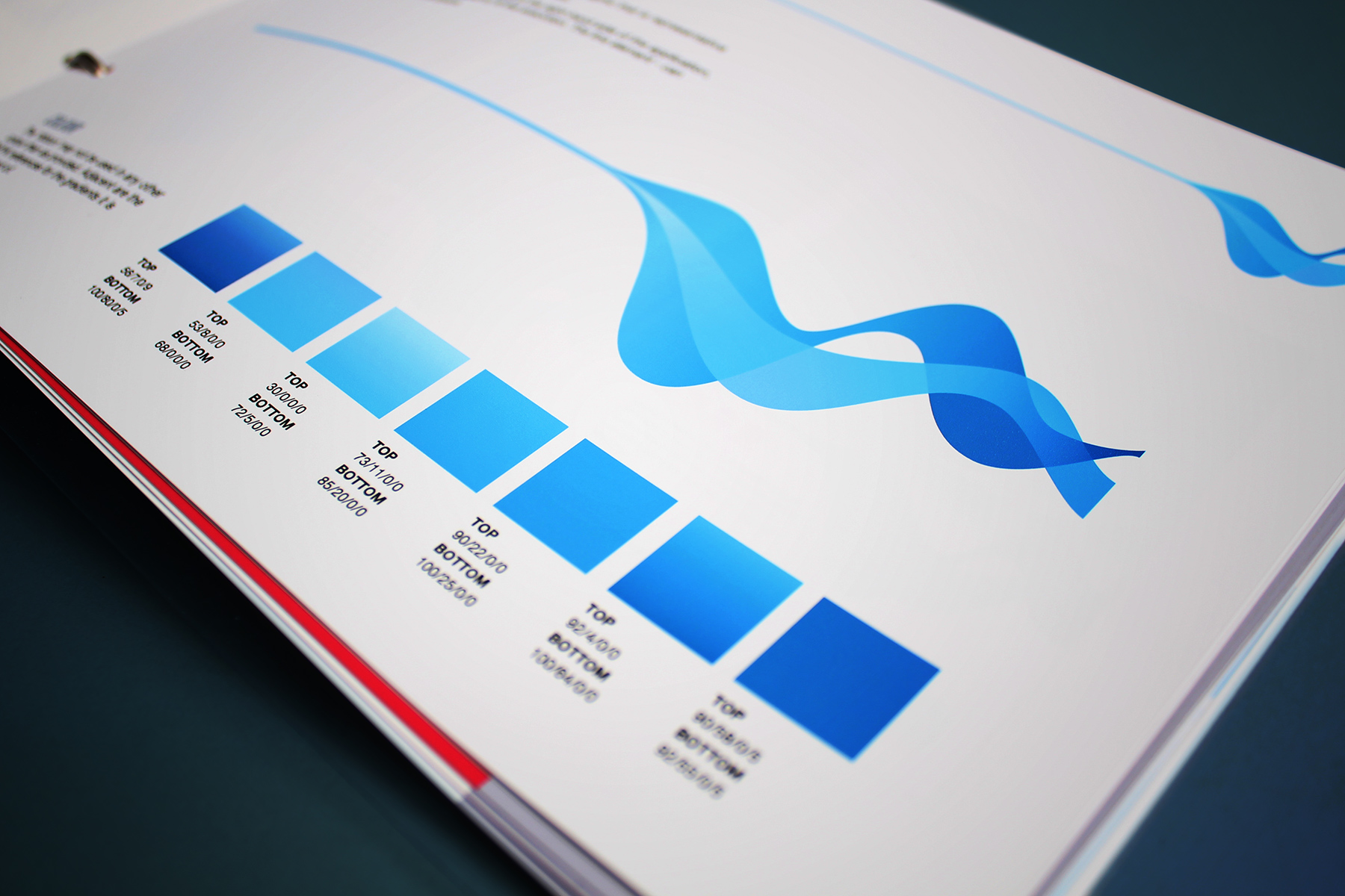
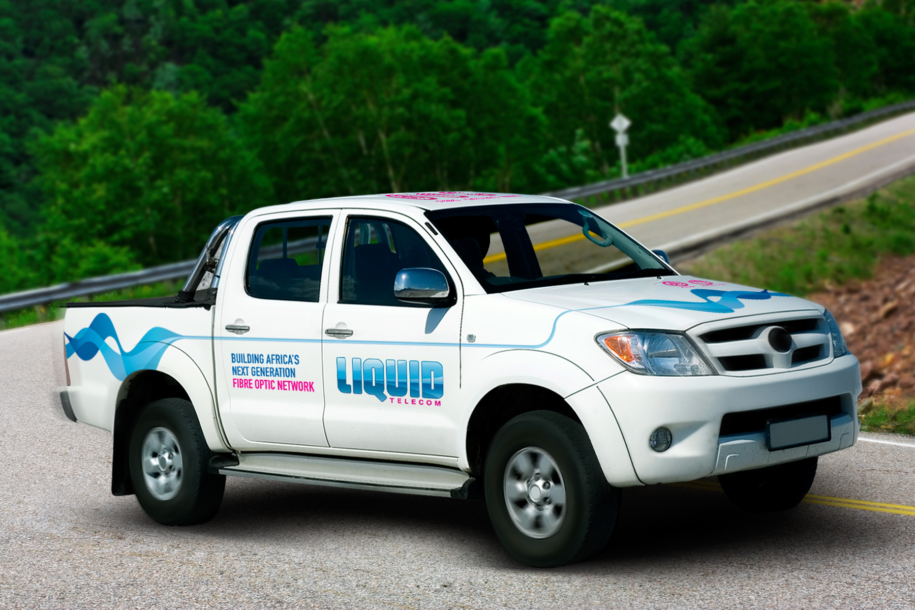
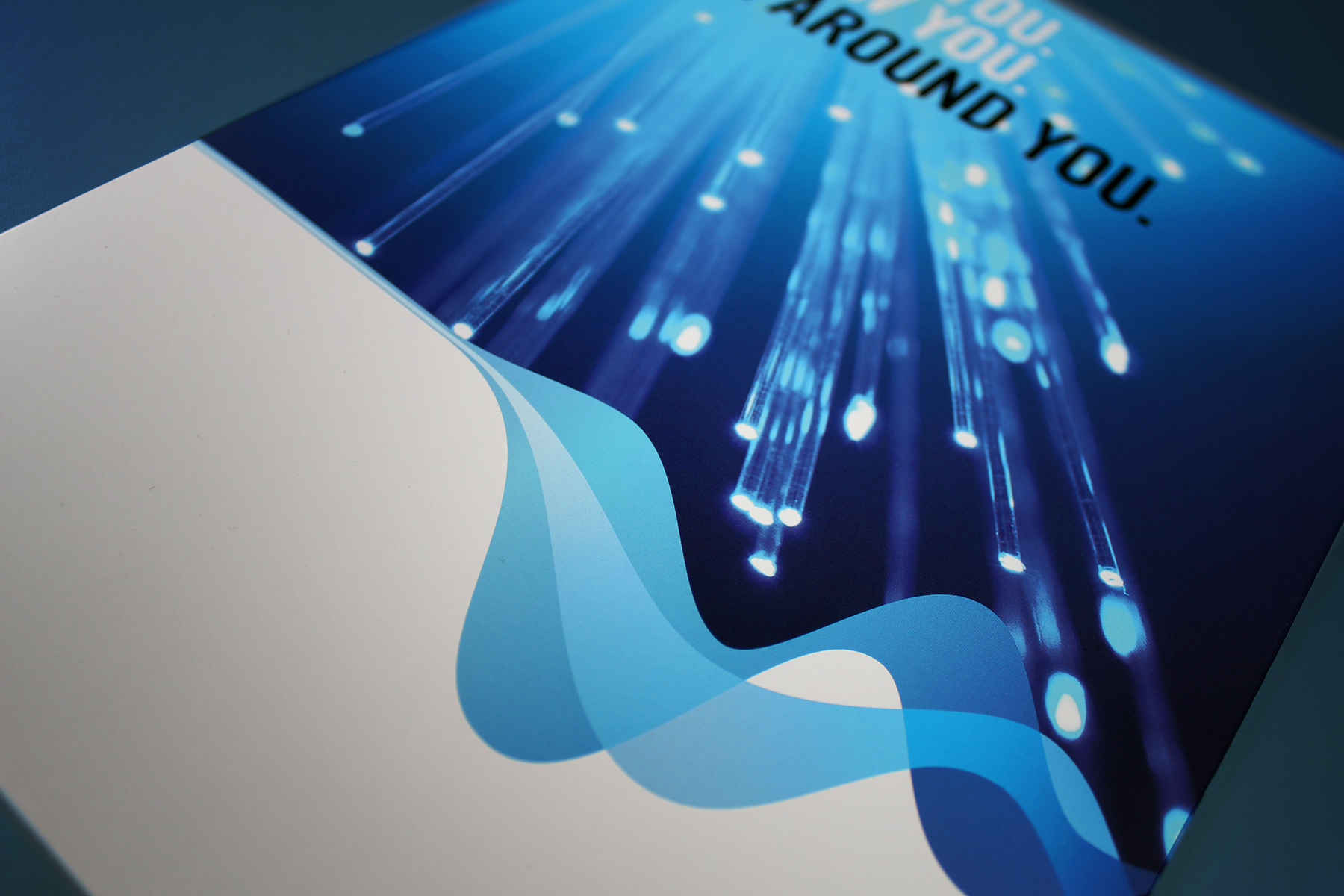
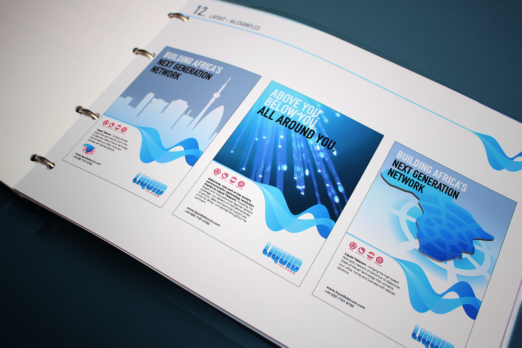
We wanted to extend the brand language out to a visual device that we could attach to communications and promotional applications. We developed a fibre ribbon graphic device.
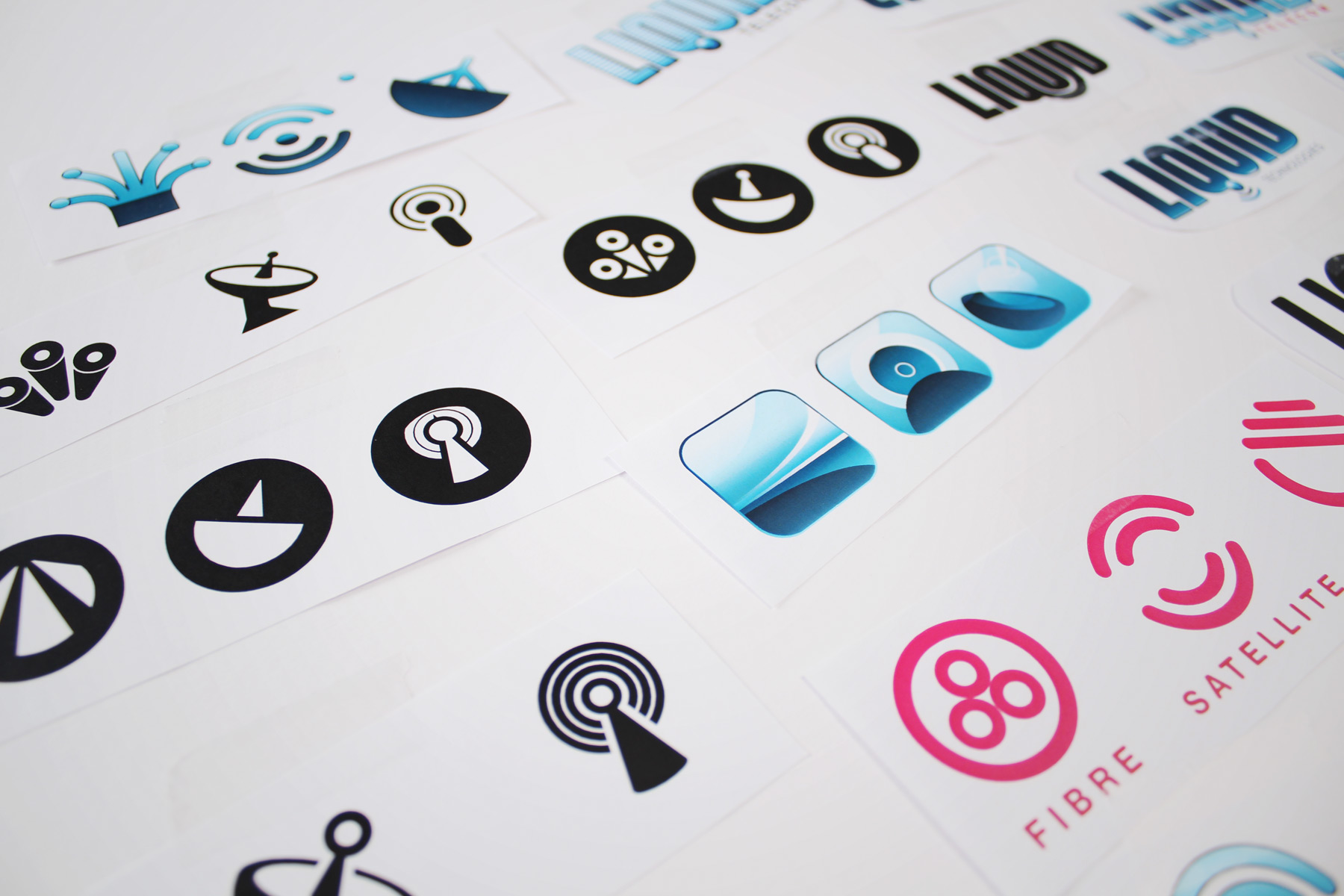
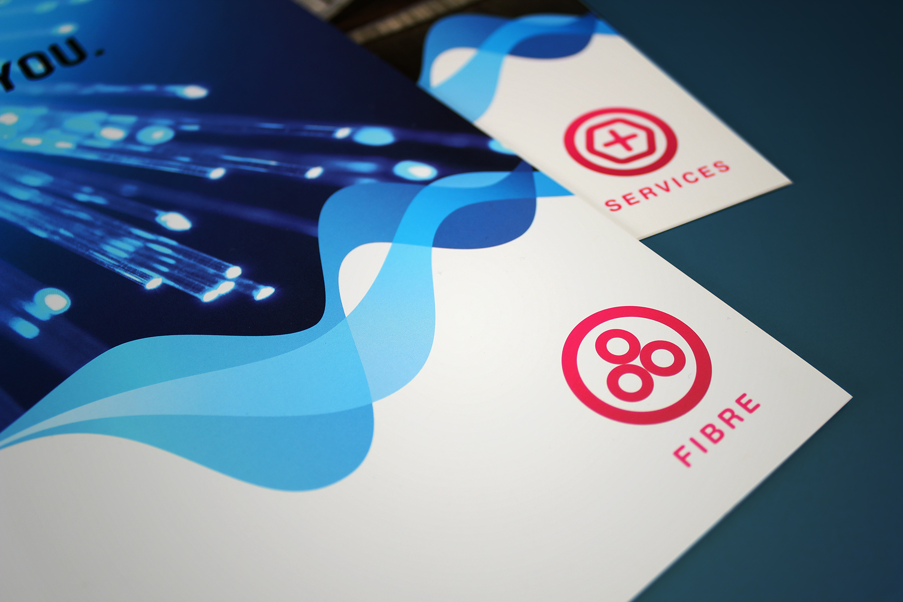
We developed the iconography for four business units, Fibre, Satellite, Waimax and Services.
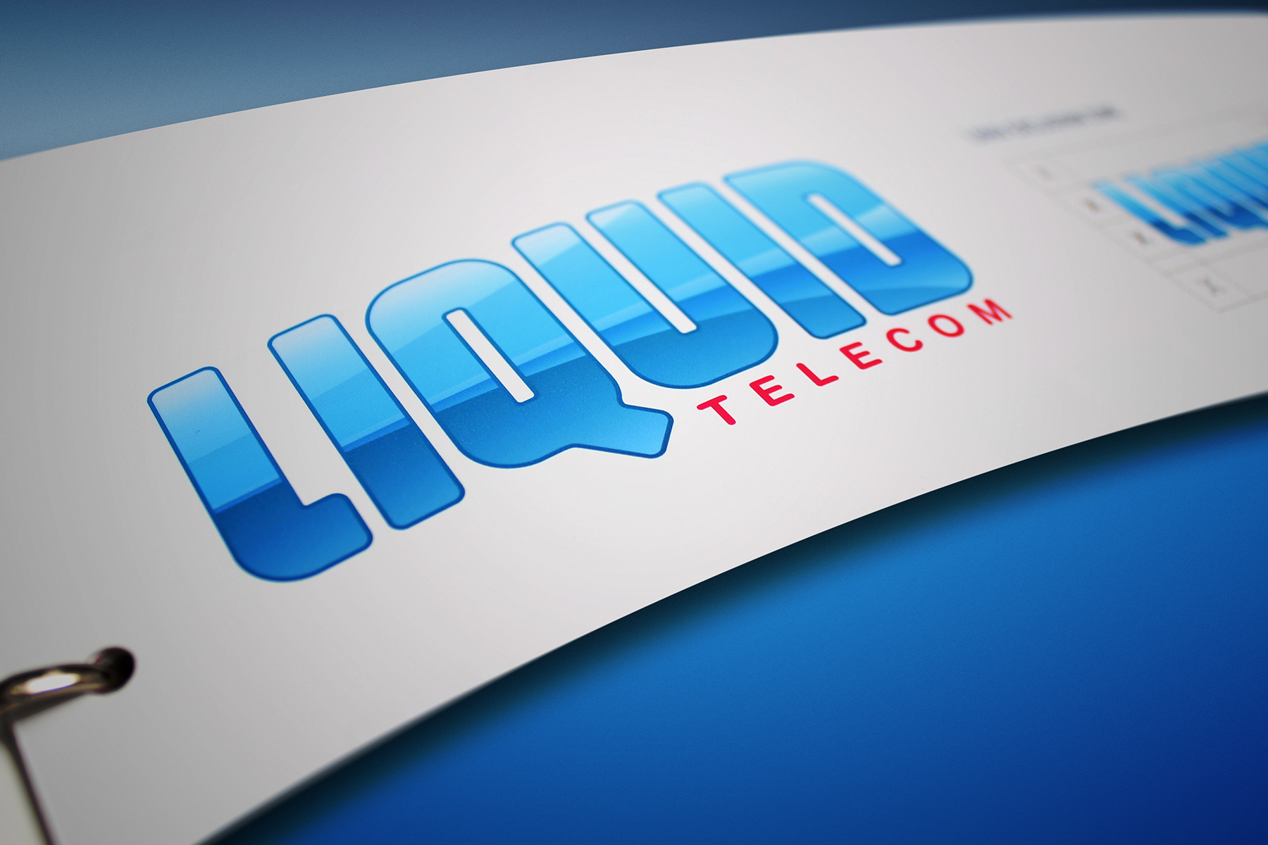
Paybay identity
Liquid Telecom has developed new and innovative software for terminals which allow consumers to make electronic payments at a shop terminal. These include credit and debit card processing, pre-paid mobile phone top-up and household bill payments. Firedog were tasked with developing a very easily recognisable icon that could be easily recalled within Africa’s visually kaleidoscopic and busy marketplace. Following empirical research of existing signage in the market, we concentrated on crafting a device that was both simple and striking. The colours reflect Liquid Telecom’s brand palette and the style of the logo design ensures ease of production and high-visibility. Print production and finishing vary from region to region so the logo needed to be easily reproduced with basic print standards. Paired with the graphic was an easy to remember name for the product that was designed to be phonetically strong. The symbol itself quickly communicates what the payment terminal can offer to the end user without the consumer needing to understand the meaning of the words.
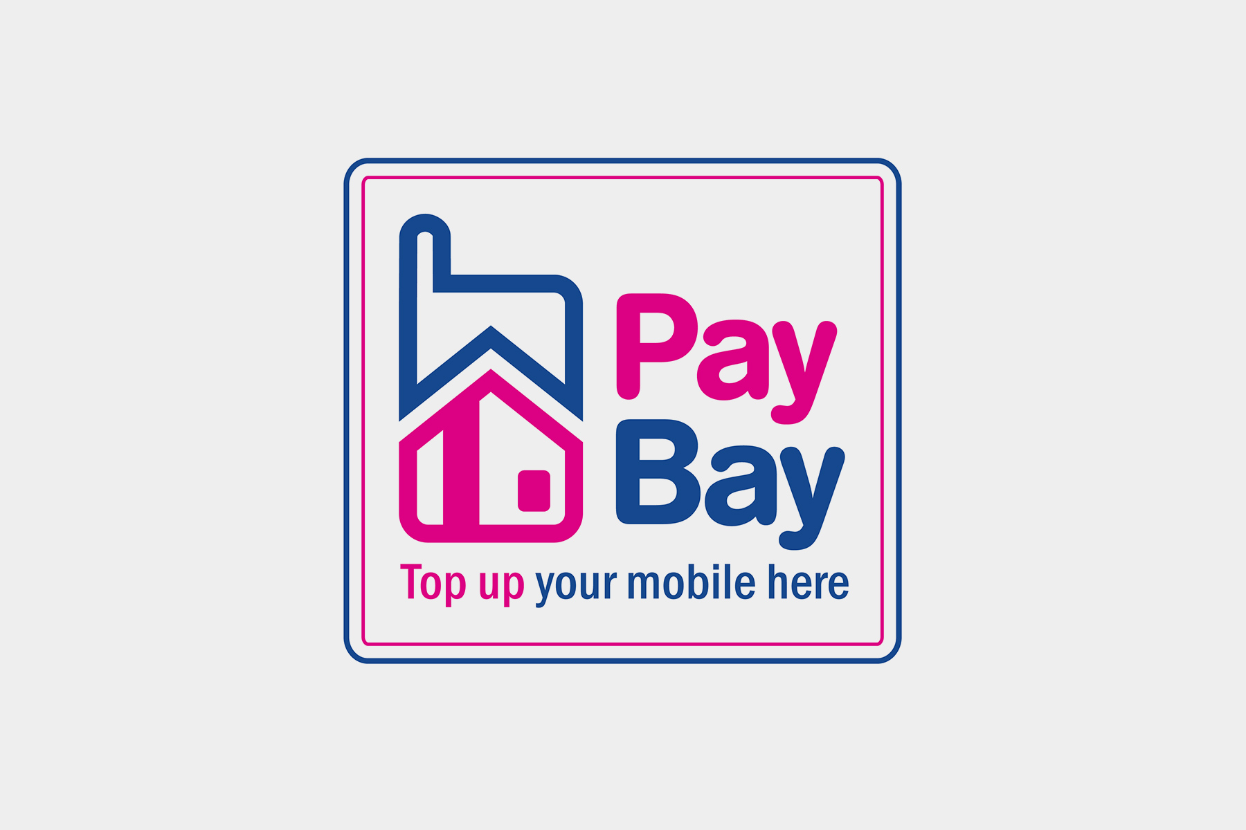
The symbol itself quickly communicates what the payment terminal can offer to the end user without the consumer needing to understand the meaning of the words.