Visual identity

Savills IM

A new positioning and brand identity for leading international property investment management business.

Savills Investment Management (Savills IM) is a wholly owned but independently operated subsidiary of Savills, the global real estate company established in 1855, listed on the London Stock Exchange and a constituent of the FTSE 250 Index. The fourth largest global agent by world turnover, Savills has a network of more than 600 offices worldwide. Our remit for this business included strategic consultancy, brand identity, visual identity creation, visual look and feel, communications and print design, website design and brand guidelines.

A new positioning was chosen which allowed us to capitalise on the play on words - in this case; From all angles.

SavillsIM wanted to escalate their online brand equity and commissioned Firedog to help develop a new unique positioning.

This was to be followed by a full brand refresh and revitalised communications and visual identity. The SavillsIM brand stands for so much more than bricks and mortar and the new positioning needed to communicate this promise.
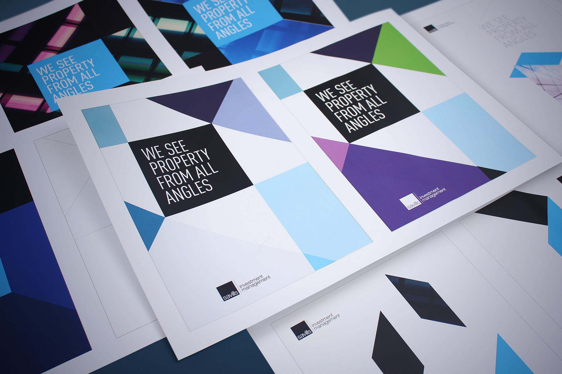
Early conceptual development emphasised the brand narrative by expressing three dimensions and architectural form.

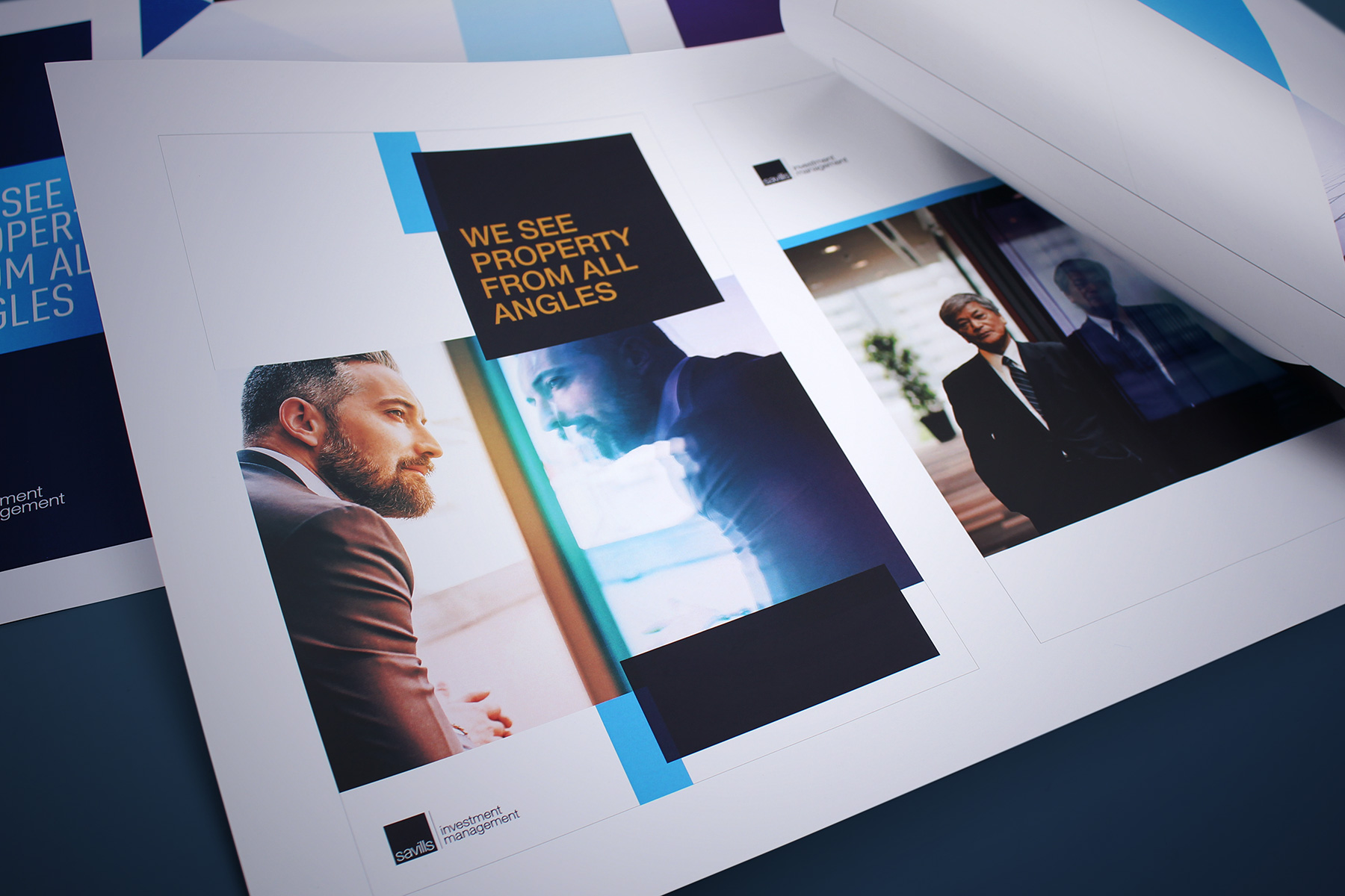
“We see property from all angles” is the creative hook on which the brand identity is built.

A new positioning statement was created to establish the enhanced offer to prospective clients. “We see property from all angles” is the creative hook on which the investment brand identity is built. We capitalised on the idea of angles being a dimensional property and looked to create a flexible system which could communicate this value in a simple yet refreshing medium.  We arrived at a concept entitled “Reflections” which utilised the square logo device coupled with positioning statement and combined with an extended colour palette and evocative imagery.

The images contained a mixed blue gradient which linked in back to the SavillsIM brand.
The imagery and brand device are combined with dynamic structured shapes which creates a formal yet somewhat contemporary feel.

Firedog continues to work with SavillsIM on subbrands and tactical campaigns.

The imagery features a double image with people reflected in glass. This technique adds depth and hints at the “all angles” narrative. It also allowed us to use established stock imagery, with a new twist which ensured unique ownership. The rebrand has been a great success and Firedog continues to work with SavillsIM on subbrands and tactical campaigns. Our most recent endeavour features a European focussed city ranking microsite which measures numerous cities’ investment status across the region. Have a look at dynamiccities.savillsim.com for more.

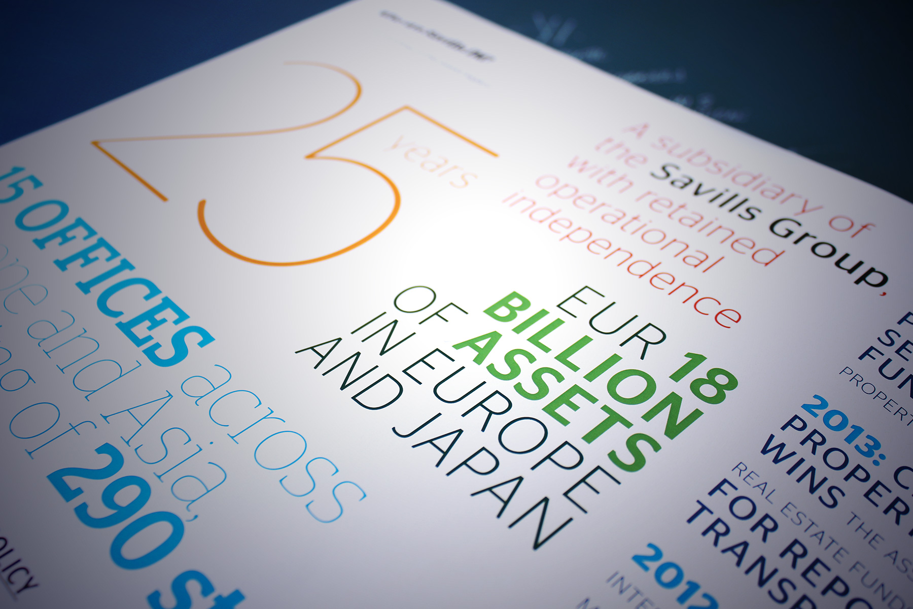
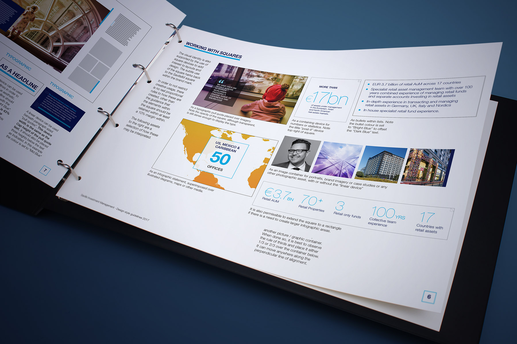
We created a suite of direct sales and communications materials, combined with a series of custom infographics.

Expertise Spotlight

The Kaboodle symbol is beautifully simple with a really subtle play in dimensions.

Branding

View case studies
We have developed a supporting international PR campaign to raise visibility and awareness. Search online for Dynamic Cities.
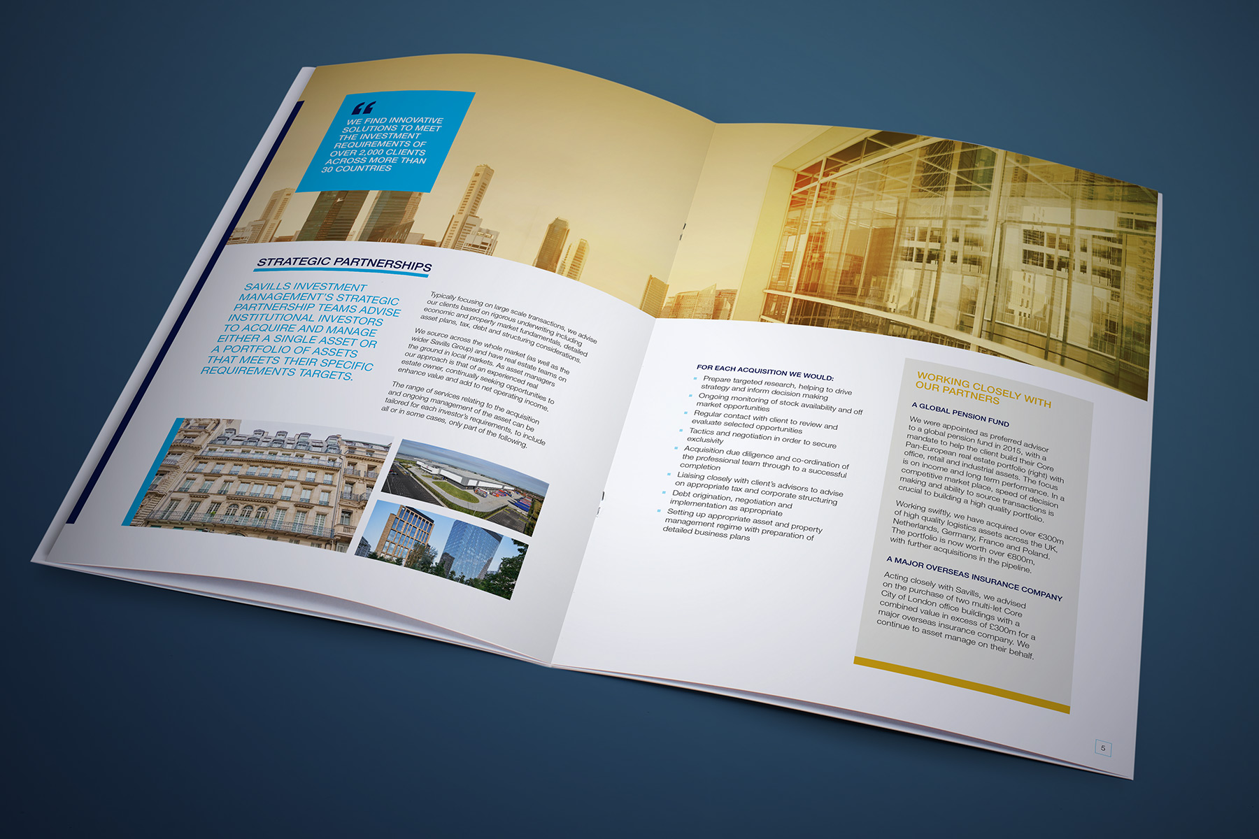
The extended colour palette allowed us to combine the formal blues with more unexpected complimentary colours.