-

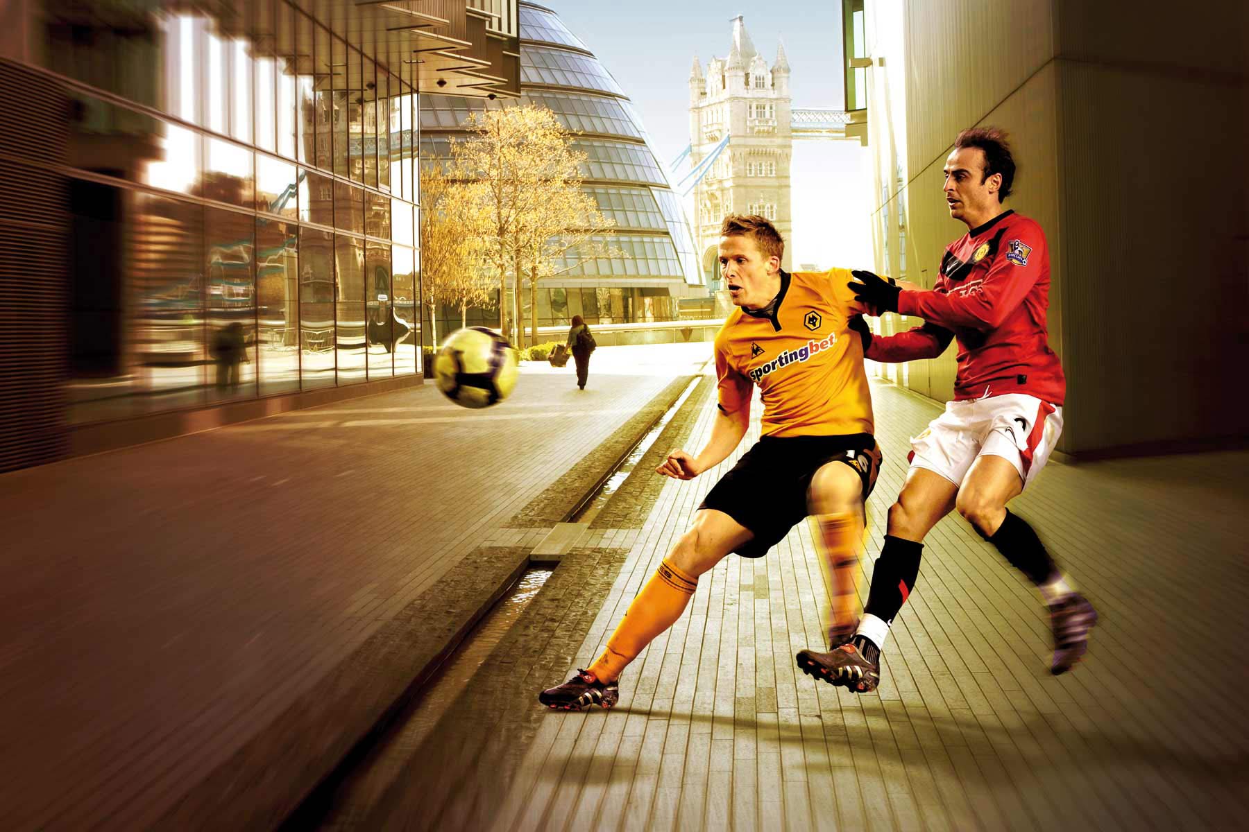
The idea behind the concept - Sportingbet dominates the field, no matter your environment or location. This is the London south bank and Sportingbet owned imagery.
-

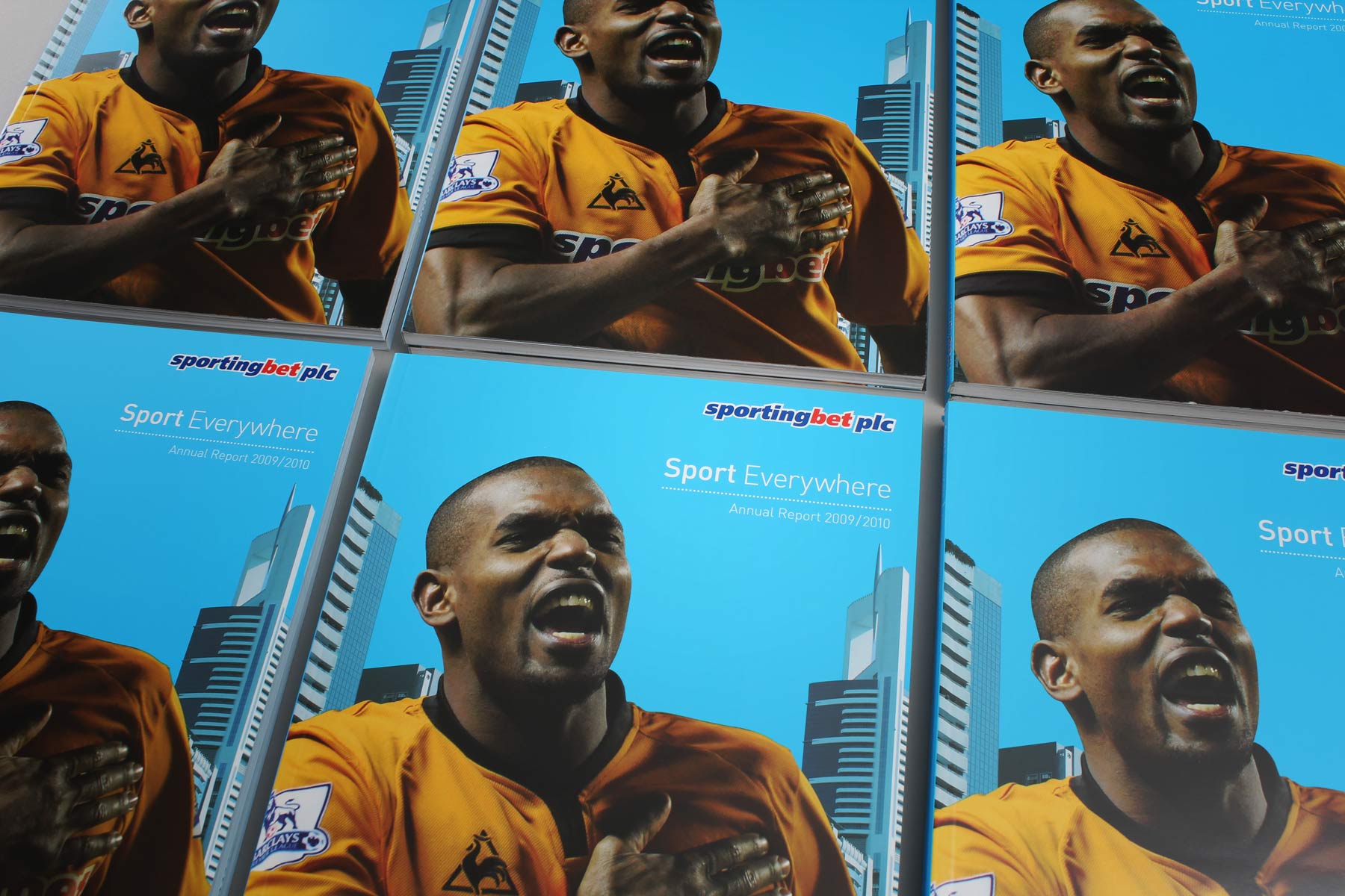
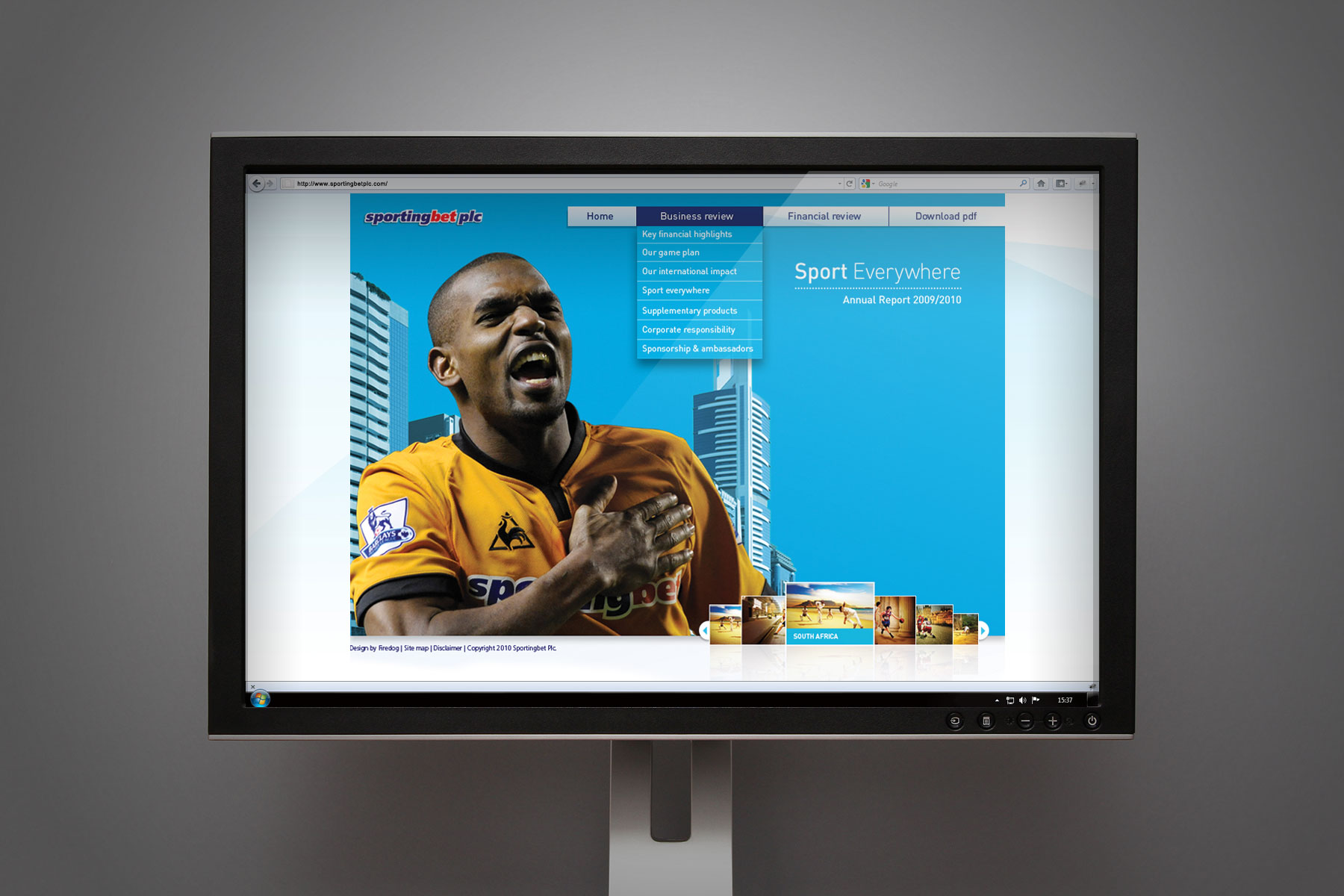
The cover of the report shows the Wolverhampton strip and Sportingbet sponsorship - A key promotional part of the brand.
-

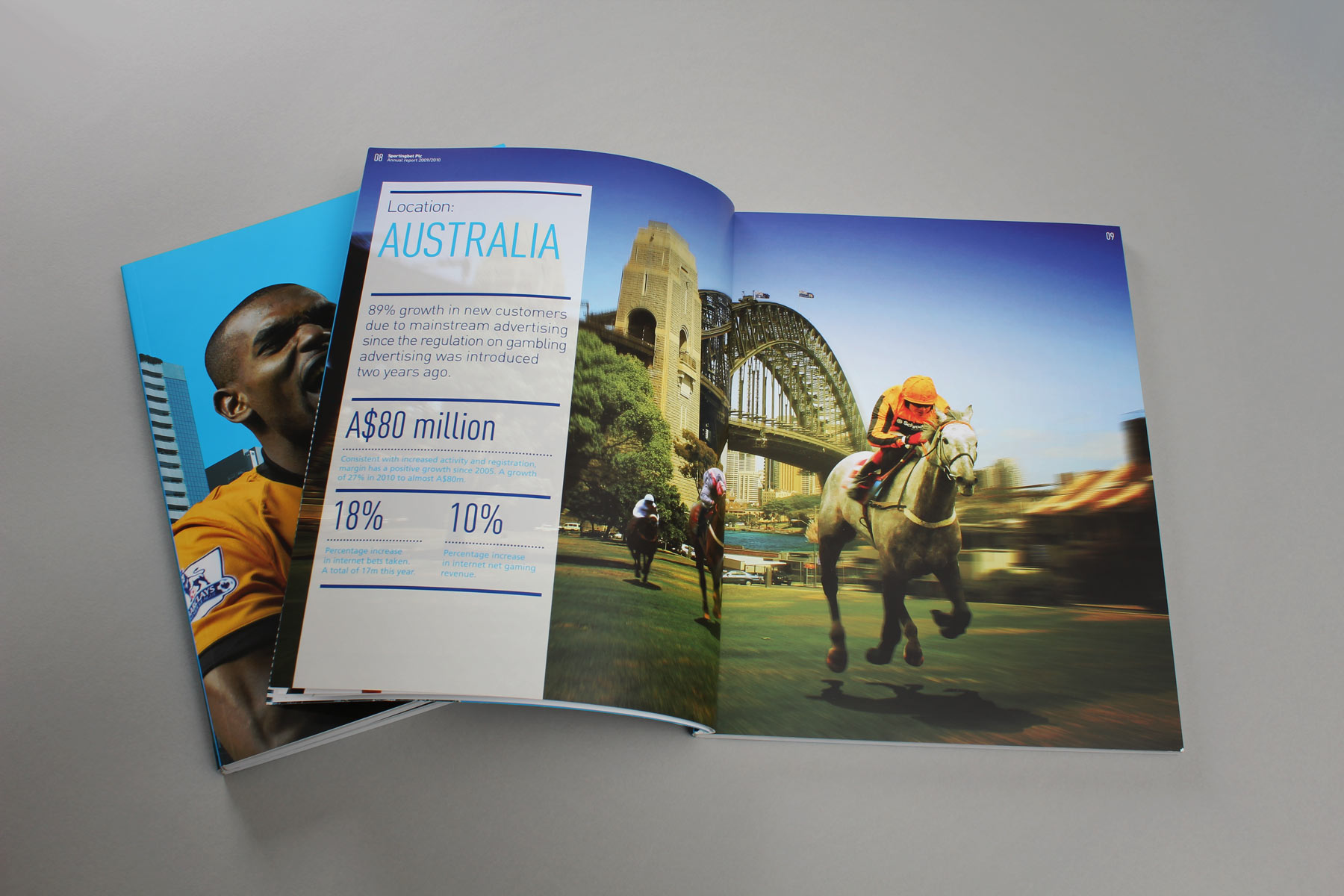
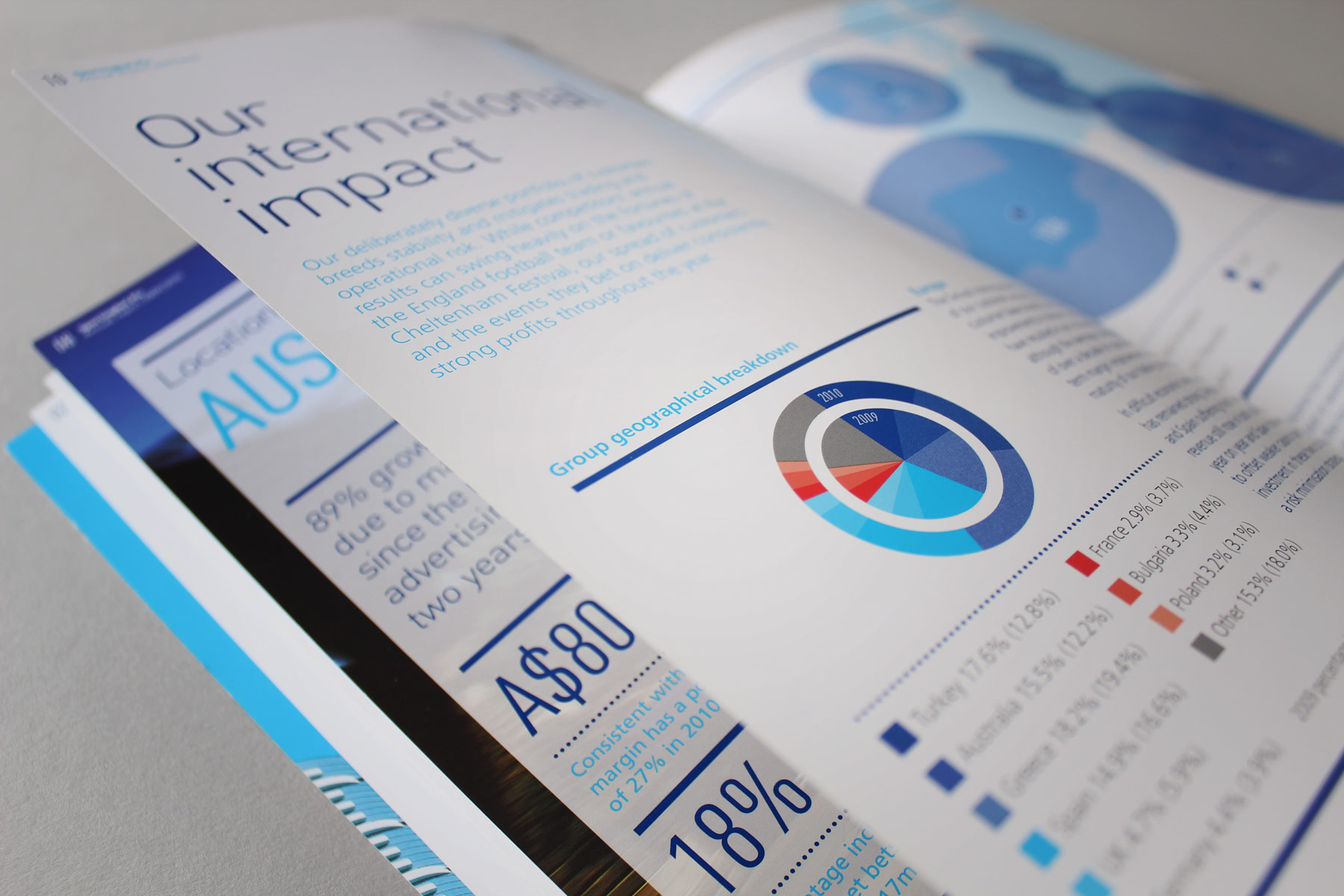
In Australia - Horseracing is the name of the game. On the left, regional facts and figures add weight to the image concept.
-

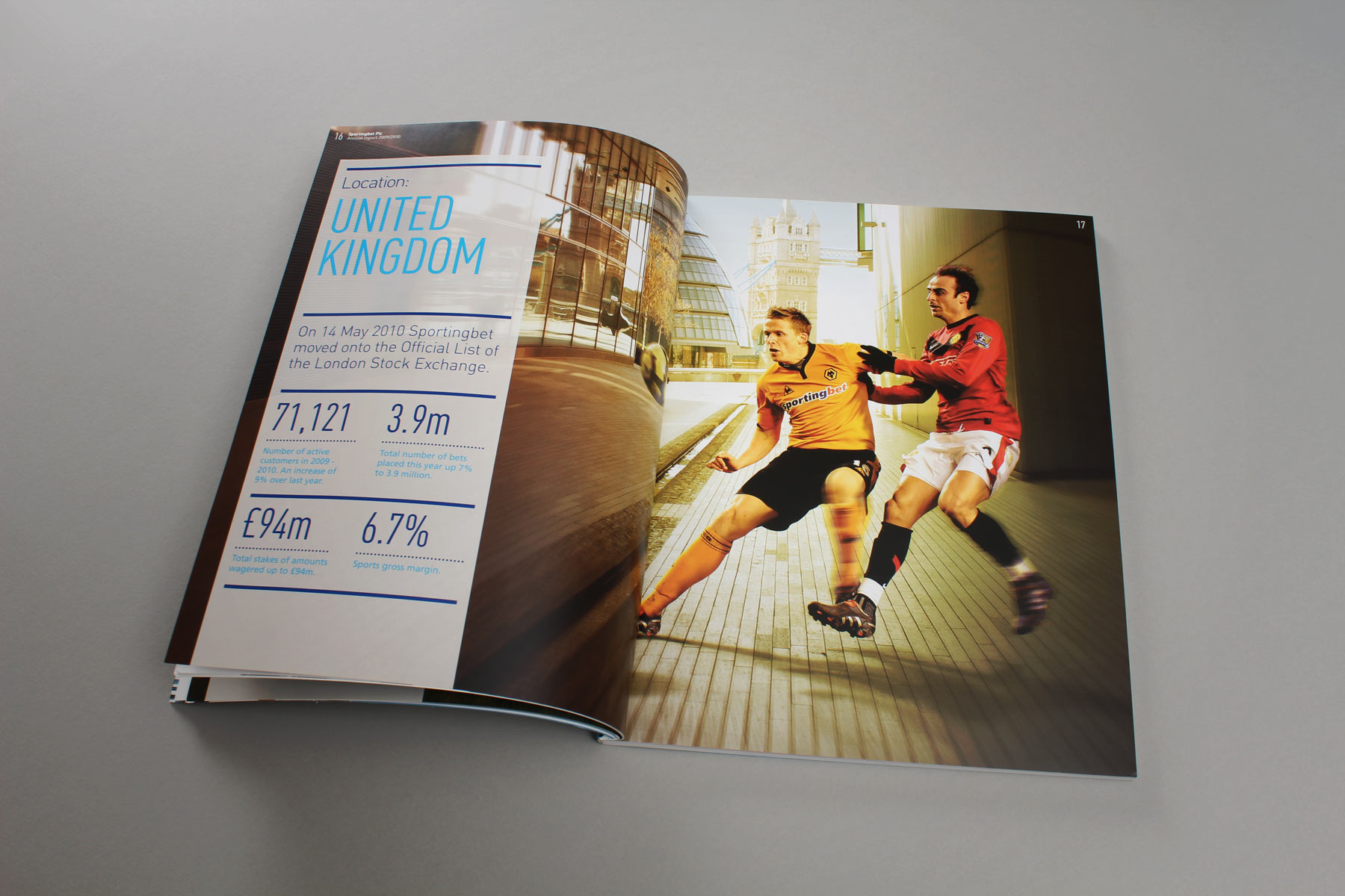
The spread for the UK brought the latest news of the movement of Sportingbet onto the official list of the LSE.
-

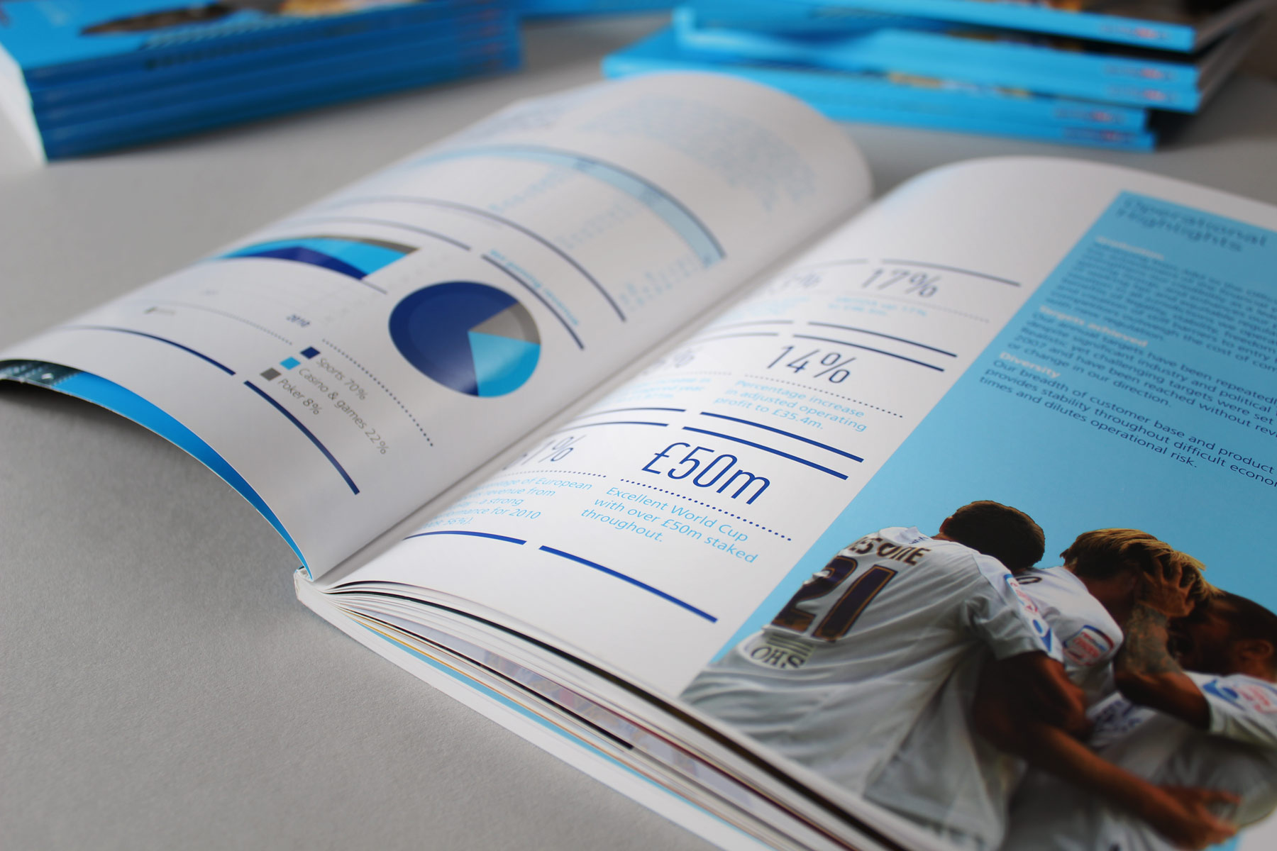
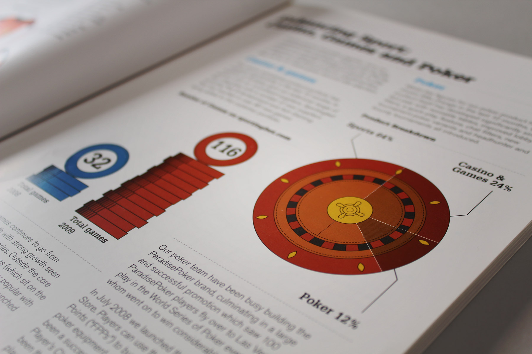
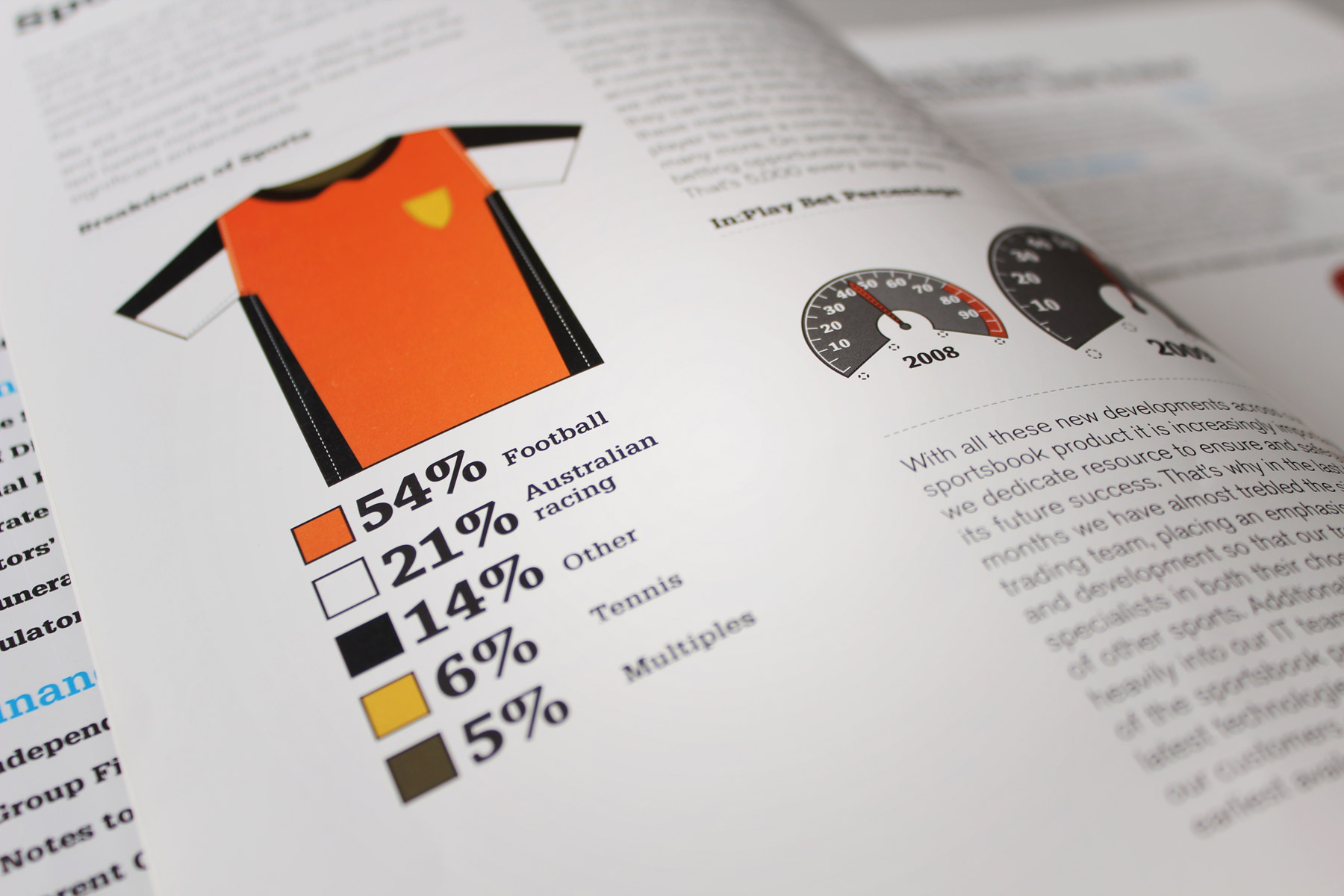
We unearthed numerous facts and figures from the editorial copy to create a lighter, more informed and quicker read.
-

The combination of illustrated stats and figures, structured copy and evocative sports based imagery makes for an absorbing and very successful publication.
-

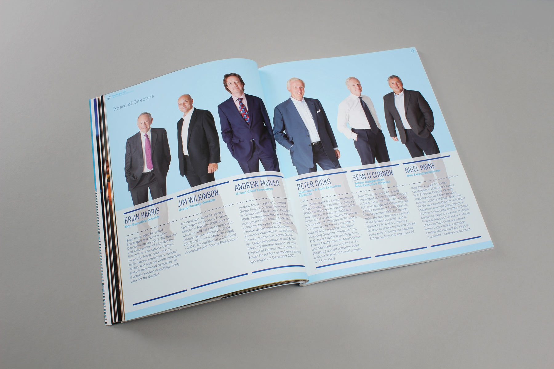
We shot the board members in full length imagery to compliment the visual concept.
-

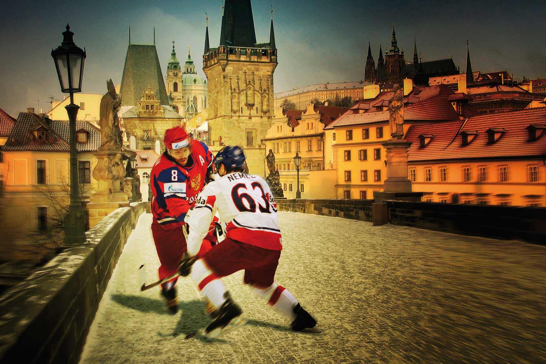
Ice hockey being big in the Czech Republic led us to create this image. The concept is designed to make the players feel as close to their environment as possible.
-

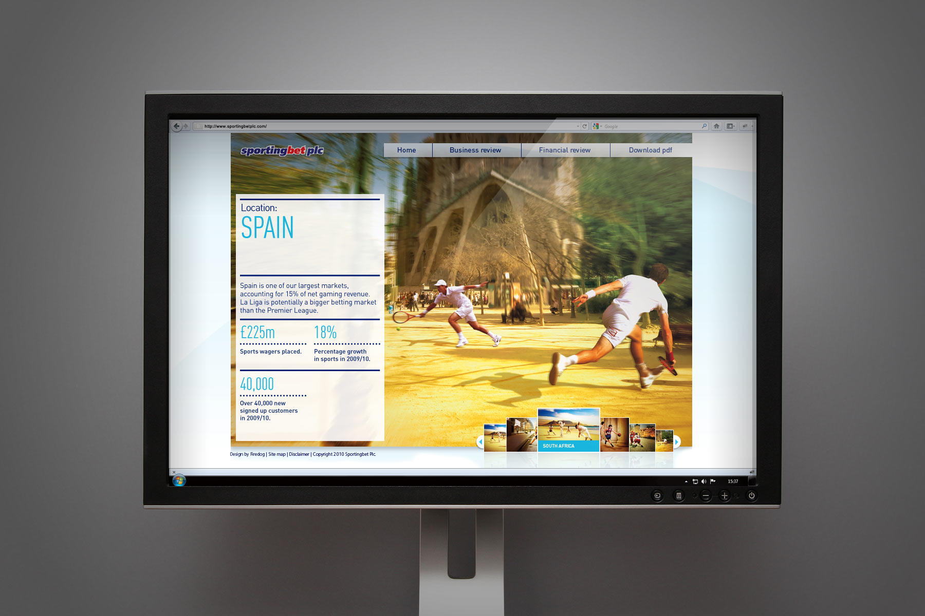
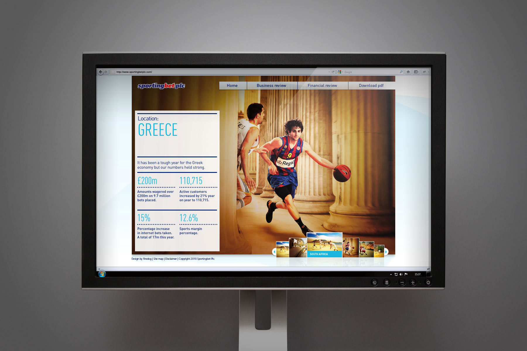
The emphasis shifted even more to the digital reporting platform compared to previous years - With more content and interactivity.
-

The fullpage imagery integrated nicely into the digital format. A quick spot of competitive tennis in front of the Sagrada Familia.
-

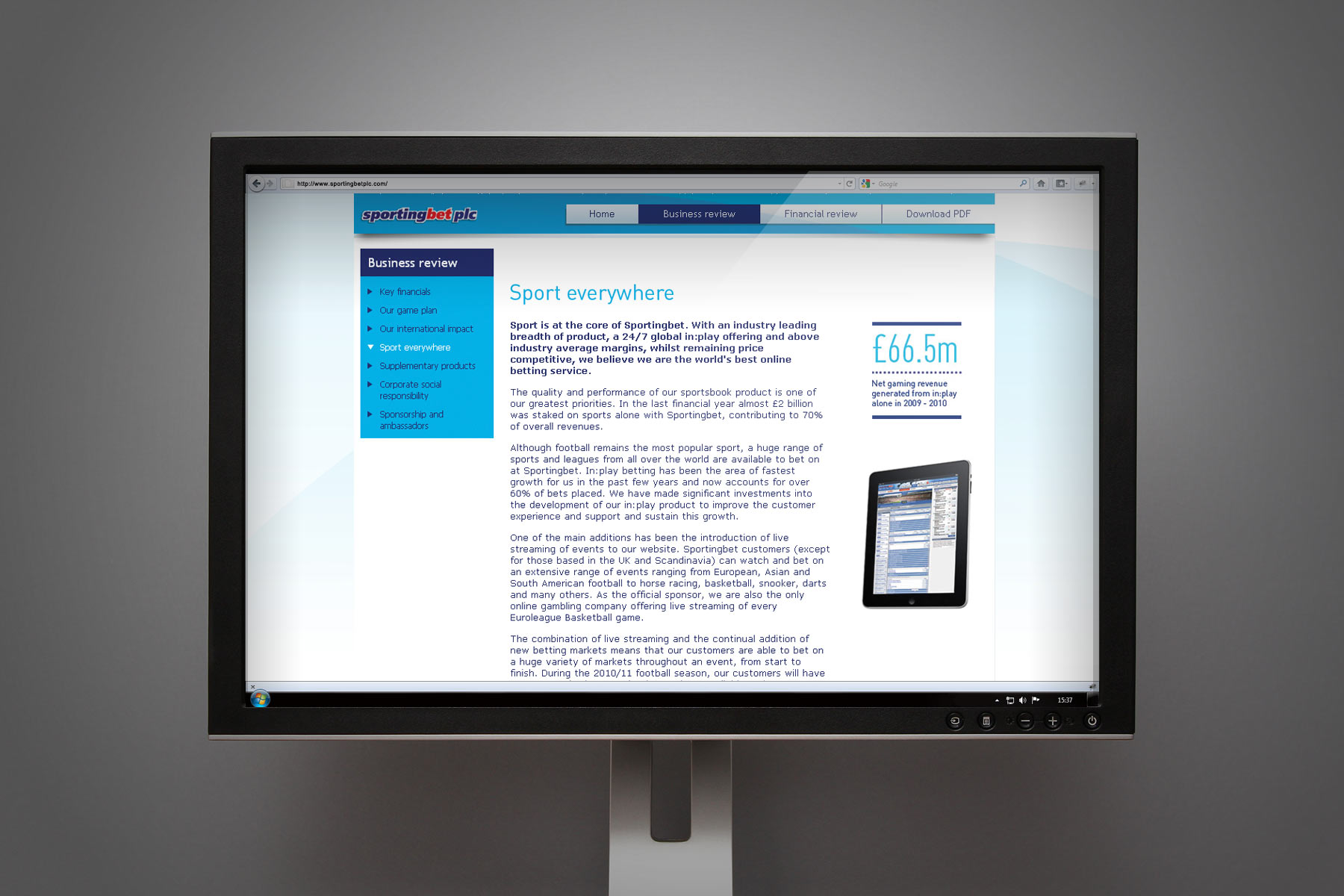
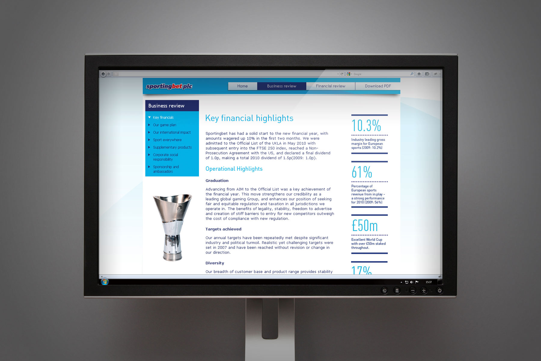
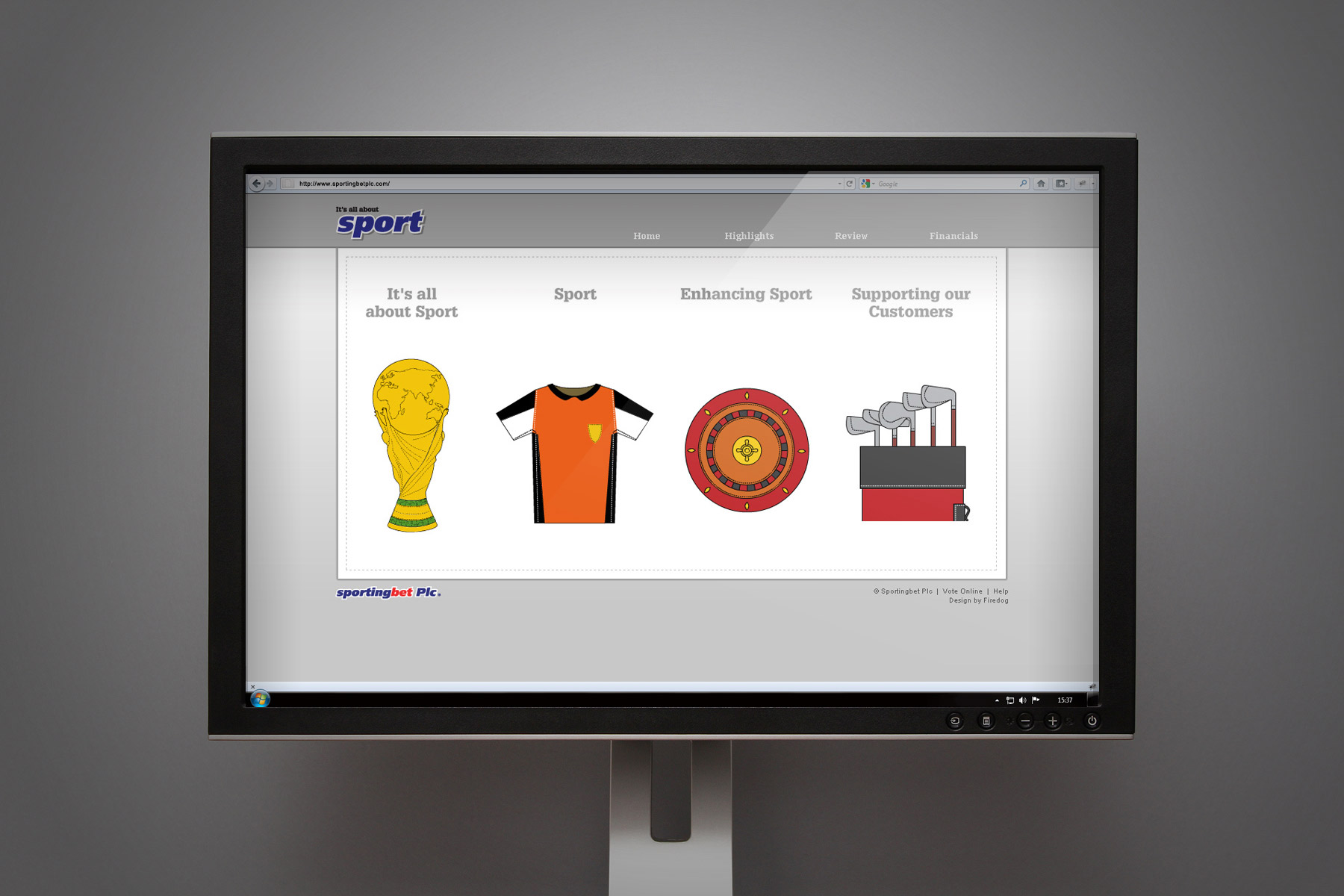
The design of the site whilst informed by the print version - Followed site best practise to enable clear reading of content.
-

Players battle it out amongst the Acropolis.
-

The layout of the online version kept the content and facts and figures within their dedicated silos so that they could be content managed and updated seperately.
-

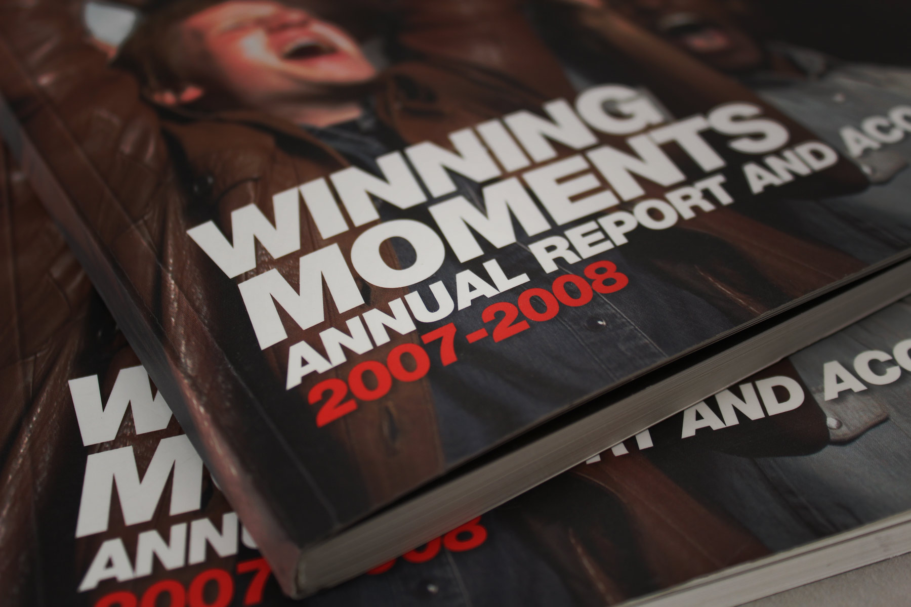
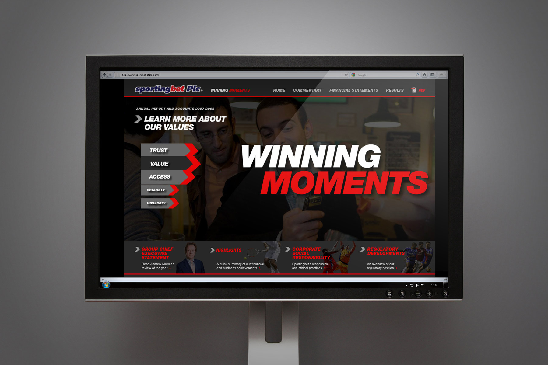
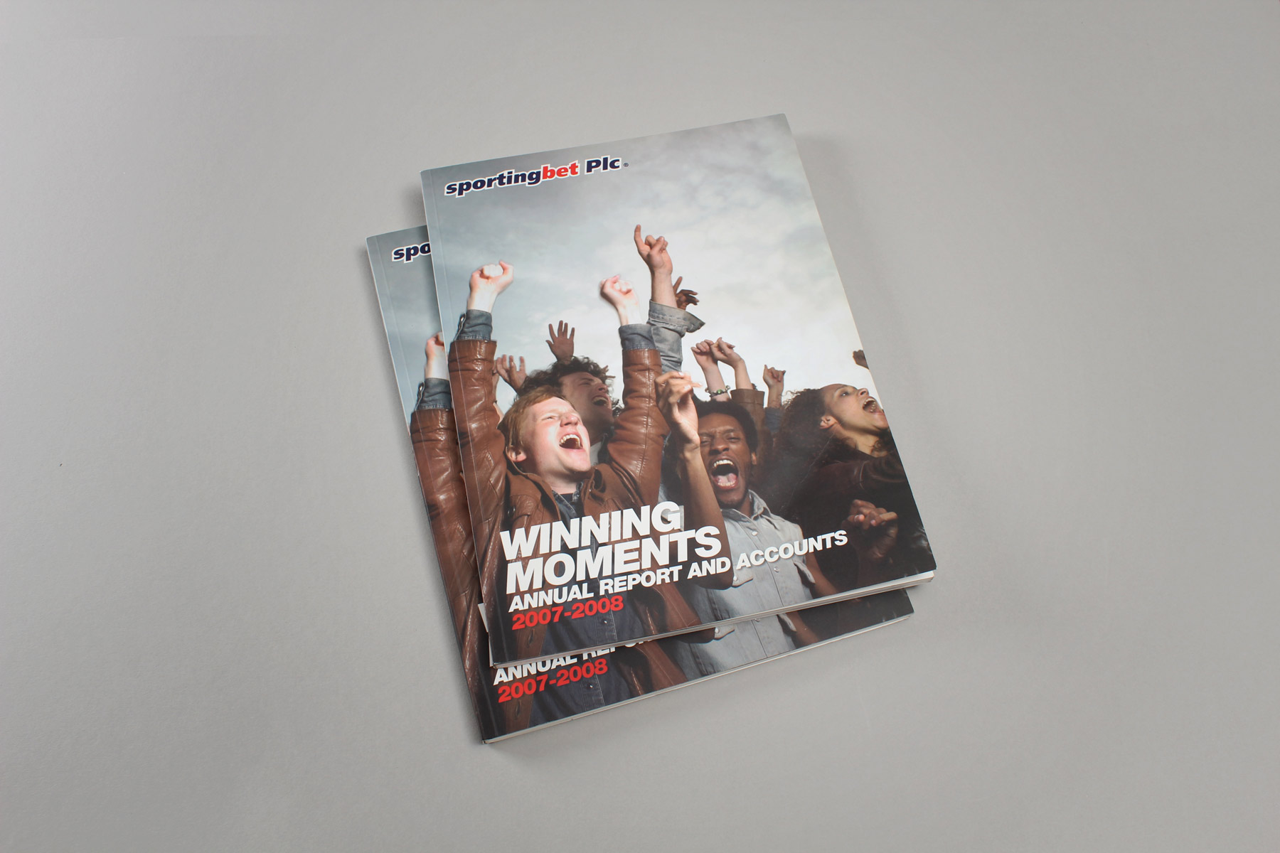
The Winning Moments moniker reflects a good year financially for the business.
-

The content produced in the physical report is gracefully transferred to the online environment.
-

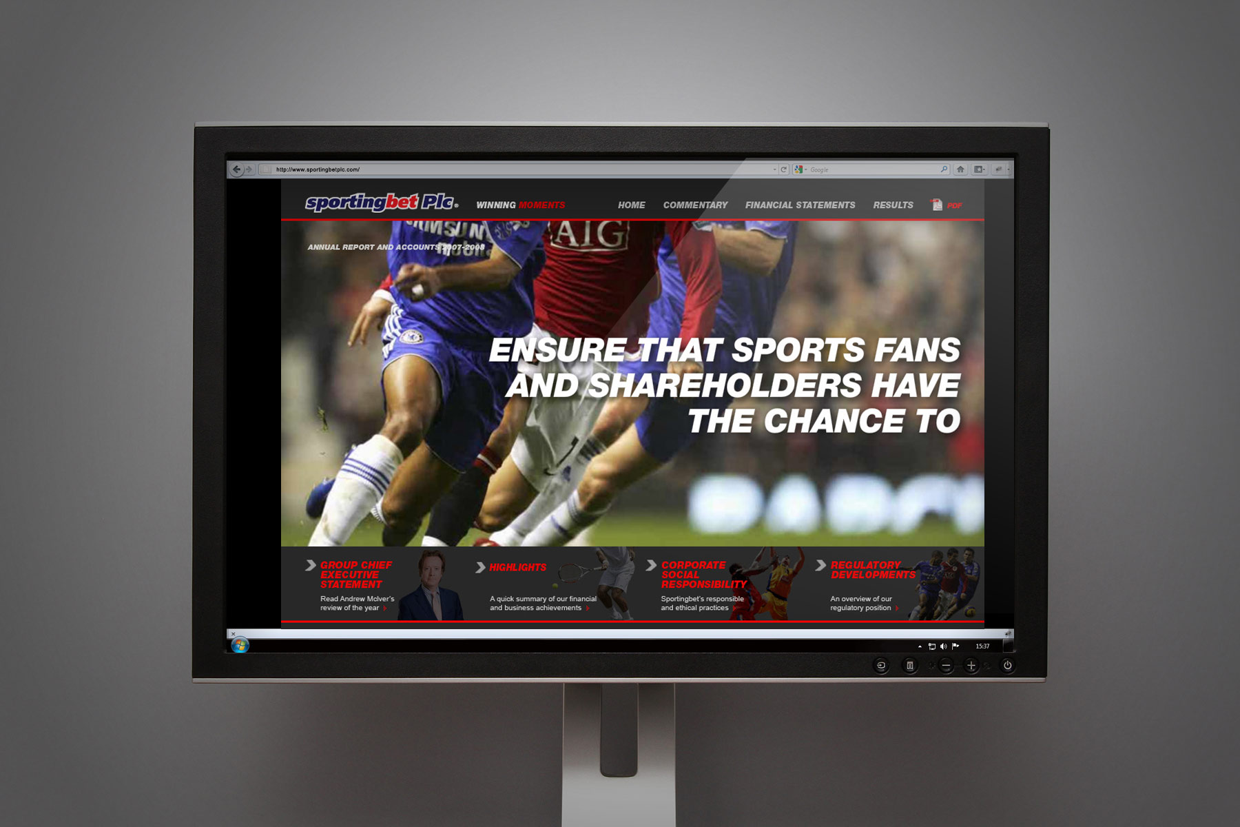
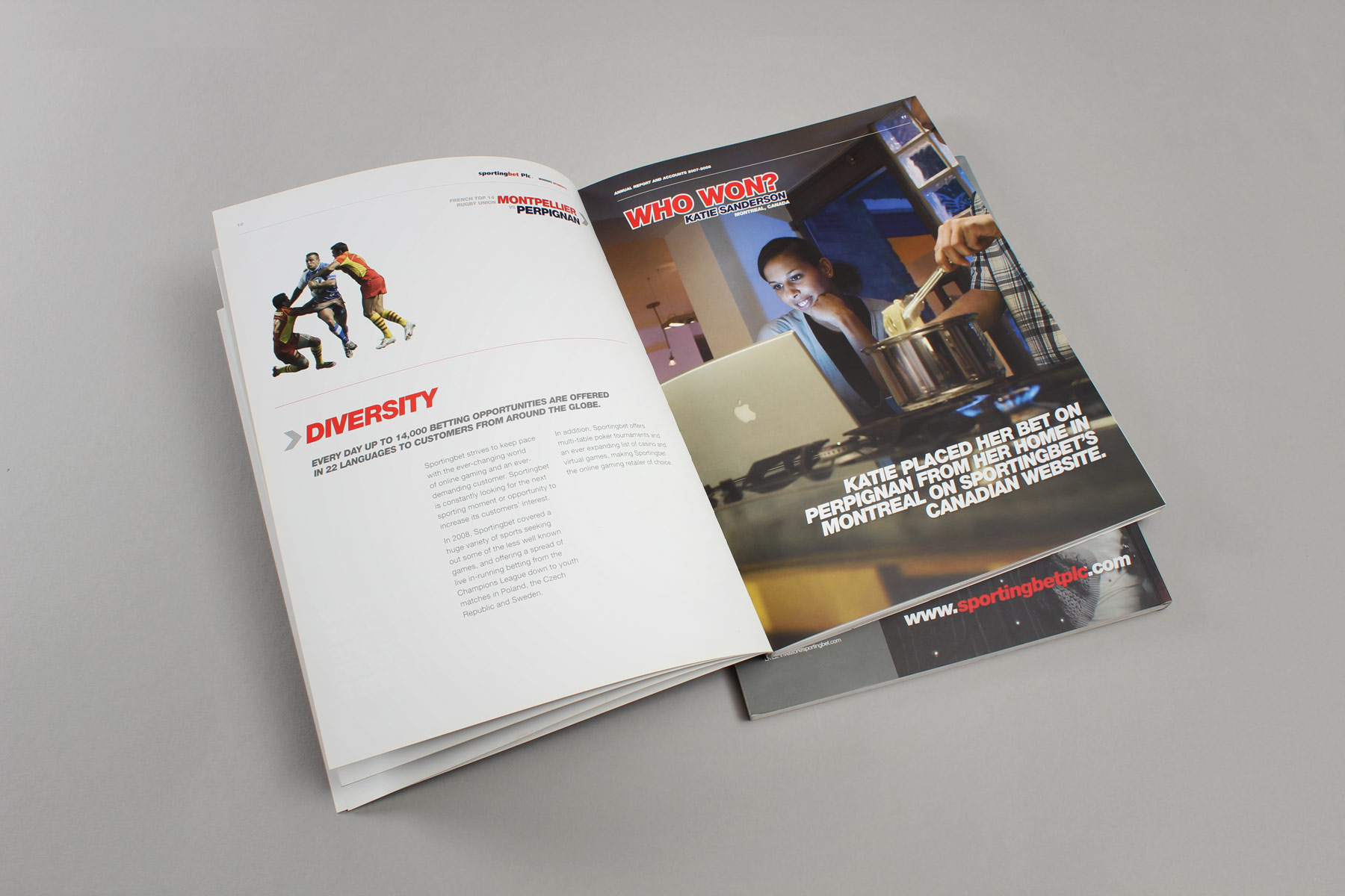
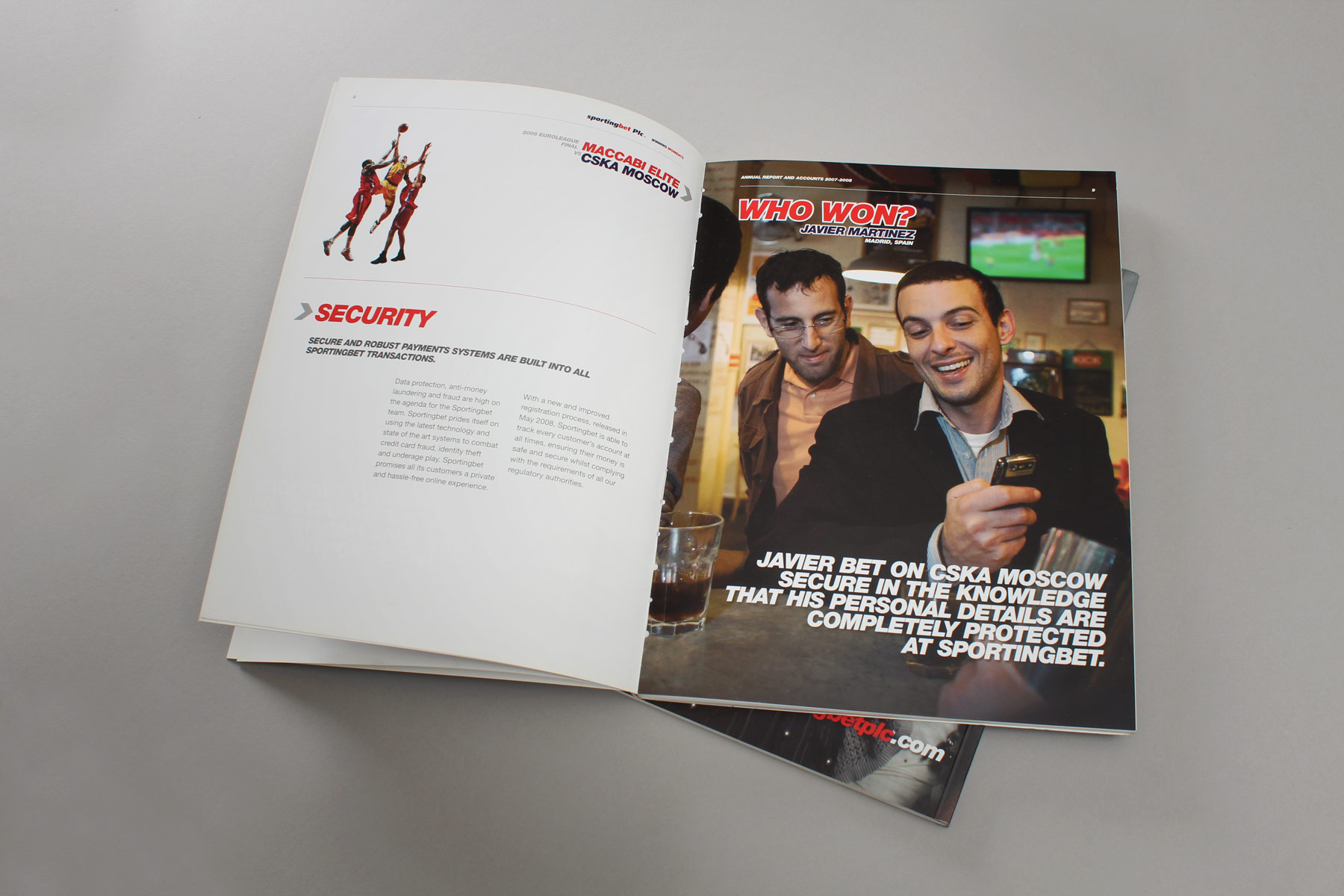
We used the combination of key statements along powerful sporting imagery.
-

The concept places the joy of winning within the frame of the audience, as opposed to the sporting team.
-

The image styling is geared to showing real people in natural environments engaging in the Sportingbet product.
-

We produced imagery from a series of photoshoots. This is shot in the Kick bar, just around the corner from the Firedog studios.
-

We shot a series of images to illustrate key messages.
-

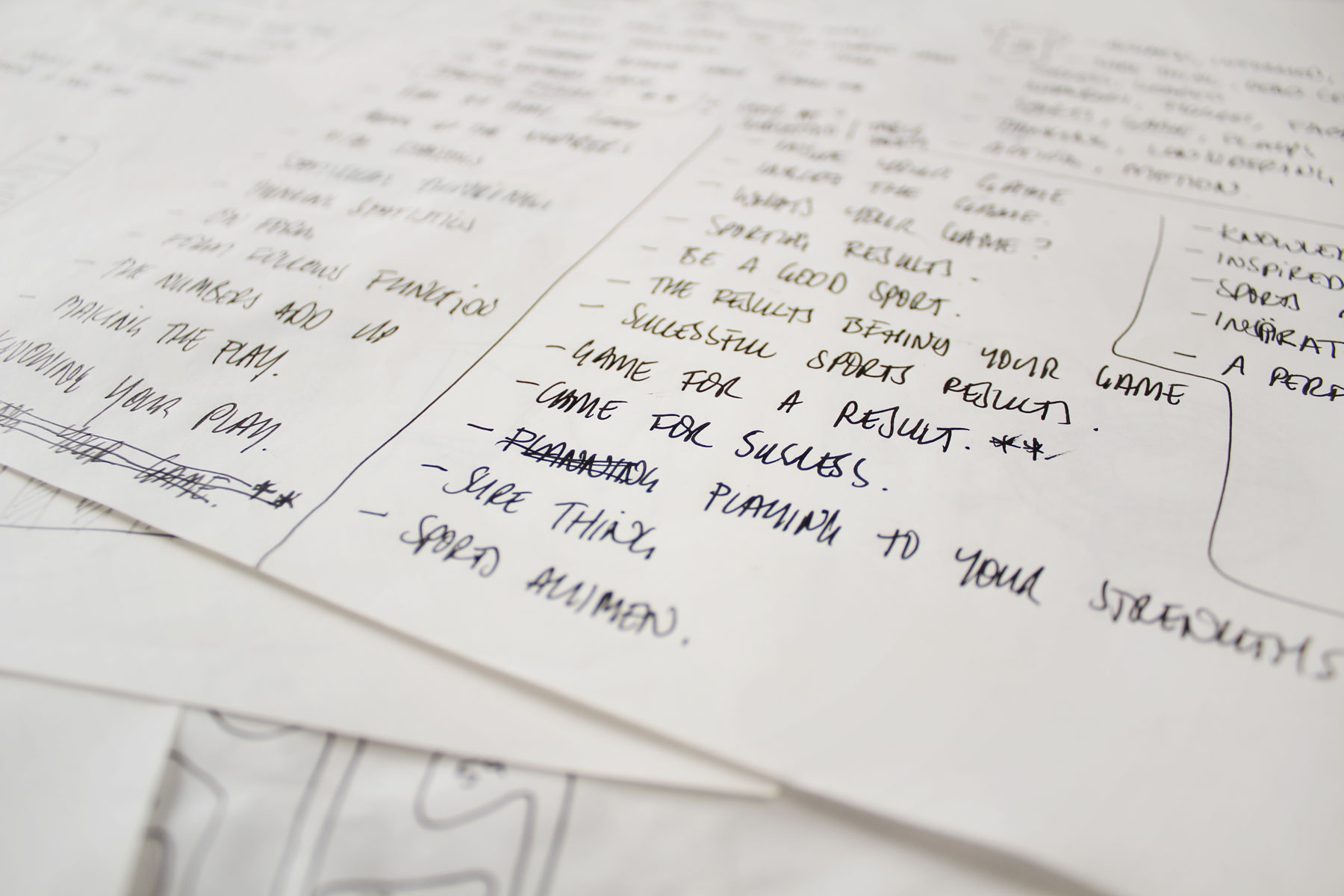
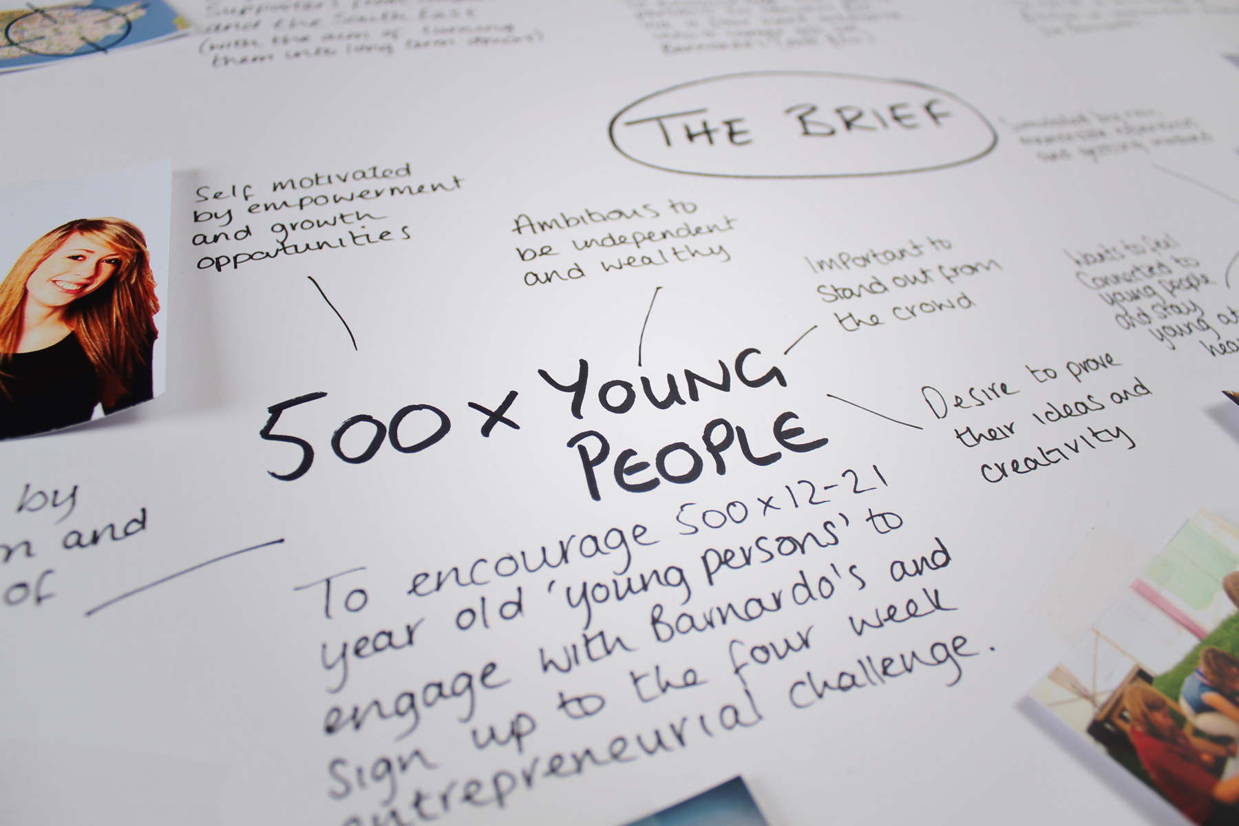
The conceptual avenue for the report is gleaned from focussed strategic planning.
-

The creative team look to convey the spirit of the year in a succinct visual thread.
-

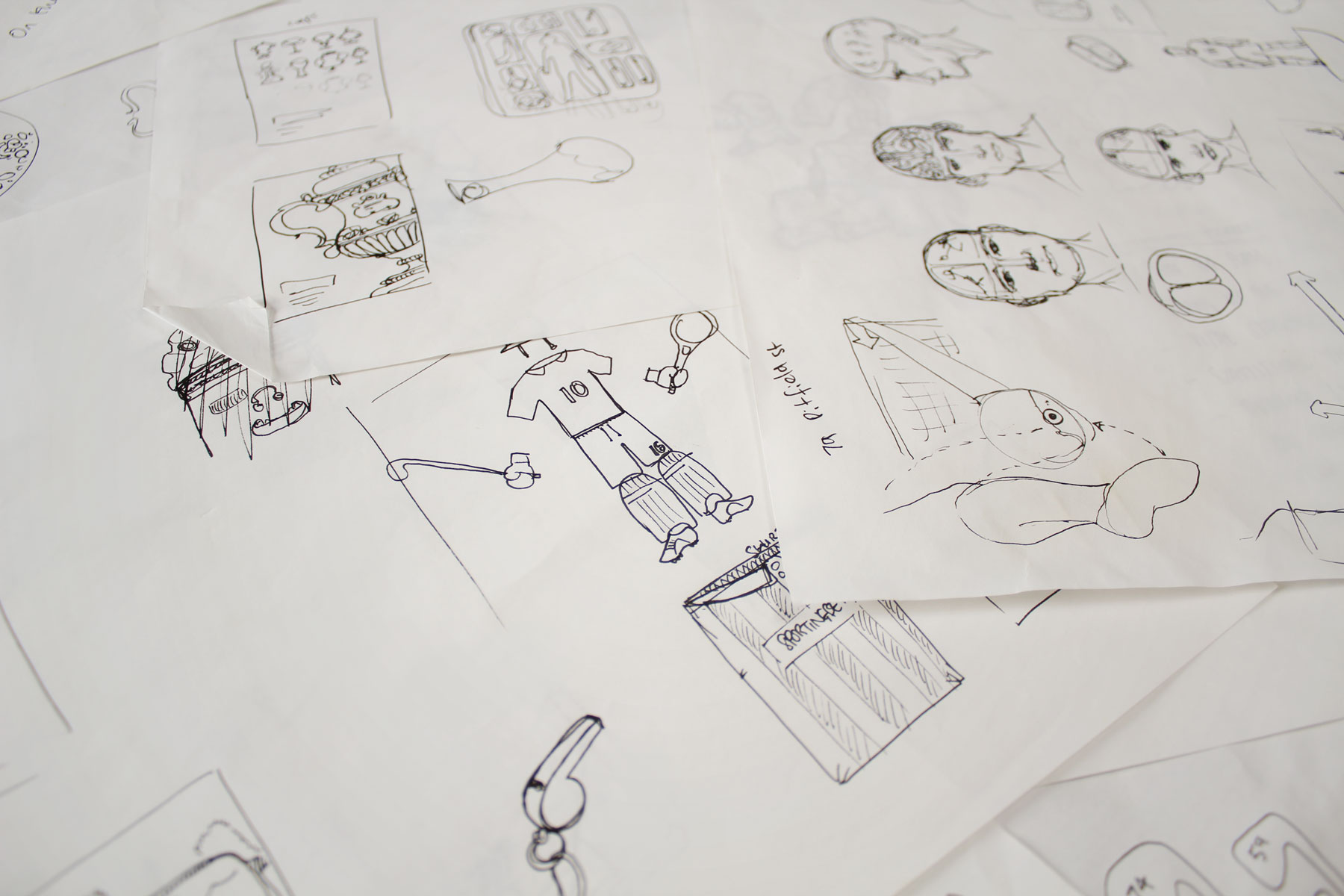
The subsequent years report contained annual key statistics formed around sporting objects, in chart like styles.
-

By liaising with the client team, we were able to unearth interesting and informative facts and figures.
-

Once online, the charts, graphs and graphic illustrations could be animated and exploited.


