-

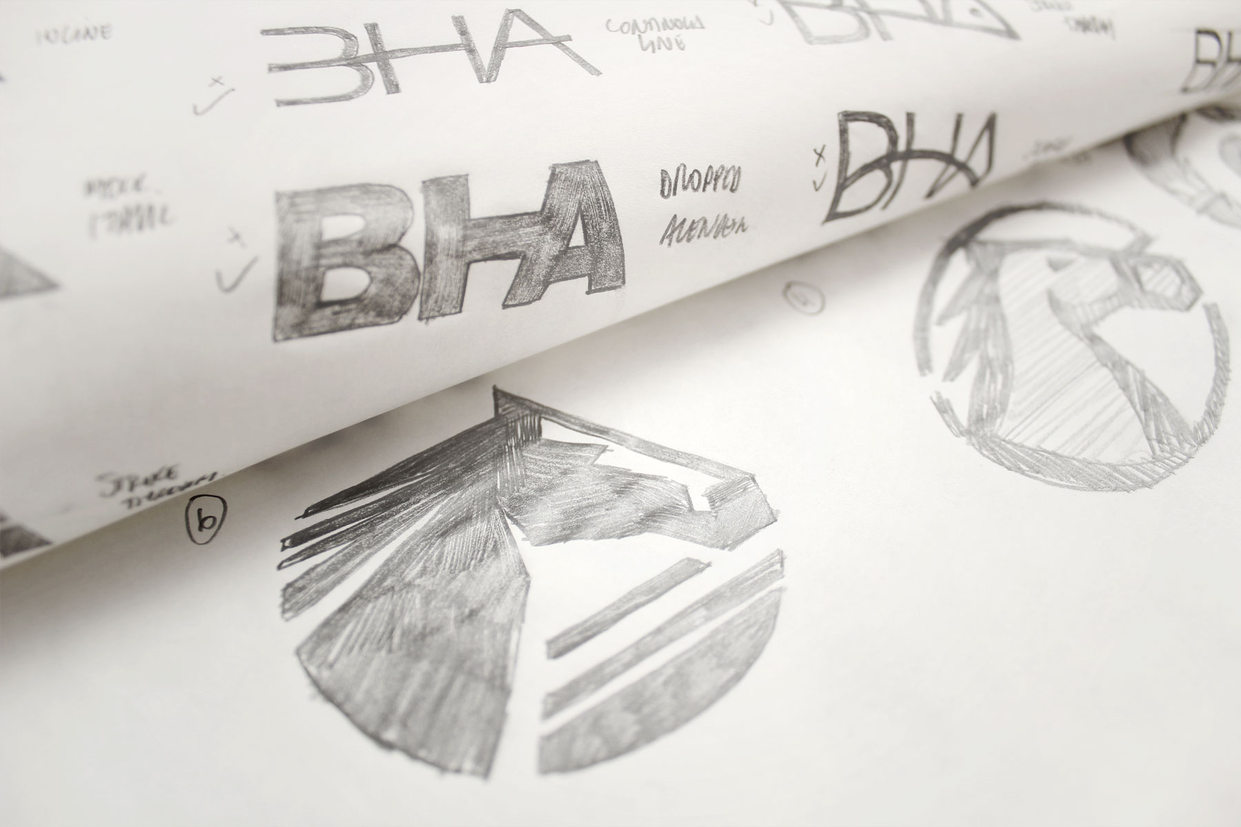
The brand icon takes the principals and values of the original brand yet renders them in a far more contemporary aesthetic.
-

Angles and graphic shapes were used to add a sense of agility and confidence.
-

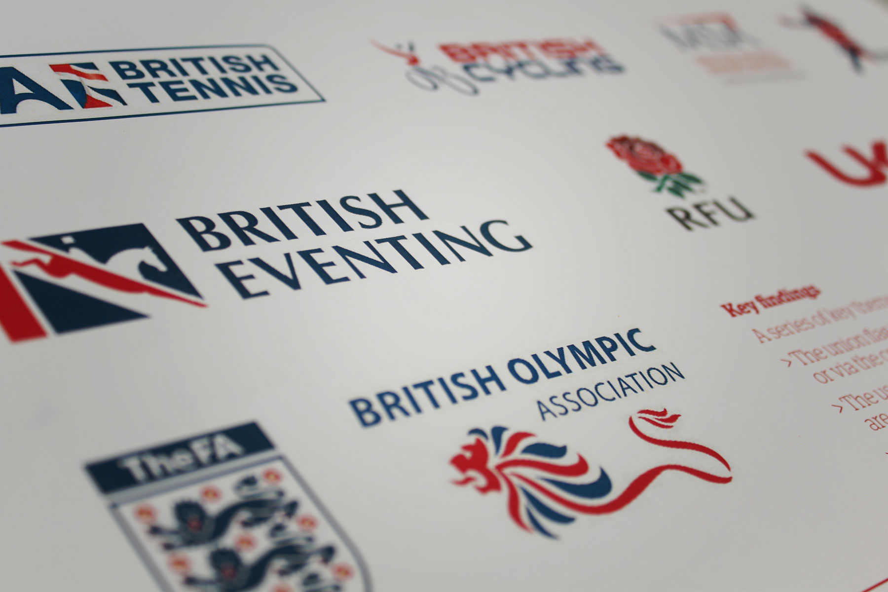
Research into governing bodies in sport highlighted the usage of caps and a consistent colour palette that represented Great Britain.
-

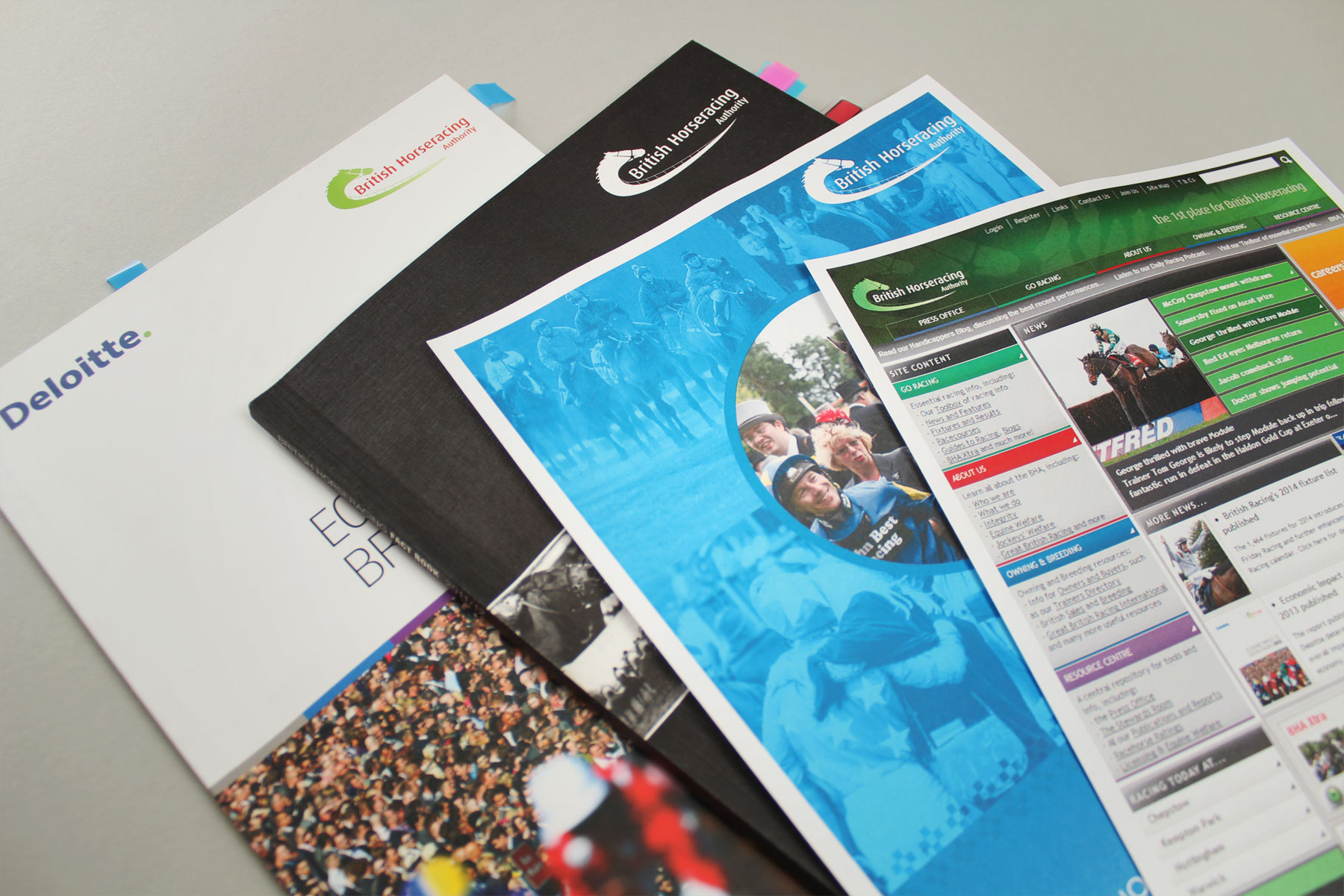
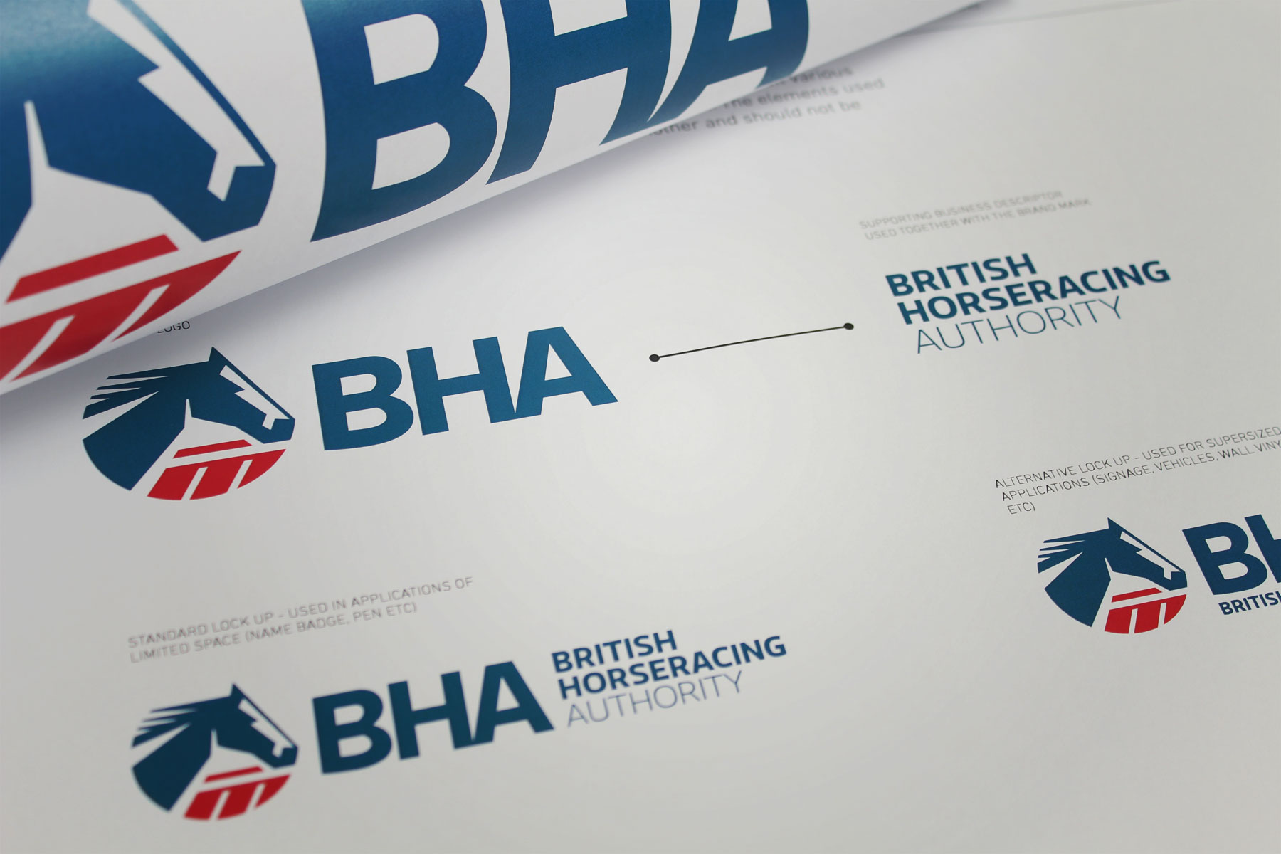
The British Horseracing Authority were widely known as the BHA. The brand mark needed to reflect this. The BHA's original look and feel was inconsistent and lacked a clear direction.
-

Brand recognition is immediate; the colour palette is distinctive and eye-catching.
-

The brand in full colour is authoritative and confident.
-

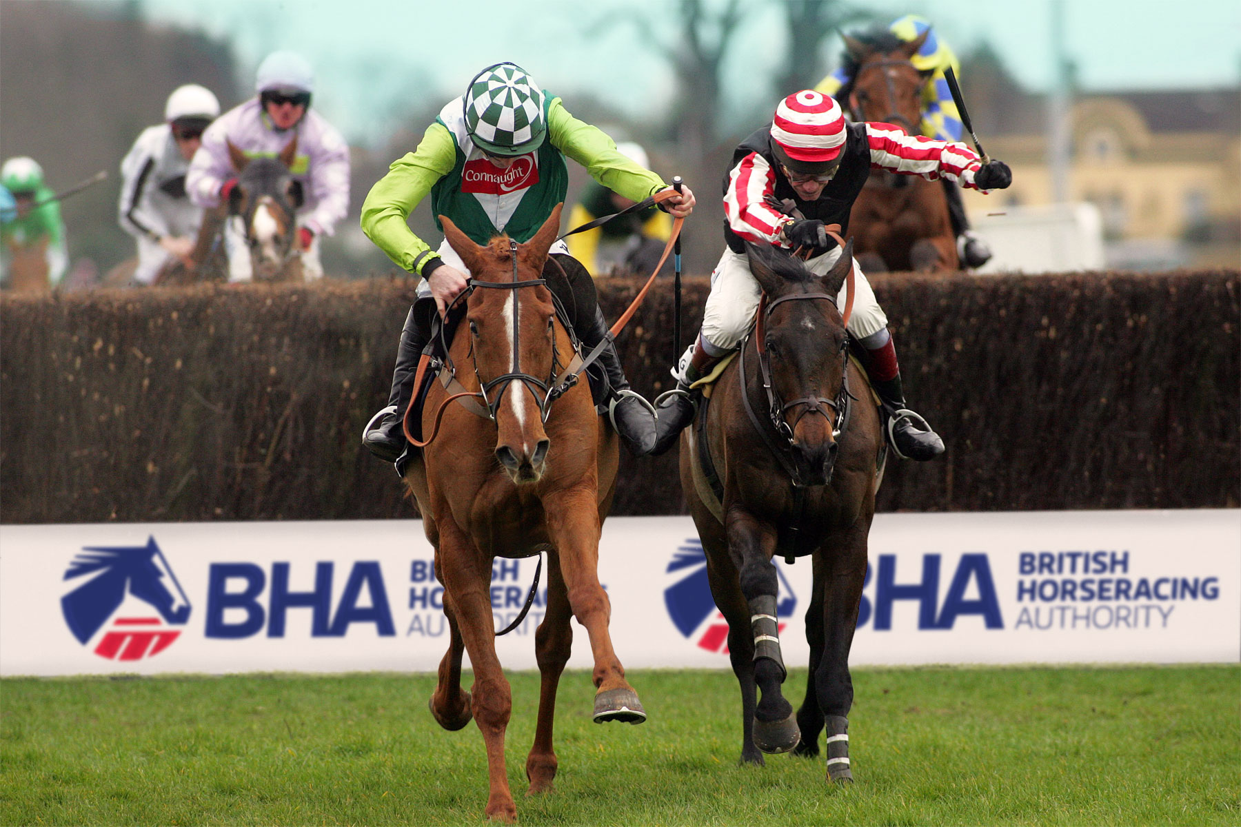
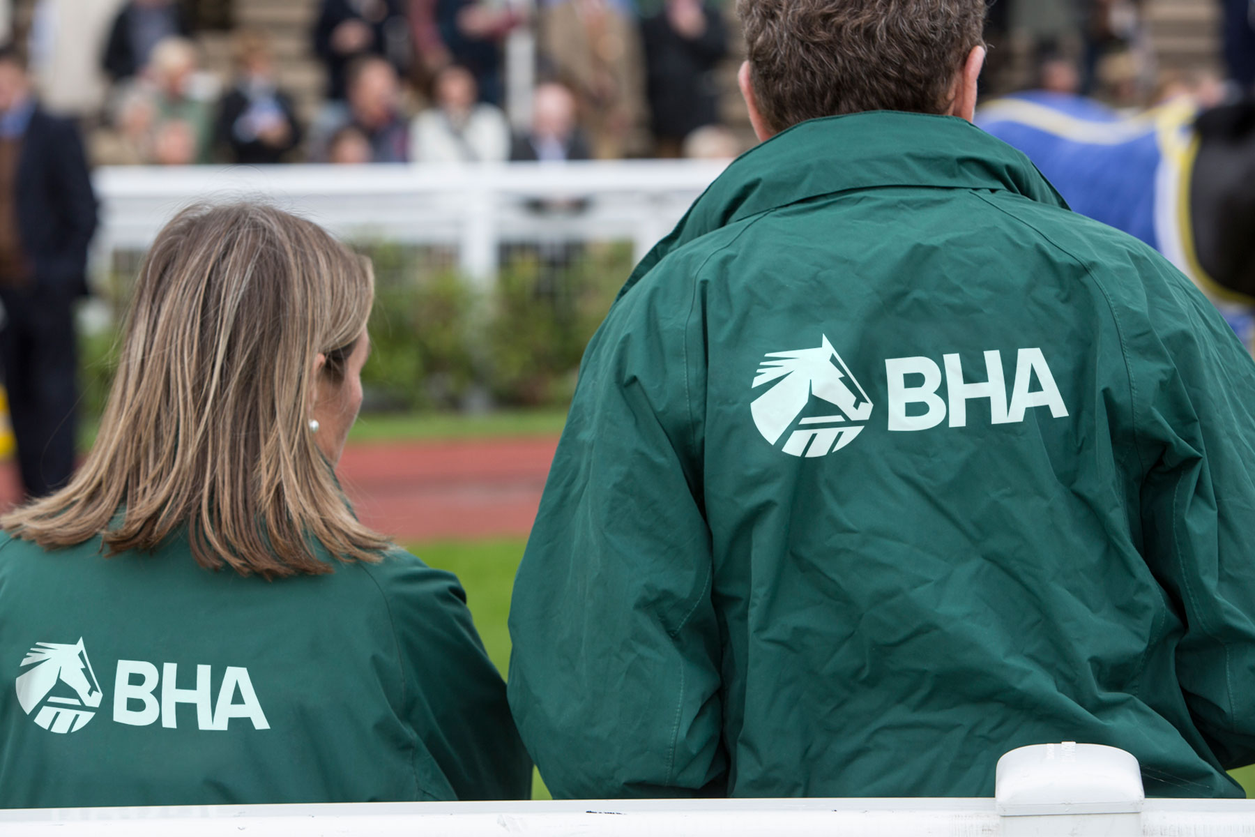
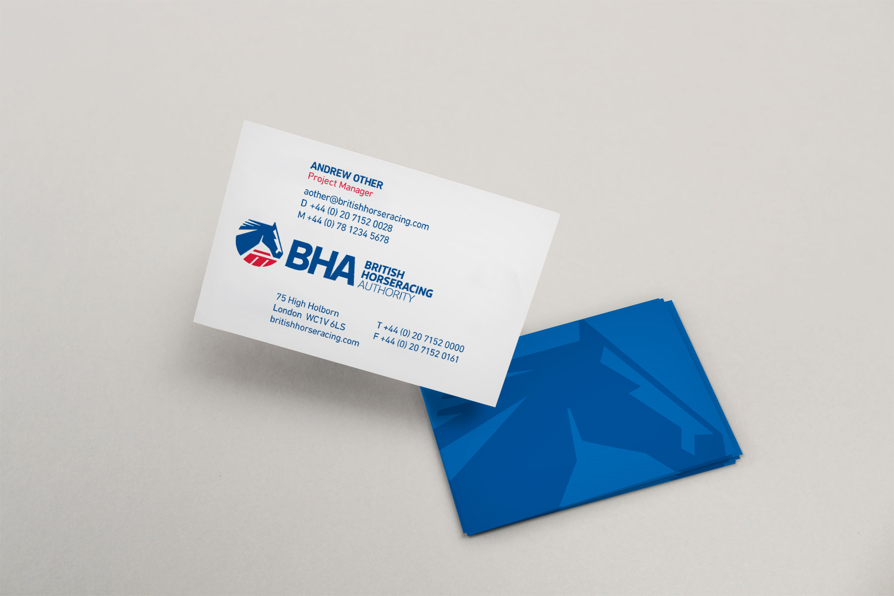
The branding is flexible for a variety of colour backgrounds. The logo and word mark are distinctive and clear, which aids visibility in the field.
-

The brand is strong and easily recognisable on any colour background.
-

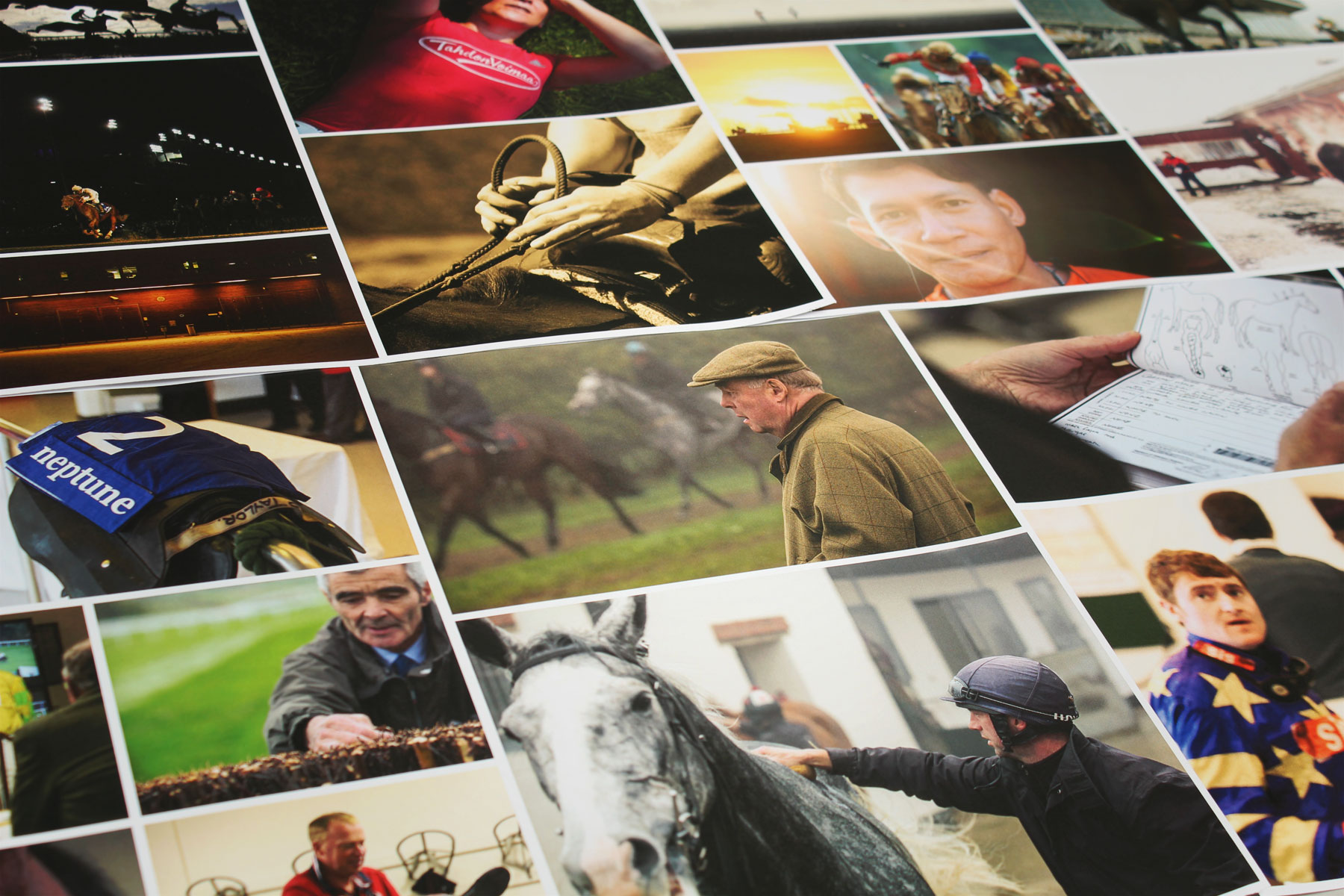
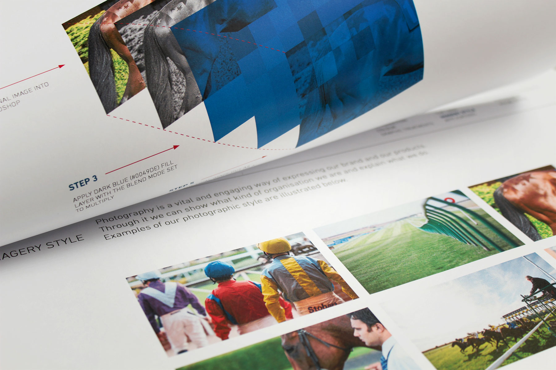
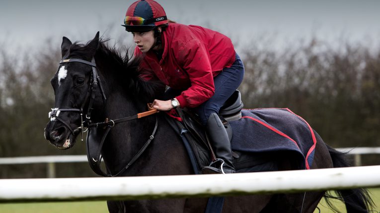
Custom photography was commissioned to get behind the scenes and document all aspects of racing, from mucking out to weighing in the jockeys.
-

The brand is easily controlled with in-depth brand guidelines. The brand offers flexibility to inspire designers but has enough control to maintain the brand authority.
-

The guidelines also allow for a range of image treatment techniques. This gives flexibility when rolling the brand out across multiple executions.
-

The brand encompasses both formality and a dynamic, progressive feeling.
-

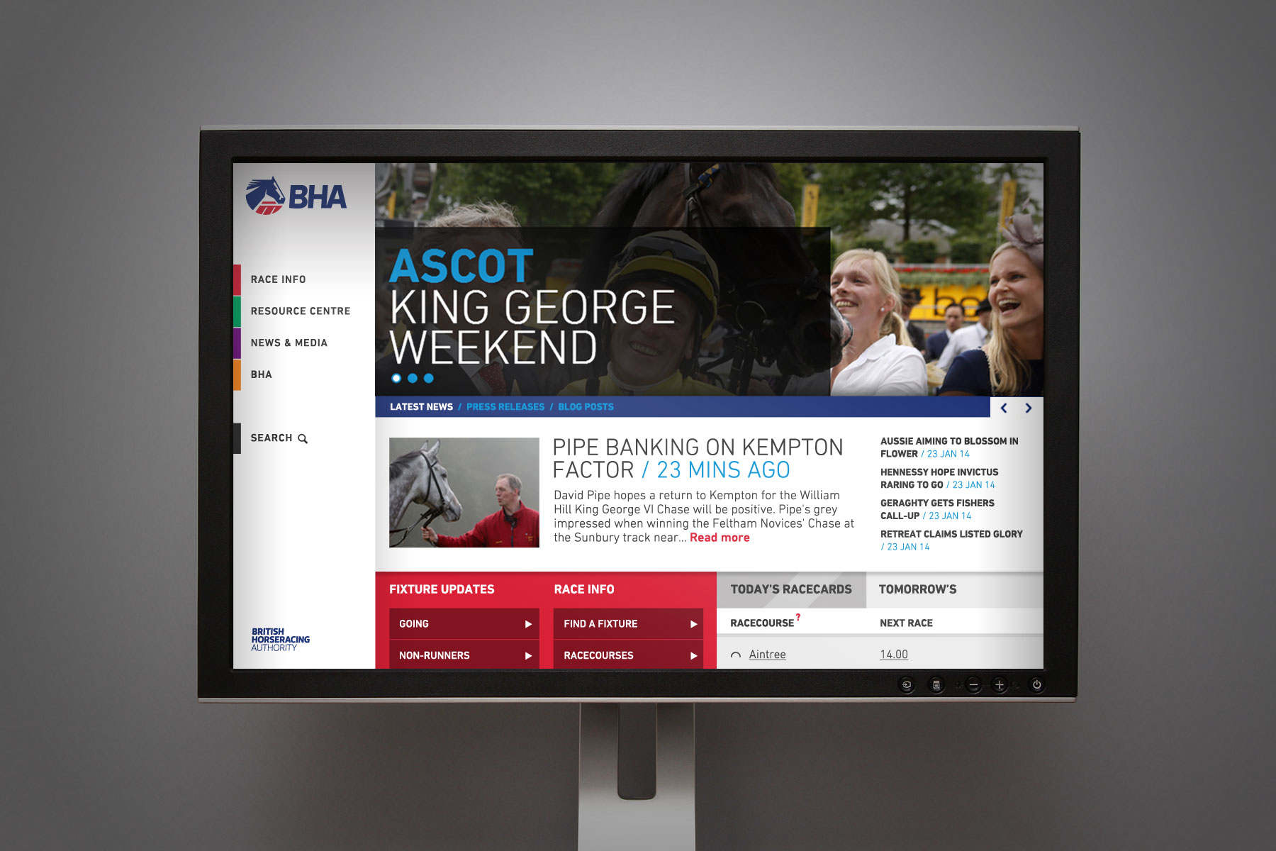
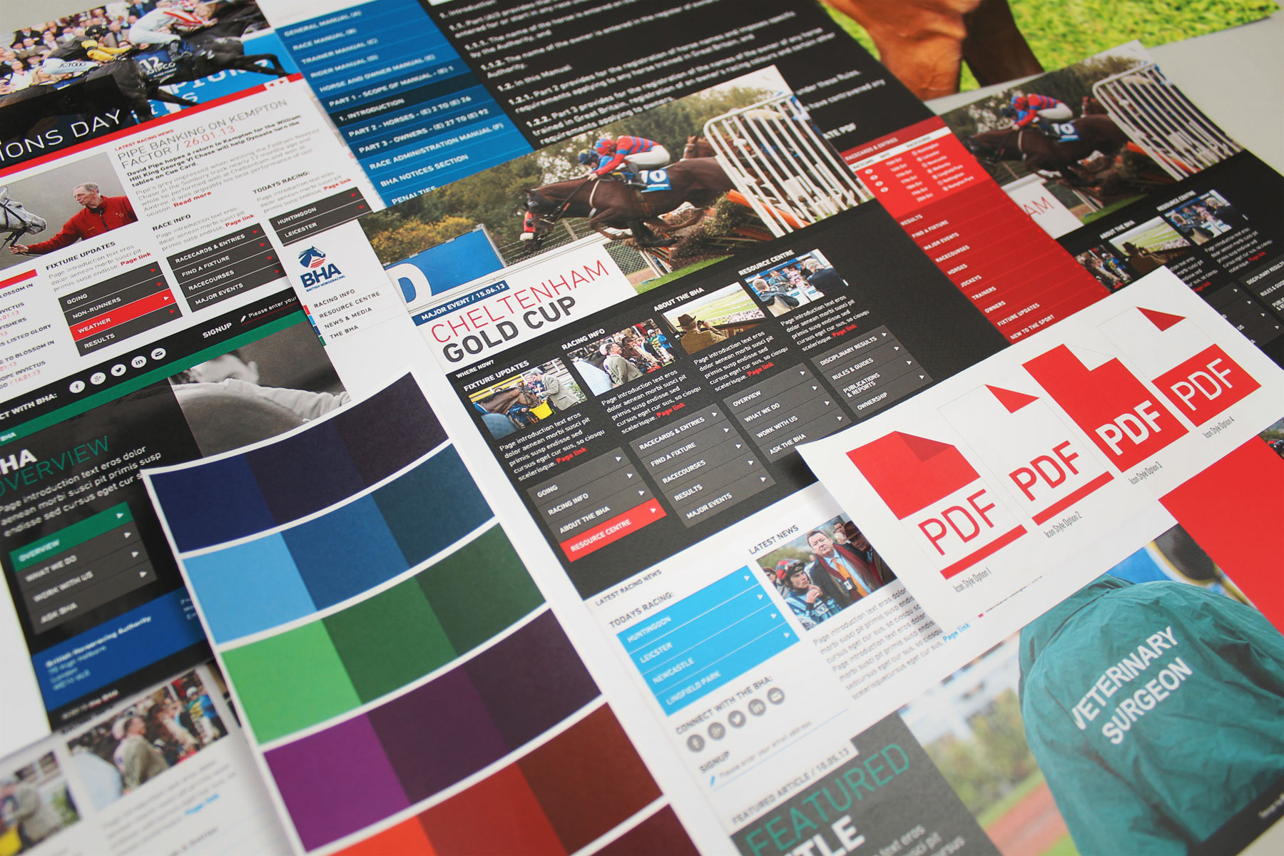
This is the branding in a digital space. A secondary colour palette is used for website section colours.
-

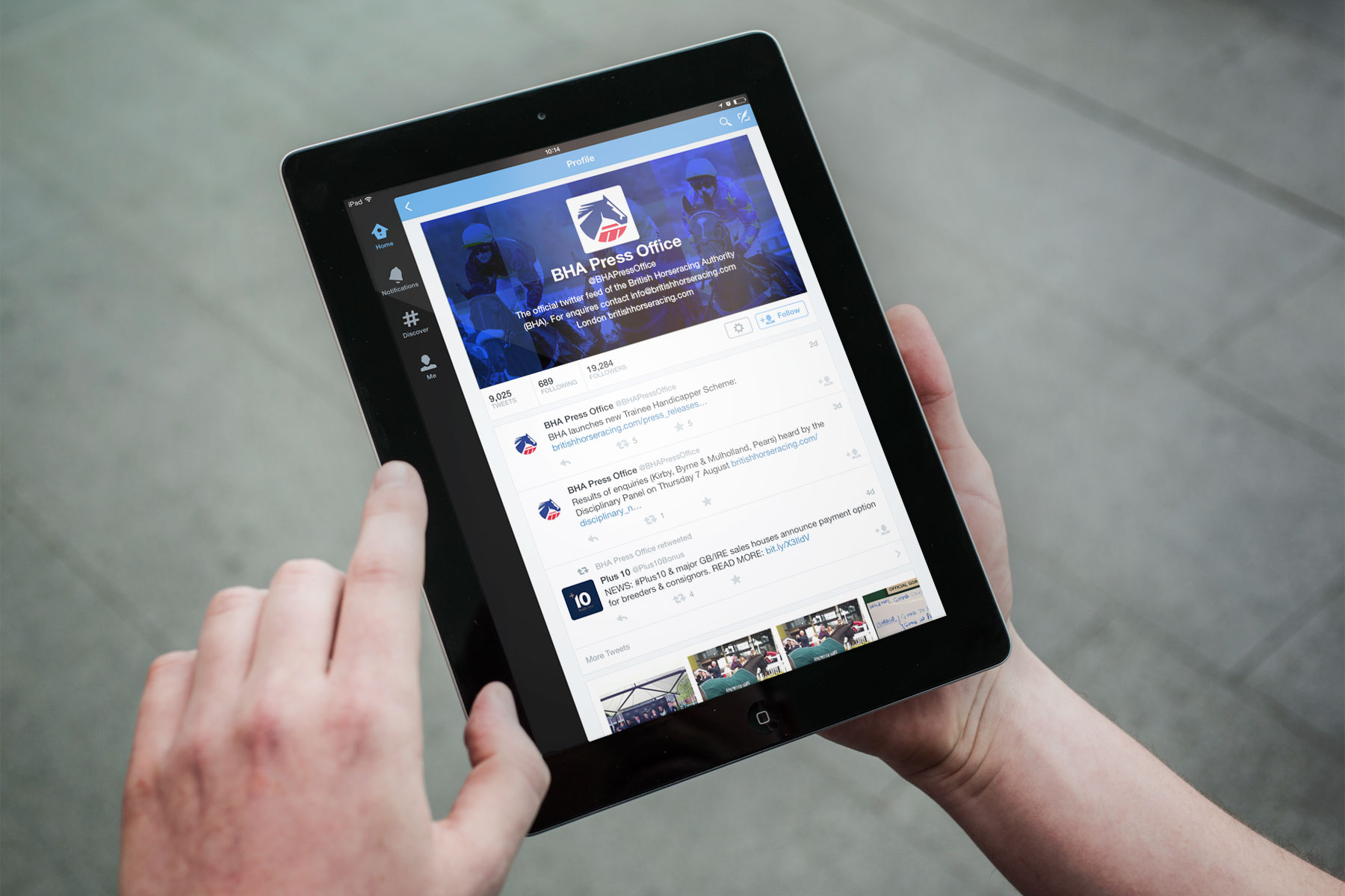
The branding at work in a social space.
-

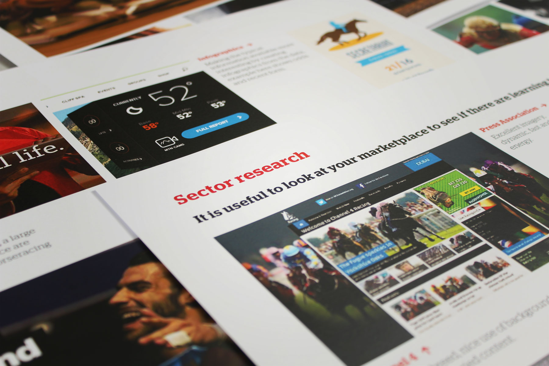
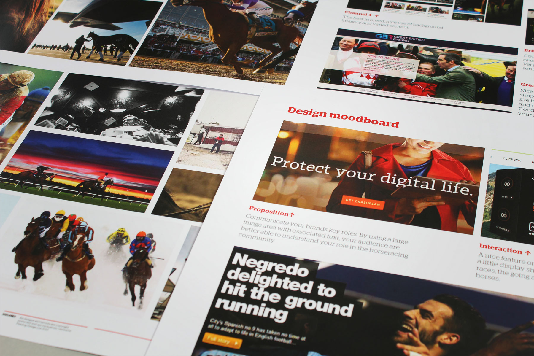
Sector research was carried out to establish functionality requirements and to ascertain gaps in information that was not highlighted in stakeholder research.
-

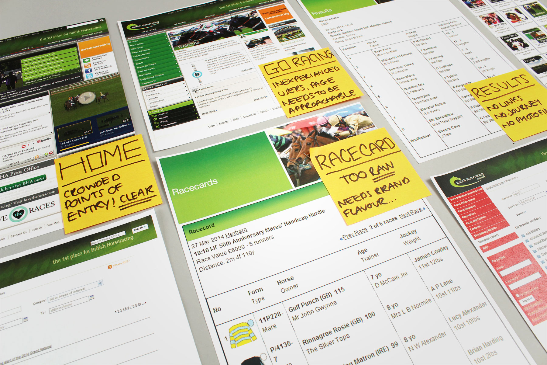
An initial audit was carried out across the BHA website. This included UI/UX, navigation and aesthetics.
-

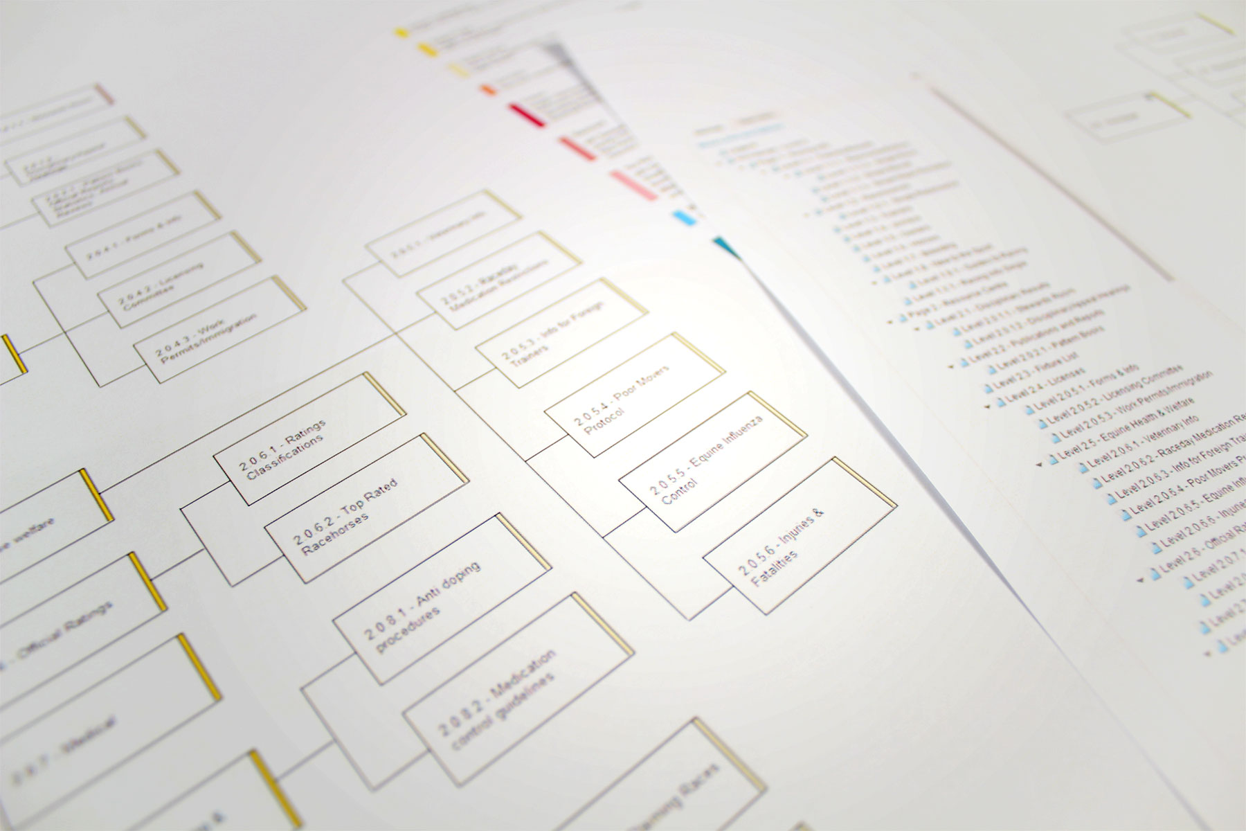
Extensive planning of the site was carried out in collaboration with the BHA. The previous site had become bloated over time and a full restructure was essential.
-

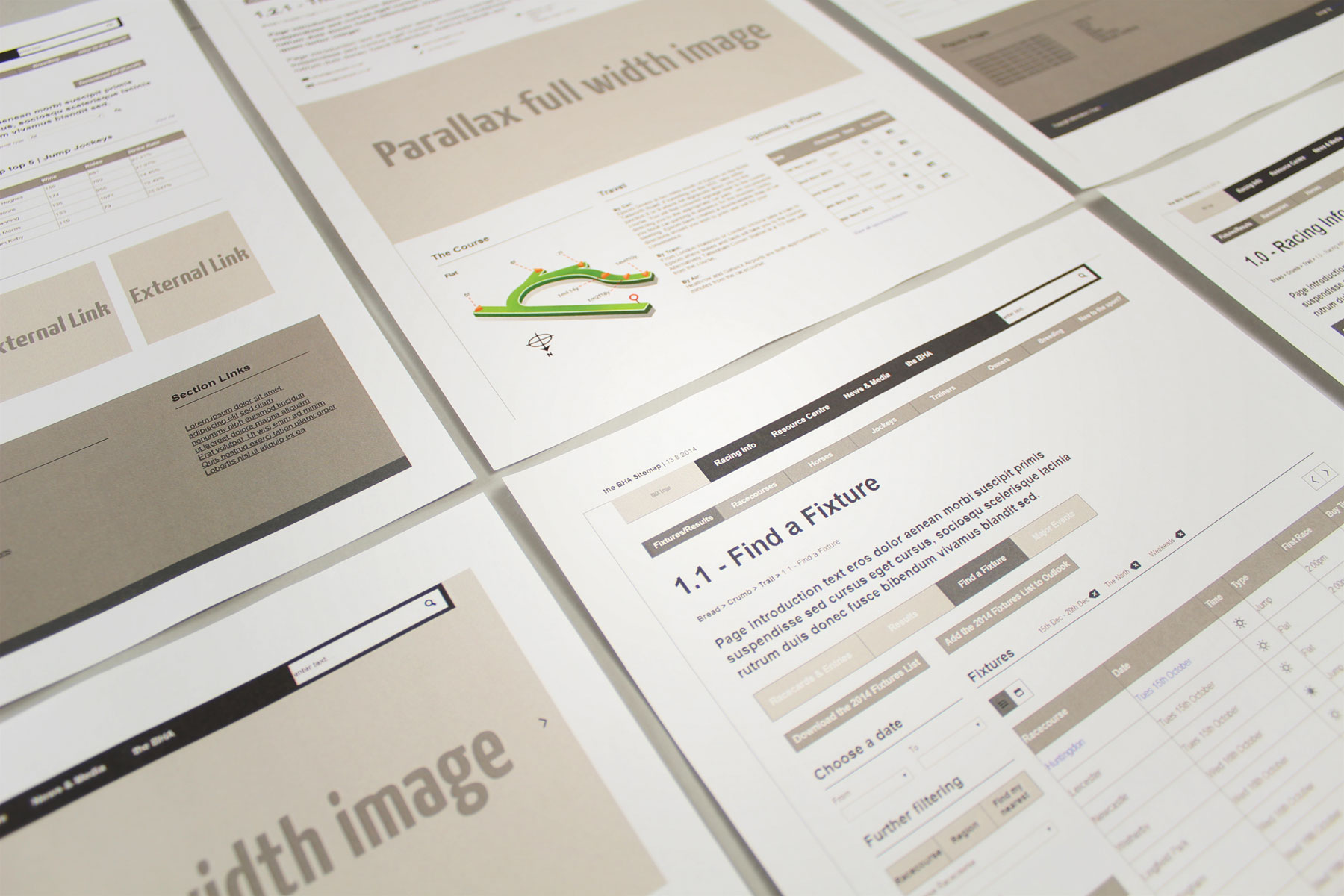
Interactive wireframes were produced, covering every single page in the site build. This enabled the number of user testing sessions to maximise usability.
-

Interactive wireframes were produced, covering every single page in the site build. This maximised usability for the number of user testing sessions.
-

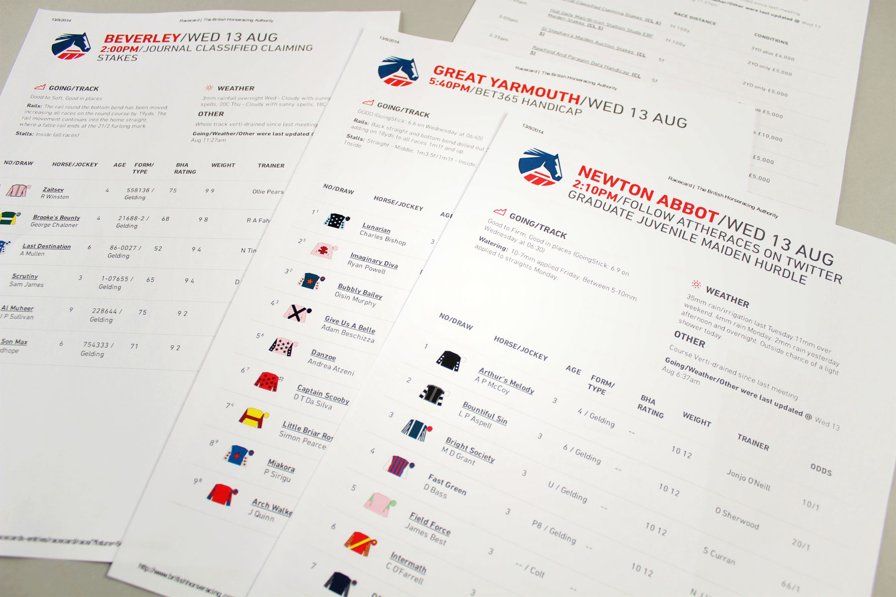
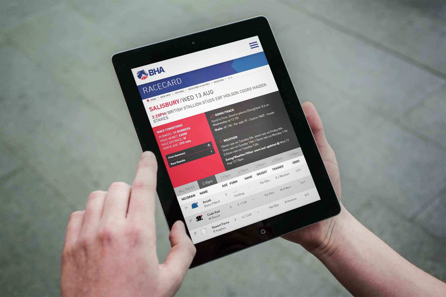
We developed a print friendly page for the racecards pages. This meant that users were able to take racecards with them if they didn’t have a mobile device.
-

We extensively explored early concepts in development, typography, colour schemes and iconography.
-

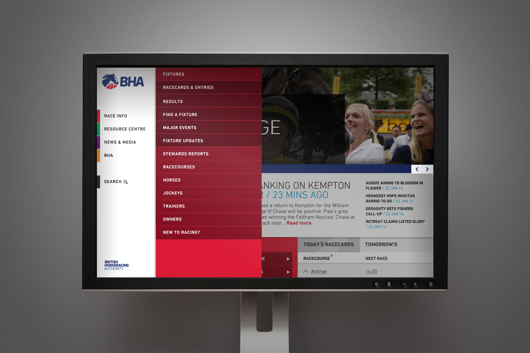
The navigation allows advanced users to directly access content in the menu structure without extensive clicks.
-

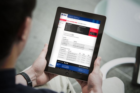
The BHA racecards are served via API and are the most detailed and thoroughly scrutinised in the market. Information is readily available as well as easy to browse on mobiles and tablets.
-

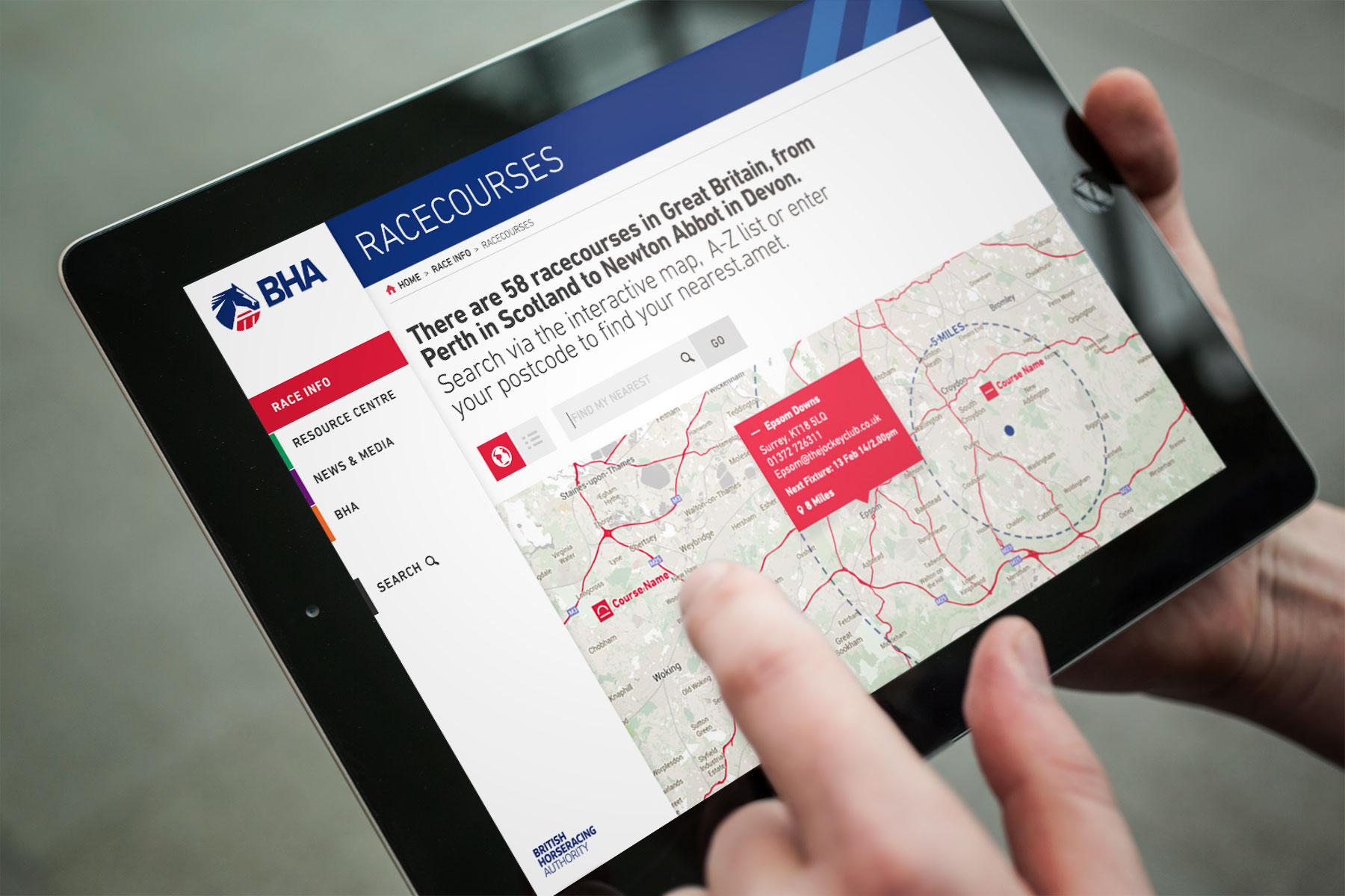
As a portal for information from disqualified jockeys to racecourse locations, the site needs to be easy to use in all situations. Here, we can see how easy it is to locate your nearest racecourse.
-

-

The resource centre is frequently used by industry insiders. The content of the section covers licence downloads for jockeys to renew their permits, right through to setting up a racecourse guide. This section therefore had to be easy to browse both on the move and on desktop format.
-

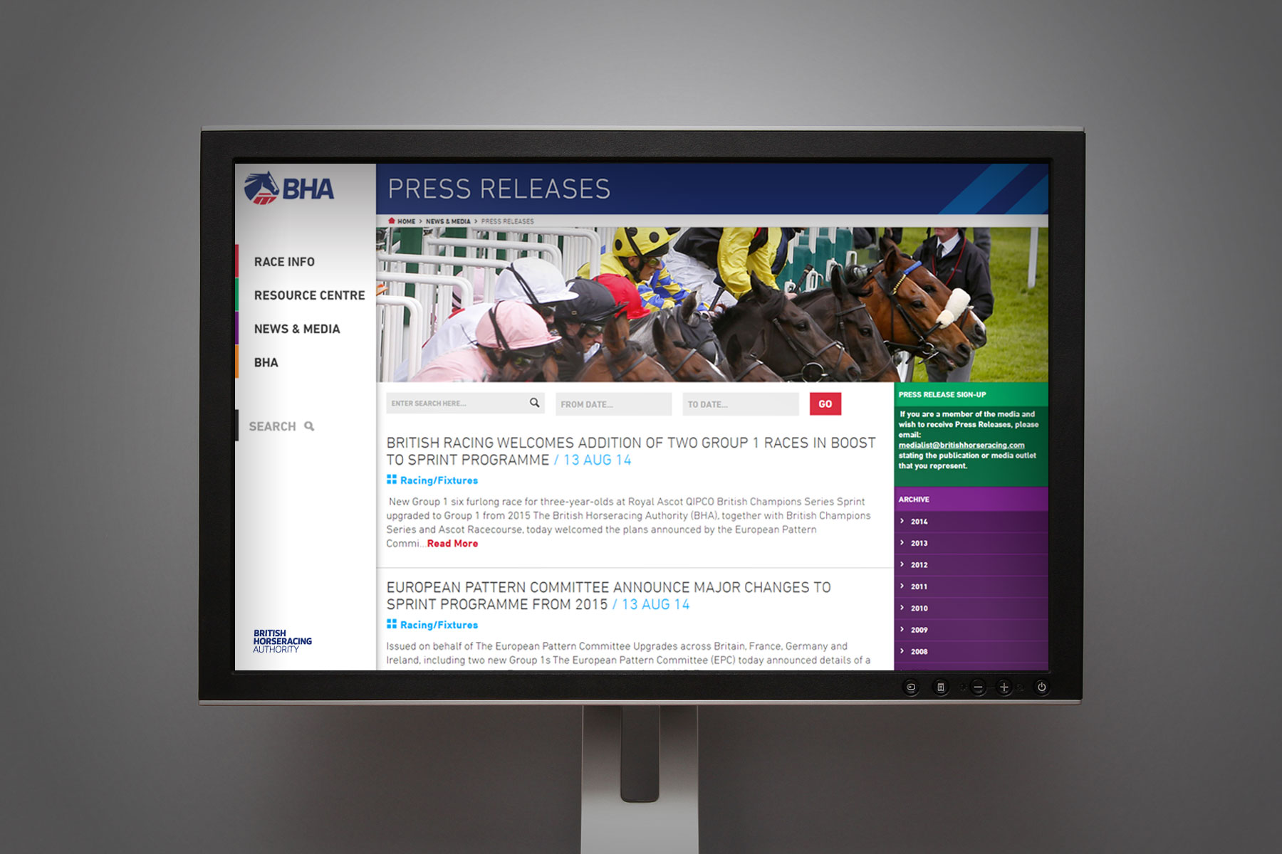
Another feature of the site was its extensive archive of news.
-

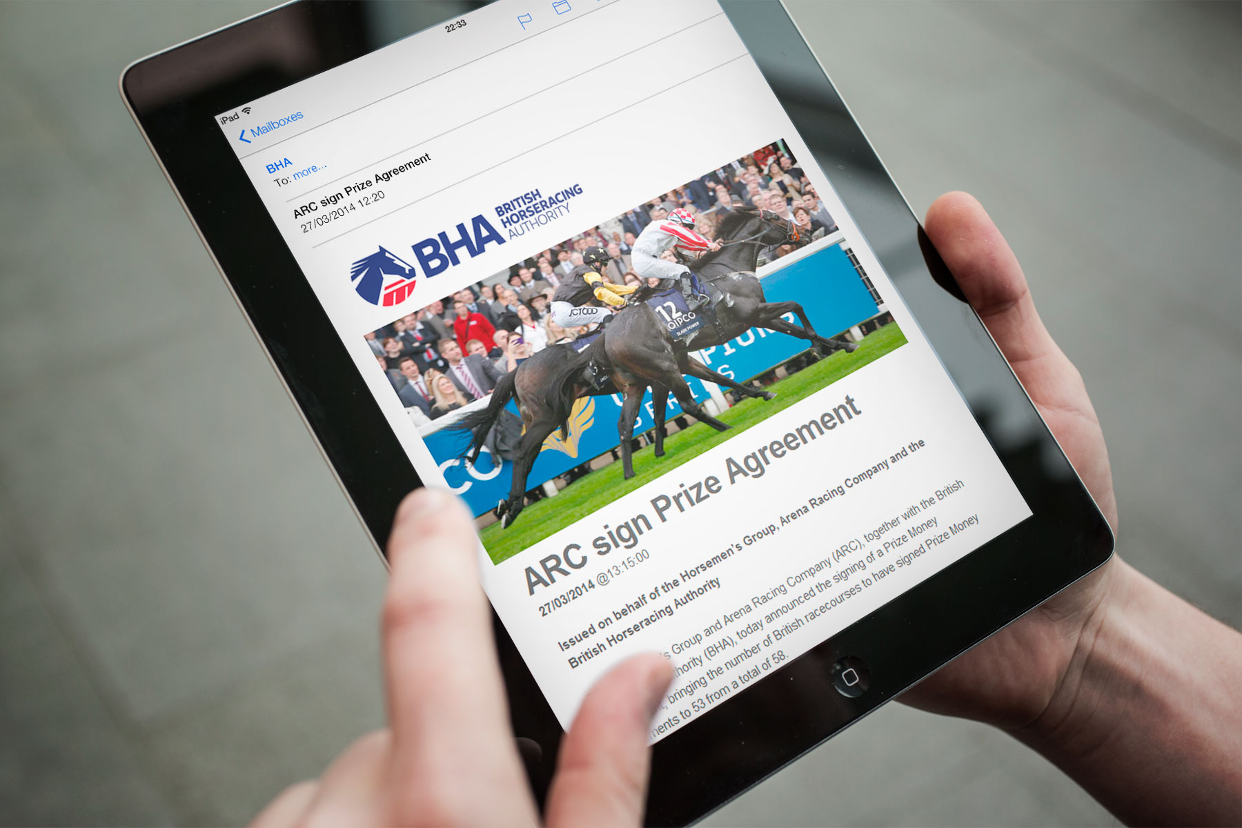
We revisited the methodology behind BHA Press Releases, Mailchimp was used to manage complex mailing lists with advanced segmentation.
-

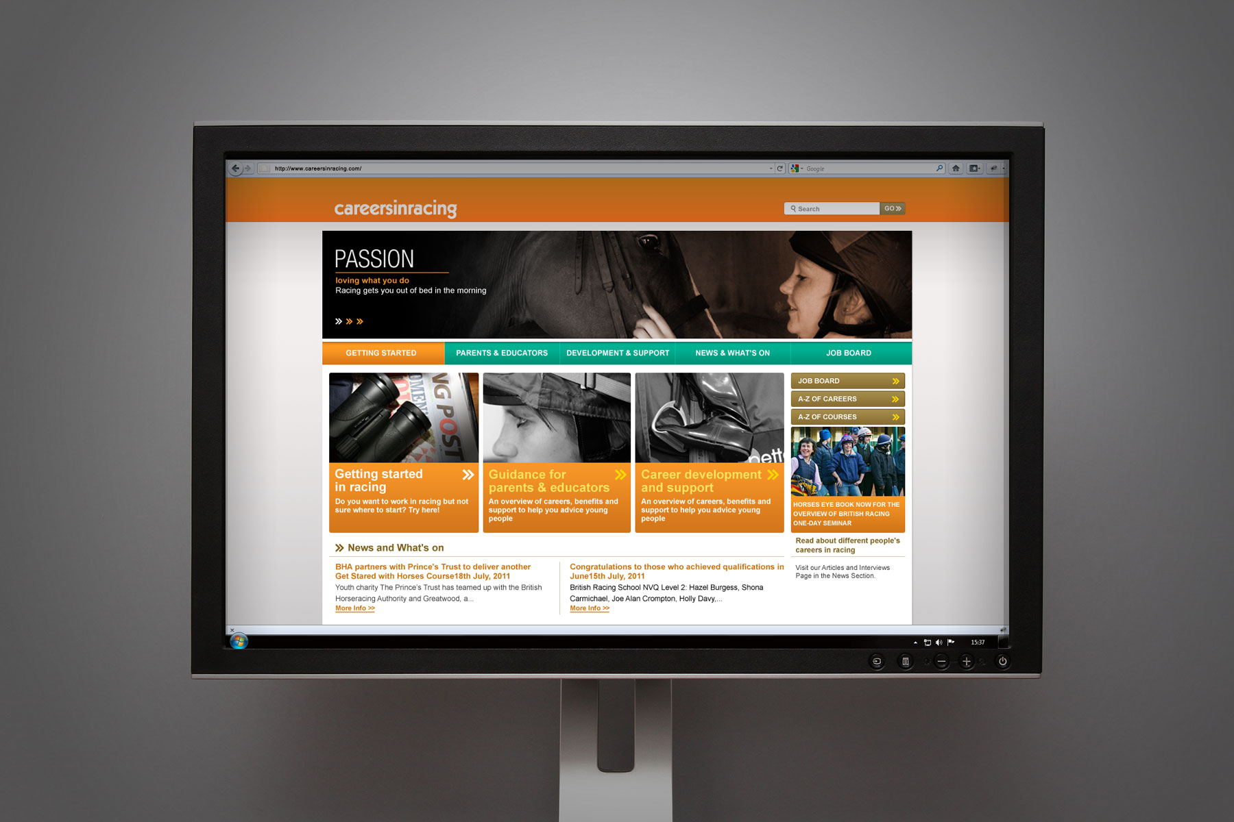
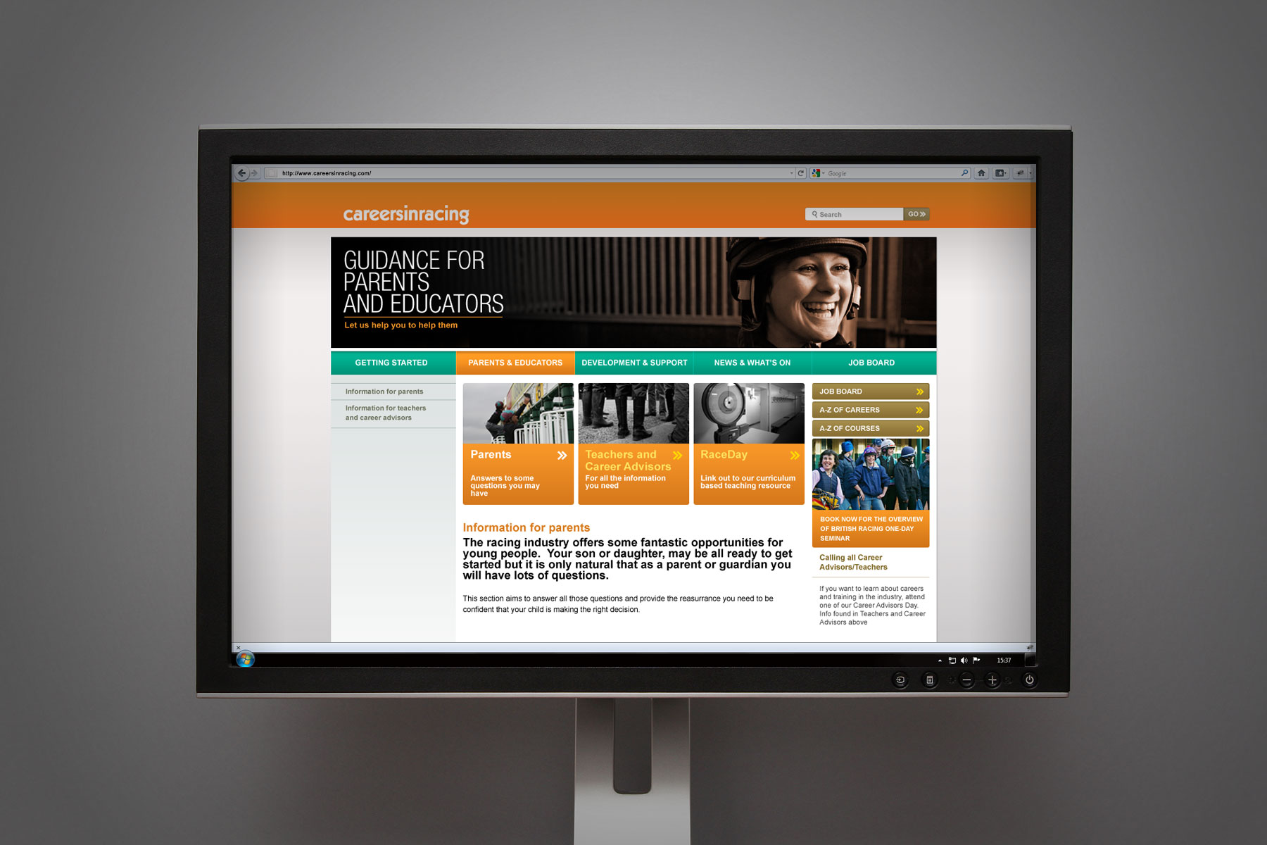
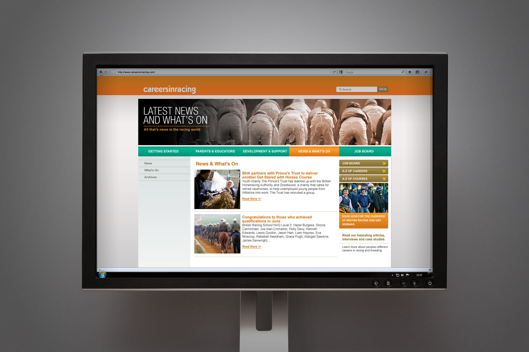
The website, like the careersinracing brand, carries its own identity with a strong colour palette, unique use of imagery and strong clear messaging.
-

The site architecture ensures that the information is clear and easily digested by the target audiences.
-

We designed and developed a suite of page templates, and built this into a customised easy to use content management system.
