Brand Identity and Website

Vitruvian

A perfect balance of creative vision and entrepreneurship.

Vitruvian Partners is an independent private equity firm based in Mayfair, London. The business specialises in middle-market buyouts, growth buyouts and growth capital investments in the UK and elsewhere in Northern Europe. Our work for Vitruvian extended to strategy, messaging, brand identity, visual identity, print design and web design / build.

The final Vitruvian logo and icon conveys a formal yet intriguing brand spirit.

Vitruvian have grown dynamically, from a start up of three to a respected equity business where the first fund created by the business closed at 925 million Euros.

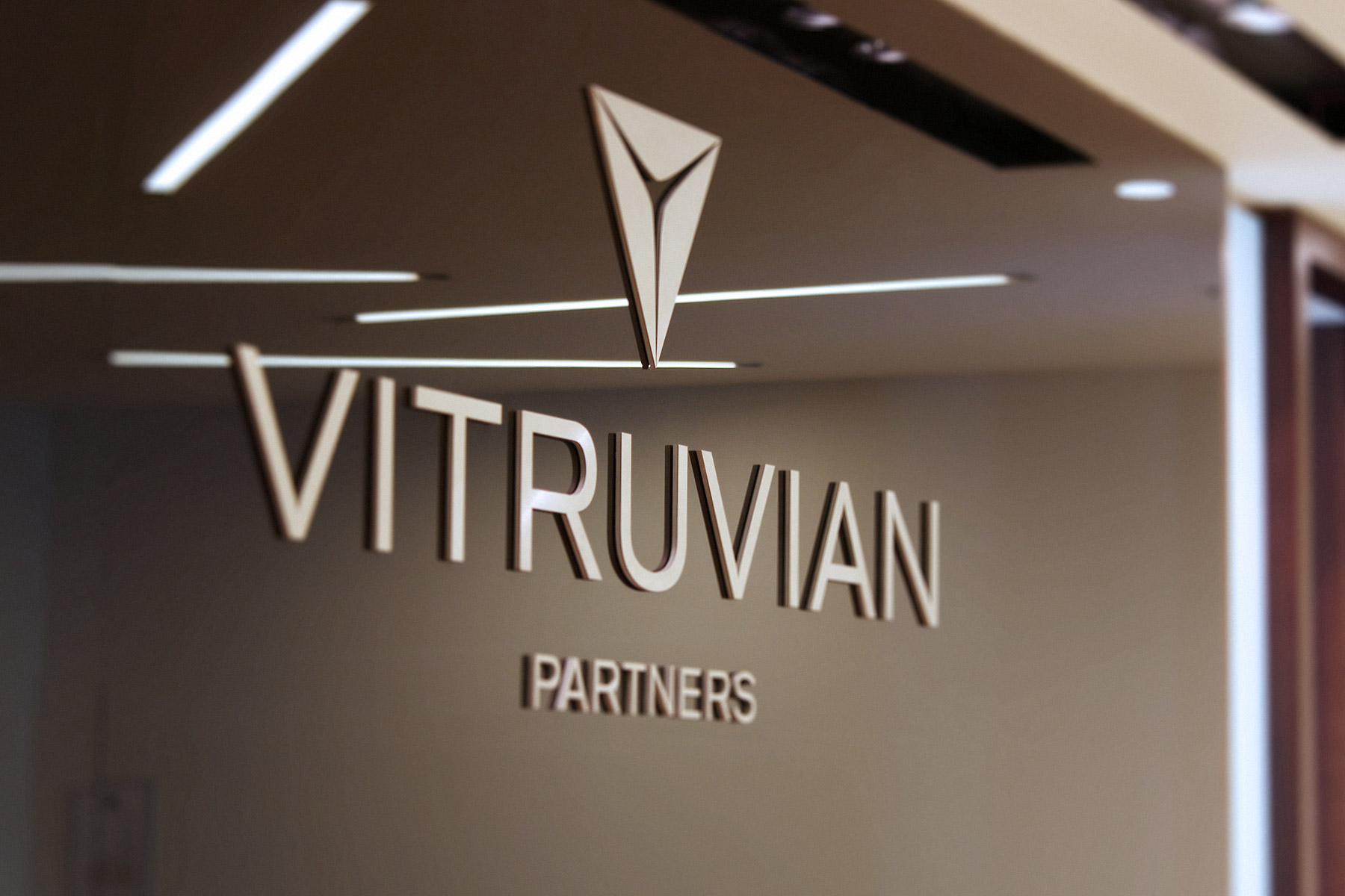
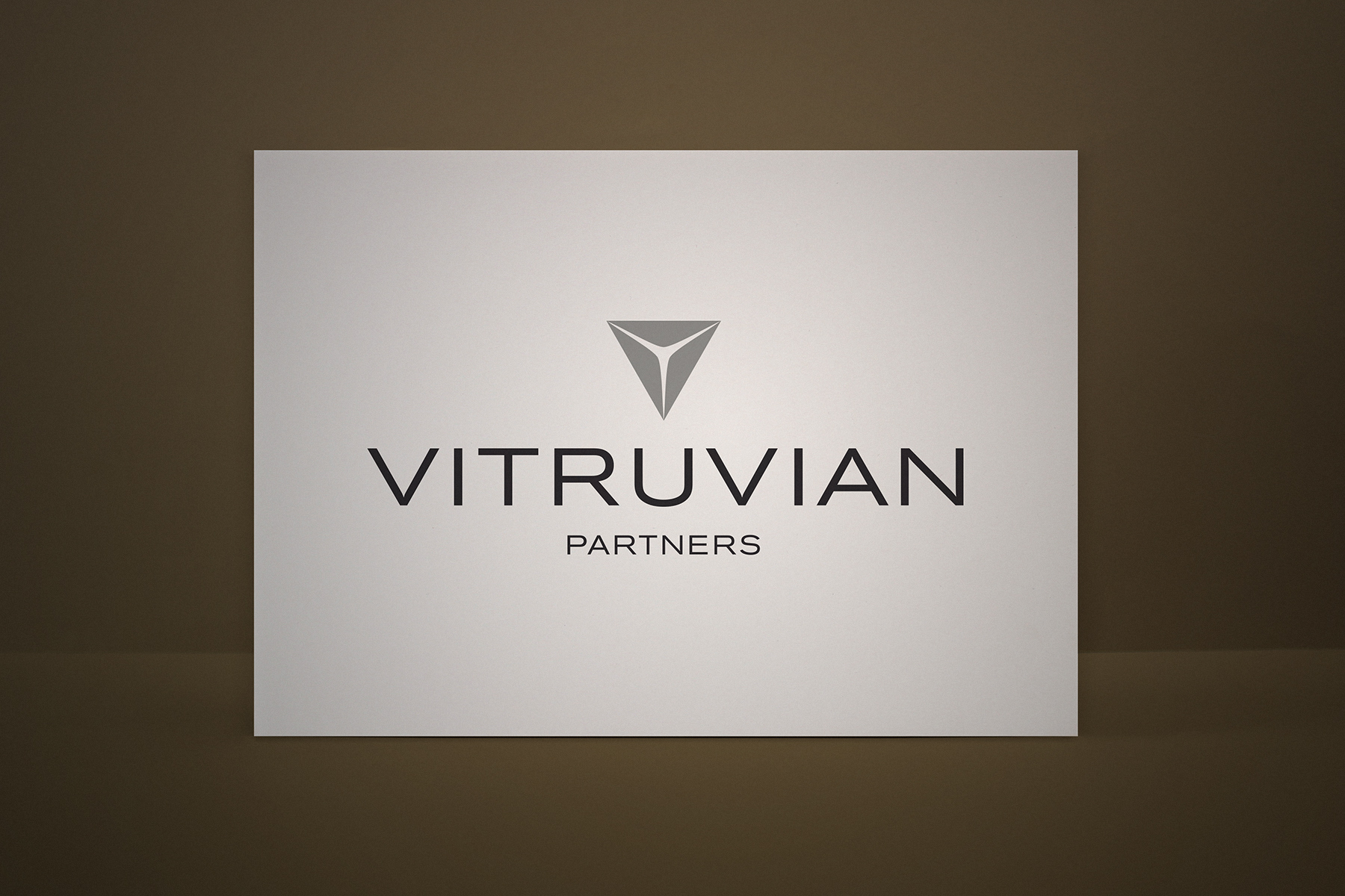
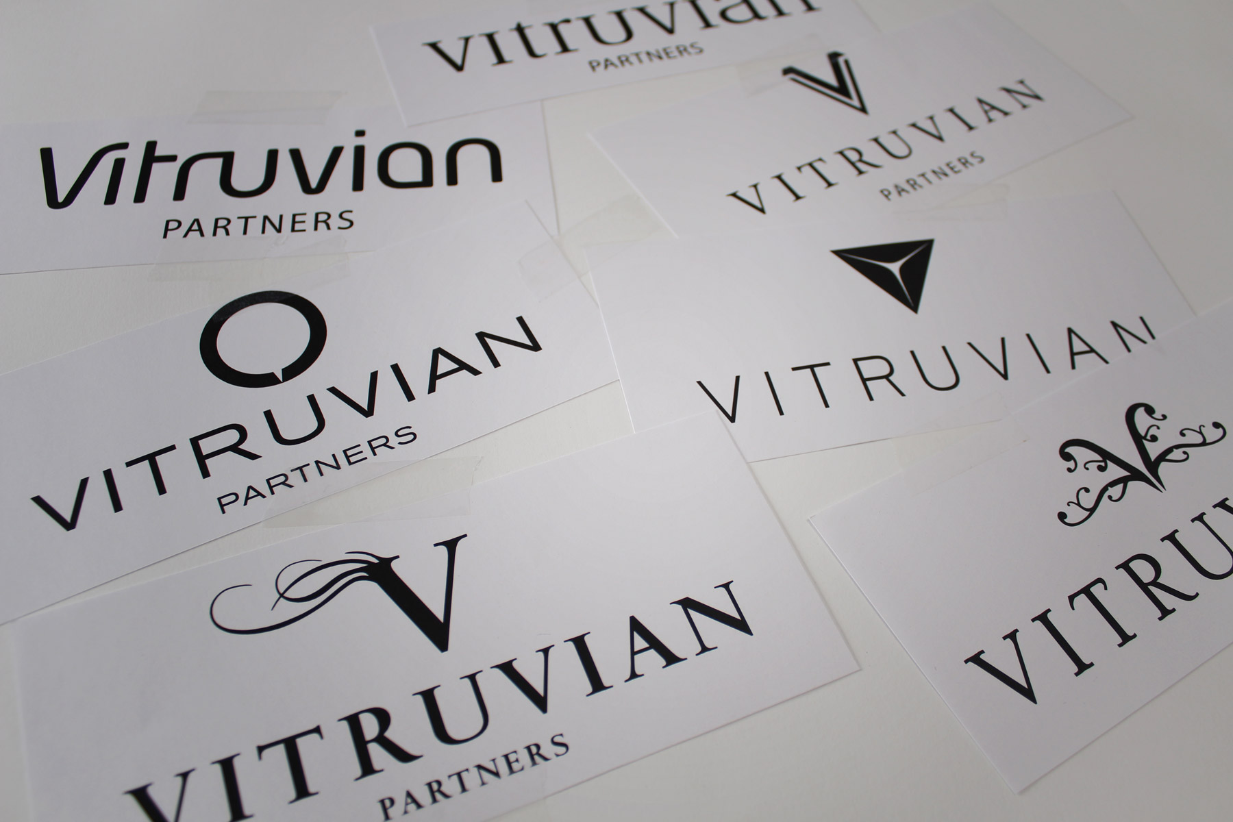
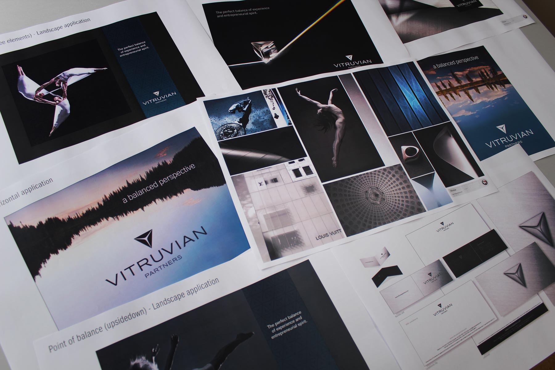
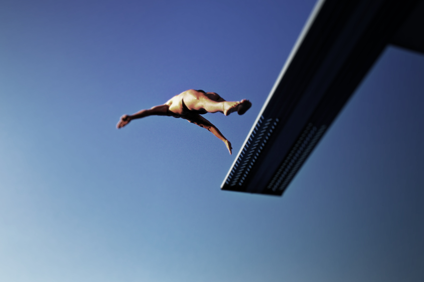
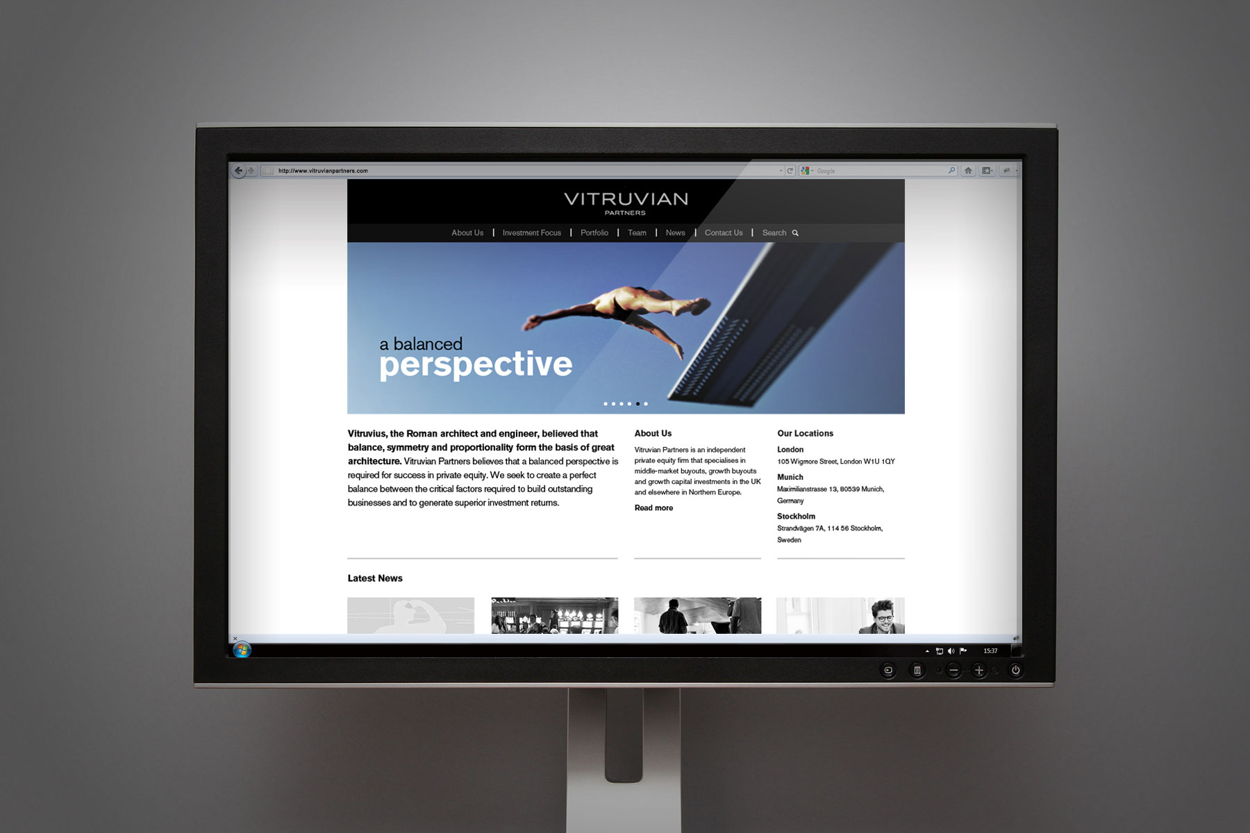
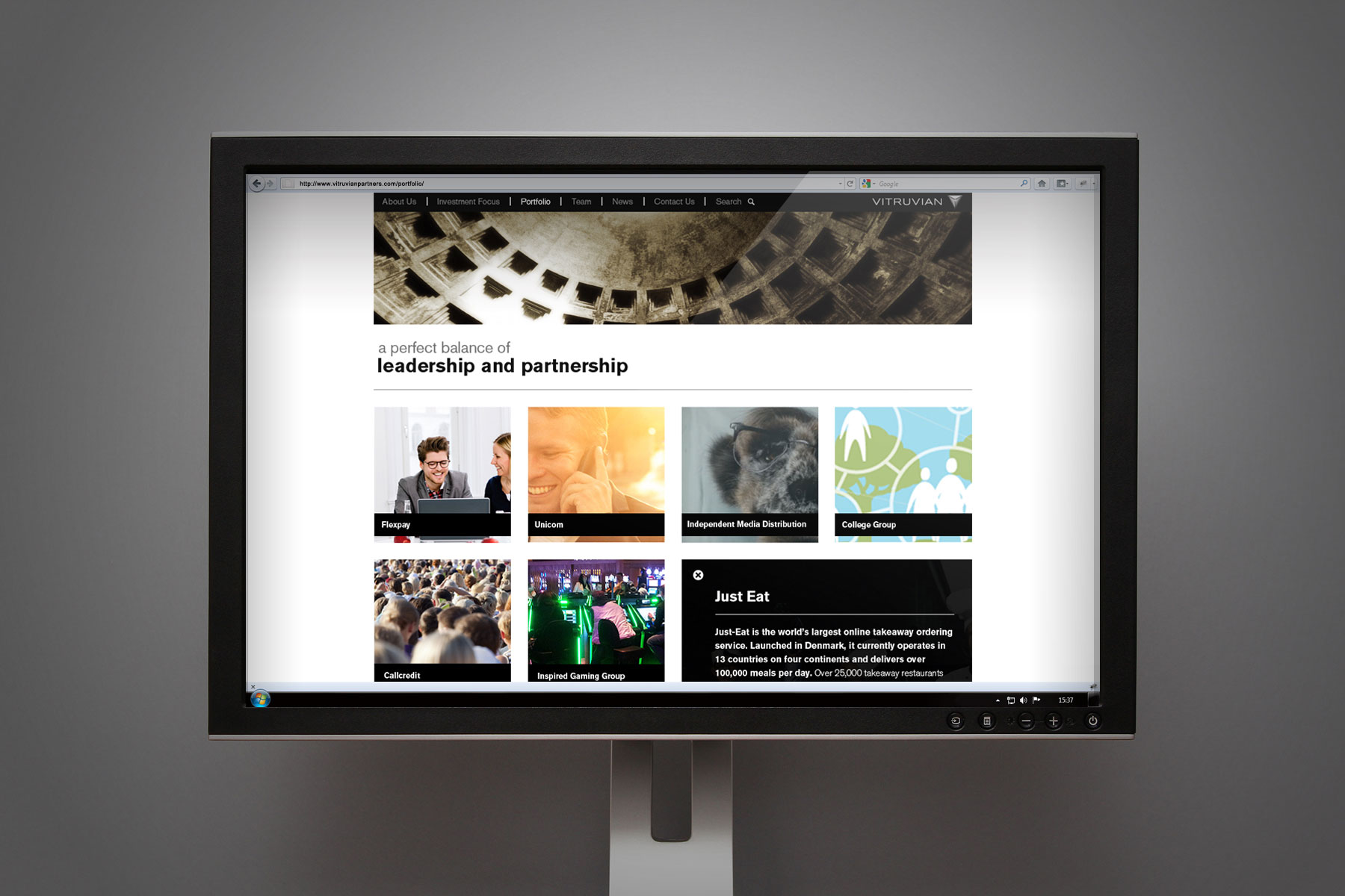
The founders of Vitruvian wanted to express the importance of maintaining a synergy between their management team’s entrepreneurial spirit and the financial institutions involved within the deal making processes. The brand identity and subsequent visual strategy had to reflect and underpin these core principles. Firedog developed a suite of key messages that were based on concept of “A Perfect Balance”. These in turn were supported by associated brand imagery.

A subtle visual pattern device is used throughout the identity, conveying quality and prestige.

The logo symbol itself is a reflection of Da Vinci’s Vitruvian man ... stripped down to its very basics, the inverted pyramid is both balanced and harmonious.

The logo symbol itself is a reflection of Da Vinci’s Vitruvian man drawings and notes, without the associated cliché factor. Stripped down to its very basics, the inverted pyramid is both balanced and harmonious. The brand also conveys a slightly mystical feel, which creates intrigued and alludes to the skill behind the trade. The resulting brand language is a cohesive and stylish representation of the core beliefs distilled within the Vitruvian Partners team.

The identity revolves around the essence of quality. Here, printing proofs control the output of stationery.
Imagery focussed along the perfect balance narrative.

The business has grown healthily over the last fifteen years with a current value of 10.4 billion Euros across four funds.

Once the brand look and feel was established, primary applications and the website were also produced by Firedog. The business ten years on has a staff of 56 investment professionals, with more than 85 invested businesses and a current fund value of 2.4 billion Euros.

Expertise Spotlight

The Kaboodle symbol is beautifully simple with a really subtle play in dimensions.

Branding

View case studies
Sign up for our Firedog Newsletter
* = required field