Creativity
Incredible design environments from 2001: A Space Odyssey
Would you believe that it has been over 54 years since the release of the incredible Stanley Kubrick science fiction epic, 2001: A Space Odyssey?
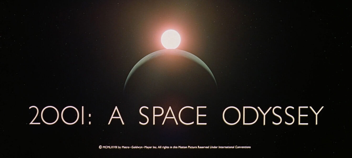
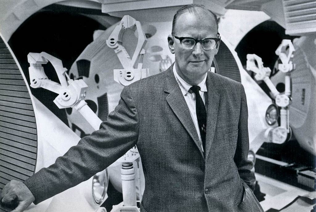
The screenplay penned by Kubrick was inspired by Arthur C. Clarke’s early short story “The Sentinel” and was later developed into a novel released concurrently with the film itself. I have read the book and it really is incredibly imaginative. It represents one of the finest sci-fi epics ever. It deals with both humanity and also plots an early warning for artificial intelligence and future tech autonomy.
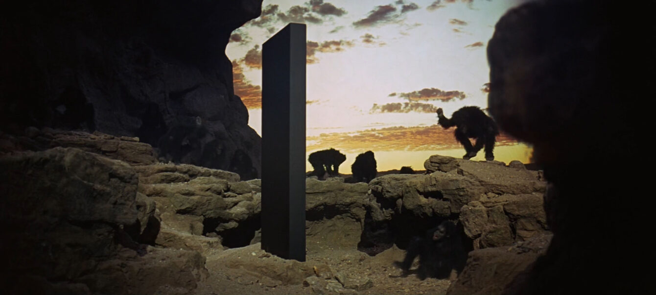
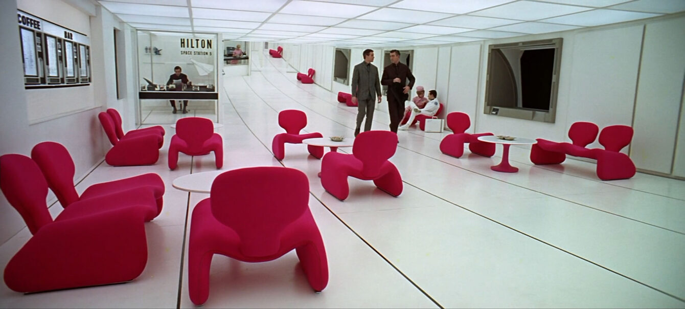
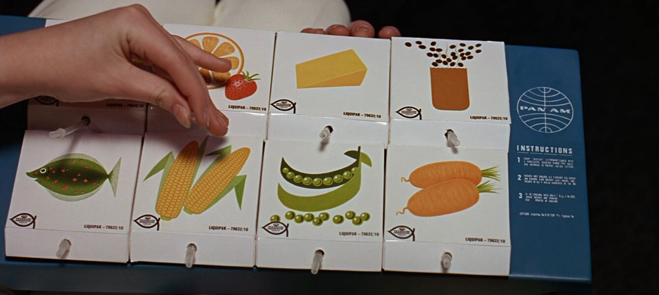
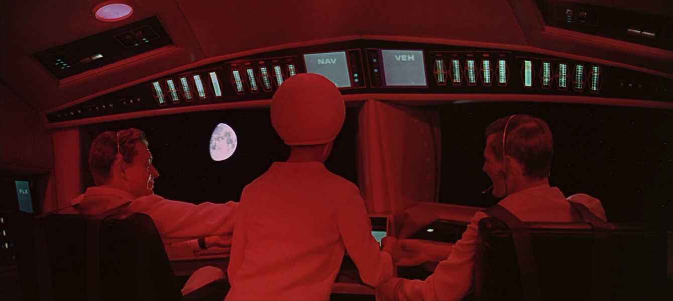
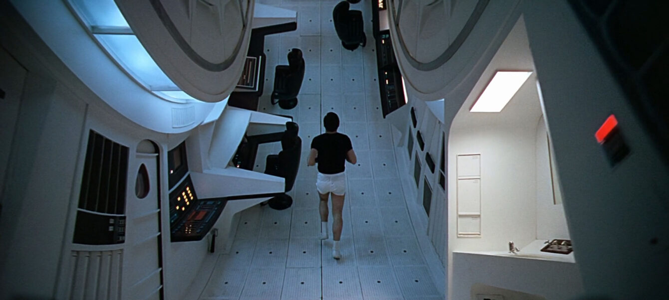
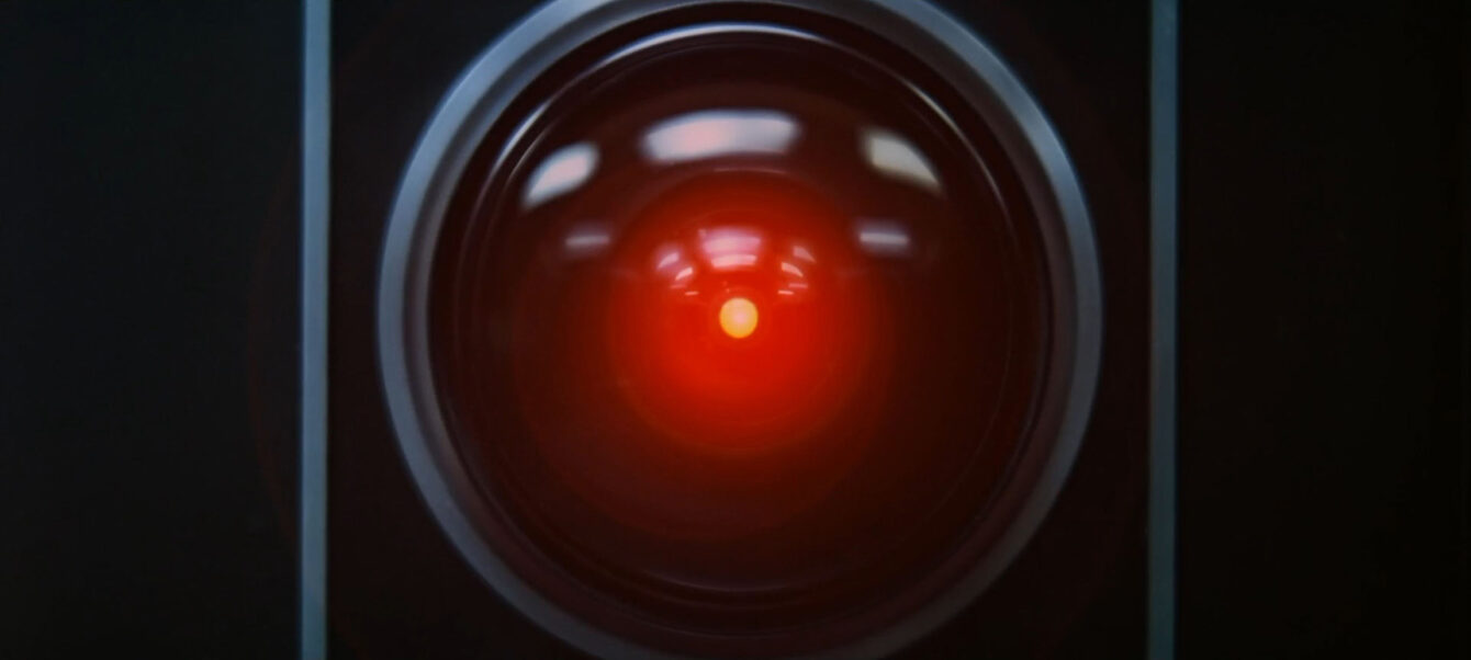
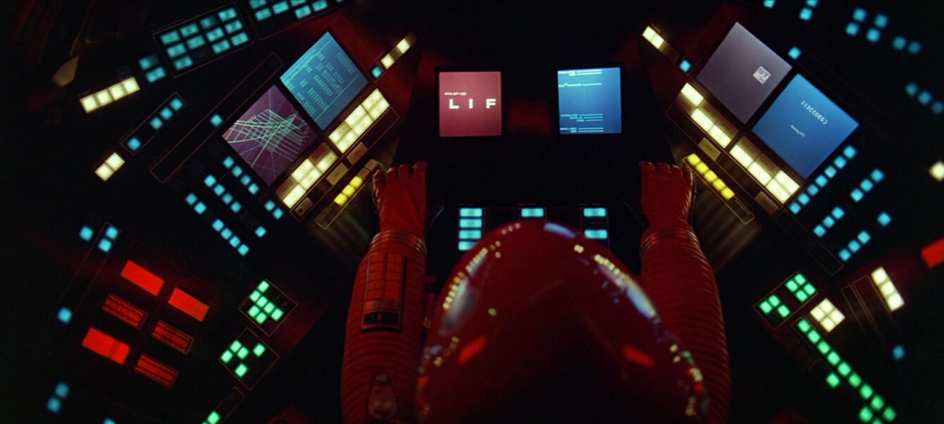
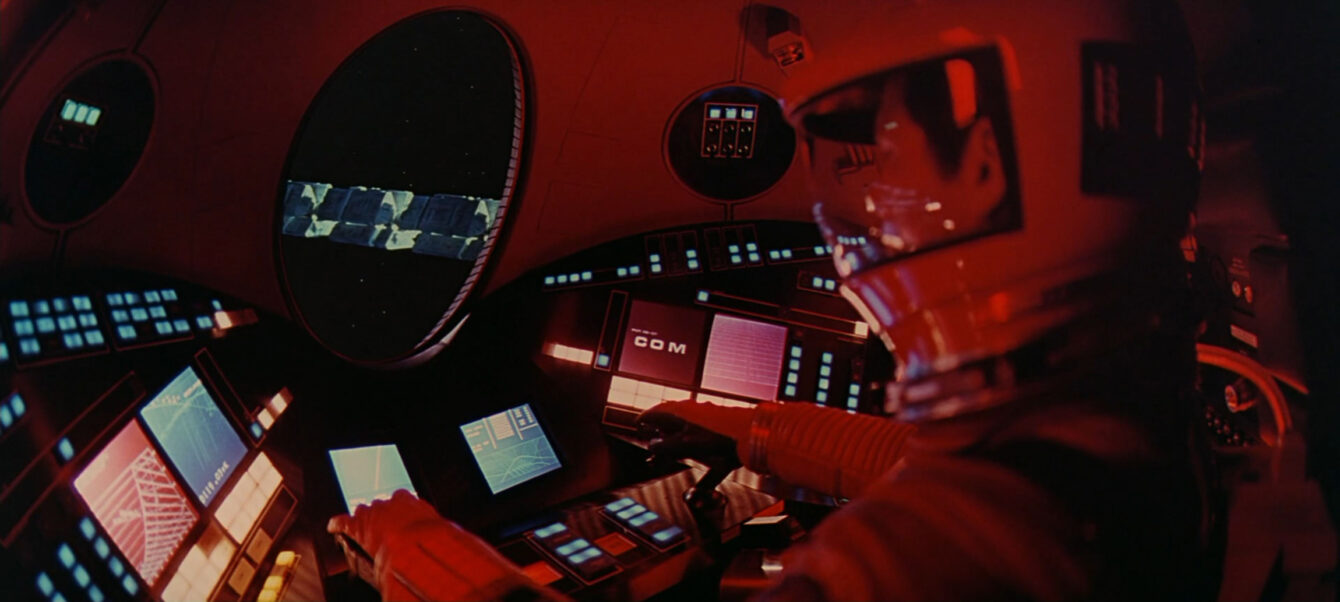
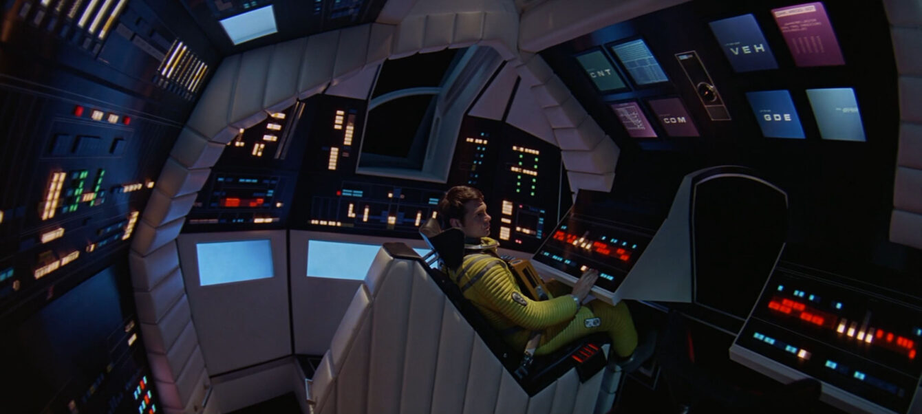
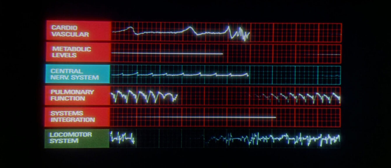
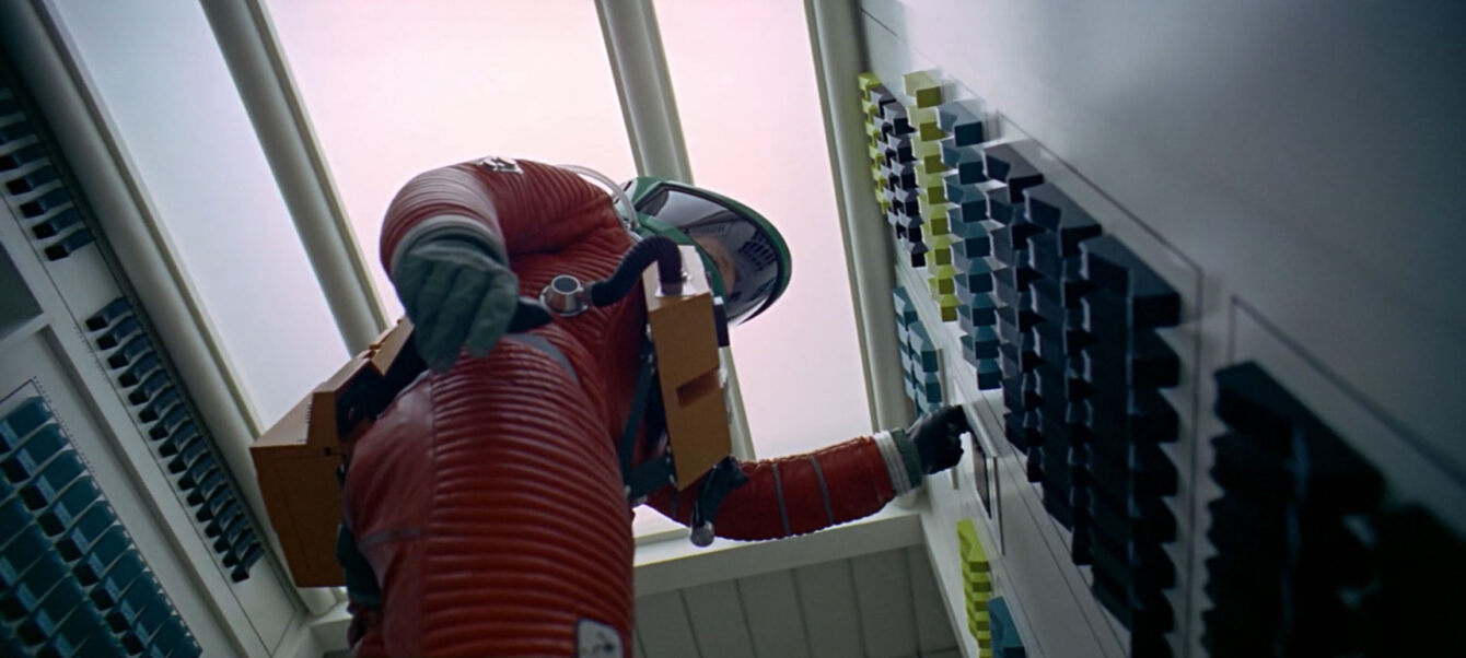
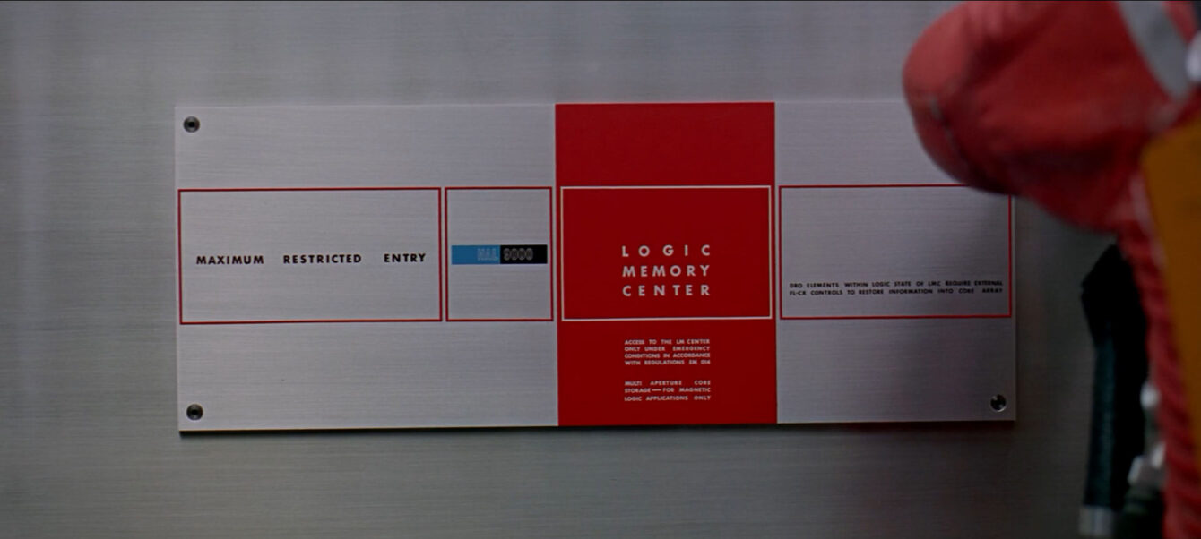
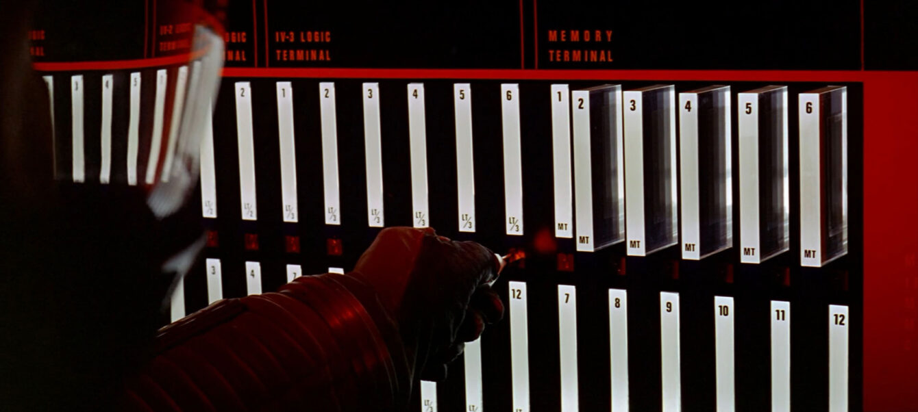
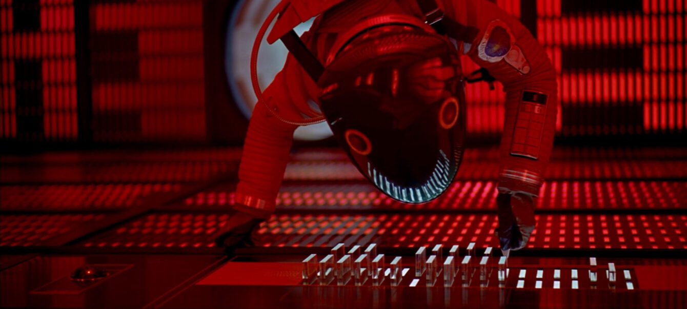
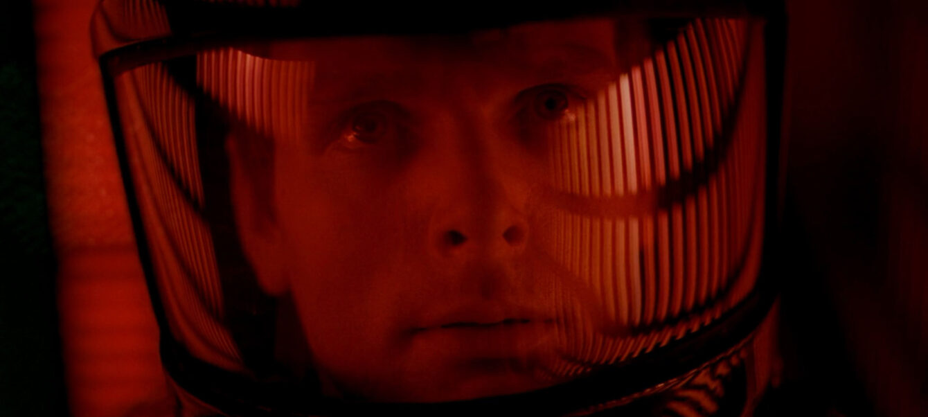
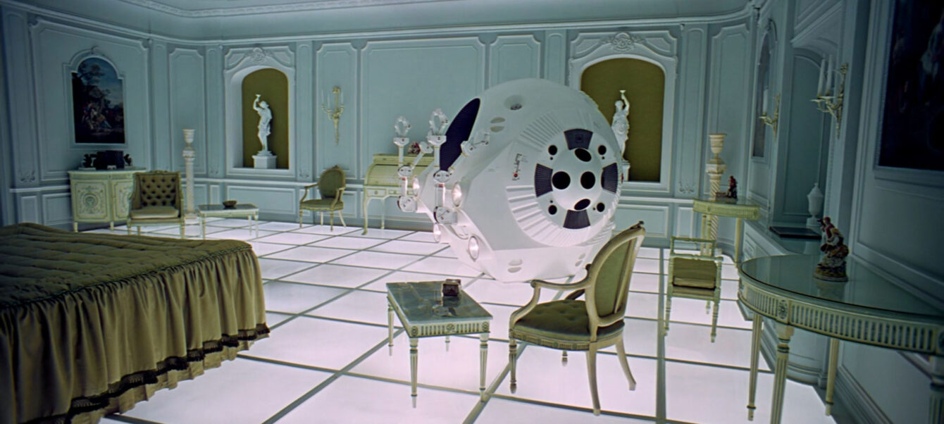
However, what is particularly striking is how well certain aspects of the film have aged. I feel the most impressive relevance to the modern world is the environment and graphic design seen in particular scenes. Coupled with this 2D/3D design is also the purely iconic symbols which the film excelled at imprinting upon our minds. Key visuals such as the Monolith (which has inspired a modern artist take) and the HAL red eyeball interface.
We have been so influenced in the agency that Firedog’s very own 404 page features a witty take on one of the critical scenes in the latter half of the film.
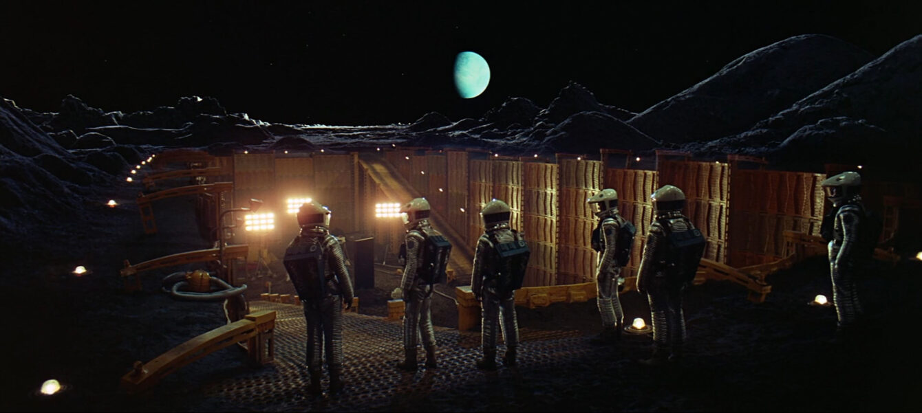
This film is also a laurel leaf for Britain’s film making heritage with the majority of production taking place in MGM Studios Borehamwood. Much of the quality of the film image is thanks to the special effects technicians creating all visual effects “in camera“. Thus avoiding a degraded picture quality that comes from blue screen and matte techniques.
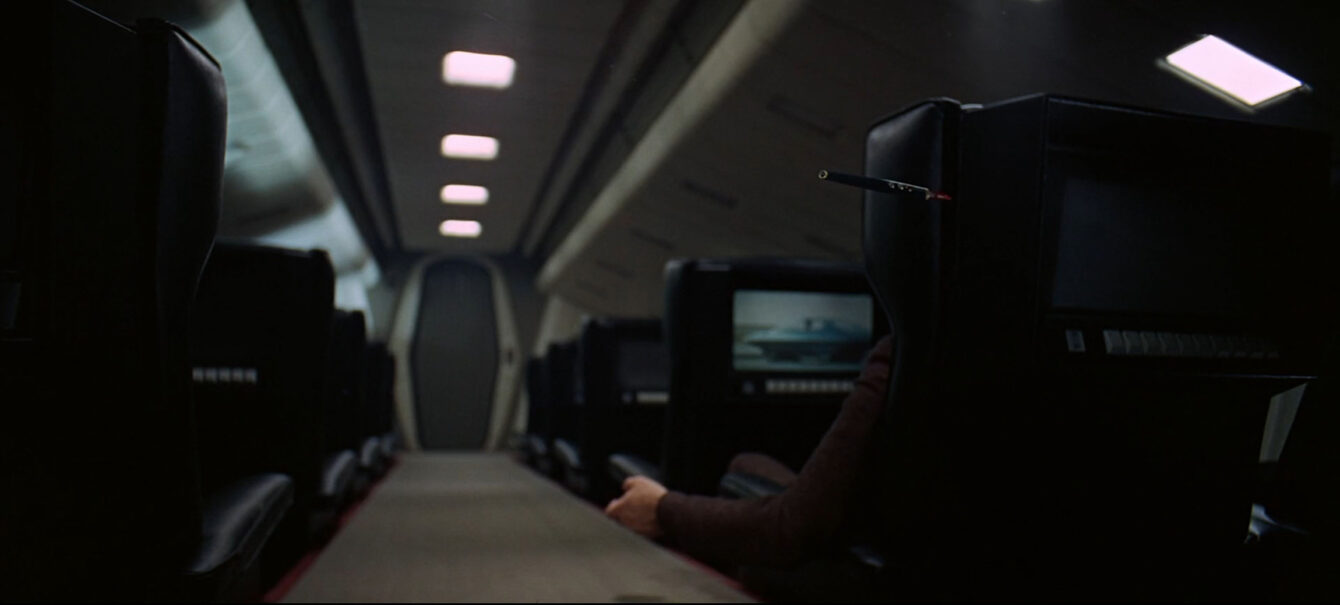
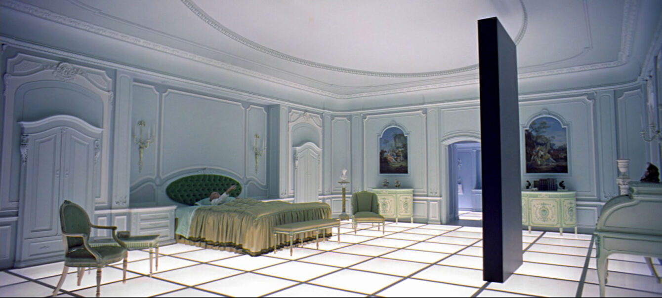
Here is a selection of my favourite film moments from 2001: A Space Odyssey.
A collection of impressive images and their related time signatures (see captions)
In concluding…
I think what makes this science fiction film incredibly relevant and futuristic even in today’s world is the uncompromising principal of aforementioned “in-shot” special effects. By building models and environments in real 3D space, we are rewarded with the most amazing array of film tone and texture. Added to this is this incredible B&O design aesthetic which is both brutalist and beautiful. Given that this film is still groundbreaking today, viewers at the time must have truly lost their marbles. A far cry from the CGI verbose releases of films such as the Marvel franchises of today.


