Case Studies
Brand logo identity created for audio engineering and design business, Segotia
Segotia is about advanced audio technology, with emphasis at first on spatial audio that can be created and perceived coming from any direction in 3D space.
Firedog worked on a shoestring budget to help out a previous client in order to realise the branding for their new (ad)venture. We had started working again with them recently on an audio controller project and highlighted that they were keen on developing an new ident.
The first customers are likely to be headphone manufacturers but the brand/logo brief outlined that the logo should not be tied exclusively to headphones. In the future Segotia will be developing the messaging mostly to target areas like spatial audio, artificial intelligence in audio, voice assistants etc. So the brand intention was to be definitely business/corporate and not necessarily consumer focused. The proposition is all about advanced audio engineering and design solutions, with a focus on personalised, spatial audio in wireless headphones.
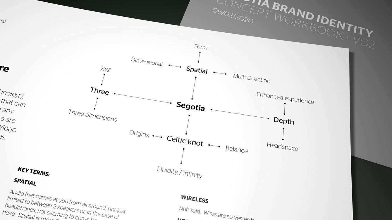
Segotia brand positioning matrix which established overall direction
Given the above direction and the need to limit the creative development, the client provided a series of sketches and references for the studio. Firstly, the name Segotia relates back to Irish Celtic roots as a friendly salutation. Secondly, the client suggested the notion of a Trinity Knot to not only express the notion of existence in 3D space – But all the other good stuff associated with a Celtic Trinity Knot (Or Triquetra) , such as wisdom, natural force and eternal love.
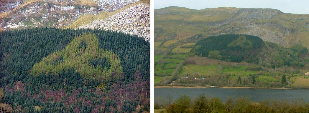
A sylvan Trinity Knot in Co. Sligo
There was also a great reference to family heritage connected to our client: Culann Mac Cabe’s father, Jim McCabe planted a sylvan Trinity Knot in the 1980s. It is located on the slopes of Tomór mountain and can be seen from the nearby N16 Sligo to Manorhamilton road in Ireland. The design is pronounced in autumn when the Japanese Larch trees change colour and contrast with the surrounding Sitka Spruce forest.
Given our fascination with renewables and all things eco, we really loved the background influences of the symbol.
Even though we were given pretty tight guidance on direction, we still explored a number of creative avenues which covered the notion of a 3D spacial element. We developed moodboards of existing brand influences which could inform the creative process. We wanted to bring additional energy and light into the symbol without making it too default to the notion of the knot.
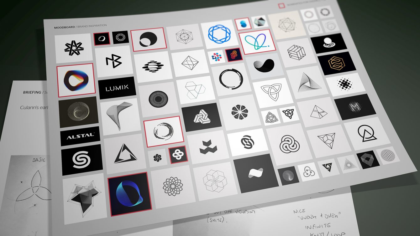
Segotia brand development moodboard
However, we came back to the idea of using a trinity knot like device yet rendered it in realistic 3D space in order to be able to look at the element from a number of different angles. We played with the knot form and thickness in an endeavor to create a further random / creative feel. The 3D process is a really liberating way of looking at what will be essentially a 2D logo.
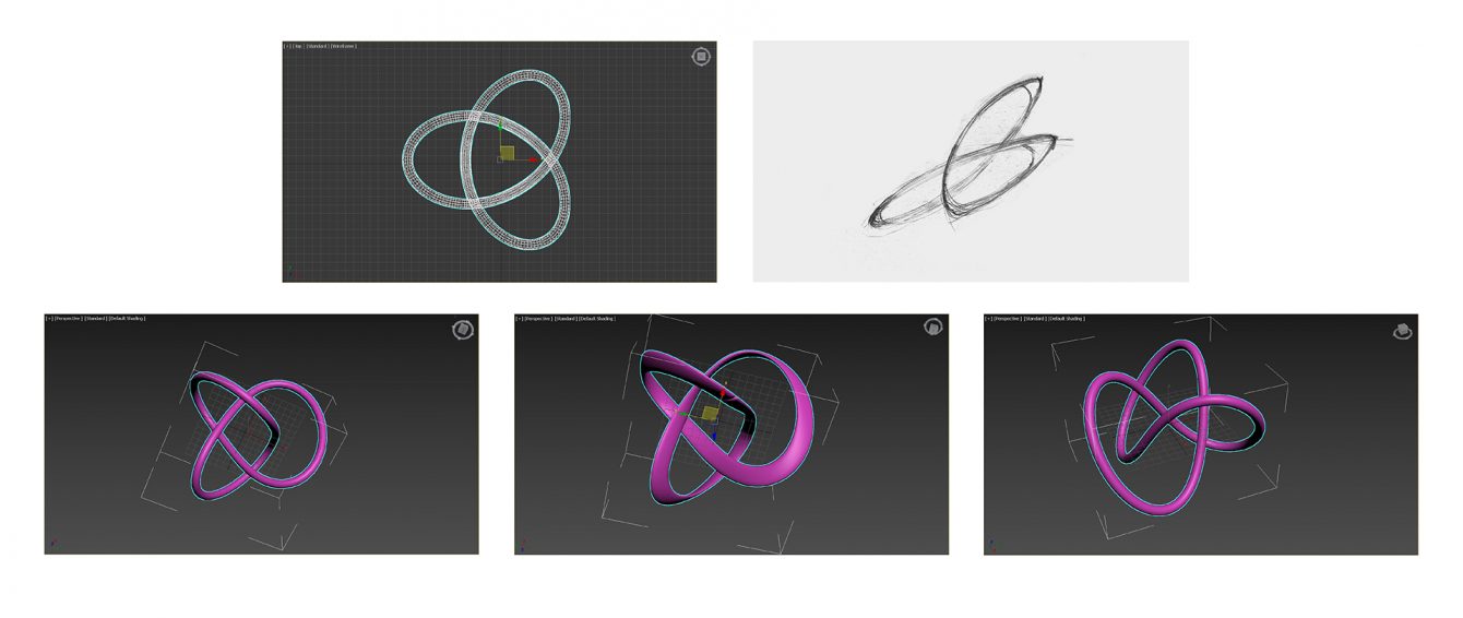
Developing the Segotia logo using 3D rendering elements
We went through a number of iterations exploring all the various viewpoints looking at the knot. It was crucial for the icon to be able to be viewed at really small sizes both for digital and manufacturing applications. The symbol became combined with an attractive and contemporary type which featured a custom ligature between two letters. The result is a mark which is both organic yet serious enough for the task.
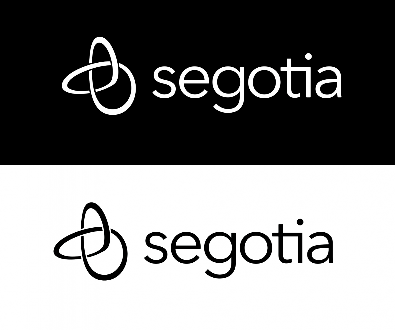
The final Segotia brand logotype
