Case Studies
PriceRunner – New digital brand identity
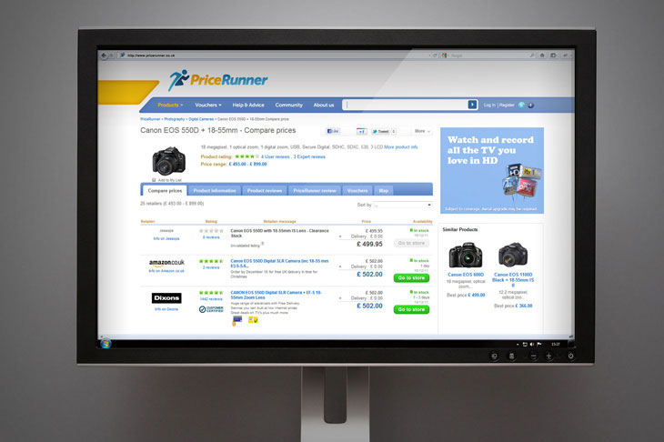
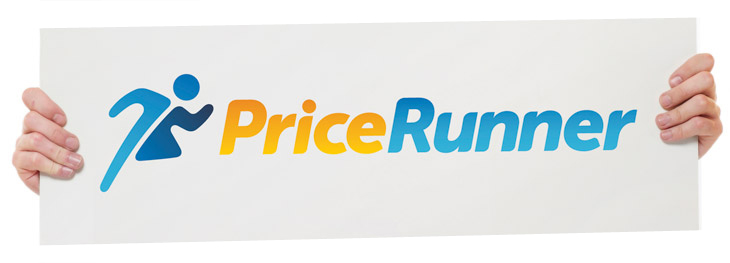 During the second half of the year, Firedog has been excitedly working away on the PriceRunner brand refresh. The refreshed visual identity, logo and website header is the first brand refresh in the company’s 12 year history and went live at the end of November.
The refresh was influenced by softening the brand image, as research states that many people do not trust shopping comparison sites and frequently confuse them with the financial comparison sites that spend large budgets on advertising campaigns.
To their advantage, PriceRunner is endorsed by Which? Portraying a more trustworthy shopping comparison to customers than some competitors.
Making the brand more exuberant, transparent and straightforward was our brief from PriceRunner. Increasing brand awareness was a key objective in the brand positioning exercise. Also, refreshing the brand without moving too far away from the iconic blue and yellow colourways and the old runner character, as not to alienate the 1.4 million visitors per month already aware of the brand.
The existing character looked far too similar to a sporting event icon – so we set out to create more personable character for the brand.
Have a look at the full Firedog case study
The new character is much more distinctive and iconic – softer and friendlier with a sense of exuberance.
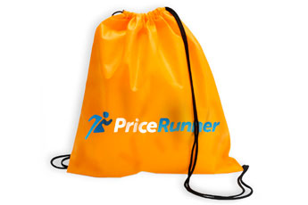
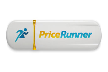
We also drew a bespoke typeface for the identity which echoes the softer elements found within the character. This typeface has also been used for additional logo executions using web suffixes and straplines in multiple languages.
Take a look at the brand refresh on the website www.pricerunner.com and have PriceRunner save you a few pounds in the run up to Christmas.