Design
5 examples of exceptional design moments in film
 It’s awards season, and rather than predictably sing the praises of A-listers, we’re focusing on design. Our designers Sam, Alessandro and Ammar give examples of exceptional design moments in film, as well as graphic designers that have reshaped cinematography.

With an impressive line up featuring the likes of Saul Bass, the DIN typeface and interpolated rotoscoping, this is far from your usual mix.
1) Best opening credits
North by North West
Web and UI Developer, Ammar, insists we give something to Saul Bass, the graphic designer who changed the face of film. “Before the advent of Bass’ title sequences in the 50s, titles were generally static, separate from the film and often just projected onto the cinema curtains.
North by North West completely changes that – the titles are brought to life as they slide up and down the screen, imitating lifts. Bass invented a new type of kinetic typography for Hitchcock that inspired many other designers, so his work is hugely significant.”
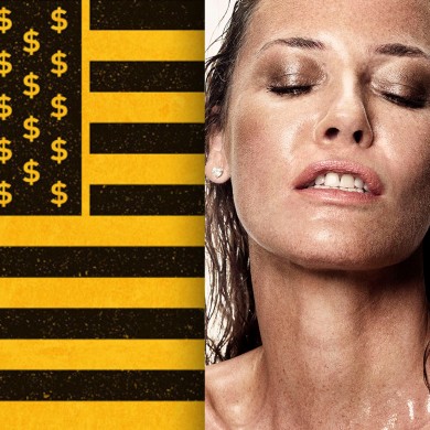
2) Best poster
Nymphomanic
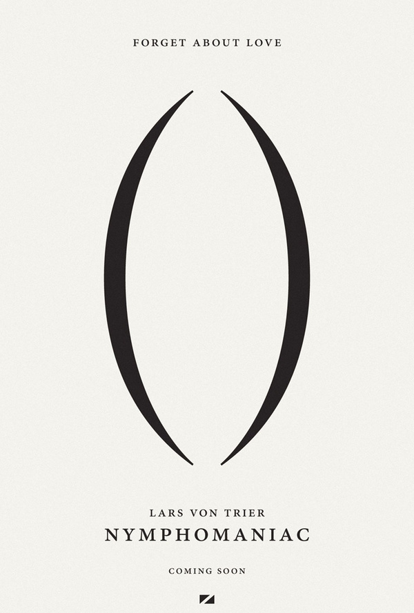 Designer Alessandro nominates Lars Von Trier’s Nymphomanic for best poster. “The posters take entirely different approaches whilst successfully maintaining a unified look and feel. The first poster is 100% typographic – the bold positioning of the parentheses definitely makes it stand out from its competitors. The modern serif typeface creates an overall clean look and feel, creating a sense of elegance while remaining explicit.
Both posters are distinctly controlled
“The second poster showcases photo realism at its best, with completely unrestrained expressions on the actors’ faces. The poster retains a minimal look and feel with the white background and naked actors – everything is literally stripped back. Both posters are sophisticated – they are distinctly controlled and not animalistic, as you might perhaps expect. It’s impressive to be able to create this kind of look and feel whilst displaying what’s probably the most intimate, personal expression on a poster.”
3)Best use of type in film
Scott Pilgrim Vs. The World
For Sam, Head of Digital, the use of type in Edgar Wright’s Scott Pilgrim Vs. The World deserves attention. “Wright’s incorporation of design into the fabric of the film – rather than it being a secondary device – is very impressive. Through this technique, Wright has created a strong synergy between the film and the original graphic novels by Bryan Lee O’Malley.”
Storyboard artist Oscar Wright says: “the idea was to have text-style graphics look like they just exist in the scene. They would never stay around for much longer than the accompanying sound effect, and they should never just look like an overlay. Even the fun facts interact with the action on screen here and there.”
4) Best integrated campaign
The Wolf of Wall Street
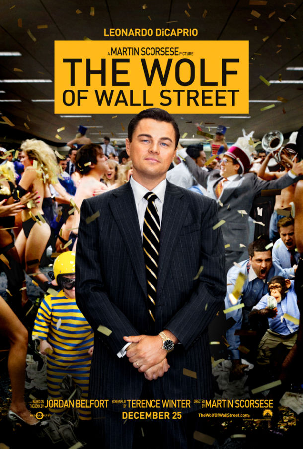 Alessandro gives best integrated campaign to Scorsese’s The Wolf of Wall Street. “What struck me most about the branding for this film is that it doesn’t rely on photography. it’s refreshing to see such a flat, minimalist treatment
As we’re experts in Photoshop now, many films take full advantage of this – just look at Gatsby and all of the textures and colours it uses. The Wolf strips all of this away; it’s refreshing to see such a flat, minimalist treatment. The poster follows the principles of the DIN typeface; the two go hand in hand. DIN is a very corporate, upright and bold typeface, which entirely complements the context of the film. Seeing the banner on buses around London was very eye-catching – the combination of black and yellow immediately signals danger, again reinforcing just how on-brand the design for this film is.”
5) Best graphic treatment
A Scanner Darkly
For Sam, Richard Linklater’s A Scanner Darkly showcases one of the most memorable uses of design in film. “The technique adds to the darkness of the film, as the real world has come to resemble the dark world of comic books. The process behind it all is really interesting, too. It was filmed digitally and then transferred to QuickTime for a 15 month animation process called interpolated rotoscoping. This 2D animation style mixes heavy black lines with shapes of solid colour to create a realistic image.
Many films have used this technique – Walt Disney used it in Snow White and the Seven Dwarfs as early as 1937. Today, you’ll definitely recognise the style in Grand Theft Auto.”