Creativity
For the love of data and infographics
 We’re having a bit of a geek out in the Firedog studio at the moment. It’s all around the love of data and info-graphics in storytelling. We recently picked up a book that has being doing the rounds among our creative team. It’s published by London based author and information designer, David Mc Candless. Reading it has inspired us all to really try and get information rendered in colourful illustrated forms, rather than dry text.
We have always been a bit geekish around data in the digital space, what with our fascination with WordPress category and tag ontology and how these database functions can be harnessed to paint amazing pictures of data contextualisation. Print design has, over the last five or so years, really come under fire due to economic pressures. A part of this is probably due to the effectiveness of print and how it can be measured. Print used to be about conveying information with words and photographs. Now that this has been superseded by on-line publishing, print has borne a resurgence in visceral imagery and information design…
We messed with the page sizes so that no layout had a common size
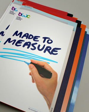
A favourite and long standing client of our’s, The Bank Workers Charity, has kindly provided us the opportunity to design and produce a great piece of print, their annual Impact Report. We wanted to take the opportunity to harness the print medium for it’s strengths over digital. It’s rare that we have the opportunity to produce printed communications over digital, and we certainly had a bit of fun with the ride. First strength of paper is format. All digital communications follow a format around the user and can tend to be really similar. Therefore, we decided to be a bit disruptive.
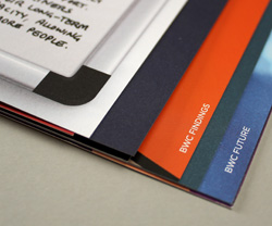
Dossier style page crops
We created a “dossier” kind of format where we combined a whole bunch of different page sizes to create a random edge on the leading pages. Secondly, we broke the style sheet. Web is all about efficiencies in markup and CSS styling is designed to bring styles together for ease of implementation. So with this example we ensured that every page carried a different look and feel. The result is energetic, different and rather dramatic.
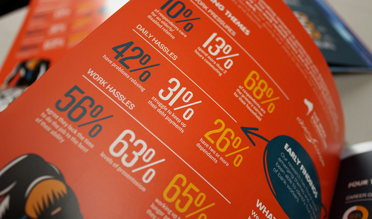
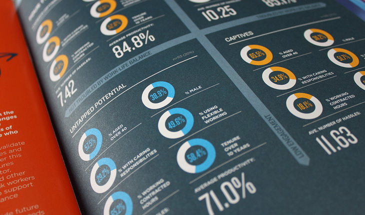
Finally, we loaded up the piece with infographics and chart materials. This is not unique to print and charts can be found all over the web. They just tend to look great in print all nicely laid out within a controlled page size and format. We’re very happy with the result as is the client. And we hope to do some more of this work over the next year, so do watch this space!
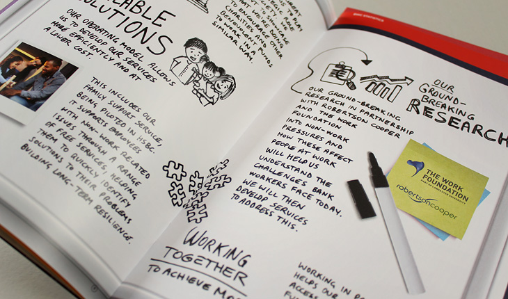
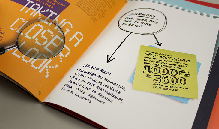
An opportunity to create fun and engaging hand drawn infographics
Again with print, no restraints on typography
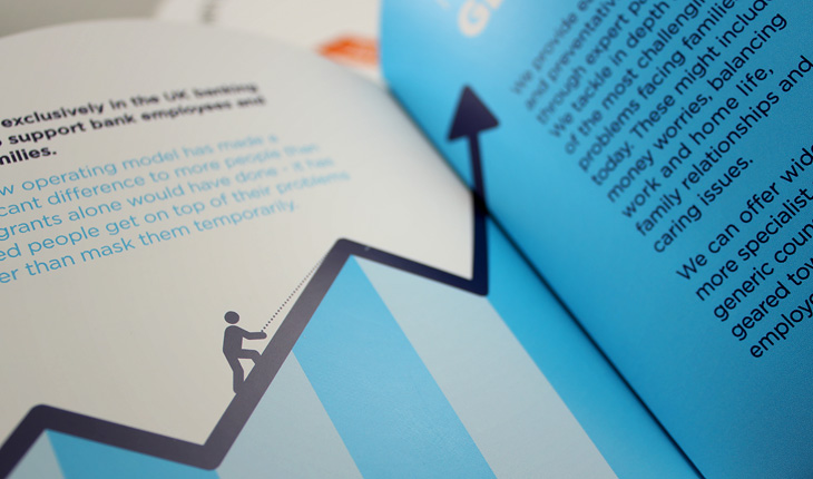
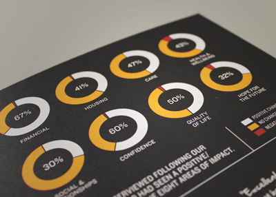
Storytelling through charts and infographic language
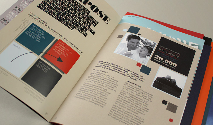
We used a striking colour palette to get the data across
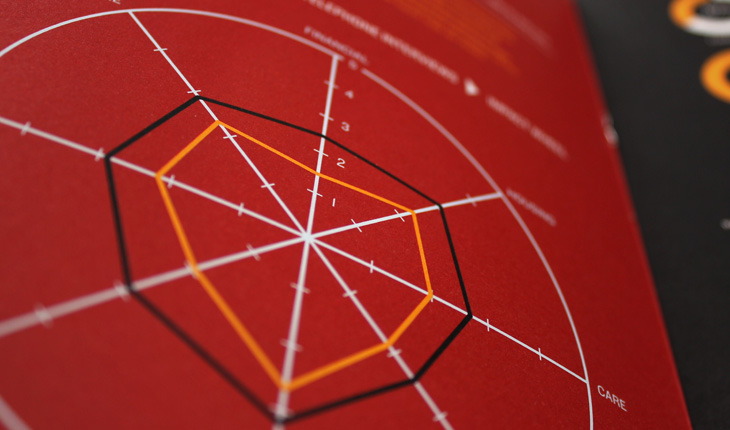
Spider charts for added dimension
Making for an engaging read
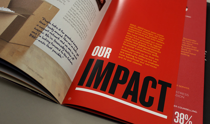
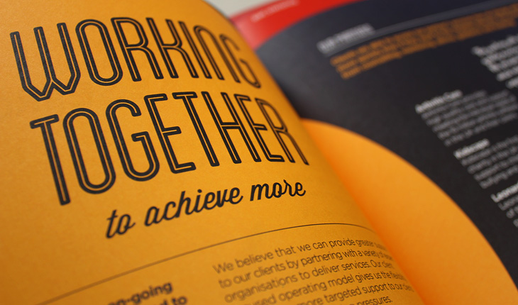
Creating impact through colour and typography
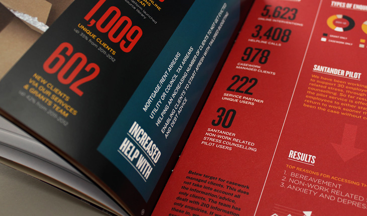
Loads and loads of engaging stats
No two pages carried the same style template
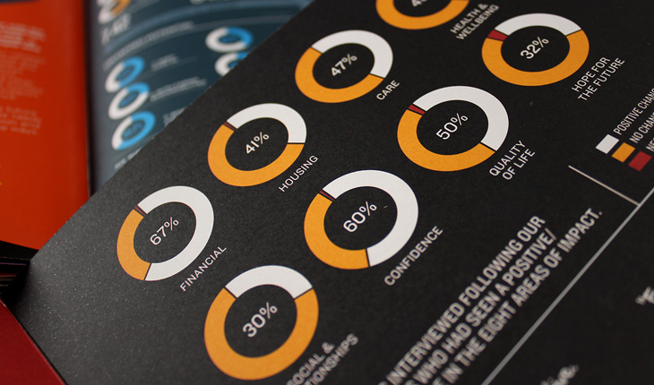
Maximum data geek out
Who needs words?