The dog speaks
Design Crimes : No. 09 : Generic type branding

Mr Barmeno
This is less about advice for the future – More about: What on earth were you thinking?
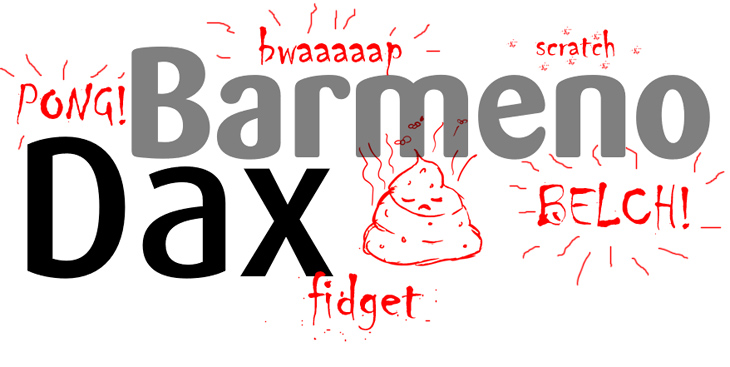
In the nineties, there were a series of fonts designed by Hans Reichel. So far, so good. But the main problem is, we’re still feeling the aftershock from the adoption of this type by purveyors of poor taste, more than a decade on. The culprits in question? Mr Dax and Mr Barmeno.
The fonts themselves are not great. They represent an attempt at bringing a modern humanist derivative to rival classics such as Frutiger – But they fail due to the fact that they resemble Frutiger somewhat; except their characteristics are more like Frutiger having let themselves go a fair bit.
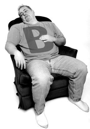
Grossly overweight … A fag in one hand and a can of Tennents in the other.
Frutiger, grossly overweight, sitting on a couch watching reruns of Ricky Lake on the Dave channel during the daytime, with a fag in one hand and a can of Tennents in the other. Stained t-shirt riding up on a copious, swollen belly, slouched to the point as if the existence of a spine is in question. Yes, I don’t think this font looks all that great.

Font culprits in question
The font has been applied with reckless abandon to a scary number of brand identities over the previous decade.
What makes it’s existance more unfortunate is that less visionary brand designers of the time supported the well-being of said lardass – financing his weekly habits of pork scratchings and lard. The font has been applied with reckless abandon to a scary number of brand identities over the previous decade. I guess the idea was to portray the message : “look at me, I’m your mate, I’m approachable” where the more accurate picture states “look at me, I’m your (fat) mate, I’ve cleaned out your fridge.”
Please, please never again…

Unfortunate brand hangovers from the past

Uncarefully considered use of type


