The dog speaks
Design Crimes : No. 18 : Are you really being sincere?
 After working in the creative industries for almost 20 years I feel like it’s time to give a little back. I feel like I have a responsibility to creative folk out there.
To designers, dare I say it, that might be looking up to me for some kind of guidance. I do want to give. I do want to help you out as you strike out in this scary world. A truly wonderful thing, is that today – we have the internetz, which means I can spread my advice far and wide to all those fledgling designers out there.
This is what I am going to do. Instead of showing you trends to follow, I am going to highlight trends that are to be avoided. Sound simple? It is. With experience comes the capability to absorb the world of marketing like a sponge. Through no will of my own, I scan billboards, press ads, online and all other hosts of materials, soaking up the shared inputs of this design fraternity. I feel now that my calling is to highlight what sucks.
I feel my basis of judgement is solid. I’m not going to even bring a question of taste into the mix. I am going to use my strategic noggin combined with the concept of market saturation. As an example, here is Rule # 1: Your ideas are only memorable if no one has done it before. Like walking into a event wearing a meat dress. Or perhaps, manning the DJ booth with a massive mouse head. No one cares about the person who does it second, third or even the hundredth time. To the common man, you’re just a wanker.
I feel like, if I can just curb these trends headed for disaster, I can almost make the world a better place. I can improve our environment and make, at least just the marketing out there, bearable to look at. Right, so now you know my angle, lets get stuck in:

Howard, you legend.
Design Crime : No. 18 : Smiley sincere people holding up signs
Oh my hat. Save me. I don’t even feel like having to say why this is so wrong, you should just know! But, I’ve made an oath above so let me begin:
- Completely breaks rule #1 (See above). I have seen this everywhere. Like all over the world. Like in every format. Like in every colour. It’s so not hot right now, I want to spew.
- Good branding and comms is about truths. About putting a message out there that folk can believe in. That inspires. One look at the typical twat that’s holding up this sign with some half arsed scribbled message wants to make me relook at the progress we’ve made as the human race. It’s just, so not sincere.
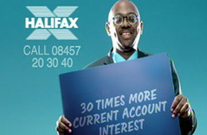
- Halifax have created an ad using this technique. If ever there was a creative barometer, by now it should be hitting you in the head repeatedly, saying “Don’t do it”
- It sucks in layout – Having to reduce your message just to fit between the porkie fingers of some useless bint – Why?
-

I used to be in advertising, but then I ran out of fresh ideas.
You are making your brand equity cheap and grossly accessible. Probably okay for Tesco’s, but with their brand equity completely in a rubbish state – Who want’s that.
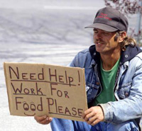
- Where I am from – Holding up a sign either means you want a lift to the nearest town, or you’re going to hassle me for spare change. Not a good sign, excuse the pun.
- In a design review, it will make me launch right across this table and make me get completely rabid. Please, no thank you!

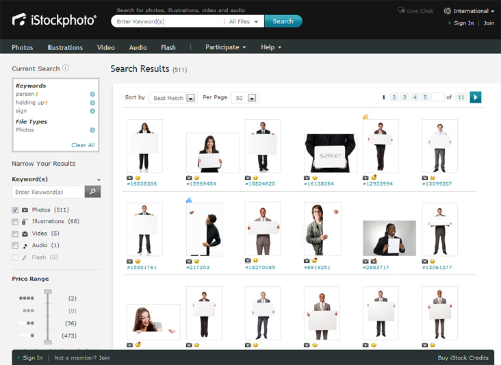
511 results on istockphoto. Gee, I wonder if maybe this concept is a little… tired?
My word. That feels so much better. How therapeutic.
Keep an eye out for more Design Crimes to follow, named and shamed; and with your help, removed from our eyeballs forever.


