Grey matters
Usability, Schmoozability?
 I was recently asked by .Net magazine to write an opinion article on a subject of my choice. Being true to myself, I chose something topical in our industry to duly receive a good dose of slagging off. The following is by no means my finite opinion on the subject, it’s just been written to get a rise (maybe, maybe not)…
Here be the start of the article:
I get the distinct feeling there is a rather large bandwagon rolling it’s way through town. The term ‘usability‘ seems to be the latest trend in what should be the default in a logical web creation process. How does it actually differ from good solid design practice? Many an environmental designer has designed an interior space without the need for a consultant. Why is online different?
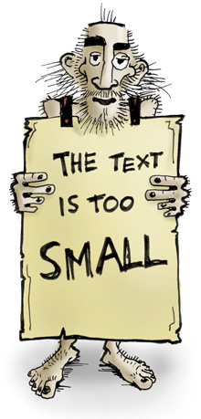
 Okay, so there was a dark age in web design when form overshadowed function and we as web ‘designers’ all deserved the collective beating we so rightly received. Yet, fast forward ten years, and designers are still being tarred with the same brush. We are seen as smelly pen practitioners, slaves to our design software and barbarians who wish to conquer the world with impossibly small body text and links that cower from the very presence of a mouse icon.
One only really needs to look at the history of the greater design profession to understand that ‘usability’ is one of the cornerstones of design best practice. Usability is, for the educated and experienced designer, our very first consideration – from the design of airport directional signage through to the creation of type that will happily print at five point on a railway timetable booklet.
So, perhaps what’s thrown the online industry into turmoil, is the fact that there are so many ‘web designers’ that have not been educated to the principals of sound design logic. The rules for industrial, graphic and environmental usability best practice have somehow been lost in translation in the disposable world of web. Maybe it was the low budget, disposable nature of early web creation that led us all astray and it’s really only now that because of cost and user liabilities, web owners are starting to get to grips with what good design really means.
I am not discounting the existence of professional companies out there that specialise in usability. They quite often bring other assets to the table, such as analytics, trend and behavioural technologies. They also are fully aware of the designer’s role in converting a cold visit to a warm prospect. We enjoy working relationships with these companies and it’s flattering to have someone rubberstamp the logic of your work. (Even if you knew it was correct beforehand.)
My real gripe is with the few consultants out there masquerading as know-it all-usability ‘experts’; Blindly regurgitating the hallowed scripts of Dr. Nielsen, preaching the end of the world as we know it and summarily condemning graphic design across the world web; full-stop, no exceptions. I think what they are discounting in their crusade is essential business practice, the human spirit and the fact that humans are sometimes just not logical.
Take MySpace.com for example. From an editor’s point of view, it’s probably the most frustrating, un-user-friendly entity on the web today. Usability logic says it just should not exist. It should be a large reversed-polarity magnet, immediately turning the user base away in droves. But it’s not; it’s one of the most dynamic sites in the world. You don’t have to like it but you have to admire those damn pesky kids. What MySpace has done really well is tapped into a human need.
We have to realise that not all needs online are as basic as the need for text-only, 5Kb information pages. In fact in this developed age of the web, I’d go far as to say that whilst you may be checking the box for usability on some of your sites, you may be un-checking the box for subconscious aesthetic satisfaction. These days, we are more likely to hear the client brief ‘Sure, make it usable. That’s a given ‘ But we want this site to engage and convert’ That is not an instruction for us to build an immense visual mind-trip of a flash site, merely the recognition that we are primarily designing for humans first and text-readers second.
Here’s to a harmonious future of web, where all factors are considered in the creation process, usability included. It has been the case in offline design for a few hundred years.
Here endith the article. So there.


