Case Studies
New website design and build for the British Horseracing Authority
 From Ascot first-timers to eagle-eyed bookmakers, the BHA aims to be the first port of call for any horseracing query. Effectively the guardian of horseracing, the BHA’s role is to provide information to a wide range of audiences.
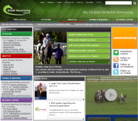
The BHA’s existing website was difficult to navigate
For Paul Bittar, Chief Executive of the BHA: “Our website is one of our most powerful communication tools and it is essential that is best reflects the work and role of BHA.” Given the importance of generating information, the BHA’s website needed to be easily navigable for all audiences.
The existing site was disorganised and unstructured The existing website failed to capitalise on its potential. Pages and links sporadically added over time gave the impression of a disorganised and unstructured site.
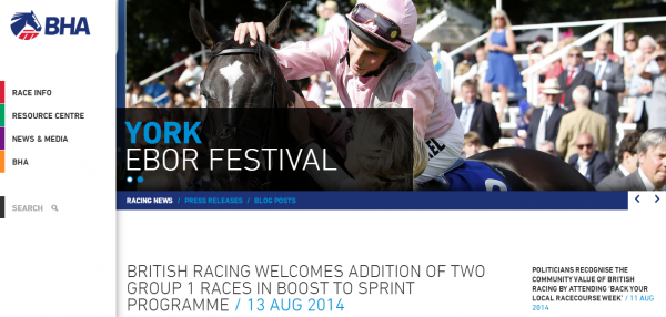
The navigation bar has been divided into five clear sections, each appealing to specific audiences
We created a distinct hierarchy to implement a sense of control and order. The navigation bar has been divided into five clear sections, each appealing to specific audiences. Adding further structure, information regarding the horses, jockeys and trainers now forms distinct sections.
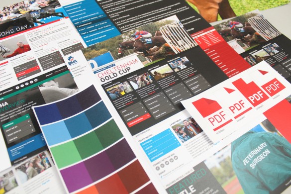
Clear signposting creates a much more enjoyable user journey
As the BHA appeals to a wide range of audiences, information is now divided up accordingly. Clear signposting creates a much more enjoyable user journey. Information is now readily accessible for everyone, and not exclusive for those who are heavily involved in the industry. There is actually now more data on each page, but the effect created is a simple, uncluttered site. Information is now readily accessible for everyone
Given that this is mainly a task-oriented site, search needed to be integral.
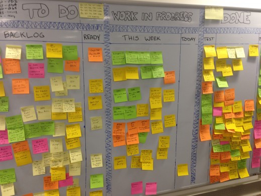
Behind the scenes with the BHA development team
Our web developer, Ammar, explains: “We created custom algorithms and applied priorities to ensure that search results are as effective as possible.” This helped to make the search integral to the site navigation. The BHA technical team also built an entirely new API for the site, which makes the new site feel highly interactive and responsive. We created custom algorithms to ensure optimum search conditions
With the use of CSS Media Queries, the BHA now owns a fully responsive website that truly reflects its world-class presence in the sporting industry.
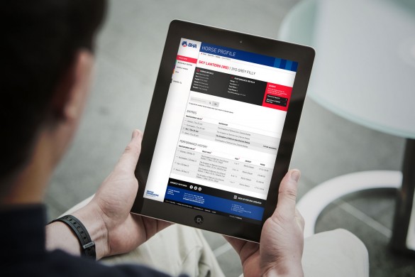
Minimum CSS usage makes the page load time much more efficient
Developing the site Mobile First meant that we began by creating the mobile pages and subsequently expanded these. This approach complements an industry where most people will need to access the site when outdoors. Mobile First complements an industry where most people will need outdoors access
To ensure that the page is never cluttered, the smaller page versions feature the menu icon at the top, and the smallest amount of CSS is used in the mobile format. As the screen resolution decreases, less CSS is used. This reduces the page load time and makes the site more efficient.
The mobile version feels more like an app than a website – it’s intuitive and you can use the GEO location tool to find a racecourse and view all fixture information. With a site that is accessible and engaging for all audiences, the BHA presents horseracing as a modern and exciting sport.
