Design
How best to engage and impress us with your CV
 A perception exists of the design industry as a laid-back environment in which designers spend all day bathing in a warm bubble of creativity, happily soaking up inspiration everywhere they turn. This, however, can be far from the reality.
The most recent Design Industry Voices Review is just one of many surveys outlining the ever-increasing competition for design jobs. Agencies are steadily replacing permanent staff with freelancers and interns, resulting in a record number of people intending to change jobs within a year. Furthermore, as a result of budget cuts, 87% of participants in this survey believed that clients expect more work for less money. So, with fewer permanent positions available and client expectations continually soaring, how do you make yourself stand apart from the crowd? We list those easily avoidable rookie errors and show you the sure-fire ways to get your CV noticed.
How do you make yourself stand apart from the crowd?
Let’s start with what makes a good CV. While the subtleties regarding what to include are agonised over, some things remain clear. Recruiters spend on average between five to seven seconds looking at a CV. Managing Director of Firedog, Cliff, agrees: “You make a decision in less than a second. It’s brutal.” Evidently, there are elements of a CV that employers seek, as well as aspects that lead to instant dismissal. Here’s our checklist for how to get that all-important first interview.
What you should be doing:
1) Use a well-designed layout.
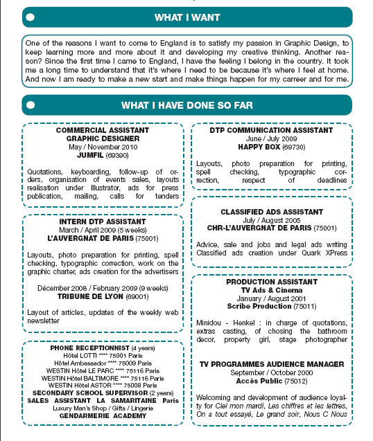
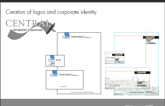
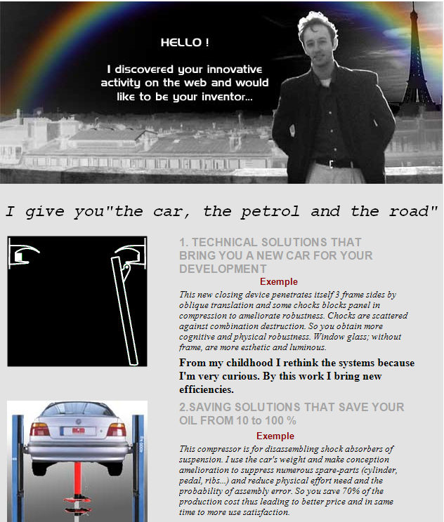
This should include a hard-aligned margin and your details should preferably be on the top right. Keep the layout clean and simple, clearly outlining the key information. The example below doesn’t know what it’s doing. A designer is fastidious; the distinct lack of structure of this CV leaves this essential quality in doubt.
2) Keep it succinct.
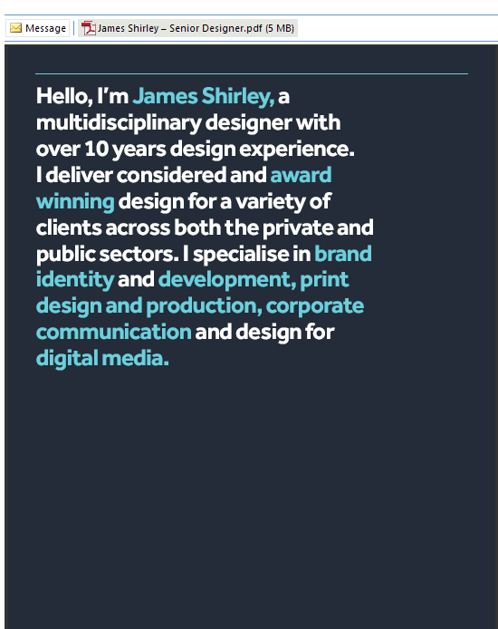
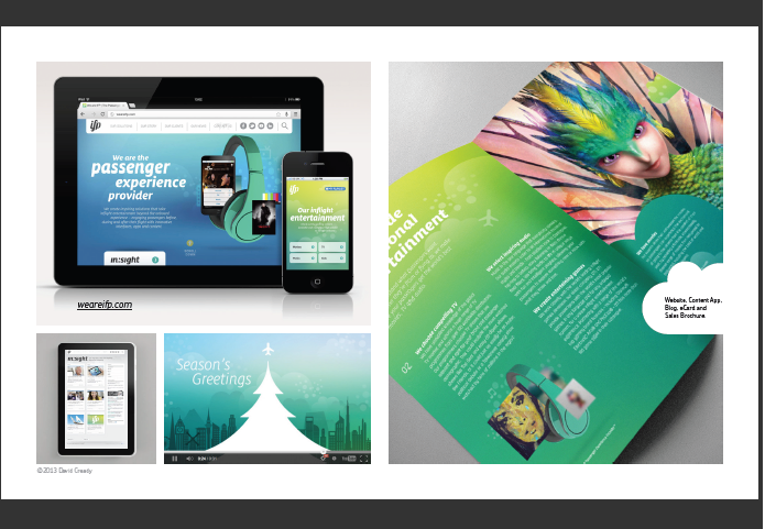
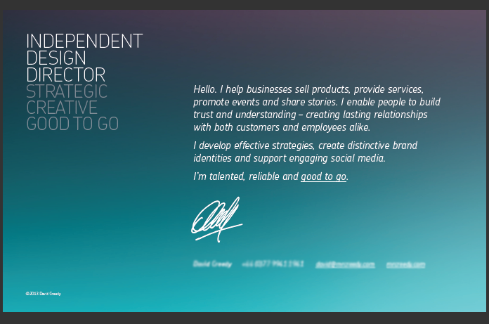
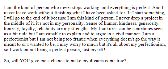
Have a paragraph outlining who you are, what you do and why we should care. No more, no less. Avoid a long winded general intro text explaining how passionate you are and detailing your personality traits. Instead, THINK about what you’re writing – what do we want to know about you? What would really interest us? Is it relevant? You need to be concise yet imaginative; we need to see that you’re a creative thinker. Here are two examples. The first uses clear text and is bright and engaging. The second is muddled, gives irrelevant information and, frankly, makes us lose the plot.
3) Show us two or three projects maximum.
Cliff says: “you are whetting our appetite, not giving it to us on a plate. You need to leave us wanting more, leave us with something exciting to discuss when we meet up. It’s disheartening when someone comes in for an interview and we’ve already seen everything.”
What you shouldn’t be doing:
1) Don’t send your CV attached as a Microsoft Word document.
Every CV in our folder for potential employees was sent as a PDF attachment: CVs that didn’t make the cut were sent in Word. We notice attention to detail – this is reflected in someone who realises that the formatting in a Word document may completely change when opened by the recipient.
2) Don’t use caps locks.
WHY ARE YOU SHOUTING AT US? DO YOU THINK IT WILL MAKE US NOTICE YOU ANY FASTER? It won’t – it looks extremely unprofessional and rushed.
3) Don’t say “Dear Sir/Madam.”
Personalise your message: even if you don’t know someone’s name, “Dear Firedog” is so much better.

This may be a cultural difference, but the addition of a “broadband connection” and the word “passion” is enough.
4) If you email us, don’t include other agencies.
This makes it clear that you have not researched any of the agencies, or how they differ. Consequently, the application will be ignored from the offset.
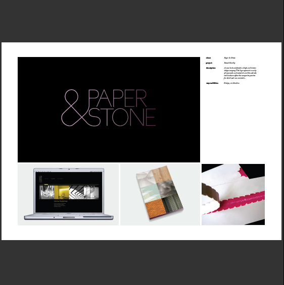
5) Don’t put more than one image per page on your portfolio.
Doing this reveals a distinct lack of pride – do you not think an individual project deserves a whole page or at least a few seconds of our attention?
This brings us to the next point: the attitude conveyed through the content of your application. While your CV may now be bereft of the above heinous CV crimes, how are you coming across? Scroll down our checklist to make sure you’re on track…
The right attitude:
1) Be creative and imaginative.
A customised physical application is much more effective “It’s not what you say, it’s what you do”, says Cliff. A physical object sent through the post is often far more effective because it’s really your chance to showcase what you can do.
Cliff agrees: “In the last few years, every designer I’ve employed has used this approach. A customised physical application is much more effective and will impress us much more than a generic email with a Microsoft Word CV attached.”
Design Director, Lee, adds: “We want to be inspired – give us something that lands on our desk and makes us stop.” Another good idea is to send something innocuous, followed up with something else a few days later. We once sent out a bottle of hot sauce to a client telling them we were “hot stuff”, followed up with some loo roll a few days later to show them we provide comfort and care as well. Cheeky but effective.
2) Make sure that whatever you send in fits with what we do.
While an imaginative approach certainly grabs our attention, make sure that what you’re sending is well thought out and cleverly targeted at us. Do some research to check that what’s heading our way is something we’d like to see. What you’re sending must be well thought out and cleverly targeted at us.
This applies to whatever shape your application takes. If it doesn’t fit in with our ethos, you’re simply wasting your time. Cliff says: “If it doesn’t look as good as a high street brand or agency portfolio, don’t apply. If your work doesn’t remotely resemble what’s out there, there’s a chance you’ll never make it. In this field, it’s 90% imitation, 10% innovation.” These examples highlight the difference between someone who has done their research and someone who has got their target audience entirely wrong. Unfortunately, these instances are not as rare as you may think. This leads us to the next and most important point…
3) Take pride in what you do.
Cliff says: “there is a distinct lack of pride with bad CVs. We’d rather see the care and attention on work for a bakery round the corner than a hashed out web banner for Deutsche Bank.” Designer Ale concurs; he stresses the importance of considering “everything from paper choice to envelope size to typefaces. It’s the attention to detail and care taken over every aspect of your application that we’ll notice.”
4) Project yourself.
Most designers have a Behance profile to showcase their work. Ale says: “Exposure using web presence is vital. I was overseas when applying for jobs in London, so I had to get my work out there effectively. Writing a blog is also a good idea. As well as showcasing practical design thinking, a blog also reveals theoretical thinking and writing skills. A designer is a thinker, not a robot – you need to demonstrate this. You also need to think about your consistency when putting your work onto these mediums. Is the Behance profile clearly created by the same person that submitted the online portfolio? Are the typefaces used consistent? Does it have the same overall look and feel?”
5) A three year degree in design is essential.
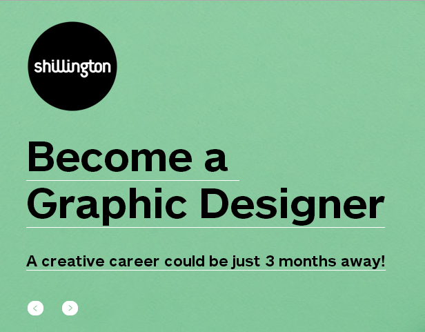
Four years is even better. Cliff says: “That fourth year seems to set people apart. It’s very different – you become more focused.” Be aware of the “quick fix” courses to becoming a designer, though. Degrees from schools like Shillington completely undermine the skill-set a designer needs to possess and will not further your career.
And the wrong attitude.
1) Generic emails.
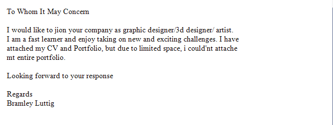
All clichés should be eliminated. “Don’t send a generic, vague email; it won’t get through”, says Cliff. Consequently, all clichés of the nature “I’m passionate about…” or “I really love…” should be eliminated. You may be passionate about design – you may love design, but “your passion is not our priority”, claims Cliff. Your enthusiasm and passion will be evident if you communicate effectively with us.
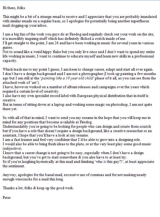
Compared to this…
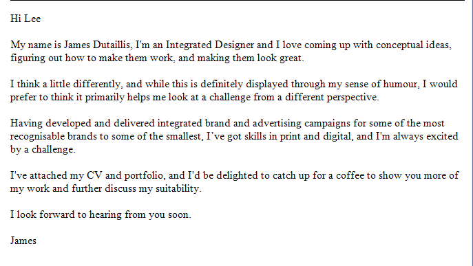
Whereas this application draws on Firedog ethos (humour, thinking differently) as well as the kind of work we produce.
2) Rudeness.
One of Lee’s bug bears is someone who bangs on the door, thinking they’re being confident. “It’s rude and irritating. If your CV is good enough and we like what we see, you will get the chance to impress us.”
3) Don’t spread yourself too thinly.
Cliff says: “Digital is much more buoyant than traditional media. If you can design but have a background in digital, this will always come in handy. It’s also very good if you can write, because a lot of these jobs will look for someone who can write copy.”
Finally…
Know when it’s just not working.
Lastly, if you’ve tried all of this to no avail, you need to recognise when it’s just not working. “If you’re slogging away and it’s just not happening, do something else”, says Cliff. Alternatively, you could get a job in-house at a big organisation where you’ll be involved in producing brochures and making PowerPoint presentations for the company.


